
30+ tips and tricks to make Google Slides presentation look good
Home Blog 30+ tips and tricks to make Google Slides presentation look good

Let’s face it, it’s no fun to look at a slide with heavy texts and overcrowded images. It leaves the audience bored and disinterested. It’s very important for your Google Slides presentation to look good in order to have your audience on board. You don’t need to be a designer to learn how to make aesthetic google slides. You can make some basic editing and formatting easily in Google Slides presentation to take it to the next level. In this article, we present some amazing hacks to have a killer presentation that leaves the audience in awe.
Be prepared for a bonus at the end!
Use Google Slides layouts wisely
1. customize slide layouts.
Every presentation needs to follow a basic layout which is regular throughout. Google Slides have a set of layout and theme options to choose from. But in case you wish to edit certain elements, you are free to do it. This will make the presentation truly yours. Click here for a complete guide on using layouts any fresher can use.
2. Use pretty backgrounds for Google Slides
Most of the professional presentations contain a lot of jargon-heavy information written in plain texts on plain backgrounds. Instead, include a transparent or mild background to support your text. The background can either be related to the story or just a plain color wall that goes with the text font and the context.
3. Draw attention with dark background
Audience gets tired of looking at bright colors all day. So, using a dark background not only catches their attention, but is also pleasant for the eyes. But remember to use the matte finish or mild colors for text with the dark background.
4. Try black and white theme to look professional
Often, a black and white theme stands out both because of the professionalism it conveys. This keeps your presentation minimal in appearance and adds to the authenticity of your delivery. But you should be careful not to make it look boring.
5. Use the Master Slides tool
Any change you make in the master slide will automatically reflect on all other slides. Customize the master slide first so that you can save time. You can modify backgrounds, rearrange placeholders, or change theme for the whole presentation with Master slides tool.
6. Keep it minimal
Don’t go fancy with the designs and fonts, keep it minimal. Overcrowding the slides with bulky texts and images or vibrant colors is not a good idea. It will distract the audience and make the presentation look unprofessional.
How to make Google Slides look good with Images
1. use shape masks to make creative images.
Using regular shapes like square and rectangle for images can get boring. To make it interesting, give different shapes to the images.
How to use shape masks in Google Slides:
Select the image you want to apply a shape mask on. Crop the image to the size you want. In crop tool, go to Shapes and choose a shape from the drop-down menu.
2. How to import images from the web
Adding relevant and catchy images make your google slides aesthetic. But you may not have the perfect image to go with the slide. In that case, you can directly download the picture from Google without leaving the tab.
How to import Google images into Google Slides:
Go to Insert >> Image >> Search the web >> Type in the name of the image you want. Or, go to Explore section and Google directly from the Slides tab.
3. Reflect your images if it suits the context
This will be a really cool effect, especially for slides with a single important image. Reflecting your images is a creative way to grab the attention with a single slide. But, this is a bit outdated feature, so it’s better to avoid for professional presentations.
How to reflect an image in Google Slides:
Select an image. Go to Format options and tick the box next to Reflection. Use the slider to adjust the size and transparency.
4. Make the image transparent
Another tip is to adjust the transparency of your image rather than adding a plain image. Plus, you can write relevant text on top of a transparent image.
How to make an image transparent in Google Slides:
Right-click on the picture and go to Formats option. Go to Adjustments >> Transparency. Adjust the transparency as per your requirements.
5. Resize and rotate shapes and images
When you import an image from the web, it might not be the right size for your slides. Google Slides allows you to resize and rotate the images and shapes.
To resize a picture, simply select the picture and move the cursor to bring to the desired size. To rotate an image, click the picture and choose Arrange. Then, click Rotate and select the preferred orientation. Avoid these while using images in Google Slides presentation: Though there are a hundred things you can do to your image, overdoing it will beat the point of making your Google Slides presentation look good. Following are some of the things you should avoid so that the slides look professional.
Using blurry or irrelevant pictures. Stretching or cropping the image more than necessary Low resolution images Watermarked images Not adding citations while using a picture you don’t own Crowding the slides with pictures Using reflection or transparency settings in all the images
Make your Google Slides presentation interactive
1. use the interactive q&a tool.
Having a Q&A section at the end helps you clear any doubts your audience might have. You can make it more interesting by using the Q&A tool. The audience don’t have to wait till the end of the presentation, they can type in the question whenever they want.
How to use the Q&A tool:
During your presentation, activate the Q&A feature by clicking on the Q&A tool. Audience sees a weblink where they can submit their questions. You can answer them at the end of the presentation. You can check the past questions by going to Tools >> Q&A history
2. Create a timeline
In many business presentations, you might need to present the progress of a project and timeline is an important part of it. It is easy to understand and remember. This can be used for interactions and discussions with the audience.
How to create timeline in Google Slides:
Go to Insert >> Diagram This shows a list of different types of timeline templates in built with Google Slides. Choose the one you like and edit it for your data.
Color schemes for your Google Slides presentation
1. edit theme colors.
Every Google Slide theme you choose comes with a pre-set color scheme. However, you can customize the theme according to the color you prefer.
Go to Slide >> Edit Theme Choose a color from the drop-down menu. Here’s a guide on choosing the right color for your Google Slides presentation.
2. Use color split
Using two different colors on the same slide is visually appealing. Make sure you use complementary colors like yellow and blue. For example, if you are using a blue background, use orange color for the texts.
3. Create a color overlay
Color overlay is a technique to make transparent shapes appear on your images or text. You can either apply it to the whole slide or a part of it.
Go to Insert >> Shape Choose a shape if you want to overlay only a part of your slide. Place the selected shape on the slide. Click on the shape and go to Fill colors and choose the color you want. Avoid these while choosing colors for your Google Slides presentation: While adding colors in a smart way can grab the audience’s attention, there are certain rules you should stick to while using them. Here is a small list of things to avoid in order to make your Google Slides look good.
Using multiple bold colors in a single slide Using same color for theme and texts Not sticking to your brand colors Using bright colors for reflection of images or texts. Overusing color gradient
Tips for text in Google Slides presentation
1. try different font attributes.
No one is going to read all the text in your presentation. So, you can highlight the parts which you want to stress on. You can make the text bold, italics, or underlined.
2. Research the top text fonts to use in Google Slides
There are a number of text fonts available in Google Slides, but not all of them make it to a professional presentation deck. So, it’s very important to know the most preferred text fonts to use in Google Slides.
Here are the 5 top text fonts:
Open sans Montserrat Cabin Ubuntu Lato
3. Use text box to have neat texts
Texts randomly strewn across the slides can be distracting for your audience. So, use a text box to have the texts placed in a neat way. You can also align your texts to left, right or centered to make it look professional.
4. Add a drop shadow to the text
Another way to make your texts look interesting is to use a drop shadow effect for Google Slides. However, if you lack experience in designing, we suggest you not to use this effect.
How to add drop shadow:
Select the text you want to use drop shadow on. Go to Format and check the box near Drop Shadow. Use the slider to adjust blur, transparency, and angle.
5. Add the technical terms to your personal dictionary
There might be terminologies or names that are specific to your topic, which may come off as spelling errors. In slides, they may appear in red and you may lose your credibility. To remove this, you can add those terms to the personal dictionary.
Go to Tools >> Personal dictionary Add the technical terms. They will no longer be shown as spelling errors. Common mistakes people make in Google Slides text: While the above features can make your text professional and easy to read, most people miss out on the basics.
Omitting indentation Wrong alignment of text on the slide Using very large or very small texts Not proofreading for typos Inadequate spacing between texts or lines.
Include infographics in Google Slides presentation
1. experiment with different types of diagrams.
If you have a lot of data to present, it’s better to present as graphs or charts instead of pulling off large sheets of data. There are different types of graphs you can use like line graph, bar graph, histogram, pie chart, etc. So, use them in your presentation. This adds credibility to your work and presentation.
2. Let your graph speak for itself
This means you must label, highlight or add everything in the graph such that anyone can analyze it. A single graph with right labels and arrows to show the trend can convey the meaning much better than large amount of texts or spreadsheets.
Add animation to make Google Slides presentation attractive
1. add subtle animation effects on texts.
If you have a lot of information to share on a single slide, use animations to delay some texts instead of displaying everything at a time. This works well for bullet points where you can display one point after another.
2. Add a GIF or a meme
One of the main reasons why presentations are boring is the lack of fun element. Adding a GIF or a relatable meme is not only funny, but helps you put the message across easily. It is an effortless attention grabber.
But you have to make sure it gets added as an animated GIF rather than a still image. For this, the following steps will help:
Find the GIF in Google and copy the image address. Go to Google Slides >> Image >> by URL Paste the URL and click Insert. Remember you have to insert the image by URL for it to play.
3. Add trimmed videos in Google Slides
People recollect visuals better than written text. So, if there is a video on YouTube which can explain what you want to convey, use it. But instead of including the full video, you can add only the relevant part by using the embed option.
4. Use transitions for slides
Adding smooth transition effects for individual slides helps in keeping the flow. The most recommended transition effects to use in a professional presentation are dissolve, fade in, slide from the left, fly in from bottom and fly in from left to right.
Go to Insert >> Animation Select a transition from the available options. Apply to a single slide or all slides, as you wish.
Are you terrified by the amount of effort you have to put in researching about fonts, choosing best colors and get the formatting perfect? This can be time-consuming if you designing is not your biggest flex.
Don’t worry! Here’s the good news!!
You can skip all these steps and still have an amazing presentation deck if you use professional templates!
Use Google Slides presentation templates
Making a presentation from the scratch is wasted time and energy which could be spent on crafting the story you want to convey. That’s why we bring to you the best presentation templates to help you tell your story in your unique way. SlideKit has professional templates designed by experts and you can customize it according to your needs. This can be installed as an add-on in Google Slides for free. It ensures consistency of aspects like font, theme, color scheme and layout used throughout the deck.
SlideKit has slides in the business and other professional domains which you can download, edit and use for free. Premium membership gives you access to 3500+ templates over 35+ niches. Using these templates will make your Google Slides presentation stand out. Here are a few tips to make the most out of SlideKit’s professional google slides templates .
1. Customize the templates
The presentation deck you choose will have all the design and infographic elements you need; but you need to customize them according to your data and your preferred color and font. In SlideKit, you can add images, videos, or hyperlinks, and place them wherever you want on the slide. Additionally, you can acquire hyperlinks from other websites to your own which is referred as niche edits .
2. Use niche-specific templates
There are templates available for different domains, so choose the one that fits your industry. Templates are perfect for branding since they come with placeholders for logo, letterhead, contact details and website address. But it’s important to choose the one that is aligned with the industry. SlideKit makes it easier for you by giving you a variety of industry-specific options to choose from. Moreover, incorporating effective SEO strategies , such as optimizing presentation titles, using relevant keywords, and providing quality content, can significantly enhance the online visibility of your Google Slides presentations, making them more accessible to your target audience and boosting overall engagement.
3. Plug in your data to relevant infographics
As mentioned before, including graphs and charts is beneficial for both you and your audience. Depending on the domain, SlideKit offers relevant infographics which can be customized according to your data. You can change the labels, legends, scale and figures, among many other features.
Now you have the best resources and tools to make your Google Slides presentation look compelling.
Happy presenting!
Welcome Back!
Please sign in to continue.
Don't you have an account?

Find the images you need to make standout work. If it’s in your head, it’s on our site.
- Images home
- Curated collections
- AI image generator
- Offset images
- Backgrounds/Textures
- Business/Finance
- Sports/Recreation
- Animals/Wildlife
- Beauty/Fashion
- Celebrities
- Food and Drink
- Illustrations/Clip-Art
- Miscellaneous
- Parks/Outdoor
- Buildings/Landmarks
- Healthcare/Medical
- Signs/Symbols
- Transportation
- All categories
- Editorial video
- Shutterstock Select
- Shutterstock Elements
- Health Care
- PremiumBeat
- Templates Home
- Instagram all
- Highlight covers
- Facebook all
- Carousel ads
- Cover photos
- Event covers
- Youtube all
- Channel Art
- Etsy big banner
- Etsy mini banner
- Etsy shop icon
- Pinterest all
- Pinterest pins
- Twitter all
- Twitter Banner
- Infographics
- Zoom backgrounds
- Announcements
- Certificates
- Gift Certificates
- Real Estate Flyer
- Travel Brochures
- Anniversary
- Baby Shower
- Mother’s Day
- Thanksgiving
- All Invitations
- Party invitations
- Wedding invitations
- Book Covers
- Editorial home
- Entertainment
- About Creative Flow
- Create editor
- Content calendar
- Photo editor
- Background remover
- Collage maker
- Resize image
- Color palettes
- Color palette generator
- Image converter
- Contributors
- PremiumBeat blog
- Terms of use
- License agreement
- Privacy policy
- Social media guidelines
- Invitations

9 Tips for Making Beautiful PowerPoint Presentations
Ready to craft a beautiful powerpoint presentation these nine powerpoint layout ideas will help anyone create effective, compelling slides..
How many times have you sat through a poorly designed business presentation that was dull, cluttered, and distracting? Probably way too many. Even though we all loathe a boring presentation, when it comes time to make our own, do we really do any better?
The good news is you don’t have to be a professional designer to make professional presentations. We’ve put together a few simple guidelines you can follow to create a beautifully assembled deck.
We’ll walk you through some slide design tips, show you some tricks to maximize your PowerPoint skills, and give you everything you need to look really good next time you’re up in front of a crowd.
And, while PowerPoint remains one of the biggest names in presentation software, many of these design elements and principles work in Google Slides as well.
Let’s dive right in and make sure your audience isn’t yawning through your entire presentation.
1. Use Layout to Your Advantage
Layout is one of the most powerful visual elements in design, and it’s a simple, effective way to control the flow and visual hierarchy of information.
For example, most Western languages read left to right, top to bottom. Knowing this natural reading order, you can direct people’s eyes in a deliberate way to certain key parts of a slide that you want to emphasize.
You can also guide your audience with simple tweaks to the layout. Use text size and alternating fonts or colors to distinguish headlines from body text.
Placement also matters. There are many unorthodox ways to structure a slide, but most audience members will have to take a few beats to organize the information in their head—that’s precious time better spent listening to your delivery and retaining information.
Try to structure your slides more like this:

And not like this:

Layout is one of the trickier PowerPoint design concepts to master, which is why we have these free PowerPoint templates already laid out for you. Use them as a jumping off point for your own presentation, or use them wholesale!
Presentation templates can give you a huge leg up as you start working on your design.
2. No Sentences
This is one of the most critical slide design tips. Slides are simplified, visual notecards that capture and reinforce main ideas, not complete thoughts.
As the speaker, you should be delivering most of the content and information, not putting it all on the slides for everyone to read (and probably ignore). If your audience is reading your presentation instead of listening to you deliver it, your message has lost its effectiveness.
Pare down your core message and use keywords to convey it. Try to avoid complete sentences unless you’re quoting someone or something.
Stick with this:

And avoid this:

3. Follow the 6×6 Rule
One of the cardinal sins of a bad PowerPoint is cramming too many details and ideas on one slide, which makes it difficult for people to retain information. Leaving lots of “white space” on a slide helps people focus on your key points.
Try using the 6×6 rule to keep your content concise and clean looking. The 6×6 rule means a maximum of six bullet points per slide and six words per bullet. In fact, some people even say you should never have more than six words per slide!
Just watch out for “orphans” (when the last word of a sentence/phrase spills over to the next line). This looks cluttered. Either fit it onto one line or add another word to the second line.

Slides should never have this much information:

4. Keep the Colors Simple
Stick to simple light and dark colors and a defined color palette for visual consistency. Exceptionally bright text can cause eye fatigue, so use those colors sparingly. Dark text on a light background or light text on a dark background will work well. Also avoid intense gradients, which can make text hard to read.
If you’re presenting on behalf of your brand, check what your company’s brand guidelines are. Companies often have a primary brand color and a secondary brand color , and it’s a good idea to use them in your presentation to align with your company’s brand identity and style.
If you’re looking for color inspiration for your next presentation, check out our 101 Color Combinations , where you can browse tons of eye-catching color palettes curated by a pro. When you find the one you like, just type the corresponding color code into your presentation formatting tools.
Here are more of our favorite free color palettes for presentations:
- 10 Color Palettes to Nail Your Next Presentation
- 10 Energizing Sports Color Palettes for Branding and Marketing
- 10 Vintage Color Palettes Inspired by the Decades
No matter what color palette or combination you choose, you want to keep the colors of your PowerPoint presentation simple and easy to read, like this:

Stay away from color combinations like this:

5. Use Sans-Serif Fonts
Traditionally, serif fonts (Times New Roman, Garamond, Bookman) are best for printed pages, and sans-serif fonts (Helvetica, Tahoma, Verdana) are easier to read on screens.
These are always safe choices, but if you’d like to add some more typographic personality , try exploring our roundup of the internet’s best free fonts . You’ll find everything from classic serifs and sans serifs to sophisticated modern fonts and splashy display fonts. Just keep legibility top of mind when you’re making your pick.
Try to stick with one font, or choose two at the most. Fonts have very different personalities and emotional impacts, so make sure your font matches the tone, purpose, and content of your presentation.

6. Stick to 30pt Font or Larger
Many experts agree that your font size for a PowerPoint presentation should be at least 30pt. Sticking to this guideline ensures your text is readable. It also forces you, due to space limitations, to explain your message efficiently and include only the most important points. .

7. Avoid Overstyling the Text
Three of the easiest and most effective ways to draw attention to text are:
- A change in color
Our eyes are naturally drawn to things that stand out, but use these changes sparingly. Overstyling can make the slide look busy and distracting.

8. Choose the Right Images
The images you choose for your presentation are perhaps as important as the message. You want images that not only support the message, but also elevate it—a rare accomplishment in the often dry world of PowerPoint.
But, what is the right image? We’ll be honest. There’s no direct answer to this conceptual, almost mystical subject, but we can break down some strategies for approaching image selection that will help you curate your next presentation.
The ideal presentation images are:
- Inspirational

These may seem like vague qualities, but the general idea is to go beyond the literal. Think about the symbols in an image and the story they tell. Think about the colors and composition in an image and the distinct mood they set for your presentation.
With this approach, you can get creative in your hunt for relatable, authentic, and inspirational images. Here are some more handy guidelines for choosing great images.
Illustrative, Not Generic
So, the slide in question is about collaborating as a team. Naturally, you look for images of people meeting in a boardroom, right?
While it’s perfectly fine to go super literal, sometimes these images fall flat—what’s literal doesn’t necessarily connect to your audience emotionally. Will they really respond to generic images of people who aren’t them meeting in a boardroom?
In the absence of a photo of your actual team—or any other image that directly illustrates the subject at hand—look for images of convincing realism and humanity that capture the idea of your message.
Doing so connects with viewers, allowing them to connect with your message.

The image above can be interpreted in many ways. But, when we apply it to slide layout ideas about collaboration, the meaning is clear.
It doesn’t hurt that there’s a nice setting and good photography, to boot.
Supportive, Not Distracting
Now that we’ve told you to get creative with your image selection, the next lesson is to rein that in. While there are infinite choices of imagery out there, there’s a limit to what makes sense in your presentation.
Let’s say you’re giving an IT presentation to new employees. You might think that image of two dogs snuggling by a fire is relatable, authentic, and inspirational, but does it really say “data management” to your audience?
To find the best supporting images, try searching terms on the periphery of your actual message. You’ll find images that complement your message rather than distract from it.
In the IT presentation example, instead of “data connections” or another literal term, try the closely related “traffic” or “connectivity.” This will bring up images outside of tech, but relative to the idea of how things move.

Inspiring and Engaging
There’s a widespread misconception that business presentations are just about delivering information. Well, they’re not. In fact, a great presentation is inspirational. We don’t mean that your audience should be itching to paint a masterpiece when they’re done. In this case, inspiration is about engagement.
Is your audience asking themselves questions? Are they coming up with new ideas? Are they remembering key information to tap into later? You’ll drive a lot of this engagement with your actual delivery, but unexpected images can play a role, as well.
When you use more abstract or aspirational images, your audience will have room to make their own connections. This not only means they’re paying attention, but they’re also engaging with and retaining your message.
To find the right abstract or unconventional imagery, search terms related to the tone of the presentation. This may include images with different perspectives like overhead shots and aerials, long exposures taken over a period of time, nature photos , colorful markets , and so on.

The big idea here is akin to including an image of your adorable dog making a goofy face at the end of an earnings meeting. It leaves an audience with a good, human feeling after you just packed their brains with data.
Use that concept of pleasant surprise when you’re selecting images for your presentation.
9. Editing PowerPoint Images
Setting appropriate image resolution in powerpoint.
Though you can drag-and-drop images into PowerPoint, you can control the resolution displayed within the file. All of your PowerPoint slide layout ideas should get the same treatment to be equal in size.
Simply click File > Compress Pictures in the main application menu.

If your presentation file is big and will only be viewed online, you can take it down to On-screen , then check the Apply to: All pictures in this file , and rest assured the quality will be uniform.

This resolution is probably fine for proofing over email, but too low for your presentation layout ideas. For higher res in printed form, try the Print setting, which at 220 PPI is extremely good quality.
For large-screens such as projection, use the HD setting, since enlarging to that scale will show any deficiencies in resolution. Low resolution can not only distract from the message, but it looks low-quality and that reflects on the presenter.
If size is no issue for you, use High Fidelity (maximum PPI), and only reduce if the file size gives your computer problems.

The image quality really begins when you add the images to the presentation file. Use the highest quality images you can, then let PowerPoint scale the resolution down for you, reducing the excess when set to HD or lower.
Resizing, Editing, and Adding Effects to Images in PowerPoint
PowerPoint comes with an arsenal of tools to work with your images. When a picture is selected, the confusingly named Picture Format menu is activated in the top menu bar, and Format Picture is opened on the right side of the app window.

In the Format Picture menu (on the right) are four sections, and each of these sections expand to show their options by clicking the arrows by the name:
- Fill & Line (paint bucket icon): Contains options for the box’s colors, patterns, gradients, and background fills, along with options for its outline.
- Effects (pentagon icon): Contains Shadow, Reflection, Glow, Soft Edges, 3-D Format and Rotation, and Artistic Effects.
- Size & Properties (dimensional icon): Size, Position, and Text Box allow you to control the physical size and placement of the picture or text boxes.
- Picture (mountain icon): Picture Corrections, Colors, and Transparency give you control over how the image looks. Under Crop, you can change the size of the box containing the picture, instead of the entire picture itself as in Size & Properties above.
The menu at the top is more expansive, containing menu presets for Corrections, Color, Effects, Animation, and a lot more. This section is where you can crop more precisely than just choosing the dimensions from the Picture pane on the right.
Cropping Images in PowerPoint
The simple way to crop an image is to use the Picture pane under the Format Picture menu on the right side of the window. Use the Picture Position controls to move the picture inside its box, or use the Crop position controls to manipulate the box’s dimensions.

To exert more advanced control, or use special shapes, select the picture you want to crop, then click the Picture Format in the top menu to activate it.

Hit the Crop button, then use the controls on the picture’s box to size by eye. Or, click the arrow to show more options, including changing the shape of the box (for more creative looks) and using preset aspect ratios for a more uniform presentation of images.

The next time you design a PowerPoint presentation, remember that simplicity is key and less is more. By adopting these simple slide design tips, you’ll deliver a clear, powerful visual message to your audience.
If you want to go with a PowerPoint alternative instead, you can use Shutterstock Create to easily craft convincing, engaging, and informative presentations.
With many presentation template designs, you’ll be sure to find something that is a perfect fit for your next corporate presentation. You can download your designs as a .pdf file and import them into both PowerPoint and Google Slides presentation decks.
Take Your PowerPoint Presentation to the Next Level with Shutterstock Flex
Need authentic, eye-catching photography to form the foundation of your PowerPoint presentation? We’ve got you covered.
With Shutterstock Flex, you’ll have all-in-one access to our massive library, plus the FLEXibility you need to select the perfect mix of assets every time.
License this cover image via F8 studio and Ryan DeBerardinis .
Recently viewed
Related Posts

Brand Colors: The How and Why of Picking the Right Colors
Whether you’re working on a major rebrand or just getting started at a new company, the impact that color has on your logo can make a huge difference.

Birthday Card Ideas: Pro Tips and Inspiration
Celebrate the ones you love with our birthday card ideas. Discover inspiring designs and tips for crafting personalized cards. Make each birthday special!

Inspiring Sketchbook Cover Ideas for Self-Publishing Artists
Check out these tried-and-true methods—and examples—for creating book covers that capture the mood of your art or photography book.

Why Monochromatic Color Palettes Are a Hack for Elegant Designs
A monochromatic color palette is a simple yet sophisticated way to create your next design. Here’s what you need to know.
© 2023 Shutterstock Inc. All rights reserved.
15 Tips to Make an Amazing Google Slides Presentation Design!
By: Author Shrot Katewa

There are many reasons that people like to use Google Slides. It could be for a school project, work presentation or just to share information with friends and family.
Whatever the reason, one thing is certain: you want your design to look amazing! If you want an easy way to create a great-looking design for your next presentation then this blog post is for you.
In this article, we will go over 15 tips on how to make an amazing design using Google Slides. Whether it’s your first time creating a presentation on Google Slides or if you’re an experienced professional, these tips are sure to help guide you in the right direction!
So, let’s get started!
Note – if you are strapped for time , simply considering outsourcing the presentation design process to a professional! I’d recommend using Fiverr . It is completely hassle-free to set up and start using. Plus, you don’t need to pay anything to hire a professional. You only pay for the slide design! And, you can start with as little as $5 to $10 per slide!
Tips to Make an Amazing Google Slide Presentation Design!
Since this is going to be an action-packed article with a ton of suggestions, let’s just dive right in with the tips!
1. Create a Compeling Narrative Through a Story Arc
A presentation is only as good as the narrative it holds!
If your presentation doesn’t leave “ food for thought ” for your audience, they are less likely to remember your presentation, and even less likely to take any action afterward (which is mostly bad news especially if you are trying to convince your investors to give you more money!)
Presentation design goes hand-in-hand with the content that is going to be used for the presentation. Thus, start with a compelling story.
The best way to create a convincing story for your presentation is to use the “ Story Arc “.
A “ Story Arc ” or a “Narrative Arc” is something that has been successfully used by storytellers and writers for ages. The keyword here is “successfully”!
A powerful narrative can not only help your audience understand the intricacies of the subject of the presentation, but it also makes the presentation engaging and entertaining.
The best way to start working on a story arc is to either look at what is the most important aspect of your presentation and how can it be emphasized in a manner that takes the role of a protagonist?
Another way that I’ve used the story arc in my presentations successfully is to work backward. Think of what is the end outcome that you expect, and try to track things backward in order to achieve the end outcome.
No matter what approach you take, if you are able to fit a story arc in your presentation, you’d be golden!
Finally use stories from your life, or what you experienced while working on a project! I’ve seen this works really well and resonates with the audience. Here’s a quick video on tips for using storytelling in your presentation.
2. One Topic Per Slide
Now that you’ve identified the larger part of what you going to cover in your presentation – in other words, the content, you now need to lay it out on your presentation such that it can be consumed by your audience comfortably!
One of the simplest tips to design a better presentation is to make sure that you don’t cramp all the information in a single slide or 4-5 slides! Make sure that you spread out the presentation on multiple slides so that the audience can absorb all the information, but in short bursts, and then move on to the next topic!
A good rule of thumb for a good design is to try and cover just 1 topic on a slide.
I’ve seen this work plenty of times, and I personally also use this technique for my presentations. Simply divide the content of your presentations first into multiple key sections. Then, divide the sections further into key topics that should be covered within that section.
You can do this activity on a sheet of paper or just on the first slide of the presentation. Once you’re done with this activity, you’ll realize that the outline that you’ve just created also serves as the “Agenda” or the “Table of Contents” slide.
Now, all you’re left to do is fill in the information that needs to go under each topic.
You may be wondering how is this a design tip. Well, when you have just one concept present on a slide, it is not only easier for your audience to consume, but also easier to design. You’ll realize this when designing the presentation and thank me later!
Remember, there will be times when you will not have much to say about a particular topic, your slide will look empty, and you will be tempted to add another topic on the same slide. Don’t fall for that. Instead, use images that accentuate the text or the topic of the slide.
3. Start with a Template (Don’t Design from Scratch!)
This next tip might seem a bit obvious to some.
But, the reality is that quite a lot of people tend to miss out on the fact that you can use presentations that already look good, and just customize the slides for your content!
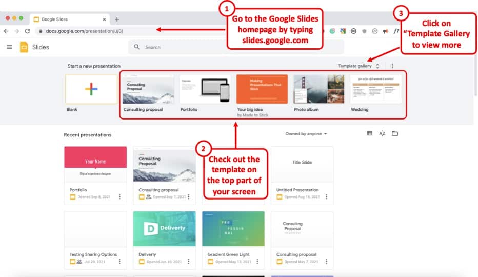
Google Slides already provides you with a number of free templates. Here’s how you can access them –
- First, visit your Google Slides dashboard page.
- Login to your Google Account (if prompted)
- Choose a template from “Start a new presentation” section
- You can also click on “Template Gallery” to view more templates.
The one template that I end up using over and over again is the file name “ Consulting Proposal “. It has got a sleek modern design, a good mix of image slides as well as different text placeholder slide layouts for you to easily edit your presentation.
But, feel free to check out other templates and see which one fits your need the best.
The point here is that if you are not great at designing a presentation, you’d perhaps be better off using a template rather than starting from scratch!
4. Use Fonts the Right Way
When it comes to designing a good presentation on Google Slides (or any application for that matter), fonts do play a key role in how your presentation looks!
Thus, it is important to make sure that you use the fonts correctly when creating your presentation.
Here’s what you need to remember when using fonts for your presentation –
- Use Just One or Two Fonts – Don’t use too many fonts in your presentation. Your presentation design will not look good. Plus, using too many fonts in a presentation shows lack of consistency and professionalism in design.
- Combine Fonts – Ideally, just use one font if you are unsure of which fonts work great together. But, you can also combine fonts to make the content of your presentation standout!
If you do want to go with a two-font option, use the Google Fonts tool to identify the font combination.
Here’s how you can find a good font combination for your presentation –
Step 1 – Visit Googe Fonts and Search for a Font
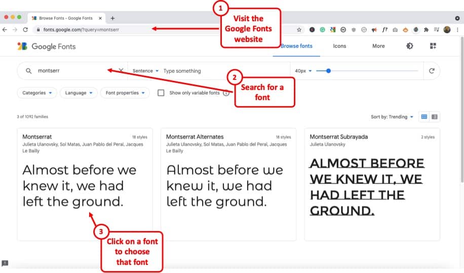
Google Fonts site provides free fonts that are compatible with most modern internet sites and web browsers. Google Fonts are considered the gold standard for sites as these look very modern and are light.
The best thing is – most of them are already available in your Google Slides presentation by default.
So, the first step is to visit the Google Fonts website . Then, search for a font, to begin with. My favorite font is Montserrat . But, you can also go with Lato, Roboto, or Source Sans Pro if you are looking for a Sans Serif Font .
If you are looking for a Serif font , I would recommend using Merriweather .
Step 2 – Choose the Font and click “Pairings”
The next step is to choose a font. You can either type one of the fonts that I mentioned in the search bar and click on it once it appears OR you can also simply choose from the list provided below.
Just make sure that you click on the font that you like to open it.
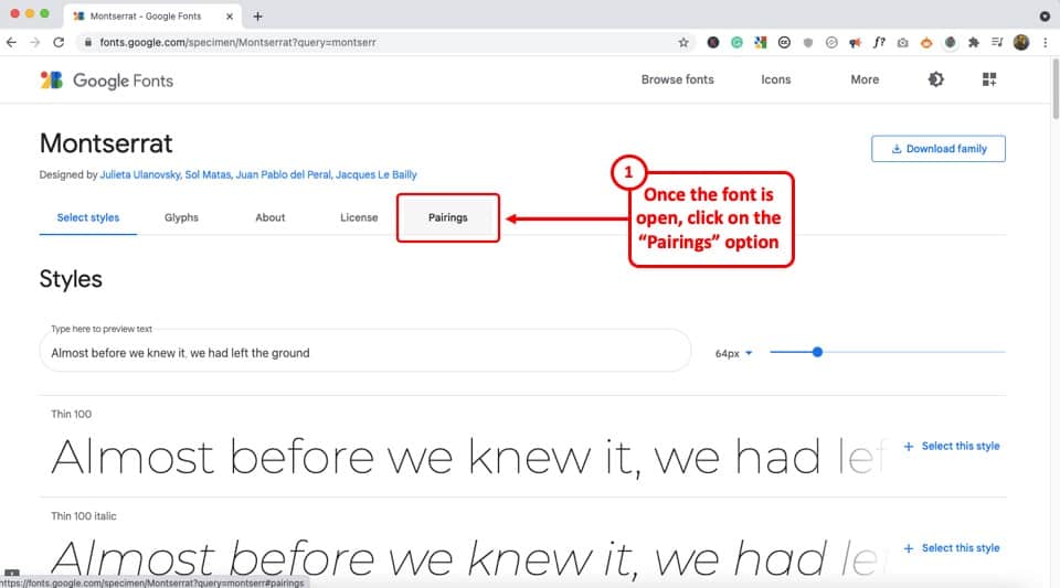
Once the font is open, click on the “Pairings” tab on the top (as shown in the image).
Step 3 – Choose a Font Pair
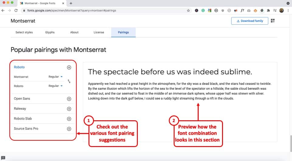
Now simply choose one of the font pairs provided by Google Fonts. You can also click on a font pair to see how it looks on the section on the right.
Play with the options provided and choose the font combination that you like.
Now, simply go back to your Google Slides presentation and change the fonts according to your selection.
5. Choose the Right Color Combination
Just the way fonts are an important part of your Google Slides presentation design, choosing a good color combination can make your presentation look visually appealing, consistent, and professional.
Unfortunately, a lot of struggle with choosing a good color combination. Thus, I highly advise going with a monochromatic color scheme.
A monochromatic color scheme in a presentation provides a variety of color combinations of the same color. This makes your presentation look consistent and professional.
Moreover, using a monochromatic color scheme is a perfect way option for a beginner as it requires the least amount of time and effort to set up!
Check out my other article on using a monochromatic color scheme for presentations to understand the topic in-depth.
Then, also check out how to use the eyedropper tool in Google Slides to implement the color scheme that you end up choosing.
Make sure that you change the color at the theme level in Google Slides instead of changing it on every single slide. This will save you quite a bit of time!
6. Use the Expore Tool to Generate Slide Designs
Once you’ve decided the fonts, color scheme, and theme, and you have the content structured out, you’ve done most of the hard work!
All you are now left to do is create the slide designs. And, to help you with that, make sure that you use the “ Explore Tool ” in Google Slides.
The “Explore” feature in Google Slides generates slide designs based on the content that is already present on the slide. It is a great way to get a slide designed almost instantaneously!
The “Explore” feature in Google Slides works much as the design ideas feature in PowerPoint.
Based on the content on the slide, it will throw a few suggestions on how the content can be laid out on the slide. You can choose the design you like. If not, you can still design your own slide. But, it is definitely worth trying out first. Pretty cool, isn’t it!
I wrote a detailed article on the Explore Feature in Google Slides . Make sure you check out that article to learn where to find this tool and know how to use it!
That said, one thing to keep in mind is that this feature is still an experimental tool . And, while it is getting better with time, I wouldn’t recommend using it with every single slide.
In my experience, I’ve noticed that using the “Explore” feature in Google Slides works best when you want to create a title slide, a section break slide, or just want to get a few ideas on how the slide can be designed.
7. Apply the 3 by 3 Design Rule
The 3 by 3 design rule, otherwise also known as “ the rule of thirds “, is a principle that has been borrowed from photography. But, it is every bit applicable even for slide designs and other design elements!
As per the 3 by 3 design principle, you basically need to divide the visual canvas into 3 equal-sized vertical and horizontal grids with the help of 2 vertical grid lines and 2 horizontal grid lines.
Here’s a video that explains the concept of the rule of thirds for presentations –
Using these grids helps place the content correctly in the grids such that the key message usually aligns with the way our eyes like to see them visually!
The 3 by 3 design principle may seem confusing at first, but once you’ve understood how to use it, you can literally take your presentation design skills a few notches above the rest!
Using 3X3 Grids to Properly Layout Content on your Slides
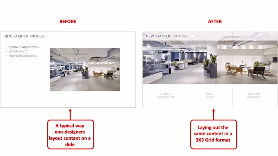
The interesting thing is, you can take the same principle to make it work with elements apart from the images that are present on your slide. And, the results are just amazing!
The picture above shows how most people design their slides (on the left). However, you can literally transform the way your slides look by applying the concept of 3×3 grids to any existing content on the slides! (as shown on the right part of the picture above)
Here’s another video that explains how this concept of 3 by 3 grids can be used to take any existing slides and make them better (if they aren’t properly organized).
8. Use Powerful Images
They say – “An image speaks a thousand words!”. This absolutely holds true when it comes to big impact presentation!
If you recollect any one of the top presentations from Steve Jobs. His presentation was almost always using powerful images with very few words on them.
Using images, as opposed to a lot of text, on your presentation has a few advantages of its own –
- Visual Appeal – Using images makes the slide visually appealing. Think about it – if there aren’t too many objects placed on the slide, the chances of making design related mistakes are also far lower!
- Emotional Connect – Using images creates a subtle emotional connect in the minds of the audience with the topic of the presentation and/or the presenter.
- Audience Focus – When you use text on a presentation, often the audience just reads the text and doens’t want to listen to the presenter. Instead, when using the images, you control the focus of the attention of your audience. Once you have their attention, making a presentation impactful is a lot easier!
- Faster Design Process – In most cases, it is faster to find an image and add it to the presentation rather than think of a way to design a slide to communicate a concept. This is especially true if you have only basic design skills.
If you watch some of the most famous TED or TEDx presentations ( know the difference between TED and TEDx presentations here ), it is quite common to see presenters using high-impact images with text. Ever wonder why is it so?
Well, one of the most important reasons is that you are able to control the attention of the audience!
Now, if you are wondering how to find images for your presentation, keep reading as I’ve got some great recommendations for add-ons later in the article!
9. Keep the Text on the Slide Readable
If using images for most slides is not the way for you, then this section is going to be quite important!
In fact, even if you do plan to use just images on your slides, there may still be a few slides where you will need to have some text. If so, make sure that the text on the slide is readable!
Make sure that you don’t use text that is too small to read.
As a general rule – the further the audience is going to be away from the screen, the larger the size of the text!
Here’s what to remember for the size of the text on the slides –
- Presentation seen on a computer screen – If the presentation that you are designing is going to be seen on a computer screen (either over an email or a zoom call), then make sure that the font size used for the presentation is not less than 16 points .
- Presentation seen on a large screen – If the presentation is going to be delivered in an auditorium, then it is recommended to use a font size no less than 30 points . For the rest of the situations, anything in between should be fine!
Also, make sure that you don’t use too much text on the same slide. Remember – you only need to cover one key topic on one slide.
It is totally okay to just use one word in the middle of the slide, and talk about that topic rather than using text from a complete word document on a slide!
If your audience will have to squint to read what is written, it just creates a bad user experience and they quickly lose interest.
Also, for the above reason, don’t include everything on the slide that you plan to say! If you do so, you may come across as a person who is just reading from the slide! Most importantly, the audience is going to end up reading the text from the slide faster than you speak, and end up losing interest in the presentation!
10. Ditch the Bullet Points (Use Infographics Instead!)
Using bullet points on a presentation is so 1990s! It’s just not the way good presentations are given anymore!
If you want your presentation design to look good, make sure that you get rid of bullet points. Instead, you can either use images, icons, or even infographics!
I’ve written an entire article on how to use infographics in Google Slides where I also talk about SmartArt and charts in Google Slides. Make sure you check out that article!
There are a ton of different ways in which you get infographics for Google Slides. I’ve talked about that also in the same article that I’ve linked above.
Likewise, you can also use icons instead of bullet points. Although adding icons to Google Slides is not an option that is available by default, there are a few ways you can work around this problem. For instance, you can use an add-on like “Flaticon” that provides free icons for Google Slides!
If you are wondering how to create a slide with bullet points and use icons or other methods, here’s a good example of an actual client slide that I redesigned –
As you can see on the image, simply using icons and structuring the text to give proper hierarchy to the information can make all the difference to the design of the slide!
In case you don’t want to use icons, you can also use numbers with circles, and use a similar design instead of just adding bullets to your presentation. If you do so, your presentation will still look good!
11. Avoid Using Just Table or a Graph
The next tip to remember is to avoid using just a table or a graph on a slide. Make sure that you also include a few points that act as key takeaways from the information that you provide.
Using just a table will present a lot of information on a single slide. This will definitely cause an information overload. And, even though your audience may be able to assess what is being presented to them, it is important to either highlight key pieces of information in the table or a graph.
Alternatively, you can also add a couple of lines of text indicating the key learnings from the data set.
Don’t get me wrong, it is important to have data sets on a presentation if you have one! But, just make sure that you also highlight key pieces of information that your audience should pay attention to.
12. Keep Animations and Transitions Subtle
Another design tip that you should keep in mind is the use of animations and transitions in Google Slides.
You want to make sure when using animations in Google Slides , you don’t add any funny movements. Think old school when using animations and transitions in your presentation.
Any additional movement or sudden transitions can distract the attention of the audience from the core topic and the messaging of the presentation.
So, make sure that you keep the use of such animations or transitions to the minimal!
13. Use Professional Google Slides Templates
If you find that the free template doesn’t have enough slide layouts for your presentation or doesn’t really fit the topic of your presentation, you may want to consider using professional templates!
There are a ton of different ways you can get templates for Google Slides. Unfortunately, most of the free options (and even most paid options) have outdated designs!
My personal favorite method for getting amazing Google Slides presentation templates is using Envato Elements .
The best part about using Envato Elements is that not only does it provide you with the best-in-class designs for your templates, but it also provides you with an option to download an unlimited number of presentations! (yes, you hear that right!)
Moreover, the pricing of Envato Elements is also really affordable! All you need to do is click on Envato Elements to visit the website, view the templates, and click on the “ Get Unlimited Downloads ” button on the top.
You will be prompted to sign up and pay a subscription. Just go for a monthly subscription and pay for one month (You can easily remove the payment method and cancel your subscription anytime).
Once you’ve logged in, simply cancel your subscription. Your subscription will be valid until the next date of renewal even if you cancel it.
Now, for the one month that you’ve paid, feel free to download all the templates that you like including templates for Google Slides, and PowerPoint!
14. Use Add-ons for Faster and Better Designs
One of the challenges with Google Slides, as opposed to some of the most reliable presentation design software, is the limited number of features it offers.
I suppose we should not really be complaining about it given that we do get a great presentation design application for free along with several additional advantages with Google Slides ! That said, you do feel the need for a few pro-features that PowerPoint has to offer.
However, one way to fix this problem is to use add-ons with Google Slides!
Using add-ons allows you to use third-party tools and bring additional functionalities to your Google Slides presentation!
Add-ons on Google Slides are easy to add. Simply go to the Google Marketplace, and search for the add-on that you would like to add. Install it, and you are done!
Check out my complete guide on using Add-ons on Google Slides where I not only talk about how to use add-ons in Google Slides, but I also provide you with my personal favorite top 5 recommendations of add-ons that you should be using in Google Slides!
15. Hire a Professional
Well, the last tip is not so much as a tool that you can use on Google Slides. But, it is a great hack to ensure that you create great presentation designs!
Simply hire a professional to do the design work for you! You may be wondering that hiring a presentation professional might be difficult. However, that is not the case.
You can easily find some really good presentation designers on Fiverr , and you can start at as little as $5 to $10 dollars per slide! I’ve personally used freelancers from the site, and although finding a good freelancer may take you 15-20 minutes, you can easily outsource your work and let the designer worry about the rest!
The best part is – you don’t have to pay a single penny to hire a professional. You only pay to get the work done!
There are a ton of other platforms to hire professionals that can design a good presentation for you. However, I have found Fiverr (especially for presentation design work) and Upwork to be the most effective.
A Few Things to Remember When Delivering the Presentation
Once you have created an amazing Google Slides presentation, you are perhaps ready to deliver the presentation. However, I’d like to also share a couple of tips that can be helpful when you plan to give the presentation!
So, here they are –
1. Use a Presentation Remote
It doesn’t matter whether you are giving a presentation in an auditorium or online through Zoom or Microsoft Teams.
Using a presentation remote helps you keep your hands free and allows for free movement and hand gestures. This does help engage with your audience.
Check out my other article on using presentation clickers with Google Slides where I provide you with a few tips and recommendations on which remote you should go with.
2. Use the Q&A Tool in Google Slides
A unique feature that Google Slides provides is the Q&A tool. This is great especially if you are delivering a webinar-style presentation or if you are simply addressing a large gathering.
This tool allows your audience to send questions during the course of your presentation. Then, at the end, you can simply view the questions in the Q&A session and answer them one by one!
It is a great way to deliver an engaging presentation using Google Slides!
Credit to cookie_studio (on Freepik) for the featured image of this article (further edited).
Sign up for our daily newsletter
- Privacy Policy
- Advertise with Us
8 Tips on How to Make Google Slides Look Good

Expect your audience to not be very impressed if you have a generic Google Slides presentation. They’re used to seeing similar information online, and this makes it difficult for you to get through to them. Deliver your point effectively by learning how to make Google Slides more pleasing to the eye in this guide.
Tip: already have a great-looking presentation? Learn how to extract images from Google Slides or PowerPoint .
How to Make Google Slides Look Good
1. choose the right slide layout, 2. use an appropriate color scheme, 3. choose a font based on application, 4. insert infographics, 5. embed videos and gifs, 6. add animations and transitions, 7. interact with audience using the q&a tool, 8. use google slides templates.
While the definition of a “good-looking presentation” is very subjective, there are some benchmarks that you can refer to. The following eight tips can improve the appearance of your Google Slides presentation:
Position your photos and text at optimal locations on a slide so that your audience can read and consume the details you’re presenting without hassle. But where are these “optimal locations”? That’s where slide layouts come into play.
When you add a new slide to a Google Slides presentation, you have an option to choose a layout. The layouts are preset with image placeholders, text boxes, title boxes, and similar elements. You just need to insert your content.
Find the slide layouts by clicking the downward arrow beside the “New slide” button in the toolbar. Choose one of these common (but effective) slide layouts:

- Section header: use this layout to separate your content into different sections. It also helps your audience understand when you’re transitioning to another topic.

- Title and body: this is likely to be the layout you use most often in your presentation. Use it to present an idea with supporting bullet points.

- One column text: this layout is good to use when you want to insert a supporting photo beside a text box.

- Caption: Sometimes a picture can convey more meaning than a slide filled with text. For full-screen photos, the caption slide is the best option.

- Big number: when presenting important figures and statistics, this layout will help deliver a better impact among your audiences.

Good to know: learn how to add a chart to your Google Slides presentation .
Colors play a vital role in setting the mood of your presentation. If you choose the wrong color scheme, you may not be able to deliver your point clearly. Worse, your audience could get distracted if you choose tacky colors.
Consider the context and audience of your presentation when choosing a color scheme:
- Monochrome for formal scenarios: when delivering keynote presentations, pitch decks, and other business reports, use colors that look more formal. Consider black and white themes or incorporate varying shades of blue to add visual interest to your slides.

- Vibrant themes for the creatives: if you’re running a creative studio or making a presentation related to marketing, consider using more vibrant colors. Make sure you find the right blend to showcase your own creative abilities.

- Utilize your brand colors: if you want to showcase your products or services in your Google Slides, why not use your brand’s colors? This would give more emphasis to your products and increase brand awareness.
Aside from the appropriate slide colors, remember to apply your chosen color scheme to other elements as well. Ensure that the color of your text contrasts nicely with the background for optimal readability. Simply put, use light-colored fonts for dark backgrounds and vice versa.
When selecting fonts, consider looking up font psychology on the Web. Basically, it shows how different styles of fonts can evoke emotion or tone among people. The following are the three major font categories:
- Serif: use this when delivering formal presentations, especially in academic and corporate applications. Examples include EB Garamond, Lora, and Roboto Serif.

- Sans serif: for more casual applications, use a sans serif font, such as Arial, Lexend, and Work Sans.

- Script: if you want to showcase your creativity, such as for art presentations and marketing pitches, a script font may be more appropriate. Examples are Caveat, and Lobster. You can also opt for a “hand-drawn” font, such as Amatic.

Whichever you choose, use only two to three fonts in your Google Slides presentation. This way, you provide enough visual interest to your slides and avoid making them look tacky. Pairing serif and sans-serif fonts for the title and body text is a great way to start.
Remember to experiment with the font sizes, too. Establish a visual hierarchy using bigger fonts for headers and smaller fonts for the details.

Good to know: use these tools to identify fonts in images .
Infographics provide a more interesting and meaningful way to present your data compared to plain text. Since there are graphics and visual cues involved, your audience can consume the content more intuitively (like in a process flow diagram).

Google Slides offers numerous kinds of diagrams, from grids to cycle charts. Whichever you choose, ensure that it matches the set of information that you’re presenting. For example, you can use a timeline chart when presenting the milestone years of your brand.

To add an infographic in Google Slides, go to “Insert -> Diagram.” Select your preferred chart, and edit as needed.

Videos are great supporting materials in your presentation, especially when you’re discussing complex topics. You have two source options here: YouTube and Google Drive.
Inserting a Video From YouTube:
- Go to YouTube and find the video that you want to insert.
- Click the “Share” button.

- Choose “Copy.”

- Return to your Google Slides presentation.
- Go to “Insert -> Video.”

- Click the search bar at the top, and paste the link that you copied.
- Select the result that appears.
- Click the “Insert” button.

Inserting a Video From Google Drive:
If you want to use videos that you have previously recorded or ones you downloaded from Facebook, upload them to your Google Drive account first, then insert them into your slides as instructed below:
- Go to your account on Google Drive , and select your video.
- Right-click on the video, then choose “Share -> Copy link.”

- Return to your presentation.
- Choose “Insert -> Video.”

- Switch to the “Google Drive” tab, then paste the link you copied to the search bar at the top.

- Click “Insert” to finish.

When using a video in your presentation , remember that it’s only supporting material. Ensure that it lasts no more than two minutes on a slide. Keep the number of video clips to a maximum of three in your entire presentation, too.
For short clips that span only a few seconds, we recommend using GIFs instead. They’re much lighter in storage than videos and would be just as effective. You can add one by choosing “Insert -> Image” in the menu bar.

Whichever source you prefer to use is up to you. You can search for photos online in an app, upload them from your drive or local storage, or copy and paste the URL of your image.
Tip: running out of space on Drive? Learn how to delete files from Google Drive to gain more room .
Using animations and transitions can make your Google Slides more attractive and enjoyable. They make your presentation appear less static and can also help with the pacing of your discussion.
When adding them to your slides, ensure that they are uniform throughout. For animations, it’s good to use up to two styles. For transitions, apply a single effect to every slide to not risk distracting your audience. Follow the steps below to add animations and transitions:
- Go to “Slide,” and select “Transition.”

- Select your preferred effect in the side panel under “Slide Transition.”
- Adjust its speed as necessary.
- Click “Apply to all slides.”

- Under “Object Animations,” select the effect you want to apply to your text or object.

- Preview your transition and/or animation using the “Play” button.

Note: we recommend that you avoid using the “Spin” animation for normal text, as it can be distracting. This also applies to the “Flip,” “Cube,” and “Gallery” transitions.
Related: want to whiz along more quickly when creating your presentation? Check out these Google Slides keyboard shortcuts .
After attracting your audience’s attention, go a step further to keep them engaged. One of the best features that you can use in Google Slides is the Q&A tool. Follow these steps to implement it:
- Click the “Slideshow” button in the top-right corner of your screen.

- Choose the More icon (vertical three dots) in the lower-left corner.
- Select “Q & A” from the list.
- Alternatively, press the “A” key on your keyboard.

- Click “Start new.”

You can enable this tool from the very start of your presentation. There will be a link displayed on top of the presenter screen where your audience can send their questions and concerns. This link works until you disable it or your presentation ends.

The questions will pool in the Q&A tool as your presentation progresses. Ensure that you allot time to address them. You can find the questions in the same tab as the steps above.
Given our tips, you probably realize that creating a visually appealing presentation consumes much time and effort. You may want to use a Google Slides template to save time for other tasks.
Templates already follow a structured format, from the design elements to the layout. Just insert your content, and customize the template to your needs.
FYI: make it educational for your kids by creating a simple flash card game in Google Slides .
Final Thoughts
A good-looking presentation doesn’t just impress your audience – it also ensures that your point comes across. To create an effective Google Slides presentation, consider using preset layouts and templates, and select the right colors and font styles to properly set the mood of your presentation.
Infographics, videos, and other visual cues would also be beneficial. And to top it off, consider using the Q&A tool to keep your audience engaged.
Want to learn more? Take a look at these 10 Google Slides tips to save you time .
Image credit: Unsplash . All screenshots by Princess Angolluan.
Our latest tutorials delivered straight to your inbox

Princess is a freelance writer based in Croatia. She used to work as an English teacher in Hokkaido, Japan before she finally changed careers and focused on content writing & copywriting, while running their own digital marketing company in Europe. For 5 years, she has written many articles and web pages on various niches like technology, finance, digital marketing, etc. Princess loves playing FPS games, watching anime, and singing.

How To Make Google Slides Look Good [Complete 2024 Guide]
- Last updated January 2, 2024
Making a standard presentation is easy, but knowing how to make Google Slides look good is an entirely different challenge. In my guide, I will show you how to make your Google Slides better , both functionally and aesthetically.
Keep reading to learn how to take your Google Slides presentation from good to great !
Table of Contents
1. Choose a Google Slides Theme

Themes ensure your presentation has visually consistent colors, fonts, sizes, and layouts. This goes a long way toward providing a professional and polished appearance, and it’s much easier for the audience to follow along.
- Choose a theme that aligns with the tone and purpose of your presentation.
- Ensure slides have a consistent set of colors, fonts, and layouts.
- Select a visually appealing color scheme and legible font combination.
While you can handpick background color palettes, typefaces, and slide layouts, many of the best Google Slides templates are built into the program! In a blank presentation, you’ll find them on the right-hand side.

Creating Your Own Google Slides Theme
It’s fairly straightforward to create your theme in Slides. Add whatever background color, images, shapes, and page formatting you prefer. Right-click your chosen slide and select “ Add to theme .”

Related : Don’t want to make one from scratch? I’ve got you covered with some of my favorite Google Slides templates at the bottom of this article.
How To Import a Theme to Google Slides
- Create a new presentation or open an existing one.

Note : Importing a theme into your presentation will impact all of your slides. To revert to the previous version, use the “ Undo ” button by pressing the keyboard shortcut Ctrl + Z (on Windows) or use Command + Z (on Mac).
2. Choosing Color Schemes in Slides
A color scheme is one of the first things your audience will see, so it’s one of the most critical elements. Google Slides offers plenty of color options, including gradients (which can be used for almost all the elements, including background, font, and shapes).
Use color theory principles (like complementary colors) to create combinations that stand out for the right reason. Color psychology is also a great way to express emotions or convey messages purposefully:
- Warm colors (e.g., red, orange, yellow) can express warmth, energy, or even a warning.
- Cool colors (e.g., blue, green, purple) can represent relaxation, sophistication, or security.
Use Color to Make Sections Stand Out
Strategically use color to highlight essential elements (e.g., headings, critical data). To guide the audience’s attention:
- Use vibrant shades that contrast the color scheme.
- Assign specific colors to categories, sections, and team members.
Be Mindful of Contrast
Check that the text and background colors have enough contrast for better reading. The most readable combination is dark text on a light backdrop (or vice versa). In charts and graphs, use color to improve focus and understanding.
Note : Avoid colors that can blend together or present difficulties for people with color blindness .
3. Choosing Text and Fonts
Your chosen font portrays information and dramatically improves your presentation’s overall aesthetic. If you’re trying to make a cool presentation on Google Slides, you’ve got a lot to consider!
Use Clear, Legible, and Easy-to-Read Fonts
Avoid overly decorative or ornate fonts because they can hinder readability (especially when projected on a larger screen). Stick to widely available and compatible fonts across devices like Arial, Georgia, or Open Sans.
Ensure Font Sizes, Weights, and Styles Stand out
Headings should stand out; supporting text should be smaller (or less emphasized). This is done to guide the audience’s attention and improve readability.
Note : While they can add visual interest, excessive use of font styles can be distracting and more challenging to read.
Complement Font Pairings
Select a combination of fonts that contrast each other and create visual interest. Consider using online resources or font pairing tools for inspiration. We recommend sticking to a maximum of two to three fonts to prevent visual chaos.
Use Fonts That Align with Branding Guidelines
If your website uses a specific font and color scheme, incorporate them into your presentations to support the organization’s visual identity.
Align Text and Spacing
Align text and leave enough white space for a clean, organized look.
4. How to Add Word Art to Google Slides:
- Select “ Insert ” > “ Word Art ” from the drop-down menu.

- Type your text, then press the “ Enter ” key on your keyboard.

There you have it! Your Word Art will now appear on your selected slide.

Note: If you want to edit the font or color, click the Word Art, and a formatting box will pop up.

5. How To Add Google Slides Transitions
You can ensure seamless transitions from slide to slide with a couple of clicks:

- If you want to apply the selected transition to all slides in your presentation, click “ Apply to All Slides .”
- Any transitions applied to skipped slides won’t play during the preview.
- Click the “ Stop ” button when you’re finished.

Tip : You can configure your presentation to play automatically using Google Slides’ automatic transitions. This removes the need to press the spacebar or click on the screen to trigger the next slide.
How Many Transitions Are Available in Google Slides?
At the time of writing, Google Slides offers seven built-in transitions . There is currently no option to add or download additional transitions.
6. How To Add Animations on Google Slides
Enhance the visual appeal of your slideshow by incorporating animations (i.e., effects that make elements move). They can be applied to almost every object, from images to tables to bullet points. Follow the steps below to add animations to your slides:

- You’ll notice that your selected object’s “ Animation Type ” is set to “ Appear .”

- Fade in : This transition introduces the object by gradually fading it in.

- Fly in from left/right or top/bottom : The object flies into the slide from one side.

- Zoom in : The object starts small and slowly increases in size.
Under “ Animation Type ,” you’ll see the “ Start Condition ” drop-down. Open it to select whether the animation should play upon clicking a slide, with the previous animation, or after the previous animation.

Note: The start conditions “With Previous” and “After Previous” will only work if there is another animated object immediately before your selected object .

- Click on the “ Play ” button to preview your animation(s).
- Click the “ Stop ” button to end the preview and continue working on your slideshow.
Related : Google Slides vs. PowerPoint: Which Program Is Better?
Tips for Using Transitions & Animations
We recommend using these effects sparingly to emphasize essential elements or facilitate the flow of information. Avoid using them solely for decorative purposes.
Pick Subtle and Smooth Transitions
Flashy or distracting effects can overshadow your content. Your goal is to provide a seamless flow between slides. Try a simple fade or slide transition.
Adjust the Timing and Duration
Transitions shouldn’t be too fast or slow. Aim for a natural pace that allows the audience to follow along comfortably.
Highlight Specific Elements Within a Slide
Selectively animating text, images, or charts can emphasize critical points (or reveal information) in a controlled manner. Avoid excessive animation that appears gimmicky or distracting.
Be Consistent
Choose a specific transition style or animation effect — then stick to it. This will help you avoid distractions and inconsistencies.
7. Using Images and Videos

Adding images and videos to slides can greatly enhance visual appeal and engage your audience. Here are some points to consider when choosing an image:
- Choose images that are relevant to your content.
- Use high-quality images that are clear, crisp, and well-composed.
- Use images that evoke emotions or illustrate concepts.
- Strike a balance between text and images on your slides.
- Consider using images as slide backgrounds.
- Adjust transparency or apply overlays to maintain readability.
- Experiment with image formatting options (e.g., cropping, resizing, transparency, brightness).
8. How To Include Infographics in Google Slides

Infographics in a presentation can communicate complex information effectively. Use the drawing feature in Google Slides to make attractive and informative infographics. Keep these points in mind when using infographics:
- Keep your infographics clean and basic.
- Choose from bar charts, pie charts, line graphs, timelines, flowcharts, maps, and diagrams.
- Avoid overwhelming your audience: Use limited details, succinct labeling, and clear graphics.
- Use custom colors, typefaces, and visual styles to reflect your presentation or company identity.
- Highlight the most significant facts or data.
- Make sure infographic details are simple to read and understand.
How Can Poor Design Affect A Presentation?
Your presentation could be significantly impacted if you haven’t learned how to make Google Slides look professional. Here’s why:
Lack of Clarity
Poor aesthetics often make it more difficult for the audience to grasp — or focus on — details. Avoid cluttered or crowded presentations, imprecise typefaces, and insufficient color contrast. Key points might be missed, or the audience may get distracted.
Unprofessionalism
A disorganized presentation might give the appearance of being unprofessional, affecting the presenter’s credibility.
Poor Readability
Small fonts, poor contrast, and ornamental typefaces can strain the eyes and make it difficult to follow a presentation.
Lack of Visual Appeal
A presentation with a dull or unappealing design may fail to catch attention (and make the material less memorable).
9. A Few of My Favorite Google Slides Templates
If you’re not interested in using stock templates (let alone creating your own), I’ve got you covered with these slick presentations:
Ganymede Template

The Ganymede template offers a modern style with bold text for extra impact. Whether you aim to make a lasting impression with your pitch deck — or simply want to use colors that align with your brand — this template suits your needs.
Access Template
Dynamic Business Template

An effective project management report is characterized by clarity, and your color scheme plays a significant role. I love the streamlined theme of this Google Slides template and appreciate that a blank timeline chart, roadmap diagram, and funnel are included for incredible customization.
Frequently Asked Questions
Can you make google slides vertical.
You can make Google Slides vertical by following simple steps:
- Open a new or existing presentation.
- Click the “ File ” button to open a drop-down menu.
- Click the “ Page setup ” option.
- Select the “ Custom ” option and set your desired size (width and height)
- Hit “ Apply ” to save the changes.
Can You Do Hanging Indent in Google Slides?
Yes. There are three methods to do hanging indent in Google Slides:
- The ruler (blur triangle) along the top to position your hanging indent.
- The keyboard Tab key for quick indentation adjustments.
- Select “ Text Fitting ”> “ Indention ” > “ Hanging ” > “ First line indent ” > “ Hanging indent ” to the desired amount.
Are There More Google Slides Templates?
Yes. There are many free Google Slides templates out there. Here are ten additional templates for you to use.
Bottom Line
Any presentation’s goal is to keep the audience’s attention, and you can do that with a balance between aesthetics and practicality.
I hope I’ve helped you learn how to make your Google Slides look good, express your message, and captivate your audience. If you need more assistance, Spreadsheet Point’s premium Google Slides templates can take the pressure off you. When you use the code SSP, you’ll get 50% off !
Get Premium Templates
- How To Download Google Slides [Step-by-Step Guide]
- How To Add Bitmoji to Google Slides
- How To Make Google Slides Play Automatically
Most Popular Posts

How To Highlight Duplicates in Google Sheets

How to Make Multiple Selection in Drop-down Lists in Google Sheets

Google Sheets Currency Conversion: The Easy Method
A 2024 guide to google sheets date picker, related posts.
- Sumit Bansal
- May 2, 2024
How to Insert a Google Sheets Hyperlink in 5 Seconds
- Chris Daniel
- April 15, 2024
How to Import Stock Prices into Google Sheets
- April 2, 2024
How to Calculate Age in Google Sheets (2 Easy Methods)
- February 21, 2024
Thanks for visiting! We’re happy to answer your spreadsheet questions. We specialize in formulas for Google Sheets, our own spreadsheet templates, and time-saving Excel tips.
Note that we’re supported by our audience. When you purchase through links on our site, we may earn commission at no extra cost to you.
Like what we do? Share this article!
How to Make Google Slides Look Good And Add a Touch of Finesse?
- Share on Facebook
- Share on Twitter
By Nikolay Kaloyanov
in How-To Tutorials
2 years ago
Viewed 25,516 times
Spread the word about this article:

From ancient times to today, people have been obsessed with beauty. People have adored art, whether we talk about cave drawings or Renaissance art. Our nature has remained the same – only the means have changed.
Regardless of the presentation software you use, a top-notch performance is about three key details: a confident speaker, helpful content, and great design. And while many people aim to add tons of information and become exceptional orators, many presenters overlook visual elements for some reason.
In this article, we will see how to make Google Slides look good and what is the benefit of adding design elements.
Article overview:
1. Why should you make your Google Slides visually appealing 2. What are the benefits of stunning Google Slides presentations? 3. How to Make Google Slides Look Good?
1. How can poor design affect your presentation?
Your audience is exposed to a lot of information daily – news, social media feeds, videos, chats, etc. A brain has been so used to receiving lots of info daily that it filters out most of it. At the end of each day, you remember the brightest moments.
The same thing applies to presentations. If you have spent much effort delivering your presentation, you win points, and your idea might get “sold.” However, it would help if you had that extra bit of something – like a pinch of salt, to make the difference between a good presentation and an outstanding one.
Visually appearing presentations can have a profound effect on your audience. Imagine seeing the same person in the subway – on day one they wear an old jacket and dirty jeans, and they are dressed up a day later. If they come to you, asking for a small favor – when will you trust them more?
2. What are the benefits of stunning Google Slides presentations?
Whether you are a teacher, student, or business person, you want valid reasons to add graphic elements to your presentation. Modifying the themes in Google Slides , inserting shapes, and creating animations are all time-consuming. A couple of minutes here and there, and you have already spent hours on the presentation. But how do you compensate for this time? Let’s see what is the added value from making your Google Slides presentation more attractive.
✅ A better understanding of your concept – Google Slides presentations have a main topic and sub-topics. If you organize your slides and make them more appealing, it will be easier for your audience to understand what you’re saying.
✅ Data visualization – in most presentations, the main focus is on 2-3 slides that contain data. Proper data visualization can convince your audience and sell your ideas.
✅ More confidence – just like formal clothes, good-looking presentations give that extra confidence in speakers required to perform more assertively.
✅ Improved conversions – while the term “conversion” might create associations with sales, it doesn’t have that purpose only. While for salespeople good presentation design could result in more products/services sold – students might convince their teachers they deserve an A+, and professors could keep their students hooked during the whole lecture.
3. How to Make Google Slides Look Good?
Google Slides offers a lot of functions that could be utilized to make your presentation look better. Below, you can find eight tips and tricks to improve your design and grab the audience.
3.1. Use presentation templates
Time is money. While you can optimize your presentation design every single time you create a new presentation, it is extremely time-wasting. Doing the same thing over and over again is not a viable strategy. This is where templates come into place. Instead of doing everything from scratch, you have a ready-made backbone, and your task is to enter your content and tweak the template a little bit, depending on the presentation.
Google Slides comes with 20+ default templates to choose from. You can then edit the colors from the Theme builder but that’s about it. You also have the option to customize each slide individually but remember – you should keep the consistency with the colors and the structure of the slide.
The last option is preferred by many. Instead of using a generic template, you can download a pre-made template mixed with some tweaks. There are plenty of free Google Slides templates. Of course, you can also buy paid templates which can be extremely useful if you carry out presentations frequently.
But no matter which ones you download – the paid or the free templates, you should know that they have been created by designers, so you should only change minor details. There’s no need to worry about font compatibility, color contrast, and other details which would otherwise be hard to manage.
3.2. Choose the right colors

The Color Theory is applicable in any area of our lives. Your Google Slides presentation makes no difference. Depending on the topic you are presenting, you need to select your colors carefully. If you offer a banking product, you might want to use light blue background combined with red and white. For presentations about nature and biology, using green and brown as more earthy colors will be a good idea.
Don’t forget to play with the font colors, too. For presentations with darker backgrounds, fonts have to be light and have bright accents. If you have a very light background, you have to make your text darker and bolder.
Colors are a substantial part of branding. If you have a Google Slides presentation and you want to showcase your branded goods, you might want to use the brand colors, as to highlight your product and add more value to it.
3.3. Pay attention to fonts

The fonts you pick will set the tone of your presentation. There are many things to consider when adding fonts. Make sure your topic matches the seriousness of the fonts – for more formal presentations (like medical presentations), you have to use more formal fonts – like Roboto, Arial, Helvetica Neue, and Garamond. You can easily add some of the best free fonts to your Google Slides presentation .
You need to focus on one critical detail, though – it’s not a good idea to use more than 2-3 fonts in your presentation. If you break this rule, you risk distracting your audience. Also, you need to be consistent with your choice of fonts – picking fonts that are either too similar (lack of visual hierarchy) or too different is a big blunder.
A quick tip : If you don’t know which fonts to choose, you can select fonts from the same family or combine one serif for the title text and a sans-serif for the standard text.
3.4. Add transitions

Knowing how to make Google Slides look good is important. So are the transitions. Finding the right balance between adding too much and having none is fundamental. Also, try to use a maximum of 1 transition per slide. It’s a good practice to set the same effect on all slides, as to keep consistency.
It will not be a bad idea if you avoid using Cube and Gallery transitions. They are a bit too overwhelming. You can also use object animations. They are quite useful if you have an important chart to show, as they can attract your audience’s attention.
3.5. Use infographics

Infographics (a combination of information + graphics) are a great way to make data more accessible to your audience. They are visual representations of necessary facts you would like to share with your audience and are a much-preferred way to present information more clearly.
Instead of explaining the details and having a slide with two long paragraphs where people get lost, creating a simple radial chart in Google Slides and displaying it in front of the others, for example, might better convey your message.
But infographics are not limited to charts. You can display all types of data – process steps, historical values, etc. Ensure you have the right infographic for your information. If you discuss the project scope, you might want to visualize it with a Gantt chart or step-by-step infographic. A pie helps show a percentage of the whole. And be careful – even if you come up with a good infographic design, you need to create a legend so that people can understand it.
If you need infographics, you can check our collection of 500+ infographics compatible with Google Slides (including freebies).
3.6 Embed videos

In one of our previous guides, we showed you how to embed videos in Google Slides . Both Millennial and Gen Z audiences consume a lot of video content. As a result, you can create a lasting impression on them by adding useful videos to your topic. The good news is you can edit the videos, so they can watch the part which is most relevant to the slide topic. It’s not a good idea to stream more than 2 minutes per slide, as you will lose your impact as a speaker. Also, don’t show more than 3 videos per presentation, as videos aim to support you, rather than be the main source of content.
As both YouTube and Slides are part of Google, it’s elementary to add videos from the video streaming platform directly. If, however, your want to add videos that aren’t uploaded on YouTube, you simply have to download them (Vimeo has such an option) and implement them through Google Drive.
3.7. Add GIFs
GIFs are the perfect mix between single-frame images and videos. With them, you can catch your audience’s attention on particular details from your presentation. GIFs are one of the cool things you can do with Google Slides. Since a GIF is practically an image, you can add them easily – by URL or from your computer. You can check one of our articles about free GIFs for presentations .
GIFs find great application in pinpointing certain phrases or infographics that readers should pay attention to. You can also create a GIF to make a demo of how something works, so it can be utilized in tutorials. But GIFs should be used moderately. Abusing these visuals will result in diminishing returns – the audience will get distracted and the GIFs won’t be able to fulfill their goal.
Regarding memes, you’d better not use them. While a positive impact is possible, the chances are that you will most probably make your presentation less serious and change the topic of the whole presentation.
3.8. Add 3D shapes

Design is design – whether we speak about presentation design or UX design. Making your Google slides aesthetic brings a lot of added value but you should know that trends are changing, and coming up with dated designs will not make a good impression. And speaking of trends – 3D shapes are an inevitable part of modern design, a 3D image might be more relevant and easily understood than a simple 2D drawing, especially if the presentation is about architecture and engineering.
Currently, Google Slides doesn’t have its own 3D shapes and charts, but you can easily add one from external sources – you can use your computer (if you have it there), a URL address, or if the image is shared with you in Google Drive.
You should learn how to make Google Slides look good, as your audience is demanding – people want to hear someone who is confident in presenting something which is visually attractive. If you manage to use Google Slides to your advantage, you can come up with outstanding presentation designs and enjoy the deserved applause at the end.
If you found our post useful, you can also take a look at our collection of Google Slides tutorials , or browse some of these:
- How to Calm Down Before a Presentation: 10 Practical Tips and Techniques
- How to Start and End a Presentation: 10 Practical Tips to Grab Attention and Make an Impact
- 20 Google Slides Tips to spice up your Presentations

Add some character to your visuals
Cartoon Characters, Design Bundles, Illustrations, Backgrounds and more...
Like us on Facebook
Subscribe to our newsletter
Be the first to know what’s new in the world of graphic design and illustrations.
- [email protected]
Browse High Quality Vector Graphics
E.g.: businessman, lion, girl…
Related Articles
How to craft a cartoon facebook cover in photoshop, how to write a killer blog post in 10 easy steps, character animator tutorials part 2: basic puppet in illustrator, how to record a zoom presentation and present in a virtual meeting, 25 affinity designer tutorials to step up your game in 2022, 500+ free and paid infographic templates compatible with google slides:, enjoyed this article.
Don’t forget to share!
- Comments (0)
Nikolay Kaloyanov
Nikolay is a copywriter with vast experience in Technology, Marketing, and Design. When he isn't playing with words and crafting texts, he watches sports and asks questions. He is a funny person...until you put him on a diet.

Thousands of vector graphics for your projects.
Hey! You made it all the way to the bottom!
Here are some other articles we think you may like:

How-To Tutorials
Beginners guide to adobe character animator.
by Lyudmil Enchev

30 Amazing Adobe Photoshop Tutorials for Beginners [2022]
by Nikolay Kaloyanov

20 Sketch Tutorials To Master the UX Design Software
Looking for design bundles or cartoon characters.
A source of high-quality vector graphics offering a huge variety of premade character designs, graphic design bundles, Adobe Character Animator puppets, and more.
17 PowerPoint Presentation Tips From Pro Presenters [+ Templates]
Published: April 26, 2024
PowerPoint presentations can be professional, attractive, and really help your audience remember your message.

If you don’t have much experience, that’s okay — I’m going to arm you with PowerPoint design tips from pro presenters, the steps you need to build an engaging deck, and templates to help you nail great slide design.
![→ Free Download: 10 PowerPoint Presentation Templates [Access Now]](https://no-cache.hubspot.com/cta/default/53/2d0b5298-2daa-4812-b2d4-fa65cd354a8e.png "how to make a slide presentation look good")
Download Now
Buckle up for a variety of step-by-step explanations as well as tips and tricks to help you start mastering this program. There are additional resources woven in, and you’ll find expert perspectives from other HubSpotters along the way.
Table of Contents
How to Make a PowerPoint Presentation
Powerpoint presentation tips.
Microsoft PowerPoint is like a test of basic professional skills, and each PowerPoint is basically a presentation made of multiple slides.
Successful PowerPoints depend on three main factors: your command of PowerPoint's design tools, your attention to presentation processes, and being consistent with your style.
Keep those in mind as we jump into PowerPoint's capabilities.
Getting Started
1. open powerpoint and click ‘new.’.
A page with templates will usually open automatically, but if not, go to the top left pane of your screen and click New . If you’ve already created a presentation, select Open and then double-click the icon to open the existing file.

2. Choose a theme or create your own.
Microsoft offers built-in themes and color variations to help you design your slides with a cohesive look. To choose from these pre-built themes, choose the File tab again, select New , choose one of the options, and click Create .

10 Free PowerPoint Templates
Download ten free PowerPoint templates for a better presentation.
- Creative templates.
- Data-driven templates.
- Professional templates.
You're all set!
Click this link to access this resource at any time.
Creating PowerPoint Slides
3. insert a slide..
Insert a new slide by clicking on the Home tab and then the New Slide button. Consider what content you want to put on the slide, including heading, text, and imagery.

- Finally, PowerPoint Live is a new tool that enables you to do more seamless presentations during video calls and may be a better overall match for doing presentations remotely. Check out this video:
11. Try Using GIFs.

12 Free Customizable Resume Templates
Fill out this form to access your free professionally-designed templates, available on:
- Microsoft Word
- Google Docs
- Microsoft PowerPoint
- Google Slides
15. Embed multimedia.
PowerPoint allows you to either link to video/audio files externally or to embed the media directly in your presentation. For PCs, two great reasons for embedding are:
- Embedding allows you to play media directly in your presentation. It will look much more professional than switching between windows.
- Embedding also means that the file stays within the PowerPoint presentation, so it should play normally without extra work (except on a Mac).
If you use PowerPoint for Mac it gets a bit complicated, but it can be done:
- Always bring the video and/or audio file with you in the same folder as the PowerPoint presentation.
- Only insert video or audio files once the presentation and the containing folder have been saved on a portable drive in their permanent folder.
- If the presentation will be played on a Windows computer, then Mac users need to make sure their multimedia files are in WMV format.
- Consider using the same operating system for designing and presenting, no matter what.
16. Bring your own hardware.
Between operating systems, PowerPoint is still a bit jumpy. Even between differing PPT versions, things can change. The easiest fix? Just bring along your own laptop when you're presenting.
The next easiest fix is to upload your PowerPoint presentation into Google Slides as a backup option — just make sure there is a good internet connection and a browser available where you plan to present.
Google Slides is a cloud-based presentation software that will show up the same way on all operating systems.
To import your PowerPoint presentation into Google Slides:
- Navigate to slides.google.com . Make sure you’re signed in to a Google account (preferably your own).
- Under Start a new presentation , click the empty box with a plus sign. This will open up a blank presentation.
- Go to File , then Import slides .
- A dialog box will come up. Tap Upload.
- Click Select a file from your device .
- Select your presentation and click Open .
- Select the slides you’d like to import. If you want to import all of them, click All in the upper right-hand corner of the dialog box.
- Click Import slides.
When I tested this out, Google Slides imported everything perfectly, including a shape whose points I had manipulated. This is a good backup option to have if you’ll be presenting across different operating systems.
17. Use Presenter View.
In most presentation situations, there will be both a presenter’s screen and the main projected display for your presentation.
PowerPoint has a great tool called Presenter View, which can be found in the Slide Show tab of PowerPoint. Included in the Presenter View is an area for notes, a timer/clock, and a presentation display.
For many presenters, this tool can help unify their spoken presentation and their visual aid. You never want to make the PowerPoint seem like a stack of notes that you’re reading off of.
Use the Presenter View option to help create a more natural presentation.
Pro Tip: At the start of the presentation, you should also hit CTRL + H to make the cursor disappear. Hitting the “A” key will bring it back if you need it.
Your Next Great PowerPoint Presentation Starts Here
Now that you have these style, design, and presentation tips under your belt, you should feel confident to create your PowerPoint presentation.
But if you can explore other resources to make sure your content hits the mark. After all, you need a strong presentation to land your point and make an impression.
With several templates to choose from — both in PowerPoint and available for free download — you can swiftly be on your way to creating presentations that wow your audiences.
Editor's note: This post was originally published in September 2013 and has been updated for comprehensiveness.
![Blog - Beautiful PowerPoint Presentation Template [List-Based]](https://no-cache.hubspot.com/cta/default/53/013286c0-2cc2-45f8-a6db-c71dad0835b8.png "how to make a slide presentation look good")
Don't forget to share this post!
Related articles.
![How to Write an Ecommerce Business Plan [Examples & Template]](https://blog.hubspot.com/hubfs/ecommerce%20business%20plan.png "how to make a slide presentation look good")
How to Write an Ecommerce Business Plan [Examples & Template]
![How to Create an Infographic in Under an Hour — the 2024 Guide [+ Free Templates]](https://blog.hubspot.com/hubfs/Make-infographic-hero%20%28598%20%C3%97%20398%20px%29.jpg "how to make a slide presentation look good")
How to Create an Infographic in Under an Hour — the 2024 Guide [+ Free Templates]
![20 Great Examples of PowerPoint Presentation Design [+ Templates]](https://blog.hubspot.com/hubfs/powerpoint-presentation-examples.webp "how to make a slide presentation look good")
20 Great Examples of PowerPoint Presentation Design [+ Templates]

Get Buyers to Do What You Want: The Power of Temptation Bundling in Sales

How to Create an Engaging 5-Minute Presentation
![How to Start a Presentation [+ Examples]](https://blog.hubspot.com/hubfs/how-to-start-presenting.webp "how to make a slide presentation look good")
How to Start a Presentation [+ Examples]

120 Presentation Topic Ideas Help You Hook Your Audience
![How to Create the Best PowerPoint Presentations [Examples & Templates]](https://blog.hubspot.com/hubfs/Powerpoint%20presentation.jpg "how to make a slide presentation look good")
How to Create the Best PowerPoint Presentations [Examples & Templates]

The Presenter's Guide to Nailing Your Next PowerPoint
![How to Create a Stunning Presentation Cover Page [+ Examples]](https://blog.hubspot.com/hubfs/presentation-cover-page_3.webp "how to make a slide presentation look good")
How to Create a Stunning Presentation Cover Page [+ Examples]
Marketing software that helps you drive revenue, save time and resources, and measure and optimize your investments — all on one easy-to-use platform
How-To Geek
8 tips to make the best powerpoint presentations.
Want to make your PowerPoint presentations really shine? Here's how to impress and engage your audience.
Quick Links
Table of contents, start with a goal, less is more, consider your typeface, make bullet points count, limit the use of transitions, skip text where possible, think in color, take a look from the top down, bonus: start with templates.
Slideshows are an intuitive way to share complex ideas with an audience, although they're dull and frustrating when poorly executed. Here are some tips to make your Microsoft PowerPoint presentations sing while avoiding common pitfalls.
It all starts with identifying what we're trying to achieve with the presentation. Is it informative, a showcase of data in an easy-to-understand medium? Or is it more of a pitch, something meant to persuade and convince an audience and lead them to a particular outcome?
It's here where the majority of these presentations go wrong with the inability to identify the talking points that best support our goal. Always start with a goal in mind: to entertain, to inform, or to share data in a way that's easy to understand. Use facts, figures, and images to support your conclusion while keeping structure in mind (Where are we now and where are we going?).
I've found that it's helpful to start with the ending. Once I know how to end a presentation, I know how best to get to that point. I start by identifying the takeaway---that one nugget that I want to implant before thanking everyone for their time---and I work in reverse to figure out how best to get there.
Your mileage, of course, may vary. But it's always going to be a good idea to put in the time in the beginning stages so that you aren't reworking large portions of the presentation later. And that starts with a defined goal.
A slideshow isn't supposed to include everything. It's an introduction to a topic, one that we can elaborate on with speech. Anything unnecessary is a distraction. It makes the presentation less visually appealing and less interesting, and it makes you look bad as a presenter.
This goes for text as well as images. There's nothing worse, in fact, than a series of slides where the presenter just reads them as they appear. Your audience is capable of reading, and chances are they'll be done with the slide, and browsing Reddit, long before you finish. Avoid putting the literal text on the screen, and your audience will thank you.
Related: How to Burn Your PowerPoint to DVD
Right off the bat, we're just going to come out and say that Papyrus and Comic Sans should be banned from all PowerPoint presentations, permanently. Beyond that, it's worth considering the typeface you're using and what it's saying about you, the presenter, and the presentation itself.
Consider choosing readability over aesthetics, and avoid fancy fonts that could prove to be more of a distraction than anything else. A good presentation needs two fonts: a serif and sans-serif. Use one for the headlines and one for body text, lists, and the like. Keep it simple. Veranda, Helvetica, Arial, and even Times New Roman are safe choices. Stick with the classics and it's hard to botch this one too badly.
There reaches a point where bullet points become less of a visual aid and more of a visual examination.
Bullet points should support the speaker, not overwhelm his audience. The best slides have little or no text at all, in fact. As a presenter, it's our job to talk through complex issues, but that doesn't mean that we need to highlight every talking point.
Instead, think about how you can break up large lists into three or four bullet points. Carefully consider whether you need to use more bullet points, or if you can combine multiple topics into a single point instead. And if you can't, remember that there's no one limiting the number of slides you can have in a presentation. It's always possible to break a list of 12 points down into three pages of four points each.
Animation, when used correctly, is a good idea. It breaks up slow-moving parts of a presentation and adds action to elements that require it. But it should be used judiciously.
Adding a transition that wipes left to right between every slide or that animates each bullet point in a list, for example, starts to grow taxing on those forced to endure the presentation. Viewers get bored quickly, and animations that are meant to highlight specific elements quickly become taxing.
That's not to say that you can't use animations and transitions, just that you need to pick your spots. Aim for no more than a handful of these transitions for each presentation. And use them in spots where they'll add to the demonstration, not detract from it.
Sometimes images tell a better story than text can. And as a presenter, your goal is to describe points in detail without making users do a lot of reading. In these cases, a well-designed visual, like a chart, might better convey the information you're trying to share.
The right image adds visual appeal and serves to break up longer, text-heavy sections of the presentation---but only if you're using the right images. A single high-quality image can make all the difference between a success and a dud when you're driving a specific point home.
When considering text, don't think solely in terms of bullet points and paragraphs. Tables, for example, are often unnecessary. Ask yourself whether you could present the same data in a bar or line chart instead.
Color is interesting. It evokes certain feelings and adds visual appeal to your presentation as a whole. Studies show that color also improves interest, comprehension, and retention. It should be a careful consideration, not an afterthought.
You don't have to be a graphic designer to use color well in a presentation. What I do is look for palettes I like, and then find ways to use them in the presentation. There are a number of tools for this, like Adobe Color , Coolors , and ColorHunt , just to name a few. After finding a palette you enjoy, consider how it works with the presentation you're about to give. Pastels, for example, evoke feelings of freedom and light, so they probably aren't the best choice when you're presenting quarterly earnings that missed the mark.
It's also worth mentioning that you don't need to use every color in the palette. Often, you can get by with just two or three, though you should really think through how they all work together and how readable they'll be when layered. A simple rule of thumb here is that contrast is your friend. Dark colors work well on light backgrounds, and light colors work best on dark backgrounds.
Spend some time in the Slide Sorter before you finish your presentation. By clicking the four squares at the bottom left of the presentation, you can take a look at multiple slides at once and consider how each works together. Alternatively, you can click "View" on the ribbon and select "Slide Sorter."
Are you presenting too much text at once? Move an image in. Could a series of slides benefit from a chart or summary before you move on to another point?
It's here that we have the opportunity to view the presentation from beyond the single-slide viewpoint and think in terms of how each slide fits, or if it fits at all. From this view, you can rearrange slides, add additional ones, or delete them entirely if you find that they don't advance the presentation.
The difference between a good presentation and a bad one is really all about preparation and execution. Those that respect the process and plan carefully---not only the presentation as a whole, but each slide within it---are the ones who will succeed.
This brings me to my last (half) point: When in doubt, just buy a template and use it. You can find these all over the web, though Creative Market and GraphicRiver are probably the two most popular marketplaces for this kind of thing. Not all of us are blessed with the skills needed to design and deliver an effective presentation. And while a pre-made PowerPoint template isn't going to make you a better presenter, it will ease the anxiety of creating a visually appealing slide deck.
How to Design a Professional PowerPoint Presentation
Our series of tips on presentation design outlined some generic rules and ideas that you can live by to create better, more professional presentations. Today we want to follow that up by taking you through the actual process of designing a presentation from start to finish.
We’ll break down every step of the design process, from choosing colors and images to using whitespace properly. After reading through this you should be all set to design your own beautiful presentation slides that will put your coworkers to shame.
Using a pre-built PowerPoint template can be a good starting point for many people (we collected some of the best PowerPoint templates for you!). But if you’re wanting to design your own from start-to-finish, you’re in the right place!
How Does Unlimited PowerPoint Templates Sound?
Download thousands of PowerPoint templates, and many other design elements, with a monthly Envato Elements membership. It starts at $16 per month, and gives you unlimited access to a growing library of over 2,000,000 presentation templates, fonts, photos, graphics, and more.

Modern PPT Templates
New & innovative.

Animated PPT Templates
Fully animated.

Maximus Template
Explore PowerPoint Templates
A Word About Content
I usually make a big deal about content preceding design, and presentations are no exception. Ideally, you’ll have the topic and much or all of the content outlined before you even think about design. This will in every way shape the appearance of your design, which is why working from pre-built templates isn’t always the best move (though generic templates can and do work great in some circumstances).
The reason that I bring this up is that I don’t really have an actual presentation in mind for this project. I’ll be running with a basic theme, but the textual information will be entirely placeholder copy. Your image, font, color and layout selection shouldn’t necessarily match mine but instead reflect the topic and content you’re working with.
Choosing A Color Scheme
Before I even open Photoshop (yes, I design PowerPoint/Keynote slides in Photoshop and drop them in), I want to find a color scheme on which to base my entire design. When I need to quickly find several colors that go together I usually start with Adobe Color CC . Not only is it a great way to build your own color schemes, it’s an outstanding source to find schemes built by others that you can just grab for your projects.
As luck would have it, I liked the very first color scheme I saw upon opening Color. This scheme was featured on the home page and looked like a great place to start for our presentation design.

Now, if you wanted to get everything exactly right, you could make a list of the RGB or Hex values, but I prefer a quicker, more direct route. What I usually do is snap a screenshot of the color scheme, paste it into my document and stretch it across the canvas on its own layer for easy access. This way I can quickly activate the layer, eyedropper the color I want, then hide the layer and get back to work. It’s a bit like having a palette of colors to dip your paintbrush in.
Designing Your Cover Slide
Now that we have a color scheme, the design work is going to be much simpler. One trick that designers often use in presentations is to leverage the color scheme as heavily as possible. If you’re new to design, you’ll likely think that this is too easy, too plain or even that it’s cheating somehow, but trust me, it’ll be much more attractive and professional than that horrid Microsoft clipart library you love so much.
To start, simply grab one of your colors from the scheme you chose and flood the background of your slide with it (I chose #631c25). Good job, there’s your background. Don’t freak out. It’ll look great. Now let’s throw in some typography.
Choosing a Font
Font choice is a major issue for non-designers. The tendency is to think that most fonts are “boring” and to look around for something exciting and fun. This inevitably leads to the use of Comic Sans or some other equally hideous font.

Unless you’re an elementary school teacher, your presentations should never look like this. Instead, why don’t you try one of those “boring” fonts to see if you can come up with something you like.
Combining fonts can be a tricky task and can take a trained eye to pull off. Fortunately, font designers have already created collections that work well together and if you’re not a designer, they make it easy to pull off great typography. The trick is to just stay in a family. Again, I know this sounds lame, but it works really well if you make sure the two styles you choose are very different.
For instance, I chose a Helvetica Bold Condensed and a Helvetica Light for my cover slide. Notice how different the fonts are from each other in terms of thickness. Choosing two styles that are relatively close causes visual confusion and should be avoided as a general rule of thumb. Instead, what you want is contrast and plenty of it.

Alignment and Layout
Notice a few things about the way I set up this slide. First, I used a strong left alignment for the text. As I say in just about every design article I write, center alignment should be a last resort, not a first. It tends to be the weakest text alignment that you can choose, having a hard edge increases readability considerably (notice that book pages aren’t center-aligned).
Also, notice the generous whitespace that I used. Remember that you don’t have to eat up every inch of space. Giving your text room to breathe helps your layout immensely and gives the design a clean look.
Adding an Image
At this point you might be wondering why you wasted your time reading so I could give you such plain advice. The truth is, most people that create presentations could improve them by 100% from following the advice above. However, I realize minimalism may be too extreme for some folks so let’s throw in an image to make it look nice.
Since our text is on the left, I wanted to find something a little heavy on the right. The general theme that I’ll go for is “City photos” assuming I had some sort of architecture or city-centric presentation to give. Again, you’ll have to choose iamges relevant to your own topic.
I grabbed this Flickr Creative Commons image from photographer Ben Spreng .

Now, if we just made this image our background, the text would become unreadable and we would be ditching our color scheme. What we’re going to do instead is set it on top of the colored slide and set our blending mode to Overlay. Then throw your opacity to around 45%.

As you can see, this helps the slide look much more interesting but keeps the text and colors fairly intact. It’s a simple solution that adds a lot of interest to an otherwise plain design.
Adding Content Slides
The cover may seem like it’s only a tiny part of the battle, but you’ve actually already set the tone for the entire presentation. You’ve got your theme, color scheme and fonts already in place. Now you just need to set up a few different layouts for your content.
The thing to keep in mind is to keep everything extremely simple, and that includes the level of content that you include. Apart from design, these are just good presentation tactics that you’ll learn in every public speaking class. Filling your slides with everything you’re going to say makes you unnecessary. You could just email everyone the slides and shut up.
Instead, the slides are merely meant to be a visual aid. Show a slide with your overall topic or main point, then speak the rest, without reading. Nothing is worse than watching a guy read his note cards word-for-word for thirty minutes, except perhaps watching a guy turn his back to the audience so he can actually read his slides out loud to you the whole time! You may laugh, but I’ve seen it happen folks.
For our first content slide, we’ll grab another Flickr photo and set it to the bottom portion of our slide at full bleed. Then we’ll set the top to another color from our scheme and toss in some text using the same exact formatting that we used on the cover.

See how this closely resembles the theme we’ve already established while still looking significantly different? This is they key to good presentation design: cohesiveness without redundancy.
Now for our third slide, we can simply do the inverse of the second slide with a new color and a new image .

Adding Informational Elements
It would be nice if every slide ever presented could work in a full bleed image, but the truth is that this simply isn’t practical. It will often be the case that you’re presenting graphical information or some other item that isn’t necessarily a photo.
My advice here is to try to stick as close to your theme as possible. For the slide below I flooded the entire background with a solid color from our original scheme and made a quick 3D graph with white columns (I drew a few flat boxes in Illustrator and applied a 3D effect).

As you can see, this slide is very information-focused and yet it doesn’t sacrifice the aesthetics and simplicity we’ve already established.
You’re All Set
From here you might come up with one or two more alternate slide designs and then rotate between them for the duration of your speech. The result is a presentation that is beautiful, very readable and highly professional. The bonus is that the simple, straightforward design will probably result in less work than a clip-art-filled horror show.
Most of the time, great design doesn’t mean being particularly artistic or knowing how to create amazing complex layouts. Instead, it’s about presenting information in an attractive and user-friendly way. With this goal in mind you realize that you’re probably trying way too hard if your end result is ugly. Try cutting out half or more of the elements on one of your slides and giving what’s left a strong left or right alignment with plenty of whitespace.
I hope this article has convinced you to abandon that clip art gallery once and for all. The benefits of clean, minimal design in presentations are clear: the information is easier to take in and the end result is more professional than the mess of information you typically see in presentation slides.
Of course, if you’re looking to get started quickly, flick through our collection of the best PowerPoint templates to find a beautiful set of pre-made designs!
10 tips on how to make slides that communicate your idea, from TED’s in-house expert

When your slides rock, your whole presentation pops to life. At TED2014, David Epstein created a clean, informative slide deck to support his talk on the changing bodies of athletes . Photo: James Duncan Davidson/TED
Aaron Weyenberg is the master of slide decks. Our UX Lead creates Keynote presentations that are both slick and charming—the kind that pull you in and keep you captivated, but in an understated way that helps you focus on what’s actually being said. He does this for his own presentations and for lots of other folks in the office. Yes, his coworkers ask him to design their slides, because he’s just that good.
We asked Aaron to bottle his Keynote mojo so that others could benefit from it. Here, 10 tips for making an effective slide deck, split into two parts: the big, overarching goals, and the little tips and tricks that make your presentation sing.

Aaron used this image of a New Zealand disaster to kick off a slide deck from TED’s tech team — all about how they prepares for worst-case scenarios. He asked for permission to use the image, and credited the photographer, Blair Harkness. View the whole slidedeck from this presentation.
The big picture…
- Think about your slides last . Building your slides should be the tail end of developing your presentation. Think about your main message, structure its supporting points, practice it and time it—and then start thinking about your slides. The presentation needs to stand on its own; the slides are just something you layer over it to enhance the listener experience. Too often, I see slide decks that feel more like presenter notes, but I think it’s far more effective when the slides are for the audience to give them a visual experience that adds to the words. .
- Create a consistent look and feel . In a good slide deck, each slide feels like part of the same story. That means using the same or related typography, colors and imagery across all your slides. Using pre-built master slides can be a good way to do that, but it can feel restrictive and lead to me-too decks. I like to create a few slides to hold sample graphic elements and type, then copy what I need from those slides as I go. .
- Think about topic transitions . It can be easy to go too far in the direction of consistency, though. You don’t want each slide to look exactly the same. I like to create one style for the slides that are the meat of what I’m saying, and then another style for the transitions between topics. For example, if my general slides have a dark background with light text, I’ll try transition slides that have a light background with dark text. That way they feel like part of the same family, but the presentation has texture—and the audience gets a visual cue that we’re moving onto a new topic. .
- With text, less is almost always more . One thing to avoid—slides with a lot of text, especially if it’s a repeat of what you’re saying out loud. It’s like if you give a paper handout in a meeting—everyone’s head goes down and they read, rather than staying heads-up and listening. If there are a lot of words on your slide, you’re asking your audience to split their attention between what they’re reading and what they’re hearing. That’s really hard for a brain to do, and it compromises the effectiveness of both your slide text and your spoken words. If you can’t avoid having text-y slides, try to progressively reveal text (like unveiling bullet points one by one) as you need it. .
- Use photos that enhance meaning . I love using simple, punchy photos in presentations, because they help what you’re saying resonate in your audience’s mind without pulling their attention from your spoken words. Look for photos that (1) speak strongly to the concept you’re talking about and (2) aren’t compositionally complex. Your photo could be a metaphor or something more literal, but it should be clear why the audience is looking at it, and why it’s paired with what you’re saying. For example, I recently used the image above—a photo of a container ship about to tip over (it eventually sank)—to lead off a co-worker’s deck about failure preparation. And below is another example of a photo I used in a deck to talk about the launch of the new TED.com . The point I was making was that a launch isn’t the end of a project—it’s the beginning of something new. We’ll learn, adapt, change and grow.
Here, a lovely image from a slidedeck Aaron created about the redesign of TED.com . View the whole deck from this presentation .
And now some tactical tips…
- Go easy on the effects and transitions . Keynote and Powerpoint come with a lot of effects and transitions. In my opinion, most of these don’t do much to enhance the audience experience. At worst, they subtly suggest that the content of your slides is so uninteresting that a page flip or droplet transition will snap the audience out of their lethargy. If you must use them, use the most subtle ones, and keep it consistent. .

- Try panning large images . Often, I want to show screen shot of an entire web page in my presentations. There’s a great Chrome extension to capture these—but these images are oftentimes much longer than the canvas size of the presentation. Rather than scaling the image to an illegible size, or cropping it, you can pan it vertically as you talk about it. In Keynote, this is done with a Move effect, which you can apply from an object’s action panel. .
- For video, don’t use autoplay . It’s super easy to insert video in Keynote and Powerpoint—you just drag a Quicktime file onto the slide. And when you advance the deck to the slide with the video that autoplays, sometimes it can take a moment for the machine to actually start playing it. So often I’ve seen presenters click again in an attempt to start the video during this delay, causing the deck to go to the next slide. Instead, set the video to click to play. That way you have more predictable control over the video start time, and even select a poster frame to show before starting. .

Lastly, I’d love to leave you with a couple book recommendations. The first is Resonate , by Nancy Duarte. It’s not so much about slides, but about public speaking in general – which is the foundation for any presentation, regardless of how great your slides are. In it, she breaks down the anatomy of what makes a great presentation, how to establish a central message and structure your talk, and more. (One of her case studies comes from Benjamin Zander’s charming TED Talk about classical music, a talk that captivated the audience from start to finish.) Think of this as prerequisite reading for my second recommendation, also by Duarte: Slide:ology . This is more focused on presentation visuals and slides.
Happy slide-making.
- Subscribe to TED Blog by email
Comments (57)
- Brand Identity Design
- Identity Portfolio
- Surface Design
- Licensing & Purchase
- Branding with Pattern
- Surface Portfolio
- Informational Interview
- Tools I Use
- Let’s Connect
- Testimonials
- How to make Powerpoint slides look more professional: 16 design tips

Greetings, office peeps! When you’re designing a Powerpoint presentation or page layout, do you ever feel like something doesn’t look right? You can’t put your finger on it. Somehow the slide looks amateur instead of professional. Friends sometimes ask me for help, but if you don’t have a designer friend (or enough time to hire a pro) these DIY tips can help. Small tweaks will make your Powerpoint presentations and page layouts more professional.
1. Gather all the content before you start
Have your text written and any crucial pictures and graphs in a folder, collected before you start designing. Then, like with a moving truck full of furniture, you can simply unpack it and place it around the room. You don’t want somebody showing up with a surprise piano halfway through! You can always add non-essential decorative elements later, but make sure you’ve got all the key ingredients before you start arranging content.
2. Begin with the longest slide
If you’re making a multi-page document, design the page or slide that has the most text first. Use this page as a starting template for the rest of your pages. Then you’ll never run out of room on a page later. You’ll already have planned for the most stuff that needs to fit. If some pages end up with extra white space, great! You can make a picture bigger or just leave some breathing room. (More on that in a sec.)
3. Set healthy margins
A common mistake is skinny margins. Placing items too close to the edges of your document creates uneasy tension. Like a glass on the edge of table near a toddler or a cat.
Pull your content away from the edges, and your page will look more professional. If needed, scale down fonts and pictures, or move some elements to the next slide.

4. Make a visual hierarchy
Where do you want people to look first? Interesting layouts have a clear focal point, where one item is bigger or louder than everything else. A main image could be the star, or big text could be the star. If everything in your layout commands the same attention, the page is boring and our eyes don’t know where to land. Layouts that have a nice mix look more dynamic: a main big thing, some medium things, and some small things.

5. Leave empty space
Unless it’s a dense report or a novel, filling every bit of white space feels crowded and daunting to readers. Aim to leave nearly a quarter of your page empty (or more). You might need to ruthlessly cut some content, shrink pictures, or use more pages. If it’s a presentation, see if you can boil your points down to a short phrase each.
6. Align what you can
Our eyes move through layouts by following edges—edges of paragraphs, boxes, lines, etc. Make it easy on your readers to move through your layout by keeping essential elements organized in rows and columns.

7. When in doubt, left align text
Centering lengthy copy looks messy. Those ragged edges mean each line begins in a different place. Our eyes have to do more work to find the start of each row. This is fine when you have only three or four short lines of text, but not when you have more than that. In that case, left alignment is better.

8. Avoid orphans
In typography, an orphan is a sad little word that ends up on a line all by itself at the bottom of a paragraph. They are not cute! Look after those little babies and give them a family. Type some soft returns (shift+enter) to break lines at better places, pushing another word or two down to keep your orphan company.

9. Avoid rivers
Rivers are awkward trails of vertical space that can show up in justified paragraphs. “Justification” is an option for text alignment, where space is added between words to make the left and right edges of a paragraph line up. Choosing justified alignment is not always wrong, but it’s harder to work with. To fix rivers, you’ll need a generous number of words per line and lots of hyphens, often added manually. This is a hassle. In general, left alignment is a better choice than justification. It prevents unsightly rivers.

10. Avoid long lines of text: target 45-90 characters
Long lines of text are hard to follow across a page. In paragraphs, target 45-90 characters per line, including spaces. Research has shown that readers are more likely to avoid reading text when line lengths don’t fit the optimal range. To fix lines that are too long, use a larger font size, wider page margins, narrower text boxes, or more columns. In general, a landscape slide will need two or more columns of text. A portrait letter will need much wider margins than Word’s default settings.

11. Stick to one or two typefaces
Using too many fonts can look chaotic. Choosing just one typeface (a.k.a. family of fonts) and using different weights is nice. For example, use bold headings with regular-weight paragraph text. Or, pick a font from two different families, using one for headlines and one for paragraphs. Make sure they’re noticeably different from each other, so it doesn’t look like an accident.
A reliable combination is pairing a serif font with a sans serif font. (If you just said, “what the what?” serifs are the little feet on some styles of letters. “Sans serif” means without the feet.) See examples below that use free Google Fonts .

12. Use limited colors
To keep your life simple, choose one main color for your design. If you like, add one or two accent colors in smaller amounts. Repeat those accents so they look intentional, not like random one-offs.
13. Use icons instead of bullets
Icons are more interesting than bullets. If your page needs to look more engaging, swap in small icons instead of bullets to add interest and color. Links to free icon sources are below.
14. Use matching icons
It’s easy to get carried away searching for the icon subject matter you need, and then forget to consider the style of the icon. Does it look like the same artist drew all the icons in your document? It should. Consistency is key to professional design. Icon styles can be solid or outlined with thin or thick lines. They can have rounded corners or sharp ones. They can be smoothly geometric or roughly hand-drawn. Make sure they match! The internet is full of designers you can hire, sets you can purchase, or for freebies, check out:
Reshot free icons — a variety of styles Feather icons — adjust the size, color and stroke thickness of 287 icons Font Awesome icons — 2,000+ freebies with 19,000 more for purchase Hand-drawn Goods icons — sets of sketched icons
15. Keep icons small
To help fill a page, it’s tempting to make icons really big. This can look clunky. If your icons don’t have much detail, keep them small, since that’s the purpose they were designed for.
16. Use better illustrations instead of “clip art”
Stock photographs are easy to find (see my list of free sources ) but good, free illustrations are trickier. Some sources of free illustrations are below, or you can purchase stock illustrations or hire an illustrator. Just like icons, make sure all of your illustrations are the same style.
Blush illustrations Humaaans illustrations Storyset illustrations
Be the design star in your office
Often just a few basic tweaks can help designs and Powerpoint presentations look better. Even if you don’t feel like a designer, you’ll be ahead of the pack in your office!
And if your company needs a consistent brand look and feel, instead of every person reinventing the wheel every time, a brand identity designer can help. We use a strategic approach to create a signature theme for your company: colors, fonts, and images in templates that your team can use all the time. No more guessing each time you make a document. If this is something your business could use, let’s talk!
Note: Text in the example images was auto-generated by Corporate Ipsum for humor. Please do not write this way for real. 🙂
Search this site
Recent posts.
- Do clients really want choices?
- How to choose a business name you love: a DIY guide to naming your brand
- 2023 Oscar bingo cards
- Oscar bingo cards for 2022— A free printable + how to fix the Oscars
- Before and after
- Design news
- Free downloads
- Logo examples
- Recent work
Privacy Overview
We use essential cookies to make Venngage work. By clicking “Accept All Cookies”, you agree to the storing of cookies on your device to enhance site navigation, analyze site usage, and assist in our marketing efforts.
Manage Cookies
Cookies and similar technologies collect certain information about how you’re using our website. Some of them are essential, and without them you wouldn’t be able to use Venngage. But others are optional, and you get to choose whether we use them or not.
Strictly Necessary Cookies
These cookies are always on, as they’re essential for making Venngage work, and making it safe. Without these cookies, services you’ve asked for can’t be provided.
Show cookie providers
- Google Login
Functionality Cookies
These cookies help us provide enhanced functionality and personalisation, and remember your settings. They may be set by us or by third party providers.
Performance Cookies
These cookies help us analyze how many people are using Venngage, where they come from and how they're using it. If you opt out of these cookies, we can’t get feedback to make Venngage better for you and all our users.
- Google Analytics
Targeting Cookies
These cookies are set by our advertising partners to track your activity and show you relevant Venngage ads on other sites as you browse the internet.
- Google Tag Manager
- Infographics
- Daily Infographics
- Popular Templates
- Accessibility
- Graphic Design
- Graphs and Charts
- Data Visualization
- Human Resources
- Beginner Guides
Blog Beginner Guides How To Make a Good Presentation [A Complete Guide]
How To Make a Good Presentation [A Complete Guide]
Written by: Krystle Wong Jul 20, 2023

A top-notch presentation possesses the power to drive action. From winning stakeholders over and conveying a powerful message to securing funding — your secret weapon lies within the realm of creating an effective presentation .
Being an excellent presenter isn’t confined to the boardroom. Whether you’re delivering a presentation at work, pursuing an academic career, involved in a non-profit organization or even a student, nailing the presentation game is a game-changer.
In this article, I’ll cover the top qualities of compelling presentations and walk you through a step-by-step guide on how to give a good presentation. Here’s a little tip to kick things off: for a headstart, check out Venngage’s collection of free presentation templates . They are fully customizable, and the best part is you don’t need professional design skills to make them shine!
These valuable presentation tips cater to individuals from diverse professional backgrounds, encompassing business professionals, sales and marketing teams, educators, trainers, students, researchers, non-profit organizations, public speakers and presenters.
No matter your field or role, these tips for presenting will equip you with the skills to deliver effective presentations that leave a lasting impression on any audience.
Click to jump ahead:
What are the 10 qualities of a good presentation?
Step-by-step guide on how to prepare an effective presentation, 9 effective techniques to deliver a memorable presentation, faqs on making a good presentation, how to create a presentation with venngage in 5 steps.
When it comes to giving an engaging presentation that leaves a lasting impression, it’s not just about the content — it’s also about how you deliver it. Wondering what makes a good presentation? Well, the best presentations I’ve seen consistently exhibit these 10 qualities:
1. Clear structure
No one likes to get lost in a maze of information. Organize your thoughts into a logical flow, complete with an introduction, main points and a solid conclusion. A structured presentation helps your audience follow along effortlessly, leaving them with a sense of satisfaction at the end.
Regardless of your presentation style , a quality presentation starts with a clear roadmap. Browse through Venngage’s template library and select a presentation template that aligns with your content and presentation goals. Here’s a good presentation example template with a logical layout that includes sections for the introduction, main points, supporting information and a conclusion:

2. Engaging opening
Hook your audience right from the start with an attention-grabbing statement, a fascinating question or maybe even a captivating anecdote. Set the stage for a killer presentation!
The opening moments of your presentation hold immense power – check out these 15 ways to start a presentation to set the stage and captivate your audience.
3. Relevant content
Make sure your content aligns with their interests and needs. Your audience is there for a reason, and that’s to get valuable insights. Avoid fluff and get straight to the point, your audience will be genuinely excited.
4. Effective visual aids
Picture this: a slide with walls of text and tiny charts, yawn! Visual aids should be just that—aiding your presentation. Opt for clear and visually appealing slides, engaging images and informative charts that add value and help reinforce your message.
With Venngage, visualizing data takes no effort at all. You can import data from CSV or Google Sheets seamlessly and create stunning charts, graphs and icon stories effortlessly to showcase your data in a captivating and impactful way.

5. Clear and concise communication
Keep your language simple, and avoid jargon or complicated terms. Communicate your ideas clearly, so your audience can easily grasp and retain the information being conveyed. This can prevent confusion and enhance the overall effectiveness of the message.
6. Engaging delivery
Spice up your presentation with a sprinkle of enthusiasm! Maintain eye contact, use expressive gestures and vary your tone of voice to keep your audience glued to the edge of their seats. A touch of charisma goes a long way!
7. Interaction and audience engagement
Turn your presentation into an interactive experience — encourage questions, foster discussions and maybe even throw in a fun activity. Engaged audiences are more likely to remember and embrace your message.
Transform your slides into an interactive presentation with Venngage’s dynamic features like pop-ups, clickable icons and animated elements. Engage your audience with interactive content that lets them explore and interact with your presentation for a truly immersive experience.

8. Effective storytelling
Who doesn’t love a good story? Weaving relevant anecdotes, case studies or even a personal story into your presentation can captivate your audience and create a lasting impact. Stories build connections and make your message memorable.
A great presentation background is also essential as it sets the tone, creates visual interest and reinforces your message. Enhance the overall aesthetics of your presentation with these 15 presentation background examples and captivate your audience’s attention.
9. Well-timed pacing
Pace your presentation thoughtfully with well-designed presentation slides, neither rushing through nor dragging it out. Respect your audience’s time and ensure you cover all the essential points without losing their interest.
10. Strong conclusion
Last impressions linger! Summarize your main points and leave your audience with a clear takeaway. End your presentation with a bang , a call to action or an inspiring thought that resonates long after the conclusion.
In-person presentations aside, acing a virtual presentation is of paramount importance in today’s digital world. Check out this guide to learn how you can adapt your in-person presentations into virtual presentations .

Preparing an effective presentation starts with laying a strong foundation that goes beyond just creating slides and notes. One of the quickest and best ways to make a presentation would be with the help of a good presentation software .
Otherwise, let me walk you to how to prepare for a presentation step by step and unlock the secrets of crafting a professional presentation that sets you apart.
1. Understand the audience and their needs
Before you dive into preparing your masterpiece, take a moment to get to know your target audience. Tailor your presentation to meet their needs and expectations , and you’ll have them hooked from the start!
2. Conduct thorough research on the topic
Time to hit the books (or the internet)! Don’t skimp on the research with your presentation materials — dive deep into the subject matter and gather valuable insights . The more you know, the more confident you’ll feel in delivering your presentation.
3. Organize the content with a clear structure
No one wants to stumble through a chaotic mess of information. Outline your presentation with a clear and logical flow. Start with a captivating introduction, follow up with main points that build on each other and wrap it up with a powerful conclusion that leaves a lasting impression.
Delivering an effective business presentation hinges on captivating your audience, and Venngage’s professionally designed business presentation templates are tailor-made for this purpose. With thoughtfully structured layouts, these templates enhance your message’s clarity and coherence, ensuring a memorable and engaging experience for your audience members.
Don’t want to build your presentation layout from scratch? pick from these 5 foolproof presentation layout ideas that won’t go wrong.

4. Develop visually appealing and supportive visual aids
Spice up your presentation with eye-catching visuals! Create slides that complement your message, not overshadow it. Remember, a picture is worth a thousand words, but that doesn’t mean you need to overload your slides with text.
Well-chosen designs create a cohesive and professional look, capturing your audience’s attention and enhancing the overall effectiveness of your message. Here’s a list of carefully curated PowerPoint presentation templates and great background graphics that will significantly influence the visual appeal and engagement of your presentation.
5. Practice, practice and practice
Practice makes perfect — rehearse your presentation and arrive early to your presentation to help overcome stage fright. Familiarity with your material will boost your presentation skills and help you handle curveballs with ease.
6. Seek feedback and make necessary adjustments
Don’t be afraid to ask for help and seek feedback from friends and colleagues. Constructive criticism can help you identify blind spots and fine-tune your presentation to perfection.
With Venngage’s real-time collaboration feature , receiving feedback and editing your presentation is a seamless process. Group members can access and work on the presentation simultaneously and edit content side by side in real-time. Changes will be reflected immediately to the entire team, promoting seamless teamwork.

7. Prepare for potential technical or logistical issues
Prepare for the unexpected by checking your equipment, internet connection and any other potential hiccups. If you’re worried that you’ll miss out on any important points, you could always have note cards prepared. Remember to remain focused and rehearse potential answers to anticipated questions.
8. Fine-tune and polish your presentation
As the big day approaches, give your presentation one last shine. Review your talking points, practice how to present a presentation and make any final tweaks. Deep breaths — you’re on the brink of delivering a successful presentation!
In competitive environments, persuasive presentations set individuals and organizations apart. To brush up on your presentation skills, read these guides on how to make a persuasive presentation and tips to presenting effectively .

Whether you’re an experienced presenter or a novice, the right techniques will let your presentation skills soar to new heights!
From public speaking hacks to interactive elements and storytelling prowess, these 9 effective presentation techniques will empower you to leave a lasting impression on your audience and make your presentations unforgettable.
1. Confidence and positive body language
Positive body language instantly captivates your audience, making them believe in your message as much as you do. Strengthen your stage presence and own that stage like it’s your second home! Stand tall, shoulders back and exude confidence.
2. Eye contact with the audience
Break down that invisible barrier and connect with your audience through their eyes. Maintaining eye contact when giving a presentation builds trust and shows that you’re present and engaged with them.
3. Effective use of hand gestures and movement
A little movement goes a long way! Emphasize key points with purposeful gestures and don’t be afraid to walk around the stage. Your energy will be contagious!
4. Utilize storytelling techniques
Weave the magic of storytelling into your presentation. Share relatable anecdotes, inspiring success stories or even personal experiences that tug at the heartstrings of your audience. Adjust your pitch, pace and volume to match the emotions and intensity of the story. Varying your speaking voice adds depth and enhances your stage presence.

5. Incorporate multimedia elements
Spice up your presentation with a dash of visual pizzazz! Use slides, images and video clips to add depth and clarity to your message. Just remember, less is more—don’t overwhelm them with information overload.
Turn your presentations into an interactive party! Involve your audience with questions, polls or group activities. When they actively participate, they become invested in your presentation’s success. Bring your design to life with animated elements. Venngage allows you to apply animations to icons, images and text to create dynamic and engaging visual content.
6. Utilize humor strategically
Laughter is the best medicine—and a fantastic presentation enhancer! A well-placed joke or lighthearted moment can break the ice and create a warm atmosphere , making your audience more receptive to your message.
7. Practice active listening and respond to feedback
Be attentive to your audience’s reactions and feedback. If they have questions or concerns, address them with genuine interest and respect. Your responsiveness builds rapport and shows that you genuinely care about their experience.

8. Apply the 10-20-30 rule
Apply the 10-20-30 presentation rule and keep it short, sweet and impactful! Stick to ten slides, deliver your presentation within 20 minutes and use a 30-point font to ensure clarity and focus. Less is more, and your audience will thank you for it!
9. Implement the 5-5-5 rule
Simplicity is key. Limit each slide to five bullet points, with only five words per bullet point and allow each slide to remain visible for about five seconds. This rule keeps your presentation concise and prevents information overload.
Simple presentations are more engaging because they are easier to follow. Summarize your presentations and keep them simple with Venngage’s gallery of simple presentation templates and ensure that your message is delivered effectively across your audience.

1. How to start a presentation?
To kick off your presentation effectively, begin with an attention-grabbing statement or a powerful quote. Introduce yourself, establish credibility and clearly state the purpose and relevance of your presentation.
2. How to end a presentation?
For a strong conclusion, summarize your talking points and key takeaways. End with a compelling call to action or a thought-provoking question and remember to thank your audience and invite any final questions or interactions.
3. How to make a presentation interactive?
To make your presentation interactive, encourage questions and discussion throughout your talk. Utilize multimedia elements like videos or images and consider including polls, quizzes or group activities to actively involve your audience.
In need of inspiration for your next presentation? I’ve got your back! Pick from these 120+ presentation ideas, topics and examples to get started.
Creating a stunning presentation with Venngage is a breeze with our user-friendly drag-and-drop editor and professionally designed templates for all your communication needs.
Here’s how to make a presentation in just 5 simple steps with the help of Venngage:
Step 1: Sign up for Venngage for free using your email, Gmail or Facebook account or simply log in to access your account.
Step 2: Pick a design from our selection of free presentation templates (they’re all created by our expert in-house designers).
Step 3: Make the template your own by customizing it to fit your content and branding. With Venngage’s intuitive drag-and-drop editor, you can easily modify text, change colors and adjust the layout to create a unique and eye-catching design.
Step 4: Elevate your presentation by incorporating captivating visuals. You can upload your images or choose from Venngage’s vast library of high-quality photos, icons and illustrations.
Step 5: Upgrade to a premium or business account to export your presentation in PDF and print it for in-person presentations or share it digitally for free!
By following these five simple steps, you’ll have a professionally designed and visually engaging presentation ready in no time. With Venngage’s user-friendly platform, your presentation is sure to make a lasting impression. So, let your creativity flow and get ready to shine in your next presentation!
Discover popular designs

Infographic maker

Brochure maker

White paper online

Newsletter creator

Flyer maker

Timeline maker

Letterhead maker

Mind map maker

Ebook maker
- SUGGESTED TOPICS
- The Magazine
- Newsletters
- Managing Yourself
- Managing Teams
- Work-life Balance
- The Big Idea
- Data & Visuals
- Reading Lists
- Case Selections
- HBR Learning
- Topic Feeds
- Account Settings
- Email Preferences
Create an Effective Slide Deck
A great presentation depends on more than the high-quality information you’re sharing. Here are some essential principles to help you create a memorable slide deck. Choose the right fonts. Use sans serif fonts like Helvetica or Arial for a minimal look and better readability. Stick to two font styles throughout your presentation—one for headings and another […]
A great presentation depends on more than the high-quality information you’re sharing. Here are some essential principles to help you create a memorable slide deck.
Source: This tip is adapted from “How to Make a ‘Good’ Presentation ‘Great’” by Guy Kawasaki
Partner Center
7 Tips for Boosting your Classroom Presentations
Looking to use a Powerpoint or Google Slides presentation in class? Below are some useful tips that you can use to easily share your presentation with your students and help you feel like you are getting the most out of your class time!
1. Make sure everyone can see your presentation
If you are worried your students cannot see your presentation because of the size of the monitor in the classroom you can always:
- Share your presentation with your students before class on Canvas and let them know they can use it as a reference.
- Communicate with your students. Let them know that the monitor in the classroom is on the small side and it is okay for them to bring a device to view the presentation during class./li>
- You can always check out laptops from Media Services and place them around the room, and ask a student to progress the slides as you speak.
- Have students sit in groups and have one student volunteer to have the presentation pulled up on their screen and move forward in the presentation while you are speaking.
2. Print physical copies
If you do not care to have students bring their own devices to class, print out your presentation with a notes section next to each slide for your students to utilize. This way students can see your presentation and also have a place to write down thoughts while you are talking! Learn how to print your presentation in Powerpoint or Google Slides .
3. Utilize large text
Try to steer clear of long wordy slides. Make your text and visuals large and easy to read! This not only helps users see and understand but also helps them to remember the content more easily. Think about adding a visual with a key phrase and elaborate on the slide during your lecture.
4. Visuals can make a big difference!
Making your presentation look good with visuals such as images, photos, or icons on slides can help your learners make a visual connection to what it is you are referencing during class. You can easily find images on open-source sites such as Unsplash or Rawpixel . You can also find free and easy-to-import Google slide and Powerpoint presentation templates on Slidesgo or Canva .
5. Try using a projector
You can request a projector from Media Services to be set up and projected on one of the classroom walls for larger viewing!
6. Think about alternative ways of presenting information
All of the Grace Dodge classrooms have multiple writable surfaces. You can write on all of the walls and tables using an Expo marker!
7. Start a Zoom session for students to join on their devices
On the computer you're using to present, open a Zoom session and share the link with your students. Students can then view the presentation on their own devices. Turning on Live Transcription provides another avenue for students to receive the information you are presenting.
References:
- Teague, Jason Cranford. “8 Tips to Power-up Your Classroom Presentations.” Edutopia , George Lucas Educational Foundation, 12 Nov. 2013, https://www.edutopia.org/blog/8-tips-classroom-presentation-jason-cranford-teague .

A simple guide to slideshows
Learn what slideshows are, how they’re used, common features, and how to choose a slideshow maker. Get started creating your own slideshows today with Microsoft PowerPoint.
What is a slideshow?
What are slideshows used for.

Meetings and presentations
Slideshows are most frequently used to create professional presentations for business meetings, conferences, and educational purposes. A slideshow program allows people to organize content, include visuals, and enhance the overall impact of their message.

Visual storytelling
Because slideshows sequentially display engaging visuals, text, and other multimedia, they’re a strong way to tell a cohesive and compelling narrative from start to finish.

Content creation
Slideshows give content creators a versatile and efficient way to organize information, increase visual appeal, and communicate effectively across different contexts.

Photo and video sharing
Slideshow makers are popular for creating photo and video presentations, especially for events like weddings, birthdays, and vacations. People can add transitions, music, and captions to fully bring the photo-sharing experience to life.

Training and tutorials
Slideshows help break down complex information into digestible chunks with the support of visuals and text, making them ideal for instructional materials, tutorials, and training modules.

Collaborative projects
In collaborative settings, teams use slideshow makers to create joint presentations or reports. The best slideshow makers enable multiple contributors to add their content simultaneously, which helps ensure a cohesive and unified presentation.
What are the features of a slideshow creator?
Slideshow creators vary in what they offer but ideally include:
A library of templates, themes, and images.
If you’re not a designer, this feature is huge. Simply browse the options available in your slideshow maker library to create a polished, professionally designed presentation in a flash. Be sure to confirm that access to the library is free and the images are approved for unrestricted usage.
Audio and video compatibility.
Keeping your audience engaged is key to any successful slideshow presentation. To mix things up, being able to add a multimedia element—like a song or a video clip—will help people stay focused and interested.
Presentation tools.
Handy presenter tools go a long way toward making your slideshow experience seamless. For example, straightforward slide navigation, slideshow keyboard shortcuts, pen and highlighter markup, and adjustable resolution settings.
AI assistance.
With AI revolutionizing content creation, using a slideshow maker that has AI capabilities will enhance efficiency and innovation. Depending on the slideshow app you have, creating an entire slideshow could be as easy as a quick prompt, like “Make a presentation about the benefits of sustainable fashion that has 15 slides.”
Animations.
Like audio and video, animations give your audience a bit of sensory surprise that can capture their attention.
Slide transitions.
Add some pizzazz to how you change slides with visual effects like fading, wiping, and zooming.
Screen recording.
Being able to record your screen in a slideshow maker is helpful when giving an instructional talk, software demonstration, and other types of presentations that require visual aids.
A place to put speaker notes.
Having somewhere to jot a few notes down will help remind you of everything you want to cover as you present.
Different viewing options.
Looking at different views—for example, a presenter view, an audience view, and a high-level view of slide order—is useful when organizing your slideshow’s structure and understanding and preparing for what you’ll see versus what your audience will see.
How do I choose the right slideshow maker?
When choosing a slideshow maker, keep the following questions in mind to make sure you get the most for your money:
Is it scalable with your business?
As your organization grows and changes, it’s important to have flexible technology that adapts to new needs. Having certain features—such as cloud-based collaboration, compatibility with other work apps, and a mobile app—will help ensure that no matter how your business changes, the slideshow maker is up to the task. This also applies to pricing plans. Consider choosing a slideshow app that has a subscription plan (so the software is always up to date), volume-based pricing, or enterprise-level pricing.
Does it have a variety of visual elements?
It’s pretty much a given that a slideshow maker will allow you to add images, but think outside the JPEG box—what other visual elements are available to you? Features like preset themes, free templates, SmartArt, a built-in clip art library, shape tools, background styles, 3D models, and charts and graphs provide diverse ways to switch up how a slideshow looks without relying solely on adding your own images.
Is it easy to use?
You could have the most feature-rich slideshow maker on the market, but if it isn’t easy to use, you probably won’t use it. Or you will, but you’ll be frustrated, waste valuable time, and have difficulty convincing people you work with to use it. As you research slideshow makers, look for videos that show the apps’ interfaces in action to help you decide if they’re intuitive and will have a shorter learning curve.
Does it have collaboration and sharing options?
Because making a slideshow is often a collaborative effort, it’s worthwhile to find a slideshow creator that was designed with this in mind. Pick one that offers editing controls and commenting, as well as the ability to work on a slideshow at the same time as someone else. Having a cloud-based slideshow maker will be key here. You’ll not only save yourself time but also keep things simple by not having multiple versions of the same slideshow.
Explore more about slideshows and slideshow makers
Copilot in powerpoint.
Transform how you make slideshows with the versatile AI in Copilot for PowerPoint.
Improve your presenting skills
Practice presenting with an AI speaker coach to get feedback on body language, repetition, and pronunciation.
Six slideshow tips and tricks
Read up on tips about how to finesse your slideshows to give your most confident presentations.
Get free PowerPoint templates
Show your style with PowerPoint templates in more than 40 categories.
How to make a branded slideshow
Create a cohesive visual identity for your brand that goes beyond adding a logo to every slide.
Try a photo album template
Relive your favorite memories with photo album templates designed for all your unforgettable moments.
The benefits of visual aids in slideshows
Discover why using visual aids helps communicate ideas and messaging more effectively.
Slideshows that reach all learners
Explore the different ways that people learn and how to include all learning styles in your presentations.
Frequently asked questions
How do i make a good slideshow.
Making a good slideshow in PowerPoint is easy:
Plan what you’d like to include in your slideshow.
Launch your slideshow creator.
Choose the theme you’d like.
Import media.
Add text, music, and transitions.
Record, save, and share your slideshow.
Learn more about how to make a slideshow .
How do I add music to a slideshow?
To add music to a slideshow, first make sure that you’re using a slideshow maker with music compatibility. In PowerPoint, follow these steps:
Open your PowerPoint presentation and select the slide where you want to add music.
Click on the Insert tab in the ribbon menu.
Click on the Audio button and select Audio on My PC.
Browse to the folder on your computer where the audio file is located and select it.
Click on the Insert button.
How do I record a slideshow?
The steps for recording a slideshow in PowerPoint will vary depending on the version that you own. Get help with slideshow recording based on your version.
What types of files can I add to a slideshow?
File compatibility in PowerPoint includes the use of JPEGs, PNGs, TIFFs, GIFs, PDFs, MP3s, WAVs, MIDIs, MPEG-4 Videos, and Windows Media Videos.
How do I share my slideshow?
To share your PowerPoint slideshow, follow these steps:
Open your presentation and click Share at the top right of your screen.
If your presentation isn't already stored on OneDrive, select where to save your presentation to the cloud.
Choose a permission level, like Anyone with a link , or maybe just people in your company. You can also control if people can edit or just view the doc.
Select Apply.
Enter names and a message.
Select Send.
Follow Microsoft
IMAGES
VIDEO
COMMENTS
Go to Insert >> Image >> Search the web >> Type in the name of the image you want. Or, go to Explore section and Google directly from the Slides tab. 3. Reflect your images if it suits the context. This will be a really cool effect, especially for slides with a single important image.
Fonts have very different personalities and emotional impacts, so make sure your font matches the tone, purpose, and content of your presentation. 6. Stick to 30pt Font or Larger. Many experts agree that your font size for a PowerPoint presentation should be at least 30pt. Sticking to this guideline ensures your text is readable.
Today, I want to show you guys how I make my presentations on Google Slides! I didn't use a template for this video but there are template resources that I'v...
Get your main point into the presentation as early as possible (this avoids any risk of audience fatigue or attention span waning), then substantiate your point with facts, figures etc and then reiterate your point at the end in a 'Summary'. 2. Practice Makes Perfect. Also, don't forget to practice your presentation.
Use the Insert > Audio option to add audio to your Google Slides. If you want to add some soft music to your presentation, you can. In fact, this method of how to make Google Slides look good has nothing to do with visuals! First, click on Insert. From the menu that drops down, click on the Audio option.
Google Slides already provides you with a number of free templates. Here's how you can access them -. First, visit your Google Slides dashboard page. Login to your Google Account (if prompted) Choose a template from "Start a new presentation" section. You can also click on "Template Gallery" to view more templates.
Follow the steps below to add animations and transitions: Go to "Slide," and select "Transition.". Select your preferred effect in the side panel under "Slide Transition.". Adjust its speed as necessary. Click "Apply to all slides.". Under "Object Animations," select the effect you want to apply to your text or object.
You can make Google Slides vertical by following simple steps: Open a new or existing presentation. Click the " File " button to open a drop-down menu. Click the " Page setup " option. Select the " Custom " option and set your desired size (width and height) Hit " Apply " to save the changes.
Here are the top 20 design tips to consider when using Google Slides: Tip 1: Use templates. Tip 2: Use plenty of images. Tip 3: Experiment with typography. Tip 4: Add diagrams and infographics. Tip 5: Get creative with your images. Tip 6: Be careful with color.
Colors are a substantial part of branding. If you have a Google Slides presentation and you want to showcase your branded goods, you might want to use the brand colors, as to highlight your product and add more value to it. 3.3. Pay attention to fonts. The fonts you pick will set the tone of your presentation.
Getting Started. 1. Open PowerPoint and click 'New.'. A page with templates will usually open automatically, but if not, go to the top left pane of your screen and click New. If you've already created a presentation, select Open and then double-click the icon to open the existing file. Image Source.
A good presentation needs two fonts: a serif and sans-serif. Use one for the headlines and one for body text, lists, and the like. Keep it simple. Veranda, Helvetica, Arial, and even Times New Roman are safe choices. Stick with the classics and it's hard to botch this one too badly.
Use the regular version for your body text and use the bold version for your title. Make your font size big enough to ensure readability (around 18pt) and make titles bigger (around 34pt). Stick to basic fonts to keep your typography solid. It's also possible to mix fonts as a PowerPoint designer.
But it's also a great way to make sure that your audience's attention is 100% exactly where you want it to be! Use a strong cover to even out simple slides. 6. Use a unifying background. A simple, easy way to make your presentation look more professional is to pay extra attention to your slides' backgrounds.
Images or pictures should be big (perhaps 20-25% of the page), bold, and have a clear purpose that complements the slide's text. Layout: Don't overcrowd your slides with too much information.
2 Million+ PowerPoint Templates, Themes, Graphics + More. Download thousands of PowerPoint templates, and many other design elements, with a monthly Envato Elements membership. It starts at $16 per month, and gives you unlimited access to a growing library of over 2,000,000 presentation templates, fonts, photos, graphics, and more.
Here's the original image. Here's the process for masking it. (1) Set the image transparency to something less than 100. (2) Duplicate that image so there is one directly over the top of the other. (3) Set the dup'd image transparency back to 100. and (4) Follow the technique here to mask the dup'd image.
Microsoft PowerPoint doesn't have to be boring. In fact, with just a few changes, you can make your next PowerPoint presentation look like a work of art! In ...
Hand-drawn Goods icons — sets of sketched icons. 15. Keep icons small. To help fill a page, it's tempting to make icons really big. This can look clunky. If your icons don't have much detail, keep them small, since that's the purpose they were designed for. 16. Use better illustrations instead of "clip art".
In this article, we share 20 pro Google Slides tips to help you get the most out of using Google Slides. Learn how to make Google Slides look good with these cool Google Slides tricks. Guide to Making Great Presentations (Free eBook Download) Before going further, be sure to grab our free eBook: The Complete Guide to Making Great Presentations.
3. Purpose-Driven Design Makes the Best Impression. We've all seen them: Slides that are fancy when it comes to ornamentation like icons and other graphics. While these look appealing and catch the eye, for sure, they're not always the best way to ensure effective communication of your presentation's message.
Apply the 10-20-30 rule. Apply the 10-20-30 presentation rule and keep it short, sweet and impactful! Stick to ten slides, deliver your presentation within 20 minutes and use a 30-point font to ensure clarity and focus. Less is more, and your audience will thank you for it! 9. Implement the 5-5-5 rule. Simplicity is key.
Here are some essential principles to help you create a memorable slide deck. Choose the right fonts. Use sans serif fonts like Helvetica or Arial for a minimal look and better readability. Stick ...
Look at your sentences carefully and cut out any filler words that don't add value to the sentence. Remember, bullet points are supposed to be notes that help guide your presentation. As such, keep them concise. The best way to do this is to focus on using nouns and verbs.
Here's another one of our top PPT tips: tap into Envato Elements' unlimited stock photo library. People are more likely to take you seriously if your presentation is visually appealing. Users view attractive design as more usable. Similarly, they'll view a more attractive PowerPoint as more effective. 11.
Think about adding a visual with a key phrase and elaborate on the slide during your lecture. 4. Visuals can make a big difference! Making your presentation look good with visuals such as images, photos, or icons on slides can help your learners make a visual connection to what it is you are referencing during class.
To add music to a slideshow, first make sure that you're using a slideshow maker with music compatibility. In PowerPoint, follow these steps: Open your PowerPoint presentation and select the slide where you want to add music. Click on the Insert tab in the ribbon menu. Click on the Audio button and select Audio on My PC.