- IELTS Scores
- Life Skills Test
- Find a Test Centre
- Alternatives to IELTS
- General Training
- Academic Word List
- Topic Vocabulary
- Collocation
- Phrasal Verbs
- Writing eBooks
- Reading eBook
- All eBooks & Courses
- Sample Graphs

IELTS Writing Task 1 Samples
Here you will find IELTS Writing Task 1 Samples for a variety of common tasks that appear in the writing exam.
The model answers all have tips and strategies for how you may approach the question and comments on the sample answer.
It's a great way to help you to prepare for the test.

The amount of money that a children's charity located in the USA spent and received in one year, 2016.
Model Answer >>>

The Proportions of Pupils Attending Four Secondary School Types Between Between 2000 and 2009.
The city of Brandfield. City planners have decided to build a new shopping mall for the area, and two sites, S1 and S2 have been proposed.

Process Diagram
The process that is used to manufacture bricks for the building industry.

The components of GDP in the UK from 1992 to 2000.

The scores of teams A, B and C over four different seasons.

The electricity generated in Germany and France from all sources and renewables in the year 2009.

British Emigration to selected destinations between 2004 and 2007.

Line and Bar Chart
Visits to and from the UK from 1979 to 1999, and the most popular countries visited by UK residents in 1999.

Thefts per thousand vehicles in four countries between 1990 and 1999.

Pie and Bar Chart
The percentage of persons arrested in the five years ending 1994 and the most recent reasons for arrest.

The different modes of transport used to travel to and from work in one European city in 1960, 1980 and 2000.

The proportion of monthly household income five European countries spend on food and drink, housing, clothing and entertainment.

How chocolate is produced.

The monthly spending in dollars of a family in the USA on three items in 2010.

How tea leaves are processed into five tea types.

Pie and Bar Chart
The percentage of women in poverty and the poverty rates by sex and age in the United States in 2008.

Line and Pie Chart
The number of books that were borrowed in four different months in 2014 from four village libraries, and the pie chart shows the percentage of books, by type, that were borrowed over this time.

Four countries of residence of overseas students in Australia

Development of the village of Ryemouth between 1995 and present.

Public Sector Employment in 2015 and 2020.

Cultural Activities of Differing Age Groups

Construction of Tourist Facilities on an island.

Average House Price Comparison.

Average carbon dioxide (Co2) emissions per person

Leisure Activities amongst Australian children.

Structure used to generate electricity from wave power.

Bar & Pie Chart
Men and women attending various evening courses

Changes to Grange Park.

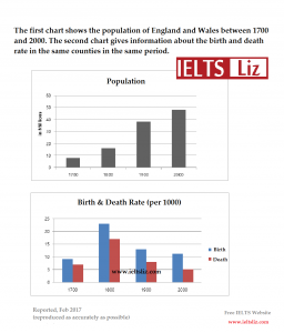
Populations in Yemen and Italy.
Student Sample Graphs
You can also view graphs that have been written by students in the forums:
- Student Graphs
Any comments or questions about this page or about IELTS? Post them here. Your email will not be published or shared.
Before you go...
Check out the ielts buddy band 7+ ebooks & courses.

Would you prefer to share this page with others by linking to it?
- Click on the HTML link code below.
- Copy and paste it, adding a note of your own, into your blog, a Web page, forums, a blog comment, your Facebook account, or anywhere that someone would find this page valuable.
Band 7+ eBooks
"I think these eBooks are FANTASTIC!!! I know that's not academic language, but it's the truth!"
Linda, from Italy, Scored Band 7.5

IELTS Modules:
Other resources:.
- All Lessons
- Band Score Calculator
- Writing Feedback
- Speaking Feedback
- Teacher Resources
- Free Downloads
- Recent Essay Exam Questions
- Books for IELTS Prep
- Useful Links

Recent Articles
Useful Language for IELTS Graphs
May 16, 24 04:44 AM

Taking a Gap Year
May 14, 24 03:00 PM
IELTS Essay: Loving Wildlife and Nature
May 10, 24 02:36 AM
Important pages
IELTS Writing IELTS Speaking IELTS Listening IELTS Reading All Lessons Vocabulary Academic Task 1 Academic Task 2 Practice Tests
Connect with us
Copyright © 2022- IELTSbuddy All Rights Reserved
IELTS is a registered trademark of University of Cambridge, the British Council, and IDP Education Australia. This site and its owners are not affiliated, approved or endorsed by the University of Cambridge ESOL, the British Council, and IDP Education Australia.
- Preparing for IELTS
- Practice tests
- Free online IELTS Writing practice tests
- Free online IELTS Academic Writing practice tests - paper
IELTS practice Academic Writing test - Task 1
How to approach academic writing task 1.
In the IELTS Academic Writing test, you will have one hour to complete both of the two set writing tasks. Keep an eye on the time it takes you to complete practice Tasks 1 and 2 to make sure you don’t go too far over, and to use as a benchmark for how long you can expect each task to take you.
In the actual test, you will move from the first to the second task without a break. However, while practising, you may wish to reflect on the outcomes of practice Task 1 using the model answer provided before moving on to practice Task 2. Or you may wish to complete them both before looking at the model answers to give you a more accurate sense of timing.
An easy reminder…
Q: How long should I spend on IELTS Writing Task 1?
A: We suggest 20 minutes – saving 40 minutes for Task 2.
Q: How many words for IELTS Writing Task 1?
A: 150 words is about the right length, but don’t be afraid to go a little over.
Q: Should I be formal or conversational in style?
A: You should write in a formal style, suited to an academic environment.
Q: What are the do’s and don’ts in IELTS Writing task 1?
A: Do pay attention to time - task 1 is worth one third of the total marks (while task 2 is worth two thirds), Don’t let nervousness stop you from trying your best.
Get more tips to help you prepare for the writing tasks
Task 1 – Take a look at the chart below and perform the task as outlined:
This graph shows the proportion of four different materials that were recycled from 1982 to 2010 in a particular country.
Summarise the information by selecting and reporting the main features, making comparisons where relevant.

What should I do next?
Once you’ve finished, you can download the model answer for Writing Task 1 and see how your work compares.
This sample offers a useful guide for how to structure your answer for IELTS writing task 1, as well as the style of writing expected. A good way to improve is to reflect on how your answer compares to the model answer – and, of course, keep practicing.
If you want to see an example of an actual answer sheet for the IELTS Academic Writing test (‘on paper’ version), you can download a sample copy below.
- IELTS practice Academic Writing test - Task 2
IELTS Academic Writing Task 1 Samples
Prepare for the IELTS Academic Test by using this collection of IELTS Academic Writing Task 1 practice samples. This collection is a great way to gain insight and practice for the exam.
The graph below shows the amount in grams of potatoes, pasta and rice eaten in a European country between 1976 and 2006.

The line graph shows the percentages of Australian exports with four countries. Summarize the information by selecting and reporting the main features and make comparisons where relevant You should write at least 150 words.

The line chart below shows the effect of vaccination on the number of reported cases of whooping cough, a childhood disease, in Britain.

The line graph below displays the unemployment rates among university graduates in Australia, Canada, Germany, and Japan from 2000 to 2020. Summarise the information by selecting and reporting the main features, and make comparisons where relevant.

The maps below show how a coastal town developed between 1950 and 2007.

The diagram below shows the process of photosynthesis.

Academic Task 1 The graph below shows the average monthly change in the prices of three metals during 2014. Summarize the information by selecting and reporting the main features, and make comparision where relevant.

The bar chart below shows shares of expenditures for five major categories in United States, Canada, the United Kingdom, and Japan in the year 2009.

The bar chart below shows the percentage of Australian men and women in different age groups who did regular physical activity in 2010. Summarize the information by selecting and reporting the main features, and make comparisons where relevant

The bar chart below shows the percentage of Australian men and women in different age groups who did regular physical activity in 2010. Summarise the information by selecting and reporting the main features, and make comparisons where relevant

The chart below shows how frequently people in the USA ate in fast food restaurants between 2003 and 2013. Summarise the information by selecting and reporting the main features,and make comparisons where relevant.

The chart below gives information about global sales of games software, CDs and DVD or video. Write a report for a university lecturer describing the information.

The graph below shows the rate of smoking per 1000 people in Someland from 1960 to 2000. Write a report for a university lecturer describing the information in the graph below.

The two line graphs below show New Zealand import figures from Australia and Japan in the years 1994 - 2004. Summarise the information by selecting and reporting the main features, and make comparisons where relevant.

The diagram below shows the process of photosynthesis

The bar chart below shows the top ten countries for the production and consumption of electricity in 2014.

The bar charts give data on noise levels by day and by night in rural and urban areas in Europe

The table and charts below give information on the police budget for 2017 and 2018 in one area of Britain. The table shows where the money came from and the chars show how it was distributed.

The bar chart below shows the percentage of Australian men and women in different age groups who did regular physical activity in 2010. Summarize the information by selecting and reporting the main features, and make comparisons where relevant.

The line chart below gives information about the percentage of female members of parliament in European countries (2000 – 2012)

The chart below shows how frequently people in the USA ate in fast food restaurants between 2003 and 2013. Summarise the information by selecting and reporting the main features, and make comparisons where relevant.

The three pie charts illustrate the changes in annual spending by local government in Someland in three different year

The chart shows the proportion of renewable energy in the total energy supply in 4 countries from 1997 to 2010.

The charts bellow give information about travel to and from UK, and about the most popular countries for UK residents to visit.

The graph shows the demand for energy and the energy available for fossil fuels in Freedonia from 1985 to 2005. Write a report for a university lecturer describing the information shown below.

The chart below shows how frequently people in the USA ate in fast food restaurants between 2003 and 2013. Summarize the information by selecting and reporting the main features, and make comparisons where relevant.

The diagram below shows how instant noodles are manufactured

The diagram below shows the floor plan of a public library 20 years ago and how it looks now. summarize the information by selecting and reporting the main features, and make comparisons where relevant.

The pie charts below show the online shopping sales for retail sectors in New Zealand in 2003 and 2013. summarise the information by selecting and reporting the main features and make comparisons where relevant

The charts below show the aversage percentages intypical meals of three types of nutrients, all of whihc may be unhealthy if eaten too much.

The pie cahrts and table give information about the total value and sources of fish imported to The US between 1988 and 2000

The charts below show the general happiness level in Korean society by age, gender, and income in 1980 and 2012.

The two main graphs show the main sources of energy in the USA in 1980 and 1990.

The charts below show the number of marriages and divorces in the USA from 1930 to 2010.

the chart below show the shares of expenditures for five major categories in UK US Canada and Japan in the year 2009.

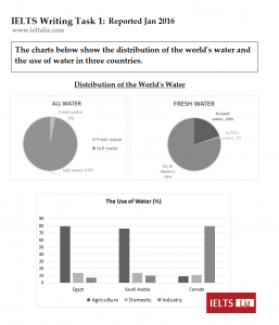
The charts below show the percentage of water used for different purposes in six areas of the world. summarise the information by selecting and reporting the main features, and make comparisons where relevent.

The three pie charts below show the changes in annual spending by a particular UK school in 1981, 1991, and 2001. Summarize the information by selecting and reporting the main features, and make comparisons where relevant. The three pie charts below show the changes in annual spending by a particular UK school in 1981, 1991, and 2001. Summarize the information by selecting and reporting the main features, and make comparisons where relevant.

The three pie charts below show the changes in annual spending by a particular UK school in 1981, 1991, and 2001. Summarize the information by selecting and reporting the main features, and make comparisons where relevant.

The chart below shows global sales of the top five mobile phone brands between 2009 and 2013. Write a report for a university, lecturer describing the information shown below.

The bar charts below give information on the road transport in a number of European countries.

The graphs below show the number of public transit passengers from 1989 to 2009 and bus and tram passenger numbers between 2000 and 2009 in Melbourne.

The pie charts below show the amount of electricity generated by energy source in Scotland for twenty years ago and last year.

You should spend about 20 minutes on this task. The table shows information about metro systems in six different cities. Summarise the information by selecting and reporting the main features and make comparisons where relevant. Write at least 150 words.

The maps below show a bookstore in 2000 and now.

You should spend about 20 minutes on this task. The line graph shows how much money overseas visitors spent in the UK from 1980 - 2010 and the pie charts show the reasons for their visits in 1980 and 2010. Summarise the information by selecting and reporting the main features and make comparisons where relevant. Write at least 150 words.

The chart below shows information about the favorite subjects of 60 students from two schools, school A and school B

the chart below shows some of the most reported issues among people living in UK cities in 2008.

The table below gives information about UK independent films. Summaries the information by selecting and reporting the main features, and make comparisons where relevant.

the chart shows shares of expenditure for five major categories in the US, UK, Canada and Japan in 2019

The graph shows the number of foreign tourists visiting country X in 2019 and 2020.

The two maps below show road access to a city hospital in 2007 and in 2010. Summarise the information by selecting and reporting the main features, and make comparisons where relevant.

You should spend about 20 minutes on this task. The chart gives employment and education statistics for eight European countries in 2015. Summarise the information by selecting and reporting the main features and make comparisons where relevant. Write at least 150 words.

The chart below shows what Anthropology graduates from one university did after finishing their undergraduate degree course.The table shows the salaries of the anthropologists in work after five years. Summarise the information by selecting and reporting the main features, and make comparisons where relevant

The chart below shows what Anthropology graduates from one university did after finishing their undergraduate degree course.The table shows the salaries of the anthropologists in work after five years. Summarise the information by selecting and reporting the main features, and make comparisons where relevant.

The chart below shows the total number of minutes (in billions) of telephone calls in the UK, devided into three categories, from 1995-2002. Summarise the information by selecting and reporting the main features, and make comparisons where relevant.

The bar chart shows the number of households in the US by their annual income in 2007, 2011 and 2015

You should spend about 20 minutes on this task. The bar and line chart below shows average monthly temperatures and bathing suit sales in New York for the first 6 months of 2012. Summarise the information by selecting and reporting the main features, and make comparisons where relevant. You should write at least 150 words.

The two maps below show the village of Bunborough in the present day and plans for the village in 2024. Summarise the information by selecting and reporting the main features and make comparisons where relevant. Write at least 150 words.

You should spend about 20 minutes on this task. The diagram below shows the life cycle of the Monarch butterfly. Summarise the information by selecting and reporting the main features and make comparisons where relevant. Write at least 150 words.

The graph shows the percentage of male and female academic staff members across the faculties of a major university in 2012. Summarise information by selecting and reporting the main features and make comparison where relevant.

two pie chart give the result of survey in the museum in after and previous year

The table below shows the numbers of visitors to Ashdown Museum during the year before and the year after it was refurbished. The charts show the results of surveys asking visitors how satisfied they were with their visit, during the same to periods. Summarise the information by selecting and reporting the main features, and make comparisons where relevant.

The table shows information about metro systems in six different cities. Summarise the information by selecting and reporting the main features and make comparisons where relevant.

The two maps below show an island, before and after the construction of some tourist facilities.

The line graph illustrates three different kind of crimes that occurred in Newport city centre between 2003 and 2012.

You should spend about 20 minutes on this task. The map below shows the development of the village of Ryemouth between 1995 and present. Summarise the information by selecting and reporting the main features and make comparisons where relevant. Write at least 150 words.

The diagram below shows how a central heating system in a house works. You should spend about 20 minutes on this task. Summarise the information by selecting and reporting the main features, and make comparisons where relevant.

The table shows the amount of money given to developing countries by the USA, EU countries and other countries from 2006 to 2010 (Figures are in millions of dollars). Write at least 150 words.

The table below shows the sales made by a coffee shop in an office building on a typical weekday. ielts-academic-task-1-coffee-shop-sales Summarise the information by selecting and reporting the main features, and make comparisons where relevant

The line graph illustrates the consumption of fish and various types of meat in grams per person per week in a European country over the period from 1979 to 2004.

The line graph illustrates the Dubai gold sales in 2002, showing monthly data points that reflect fluctuations in sales volume throughout the year.

The chart below shows some of the most reported issues among people living in UK cities in 2008.

The bar chart below shows the percentage of unemployed graduates aged 20-24, in one European country over a two-year period.

The bar chart shows the number of households in the US by their annual income in 2007, 2011 and 2015. Summarise the information by selecting and reporting the main features, and make comparisons where relevant.

The diagram below shows the changes, which took place in a coastal area called Pentland from 1950 to 2007. Write a report for a university lecturer describing the diagrams below.

The provided charts illustrate the distribution of energy consumption and the associated greenhouse gas emissions in an average Australian household.

The bar charts below shows the prevalence of obesity among boys and girls aged 12 to 19 by ethnicity, in the United States for the years 2004 and 2014.

The graph shows the amount of money spent on books in Germany , France , Italy and Austria between 1995 and 2005.

The first chart below shows how energy is used in an average Australian household. The second chart shows the greenhouse gas emissions which result from this energy use.

This graph shows the amount of money spent on books in germany, france, Italy and Australia between 1995 to 2005.

The line graph below shows the number of monthly active users of some social network and messaging services between 2010 and 2015. Summarise the information by selecting and reporting the main features, and make comparisons where relevant.

The table below shows the world's ten most expensive countries for petrol along with other financial information. Summarise the information by selecting and reporting the main features, and make comparisons where relevant.

The line graph below provides information about the incomes of four restaurants in a city in 2010

The table below shows how UK unemployed spent their time last year?

The pie charts provide information about the proportion of three kind of nutrients included in common meals in the USA. These nutrients might be harmful when eaten pretty often.

The graph below provides information on the nuber of students from the US, UK and Australia who studied in other countries between 2002 and 2007.

The table below shows the numbers of visitors to Ashdown Museum during the year before and the year after it was refurbished. Summarise the information by selecting and reporting the main features, and make comparisons where relevant.

The bar chart below shows average UK salaries, by city. Summarise the information by selecting and reporting the main features, and make comparisons where relevant. You should write at least 150 words.

- Unlimited Task 1 checks Get all the feedback you need to keep improving your charts and letters.
- Unlimited Task 2 checks Practice and perfect your skills with essays.
- Personalized suggestions Know how to boost your score.
- Detailed mistakes analysis Get instant feedback. Spot every mistake.
- Topic ideas generator Get topic-specific ideas to enhance your writing.
- Vocabulary helper Get the right words for any topic.
- Progress tracking Track your writing improvements.
IELTS Exam Preparation: Free IELTS Tips, 2024
Ielts sample charts (ielts writing task 1).
The Writing Task 1 of the IELTS Academic test requires you to write a summary of at least 150 words in response to a particular graph (bar, line or pie graph), table, chart, or process (how something works, how something is done). This task tests your ability to select and report the main features, to describe and compare data, identify significance and trends in factual information, or describe a process.
Exam Preparation
Ielts preparation, ielts sample letters (ielts writing task 1).
The purpose of this section is to help you with the Writing Task 1 of the IELTS General test. In Task 1, candidates are asked to respond to a given problem with a letter requesting information or explaining a situation. It is suggested that about 20 minutes is spent on Task 1, which requires candidates to write at least 150 words. Depending on the task suggested, candidates are assessed on their ability to:
- engage in personal correspondence - elicit and provide general factual information - express needs, wants, likes and dislikes - express opinions (views, complaints etc.)
IELTS Writing Task 2 (IELTS Sample essays)
IELTS Writing Task 2 requires you to write at least 250 words. You will be presented with a topic and will be tested on your ability to respond by giving and justifying an opinion, discussing the topic, summarizing details, outlining problems, identifying possible solutions and supporting what you write with reasons, arguments and relevant examples from your own knowledge or experience. The assessment of Task 2 carries more weight in marking than Task 1. Writing scripts are marked by trained and certificated IELTS examiners, who all hold relevant teaching qualifications and are recruited as examiners by the test centres and approved by British Council or IDP: IELTS Australia.
SHARE THIS PAGE
The reading, writing and listening practice tests on this website have been designed to resemble the format of the IELTS test as closely as possible. They are not, however, real IELTS tests; they are designed to practise exam technique to help students to face the IELTS test with confidence and to perform to the best of their ability.
While using this site, you agree to have read and accepted our terms of use, cookie and privacy policy.
Dear readers,
This is to inform you that we have moved to a new domain, https://www.ielts-writing.info/EXAM/ .
Our old domain, https://www.ielts-exam.net/ will remain active till the time we migrate all our content to the new domain.
We look forward to your continuing support.
- Skip to primary navigation
- Skip to main content
- Skip to primary sidebar
- Skip to footer
IELTS Advantage
IELTS Preparation Courses
IELTS Writing Task 1: Everything You Need to Know
Ielts writing task 1 in 6 simple steps.

Academic Writing Task 1 Strategy
- Understand how the test is marked. Knowing the marking criteria will allow you to give the examiner exactly what they need.
- Paraphrase the question. It is best to paraphrase the question in the first paragraph. You can do this by using synonyms.
- Write the overview. To write your overview , pick 3 or 4 of the main features and write about them generally without referencing any data.
- Support the main features. In a new paragraph, support the key features with the data in the information given to you.
- Check your work. Check your report for spelling and grammar mistakes. Make sure that the data you mentioned is also accurate!

Essential Writing Task 1 Skills
- How to Write an Overview Paragraph
- How to Paraphrase
- How to Write a Complex Sentence
- How Many Words?
- Task 1 Charts Checklist
- Task 1 Tips
- The Danger of Synonyms
- 6 Common Mistakes
- Paragraphing and Editing
Writing Task 1 Full Lessons
- Writing Academic Task 1 in 5 Easy Steps
- Charts Lesson
- Maps Lesson
- Multiple Charts/Graphs
- Process Lesson

Academic Task 1 Sample Answers

- Bar Chart Sample Essay (Cars in Asia)
- Process- Cement and Concrete Production
- Pie Chart (Italy and Yemen Populations)
- Process Question
- Bar Chart Question (UK Telephone Usage)
- Line Graph (US Consumption of Energy)
- Bar Chart Sample Answer (International Students)
General Training Writing Task 1

General Training Writing Task 1 in 5 Simple Steps
- Understand how the test is marked. Knowing the marking criteria is the best way of giving the examiner exactly what they need and nothing else.
- Decide whether the letter is formal or informal. This part is easy. If the question asks you to write to a ‘friend’, it should be an informal letter. If the question asks you to write to anyone else, it should be a formal letter. It is that simple!
- Discuss each bullet point from the question. Make sure to take a new paragraph for each bullet point. This will make your letter easy to read and understand.
- Sign off your letter. Don’t overcomplicate this part. Include a sign-off suitable to your letter’s tone and write your name beneath.
- Check your work. Make sure your letter doesn’t contain any grammar or vocabulary mistakes.
- Letter Writing Tips
- How to Write an Informal Letter
- How to Write a Formal Letter
General Training Essential Writing Task 1 Skills
- Task 1 General Training Writing Strategy
- Task 1 General Training Writing Guide
Sample Answers
- Formal and informal sample letters.
Writing Task 1 Essential Information
- People doing the Academic test will write a report on a data set, map, or process. People doing General Training will write a letter.
- You must write 150 words or more.
- You should spend around 20 minutes on this part of the test.
- Task 1 is worth 1/3 of your total mark on the Writing test.
- You will be assessed in four areas: Task Achievement (25%) Coherence and Cohesion (25%) Lexical Resource (25%) Grammatical Range and Accuracy (25%)
- The most important thing is that you can demonstrate that you can clearly communicate in English.
- The key to doing well is to know exactly what the examiners want and give it to them.
- Grammar and Vocabulary Guide

- Top 10 Grammar Mistakes
IELTS Writing Task 1 FAQs
How can i improve my writing.
You will find all the resources you need on our Writing Task 1 page. Click the link below:
Writing Task 1
If you need serious help or personalised feedback, you should check out our online course. There is a waiting list, but you can add your name here:
How can I get a Band 7, 8 or 9?
The answer to this question is different for every individual IELTS student, as it depends on a number of factors, including your work ethic, English skills and exam strategy. You'll find a guide to answering this question in this article
If you need serious help with improving your IELTS scores, you should check out our online writing course. There is a waiting list, but you can add your name by clicking the link below:
Can you correct my writing?
Please click the link below and it will give you all the information you need about our writing correction service:
Writing Correction Service
Do you have any sample answers?
Yes, you will find them at the link below:
Task 1 Sample Answers
Will using 'high level' or 'academic' words help me improve my score?
Probably not.
Read my recent article about IELTS vocabulary here:
5 Things You Need to Know about IELTS Vocabulary
How many paragraphs should I write?
Introduction
You can put the overview at the end if you'd like.
Can I use idioms?
No, you should typically avoid using idioms in Writing Task 1.
The only time this is acceptable is if you are taking the General Training test and must write an informal letter.
Should I write a conclusion for Task 1 Academic?
No. A conclusion is a summary of YOUR ideas and your opinion. Task 1 is simply reporting what you see, so there shouldn't be any of your ideas or your opinion.
Instead of a conclusion, you should write an overview.
The reason lots of people get confused about this is that some teachers, books and even one British Council website call the overview a 'conclusion'. It's not a conclusion, it's an overview.
Finally, it does not matter where you put the overview paragraph. We teach our students to put it after the introduction, but it is also fine to have it as your final paragraph.
How many words should I write?
You must write at least 150 words in Writing Task 1 (yes, the examiners will count them!)
I would suggest that you aim to write around 160-170 words for Task 1. Aiming for 20-30 words more than the required amount makes you more likely to reach the word limit without setting an unrealistic goal.
Will I lose marks if I don't write enough words?
Yes. If you don't write the required number of words, you will lose marks in 'Task Achievement' for not answering the question fully. Read more here .
Can I use contractions?
No, should not use contractions when you are writing an academic essay or formal letter. However, it is fine to use contractions in an informal letter.
When should I write formally?
There are a few signposts that indicate when you should write formally or informally. Watch our video lesson to find out what they are:
IELTS Writing Task 1 General Training: Formal or Informal Letters?
IELTS Writing Task 1 – Sample Questions and Practice Resources

On the IELTS Academic exam, Writing Task 1 requires you to look at an informational graphic and describe the contents of the graphic in writing. In this post, we’ll look at different IELTS Writing Task 1 samples to prepare you for test day. In addition to advice and practice, you’ll also get our IELTS Writing Task 1 Examples PDF with Answers for portable prompts and model answers.
IELTS Academic Writing Task 1 Samples With Answers PDF
If you want a print-friendly version of the IELTS Writing Task 1 samples in this post, click below to access the IELTS Writing Task 1 examples PDF!

Note that all the IELTS Writing Task 1 samples are model essays for a band 9 IELTS score. The line graph sample prompt includes a detailed scoring explanation. You can learn more about scores for IELTS Writing Task 1 by consulting the official IELTS rubric .
- Take a good look at our guide to IELTS Writing Task 1 paragraph structure . The guide tells you everything you need to know about how Writing Task 1 essays and paragraphs should be structured, with an example question and model essay.
IELTS Writing Task 1 Samples: The Major Question Types
Below are questions for each common infographic in IELTS Writing Task 1: bar charts, pie charts, line graphs, process diagrams, and maps.
IELTS Academic Writing Task 1: Line Graph with Model Answer and Scoring Explanation

[/threecol_one_last]
IELTS Academic Writing Task 1: Bar Chart With Model Answer

Pie Chart with Model Answer

Process Diagram with Model Answer

IELTS Academic Writing Task 1: Map with Model Answer

IELTS Academic Writing Task 1: Two Different Types of Graphics

[/threecol_two][threecol_one_last]
Additional Resources for Writing Task 1
Now that you’ve seen some models for how this task is done, you should be ready for some real practice! Here are some resources from Magoosh that should help.
- Practicing using these common IELTS Writing Task 1 and Task 2 linking words .
- Familiarize yourself with the test with IELTS Academic Writing Task 1: Ultimate Guide video , and use a Writing diagnostic quiz to assess your current strengths and weaknesses.
- Use study schedules to help you find time to study and stay motivated. To help you organize your time, use this IELTS study schedule if you only have a week to go before you will take the IELTS. If you have a month, this one month IELTS study schedule offers more extended practice.
- Find high-quality study materials. We offer a huge collection of study reources for the whole IELTS Writing seciton ! Don’t forget about Magoosh IELTS Prep which includes lessons on IELTS Writing Task 1 (and all other sections of the exam!) to help you prep smarter. In addition to many video lessons and practice essays, the 6-month plan allows students to get feedback and scoring on four practice IELTS Writing essays; the 1-month plan includes feedback on one essay. You can also browse more recommended books and resources !

David is a Test Prep Expert for Magoosh TOEFL and IELTS. Additionally, he’s helped students with TOEIC, PET, FCE, BULATS, Eiken, SAT, ACT, GRE, and GMAT. David has a BS from the University of Wisconsin-Eau Claire and an MA from the University of Wisconsin-River Falls. His work at Magoosh has been cited in many scholarly articles , his Master’s Thesis is featured on the Reading with Pictures website, and he’s presented at the WITESOL (link to PDF) and NAFSA conferences. David has taught K-12 ESL in South Korea as well as undergraduate English and MBA-level business English at American universities. He has also trained English teachers in America, Italy, and Peru. Come join David and the Magoosh team on Youtube , Facebook , and Instagram , or connect with him via LinkedIn !
View all posts
More from Magoosh

Leave a Reply Cancel reply
Your email address will not be published. Required fields are marked *
Free IELTS lessons signup

- Academic practice
- General practice
- Task 1 Academic
- Task 1 General
- Task 2 (essay)
IELTS Academic Writing Task 1. Sample 1
You should spend about 20 minutes on this task.
The pie graphs below show the result of a survey of children's activities. The first graph shows the cultural and leisure activities that boys participate in, whereas the second graph shows the activities in which the girls participate.
Write a report describing the information shown in the two pie graphs.
Write at least 150 words.

How to answer this task?
Introduce the pie charts.
Write what do they summarize.
Write a general overview.
Write in brief the main trends.
Describe the first chart.
Tell about the activities on the boys' chart and their popularity. Use linking structures and vocabulary to describe graphs .
Describe the second chart.
Tell about the activities on the girls' chart and their popularity. Use words from academic wordlist .
Model answer
The two pie charts draw the conclusion of a survey of boys' and girls' cultural and leisure activities.
Overall, equal quantities of both sexes enjoyed listening to music, but a dramatically larger number of girls liked reading. There were also many differences in terms of the children's preferred sports.
Turning to the first chart, we can observe that boys prefer playing computer games (34% participation rate) than taking other activities. Playing basketball comes as the second most popular leisure, practiced by almost a third of male children. Basketball is followed by soccer, which is exercised by 17%. Skateboarding and listening to music are less preferable activities, chosen by 11% and 10% of boys respectively. Reading, the least popular cultural activity among boys, represents only two percent.
Taking a closer look at the second chart, we can see that girls' most preferred activity is dancing, being 27% of the total. In contrast to the boys' preferences, reading is chosen by more than a fifth of all girls. Although percentage of female children who play computer games is roughly twice less than that of boys (16%), this activity is third most popular on the girls' chart. With a slight difference between computer games and netball, the latter is practiced at 15% rate. Similarly to skateboarding popularity among boys, 11% of girls go in for gymnastics. Listening to music comes as the least popular leisure, with a proportion of 10%, equal to those on the first chart.
(244 words)
IELTS Mentor "IELTS Preparation & Sample Answer"
- Skip to content
- Jump to main navigation and login
Nav view search
- IELTS Sample
20 Recent IELTS Graph samples with answers
The chart below shows how much money is spent in the budget on different sectors by the uae government in 2000..

The charts below show the growth in the population in some of the world’s largest cities as well as the population distribution in urban and rural areas.

The average prices per kilometre of clothing imported into the European Union from six different countries in 1993 and 2003 are shown in the bar chart below.

The bar charts below show the number of hours each teacher spent teaching in different schools in four different countries in 2001.

The line graphs below show the production and demand for steel in million tonnes and the number of workers employed in the steel industry in the UK in 2010.

The bar charts and line graph below show the results of a survey conducted over a three-year period to discover what people who live in London think of the city.

The pie charts below show the online sales for retail sectors in New Zealand in 2003 and 2013.

The number of tourists visiting Malaysia and Dubai from 1995 to 2003 is presented below.

The bar chart below shows the estimated sales of jeans for two companies next year in Turkey. The pie chart shows the projected market share of the two companies in jeans at the end of next year.

The graph below shows a survey result of 4000 participants who expressed what important aspects they have learned from the internship they have completed.

The graph below shows the top priorities by business companies in the USA in 2016.

The graphs below show the average monthly expenditure on children’s sports and participation in different sports in the UK from 2008 to 2014.

The pie charts below show the online shopping sales for retail sectors in Australia in 2010 and 2015.

The bar chart below shows Scotland’s exports to the rest of the UK and the rest of the world for the year 2014.

The chart below shows the changes in sales of four different types of books from 2002 to 2012.

The diagram shows the procedure for university entry for high school graduates.

The chart below shows Morocco’s income from different economic sectors in 2003 as well as its income from fishing from 1982 to 2003.

The bar chart below shows the proportions of English men and women of different ages who were living alone in 2011. The pie chart compares the numbers of bedrooms in these one-person households.

The diagram below shows the life cycle of a salmon, from egg to adult fish.

The table below shows the worldwide market share of the notebook computer market for manufacturers in the years 2006, 2007 and 2014.

- Academic Writing Task 1
IELTS Materials
- IELTS Bar Graph
- IELTS Line Graph
- IELTS Table Chart
- IELTS Flow Chart
- IELTS Pie Chart
- IELTS Letter Writing
- IELTS Essay
- Academic Reading
Useful Links
- IELTS Secrets
- Band Score Calculator
- Exam Specific Tips
- Useful Websites
- IELTS Preparation Tips
- Academic Reading Tips
- Academic Writing Tips
- GT Writing Tips
- Listening Tips
- Speaking Tips
- IELTS Grammar Review
- IELTS Vocabulary
- IELTS Cue Cards
- IELTS Life Skills
- Letter Types

- Privacy Policy
- Cookie Policy
- Copyright Notice
- HTML Sitemap
IELTS Preparation with Liz: Free IELTS Tips and Lessons, 2024

- Test Information FAQ
- Band Scores
- IELTS Candidate Success Tips
- Computer IELTS: Pros & Cons
- How to Prepare
- Useful Links & Resources
- Recommended Books
- Writing Task 1
- Writing Task 2
- Speaking Part 1 Topics
- Speaking Part 2 Topics
- Speaking Part 3 Topics
- 100 Essay Questions
- On The Day Tips
- Top Results
- Advanced IELTS
IELTS Sample Charts for Writing Task 1 Practice
Below are sample IELTS charts to practise writing task 1 at home. In the IELTS writing task 1 (academic paper), you will be given one of the following and will have 20 mins to write a full report:
- diagram or process
- combination of the above (multiple tasks)
This collection of IELTS charts represents the main types of charts that you can be given in writing task 1, including tasks with two or three charts combined. Please remember that writing task 1 is not an essay, it is a report.
Use the sample practice charts, tables and diagrams below to practise and develop your IELTS writing task 1. Some charts below have links to model answers. Charts not created by myself have the known source stated when possible.
Practice Charts for IELTS Writing Task 1
You must write a report of over 150 words You have 20 mins for this task
IELTS Bar Chart Practice Samples
The bar chart below shows the percentage of people who ate five portions of fruit and vegetables per day in the UK from 2001 to 2008.
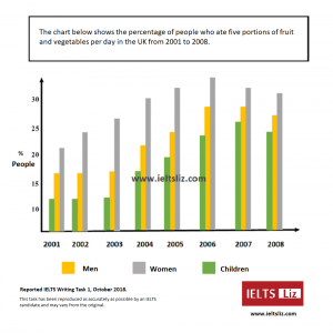
- Source: IELTS Liz, Reported by IELTS Candidate
- Download: IELTS Writing task 1 October 2018
- Model Answer: Answer
The bar chart below shows the hours per week that teenagers spend doing certain activities in Chester from 2002 to 2007.
- Source: English-in-Chester
The chart below shows the global sales of different kinds of digital games from 2000 to 2006.

- Source: Chart not by IELTS Liz. Source unknown.
IELTS Line Graph Practice Samples
The graph below shows the population figures for different type of turtles in India from 1980 to 2012.

- Source: Graph not designed by IELTS Liz. Source unknown.
The graph below shows the amount of goods transported in the UK from 1974 to 2002.

- Source: IELTS Cambridge English Test Books
- Useful Tips: Tips
The line graph below shows the consumption of 4 kinds of meat in a European country from 1979 to 2004.

IELTS Table Practice Samples
The table below shows the proportion of income spent on 4 common items in the UK in 1998.

- Source: Table not designed by IELTS Liz. Source unknown

- Source: IELTS Liz, Reported by IELTS candidate
The table below gives information about the underground railway systems in 6 countries.

The table below shows consumer spending on different items in 5 countries in 2002.

The table below gives information about the employment sectors in which people from 3 age groups worked.

IELTS Pie Chart Practice Samples
The pie charts below show the average household expenditures in a county in 1950 and 2010.

- Source: Charts not designed by IELTS Liz. Source unknown.
The charts below show the percentage of students joining North West University.

The charts below give information about the electricity generation in two countries in 2009.

The pie charts below show the spending of a school in the UK from 1981 to 2001.

IELTS Diagram Practice Samples
The diagram below shows how rainwater is collected for the use of drinking water in an Australian town.
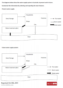
The diagram below shows the water supply in Australia at present and in the future.
The diagram below shows how the water cycle works.

- Source: New Insight into IELTS
- Although this book was published years ago, I still recommend it for practise at home.
The diagram shows the process of making coffee.

- Source: Diagram not designed by IELTS Liz. Source unknown.
The diagram below shows how coal is used to generate electricity.
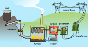
- Source: mstworkbooks.co.za , natural sciences.
IELTS Map Practice Sample

IELTS Multiple Charts Practice Samples
Two Bar Charts
- Download PDF: IELTS 2017 Writing Task 1
Bar Chart & Two Pie Charts The charts below give information about levels of education in Glasgow, a city in Scotland, in 2010.
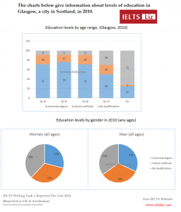
Table & 3 Pie Charts

Two Pie Charts & Bar Chart
Useful Links for Free IELTS Preparatio
IELTS Writing Task 1: Tips, Answers, Vocabulary & Videos
IELTS Writing Task 2: Model Essays, Linking Words & Videos
All the best
Advanced IELTS Lessons & E-books
Click Below to Learn:
- IELTS Test Information
Copyright Notice
Copyright © Elizabeth Ferguson, 2014 – 2024
All rights reserved.
Privacy Policy & Disclaimer
- Click here: Privacy Policy
- Click here: Disclaimer
Return to top of page
Copyright © 2024 · Prose on Genesis Framework · WordPress · Log in
This website uses cookies.
IELTS Writing Task 1 (academic)
Tips and techniques.
1. Describing line graphs 2. Avoid these mistakes 3. First impressions / outline 4. Line graph overview 5. The most common mistake 6. Overview, not conclusion 7. The overview 8. Eleven overview tips 9. The most important skill 10. Don’t practise this! 11. How to use the 20 minutes
Report writing skills
1. Describing a location 2. Describing numbers 3. Past and future 4. Correct the sentences 5. Singular or plural? 6. Paraphrasing 7. Advanced cohesion 8. Noticing verb tenses 9. Paragraph organisation 10. One perfect sentence 11. Perfect sentence problems 12. Perfect sentence practice 13. Correct the sentences 14. Adding figures 15. A student’s sentence 16. Describing age groups 17. Useful phrases exercise 18. Rise or raise? 19. Fall or reduce? 20. Using words from the chart 21. ‘Real’ report writing 22. Using ‘in terms of’ 23. Using ‘with’ and ‘at’ 24. Finish my overview 25. 4 numbers in 1 sentence 26. Different word forms 27. Two charts overview 28. Using the passive 29. Important little words 30. Charts showing countries 31. Using a model sentence 32. Variety and repetition 33. Using ‘to’ and ‘by’ 34. Paraphrasing with numbers 35. 10-year or 10 years? 36. Correct the mistakes 37. Show, compare, illustrate 38. Diagram paraphrasing 39. Describing steps 40. List sentences 41. Good lists, bad lists 42. Two graphs introductions 43. Two graphs overview 44. Comparison sentences 45. Start simple, add detail 46. Easy verbs, long nouns 47. Bar chart sentences 48. Easy but accurate 49. Describing overall trends 50. Three basic skills 51. Correct the mistakes 52. to, by, with, at 53. Process diagram overview 54. Be careful with ‘ing’ words
Model Answers
Line graphs.
1. Car ownership 2. Internet users 3. Migration 4. Acid rain emissions 5. Elderly populations 6. TV and radio audiences 7. Children’s sports 8. Waste 9. Food and oil 10. Visitors’ spending 11. Appliances and housework
1. Fast food 2. Museum visitors 3. Education and science 4. Consumer goods spending 5. House prices 6. Marriage and divorce rates 7. Transport incidents 8. Reasons for study 9. Population age distribution 10. Further education 11. Phone calls 12. Internet and video games 13. Hospital attendance 14. Physical activity
1. Hotel survey 2. Water usage 3. Comparing diets 4. Electricity production 5. Dangerous waste 6. Tourist attractions
1. Coffee and banana sales 2. Poverty and family types 3. Daily activities 4. Consumer spending 5. Waste production 6. Educational problems
Process diagrams
1. Cement production 2. Recycling office equipment 3. Weather forecast 4. Coffee production 5. Salmon life cycle 6. Silkworm life cycle 7. Sugar manufacture
Comparison diagrams / maps
1. Town development plans 2. Art Gallery redevelopment 3. Park plans 4. Flood protection methods 5. School changes 6. Airport redevelopment 7. House designs
Two different charts
1. Water use 2. Travel 3. Land degradation 4. Living alone
IELTS Writing Task 1 – Table Essay Example 1
In this post, we will look at a Writing Task 1 Academic table essay example from the IELTS writing task 1 Academic Test. Students often ask if the questions are repeated year after year and the answer is no, but the type of chart, graph or table can be.
There are so many questions written each year, you may find you practice answering various questions on different topics. It is best practice to learn how to answer each one of the various types of writing task 1 questions , from bar charts, line graphs, maps, process etc.
If you would like to learn how to structure a charts, graphs, table essay please click the button below >
Take a look at the IELTS Writing Task 1 Academic essay example below >>
*This table question and answer were provided by a student. IELTS Achieve did not design this question*
The table illustrates the comparative figures based on four phases of the lives of citizens from five countries namely Bangladesh, Bolivia Egypt, Indonesia and the USA.
Overall, The United States of America got the highest number on the GNP and caloric intake per person. They also have the longest life expectation and the lowest infant death rate, whereas Bangladesh obtained the lowest figure in the same category. In addition, they have the shortest life expectancy and received the highest numbers of mortality rate in infants.
On the one hand, based on the GNP in 1982 using US dollars as the basis, the Americans got the highest figure with 13160 followed by Egypt and Indonesia with 690 and 580 respectively, whereas Bolivians got 570 and lastly with 140 are the Bangladeshis. The USA yet again have the highest daily caloric intake per person with 3653 while Bangladesh got the lowest daily calorie consumption per citizen with 1877.
On the other hand, looking at the life expectancy, Americans outlive the other citizens from the four countries with 74 as the average life expectation. Just trailing behind were Egypt, Bolivia and Indonesia with 56, 49 and 40 correspondingly, whereas Bangladesh got the lowest position with only an average of 40 years old.
Finally, with regards to the infant mortality rate, Bangladesh received the highest rate with 132 deaths per 1000 live births followed by Bolivians, Egyptians and Indonesians with 124, 97 and 87 respectively, whereas only 12 infants’ deaths are recorded for the Americans.
Word count – 251 / Band score – 8

- Task Achievement – The answer provides a paraphrased question, to begin with, followed by an overview that gives the reader key information.
- Coherence and Cohesion – The answer has been divided into clear logical paragraphs.
- Lexical Resource – There is evidence of paraphrasing, synonyms and some less common words.
- Grammatical Range and Accuracy – The answer has no grammatical errors. The sentences are mainly made up of multiple clauses and have a variety of structures.
We hope you found this post useful in helping you to study for the IELTS Test . If you have any questions please let us know in the comments below or on the Facebook page.
The best way to keep up to date with posts like this is to like us on Facebook , then follow us on Instagram and Pinterest . If you need help preparing for the IELTS Test, join the IELTS Achieve Academy and see how we can assist you to achieve your desired band score. We offer an essay correction service, mock exams and online courses.
Related Posts

Invite your colleague to your son’s birthday party and give details of the party: IELTS Semi-Formal Letter
You should spend about 20 minutes on this task. You will be celebrating your son's…

IELTS Agree/Disagree Essay Sample 10 – Customs/Traditions
IELTS Writing Task 2 agree/disagree essay example that is a band score 8. The question is…
A new neighbour has moved in next door and has taken your main rubbish bin
Home » IELTS general writing task 1: letter samples, phrases and tips. » A new neighbour has moved in next door and has taken your main rubbish bin
A new neighbour has moved in next door and has taken your main rubbish bin.
Write a letter to your new neighbour requesting that they return the item. In the letter: - Explain that new bins must be sourced from the local council - Request that the person returns your bin immediately - Inform the person of what further actions you will take should they not return your bin
Dear new neighbour,
First of all, welcome to the neighbourhood.
I live at number 10, next door to you, and I’m writing to you because I saw you take my bin into your garden on the day you moved in. I’m sure you were convinced that it must have been yours, but I had simply left it outside for collection. If your bin is missing, you should call the council and have them deliver a new one.
I cannot, however, live without a bin. I already have a bag in my kitchen waiting to be taken out, and so I’m forced to request that you return my bin immediately. Feel free to leave any rubbish it already contains, but if you don’t return the bin within 48 hours, I will feel it necessary to involve the council.
I hope we can resolve this conflict as quickly as possible, as I’m sure we’d make great neighbours otherwise.
Your new neighbour, Frederick Nickelson
For sample essays for general task 1 click here.
- Free Essay Band Score Evaluation
- Sign up to claim your free IELTS materials
- Jump to Band 7 or it’s Free
- IELTS Writing Evaluation
- IELTS Band Score Calculator
- Book Your Online IELTS Test
- Sample Topic Answers
- Useful Sentences
- Sample Task 2 Questions 2022
- Introduction to Paraphrasing
- Model Band 9 Essay
- Five Band 9 Words
- Model Band 7 Essay
- Differences Band 9 vs Band 7 Essay
- Band 6.5 Essay
- Academic Collocations
- Topic Sentences
- Discuss Both Views
- Tutorial: To What Extent Essays
- Paraphrasing Introductions
- Essay Structures
- Essay Plans
- Describe a Pie Chart
- Using Percentages
- Map Vocabulary
- Describe Flow Charts
- Describe a Bar Chart
- How to get Band 9
- AT 1 Sample Questions 2022
- Describe a Graphic
- GT Task 1 Questions 2022
- IELTS Vocabulary
- Google Play / Podcasts
- Apple Podcast
- Android App
- Task 2 Sample Questions
- AT 1 Questions
Company addresses: HK Office: BW ENGLISH SERVICES HK Ltd, Unit 2512, 25/F, Langham Place Office Tower, 8 Argyle Street, Mongkok, Hong Kong UK Office: BW ENGLISH SERVICES, 120 High Road, East Finchley, N29ED, London, England, United Kingdom +44 20 3951 8271 ($1/min).

IMAGES
VIDEO
COMMENTS
Here you will find IELTS Writing Task 1 Samples for a variety of common tasks that appear in the writing exam. The model answers all have tips and strategies for how you may approach the question and comments on the sample answer. It's a great way to help you to prepare for the test.
IELTS Academic - Graph Writing: In your IELTS Academic Writing Task 1, you will be given with one or more graph(s) (i.e. bar, column, line or pie), table, flowchart, map or process diagram and you need to summarise the main information, compare data, show contrasts and trends, identify significant trends and describe a process.You should write between 150 to 200 words and the minimum word ...
Read my sample answer for this (unusual) task 1 here. IELTS Essay: Bridges. Read my sample answer for this topic here. The bar graph shows the total manufacturing production in percentages Asia, Europe, and the rest of the world. ... IELTS Exam Writing Task 1 posted in Nhẩy đầm với IELTS by Đỗ Phương Thảo February 20th
IELTS writing task 1 can be challenging but with practice you will get better and better. The resources below include an IELTS writing task 1 sample answer pdf. Line graph IELTS academic task 1 sample essay 26: Thermal conductivity of material at 25C. Line graph IELTS academic task 1 sample essay 7: January 2015 temperature variation in the ...
In the IELTS Academic Writing test, you will have one hour to complete both of the two set writing tasks. Keep an eye on the time it takes you to complete practice Tasks 1 and 2 to make sure you don't go too far over, and to use as a benchmark for how long you can expect each task to take you. In the actual test, you will move from the first ...
IELTS Academic Writing Task 1 Samples. Get a band score and detailed report instantly. Check your IELTS essays right now! Read more ». Prepare for the IELTS Academic Test by using this collection of IELTS Academic Writing Task 1 practice samples. This collection is a great way to gain insight and practice for the exam.
You should write over 150 words. IELTS writing task 1 is worth only about 33% of your total writing marks. Academic writing task 1 is a report on a chart (bar chart, line graph, pie chart, table, map, diagram/process). See below for practice charts, model answers, tips etc. General Training writing task 1 is a letter only.
The Writing Task 1 of the IELTS Academic test requires you to write a summary of at least 150 words in response to a particular graph (bar, line or pie graph), table, chart, or process (how something works, how something is done). This task tests your ability to select and report the main features, to describe and compare data, identify significance and trends in factual information, or ...
Another useful tip for IELTS writing task 1 is to find things that were the same or similar, then contrast them with what was different. For example, 'Sales of both sugar and salt increased during the period shown, reaching their highest prices in November. In contrast, sales of coffee fluctuated significantly.'.
People doing the Academic test will write a report on a data set, map, or process. People doing General Training will write a letter. You must write 150 words or more. You should spend around 20 minutes on this part of the test. Task 1 is worth 1/3 of your total mark on the Writing test.
IELTS Academic Writing Task 1. In IELTS academic writing task 1, you are presented with a graph, table, chart or diagram and asked to describe, summarise or explain the information in your own words. IELTS Writing Task 2. In IELTS writing task 2, you will need to write a traditional style essay in response to a question.
The guide tells you everything you need to know about how Writing Task 1 essays and paragraphs should be structured, with an example question and model essay. IELTS Writing Task 1 Samples: The Major Question Types. Below are questions for each common infographic in IELTS Writing Task 1: bar charts, pie charts, line graphs, process diagrams, and ...
Sample Essay 1 - Pie Charts. The pie charts show the ratio of goods shipped from Great Britain from 2010 to 2015. The products are measured by percentage. Overall, over the five-year period, the most exported goods were machinery and vehicles. These two types of goods were predominantly wanted out of all of the categories.
IELTS Academic Writing Task 1. Sample 1. You should spend about 20 minutes on this task. The pie graphs below show the result of a survey of children's activities. The first graph shows the cultural and leisure activities that boys participate in, whereas the second graph shows the activities in which the girls participate.
Whether you're taking the IELTS academic or general exam, writing task 1 is the first section of the IELTS writing task. Our website contains numerous online resources to help you prepare for this part of your IELTS exam, with different IELTS vocabulary, writing exercises and task 1 sample essays.. It is important that you focus your preparation on the right information so that you're able ...
20 Recent IELTS Graph samples with answers. The following IELTS Academic Writing Task 1 questions are taken from recent IELTS exams. If you are preparing for the Academic IELTS or planning to take the test soon, practise those samples and submit a worth sharing answer in the comment section. If you have recently taken Academic IELTS test, you ...
This collection of IELTS charts represents the main types of charts that you can be given in writing task 1, including tasks with two or three charts combined. Please remember that writing task 1 is not an essay, it is a report. Use the sample practice charts, tables and diagrams below to practise and develop your IELTS writing task 1.
IELTS writing task 1 sample: A new neighbour has moved in next door and has taken your main rubbish bin. Write a letter to your new neighbour requesting that they return the item. In the letter: - Explain that new bins must be sourced from the local council. - Request that the person returns your bin immediately.
21. 'Real' report writing 22. Using 'in terms of' 23. Using 'with' and 'at' 24. Finish my overview 25. 4 numbers in 1 sentence 26. Different word forms 27. Two charts overview 28. Using the passive 29. Important little words 30. Charts showing countries 31. Using a model sentence 32. Variety and repetition 33. Using 'to' and ...
Writing Task 1. The Chart Below Shows the Number of Households in the US by Their Annual Income. READ MORE >>. The Graph Below Shows the Average Monthly Change in the Prices of Three Metals During 2014. READ MORE >>. The Diagram Below Shows the Floor Plan of a Public Library. READ MORE >>. The Graph Below Gives Information About the Percentage ...
IELTS Writing Task 1 - Table Essay Example 1. In this post, we will look at a Writing Task 1 Academic table essay example from the IELTS writing task 1 Academic Test. Students often ask if the questions are repeated year after year and the answer is no, but the type of chart, graph or table can be. There are so many questions written each ...
I hope we can resolve this conflict as quickly as possible, as I'm sure we'd make great neighbours otherwise. Your new neighbour, Frederick Nickelson. For sample essays for general task 1 click here. Have a look at our various sample letter essays for the Academic Writing 1 of the IELTS writing exam. Subscribe to IELTS Podcast for more.
IELTS General Training Writing Practice Test Task 1. You should spend about 20 minutes on this task. Write at least 150 words. After you finish, use the checklist to evaluate your writing task. Then, compare your task with the sample answer. Your friend helped you prepare for an exam, and you have passed it. Write a letter to your friend. In ...