By lyn January 3, 2024

12 Best Fonts for PowerPoint Presentations (2024)
What are the best fonts for PowerPoint presentations? That’s a question we want to answer in this post.
We list a dozen fonts suitable for presentations. We included different font styles to account for the different presentation styles you can create with Microsoft PowerPoint.
Some fonts are included in the application itself. Others are from marketplaces like Creative Market and Envato Elements.
Envato Elements is a subscription service that gives you access to an unlimited number of downloads of over 80,000 design elements for $16.50/month.
You can get started with a 7-day free trial. We wrote a review on Envato Elements if you’d like to learn more about it.
Let’s get into our list for now.
The Best Fonts for PowerPoint Presentations
01. visby cf.

Visby CF is a versatile sans-serif font fit for any PowerPoint presentation.
It’s easy on the eyes when used in lowercase format or lighter font styles.
When you use all uppercase or bold letters, your text becomes more audacious, lending itself to a more noticeable appeal.
This versatility makes this a suitable primary font for any presentation. Use it for headings and paragraph text alike.
The font comes packaged in an OTF file.

Tahoma is a sans-serif font. It was designed by Matthew Carter for Microsoft in 1994, after which it was included in the original edition of Windows 95.
It’s been a staple of Microsoft applications like PowerPoint ever since.
The font contains two Windows TrueType fonts in regular and bold weights.
It’s a versatile font perfect for headings and paragraph text as well as personal and professional projects.
03. Caridora

Caridora is a rounded, semi-condensed sans-serif font.
It’s an okay font for text, but it’d truly shine as a heading font, especially for casual or non-corporate presentations.
It comes with two styles in TTF and OTF file formats, meaning four files in total.
04. Palatino Linotype

Palatino Linotype is a modern take on a font by the same name, Palatino. Both the original and digital typefaces were designed by Hermann Zapf.
Hermann designed the original in 1950, after which it became one of the most popular fonts used around the world.
It’s a serif font and a safe option for headings and secondary text in professional presentations.
05. Bergen Sans

Bergen Sans is a big and bold sans-serif font. It’s one of the best fonts for PowerPoint presentations, especially for larger headings meant to grab your viewer’s attention.
This particular font comes packaged as a font family that consists of 6 individual fonts.
Because of this, you can easily use one font for headings and a lighter font from this family for text.
The fonts come in OTF format

Frunch is a bold script font with a vintage flair.
It’d make a great heading font, especially for those in-between slides that only have a simple heading and an accompanying graphic.
The font comes in OTF and TTF file formats and includes 389 glyphs.
07. Addington CF

Addington CF is one of the most elegant serif fonts for PowerPoint presentations.
It’s not too unlike Palatino Linotype, though this font does feature a more vibrant style.
It comes in OTF format and includes 6 font weights plus roman and italic font sets.
Price: Free with Envato Elements.
08. Fonseca

Fonseca is an art deco sans-serif font with a modern twist.
This makes it a suitable choice for headings and subheadings, especially for artistic presentations.
The font is packaged in OTF format with several font styles included. It has 345 glyphs.
09. RNS Camelia

RNS Camelia is a slab serif font. That makes it an incredibly suitable choice for headings right off the bat.
However, it’s also a great text font when used in a lighter font weight.
The font comes in OTF format with 14 styles included.
10. Verdana

Verdana is a classic Microsoft Windows font designed by Mattew Carter. This one, in particular, was one of the first fonts designed with on-screen displays in mind.
It’s a sans-serif font, but a rather plain one.
This makes it most suitable as a text font for professional, and especially corporate, presentations.
Price: Included with PowerPoint.
11. RNS Sanz

RNS Sanz is one of the best sans-serif fonts for PowerPoint presentations.
It’s multipurpose as you can use it as both a heading and text font for PowerPoint presentations.
The font comes in multiple styles and is packaged in OTF and TTF file formats.

Corbel is a rounded sans-serif font that first appeared in Microsoft applications with the release of Windows Vista.
It’s a simple font, but it’s versatile enough to be used as a heading font in professional presentations and a text font in all others.
How to Use Custom Fonts for PowerPoint Presentations
Microsoft PowerPoint Online does not allow you to use custom fonts. If you only have access to this version of PowerPoint, you’ll need to stick to the default fonts it comes with.
Based on our list, this means sticking to fonts that say “included with PowerPoint” in the Price section of each list item.
For the desktop version of PowerPoint , follow these steps to upload a custom font into the application:
- Download a copy of the font you want to add to PowerPoint.
- Custom fonts need to be in TTF (TrueType Font) or OTF (OpenType Font) file formats in order to use them in PowerPoint. If your font came in a ZIP folder, unzip the folder to extract the correct file format.
- Double click this file. This opens a window that contains a preview of the font you downloaded.
- Click the Install button in the window. It’s located toward the top.
- If your font came with additional styles (bold, italic, extra bold, etc.), you may see additional TTF and OTF files, one for each additional style. Go through the same process of double clicking and installing each one if you want to use them in PowerPoint.
- Restart your computer (or PowerPoint, at the very least).
That’s it! The font should now be available for use in PowerPoint.
The process is similar on a Mac.
After Step 2, open Font Book on your Mac. Then, drag and drop any files you want to use in PowerPoint from its original folder over to Font Book.
Embedding Fonts in PowerPoint Presentations
If you want to ensure your PowerPoint presentation features all of the custom fonts you used (instead of the app’s default ones), you need to embed them into your final presentation file.
Otherwise, custom fonts will only appear when you show the presentation on a computer that has the font installed.
Here are the steps for embedding fonts on a PC:
- Click File, then Options.
- Open the Save tab.
- Look for the “Preserve fidelity when sharing this document” setting. It’s located at the bottom.
- Make sure the “Embed fonts in the file” option is selected, then click OK.
- Save/export your presentation as usual.
Follow these steps to embed fonts on a Mac:
- Select Preferences.
- Look for the Output and Sharing section, then click Save.
- Look for the “Font Embedding” setting.
- Make sure the “Embed fonts in the file” option is selected.
How to Choose the Best Fonts for PowerPoint Presentations
PowerPoint presentations are akin to signs, posters and even billboards you see as you drive along the highway.
They’re filled with information but are often paired with visuals designed to grab your attention and complement the words they’re attributed to.
However, a good sign or billboard can grab your attention with either. Each slide in your presentation should do the same.
Yes, the visuals in your presentation do a lot, but don’t discredit the power typography can play when it comes to conveying a message or providing facts.
So, instead of choosing any old font to add to your PowerPoint, choose the best fonts for your presentation instead.
It’s best to choose no more than two fonts that complement each other: one for headings and a second for text.
Your heading font should captivate your viewers at a moment’s glance. It should also look good in larger font sizes.
Visby CF, Tahoma, Caridora, Frunch, Addington, and RNS Camelia are all great options for headings.
They each have different styles, though, so make sure you choose one that complements your presentation’s content as well.
For example, Addington is a bit of a fancier, more elegant font. It likely wouldn’t be suitable for a presentation on skateboarding.
It’s best to choose a simpler font for text.
This is because text in PowerPoint presentations is used to convey more information (and words) than headings.
Stick with sans-serif fonts for text since they’re easier to read.
Tahoma, Palatino Lintoype, Bergen Sans, Fonseca, and RNS Sanz are good choices.
Be sure to grab an Envato Elements subscription if you want more choices. They also have thousands of PowerPoint templates, all of which are free with your subscription.
You can get started with a 7-day free trial.
Related Posts
Reader interactions, droppin' design bombs every week 5,751 subscriber so far.
You have successfully joined our subscriber list.
Leave a Reply Cancel reply
Your email address will not be published. Required fields are marked *
- Color Palettes
- Superhero Fonts
- Gaming Fonts
- Brand Fonts
- Fonts from Movies
- Similar Fonts
- What’s That Font
- Photoshop Resources
- Slide Templates
- Fast Food Logos
- Superhero logos
- Tech company logos
- Shoe Brand Logos
- Motorcycle Logos
- Grocery Store Logos
- Beer Brand Ads
- Car Brand Ads
- Fashion Brand Ads
- Fast Food Brand Ads
- Shoe Brand Ads
- Tech Company Ads
- Web and mobile design
- Digital art
- Motion graphics
- Infographics
- Photography
- Interior design
- Design Roles
- Tools and apps
- CSS & HTML
- Program interfaces
- Drawing tutorials

5 Ways To Protect Your Unique

The Valve Logo History, Colors, Font,
The Zynga Logo History, Colors, Font,

Awesome Spring Color Palettes To Use
Design Your Way is a brand owned by SBC Design Net SRL Str. Caminului 30, Bl D3, Sc A Bucharest, Romania Registration number RO32743054 But you’ll also find us on Blvd. Ion Mihalache 15-17 at Mindspace Victoriei
The 33 Best Fonts for PowerPoint Presentations
- BY Bogdan Sandu
- 7 February 2024

Picture this: You’ve crafted the most compelling PowerPoint, your content’s pure gold. But wait, does your font scream snooze fest or radiate confidence? That’s where I step in .
Slide design isn’t just about pretty visuals; it’s the fine print too. Think about it, the legibility , typography , and sans-serif charm that could make or break your presentation. We’re diving into a world where Arial isn’t the alpha, and Calibri has companions.
By the end of this deep-dive, you’ll be armed with examples of the best fonts for PowerPoint presentations . Fonts that won’t just hold your audience’s gaze but glue it to the screen.
From PowerPoint font styles to mastering the visual hierarchy in slides , I’ve got your back. We’re talking readability , professionalism, and those oh-so-subtle nuances of typeface selection .
Ready to transform your text from meh to magnificent ? Let’s turn that tide with typeface.
Top Fonts for PowerPoint Presentations
Serif fonts.
Serif fonts are the old souls of typography. They’re classic, elegant, and have a touch of sophistication. Think of them like a fine wine – they just make everything look more refined.
Times New Roman

The Bauhaus Influence: A New Era in Graphic Design
The husqvarna logo history, colors, font, and meaning.

You may also like

Ad Impact: The 19 Best Fonts for Advertising
- Bogdan Sandu
- 20 December 2023

T-Shirt Typography: 30 Best Fonts for T-Shirts
- 21 December 2023

Microsoft 365 Life Hacks > Presentations > Choosing the Right Font For Your PowerPoint Presentation
Choosing the Right Font For Your PowerPoint Presentation
Whether it’s for a professional conference or middle school book report, it’s important to know the best font to use for your PowerPoint presentation . Believe it or not, fonts are a big part of the overall design of your presentation —and they can make a world of difference! Some convey a lighthearted message, while others can show authority, and so on.

In this guide, we’ll take a closer look at:
- The different styles of fonts
- The 5 most popular fonts
- How to embed fonts, and more.
What are the different styles of fonts? Before we get too deep into each font and what looks best, let’s examine font styles and how they’re classified.
- Sans-serif fonts. Most serif fonts are easy to identify because of the tiny flags or projections on the ends of the characters. Serifs make distinguishing a lowercase L from a capital I in print easy.
- Serif fonts. Sans-serif fonts are commonly used in digital media because serifs can make letters difficult to see if an image or screen is low-resolution.
- Script fonts. Script fonts are also known as handwritten fonts because of the looping letters that make them look like cursive or calligraphy. Most people find it difficult to read more than a few sentences in a script font, so they’re best limited to a few words or a single phrase.
- Monospaced fonts. Even when writing by hand, you’ll notice that not all letters take up the same amount of space. Monospaced fonts buck this trend by allotting the same amount of space laterally for all letters, similar to a typewriter.
- Display fonts. Display fonts can also be known as fantasy or decorative fonts. These aren’t typically used for anything besides signage, banners, logos, or other text that’s isolated. Using display fonts for multiple sentences or a full paragraph isn’t a good practice because they can be hard to read or off-putting after a while.

Tell your story with captivating presentations
Powerpoint empowers you to develop well-designed content across all your devices
What are the 5 most popular fonts in presentations and why? A common theme you’ll notice when looking at the best fonts for PowerPoint is that they’re traditionally sans-serif fonts. Why? Well, this style is much easier to read from a distance and won’t feel cramped if letters are bolded. Additionally, the minimalistic style of sans-serif fonts isn’t distracting from the material or the speaker. Let’s look at five fonts that fit the best practices for a winning presentation .
Note: You’ll notice a serif font on this list, but we’ll address it when we get there.
- Roboto. Roboto is a sans-serif font that’s relatively basic, with sharp edges and rounded loops, counters, and bowls (the rounded parts of letters) without going overly bold or too thin. You can be safe using Roboto for just about any presentation.
- Verdana. Despite the font size you choose, not all fonts display the same. Verdana is a larger sans-serif font that can make it easier to display information without taking your font up an extra size.
- Helvetica. A point of differentiation between Helvetica and other sans-serif fonts is the weight toward the top of the letters. The top of every lowercase letter and the midpoint of every capital letter go to a thick midline’s upper edge. For instance, the top of every lowercase letter reaches the same horizontal point as the top of the crossbar on an H. This unique feature makes the Helvetica type look larger and bolder than it really is, which makes it great for headings and titles.
- Tahoma. Tahoma is different from the previous sans-serif fonts in that it is thinner than the others. While Tahoma might not have the same impact for a heading or title as Helvetica, it’s perfect for body text and fitting into smaller spaces without crowding.
- Palatino Linotype. Serif fonts have long been considered a no-no with digital publications, but with the advent of high-resolution computer monitors, tablets, smartphones, and TVs, they’re fine. What’s more, the serifs on Palatino Linotype aren’t incredibly prominent, so they make for a subtle nod to old-style fonts without over-embellishing.

How do you embed fonts in PowerPoint ? If you’re sharing your presentation with a friend, classmate, or colleague, you could be at risk of the fonts you used transferring properly to their device. For example, if you have a font you love using and installed it onto your computer, they might not have the same font. So, if you send your presentation to them, there could be formatting errors as their device defaults to a different font. Keep this from happening by embedding your font in PowerPoint using these easy steps:
- Click the “File” tab.
- Move down to the lower-lefthand corner of the window and click “Options.”
- Click “Save” on the left side of the screen.
- Scroll down to the section titled “Preserve fidelity when sharing this presentation:”
- Click the box next to “Embed fonts in the file.”
- If you or someone else will be using the presentation on a different device, then select the first option, “Embed only the characters used in the presentation (best for reducing file size).” If you or someone else will be editing the presentation on a different device, then select the second option, “Embed all characters (best for editing by other people).”
- Click “OK.”
There you have it! Choosing the best font for PowerPoint doesn’t have to be difficult. The most important part is making sure that the font is easy to read, and sans-serif fonts are usually a good way to go. By the way, it’s always a good idea to get a second set of eyes on your presentation before your big speech—and be sure to practice it a few times to iron out the kinks !
Get started with Microsoft 365
It’s the Office you know, plus the tools to help you work better together, so you can get more done—anytime, anywhere.
Topics in this article
More articles like this one.

How to create an educational presentation
Use PowerPoint to create dynamic and engaging presentations that foster effective learning.

Five tips for choosing the right PowerPoint template
Choose an appropriate PowerPoint template to elevate your presentation’s storytelling. Consider time length, audience and other presentation elements when selecting a template.

How you can use AI to help you make the perfect presentation handouts
Learn how AI can help you organize and create handouts for your next presentation.

How to use AI to help improve your presentations
Your PowerPoint presentations are about to get a boost when you use AI to improve a PowerPoint presentation.
Everything you need to achieve more in less time
Get powerful productivity and security apps with Microsoft 365

Explore Other Categories
👀 Turn any prompt into captivating visuals in seconds with our AI-powered visual tool ✨ Try Piktochart AI!
- Piktochart Visual
- Video Editor
- Infographic Maker
- Banner Maker
- Brochure Maker
- Diagram Maker
- Flowchart Maker
- Flyer Maker
- Graph Maker
- Invitation Maker
- Pitch Deck Creator
- Poster Maker
- Presentation Maker
- Report Maker
- Resume Maker
- Social Media Graphic Maker
- Timeline Maker
- Venn Diagram Maker
- Screen Recorder
- Social Media Video Maker
- Video Cropper
- Video to Text Converter
- Video Views Calculator
- AI Flyer Generator
- AI Infographic
- AI Instagram Post Generator
- AI Newsletter Generator
- AI Report Generator
- AI Timeline Generator
- For Communications
- For Education
- For eLearning
- For Financial Services
- For Healthcare
- For Human Resources
- For Marketing
- For Nonprofits
- Brochure Templates
- Flyer Templates
- Infographic Templates
- Newsletter Templates
- Presentation Templates
- Resume Templates
- Business Infographics
- Business Proposals
- Education Templates
- Health Posters
- HR Templates
- Sales Presentations
- Community Template
- Explore all free templates on Piktochart
- The Business Storyteller Podcast
- User Stories
- Video Tutorials
- Visual Academy
- Need help? Check out our Help Center
- Earn money as a Piktochart Affiliate Partner
- Compare prices and features across Free, Pro, and Enterprise plans.
- For professionals and small teams looking for better brand management.
- For organizations seeking enterprise-grade onboarding, support, and SSO.
- Discounted plan for students, teachers, and education staff.
- Great causes deserve great pricing. Registered nonprofits pay less.
Presentations
14 Fonts That Make Your PowerPoint Presentations Stand Out
Presentation fonts, more generally known as typography , are one of the most neglected areas of presentation design .
That’s because when presentation fonts are used appropriately and correctly, they blend so well with the overall design that your audience doesn’t even notice it. Yet, when your font usage is lacking, this sticks out like a sore thumb.
Over 30 million PowerPoint presentations are made daily. Therefore, when it comes to creating your own slide decks, you need to take every advantage you can get to make it stand out. Among other design choices, choosing the best fonts for presentations can provide a huge impact with minimal effort.
In fact, it’s one of the reasons why Steve Jobs was able to turn Apple into the brand it is today. His expertise in branding and design was fueled by the Calligraphy classes that he attended in his early years. This allowed him to find the best font family that accentuated his company’s brand and identity.
So no matter the subject of your PowerPoint presentation, the best font or font family will help you create a lasting impression and convey a powerful message. To help you shine through your next slideshow, here’s our cultivated list of the best fonts for presentations.
If you want to create a PowerPoint presentation but don’t have access to PowerPoint itself, you can use Piktochart’s presentation maker to create a presentation or slide deck and export it as a .ppt file.
Best Fonts for Presentations and PowerPoint
Before we proceed, you should know some basics of typography, especially the difference between Serif, Sans Serif, Script, and Decorative types of fonts.
Serif Fonts
These are classic fonts recognizable by an additional foot (or tail) where each letter ends. Well-known Serif fonts include:
- Times New Roman
- Century
Sans Serif Fonts
Differing from the Serif font style, Sans Serif fonts do not have a tail. The most popular Sans Serif font used in presentations is Arial, but other commonly employed renditions of Sans Serif typeface include:
- Century Gothic
- Lucida Sans
Script and Decorative Fonts
These are the fonts that emulate handwriting—not typed with a keyboard or typewriter. Script typefaces and decorative or custom fonts for PowerPoint vary immensely and can be created by a graphic designer to ensure these custom fonts are bespoke to your company/brand.
With these font fundamentals explained, you can also keep up-to-date with the popularity of such fonts using Google’s free font analytics tool here . Let’s now go ahead with our list of the best presentation fonts for your PowerPoint slides.
- Libre-Baskerville
Keep in mind that you don’t have to stick with only a single font for your slides. You could choose two of the best fonts for your presentation, one for your headings and another for the copy in the body of the slides.
Without further ado, let’s dive into the 14 best presentation fonts.
1. Helvetica

Helvetica is a basic Sans Serif font with a loyal user base. Originally created in 1957 , Helvetica comes from the Latin word for ‘Switzerland’ where it was born. When you use Helvetica, the top-half part of the text is bigger than in other Sans Serif fonts. For this reason, letters and numbers have a balanced proportionality between the top and bottom segments. As a result, this standard font makes it easier to identify characters from a distance.
As a result of being one of the easiest typecases to read compared to different presentation fonts, Helvetica is great for communicating major points as titles and subheadings in a Microsoft PowerPoint presentation.
For these reasons, Helvetica is a popular choice for anyone creating posters .
If you are presenting live to a large group of people, Helvetica is your new go-to font! The classic Sans Serif font is tried and tested and ensures the legibility of your slide deck, even for the audience members sitting at the very back. Though it looks good in any form, you can make Helvetica shine even more in a bold font style or all caps.

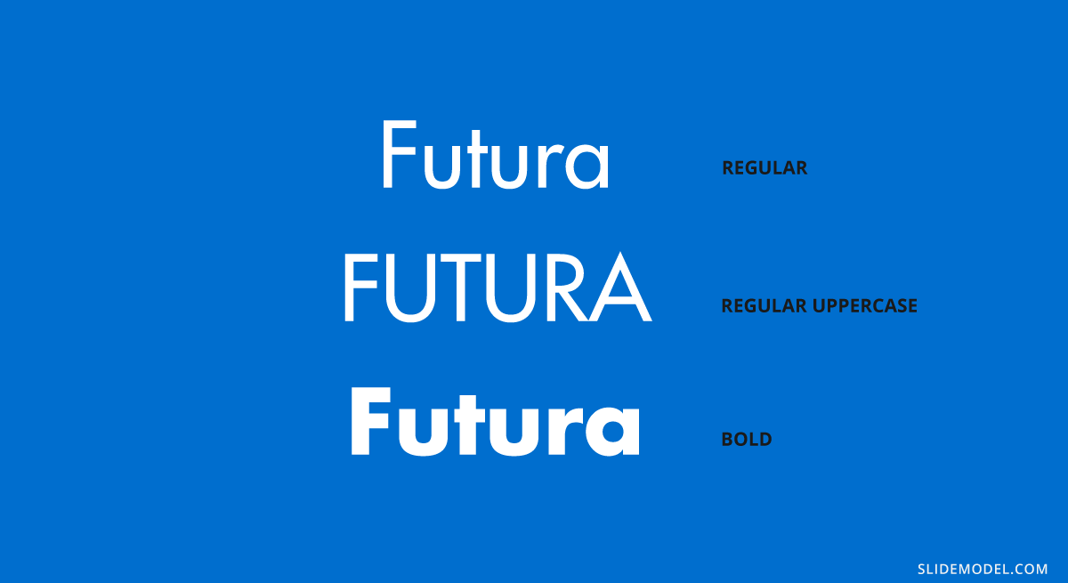
Futura is one of the popular Sans Serif fonts and is based on geometric shapes. Its features are based on uncomplicated shapes like circles, triangles, and rectangles. In other words , it mimics clean and precise proportions instead of replicating organic script or handwriting. Futura is a great default font for presentations because of its excellent readability, elegance, and lively personality.
As one of many standard fonts designed to invoke a sense of efficiency and progress, Futura is best employed when you want to project a modern look and feel in your presentation. Futura is a versatile option ideal for use in both titles and body content, accounting for why it has remained immensely popular since 1927.
3. Rockwell

The Rockwell font has strong yet warm characters that make it suitable for a variety of presentation types, regardless of whether it’s used in headings or the body text. However, best practice dictates that this standard font should be used in headers and subheadings based on its geometric style. Rockwell is a Geometric Slab Serif , otherwise known as a slab serif font alternative. It is formed almost completely of straight lines, flawless circles, and sharp angles. This Roman font features a tall x-height and even stroke width that provides its strong presence with a somewhat blocky feel.
Monoline and geometric, Rockwell is a beautiful font that can display any text in a way that looks impactful and important. Whether you want to set a mood or announce a critical update or event, you can’t go wrong with this robust font.

Verdana is easily a great choice as one of the top PowerPoint presentation fonts. Its tall lowercase letters and wide spaces contribute significantly towards boosting slide readability even when the text case or font size is small. That’s why Verdana is best for references, citations, footnotes, disclaimers, and so on. Additionally, it can also be used as a body font to extrapolate on slide headings to nail down your key points.
Besides that, it is one of the most widely available fonts, compatible with both Mac and Windows systems. This makes this modern Sans Serif font a safe bet for when you are not certain where and how will you be delivering your presentation.

Raleway is a modern and lightweight Sans Serif font. Its italicized version has shoulders and bowls in some letters that are a bit off-centered. What this means is that the markings excluding the stem are intentionally lower or higher as compared to other fonts.
This gives Raleway a slightly artistic look and feels without impacting its readability (and without falling into the custom or decorative fonts category). In fact, many professionals think the swashes and markings actually enhance the font’s readability and legibility. Moreover, Raleway also has a bold version which is heavily used in presentations and slide decks.
The bottom line is that Raleway is a versatile typeface that can be used in a variety of presentations, either in the body copy or in titles and subheadings. When the titles are capitalized or formatted as bold, captivating your audience becomes a breeze.
6. Montserrat

Montserrat is one of our favorite PowerPoint fonts for presentation titles and subheadings. The modern serif font is bold, professional, and visually appealing for when you want your headers and titles to really capture the audience’s attention.
Every time you move to the next slide, the viewers will see the headings and instantly understand its core message.
Another major quality of the Montserrat font is its adaptability and versatility. Even a small change, such as switching up the weight, gives you an entirely different-looking typeface. So you get enough flexibility to be able to use the font in all types of PowerPoint presentations.
Montserrat pairs nicely with a wide range of other fonts. For example, using it with a thin Sans Serif in body paragraphs creates a beautiful contrast in your PowerPoint slides. For this reason, it is usually the first modern Serif font choice of those creating a business plan or marketing presentation in MS PowerPoint.
Create powerful presentations with Piktochart
Piktochart is the easiest way to make powerful presentations. Import your own fonts.

Roboto is a simple sans-serif font that is a good fit for PowerPoint presentations in a wide range of industries. Well-designed and professional, Roboto works especially well when used for body text, making your paragraphs easy to read.
Roboto combines beautifully with several other fonts. When you’re using Roboto for body text, you can have headings and titles that use a script font such as Pacifico, a serif font such as Garamond, or a Sans Serif font such as Gill Sans.

Bentham is a radiant serif font perfectly suited for headings and subtitles in your PowerPoint slides. It gives your presentation a traditional appearance, and its letter spacing makes your content really easy to read.
You can use this font in uppercase, lowercase, or title case, depending on how it blends with the rest of your slide. For best results, we recommend combining Bentham with a Sans Serif font in your body content. For example, you can use a font such as Open Sans or Futura for the rest of your slide content.
9. Libre-Baskerville

Libre-Baskerville is a free serif Google font. You can pair this classic font with several other fonts to make a PowerPoint presentation with a traditional design.
One of its best features is that it works equally well in both headings and body copy. It’s clear and easily readable, no matter how you use it. And when used for headings, it works really well in uppercase form.

Tahoma is one of the fonts that offer the best level of clarity for PowerPoint slides. It has easily distinguishable characters like Verdana, but with the exception of tight spacing to give a more formal appearance.
Designed particularly for screens, Tahoma looks readable on a variety of screen sizes and multiple devices. In fact, this significant aspect is what makes Tahoma stand out from other fonts in the Sans Serif family.
11. Poppins

Poppins falls within the Sans Serif font category but is a different font of its own uniqueness. The solid vertical terminals make it look strong and authoritative. That’s why it’s great for catchy titles and subheadings, as well as for the body paragraphs. Poppins is a geometric typeface issued by Indian Type Foundry in 2014. It was released as open-source and is available in many font sizes for free on Google Fonts.
When you want something that feels casual and professional in equal measure, pick Poppins should be in the running for the best PowerPoint fonts.
12. Gill Sans

Gill Sans is another classic presentation font for when you’re looking to build rapport with your audience. Gill Sans is a friendly and warm Sans Serif font similar to Helvetica. At the same time, it looks strong and professional.
It’s designed to be easy to read even when used in small sizes or viewed from afar. For this reason, it’s a superior match for headers, and one of the best PowerPoint fonts, especially when combined with body text using Times New Roman or Georgia (not to mention several other fonts you can pair it with for successful results). This is the right font for combing different fonts within a presentation.
13. Palatino

Palatino can be classified as one of the oldest fonts inspired by calligraphic works of the 1940s. This old-style serif typeface was designed by Hermann Zapf and originally released in 1948 by the Linotype foundry. It features smooth lines and spacious counters, giving it an air of elegance and class.
Palatino was designed to be used for headlines in print media and advertising that need to be viewable from a distance. This attribute makes Palatino a great font suitable for today’s PowerPoint presentations.
Palatino is also a viable choice for your presentation’s body text. It’s a little different from fonts typically used for body paragraphs. So it can make your presentation content stand out from those using conventional fonts.
14. Georgia

Georgia typeface has a modern design that few fonts can match for its graceful look. It’s similar to Times New Roman but with slightly larger characters. Even in small font size, Georgia exudes a sense of friendliness; a sense of intimacy many would claim has been eroded from Times New Roman through its overuse. This versatile font was designed by Matthew Carter , who has successfully composed such a typeface family which incorporates high legibility with personality and charisma. Its strokes form Serif characters with ample spacing, making it easily readable even in small sizes and low-resolution screens.
Another benefit of using this modern font is its enhanced visibility, even when it’s used in the background of your PowerPoint slides. Moreover, the tall lowercase letters contribute to a classic appearance great for any PowerPoint presentation.
Final Step: Choosing Your Best Font for Presentations
Choosing the right PowerPoint fonts for your future presentations is more of a creative exercise than a scientific one. Unless you need to abide by strict branding guidelines and company policies, there are no rules for the ‘best font’ set in stone. Plus, presentation fonts depend entirely on the environment or audience it is intended for, the nature and format of the project, and the topic of your PowerPoint presentation.
However, there are certain basic principles rooted in typography that can help you narrow down the evergrowing list of available PowerPoint presentation fonts and choose PowerPoint fonts that will resonate with and have a powerful impact on your target audience.
As discussed in this article, these include font factors such as compatibility with most systems, clarity from a distance, letter spacing, and so on. Luckily for you, our carefully researched and compiled list of best fonts for presentations above was created with these core fundamentals already in mind, saving you time and hassle.
As long as you adopt these best practices for standard fonts without overcomplicating your key message and takeaways, you’ll soon be on your way to designing a brilliant slide deck using a quality PowerPoint font or font family! From all of us here at Piktochart, good luck with your new and improved presentation slides that will surely shine!

Hitesh Sahni is an editor, consultant, and founder of http://smemark.com/ , an upscale content marketing studio helping brands accelerate growth with superior and scalable SEO, PPC, and copywriting services.
Other Posts

Mastering the Craft: Presentation Design Strategies From a Pro

How to Make a Presentation (2023 Guide With Tips & Templates)

How to Nail Your Brand Presentation: Examples and Pro Tips
Do you want to be part of these success stories, join more than 11 million who already use piktochart to craft visual stories that stick..
Home Blog Design 20 Best PowerPoint Fonts to Make Your Presentation Stand Out in 2024
20 Best PowerPoint Fonts to Make Your Presentation Stand Out in 2024

What makes or kills a first impression during any presentation is your usage of typefaces in the slide design. There are common sins that we should avoid at all costs, but mostly, there are tactics we can learn to feel confident about designing presentation slides for success.
In this article, we shall discuss what makes a quality typeface to use in presentation slides, the difference between fonts and typefaces (two terms mistakenly used interchangeably), and several other notions pertinent to graphic design in an easy-to-approach format for non-designers. At the end, you will have a better idea of which are the best fonts to use for presentations. Let’s get started.
Table of Contents
Font vs. Typeface: What’s the difference?
Serif vs. sans serif, 6 elements you should consider when picking a typeface for presentation design, how to install a font in powerpoint.
- 20 Best PowerPoint Fonts
10 Best PowerPoint Fonts combinations for presentations
Considerations before presenting or printing a slide regarding typefaces, recommended font pairing tools & other resources, closing thoughts.
Most people are familiar with the term font , but what if we tell you it is wrongly used and you intend to say another word? Let’s start by defining each term.
A typeface is a compendium of design elements that set the style of any lettering medium. The misconception comes as the typeface is the set of rules that form a family in style, and the font is the implementation of those rules in practical elements. How so? Well, a font is part of a typeface family and can list variations , i.e., light, regular, bold, heavy, etc.
Putting it into simpler terms, a font is part of a typeface, and typefaces are set to classes depending on their graphical elements. That categorization stands as:
- Blackletter

Up to this point, you may ask yourself: what is the whole point of the serif? Well, there’s a little bit of story behind it. Back in the old days, when writings were made in stone, engravers added extra glyphs at the end of each letter, as a consequence of the chisel mark. In 1465, with the development of the type printing press by Johannes Gutenberg , the Gothic’s overly-ornamented Blackletter style – used mostly for ecclesiastical purposes – was the go-to typeface to use as it mimicked the formal handwriting style. There was a problem, though, and it arose as such typefaces required lengthy space to produce a book, increasing printing costs. This is where the first pure serif types started to emerge, but readability remained a problem; especially when Renaissance’s calligraphy style didn’t offer an alternative.
These concepts were revised by the 18th century when a pursuit for aesthetics gave birth to newer, slim versions of the serif script. By 1757, John Baskerville introduced what we now know as Transitional typefaces, intended as a refinement to increase legibility. The end of the 18th century saw the inception of modern serif typefaces, which came from the hand of designers Firmin Didot and Giambattista Bodoni. Their work altered the appearance of standard serif typefaces to make the metal engraving process a high-quality process. This is what we now know as the Didone typeface family.
19th century introduced the slab serifs , also known as Egyptian, which changed communication media as large-scale advertisement quickly adopted this style. In case you wonder if you ever saw this style, remember the large bold letters that newspapers used for headings. The evolution of this typeface style came in 1816, with William Caslon’s “ Caslon Egyptian ” style, or the two-lines style. This is the very first sans serif typeface ever recorded, and its continuity in style or alterations saw a massive process during the 20th century.
It is quite the process that led to what we now know as sans serif typefaces, and such a road was paved for the sake of legibility and style. Nowadays, there’s little doubt about these two typeface families as you can easily identify iconic styles such as “Times New Roman” and clearly differentiate them from sans serif families like “Arial.” In the graphic below, you can appreciate the glyphs that distinctively give the serif typefaces their style.

Moving on to the parts that pique our interest as presenters, you should consider some implicit rules before starting a PowerPoint design.
Functionality
Let’s be hyper-clear on this point: not every typeface works for your intended purpose. Legibility should be your primal focus, way more than design, as what’s the point of using a cool-looking typeface if no one can get a clue of what’s written?
Functionality refers to the usage of a typeface at different sizes across a document. Do you ever wonder why you see the same typeface on eye testing boards? Usually is a slab serif, with its sans serif alternative, and the same font is repeated, downscaling its size to test your visual acuity. If, said typeface, had “catchy” glyphs, you would require twice as much time actually to read the type below the average 24pt in a board.

Language support
This is a common, and painful, pitfall many non-English speakers do. They fall in love with a typeface after browsing an English-based website, but whenever they apply it to a personal project, they find they cannot use their average characters. Which characters are those?
- Ø – in Nordic languages.
- Ö – also known as umlaut in German, is commonly used in Turkish, Nordic, and Baltic languages.
- Á – the acute accent used in most Latin-based languages such as Spanish, Italian, Portuguese, and French.
- Ô – the circumflex, mostly used by Portuguese-speaking users but also French.
- Ç – the cedilla, used in Portuguese, French, Catalán, and Turkish (the ? character, for example).
- Ã – the tilde, common in Portuguese.
And those are just some examples extracted from the Latin alphabet. The problem even worsens if we intend to use Cyrillic, Greek, Hindi, or other Asiatic alphabets (which don’t fall into Chinese, Japanese, or Korean typical logographic style). For this reason, we emphasize testing the characters you will mostly use throughout a standard written text, just not to come across nasty surprises.
Some font families offer support for multi-language applications across the same alphabet. Others, restrict their compatibility in terms of certain characters (i.e., the acute accent in Spanish), but sometimes, that renders as a distorted character that looks awful at any written copy.

Multiple weights
We want to expose this point by first explaining what weight means for a font family. As previously mentioned, fonts are part of a typeface; they are their implementation in terms of style. Well, fonts include variations within the same specific family style that makes the text look thinner or bolder. That’s known as font weight and can be classified in two ways.
Name classification:
- Thin Italic
- Medium Italic
- Semibold (also known as Demi Bold)
- Semibold Italic
- Bold Italic
- Heavy (also known as Black)
- Heavy Italic
Web designers and graphic designers often use a number-based scale, which is inherited from CSS.
- 100 – Thin
- 200 – Extra Light
- 300 – Light
- 400 – Normal or Regular
- 500 – Medium
- 600 – Semibold
- 700 – Bold
- 800 – Extra Bold
- 900 – Black
Now you know the reason why some places like Google Fonts often show numbers next to the name definition of it.

Not every typeface can be used for any project. Some typefaces can be acquired for a fee through sites like MyFonts.com , but their usage does not allow commercial use. What exactly does this mean?
Let’s say you created a product, and you love the Coca-Cola lettering style. Well, you want to use the Coca-Cola typeface, which is trademarked, as the typeface for your logo. Everything sounds fantastic until your designer warns you that it’s impossible.
Brands that create typefaces for their logos, which is a common practice to deliver the originality factor into the brand, restrict the usage of their intellectual property for commercial use as they don’t want to be associated with the wrong kind of message. Okay then, what happens when a kid uses those typefaces on a school project? This writer sincerely doubts a company shall put their legal team to prosecute a student; most likely, they feel it is part of their brand awareness and cultural influence. That same argument won’t be used if a particular is intending to use the typeface to make a profit with a non-branded product, and you will be legally requested to ditch the design altogether.
Therefore, before opting for a typeface, don’t fall prey to using a fancy, trademarked, typeface.
The unknown-typeface strikes again
This is another common pitfall if you attend multiple presentations or if you work in the printing business. How often does a user feel annoyed that the presentation “looked different” at home? Fonts are the culprit for this.
Whenever you work on a presentation using local-based software, like PowerPoint, the typefaces you pick are the ones installed on your computer. Therefore, if you change devices, the typefaces won’t be available. We will retake this topic later, but consider always working with well-known typefaces available on any computer rather than innovation.
Sins of type
Finally, we want to conclude this section with the vices you should avoid at all costs whenever working with type in presentations.
- Using multiple typefaces on the same document: As a rule, don’t use more than 3 typefaces across your presentation slides design. Increasing the number of typefaces won’t make it more appealing; quite the opposite, and you should be mindful that if your images contain text, they have to match the existing typefaces in the presentation.
- DO NOT use Comic Sans: By all means, do yourself a favor. There are multiple reasons why designers feel like having a stroke whenever Comic Sans enters the scene, but if you want a straightforward reason why, it makes your work look childish, unprofessional, and unfit for its purpose.
- Script fonts for the body of text : Legible typefaces are required in long text areas to make the reader feel comfortable. Script fonts are not intended for readability but for design purposes. If your text is long, work with serif or sans serif typefaces (slab serif won’t do good as well).
- Excess tracking : Tracking refers in typography to the space between words, and the perfect way to point this out is by referring to the Justify paragraph alienation, which often leaves heavy white areas between words. Excess tracking makes the text look boring and hard to read.
Installing a font in PowerPoint doesn’t mean installing it as a third-party plugin; you must install the font family into the operating system (OS).
Installing a font in Windows
Method 1 – Via Contextual Menu
- Download your desired font family. Extract the zip file you obtain.
- Right-click the font files you obtain from the zip (they can be in OpenType or TrueType format). Click on Install on the contextual menu.
- You will be prompted to give admin rights to make changes to your computer. If you trust the source, then click yes.
Method 2 – Via C: Drive
- Open a new File Explorer window. Search this path: C:\Windows\Fonts. That’s where fonts are stored in any Windows OS.
- Copy the files from your extracted zip file or folder containing fonts.
- Paste the fonts by right-clicking inside the Fonts folder, then click Paste .
Relaunch the opened applications to see the effects of installing a font.
Installing a font on Mac
Mac OS requires a different procedure for installing fonts. First, access the Font Book app.
After launching Font Book, go to File > Add Fonts to Current User . Double-click the font file.
The Font Book app validates the integrity of the font file and if there are duplicate fonts. For more detailed instructions and troubleshooting on Mac font install procedures, check this guide by Apple .
20 Best Fonts for PowerPoint
Now it’s time to explore what you’ve been looking for: the best fonts for PowerPoint! This is a list of typefaces intended for multiple uses in slides, and it will certainly boost your PowerPoint design ideas for the greater.
#1 – Tahoma Font
This typeface is typically used in PowerPoint slides, emails, Word documents, and more. It resembles Verdana but with a smaller kerning (distance between characters). Due to that, it feels slimmer, professional and works perfectly on multiple devices. This is one of the best fonts for presentation that you can consider to use.

Recommended font pairing: Georgia, Brandon Grotesque, Helvetica Neue, Palatino, Arial.
#2 – Verdana Font
Verdana is a sans serif classic commonly used for citations, disclaimers, and academic documents. It is available on both Windows and Mac as a pre-installed font, which would solve your problems if you have to deliver presentations on multiple devices (which may not be yours).

Recommended font pairing: Arial, Lucida Grande, Futura, Georgia.
#3 – Roboto
Another delicate sans serif font that is ideal for text bodies. It is rated among the best fonts for PowerPoint readability and presentations, so you can easily pair it with more prominent font families. You may recognize this typeface as it is the default Google Maps uses.

Recommended font pairing: Oswald, Gill Sans, Garamond, Open Sans, Teko, Crimson Text.
#4 – Rockwell
Including visually attractive elements is crucial when looking for the best fonts for presentations, so why not combine a professional style with a slab serif typeface like Rockwell?
It is ideal for headings, especially if used in its bold font weight and paired with a sans serif for the body.

Recommended font pairing: Helvetica Neue, Gill Sans, Futura, DIN Mittelschrift.
#5 – Open Sans
This is easily one of the most versatile sans-serif fonts you can find! It is commonly used in presentation slides as both heading and body, varying font-weight, but you can also create powerful combinations with different typefaces.

Recommended font pairing: Roboto, Brandon Grotesque, Montserrat, Oswald, Lora, Raleway.
#6 – Lato
A typeface intended for digital mediums, one of its biggest advantages is its wide range of font weights – much like Open Sans. It is ideal for headings in minimalistic-themed presentations, but it can work perfectly as body text if paired with a serif font or a script one.

Recommended font pairing: Montserrat, Oswald, Roboto, Merriweather.
#7 – Futura
This sans serif typeface was designed by Paul Renner in 1927 and remains a preferred choice of designers thanks to its clean aspect with pure geometric shapes. It has inspiration from the Bauhaus in terms of styling, so any presenter that loves modern style will find in this typeface a loyal companion.
Recommended font pairing: Playfair Display, Lato, Book Antiqua, Helvetica, Open Sans.
#8 – Book Antiqua
A typeface widely used in the first years of the 2000s, its graphical elements are inspired by Renaissance’s handwritten style. Created in 1991 by The Monotype Corporation, it is known as a classic in design projects and won’t run out of fashion any time soon. Its italic variation is considered one of the most beautiful italic serif fonts.

Recommended font pairing: Myriad Pro, Baskerville, Georgia, Futura, Vladimir Script.
#9 – Bebas Neue
This typeface is strictly intended for headings or for body copy that doesn’t mind the usage of caps. The reason is that this typeface is entirely made of caps. It has no lowercase characters, but its slender shape and tight kerning have made it a popular choice among well-known designers like Chris Do. One creative usage of this typeface is to use it in outline format.

Recommended font pairing: Avenir, Montserrat, DIN Mittelschrift, Roboto.
#10 – Lora
This serif typeface can be used both in PowerPoint and Google Slides, as it is a free typeface offered by Google. Works perfectly for formal-styled headings, but it can adapt for text body as long as it remains a minimum of 15pt in size. It is an ideal option to pair with free PowerPoint presentation templates.

Recommended font pairing: Montserrat, Open Sans, Poppins, Avenir.
#11 – Montserrat
You most likely came across Montserrat at some point in your life, since it is an extremely popular choice among designers for presentations and packaging. Due to this, you won’t spark innovation but rather remain on the safe side for font pairings – which is ideal for corporate styling.

Recommended font pairing: Lora, Open Sans, Merriweather, Oswald, Georgia, Roboto.
#12 – Bentham
Another elegant serif font used for formal occasions, like wedding invitations, headings, or product descriptions. Its kerning makes it readable, unlike many other serif fonts, which is one of the reasons why you can work with this font for the body if you opt for a sans serif in the headings.

Recommended font pairing: Futura, Open Sans, Lato, Raleway.
#13 – Dosis
It is a simple, monoline sans serif typeface, which works perfectly in its extra light and light font weights to make a drastic contrast with a bold sans serif typeface. Ideally, work with this typeface for subheadings.

Recommended font pairing: Lato, Montserrat, Roboto, Oswald, Raleway.
#14 – Baskerville
You can come across this serif typeface in the form of Libre-Baskerville, a free serif typeface offered by Google. It is ideal for headings, thanks to its traditional style closely resembling the original Baskerville typeface, so it is ideal to stick to it in uppercase mode.

Recommended font pairing: Montserrat, Poppins, Lucida Grande, Helvetica Neue, Open Sans.
#15 – Poppins
This sans serif typeface breaks with the formal style of families like Verdana and Open Sans, introducing some graphical cues that make it adept for more relaxed situations. Therefore, it is ideal to use in team meetings, product presentations, or non-business presentations as long as it remains for title headers.

Recommended font pairing: Raleway, Garamond, Merriweather, Droid Serif.
#16 – Zenith Script
EnvatoElements is a great marketplace for typefaces; among the options, we can find this brush-style script typeface. Zenith Script is a powerful option to come up with creative title designs for non-corporate meetings, as long as the title remains short. It can also work for branding purposes, and certainly, you can use it as an asset if you are looking for how to start a presentation .

Recommended font pairing: Any sans serif font in uppercase format, with increased kerning. Options can be Open Sans, Bebas Neue (modified), Roboto, and Futura.
#17 – Amnesty
The second option we consider among script typefaces. Amnesty has that dramatic effect that resembles rusting handwriting from the old days. It is ideal for presentations that have to convey a strong emotional factor, like product releases for fashion brands, and we recommend limiting its usage to short titles, always paired with sans serif typefaces.

Recommended font pairing: As it is a custom-made font, we recommend pairing it with its Amnesty Sans listed in the product file.
#18 – Bodoni
This typeface dates all the way back to 1798 and is considered a transitional font type. Its name comes from Giambattista Bodoni, designer, and author of this typeface, whose work was heavily influenced by John Baskerville. As a didone typeface, you find elegant traces that instantly give the feel of a fashion magazine heading, and it is no coincidence that this was the selected typeface for the title of Dante Alighieri’s La Vita Nuova re-print in 1925 .

Recommended font pairing: Brandon Grotesque, Gill Sans, Playfair Display, Raleway, Courier.
#19 – Avant Garde
If you are looking for good presentation fonts, this geometric sans serif is the answer to your question. This typeface is based on the Avant Garde magazine logo and remains one of the most popular condensed sans serif options. Many brands use Avant Gard these days as part of their branding identity, such as Macy’s (lowercase usage), the Scottish rock band Travis, RE/MAX, among others.

Recommended font pairing: Helvetica Neue, Sentinel, Garamond, Neuzeit Grotesk.
#20 – DIN Mittelschrift
Our final typeface in this list is the DIN 1451 sans serif typeface, widely used in traffic signage and administrative/technical applications. Its denomination, Mittelschrift, comes from the German word for medium, which refers to the font weight. You can find it in Engschrift , which stands for condensed.

Recommended font pairing: Open Sans, Didot, Helvetica Neue, Lucida Grande.
Keep in mind that if you are looking for a proper way how to end a presentation , working with graphics is much better than sticking with type, as you show extra care for the final element in your slide deck.
Open Sans + Roboto

Didot + DIN Mittelschrift

Bodoni + Gill Sans

Rockwell + Bembo

Bebas Neue + Montserrat Light

Helvetica Neue + Garamond

Oswald + Lato

Baskerville + Montserrat

Lora + Poppins

Book Antiqua + Myriad Pro

Before concluding the technical aspects of this article on best presentation fonts, we want to mention some key elements that you should consider before delivering a presentation or printing it for physical format.
Working with accurate text si zing in presentations can make a difference in how the slides are perceived by the audience. First, let’s make one very valid clarification: a Point (pt, unit used in PowerPoint and other word processing software) equals 1.333 pixels, or we can say a pixel is 0.75 pt.
You can find multiple resources and rules on font sizing intended for web designers, so let’s resume the primary points here:
- Body text should remain 12 to 14pt for legibility. If the presentation is shown from afar, increase body size to 16pt.
- The ratio for headings and titles is twice as big as the body text.
- Subheadings should be between 3-4 pt smaller than headings to make a valid contrast but not compete with the body text.
- Keep an eye on leading , the space between lines of text. Double spacing makes it hard to read in most situations, so avoid it for the text body.
Getting slides ready for print format
Remember what we mentioned above about not having your fonts installed on the computer? Well, this inconvenience can be easily solved by rastering type before leaving your home or exporting your presentation file. PowerPoint doesn’t offer a native option to do this, so if your presentation has sections that are bound to suffer from font issues, work with them as images, which can be exported from Adobe Acrobat or Adobe Photoshop/Illustrator. It is just like working with PowerPoint shapes , but you remain on the safe side of font compatibility issues.
Word of advice : keep an editable copy instead of just the rastered version.
Color contrast and color testing
Accessibility is the number #1 rule to remember when working with text, as it enhances the performance of your visual communication tactics. In general, don’t work with pure white or pure black colors, since it induces eye strain whenever a spectator has to read your slides for a long while. You can work with color contrast resources such as WebAIM’s Contrast Checker .
If your presentation slides are going to be handed out in deliverable format, be sure to perform a color test before you bulk print the slides. Some colors can be misleading, especially in the conversion from RGB to CMYK color spaces. Also, some light grays may not be accurately printed if done with an inkjet printer. Take some extra time to ensure this process is done right, and avoid last-minute costly frustrations.
If you need to purchase typefaces, opt for trustworthy marketplaces. Sites like MyFont.com offer an immense collection of font families available for you, plus extra services like WhatTheFont , their AI-based typeface recognition software, which allows you to scan and detect typefaces from documents, images, and more. It is extremely useful if you are looking for a typeface but cannot remember its name.
Alternatives: Fonts.com | Adobe Fonts | Google Fonts
Fontjoy.com
For those who seek to explore creative font pairing schemes, Fontjoy is the site to visit. It is a simple layout, in which you select the font for the Title, Subheading, and Body. You can randomly generate combinations based on the contrast between typeface styles, or start with a typeface you had in mind for one section – lock it – and click on the generate button.
Keep in mind it has a limited number of typefaces, some of which we mentioned here may not be available.
Alternatives: fontpairings.com
When looking for inspiration to create visually attractive font pairings, Typ.io is a website intended for web font inspiration, meaning to guide designers with different font schemes by looking at the font’s name.
You can look at some projects in detail, with their CSS code written for you, so you can analyze the font weight used or particular style details.
Typewar.com
Want to have fun while learning about font pairing? Well, an important part of that process is to learn by heart the most used typefaces. Typewar is a website that offers a quiz showing different characters in multiple typefaces, with the input to choose between two font families. It is ideal to practice classic typefaces, and you will increase your knowledge in design by a great deal if you practice 10 minutes a day.
Typescale.com
One crucial aspect of working with text is knowing how to scale it properly. Since readability is critical, you should know when and where to use each font size. Typescale is a website that is intended for web designers and can help convert typefaces from pixels to rem . How is this useful for presenters? Well, since we won’t dwell in pixels and other units besides points (pt), this tool is ideal to tell if a text is legible from distance at the current size you assigned, or whether you should upscale or downscale the body text to make a better contrast with the headings.
Finally, we conclude this section by introducing Coolors , a palette generator tool that helps designers come up with beautiful color schemes for their work. As we discussed in our color theory for presentations article, it is important to keep an eye on the colors we manage as they contribute to the psychological impact the presentation has on the audience.
Get used to generating creative PowerPoint color palettes for each presentation to make them unique, or help your brand to tailor cooperative slides to the appropriate PowerPoint theme that matches the company’s logo.
As you can see, getting ready to make a presentation isn’t just an easy feat that can be accomplished in minutes if you aim for custom-made solutions rather than sticking to PowerPoint templates . Increasing your knowledge of font pairing and its proper usage will certainly boost your performance as a presenter, making you less prone to a design faux-pas that diverts the attention from your content.
We recommend you to visit our tutorials on how to add fonts to PowerPoint and how to add fonts to Google Slides . We hope this guide brings light to a complex topic like working with design decisions in presentations and see you next time.

Like this article? Please share
Design, PowerPoint Tips Filed under Design , PowerPoint Tutorials
Related Articles

Filed under PowerPoint Tutorials • March 26th, 2024
How to Translate in PowerPoint
Unlock the experience of PowerPoint translation! Learn methods, tools, and expert tips for smooth Spanish conversions. Make your presentations global.

Filed under PowerPoint Tutorials • March 19th, 2024
How to Change Line Spacing in PowerPoint
Adjust text formatting by learning how to change line spacing in PowerPoint. Instructions for paragraph indenting included.

Filed under PowerPoint Tutorials • March 12th, 2024
How to Create an Action Button in PowerPoint
Create engaging presentation slides by learning how to make an action button in PowerPoint. Add CTAs to your slides in just minutes.
Leave a Reply
50+ Best Fonts for PowerPoint Presentations
Picking the right font for your presentation is probably the most important part of designing a PowerPoint slideshow. If your font isn’t readable, you’ll have a confused audience. We explored the web to find this collection of the best fonts for PowerPoint presentations to help you choose the best font for your slideshow design.
When designing a PowerPoint presentation it’s easier to just pick a font from the default fonts collections installed on your computer and just finish making the slides. But, a unique, custom font can help you create a winning presentation that shows off professionalism.
Choosing a unique font with the right weight and creative design will allow you to not only design a presentation that looks more original, but also to quickly attract the attention of your audience.
In this collection, we’re featuring some of the best fonts you can use to design professional slides for all kinds of PowerPoint presentations from business to startup pitch decks, school presentations, and much more.
We’re also featuring a few helpful tips for choosing a presentation font to help get you started.
How Does Unlimited PowerPoint Templates Sound?
Download thousands of PowerPoint templates, and many other design elements, with a monthly Envato Elements membership. It starts at $16 per month, and gives you unlimited access to a growing library of over 2,000,000 presentation templates, fonts, photos, graphics, and more.

Pitch Deck Templates
Startup pitch deck.

Maximus Template

Mystify Presentation
Explore PowerPoint Templates
Config – Complete Font Family (40 Fonts)

Unlike most other font families, Config is a complete font family made just for professional designers and creatives. This font family comes with a total of 40 fonts.
Config includes 40 fonts in 8 different styles and in 10 weights. You also get italics, ligatures, alternatives, and much more with this font pack.
Why This Is A Top Pick
This is truly a special font pack that will help you design not only professional presentations but also many other types of print and digital designs. With 40 fonts, you’ll have plenty of options to choose from.
Devant Horgen – Modern Font for PowerPoint

This is one of the best fonts for presentations that features a tall and bold letter design that’s simply perfect for crafting titles for your slides. The font also comes in two different styles featuring glyphs, multilingual support, and web fonts.
Jungle East – Font For PowerPoint Titles

The quirky and simple design of this font makes it a great choice for PowerPoint presentations. It’s especially ideal for presentations about casual and lifestyle topics. The font features all-caps letters with lots of creative alternate characters.
Lost Signal – Font Duo for PowerPoint

With this font, you get a two-in-one deal as it comes with two unique fonts. It includes a regular font and an outline version that you can pair to craft attractive titles and designs for your presentations and various other projects.
Apple Juice – Fun Font for Presentations

Apple Juice is a fun font that will fit in great with presentations related to kids, education, schools, and more. It features uppercase and lowercase characters along with multilingual support.
Vistol Black – Free Font for Presentations

Vistol Black is a free font that comes with a very clean and professional letter design. It’s great for all your business and corporate presentations, especially for designing titles that grab attention.
Meribold – Modern Font for Presentations

This font has one of the coolest-looking letter designs that will make your titles and headings look extra sharp on presentation slideshows. It has bold letters with thick strokes to instantly grab your audience’s attention.
PlainScribe – Clean Font for PowerPoint

This font comes in two different styles featuring a regular and outline version, along with italics for both fonts. You can combine these two fonts to create attractive titles and text for PowerPoint presentations.
Handcraft Chalk Font for Presentations

If you’re going with a chalkboard-style handcrafted look for the presentations, then this font is a must-have for your project. It has a chalk-style letter design with a set of all-caps characters.
BRIGHTONS – Bold Title Font for PowerPoint

Brightons is a bold title font family that includes 16 different fonts with different weights. It’s a fantastic choice for designing big headings and titles for your PowerPoint slides that stand out.
Open Runde – Free Sans Font for PowerPoint

This free font has a very casual and clean letter design featuring rounded edges and beautifully smooth characters. You can use it to craft both titles and paragraphs for presentations. And it’s free to use with commercial projects.
Leading – Bold Sans Serif Font for PowerPoint

Leading is a modern sans-serif font that features a set of clean and thick letters. The font is perfect for adding attention-grabbing titles to your slideshows and presentations.
Chalk Brush – Creative Font for Presentations

This font combines two different styles of fonts to create a unique look. It takes elements from brush and chalk-style fonts to offer a unique handwritten letter design, which you can add to your own PowerPoint presentations.
Milkyway – Playful Font for PowerPoint

The retro and groovy design of this font will make any presentation stand out from the crowd. It features a fun and playful letter design that is ideal for all your PowerPoint slideshows related to casual and entertaining topics.
Sans Block – Handwritten Font for PowerPoint

If you’re looking for a font with a more personalized handwritten look, then this font is perfect for your presentations. It features a thin and minimalist letter design that’s especially suitable for school and educational slideshow designs.
RL Madena – Free Font for Presentations

This font is also free to download and it comes with an elegant serif letter design. It will make your typography look extra stylish in fashion and lifestyle-related presentations. The font is free for commercial use.
San Marino – Urban Font Family for Presentations

San Marino is another professional font that features clean-cut geometric letters. This font comes in 4 styles for you to choose from. And it’s suitable for business, lifestyle, and creative PowerPoint slideshow designs.
Kod Hulling – Rounded Fonts for PowerPoint

Want to add a casual and friendly look to your presentation slides? Then use this font to craft your slides with a classic look. The font comes with a very unique design featuring both uppercase and lowercase letters.
Miracle World – Elegant Font for Presentations

This font has the perfect design for crafting titles in presentations for luxury businesses and elegant lifestyle brands. It includes lots of stylistic characters and ligatures to help you design unique titles and designs for your slideshows.
Action Hero – Brush Font for PowerPoint Titles

With this brush font, you can design attention-grabbing titles for your fun and casual presentations. It has an 80’s action movie-themed letter design that comes with a set of cool all-caps letters. And with lots of alternate characters.
Quanty – Free Modern Font for PowerPoint

This free font is also great for designing titles in your PowerPoint slides. It has a simple and clean letter design that will add an extra-professional look to your presentation. The font is free to use with personal projects.
Indigo – Chunky Font Duo

Indigo is a modern and creative font that features a bold and thick character design. This font is ideal for designing titles and the headers of your presentations. It comes in both regular and outline styles.
Maximum Profit – Business Presentation Font

If you’re creating a business explainer PowerPoint presentation, Maximum Profit will help you hit a home run. It comes with a full set of uppercase and lowercase letters, numbers, punctuation, multilingual support, and more. Try it out today!
Mosra – PowerPoint Presentation Font

Looking for a typeface that feels right at home on virtually any kind of PowerPoint presentation? Mosra is a solid font choice that will help you create a presentation that stands out from the pack. We recommend you choose Mosra for your upcoming pitch deck or add it to your shortlist at the very least.
Cornerone – Corporate Presentation Font

Say hello to Cornerone, a simple, round typeface that will add a vintage flair to your presentation, and take it to a whole new level. Available in bold and regular styles, and cyrillic, and latin alphabets, Cornerone provides a surprising amount of creative control in your hands.
Cholens – Free Sans-serif Font

Modern, and classy, Cholens is a rounded sans-serif font that can be a solid choice for PowerPoint presentations of any kind. It contains uppercase and lowercase letters and is available for you to download without spending a penny. Get it now.
Mike Sans – Square Font

Mike Sans is a sans-serif font family that features a unique square and slightly rounded character design. The font includes 8 weights ranging from thin to heavy. It’s ideal for both title and paragraph text designs of presentations.
Metropolis – Font Family

Metropolis is an elegant serif font family that comes with a mix of modern and vintage design elements. It features a design inspired by the 1927 Fritz Lang movie of the same name. This font is perfect for crafting business and professional presentation slideshows.
RNS Miles – Geometric Sans Font

RNS Miles is a modern sans-serif font featuring an attractive design. It’s been crafted with a combination of “geometric shapes, open forms, and grotesque mood”, which gives the font a unique look. The font includes 7 different weights with 7 italic versions of the font.
CA Texteron – Six Weight Text Font

Texteron is a professional font that comes in 6 different weights, including bold, heavy, and small caps font styles. The font features an elegant design that makes it perfect for designing the paragraph text of your PowerPoint slides.
Peace Sans – Free Presentation Font

Peace Sans is a bold display font with thick character design. This font is most suitable for designing titles and headers of your presentations. It’s free to use with your personal projects.
Univia Pro – Free Font Family

Univia Pro is a family of sans-serif fonts that features multiple font weights ranging from thick to bold designs. You can use it to design both titles and body text of your presentations.
Italo – Creative Font

Italo is a creative sans-serif handwritten font that comes with a unique design. It’s most suitable for designing PowerPoint slides for entertaining, fun, and creative presentations. The font also includes lots of glyphs and alternate characters as well.
Brother Typeface

Brother is a yet another creative font that comes with a bold design, making it best for using to design the titles of your slides. The font comes with both uppercase and lowercase letters, numbers, and punctuations.
Vistol – Free Sans Serif Font Family

Vistol is a free font family that features a set of clean and minimalist sans serif characters. The font includes 9 different font weights ranging from thin to extra bold and black.
This font is ideal for designing both titles and body text of your presentations as it includes both uppercase and lowercase letters.
The simple and attractive character design gives this font family a special place on our list. It’s also completely free to use with your personal and commercial projects.
Cansu – Free PowerPoint Font

While you’ll find a number of freebies on our list, when it comes to choosing the one that we like the most, Cansu definitely takes the cake. With an air of minimalism, the font is perfectly suited for a variety of presentation formats.
Addington CF – Serif Font Family

Addington is a family of serif fonts that feature a very formal design. It’s perfect for designing PowerPoint slides for business and professional presentations. The font comes with 7 different font weights including roman and italic sets.
Avera Sans – Font Family

Avera is a unique family of sans-serif fonts that comes in 3 different styles, a brush font, a handcrafted style font, and a sketch style font. This font family will come in handy when designing many different types of slideshow presentations.
Calama – Free Condensed Font

Calama is a free font that comes with a narrow condensed design. This type of fonts is best not to be used as your body text font. But it will make your titles look great.
Mathison – Free Modern Display Font

Mathison is a free serif font that has a unique design of its own. This font is perfect for crafting unique headers and sub-headers in your presentations. It’s free to use with personal and commercial projects.
Cormier – Art Deco Font

Cormier is a creative font that comes with an art deco inspired design. It includes 3 styles of fonts: Rough, Double, and Regular. The font features all-uppercase letters, numbers, and punctuations.
Metrisch – Sans-Serif Font Family

Metrisch is a minimalist sans-serif font that features an elegant design. The font comes in 7 different weights to match both the titles and text in your slides. It’s most suitable for making slides related to business and professional projects.
Frank – Modern Font Family

Frank is a bold font that comes with a modern design. It includes 4 different fonts, including oblique and rough styles. And the fonts are available in 5 different weights, making a total of 20 fonts.
Bistro – Handcrafted Font

Bistro is a creative font with a handcrafted design. This font is perfect for designing slides related to creative work, kids, school presentations, and more. It comes with 3 different weights and in both serif and sans-serif versions.
Hunky Dory – Fun Bold Font

This cute and adorable font features a fun and quirky design that makes it most suitable for designing presentations related to fun events. It will especially help get the attention of children.
Mosk – Free Clean Sans-Serif Font

Mosk is a modern sans-serif font family that comes with 9 different font weights. You can use this free font to design both titles and paragraphs of your PowerPoint presentations.
Manrope – Free Geometric Sans-Serif Font

Manrope is a unique sans-serif font that comes with 7 different weights. It features a geometrically accurate design that makes it perfect for all kinds of business and professional presentations.
Venice Serif – Font Family

Venice is a serif font with an elegantly thin design. The font comes in multiple weights, including light, bold, and italic versions. It also includes 195 glyphs and it’s best for fashion and luxury presentation designs.
Granite – Modern Brush Font

Granite is a creative brush style font you can use to design bold and creative PowerPoint slides. The font includes lots of swashes and glyphs. It’s perfect for slides with colorful images and graphics.
Bison – Bold Font Family

Bison is a bold font family that comes with several unique font styles, including regular and outline versions of the font. It also features italics, numbers, and punctuations as well.
Frosty – Modern Typeface

Frosty is a creative font you can use to design the titles of fun and attractive slides. The font features a quirky design that will work well with colorful and minimalist PowerPoint presentations.
Hobart – Minimal Typeface

This sans-serif font is ideal for designing creative and business slideshow presentations. The font features a design inspired by a font released in the 20th Century and it comes in 3 different weights.
4 Tips for Choosing a Presentation Font
If you’re new to creating presentations, follow these tips to find the best font for your design.
1. Choose Fonts That Improve Readability
Most PowerPoint presentations include two different types of text titles or headings and paragraph text. When designing both types of text, you need to take readability into account.
Where are you presenting your slideshow? Will it be at a big conference for a big crowd? Or a small team meeting at the office? Depending on the situation, choose a font and a font size appropriately. For example, if you’re presenting the slideshow to a crowd at a large hall, you may want to use an easy to read sans-serif font with larger font size for paragraph text to let people in every corner read the text more easily.
2. Use No More Than Two Fonts
It’s best to use two different fonts for your titles and paragraph text. But, avoid using more than two fonts. Some people actually use one font for titles, one for bullet points, one for paragraphs, and another for sub-headings. This is a mistake that only creates confusion and destroys professionalism.
Use two matching font pairs for titles and paragraphs, preferably sans-serif fonts.
3. Keep Consistency
One of the biggest mistakes people make when using fonts in presentations is choosing different font styles that ruin readability. For example, using a script font for paragraphs is a terrible choice.
When choosing different fonts, also remember to keep consistency. Don’t use different fonts for each and every slide in your presentation.
4. Avoid Using All-Caps Fonts
Some fonts only include uppercase letters and doesn’t come with lowercase letters. When choosing a font, remember to check whether your font includes both sets of letters.
While all-caps text is suitable for designing titles and headings, it’s not a good choice for body text. You should try to avoid using all-caps fonts altogether especially when designing professional and business presentations.
- Slide Library
- Slide Library for PowerPoint
- Downloadable slides and shapes
- Slide Library search
- Search Library via shortcut keys
- Slide Library update alerts
- Rename or delete objects
- Share Slide Library
- Save slides or shapes to Slide Library
- Save presentation to Slide Library
- Manage Templates
- View all templates and set default
- Agenda Wizard
- Create Agenda Slides
- Update Agenda Slides
- Agenda Slide Numbering
- Navigate via Agenda
- Table of Contents
- Import Agenda Items
- Save Agenda Format
- Manage Colors
- Color Palette Toolbar
- Customize Color Toolbar
- Apply fill with outline color
- Recolor Charts
- View RGB color values & names
- Theme Color Tints and Shades
- Share Color Palette with team
- Insert Shapes
- Standard PowerPoint shapes
- Callouts / Speech Bubbles
- Hand Drawn Circles
- Harvey Balls
- Create Mini Slides
- Move to Multiple Slides
- Right Facing Centered Triangle
- Status Indicators
- Arrange and Align Shapes
- Select same color or size
- Select shapes by attribute
- Align shapes
- Align to first selected shape
- Choose Align anchor point
- Align using shortcut keys
- Copy paste position multiple shapes
- Straighten Lines
- Swap positions
- Distribute evenly
- Set Horizontal Gaps
- Set Vertical Gaps
- Squeeze or expand gaps
- Remove gaps
- Group Objects by Row
- Group Objects by Column
- Send to back, bring to front
- Send backward, bring forward
- Flip or rotate
- Group, ungroup and regroup
- Edit Shapes
- Same height, same width
- Copy paste position, size
- Resize shapes
- Slice shapes
- Multiply shapes
- Stretch shapes and fill gaps
- Toggle line weight and style
- Change margins toggle
- Chevrons same angle
- Paragraph Styles
- Save Paragraph Styles
- Apply Paragraph Styles
- Use PowerPoint Indent Increase/ Decrease to apply bullet styles
- Reset Paragraph Styles
- Ticks and Crosses bullets
- Paint Formatting
- Advanced Format Painter
- Position & Size Painter
- Table Format Painter
- Style Painter
- Text Format Painter
- Change Shape Painter
- Chart Format Painter
- Angles & Curves Painter
- Animation Painter
- Cycle Accent Colors
- Format Text
- Fit text to textboxes
- Wrap Text Toggle
- Merge Textboxes
- Split Textboxes
- Increase/ Decrease Font size
- Change Text Case
- Color Bold Text
- Delete Text or Replace
- Insert Superscript text
- Format Tables
- Create table from text boxes
- Convert table to text boxes
- Convert text to table
- Insert columns and rows
- Paste Excel data without source formatting
- Paste Excel data into text box tables
- Export Table or Box Table Data to Excel
- Set cell margins
- Express Table layout
- Table stripes
- Autofit columns
- Evenly space columns
- Align shapes over tables
- Harvey Balls for Tables
- Status Indicators for Tables
- Customizable PowerPoint Shortcuts
- Extra PowerPoint shortcuts
- Add PowerPoint shortcuts
- Search shortcut keys
- Reassign PowerPoint shortcuts
- Reset PowerPoint shortcuts
- McKinsey PowerPoint shortcuts
- F4 or Ctrl+Y redo or repeat
- Printable PowerPoint Shortcuts PDF
- How to Print a Custom Shortcuts list
- Search Shortcut Keys
- Searchable PowerPoint Shortcuts list
- Format Toolbar Overview
- Format Toolbar Layout Options
- Lock or Unlock Objects
- Lock objects
- Lock objects to the Slide Master
- Unlock objects
- Proofing Tools
- Check Formatting
- Check Fonts
- Check Template
- Check Slide Layout
- Check Content
- Check Punctuation & Spacing
- Reduce File Size
- Flip Slides
- Set Proofing Language
- Change set language for PowerPoint presentations
- Slide Numbering
- Manage Slide Numbering
- Slide Numbers with totals
- Add words to Slide Numbers
- Change Starting Slide Number
- Skip Slide Numbers on Hidden Slides
- Slide Navigator
- Footers & Footnotes
- Filename Footer
- Enlarge Footnotes
- Refine Slides
- Add summary slide
- Format slide title
- Display No Fly Zone
- Send slide to appendix
- Camouflage mode
- Format Painter
- Set Grayscale
- Format Images
- Compress file size
- Format Charts
- Charts Toolbar
- Config Options
- Customize Settings
- Dark Mode Display
- Review Slides
- Customizable Status Stamps
- Sticky Notes
- Tag slides with filename and page number
- Share Slides
- Email selected slides in PPT or PDF format
- Print selected slides
- Save selected slides
- Slide Library for Teams
- Team Slide Library
- Create multiple Team Slide Libraries
- Synchronize Team Slide Libraries
- Synchronize Team Slide Library to your company Dropbox/ Box/ OneDrive folder
- Updating your Team Slide Library
- Import entire presentation to the Slide Library
- Share Slide Library with a colleague
- Share Custom Settings
- Share Custom Settings with Team
- Getting Started
- Getting started with PPT Productivity add-in for PowerPoint
- Downloadable PowerPoint Elements for Slide Library
- Tutorial - How to Create Custom Paragraph Styles for PowerPoint
- Can I use PPT Productivity on a Mac?
- PPT Productivity Basic Tools Tutorial
- PPT Productivity Plus Tools Tutorial
- New Features
- August 2023 update: Color Toolbar enhancement, new icons and more
- February 2023 update: New Slide Libraries available to download!
- January 2023 Update: Agenda Wizard, Format Painters + More
- How to copy and paste formatting in PowerPoint
- PowerPoint How To
- What are the most popular PowerPoint shortcuts?
- Where are PPT templates stored? Finding templates in PowerPoint
- Pasting data into a PowerPoint table without source formatting?
- Consulting Toolkit
- How to create effective consulting slides using Minto Principles
- Missing the McKinsey PowerPoint Shortcuts?
- Missing the Accenture QPT for PowerPoint?
- Missing the BCG PowerPoint Tools?
- Missing the Bain Toolbox for PowerPoint?
- How to add Stamps or Stickers to PowerPoint slides?
- Looking for a Consulting PowerPoint Toolbar?
- Top 10 PowerPoint Hacks / Shortcuts used by strategy consultants
- PowerPoint Tips
How to choose the best fonts for PowerPoint Presentations
- November 10, 2023
PowerPoint is one of the most popular and versatile tools for creating and delivering presentations. Whether you are pitching an idea, teaching a lesson, or sharing information, you want your slides to be clear, consistent, and compelling. But beyond the storyline, one of the key elements that can make or break your presentation is the choice of fonts.
Fonts are more than just letters and symbols - fonts can help convey meaning, mood, and personality. They can also affect the readability and legibility of your text, which is crucial for keeping your audience engaged and informed.
In this blog post, we look at the different styles of fonts, recommendations of the best fonts for PowerPoint presenting vs printed reports and we share some hints and tips on how to choose the best font for PowerPoint presentations based on your audience and delivery method.
What are the types of fonts?
Before we dive into the specific fonts that work well for PowerPoint, its helpful to have an overview of some basic terminology and categories of fonts. Fonts can be classified into two main groups: serif and sans serif. Here's a quick explanation of each style:
- Serif fonts have small strokes or lines at the end of each character, such as Times New Roman, Georgia, or Garamond. They are often associated with tradition, elegance, and formality.
- Sans serif fonts do not have these strokes or lines, such as Arial, Helvetica, or Verdana. They are often associated with modernity, simplicity, and clarity. They are also more readable on-screen than serif fonts, which can look blurry or pixelated.
There are also other types of fonts, such as script, decorative, or monospaced fonts, but they are usually not recommended for PowerPoint presentations because they can be hard to read (or distracting!).

What are the factors to consider when choosing the best font for presentations?
When choosing a font for PowerPoint presentations, it's important to consider the following factors:
- Readability : How easy is it to read the text on your slides? You want to choose a font that is clear and crisp, especially if you have a lot of text or small font size. You should also avoid using too many different fonts or styles in your presentation, as this can create visual clutter and confusion. Consider as part of this the intended delivery format - for example, will you be presenting the slides in an auditorium or emailing/ printing a deck for individuals to read through on their screen or on paper?
- Design : How well does the font match the theme and tone of your presentation? You want to choose a font that reflects your intended message and brand (or personality, for individual presentations). For example, if you are presenting a creative or playful topic, you might want to use a font that has some flair or fun. However for presenting a serious or professional topic, you might want to use a font that has some weight or authority.
- Style : How do you want to emphasize or differentiate certain parts of your text? You can use different font styles, such as bold, italic, underline, or color, to highlight important words or phrases in your presentation. However, you should use these styles sparingly and consistently, as too much variation can reduce the impact and coherence of your text.
What are some examples of good fonts for PowerPoint presentations?
Based on these factors, here are some examples of good fonts for PowerPoint presentations in 2023.
- Sans serif fonts : These are fonts that do not have small strokes or lines at the end of each character, such as Arial, Helvetica, or Verdana. They are often associated with modernity, simplicity, and clarity. They are also more readable on-screen than serif fonts, which can look blurry or pixelated.
- Simple and clean fonts : These are fonts that have a clear and crisp design, without too much embellishment or decoration. They are also versatile and adaptable, as they can suit different themes and tones. Some examples are Verdana, Roboto, Fira Sans, and Montserrat.
- Fonts that match the font size : These are fonts that look good at both big and small sizes, without losing their quality or legibility. They are also not too thin or too thick, as this can affect the readability of your text. Some examples are Tahoma, Segoe UI, Georgia, and Bentham.
Suggested Fonts available in standard PowerPoint versions from 2007 onwards
There is an almost unlimited number of fonts available for download on the internet, that you could choose to use for your presentations. To keep things easier, we have focused on a list of fonts that are all available in standard PowerPoint.
Some of the simple and clean fonts great for presentations and available in standard PowerPoint:
- Calibri : Calibri is a sans serif font that has a modern and elegant look. It is the default font for PowerPoint since 2007 and it is very readable and versatile.
- Helvetica : Helvetica is another sans serif font that has a clean and sleek look. Helvetica is one of the most popular fonts in the world and it is very clear and adaptable.
- Garamond : Garamond is a serif font that has a vintage and classy look. It is very legible and stylish, as it has a distinctive contrast between thick and thin strokes.
- Gill Sans : Gill Sans is a sans serif font that has a friendly and playful look. It's very readable and expressive, as it has a lot of character and charm.
You can view and compare the fonts in this screenshot:

PowerPoint 2023 Font update including Aptos
In July 2023, Microsoft introduced Aptos as the new default font for PowerPoint. Aptos is a sans serif font that has a modern look. If you are a Microsoft 365 user, you will have access to Aptos from mid 2023. Users on older versions of Office will continue to have the fonts listed above. Aptos replaces Calibri as the default font for PowerPoint (but Calibri and the other fonts listed above continue to also be available in PowerPoint!).
Along with the Aptos introduction, Microsoft commissioned the design of an additional 5 fonts which have been added to PowerPoint, Excel and Word:
- Aptos : a sans serif font that has a modern look, which is being rolled out as the new default Office font for Microsoft 365 users
- Bierstadt : a sans serif font, designed to be more angular and precise than Arial with high readability in mind.
- Grandview : a sans serif font which has been specifically designed as a high legibility font for use in body text, on any device.
- Seaford : a sans serif font inspired by old-style serif text typefaces. While Bierstadt is more angular, Seaford is more organic.
- Skeena : a sans serif font inspired by traditional serif text typefaces. There is intentional contrast between the thick and thin in the strokes. Designed for body text in long documents and presentations.
- Tenorite : a sans serif font, Tenorite was designed to be an easily readable font at small sizes onscreen, with larger punctuation.

Suggested Presentation Fonts to download for PowerPoint
If you don't like the look of any of the fonts available in PowerPoint, you can also download additional fonts. Note that you will need to also embed any non standard fonts in a presentation if you are distributing it to others (refer to the next section for how to do this).
The following fonts are Sans Serif and Serif fonts which are modern and easy to read. They are not available in standard PowerPoint, however you can easily download them online and install them for PowerPoint.
- Lato : Lato is a sans serif font that has a modern and elegant look. It is very readable and versatile, as it comes in different weights and styles. Lato is recommended for both headers and body text in your presentation.
- Roboto : Roboto is another sans serif font that has a clean and sleek look. It is also very readable and adaptable, as it has many variants and styles. Roboto is recommended for both headers and body text in your presentation.
- Bentham : Bentham is a serif font that has a vintage and classy look. It is very legible and stylish, as it has a distinctive contrast between thick and thin strokes. You can use Bentham for headers or sub-headers in your presentation.
- Fira Sans : Fira Sans is a sans serif font that has a geometric and futuristic look. It is very clear and dynamic, as it has a wide range of weights and styles. You can use Fira Sans for headers or sub-headers in your presentation.
- Montserrat : Montserrat is a sans serif font that has a friendly and playful look. It is very readable and expressive, as it has a lot of character and charm. You can use Montserrat for headers or sub-headers in your presentation.

How to embed non standard fonts in PowerPoint presentations
As noted in the section above, if you choose to download a non standard PowerPoint font for your presentation, you need to embed the font in your presentation, if you plan to share the presentation electronically with others. To do this:
- With your presentation open, from the PowerPoint Ribbon, click the File tab and then click Options
- From the left menu select the Save tab.
- The second last menu option is Preserve fidelity when sharing this presentation . Check the Embed fonts in the file check box. We recommend also checking the Embed all characters (best for editing by other people) if you are intending for your presentation to be edited by others.

How to apply fonts to your PowerPoint presentation?
Once you have chosen the fonts that you want to use for your PowerPoint presentation, you need to apply them to your slides. Here are some steps to follow:
- Select the text that you want to change : You can select a single word, a sentence, a paragraph, or the entire slide. You can also select multiple slides at once by holding the Ctrl key and clicking on the slides in the left pane.
- Open the Font dialog box : You can open the Font dialog box by clicking on the Home tab, then clicking on the small arrow in the bottom right corner of the Font group. Alternatively, you can press Ctrl + D on your keyboard.
- Choose the font that you want to use : You can choose the font from the drop-down list in the Font dialog box. You can also choose the font size, style, color, and effects from the same dialog box. You can preview how the font looks like in the Sample box at the bottom.
- Click OK : Once you are happy with your font choice, click OK to apply it to your selected text.
You can also use themes and templates to apply fonts to your PowerPoint presentation. Themes and templates are pre-designed sets of colors, fonts, and layouts that you can apply to your presentation with one click. You can choose from the built-in themes and templates in PowerPoint, or you can create your own or download from online sources.
To apply a theme or template to your PowerPoint presentation, follow these steps:
- Open the Design tab : You can open the Design tab by clicking on it in the ribbon at the top of your screen.
- Choose a theme or template : You can choose a theme or template from the gallery in the Design tab. You can also click on the Browse for Themes button at the bottom of the gallery to find more themes or templates on your computer or online.
- Click on the theme or template that you want to use : Once you click on a theme or template, it will be applied to your entire presentation. You can see how it changes the colors, fonts, and layouts of your slides.

Want to see our tools in action?
Book a personalized demo with our PowerPoint professionals

Download 30 Day Free Trial
Download your 30 day free trial - Microsoft Office for Windows
Related productivity tips

How to change theme fonts in PowerPoint?
This Hints and Tips post provides a brief overview of PowerPoint templates and the steps for how to ...

How can I share a PowerPoint presentation with custom fonts?
Can I share a PowerPoint Presentation containing customized fonts with others who do not have the ...

How to reduce file size of PowerPoint Presentations?
You’ve spent hours creating an awesome presentation, including lots of well thought-out images and...
- Creatype Studio Co
Best Font for PowerPoint Presentation in 2023: 15 Essential Fonts

Coming up below is our best font for PowerPoint presentations. Obviously, you can use all of them for the title, but try combining them for the subheading too, and look at your best presentation ever.
Best Font for PowerPoint Presentation
Without further ado, here is our best list to check out!
1. Fainland

Fainland is perfect for any occasion, whether it’s a school project or a work presentation. The font is not only formal but also stylish. It has the characteristics of chalk writing, so you can use it as a professional font for PowerPoint presentations .
Also Read: 7 Best Font Recommendations for Subtitles with Good Readability
2. Bottanical

This one is gonna be your best pick. Bottanical is beautiful and easy to read, perfect for your presentations. The font exudes freedom from its movements but is borderline formal.
3. Broocklyn

Similar as the previous one with the brush script font, but Broocklyn is different. The fancy-looking font has two faces. Depending on what you’re presenting, it can be classy or rustic.
4. Renaisans

You know the vibe, Renaisans is dashing, gallant, and classy. You can always rely on a serif font to make everything look formal. It says modern there, but come on. The font is timeless, honestly.
5. Sunblock

If you want to present some promotional project, use Sunblock in that offer. You can even function this font for the majority of your tasks. The regular “Discount” or “Big Sale” in this font is gonna grab a lot more attention.
Also Read: 20+ Best Font for Blog Most Popular in 2023

Another display font you should use is Mathewo . It is playful and unique, generally the best font for PowerPoint presentations. It supports upper and lowercase letters. So, you can use it accordingly to elevate your slides.

You need to know more about Moores , here. At a glance, it’s classy, chill, and beautiful. But, just like your friend, the more you know them, the wilder it gets. Moores just can’t stand to be unnoticed, it is rich in ornaments and alternates.
8. Scratchy

Do you need a font that stands out enough for your title? Still, you will also need another unique font that’s humble enough so that you can write a lot with it. Try Scratchy . It is arguably the best font for PowerPoint . Your presentation is gonna look a lot more fun written in it.
9. Klassik Style

Getting ready to present something retro? Easy, Klassik Style is the answer. This eye-catching font is a bold script font. But more importantly, it is still easy to read. So, don’t be afraid if it takes up space. Rather, you want it to take up space to grab people’s attention.
10. Kingstyle

Let’s take a breather from this wild stuff and enjoy Kingstyle . The font is cute, neat, and elegant. One of the best serif fonts for your presentations. As a serif font, it can be your designated professional font for PowerPoint presentations .
Also Read: 9 Best Font for Advertising Campaigns in 2023 to Choose
11. Ghiyast

This font is a hidden gem. Ghiyast is indeed a one fine font. It’s a modern calligraphy style from a handwritten script font. Not to mention the imperfections that make it beautiful. Wanna get the best font for PowerPoint ? Yeah, get this one!
12. Sadhise

Aside from being a gothic brush font, Sadhise looks alive. The natural scratch promotes movement and activity. Although it has a little bit of dark feeling within it, it’s exciting and compelling. So, it’s perfect if you want to capture those vibes.
13. Rintjany

Rintjany is robust. It is the font for casual occasions. In addition, it will be the best font for PowerPoint presentation to portray fun. Just imagine it on your last page saying ”Thank You”, what a cutie.
14. Yuanytta

If you’re looking for more exciting typography in your presentation, try Yuanytta . It is a signature script font. With its slender figure, you can put it slightly on top of the heading.
15. Hypebeast

The last one has to be extravagant, introducing Hypebeast . It’s a rich pack, you’ll get all the bells and whistles in this one. Hypebeast is a vintage typeface. It is a layered typeface, so you can create your own style from it.
Also Read: 12 Recommendations of the Best Font for Email Marketing and Newsletter
Pick the Best Font for PowerPoint and See Your Work On Top!
Get to know more about the fonts in the examples. You can find out what the font is all about and get the best suited for your presentations.
There are numerous selections to get the best professional font for PowerPoint presentation , just visit Creatype Studio . Find your font for only $1 and elevate your presentation using our font collections.

Related Post
30+ unique cartoony fonts for your designs, 5 things to consider when choosing fonts for digital signage content, top 25 modern lanyard designs ideas you find interesting, a typeface is not a font, here’s why.
Home » Fonts » 25 Best Fonts for Powerpoint to Elevate Your Presentations
25 Best Fonts for Powerpoint to Elevate Your Presentations
- January 22, 2024

- Written by a professional
Summary: In today’s article, I selected 25 amazing Microsoft fonts that are simply perfect for Powerpoint presentations. My top three favorites are:
- Impact : It helps emphasize key points by its bold and attention-grabbing nature.
- Goudy Old Style : It offers a balanced and readable choice for conveying information.
- Century Gothic : Its clean style is versatile, it does help maintain a professional look.
When it comes to selecting fonts for PowerPoint presentations, I understand the importance of making the right choice to enhance the overall look and effectiveness of slides. Choosing the right font is crucial & this article highlights the best fonts that combine readability with professional style, ensuring your slides make a lasting impression. Whether you're presenting in a corporate meeting or a creative showcase, these fonts will enhance your message and keep your audience engaged. Let's explore my top picks & move your next presentation on new level.
TOP 25 best fonts for PowerPoint
- Goudy Old Style
- Century Gothic
- Baskerville Old Face
- The Serif Hand
- Cooper Black
- Gill Sans Nova
- Alasassy Caps
- Avenir Next LT Pro
- Century Schoolbook
- Georgia Pro
- Verdana Pro
- Vivaldi Italic
- Chamberi Super Display Regular
- Mystical Woods Smooth Script
- Tisa Offc Serif Pro
- Britannic Bold
- Baguet Script Regular
- Modern No. 20
- Modern Love Caps

- About Impact: Impact, with its bold and condensed style, is ideal for PowerPoint presentations needing striking headlines or attention-grabbing titles.
2. Goudy Old Style
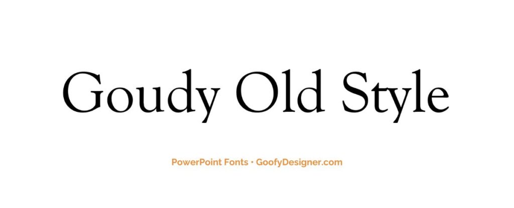
- About Goudy Old Style: Goudy Old Style offers an elegant, traditional touch to PowerPoint presentations, perfect for formal or historical topics.
3. Century Gothic
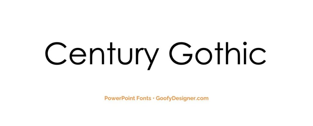
- About Century Gothic: Century Gothic, known for its clean, sans-serif design, is suitable for modern and minimalistic PowerPoint presentations requiring readability.
4. Baskerville Old Face
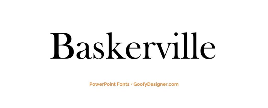
- About Baskerville Old Face: Baskerville Old Face adds a touch of classic sophistication to PowerPoint presentations, ideal for literature or history-themed slides.
5. The Serif Hand
- About The Serif Hand: The Serif Hand, with its handwritten appearance, is great for informal or creative PowerPoint presentations that aim for a personal touch.
6. Cooper Black
- About Cooper Black: Cooper Black, with its rounded, bold letters, is excellent for casual or playful PowerPoint presentations needing a friendly tone.
7. Gill Sans Nova
- About Gill Sans Nova: Gill Sans Nova, a refined sans-serif font, is versatile for both professional and casual PowerPoint presentations, offering clarity and elegance.
8. Alasassy Caps
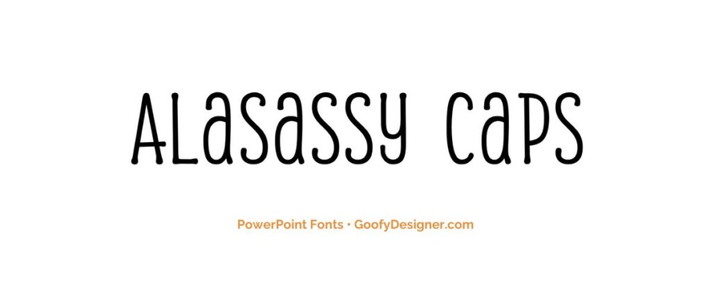
- About Alasassy Caps: Alasassy Caps, characterized by its stylish uppercase letters, is suitable for decorative titles in modern or fashion-themed PowerPoint presentations.
9. Avenir Next LT Pro
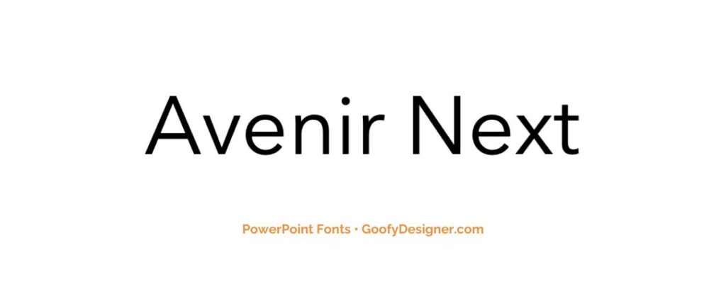
- About Avenir Next LT Pro: Avenir Next LT Pro, known for its sleek and professional look, is ideal for business or technology-themed PowerPoint presentations.
10. Century Schoolbook
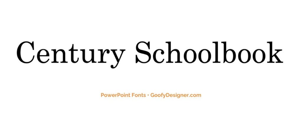
- About Century Schoolbook: Century Schoolbook, with its legible and formal style, is perfect for educational or academic PowerPoint presentations.
11. Georgia Pro
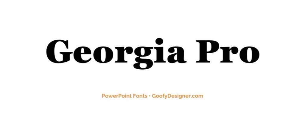
- About Georgia Pro: Georgia Pro, a serif font, offers excellent readability and a professional look, suitable for varied PowerPoint presentation topics.
12. Verdana Pro
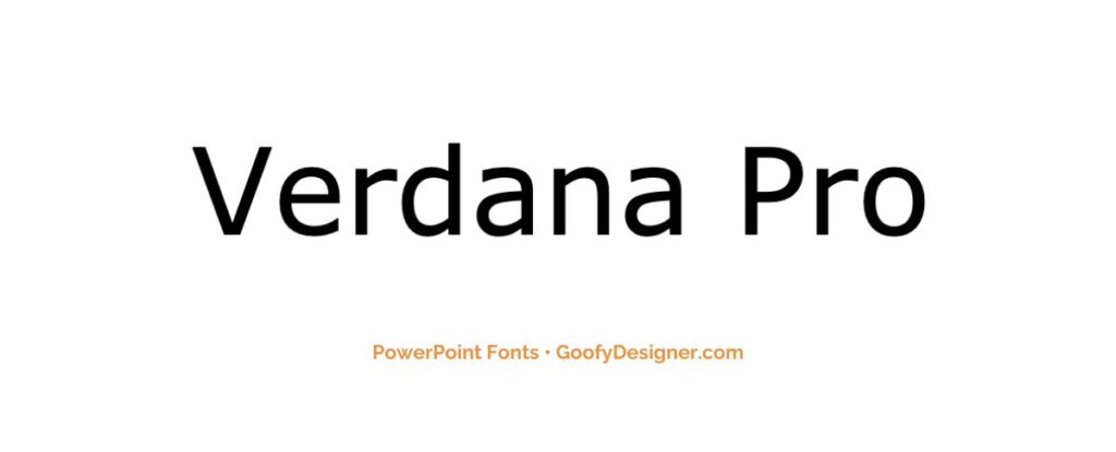
- About Verdana Pro: Verdana Pro, designed for high readability on screens, is a great choice for text-heavy PowerPoint presentations.
13. Vivaldi Italic
- About Vivaldi Italic: Vivaldi Italic, with its elegant and flowing script, is ideal for artistic or decorative titles in PowerPoint presentations.
14. Chamberi Super Display Regular
- About Chamberi Super Display Regular: This font, known for its sophisticated and impactful style, is perfect for headlines in modern PowerPoint presentations.
15. Garamond
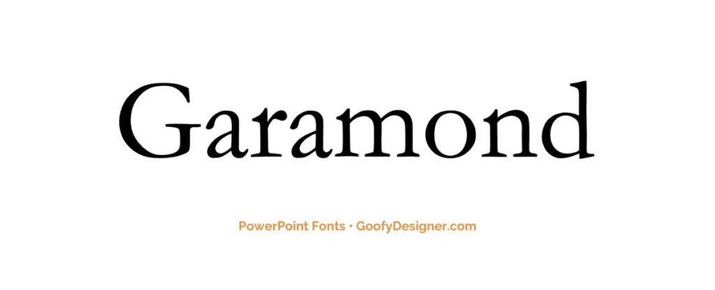
- About Garamond: Garamond, a classic and timeless serif font, is suitable for formal and sophisticated PowerPoint presentations.
16. Broadway
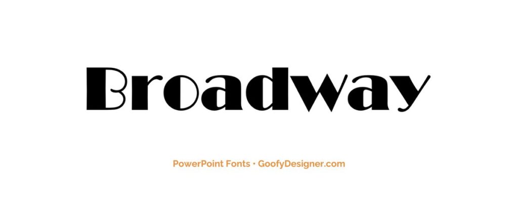
- About Broadway: Broadway, with its art deco style, is excellent for PowerPoint presentations that require a touch of retro glamour.
17. Tw Cen MT
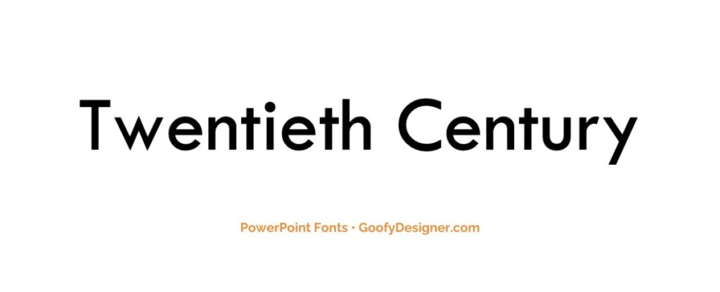
- About Tw Cen MT: Tw Cen MT offers a sleek, geometric appearance, making it suitable for contemporary and business-oriented PowerPoint presentations.
18. Gungsuh

- About Gungsuh : Gungsuh, a Korean font, is ideal for PowerPoint presentations that require an Asian aesthetic or for presentations in Korean language.
19. Mystical Woods Smooth Script
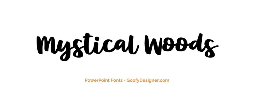
- About Mystical Woods Smooth Script: With its flowing and decorative style, this font is perfect for creative or fantasy-themed PowerPoint presentations.
20. Tisa Offc Serif Pro
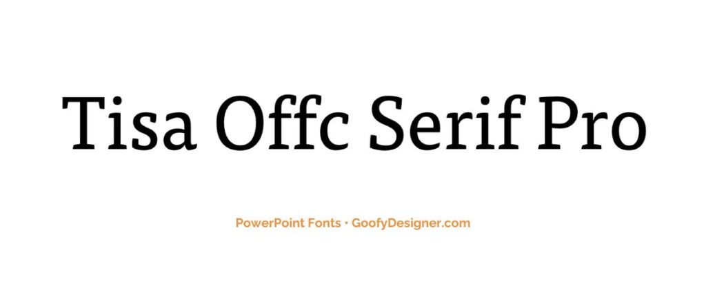
- About Tisa Offc Serif Pro: Tisa Offc Serif Pro, known for its readability and elegance, is a versatile choice for a range of PowerPoint presentation themes.
21. Britannic Bold
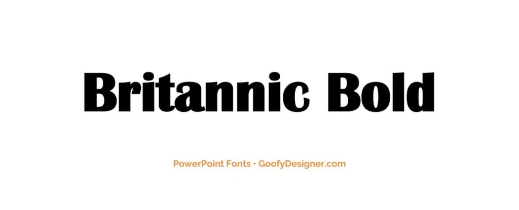
- About Britannic Bold: Britannic Bold, with its strong and assertive style, is great for headlines in business or educational PowerPoint presentations.
22. Rockwell
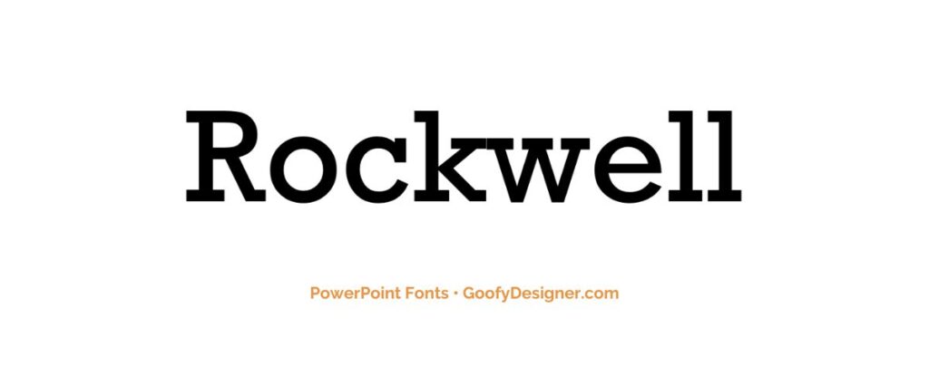
- About Rockwell: Rockwell, known for its slab-serif and sturdy appearance, is ideal for PowerPoint presentations requiring a robust and solid feel.
23. Baguet Script Regular
- About Baguet Script Regular: Baguet Script Regular, with its handwritten, cursive style, adds a personal and artistic touch to PowerPoint presentations.
24. Modern No. 20
- About Modern No. 20: Modern No. 20, featuring a sleek and elegant design, is suitable for formal and contemporary PowerPoint presentations.
25. Modern Love Caps
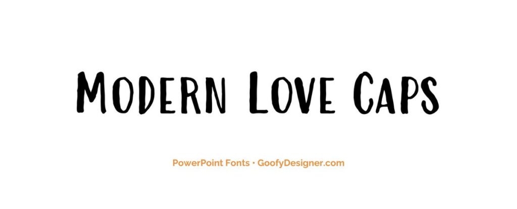
- About: Modern Love Caps, with its playful and bold hand-drawn lettering, is best suited for engaging PowerPoint presentations that aim to convey creativity and uniqueness.
Want more fonts for PowerPoint?
If you want to find more fonts and get access to milions of elements for Canva, browse my favorite site: Envato Elements .
They have all kinds of assets such as:
- Fonts (40,000+)
- Stock photos (9,3M+)
- Graphic templates (270,000+)
- Presentation templates (110,000+)
- Stock videos (5,1M+)
- Video templates (96,000+)
- 3D elements (210,000+)
- WordPress assets (6,500+)
- Royalty-free music (140,000+)
How to choose the best fonts for PowerPoint?
- Readability : Prioritize fonts that are easy to read, even from a distance. Steer clear of overly ornate or decorative fonts that may hinder comprehension.
- Consistency : Maintain font consistency throughout your presentation. Stick to two or three fonts at most to create a cohesive and professional look.
- Audience and Purpose : Consider your audience and the purpose of your presentation. Formal presentations may call for classic, serif fonts, while creative or informal presentations can benefit from more playful, sans-serif fonts.
- Contrast : Use font contrast to your advantage. Pair a bold font for headers with a more straightforward font for body text to create visual interest and hierarchy.
- Testing : Experiment with different fonts in your PowerPoint design. Test them on sample slides to see how they look in context, both in terms of style and legibility, before finalizing your choices.
What are PowerPoint fonts usually used for?
- Readability and Clarity : Fonts in PowerPoint are primarily used to ensure the text on slides is clear and easily readable, facilitating the communication of information and ideas.
- Visual Hierarchy : Fonts help establish a visual hierarchy in presentations. Different font styles, sizes, and weights distinguish headings, subheadings, and body text, guiding the audience's attention.
- Tone and Style : Fonts play a vital role in conveying the tone and style of the presentation. They can communicate formality, creativity, professionalism, or informality, depending on your choice.
- Branding and Consistency : Fonts contribute to maintaining branding consistency in presentations. Organizations often have specific fonts associated with their identity, which can be used to reinforce brand recognition.
- Visual Appeal and Impact : Fonts can be creatively employed to add visual interest and personality to slides. Unique or stylized fonts can be used for emphasis, thematic alignment, or to engage the audience's visual senses.
In conclusion, this exploration of the 25 best fonts for PowerPoint reveals a versatile range of typographic choices to enhance your presentations. Among them, three fonts shine – Impact , ideal for bold headings and capturing attention; Goudy Old Style , a timeless choice for balanced and readable body text; and Century Gothic , offering a clean and modern design to maintain professionalism. Like a painter's palette, these fonts empower you to craft impactful messages that resonate with your audience, whether you're delivering a corporate report or a captivating sales pitch, ensuring your words leave a lasting impression with a touch of sophistication and contemporary flair.

Hana Terber
Latest articles on goofy designer.

10 Best After Effects Award Show Templates (My Favorites)
Summary: In this guide, I’ve picked out 10 amazing After Effects templates for award shows that I think will really make your video projects shine.

10 Best After Effects Hud UI Packs (My Favorites)
Summary: In this guide, I’ve meticulously curated a selection of 10 outstanding After Effects HUD UI template packs that I believe will perfectly complement your

10 Best After Effects Action Vfx templates (My Favorites)
Summary: In this guide, I’ve chosen a selection of 10 outstanding After Effects action VFX (visual effects) templates that I believe will perfectly complement your

10 Best After Effects Company Profile Video Templates (My Favorites)
Summary: In this guide, I’ve carefully selected a collection of 10 excellent After Effects company profile video templates that I think are perfect for improving

Stay notified

Explore curated typefaces created by independent creatives from around the world.
30 Best PowerPoint Fonts for Powerful Presentations

Table of Contents
Last Updated on October 9, 2023
Fonts in PowerPoint are a crucial design element for creating effective presentations. Choosing the right style, size, and color is essential for readability and visual appeal. It’s important to maintain consistency throughout your slides so everything looks professional and on point.
Once you’ve chosen a typeface, ensure readability through appropriate contrast between text and background. Consider size and proper alignment, as well as formatting options like bold or italics to emphasize key points. Don’t forget accessibility and font variety so everyone can enjoy your hard work with little to no problems!
Selecting and using fonts wisely in PowerPoint is essential to enhance the overall quality of your presentation. Prioritize readability and uniformity while aligning font choices with your content and audience. This creates an impactful, visually pleasing slide deck.
Best PowerPoint Fonts for Your Next Presentation

This sophisticated modern typeface from Yukita Creative is an excellent choice for fashion -oriented projects. Its graceful, slender letterforms lend themselves beautifully to branding and logo design.
With its low legibility height, it’s equally suitable for web design, advertising, and various communication materials. Supports 37 languages and includes OTF , TTF , and WOFF files.
Download Gullia
2. Oliviar Sans Italic Family

Inspired by geometrical fonts and humanist sans serifs, this font family by Adam Fathony consists of 7 styles ( Thin , Ultralight, Light, Regular, Semibold, Bold, Black) and different weights (from Thin [100] to Bold [900]). Ideal for minimalist and brutalist themes.
Download Oliviar Sans Italic Family
3. GROTESKA

With influences from popular Swiss designs, this minimal sans- serif from Designova is clear and spartan by nature . You will get a total of 14 fonts spreading between 7 weights, featuring 7 uprights and matching italics for each weight. There’s also extended language support for your convenience. Contains OTF , TTF , and web fonts (all EOT, SVG, WOFF included).
Download GROTESKA
4. Ethos Nova

Introducing this sleek, neo- geometric sans- serif typeface family comprised of12 meticulously crafted fonts. Designed with precision and equipped with robust OpenType features, each weight offers extensive language support, encompassing Western European and Central European character sets, totaling 312 glyphs.
Whether you’re working on graphics, text presentations, websites, print materials, or corporate identities, this versatile typeface will deliver clean, minimalist results that wow!
Note: try increasing letter-spacing for uppercase characters when designing logos, labels, and headlines.
Download Ethos Nova

This functional modern-grotesk font from UnioCS was inspired by the aesthetics of 1950’s Swiss rationalism. Featuring a monolinear solid design and a fusion of sharp and rounded curves, it presents a fresh take on the classic grotesque style while maintaining exceptional legibility – even when used in small sizes.
Rooted in rationalist principles, its style highlights its balanced variations. Ideal for anything requiring a professional flair, such as book covers, business cards, PowerPoint presentations, and logos.
Download Argon
6. Sherika Font Family

Simple , legible, and warm, this sans serif font family from Seniors_Studio consists of 7 weights plus matching italics. The download file contains 14 styles (7 uprights and matching italics), 232 glyphs, and OpenType features, together with ligatures.
Download Sherika Font Family

A neo- grotesque typeface exuding a clean, enduring aesthetic . Ideal for crafting logotypes, branding elements, headlines, corporate identities, and marketing materials across web, digital, and print platforms.
By adjusting letter spacing, it can transform into the ideal choice for creating minimalistic headlines and logotypes. Pack contains 300 glyphs, handcrafted OpenType features, and extended language support.
Download Helixa
8. Univa Nova

Drawing inspiration from the Swiss design heritage, this font pays homage to the original branding projects that defined an era. It works great for an array of creative applications, including graphic design, text presentation, web development, print materials, and display purposes.
You will receive a total of 16 fonts having 8 weights (Hairline, Thin , Light, Regular, Medium, SemiBold, Bold, Heavy ) as well as Italic versions of each weight.
Download Univa Nova
9. JUST Sans

Warm, open, and expressive, this geometric typeface features open characters, a generous width, and an elegant contemporary feel with sharp, angled terminals.
Don’t underestimate its minimal aesthetic : it’s a workhorse with 7 weights, complete Latin extended language support, accurate hand-adjusted kerning , and a variable version for maximum adaptability.
Aside from legibility on displayed on screens, feel free to apply this endearing font on logos, headlines, paragraph text, user interfaces (UI), signage , packaging, posters , new media, architecture , and fashion .
Download JUST Sans
10. Architect

Meet this engaging digital typeface from epdesigns . Inspired by the nostalgic charm of early personal computers. This font is tailor-made for creating impactful headlines, logos, layouts, and content, adding a touch of retro appeal to your designs.
Architect effortlessly complements a variety of fonts, making it a versatile choice that seamlessly integrates with any project you’re working on.
Download Architect

Embodying confidence, showmanship, and speed, this bold racing font is all about limitless creative potential. From crafting logos and flyers to designing posters , headlines, sports -related materials, and even dynamic video content – let it fuel your concepts with energy and flair.
Download Pulse
12. Mammoth

If you’re tackling mammoth projects, look no further than this generously proportioned sans- serif . It offers both Regular and Outlined versions, along with lowercase letter options for each, allowing you to create original, attention-grabbing works.
From branding, photography, event invitations , to inspirational quotes , blog headers, posters , ads, and web design, this versatile typeface will be your go-to choice moving forward.
Download Mammoth

Looking for an elegant sans serif with incredible versatility? This typeface will not only capture attention but also elevate your works to new heights. Its applicability extends to fashion , packaging, branding, magazine layouts, headlines, social media posts, invitations , etc..
Plus, it boasts a collection of exquisite ligatures that will infuse charm into your designs!
Download Oyster

Inspired by the iconic magazine ads of the 70s and 80s , this font is set to become your ultimate choice for marketing, advertising, editorials , and branding. Craft attention-grabbing headlines that call for meticulous tracking. Download contains upper and lowercase letters, ensuring brilliant performance in both spacious and compact layouts.
Download Gnarly
15. Spring Melody

Featuring elegant curves, precise kerning , and sharp edges, this humanist typeface comes highly recommended for crafting vintage-inspired concepts.
Try it on branding, packaging, social media visuals, wedding invitations , ad materials, and editorial layouts. With its unmistakable charm, this typeface is sure to imbue your creations with a touch of extravagance!
Download Spring Melody

Take a captivating journey – not just for yourself but also for your audiences – back to the vibrant spirit of the 60s and 70s with this bold retro serif .
What distinguishes it are its gentle, rounded corners and delightful, flowing curves. Tailor-made for modern-day designers, you will find that you can’t get enough of all things vintage after using it!
Download Rolla
17. Grayson

This art deco typeface was influenced by the stylish store signs that adorned the streets of London, New York, and other bustling metropolises during the 1940s .
With its clean lines, effortless readability, and unforgettable letterforms, it’s an ideal choice for branding. The font pack includes both OTF and TTF versions, ensuring flexibility and ease of use.
Download Grayson
18. Isabella

Minimalist, elegant , and pristine – this modern sans radiates sophistication. Allow it to grace your logos, titles, and invitations , among others. It also complements script typefaces seamlessly, allowing for flexible design combinations.
The pack contains an extensive set of features, encompassing uppercase and lowercase characters, ligatures, alternates, numerals, as well as a rich assortment of punctuation and symbols.
Download Isabella
19. Redhawk

Let the details speak for itself in this cutting-edge futuristic font tailored for sci-fi and tech-themed projects. The possibilities are as limitless as the future it represents. With its minimalist aesthetic and unique letterforms, it’s fitting for a wide range of applications, such as labels, posters , branding, cinematic works, magazines, packaging, books, and video games.
Download Redhawk
20. Golden Hooge

This typeface from Aqeel- Art draws inspiration from the renowned minimalist logo design. With it, you can effortlessly craft beautiful templates, brochures, videos, advertisements, branding materials, logos, invitations , and more. PUA Encoded and includes multilingual support. Compatible with Adobe Illustrator, Adobe Photoshop, and Corel Draw.
Download Golden Hooge
21. Basted Club

With influences from the typography style of old nightclubs, this vintage font family exudes a classic appeal with its robust, steadfast letterforms. Comprising of Regular, Medium, Semi Bold, Bold, and Black variations, this font is a versatile choice for tackling anything that needs a clean but bold visual impact. You will get OTF and TTF formats.
Download Basted Club
22. Next Sphere

Andikafezco gives you this super extended, futuristic display font family in 9 styles ( Thin , Extra Light, Light, Regular, Medium, Semi Bold, Bold, Extra Bold, and Black). Combine 2 or 3 looks to see impressive results. It’s best used on themes that focus on sci-fi , high- fashion , architecture , brutalist , tech, and spartan vibes.
Download Next Sphere
23. Twinton

Crisp and minimalist, this unique font is handmade for contemporary designs. Crafted for maximum legibility, it allows your content to make a bold statement with ease. You’ll be confident showing it off on headlines, business cards, thumbnails, social media graphics, posters, and cover designs. Use it to elevate your design game today.
Download Twinton

A captivating serif display font that absolutely refuses to blend into the background. Unlike fonts that opt for subtlety, this bold, dynamic font radiates extroverted energy.
You’ll have access to both Bold and Regular variations for convenience. It’s an excellent choice for wedding invitations , magazine layouts, book covers, packaging designs, websites, user-friendly mobile apps, logos, and more.
Download Avalar

Presenting a contemporary yet refined font characterized by its sleek lines and graceful curves. With 6 different weights, it introduces timeless beauty and sophistication – be it branding, web design, or print. Its exceptional legibility renders it appropriate for both display and body text, so you achieve clear and poignant communication.
Download Amenti
26. Estrella

With its graceful curves and precise lines, this contemporary sans serif will inject a touch of sophistication into any project. You can’t go wrong with its professional and polished aesthetic that comes in 6 weights ( Thin , Light, Regular, Medium, Bold, and Black).
And because it remains legible whether used on headlines or body text, you can rest easy knowing your logos, websites, business cards, posters, and editorials are in good hands. Sleek, stylish, and highly elegant , it will surely set your work apart from the competition.
Download Estrella

Boasting a contemporary, exquisite, and uncluttered look, this modern typeface will definitely add a sense of whimsy into every project. Its fresh, straightforward lines imbue a timeless quality, while its graceful curves deliver a distinctive visual allure.
It’s ideal for branding, product packaging, websites, and logos. However, feel free to experiment and see just where this typeface will take you!
Download Wanafi
28. Endzone Express

Don’t settle for the ordinary when you can have this sporty serif . amp up your game and get ready to express your active, bold side with its geometric lines and thick , robust presence.
See it perform its best on team jerseys, motivational posters, and sports -themed branding materials. Unleash your creativity with this exceptional font that perfectly embodies the essence of triumph!
Download Endzone Express
29. Northura

Challenge your perception of conventional typography with this ultramodern sans- serif . With a staggering variety of 30 weights, it seamlessly blends minimalism, aesthetics, and readability, providing you with precise control over your design.
While it excels in minimalist and futuristic contexts, it’s also an excellent option for contemporary, travel , business , and sports -related projects.
Download Northura
30. Overdrive

Give your works the feel of Italian racing using this automobile-inspired font. Radiating sheer elegance, it provides generous spacing for use on logotypes, headlines, presentations, and promotional materials. It will also look gorgeous on minimalist and science-fiction themes. Get it today and rev up your imagination!
Download Overdrive

Posted by: Igor Ovsyannykov
Hello, I am a seasoned Graphic and Type Designer, boasting a distinguished career spanning over 16 years in the creative industry. During this time, I have meticulously crafted hundreds of innovative designs and iconic logos, leaving a lasting impact on various brands. My expertise lies not only in the aesthetic creation of visuals but also in understanding the profound significance of selecting the perfect font to embody a brand's essence. This unique blend of skills has enabled me to transform mere ideas into powerful visual identities, making me a trusted and respected figure in the design world.
Best Fonts for Presentations in 2023
Even if you’re not a graphic design geek, you can probably recognize and name a few of the world’s most famous fonts. Times New Roman, for example, will be familiar to anyone who used Microsoft Word in the early 2000s. The playful rounded letters of Comic Sans have been much maligned on the internet, while the spindly lines of Papyrus have been used to great effect in every childhood project about Ancient Egypt.
Helvetica is familiar from its use by a wide range of brands, including American Apparel and Jeep as well as being used extensively on Apple software. Arial is the default font of Google Slides and Docs. And while most people probably don’t know it by name, the font Gotham has been much used in politics and advertising after its use in branding by the 2008 Obama presidential campaign.
This is all to say that even though people may not think of themselves as font enthusiasts, your presentation font choice absolutely matters. The fonts you use are a subtle but powerful visual cue that can be used to complement your presentation and effectively convey your message. While a unique and fun typeface can help you grab your audience’s attention, a more familiar font can convey authority and expertise.
In the increasingly visual and video-based culture of 2023, where TikTok is the world’s most downloaded app , and Instagram has more monthly users than Twitter, getting your slides’ appearance right is just as essential as perfecting your script. So, which font choices can help your presentation hit the mark ? Here are the best fonts for presentations in 2023, as well as the ones to avoid.
But first, a note of serif and sans serif
Serif and sans-serif fonts are the two main categories you’ll need to consider when designing your presentation template . Despite the fancy names, the difference between the two is very simple.
Serifs are the elegant flourishes at the ends of letters, modeled on the way a paintbrush flares out when painting letters. Used extensively in print, these can sometimes be harder to read on a digital screen because of the additional detail. However, digitally optimized serif fonts can look amazing in presentations as titles or body text because of their elegant and classic look. Examples of well-known serif fonts include Times New Roman, Georgia, and Garamond.
Sans serif is the French term for ‘without serif.’ Sans serif fonts do not have these fancy flourishes; they became widespread on digital screens because their simpler design was easier to render in pixels. Sans serif fonts look modern, clean, and simple, making them a great choice for the body text of your presentations. Well-known examples of sans serif fonts include Arial, Lato, Helvetica, Calibri, and Verdana.
Don’t worry — you don’t have to pick just one type of font and stick to it. In fact, using sans serif fonts for titles and serif fonts for body text, or vice versa, can look stylish and cohesive in your presentation. A good technique is to pick one serif font and one complementary sans serif font to make your presentation design pop.
Yes, it’s a classic, but it’s a classic for a reason. Arial is so commonly used and well-known that it projects instant familiarity and authority. It looks clean, clear, and persuasive at any font size. Most importantly, it doesn’t distract from what you’re talking about.
Best for: Instructive presentations such as internal company workshops or training sessions. If you’re teaching people a new skill or informing them about policy changes or important information, a clear and easy-to-read font like Arial is ideal.
Add it to your template as: Body text.
What this presentation font says about you: You’re trustworthy and know what you’re talking about. Questions will be taken at the end.
League Spartan
Approachable, fun, and a little bit trendy without trying too hard, League Spartan gives your presentation a fresh and youthful appearance. Sans serif typeface in your titles adds visual interest to your slides, especially when fashioned in your brand colors.
Best for: Welcome and onboarding presentations, progress updates, and informational presentations.
Add it to your template as: Eye-catching titles and attractive sub-headings.
What this presentation font says about you: You’ve got important information to share, but you’re not afraid to have a little fun as a presentation maker.
Lovelo Black
Bold and attention-grabbing, the thick strokes and all-caps letters of Lovelo Black make it the perfect sans-serif title font. This typeface looks great on a slide deck with lots of pictures and minimal text, drawing the focus to the screen. Alternatively, if you’re feeling a bit funkier, why not try Lovelo Line for a distinctive line-based version of the font?
Best for: Image-based presentations, marketing pitches, and storyteller-style presentations.
Add it to your template as: Big, bold titles.
What this presentation font says about you: You’re ready to inform and entertain your audience.
Another of those famous fonts that shows up everywhere, Montserrat has a modern appearance that looks great on screens. Fun fact: Montserrat was inspired by signage and posters in Buenos Aires and is often used in design and marketing materials.
Best for: Pitches, sales proposals, video resumes, and inspirational presentations.
Add it to your template as : titles or body text — it looks great either way!
What this presentation font says about you: You’re modern and with it. You’ve got a great eye for design, and this presentation is evidence of that.
De Valencia
Minimalist yet elegant, De Valencia is a distinctive typeface that works best when splashed across your slides in large font sizes. The tall, well-defined letters with large spaces between them make a great title slide that will catch your audience’s eye.
Best for: Motivational and inspirational presentations.
Add it to your template as : short titles — don’t overwhelm your slide with too much of this font.
What this presentation font says about you: You’re thoughtful and creative, appreciating a touch of flair to your presentations. Your audience will walk away feeling uplifted and inspired.
Cabin Sketch
In contrast to the minimalist design of De Valencia, Cabin Sketch can only be described as maximalist. This fun, hand-drawn style title font looks informal and friendly when used correctly. If you’re looking for a font that keeps it casual or is appealing to a younger audience, Cabin Sketch is the one for you.
Best for: Informative and educational presentations aimed at a younger or mixed audience.
Add it to your template as Titles and subtitles. Keep the color scheme simple, or your presentation will end up looking too messy.
What this presentation font says about you: You’re approachable and fun; come say hi after the presentation!
Fonts to avoid in 2023
Using Comic Sans in your deck just screams ‘2007 school project PowerPoint presentation’. It’s not the fault of this playful rounded typeface, but unless you’re creating a presentation for small children, it’s a definite no-no.
If you’re looking for a child-friendly handwriting style font that isn’t a total cliche, try Schoolbell or Shadows into Light. Both convey that informal handwritten feel; these add more visual interest than boring old Comic Sans.
There’s a reason that Impact is sometimes referred to as ‘the meme font.’ Its use in the 2000s and 2010s internet memes has sadly made Impact font unusable in 2023. Sure, it’s eye-catching, but Impact will make your presentation appear totally outdated and low quality — not a good look!
For a similarly bold and attention-grabbing font that hasn’t been beaten to death by the internet, try Beethoven or Chunky. These stylish fonts are loud and fun, keeping your presentation informal while still looking high-quality and well-designed.
Times New Roman
So named because it was commissioned by the Times newspaper in the 1930s, Times New Roman is a classic serif font that can look great both on screens and in print. However, its use as a Microsoft default font has forever led to it being associated with the word processor. Using Times New Roman in your presentation risks making your deck look unfinished, as though you made it in PowerPoint and forgot to change the typeface to something better. It’s a shame, but outside of printed newspapers, there’s no use for Times New Roman in 2023.
A better serif font to use in your presentations is Playfair Display or Poppins, two gorgeous, glossy typefaces that add a touch of that old-school luxury to your titles.
Perfect your own presentations with Powtoon
Looking to create a beautiful presentation in minutes? Powtoon is a free presentation maker with a wide range of presentation templates to suit every occasion, from proposals and value propositions to onboarding and training templates. Put together by our expert designers with stunning layouts and fonts, the templates allow you to easily customize the text, color schemes, images, and animations. To get started, sign up for your free account today and start making amazing video content for presentations, social media, and more!

- Latest Posts

Hanna Abitbul
Latest posts by hanna abitbul ( see all ).
- The Best 13+ AI Video Editors of the Year - February 22, 2024
- 10+ Best AI Video Generators of 2024 [Complete Review] - February 22, 2024
- Boosting L&D ROI with Associative Learning: 5 Effective Strategies and Best Practices - November 14, 2023
- How AI-Infused Personalized Learning Content Can Enhance Employee Knowledge Retention - November 12, 2023

The Ultimate Guide to Make an Animated Video for Your Brand

7 Steps to Creating Better Animated Video Presentations in 2022

The Best AI Tools to Elevate Your Presentations

A beginner’s Guide to Becoming a YouTube Video Editor

Presentation Summit Sweepstakes — Turn Your Presentation into a FREE PASS!

Common Presentation Mistakes to Avoid

Thank you for your interest in Powtoon Enterprise!
A solution expert will be in touch with you soon via phone or email.
Request a demo
By submitting, you agree to our Terms of Use and Privacy Policy.
- Ad Creative Eye-catching designs that perform
- Social Media Creative Engaging assets for all platforms
- Email Design Templates & designs to grab attention
- Web Design Growth-driving designs for web
- Presentation Design Custom slide decks that stand out
- Packaging & Merch Design Head-turning apparel & merch
- eBook & Digital Report Design Your digital content supercharged
- Print Design Beautiful designs for all things printed
- Illustration Design Visual storytelling for your brand
- Brand Identity Design Expertise & custom design services
- Concept Creation Ideas that will captivate your audience
- Video Production Effortless video production at scale
- AR/3D Design New creative dimensions that perform
- AI-Enhanced Creative Human expertise at AI scale

Best PowerPoint Fonts To Make Your Presentations StandOut

The foremost purpose of your presentation is to communicate your thinking to your audience effectively. To keep the audience engaged in your presentation, believe it or not, the Presentation font selection also plays a significant role. The fonts create the tone and atmosphere of the presentation. PowerPoint Fonts have the power to enhance or dampen your communication considerably. Fonts are like non-verbal expressions of written words. You can make your words look bold and confident or shaky just by the choice of your fonts in presentations . You can actually produce deep and powerful impressions using presentation fonts .
In a nutshell, you don’t want your audience to be distracted from the topic just because of the font selection. Right? So what should you be taking care of in font selection while designing your next winning presentation ? Let’s learn more about professional presentation fonts for winning over your audience:
Points To Avoid While Choosing Presentation Fonts:
Overuse of certain presentation fonts.
Initially created for The Times newspaper in 1929, Times New Roman became the new default font for many MS Office Apps, and it is overused since then. Just like Times New Roman, Arial has been a default font for Windows for many years; this reason is enough to justify why Arial is one of the most boring fonts. We are tired of seeing these presentation fonts almost everywhere. You don’t only have to choose the font that fits your business and the presentation topic, but also need to make sure that you avoid all of the common options. Our attention span is decreasing very fast; we get bored very fast. If your content is not attention-grabbing, you can’t engage your audience. Move away from the defaults; use different cool presentation fonts , there is so much more out there.

Use Of Cool Fancy Fonts
Although it might look fancy to look at cool presentation fonts , they considerably reduce the readability of your content. Handwriting-style fonts such as Mistral and Viner Hand can be fun to use; however, they can make your slides look unprofessional. Similarly, some best fonts for a presentation such as Comic Sans are more appropriate for content prepared for children rather than for professional presentations . Your audience in the back row relies on the slides to help them understand what you’re talking about, the corporate presentations are why you should avoid tiny presentation fonts like Brush Script or Bradly Hand. Most of us should try to stick to the basics when it comes to font styles. Make sure you keep it simple and formal!

Use Of Obvious & Boring Fonts
Helvetica Neue typeface was proudly used by widely-known companies such as Apple, Nasa, and BMW because it worked for them. The problem is that Helvetica is a thin-weight font, and when shown in smaller point sizes, its curves break up. Kerning is the space between two letters based on their shape. Too little space makes the professional presentation fonts unreadable because the letters are smushed together. Unfortunately, Helvetica uses kerning to distort words, making the text difficult to read by randomizing the spaces between characters. Using this professional presentation font in your presentation won’t bring any extra value.

Misuse Of Shadow
Many people use shadows on their text to make it stand out. However, when you use shadows, the text looks blurry and dirty. It’s always better to avoid shadow, especially for PowerPoint presentations . But if you are a fan of text-shadow and still want to use a drop shadow on text, only use it on the header and never in the body. Also, consider using a dark background with white bold text for better visuals.
What are the best fonts for a presentation?

Use Best PowerPoint Fonts – Verdana and Georgia
Designers at Microsoft deliberately crafted Verdana for use on computer screens. This is considered one of the cool presentation fonts . The letters are widely spaced, and lowercase letters are tall, making this font extremely readable. Verdana makes it a very safe bet when you know that your presentation will appear on different devices. It is also not overused making it the best font for a presentation to make the content look appealing and readable To effectively showcase numbers in the PowerPoint presentation , Georgia is a great serif option offering lowercase numbers, which are also a Windows standard font. Therefore this is amongst the best presentation fonts when showcasing numbers.
Make Your Presentation Fonts Readable
Creating your presentation using some cool presentation fonts will make your audience focus on the design rather than the message that you want to deliver. Also, it would reduce the readability of your content. Therefore choose professional fonts that allow your readers to focus on the message . It would help if you effectively format your text on the slides so that they don’t look too busy. The use of proper line spacing and margins can increase the readability of the content . Effective use of bullet points and indentation can make your slides look neat.
Stick To Grayscale For Fonts In Presentation
Studies have shown that different colors have different impacts on the mind and evoke mixed feelings in many people. It would be best if you keep that in mind while creating a presentation since you want to avoid colors that might negatively impact the message you are delivering. Pro Tip: It is always safe to use grayscale in your presentation as they look professional.

People Are Also Reading:
- The One Color To Never Use In Your Presentations Is
- Exploring The Power Of Gardner’s Theory Of Multiple Intelligences
- 6 Tips For Excelling In Executive C Level Presentation
- 9 Types Of Infographic Templates To Make Effective Presentations
- Best Marketing Plan Templates To Build A Winning Marketing Presentation

Privacy Overview
Necessary cookies are absolutely essential for the website to function properly. This category only includes cookies that ensures basic functionalities and security features of the website. These cookies do not store any personal information
Any cookies that may not be particularly necessary for the website to function and is used specifically to collect user personal data via ads, other embedded contents are termed as non-necessary cookies. It is mandatory to procure user consent prior to running these cookies on your website.
10+ Best Fonts for Presentations in Powerpoint 2023

Design choices for PowerPoint presentations. The colors, icons, photography, and illustrations you use all contribute to the overall style of your presentation. This also includes the fonts you use. It is essential to choose the best font for presentations that align with the rest of your design and conveys the right message. The right font can significantly impact your presentation’s overall look and feel. Finding the Best Fonts for Presentations can take time and effort, considering many factors. But with this list, you’ll be sure to find the perfect and best Presentation Fonts For Powerpoint.
Table of Contents
List of Best Fonts for Presentations
Following is the list of best font for presentations:
Lato is a sans-serif font family designed by Łukasz Dziedzic. It was released in 2010 through the Polish foundry typoland.com. The family contains six weights:
- Hairline
- Ultra Black
The hairline and ultra-black weights are not as widely supported as the other.
Lato’s name means “summer” in Polish. The designers have said that they wanted the font to evoke the warmth of summertime.
The Lato family has been used by companies such as Google, Microsoft, and Apple Inc. Google’s Android operating system uses the Lato font for its user interface. Microsoft’s PowerPoint presentation software also uses Lato as its default sans-serif font. Apple Inc.’s Pages word processing software uses Lato for body text.
Lato is available under the SIL Open Font Licence, which can be used for personal and commercial purposes without restriction. The license allows for modification and redistribution of the font.
- Open Sans
Another great font that works well for PowerPoint presentations is Open Sans. Since there is some space between the lines, it is easy to read. It’s the best choice if you have long paragraphs that you can’t break up with bullet points. Since it’s a standard font for PowerPoint, you probably already have it in your font library.
Candara is not a font you see every day. Since it is proprietary, you can’t use it in Linux or on the web. However, you can use it in PowerPoint. What makes it interesting are the curved diagonals, which give it more personality.
Tahoma is a very formal font made for Windows 95. It works well for business presentations. It’s a clear and easy-to-read font that can help keep things from getting confusing. This makes it great for formal exhibitions that need to be precise.
Garamond is not a specific font name but a font style. You may have heard of Adobe Garamond, Monotype Garamond, and Garamond ITC as some examples. All of these fonts are a little bit different, but they all come from the work of Claude Garamond. He made the first punch cuts in the 1500s, which makes Garamond fonts some of the oldest.
Before Claude Garamond’s work, fonts were made to look like scribe’s handwriting. On the other hand, Garamond’s typefaces were made in the Roman style, with the letters ascenders being straight and the crossbar of the letter ‘e’ being horizontal instead of slanted like earlier calligraphic fonts.
The letters were made this way to make them easier to read in print. This is why Garamond fonts are so good for body text. Garamond fonts have been used outside of the image in the logos of many brands, such as Rolex, Abercrombie & Fitch, and tech giants Google and Apple. Adobe Garamond is such a good choice that the entire Harry Potter series is printed on it.
Because Garamond fonts have a long history and are easy to read, you can be sure that they will add a timeless elegance to your slides while keeping the text easy to read.
Hermann Zapf came up with the idea for Palatino in 1949. Palatino is a typeface based on the style of the Italian Renaissance. It was named after the master calligrapher Giambattista Palatino, who lived at the same time as Claude Garamond.
Zapf made Palatino so it could be used in headings, ads, and printing. More specifically, it was made so that it could be read even if printed on cheap paper, made small, or looked at from far away.
Palatino Linotype is the font version that comes with Microsoft PowerPoint products. It has been slightly changed from the original version to look best on screens. Book Antiqua, also one of Microsoft’s default fonts, looks a lot like Palatino Linotype and is almost impossible to tell apart.
Matthew Carter made Verdana in 1996 for Microsoft. It was made to look good on computer screens. This font is very easy to read, even at small sizes, because the letters are far apart and have expansive counters and tall lowercase letters.
Verdana is another font that is almost always used. Since it was made, it has been included in all versions of Windows and Office. According to a survey, it can be found on 99.7% of Windows computers and 98.5% of Macs.
On the one hand, this makes it a very safe bet because you can almost be sure that your presentation will look the way you want it to on all devices. On the other hand, you might stand out less than you’d like.
But you can’t argue with how easy it is to read. Verdana is an excellent font for small text, like footnotes, references, and disclaimers, so they are easy to read. Or, if you want to play it safe, choose Verdana. Its simple, easy-to-read characters will keep your audience’s attention on what you say, not your font.
Whitney is a great font that will make your presentation stand out. Whitney can be used for header and body text, but we find it too busy for PowerPoint paragraphs. You can choose between Whitney Narrow and Whitney Condensed.
Oswald is a good sans-serif font in three styles: light, regular, and bold. It has some modern elements and a classic gothic style, which makes it an excellent choice for PowerPoint presentations.
If you’ve used a Windows computer, Skype, an Xbox 360, or even the Microsoft logo, you’ve seen a font from the Segoe family. Microsoft’s logos and marketing materials are made with Segoe fonts, and since Windows Vista, Segoe UI has been the default font for the operating system.
This is because it is so simple and easy to read on a screen. Like Verdana, Segoe fonts look great on screens and in small sizes. They are warm and inviting while still having technology’s airy, progress-oriented feel.
On the other hand, Segoe fonts are great for titles and headers, unlike Verdana, which has a lot of space between the letters and thicker ones.
The many symbols and icons that come with the Segoe font family are another fun thing about it. From PowerPoint’s insert tab, click the logo, change the symbol font to either Segoe UI Symbol or Segoe UI Emoji, and be amazed at how many characters you can choose from.
Almost any sign you could want is probably in there. There are shapes, arrows, musical notes, mathematical notation, scientific notation, animals, buildings, food, Mahjong tiles, Fraktur letters, and I Ching hexagrams…
So, the Segoe font family is an excellent choice for easy-to-read body text, elegant and light headers, and a quick and easy way to add any icon to your presentation.
- The Franklin Gothic
What is it about a font that makes it “gothic”? Franklin Gothic has nothing to do with bats in bell towers or doomed lovers wandering the Yorkshire moors. Well, it’s confusing that “Gothic” can mean two very different things when talking about fonts.
Sometimes it means a blackletter font in the style of the Middle Ages, and sometimes it means a clean, geometric, sans serif font that became popular in the early 19th century. And Franklin Gothic is definitely in that group.
Franklin Gothic is a classic American font made by Morris Fuller for the American Type Founders in 1902 and named after the American printer and Founding Father Benjamin Franklin. It has been called “square-jawed and strong-armed, yet soft-spoken.”
With its wide range of weights and widths and exciting design details (check out the uppercase Q and lowercase g for beautiful, unusual curves and the uppercase A and M for slightly different line weights), Franklin Gothic will look solid and friendly as your headings and classy and readable as your body text.
It depends on you. The Adobe Font Family has a great font called Europa. It’s a modern geometric sans-serif font that works well with other Adobe fonts but can also be used with other companies.
Roboto is one of the most helpful web fonts because it comes in 6 different styles. It’s the default font for Google Maps, and it’s called a “grotesque sans-serif.” It works well for short readers but could be better for titles. It’s great for body texts where scanning is critical because it’s easy to read.
Giambattista Bodoni was a master printer who lived and worked in the Italian city of Parma at the end of the 18th century and the beginning of the 19th century. Like Garamond, Bodoni is not a single font but a family of fonts based on the work of a master typographer from hundreds of years ago.
Bodoni and a French typographer named Firmin Didot were the ones who came up with the “New Face” style of lettering, which is made up of lines that are both very thick and very thin.
If you’ve ever looked at a fashion magazine, you’ve seen this at work. The names of Vogue, Harper’s Bazaar, and Elle are all written in a font called Bodoni. These fonts are used so often in fashion graphic design that they have become shorthand for the elegance and sophistication that the fashion world admires.
Bodoni fonts could be a stylish and sophisticated solution if you need to layer text over photos. People have compared the sharp edges and smooth curves of these fonts to the precise geometry of fabric patterns, and their delicate, graceful shapes give them a sophisticated femininity.
Because they are so soft, these fonts are also great for putting over photos. On the covers of fashion magazines, you can see that the titles are still there, but they don’t take over the picture. You can use this to affect your designs significantly.
Bodoni fonts will give your design an instant air of effortless, timeless elegance. They work best in large headings where different line weights will impact the most.
Bodoni himself wrote that “conformity without ambiguity, variety without dissonance, and equality and symmetry without confusion” are the things that make a type beautiful. Bodoni fonts have many of these things and are some of the most beautiful fonts you can use.
Bebas Neue is one of the best fonts for headers in PowerPoint. It has five font weights, which is a good number. Bebas Neue, on the other hand, only comes in capital letters, so there are better choices for body text. Think about this before using the font.
- Show Fairness
Most of the characters in this font stay between the baseline and the X-height. This means that most letters stay within the line. Many fonts that try to have the “box look” are hard to read from far away.
Playfair Display avoids this problem by giving the stems of their letters different thicknesses compared to the arms and other extensions. This makes the letters stand out more.
Playfair display is a classy and elegant font made for titles and headers. You can still use it in paragraphs, but you should use it only in shorter text parts.
Some people need clarification to read words that are all the same size and have the same amount of space between them. So, think about using Playfair Display as the font for your presentation’s titles, quotes, and subtitles.
How do you choose the best font for presentations?
Want to make your next presentation more interesting? One way to do this is to choose a font that stands out or is interesting. But there are so many fonts out there. How do you pick the best font for presentations?
When choosing a font for your presentation, here are a few things to consider:
- What is your presentation about?
If you want your presentation to be fun or lighthearted, you can be more daring with your chosen fonts. Choose a more subdued font if you’re giving a severe presentation on a sensitive subject.
- How do you sound when you talk?
You should pick a font that fits the mood of your presentation. Is it a casualor formal event? Are you creative or professional?
Your audience. Think about who you’re writing for and what might interest them. If you’re giving a presentation to a group of designers, they may like it if you use a more creative font. But if you’re giving a presentation to a group of business leaders, they might want a more traditional font.
- How long will your Speech be?
If you’re giving a long presentation, choose a font that’s easy to read. That means you should avoid fancy, script, and decorative fonts that could be hard to read on a slide.
- How does your presentation look as a whole?
Once you’ve chosen a font, step back and look at your presentation. Make sure the font you choose goes well with the other parts of the design.
Choosing the right font for your presentation can distinguish between a boring slideshow and an attractive, visually appealing presentation. You can select a font that will make your presentation look its best by thinking about its topic, tone, audience, and length.
Our blog has shown you that choosing the best fonts for presentation that can help you reach the goal of the display. We recommend you the best font generator ( Fontgeneratorapp.com ) for using the Best Presentation Fonts. These good fonts for presentations are professional and stylish, so using them in your PowerPoint slides can make the whole production look more professional. Visual Spiders can help you make presentations that get people’s attention. Never be afraid to contact us if you need help with the best font for PowerPoint presentations.
You May Also Like
20 Best Canva Font Pairings
35+ Cute Bubble Fonts You Love to Download
Featured post

Fontgeneratorapp VS LingoJam Font Generator

15 Best Google Font Pairings That Every Designer Should Know

Fontgeneratorapp VS Picsart Font Generator – Which Font Maker is Best?
Today posts

The Master Guide to Font Psychology

15+ Free / Premium Nautical Fonts for Unique Design Projects

15 Best Fonts for Designing Stunning Logos in 2023

Revolutionizing Digital Design with Variable Fonts
- Terms and Conditions
- Privacy Policy
© Escasa 2023 all rights reserved
Free All-in-One Office Suite with PDF Editor
Edit Word, Excel, and PPT for FREE.
Read, edit, and convert PDFs with the powerful PDF toolkit.
Microsoft-like interface, easy to use.
Windows • MacOS • Linux • iOS • Android

- Articles of PPT
- Top list of PPT
5 Best Free Fonts That Make Your PowerPoint Presentations Visually Appealing
A presentation is all about visual appeal and how effectively the information it conveys connects with the audience, and fonts play a crucial role in this communication. For a business presentation, it's essential to have a professional and business-oriented font. Similarly, in a comical or informal presentation, a more relaxed font is suitable. However, using the same old fonts can become a bit monotonous. In this article, we've compiled the best fonts for PowerPoint presentations in 2023. These fonts will not only enhance your presentation's overall quality but also boost your confidence during delivery. So, let's embark on a font hunt journey and explore the best fonts for PowerPoint and how to use them effectively.
Why Is It Important to Embed Custom Fonts for PowerPoint?
In the realm of Office apps, font embedding is pivotal. It ensures your document retains its fonts, style, and layout, even on devices lacking those specific fonts. This feature eliminates the frustration of seeing special characters turn into unreadable symbols.
While Office fonts have moved to the cloud, font embedding remains essential. It's ideal for non-standard fonts and offline sharing, and it greatly benefits online PDF conversions. By embedding custom fonts, you ensure consistent font use during conversions. It's the solution to font substitution issues!
Top 5 Beautiful Fonts for PowerPoint Design - Free Download
Here are some PowerPoint fonts available for free download and use for your presentations:
Waltograph Disney Font (childhood)
The Waltograph Disney font, inspired by the Walt Disney Company's logo, offers a playful and whimsical style, perfect for evoking nostalgia and childhood memories. Popular for fan-made projects, invitations, and Disney-related designs, it includes uppercase, lowercase, numbers, punctuation, and special characters. Explore this charming font, reminiscent of classic Disney lettering, a favorite among Disney enthusiasts and fans of unique typography.
Halloween Plaque Font (holiday)
Halloween Plaque is an ideal free font for spooky season designs. Perfect for titles, logos, invitations, and Halloween-themed projects, it features a unique style resembling wooden plaques with carved letters and colorful string threads. This font adds a festive and fun vibe to any design. With Latin characters, numbers, and punctuation support, as well as alternates and ligatures for text variety, Halloween Plaque comes in regular and bold versions. Embrace the holiday spirit with this font, bringing charm and elegance to your PowerPoint designs. Give Halloween Plaque a try for a touch of creativity.
Sports World (sports)
Sports World is a dynamic display font inspired by the world of sports. Ideal for headlines, logos, posters, and banners, it boasts bold and clear characters for easy readability. This modern, geometric font exudes movement and speed with rounded edges and curved strokes adding a touch of softness. Available in regular and italic versions, it's perfect for capturing the excitement and passion of sports in your PowerPoint designs. Give Sports World a try to infuse energy into your presentations.
Old London (old school)
The Old London font is a gothic medieval typeface inspired by historic English lettering found in manuscripts and documents. With a classic, elegant look, it's perfect for formal and decorative use in headlines, logos, posters, certificates, and more. The font offers four variants: Old London Regular, Old London Alternate, Old London Outline, and Old London Shaded. Each variant includes 217 glyphs supporting uppercase, lowercase, numbers, punctuation, and special characters. Old London brings a unique vintage touch and ornate style, making it ideal for timeless designs like invitations, posters, and signage. Download Old London for your classic design needs.
Star Jedi (sci-fi)
Star Jedi: A sci-fi font inspired by Star Wars. Its futuristic design with sharp edges and space-themed style is a favorite among Star Wars fans. It offers lettering variations accessible through uppercase and lowercase letters. Embrace the Force with the Star Jedi font.
How to Embed Font in PowerPoint (Step-by-Step)
For windows users.
Before embedding fonts into PowerPoint, it's crucial to ensure your desired font file isn't set to "read-only" and can indeed be embedded. Follow these steps to confirm the font's suitability for embedding:
For any necessary alterations to font file attributes, you may need Administrator privileges.
Step 1: Open File Explorer and access C:\Windows\Fonts.
Step 2: Find the font you intend to use (e.g. Star Jedi).
Step 3: After selecting the desired font, click on it, and the font details will appear below. Check for the "Font Embeddability", and make sure it's listed as either "Installable" or "Editable". If it doesn't meet these criteria, embedding won't be possible.
Step 4: Open your PowerPoint presentation and visit the “File” menu located at the top left corner.
Step 5: Select "Options" from the sidebar in the lower-left corner.
Step 6: In the PowerPoint Options window, navigate to Save options and check the "Embed fonts in the file" box.
Step 7: Next, you can choose to embed only the characters used or all characters (for better compatibility). Click OK and save your presentation.
Embedding all characters may increase file size; limit non-standard fonts to two for a smaller file.
For Mac Users
Step 2: Open your PowerPoint presentation, then click "PowerPoint" in the top menu, and choose "Preferences".
Step 2: In the Preferences window, navigate to "Save" under Output and Sharing.
Step 3: Within the font embedding options, select either:
"Embed Only the Characters Used in the Presentation" (for smaller files).
"Embed All Characters" (for improved editing).
Now your fonts are successfully embedded in the presentation.
How to Add a Custom Font in PowerPoint (In Simple Steps)
Follow these steps on your Windows system to get the best font style and size for your PowerPoint presentation.
Step 1: Download the font files, which are often compressed in .zip folders. After downloading, you'll have a .zip folder with multiple font variations.
Step 2: To unzip the font files, right-click the .zip folder and select "Extract". This action reveals the available TrueType and OpenType font files.
Step 3: Double-click on the font to open. In the font window, you will see “Install” at the top left corner. Click to install a new font on your Windows system.
Step 4: If prompted to allow the program to make changes to your computer, and you trust the source of the font, click "Yes".
Step 5: Your newly installed fonts will now be accessible in the fonts list in PowerPoint.
To install fonts in PowerPoint on a Mac after downloading, follow these simple steps:
Step 1: Open PowerPoint on your Mac and go to the Home tab.
Step 2: Click on the Font drop-down menu and select the font you downloaded.
Unlock More Delicate Fonts for PowerPoint with WPS Office
What is wps office and why choose it.
WPS Office is a widely acclaimed office suite that caters to the needs of individuals across various professions. Whether it's academic work or professional tasks, WPS Office's free tools offer a seamless experience, all within a user-friendly interface. This suite combines essential components, including document editing, spreadsheets, presentations, and PDF tools, making it a versatile solution for any task.
While WPS Office offers a comprehensive set of features comparable to Microsoft Office, it stands out by providing free PDF tools with enhanced features. The presence of a built-in template store simplifies document personalization and management, making WPS Office a one-stop solution for all your office needs.
Available on Windows, Mac, Linux, and both iOS and Android mobile devices, WPS Office allows users to seamlessly transition between platforms. The cloud storage functionality enables files to be stored securely on WPS Cloud, offering easy access from anywhere. Security is a top priority, with WPS Office placing a strong emphasis on safeguarding your work.
How to Embed Fonts in WPS Presentation
Step 1: Open the WPS Office Presentation and click on "Menu" in the upper-left corner.
Step 2: In the Main menu, choose “Options” located at the bottom left corner of the screen.
Step 3: In the dialog box that appears, navigate to "General and Save" on the left-hand side and then select “Embed Fonts”.
Step 4: Select the "Embed Fonts" option, and choose between the two available options.
Step 5: Click "OK" to save your settings.
Use Word, Excel, and PPT for FREE, No Ads.
Edit PDF files with the powerful PDF toolkit.
Microsoft-like interface. Easy to learn. 100% Compatibility.
Boost your productivity with WPS's abundant free Word, Excel, PPT, and CV templates.
Q1. Can I add custom fonts to WPS Office?
Yes, you can add custom fonts to WPS Office. Here are the steps:
Step 1: Open WPS Office and click on “Home”.
Step 2: Navigate to “Fonts” and select “View more Cloud fonts” to choose fonts to download .
Following that, you should be able to install and manage custom fonts using the features that WPS Office specifically offers. You may pick and download new fonts by exploring any available options to discover more cloud fonts.
Q2. What is the best font and size for PowerPoint?
For persuasive PowerPoint presentations, it's advised to maintain a minimum font size of 24 points across all slides. Palatino, Georgia, Verdana, Tahoma, Arial, and Helvetica are all recommended fonts. It's critical to offer an alternative method, such as bold text, when using color to emphasize or express information to guarantee accessibility and clarity. These guidelines encourage intelligibility and visual consistency, contributing to a more engaging and comprehensible presentation.
Q3. How do I change the theme font in PowerPoint?
To alter the theme font in PowerPoint, here's is a simplified guide:
Step 1: Access PowerPoint and go to the "Design" tab.
Step 2: Pick the theme you like from the theme drop-down menu.
Step 3: Check out more options by clicking the selection menu in the Variants group.
Step 4: Select "Fonts" and choose a different font combination from the menu.
Step 5: Save the theme to make your changes permanent.
This adjustment impacts the default font for your entire presentation. Selecting the right font combination, which includes the header and body fonts, is a crucial design choice in PowerPoint.
Power Up Your Presentations with Fonts: A Visual Advantage
Having fonts that match your presentation style and content is a necessity and can play a key role in captivating your audience. This article provides a walkthrough on how to embed the best fonts for PowerPoint in your Mac or Windows system. While premium office suites can be pricey, we recommend WPS Office, a robust and free office suite that offers a wide range of free features and fonts for various presentation themes and styles. So, go ahead, download WPS Office , enhance your PowerPoint's visibility and credibility by changing fonts!
- 1. How to Make Your Downloadable CV Template Word Professional and Visually Appealing to Recruiters
- 2. Professional Tips to Make Your PowerPoint Slides Appealing to the Audience
- 3. How to Make A Beautiful Slideshow in PowerPoint-- Make Your Presentations Better
- 4. How to Make Your PowerPoint Presentations More Engaging with Interactivity
- 5. 5 Best Visually Appealing Gantt Chart Templates for PowerPoint
- 6. PowerPoint fonts download for free and create free Slides

15 years of office industry experience, tech lover and copywriter. Follow me for product reviews, comparisons, and recommendations for new apps and software.

- Oct 2, 2023
The 4 Best Fonts for PowerPoint Presentations
The right font can make or break a presentation.
But fonts pose unique challenges in presentations. They can vary based on platform, where you are presenting, and even what type of content you are using. Some are stylish but hard to read, others are clear and don’t stand out.
There there are serifs, sans serifs, weights, and so many more things to decide before you even write a word.
So how do you choose the best fonts for your presentation?
In this blog, we’ll cover our top 4 favorite fonts to use in PowerPoint presentations, along with a few suggestions for the best way to use each one.
What is a font?
People generally use the term “font” to refer to a set of letters with a specific style.
Traditionally, a typeface is the larger family of letters (for example, Arial) and a font is a specific version of that family (Arial > Arial Bold). But since font is the common usage, we’ll stick with that.

Why does it matter what font I choose?
Fonts serve two purposes: to share your content, and to add visual style.
Some fonts are clear and easy to read, like Arial or Helvetica. Others are complex and striking, but can be hard to decipher.
The font you choose can also set the tone for your brand and your presentation. Some fonts are playful and fun, while others are serious and weighty. This also means that not every font is appropriate to every presentation.
For more on fonts, check out our Typography 101 post .
Serif vs. sans serif
Most fonts fall into two categories: serif fonts and sans serif fonts.
A serif is just a decorative stroke on the end of letters. Serif fonts are often used in body text, as the serifs make letters easy to read, even when they are small.
Sans serif fonts don’t have the decorative serif (or stroke) at the end of the letter. This tends to make them appear more “modern,” which is why you’ll see them used in apps or social media platforms, for example.

What are the best fonts for presentations?
Because each font (and presentation) is unique, there’s no single “best font” you can use, but there are some that work better than others.
Here are the five best fonts to use in your next presentation.
Best fonts for presentations: Sans serifs
Arial is one of the best fonts for presentations for a few different reasons.
First, its simplicity makes it clear and easy to read at almost any size. This means your audience can understand the content of your slides without any distractions. And with its classic look, it feels both familiar and professional.
It’s also a system font, which is a bonus for presentations. System fonts are ones that are on most computers by default, so they won’t look funny if a user opens your presentation on another device.

Our second favorite sans serif font is Calibri.
Calibri excels for the same reasons as Arial – it’s clean and legible, and it’s a system font. In fact, it’s probably the most widely recognized system font, as it was the default font when Microsoft Office launched.
But each option brings a slightly different feel. Where Arial is classic and elegant, Calibri is casual and approachable.
Its contemporary look makes Calibri adaptable to various presentation themes and styles, from a school project to a marketing deck.

Best fonts for presentations: Serifs
For serif fonts, Georgia is an excellent choice.
When you want to make text more readable, serifs can help guide the eye from letter to letter. It’s also a system font, so it’s a reliable choice for presentations that you need to share with multiple people.
Georgia also has an elegant and timeless look that adds a touch of sophistication to your presentations. This makes it a great choice for bringing a sense of established credibility to your content.

Best font for presentations overall: Your brand font
If your brand has a unique font that is set in your guidelines, that’s often the best choice for your presentations.
The reason your brand font is best is that it has been carefully chosen to best represent your brand. It also helps to ensure that all of your brand assets are consistent, including presentations.
Using a brand font is ideal for cases like custom presentations or conferences, where you are controlling the creation and ownership of the presentation and you really want to showcase your branding.
If you have a template, your brand font is likely already included. If it’s not, you should consider embedding your brand font into your presentation to make sure it displays correctly. Note that embedding can be tricky depending on the font you’re using, so make sure to test it out before your presentation.
These options are effective fonts for almost any presentation, but the best font to choose is the one that fits your audience and your content.
When you are considering fonts, always think about what type of presentation you are giving, who the audience is, and where it will be given. The answers to these questions can help you choose a font that is clear, legible, and appropriate.
Looking for more information about PowerPoint fonts and beyond? Check out our resources for expert advice and tested strategies.
Presentation Design 101
Presentation Training
Storytelling
PowerPoint design
PowerPoint tips and tricks
About the author
Danielle John is the founder of VerdanaBold. She has more than 25 years as an award-winning designer and creative lead, directing the visual expression and production of thousands of high-value new business pitches, C-level presentations and internal presentations for major global brands. When she’s not busy at VerdanaBold, she can be found antique shopping and spending time with her husband and two kids.
Related Posts
Data Visualization Secrets: How To Choose The Right Chart or Graph
The three steps in data storytelling: Visualize the data
The three steps in data storytelling: Shape the narrative
SUBSCRIBE TO OUR NEWSLETTER
PowerPoint tips and tricks, new presentation design ideas, and other bold ideas, delivered directly to your inbox.
IMAGES
VIDEO
COMMENTS
7. Maine: Book Antiqua. Moving on to presentation fonts, this clean and modern font based on the roman typeface, Book Antiqua. If you want to give a professional, no-nonsense impression in your presentation, this font is the one you're looking for. Maine is specially designed for creating more legible body text.
The popular system-installed serif fonts include Garamond, Georgia, and Times New Roman. They can definitely serve as some of the best fonts for presentations. Serif fonts like Adallyn are the most professional font for PowerPoint presentations. In 2023, the best font for PowerPoint presentations are sans-serif fonts.
Presentation Font #26: Dela Gothic One. Dela Gothic One is a thick and chunky font with a strong feel. It's ideal for headings on posters, packaging and in titles on presentations. This font has a lot of power and is best paired with a simple sans serif font or even a classic serif like Garamond for body copy.
Price: Included with PowerPoint. 11. RNS Sanz. RNS Sanz is one of the best sans-serif fonts for PowerPoint presentations. It's multipurpose as you can use it as both a heading and text font for PowerPoint presentations. The font comes in multiple styles and is packaged in OTF and TTF file formats. 12.
Calibri. The default champ for a reason! Calibri is friendly and easy on the eyes, making it a solid pick for lengthy presentations where you don't want to tire out your audience. Tahoma. Tahoma's like Arial's more laid-back sibling. It's simple, clear, and does the job well, especially in smaller sizes. Verdana.
Keep this from happening by embedding your font in PowerPoint using these easy steps: Click the "File" tab. Move down to the lower-lefthand corner of the window and click "Options.". Click "Save" on the left side of the screen. Scroll down to the section titled "Preserve fidelity when sharing this presentation:".
7. Roboto. Roboto is a simple sans-serif font that is a good fit for PowerPoint presentations in a wide range of industries. Well-designed and professional, Roboto works especially well when used for body text, making your paragraphs easy to read. Roboto combines beautifully with several other fonts.
13. Ingo - Modern Serif Display Font. Ingo - Modern Serif Display Font.Image Credits: Design Cuts. Ingo is most definitely one of the most unique fonts to ever grace the internet, immediately making it a great option for PowerPoint presentations.
Example of Verdana font face for presentations. Recommended font pairing: Arial, Lucida Grande, Futura, Georgia. #3 - Roboto. Another delicate sans serif font that is ideal for text bodies. It is rated among the best fonts for PowerPoint readability and presentations, so you can easily pair it with more prominent font families.
Metropolis - Font Family. Metropolis is an elegant serif font family that comes with a mix of modern and vintage design elements. It features a design inspired by the 1927 Fritz Lang movie of the same name. This font is perfect for crafting business and professional presentation slideshows.
It is the default font for PowerPoint since 2007 and it is very readable and versatile. Helvetica: Helvetica is another sans serif font that has a clean and sleek look. Helvetica is one of the most popular fonts in the world and it is very clear and adaptable. Garamond: Garamond is a serif font that has a vintage and classy look.
Also Read: 20+ Best Font for Blog Most Popular in 2023. 6. Mathewo. Another display font you should use is Mathewo. It is playful and unique, generally the best font for PowerPoint presentations. It supports upper and lowercase letters. So, you can use it accordingly to elevate your slides. 7. Moores.
Lato. Lato is a modern font that is perfect for presentations that are more casual or informal in nature. It's a sans-serif font that is easy to read and looks great on screen. These are the 10 best fonts for PowerPoint. Consider the theme of your presentation and the audience demographics to choose the best font that suits your needs.
1. Impact. About Impact: Impact, with its bold and condensed style, is ideal for PowerPoint presentations needing striking headlines or attention-grabbing titles. 2. Goudy Old Style. About Goudy Old Style: Goudy Old Style offers an elegant, traditional touch to PowerPoint presentations, perfect for formal or historical topics. 3. Century Gothic.
1. Gullia. 2. Oliviar Sans Italic Family. Last Updated on October 9, 2023. Fonts in PowerPoint are a crucial design element for creating effective presentations. Choosing the right style, size, and color is essential for readability and visual appeal. It's important to maintain consistency throughout your slides so everything looks ...
Learn the best fonts for your presentations in 2023, from serif and sans serif options to famous and funky typefaces. Find out the pros and cons of each font, how to use them in your slides, and what they say about your message and style.
7 Tips for Choosing PowerPoint Fonts. Here are seven tips to help you find the best PowerPoint fonts for your presentation: 1. Stick to Standard Fonts. There are several fonts you can use for your presentation. However, you are better off choosing standard fonts, such as Calibri, Tahoma, Gill Sans and Garamond, or even Times New Roman and ...
Fonts play a crucial role in your presentation design, significantly influencing the readability, aesthetic and overall impact. In this article, we'll delve into the art and science of selecting the best PowerPoint font to make your presentations shine in 2023.
Use Best PowerPoint Fonts - Verdana and Georgia. Designers at Microsoft deliberately crafted Verdana for use on computer screens. This is considered one of the cool presentation fonts. The letters are widely spaced, and lowercase letters are tall, making this font extremely readable. Verdana makes it a very safe bet when you know that your ...
Bodoni fonts have many of these things and are some of the most beautiful fonts you can use. Bebas Neue. Bebas Neue is one of the best fonts for headers in PowerPoint. It has five font weights, which is a good number. Bebas Neue, on the other hand, only comes in capital letters, so there are better choices for body text.
Verdana. Optimised for digital displays, the Verdana font is often a viable choice for any PowerPoint presentation. It's one of the most adaptable fonts and is available on most computers. Its best features include tall lowercase characters, loose letter spacing, wide spaces and counters.
For Mac Users. Step 2: Open your PowerPoint presentation, then click "PowerPoint" in the top menu, and choose "Preferences". Mac PowerPoint preferences. Step 2: In the Preferences window, navigate to "Save" under Output and Sharing. Mac PowerPoint save options. Step 3: Within the font embedding options, select either:
Arial. Arial is one of the best fonts for presentations for a few different reasons. First, its simplicity makes it clear and easy to read at almost any size. This means your audience can understand the content of your slides without any distractions. And with its classic look, it feels both familiar and professional.