- Google Slides Presentation Design
- Pitch Deck Design
- Powerpoint Redesign
- Other Design Services

- Business Slides
- Guide & How to's

Why present SWOT analysis and how to improve it?
Making a SWOT analysis equals taking a snapshot of your organization in a specific period and analyzing what you do well internally and externally: strengths, weaknesses, opportunities, and threats. SWOT analysis PowerPoint presentation portrays visually what you’re doing right and wrong and where to move to perform better. Indeed, it collects all numbers for comprehensive bar/chart/diagram statistics, adds colors to your situation analysis, and makes the information more memorable to your investors or managers.

What Slides Should the SWOT analysis presentation Include?
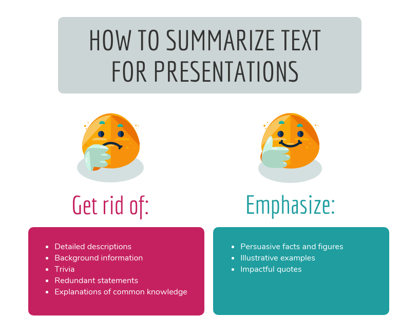
The bullet points are the best option to show statements 1,2, 3 to be clear and concise. The time of any audience is likely to be limited, so do not overload their visual memory with plentiful SWOT analysis presentation slides.
You can explain every strength or threat orally but be limited to one sentence in a single line visually. If you need help with this, make sure to contact custom PowerPoint presentation services that know how to play with your text and colors.
Here is the basic outline for your SWOT analysis presentation ppt:
- Intro (what is the company, its market direction, the goal of the presentation, etc.).
- Strengths (what the company does well & how do you make strengths even stronger), e.g., ensured budget, team available, verified technology, etc.
- Weaknesses (what the company does poorly & how you can improve it), e.g., no methodology, lack of experience with the market, no reputation, etc.
- Opportunities (what outside opportunities could the company take advantage of), e.g., increasing demand for the product, positive financial trend, specific market situation, etc.
- Threats (what outside threats could a company be hurt by & what strategies should you have to fight off those threats), e.g., unstable market situation, offers of emerging competition, the geopolitical situation, etc.
- Conclusion (conclude the information, discuss plans, answer the “so what?” question).
Pro Tip: It is easy to list strengths and enjoy how cool you are. However, if you want to prosper, you have to admit your weaknesses and not be scared that people will see how bad you are. No investors will give money to the company seeing no competition and market changes.
How to Design SWOT Analysis?
Your presentation must be visually engaging to cause the expected audience’s impression and results. You should use strong, colorful diagrams & symbols to rock your slides. There are also several ways to design SWOT analysis slides:
- Use simple flat diagrams (show each SWOT item on a separate slide if you have a lot of text).
- Compare internal (strengths and weakness) and external (opportunities and threats SWOT factors separately.
- Present all four SWOT items on one slide if you have a few short keywords (SWOT analysis one-pager).
Preparing the text and designing slides might be a significant burden for your fantasy. That is why we always advise delegating your PowerPoint to a professional presentation agency that can redesign your draft slides or create new ones from scratch.
Hack Your SWOT Analysis PPT Presentation with These Tips
Presenting creatively is complicated for people of different minds and fantasy horizons. Besides, being, e.g., an accountant, you are not supposed to follow the latest PowerPoint trends and Pantone colors. Check out these tips to improve your presentation:
- There are many tutorials on YouTube you can follow step-by-step to stimulate your fantasy or leave it alone 🙂
- Use icons, lines, and other decorative shapes to differentiate strengths from threats visually.
- Sort and distribute text over the slide so that the last rows can see it vividly.
- Choose vibrant and contrasting colors to create associations in viewers’ minds.
- Choose a background that helps to read text, not vice versa.
- If you want to add sub-points, choose methods of 4 rounded rectangles: the main one on the left and three smaller ones on the right (e.g., SWOT action description with a due date, status, etc.).
- Enrich your slides with abundant diagrams and visuals to better explain and depict the topic.
These pieces of advice are not unusual, but still, many people write blue text on black backgrounds, choose fonts from 2007, and are afraid to improvise with icons. So, design wisely but not typically.
The SWOT analysis is a strategic planning technique for an any-size organization at any period of their activity. Such an analysis helps connect with reality, see current wins and flaws, and plan prospects. Today, we’ve talked about how to do a SWOT analysis presentation, and you know now what slides are compulsory to include and how to improve them visually.
If you still need help with slide design, do not hesitate to contact us and get a free consultation on your current or required slides.
#ezw_tco-2 .ez-toc-widget-container ul.ez-toc-list li.active::before { background-color: #ededed; } Table of contents
- Presenting techniques
- 50 tips on how to improve PowerPoint presentations in 2022-2023 [Updated]
- Keynote VS PowerPoint
- Types of presentations
- Present financial information visually in PowerPoint to drive results

- Design Tips
How to create weekly status report template

How to create a business plan presentation?

Why presentation of data is important?
Researched by Consultants from Top-Tier Management Companies

Powerpoint Templates
Icon Bundle
Kpi Dashboard
Professional
Business Plans
Swot Analysis
Gantt Chart
Business Proposal
Marketing Plan
Project Management
Business Case
Business Model
Cyber Security
Business PPT
Digital Marketing
Digital Transformation
Human Resources
Product Management
Artificial Intelligence
Company Profile
Acknowledgement PPT
PPT Presentation
Reports Brochures
One Page Pitch
Interview PPT
All Categories
Top 10 Data Analysis Templates with Samples and Examples

Mohammed Sameer
If people could eat data instead of food, we could end world hunger with enough spare data left over to tackle 3 famines.
This startling but obvious statement underscores the abundance of data available to the human race today and the humungous rate at which it has grown in our digital age. Just as sustenance nourishes our bodies, data fuels our intellect, satiating the hunger for insights and understanding.
Data is the foundation upon which the structure of information stands tall. Imagine gazing at a puzzle's scattered pieces – each is important, might be beautiful and vital, but the true picture emerges only when the pieces interlock. Similarly, data is the root of knowledge for today’s businesses. Our new Data Analysis Templates are the masterful hands that bring all that scattered knowledge and wisdom together.
These PPT Presentations emerge as essential companions in a landscape where accurate decision-making means the difference between thriving and surviving. Understanding data is pivotal in the symphony of business strategies, marketing endeavors, and research pursuits.
The 100% customizable nature of the templates provides you with the desired flexibility to edit your presentations. The content-ready slides give you the much-needed structure.
Let’s explore!
Template 1: Data Analysis Process PPT Set
Use this PPT Set to help stakeholders understand difficulties that mar the data analysis process and gain valuable insights. Explore the crucial stages of data analysis, from establishing data requirements and efficient data collection to thorough data processing and cleaning. This PPT Design highlights the often underestimated yet pivotal phase of data cleaning. With this template, you'll understand how data lays the foundation for seamless analysis, leading to more accurate results and impactful communication. Download now!

Download this template
Template 2: Data Analysis Business Evaluation Process for Visualization and Presentation
This holistic PPT Bundle guides you through the complex stages of visualization and presentation while offering a profound understanding of each crucial phase. Use this presentation template to understand the essence of successful data analysis, as it breaks down the process into digestible segments. From the initial steps of business issue comprehension and data understanding to data preparation, exploratory analysis, monitoring, validation, and finally, captivating visualization and presentation – every facet is covered. This PPT Preset goes beyond mere process explanation, offering a robust framework for the holistic development of data conceptualization, collection, analysis, and cleaning procedures. Get it today!

Get this template
Template 3: Data Requirement Analysis PPT Bundle
Navigating challenges of problem-solving, prioritization, and data insight, this PPT Presentation presents a strategic roadmap that transforms raw information into actionable intelligence. It starts with a deep dive into the heart of your business challenges. Focusing on defining the core problems, this presentation template guides you through the process of setting priorities, ensuring every move is a step closer to your objectives. Data collection, a crucial cornerstone, is explained through insightful visual aids and organized segments. Witness the transformation of disparate data points into a coherent narrative, empowering you to decipher trends, anomalies, and opportunities.
This PPT Template equips you with the tools to not only gather data but also comprehend its implications, turning information into true knowledge. Navigating the challenges of data requirement analysis is no longer a daunting task. From security gaps that demand attention to complex data systems that require expertise, our template ensures you're prepared to overcome these hurdles with confidence. The high costs that often come with data analysis are confronted head-on, unraveling budget-friendly strategies that don't compromise on quality. Get this template today!

Grab this template
Template 4: Big Data Analysis PPT Set
This comprehensive PPT Deck presents a pre-made Big Data Analysis funnel that guides you through the rather complex process of turning data into gold. Gain a competitive edge by understanding effective data analysis techniques of association rule learning, classification tree analysis, genetic algorithm, regression analysis, and sentiment analysis. It's more than a run-of-the-mill PPT Presentation; it's a transformative tool. Invest in a big data analysis PPT like resource that's not just about graphs and numbers; get it now. Download now!

Template 5: Data Management Analysis PPT Framework
For achieving business excellence, the quest for efficient and time-saving solutions is a universal endeavor. Recognizing your aspirations, we present the Data Management Analysis PowerPoint Presentation — an invaluable asset for seamless change management and effective data analysis. It incorporates PPT Slides designed to provide an effortless avenue for embracing change management and conducting incisive data analysis. It offers a cohesive platform for centralizing your objectives, ready to be shared with your team. The judicious use of text boxes empowers you to articulate your perspectives with precision on each pertinent subject. Download today!

Template 6: Predictive Data Analysis PPT Layout
Get this PPT Preset to consolidate your stakeholder's grasp on predictive analytics, a discipline that uses statistical methodologies, cutting-edge machine learning algorithms, and a suite of tools to dissect historical data. This PPT Layout guides you through a well-structured journey, unfolding the essentials of predictive analytics, its foundational framework, and a suite of models that constitute its core. The significance of predictive analytics takes center stage, underscored by its multifaceted applications. Additionally, this resource has an Estimation Model PPT Slide, which explains the key tenets of diverse predictive analytics tools and their closely-knit workflows. The demarcation between the four pivotal categories of advanced analytics in this PPT deck receives careful attention. It sheds light on predictive analytics models – from classification to clustering models and beyond. Download now!

Template 7: Dashboard For IT Operations Data Analysis
This PPT Template Dashboard is a dynamic representation of your operational landscape. This PPT Set helps track the total number of cases from inception to resolution. Visualize trends with a graph showcasing the weekly ebb and flow of opened and closed cases. Prioritize effectively, allocating resources where they matter most, as the presentation template depicts it across departments. Efficiency meets clarity as you explore the time distribution of tickets on a day-by-day basis. Gain a better understanding of workflow patterns and resource utilization. Analyze open case statuses, fostering an environment of proactive response and swift action. Download now!

Template 8: Quarterly Sales Data Analysis Report
Visualize your progress with ease using this PPT Template's intuitive presentation of monthly sales data. Get a clear view of team-wise statistics that showcase individual contributions, fostering a culture of recognition and growth. Uncover finer details through the nuanced comparison of total versus actual sales values, empowering you to identify trends and opportunities. Engage stakeholders in strategy evaluation as you assess team goals versus actual achievements. Pinpoint areas of excellence and those warranting attention, refining your approach. Download now!

Template 9: Real-Time Marketing Data Analysis
Here's a dynamic marketing analysis tool blending insights and aesthetics. It presents a pie chart comparing planned vs. actual budgets while diving deep into sections showcasing real-time marketing benefits: Elevated customer experiences, surging conversions, enhanced retention, and refined brand perception. Navigate budget allocation through intuitive bar graphs. Improve your strategy with data symphony, moving a step closer to success through informed choices. Download now!

Template 10: Data Analysis Process for Visualization and Presentation
Embark on a data-driven journey with this PPT Set. Learn the process of Data Analysis, Visualization, and Presentation to address complex business challenges. This PPT Design walks you through these stages, from issue identification and data preparation to exploratory analysis modeling. Witness raw data transform into insights through rigorous validation. Culminate in captivating visualizations and masterful presentations, setting new standards for impactful communication. Download now!

Bridging Numbers and Narratives: Your Journey Through Data Analysis
In a world where data weaves the fabric of progress, our journey through this blog comes to an inspiring end. As you venture into data analysis armed with our templates, remember that each graph, each layout, and each piece of information is a brushstroke on the canvas of understanding. With every mouse click, you’re not just navigating slides; you're charting the course for informed decisions, breakthrough discoveries, and transformative strategies.
FAQs on Data Analysis
What is data analysis.
Data analysis involves inspecting, cleansing, transforming, and modeling data to derive meaningful insights, draw conclusions, and support decision-making. It encompasses various techniques, including statistical methods, machine learning, and visualization, to uncover patterns, trends, and relationships within datasets.
What are the four types of data analysis?
There are four main types of data analysis:
- Descriptive Analysis: This type of analysis focuses on summarizing and describing the main features of a dataset. It involves statistical measures such as mean, median, mode, range, and standard deviation. Descriptive analysis aims to clearly understand the data's characteristics but doesn't involve drawing conclusions or making predictions.
- Diagnostic Analysis: Diagnostic analysis involves digging deeper into data to understand why certain patterns or outcomes occurred. It aims to identify the root causes of specific events or trends. Techniques used in diagnostic analysis often include data visualization, exploratory data analysis, and statistical tests to uncover relationships and correlations.
- Predictive Analysis: Predictive analysis involves using historical data to predict future events or outcomes. This type of analysis uses statistical models, machine learning algorithms, and data mining techniques to identify patterns and trends that can be used to forecast future trends. It's widely used in finance, marketing, and healthcare for making informed decisions.
- Prescriptive Analysis: Prescriptive analysis goes beyond predicting future outcomes. It provides recommendations or solutions for specific situations based on historical and current data analysis. This type of analysis considers different possible actions and their potential outcomes to guide decision-making. Prescriptive analysis is often used in complex scenarios involving multiple variables and options.
Where is data analysis used?
Data analysis is used in a wide range of fields and industries, including but not limited to:
- Business: Analyzing customer behavior, market trends, and financial performance.
- Healthcare: Analyzing patient records, medical research data, and disease trends.
- Science: Analyzing experimental results, simulations, and observations.
- Finance: Analyzing investment trends, risk assessment, and portfolio management.
- Marketing: Analyzing campaign effectiveness, consumer preferences, and market segmentation.
- Social Sciences: Analyzing survey data, demographic trends, and human behavior.
- Sports: Analyzing player performance, game statistics, and strategy optimization.
What is the main tool for data analysis?
There isn't a single "main" tool for data analysis, as the choice of tools depends on the specific tasks and the preferences of the analyst. However, some widely used tools for data analysis include:
- Spreadsheet Software: Like Microsoft Excel or Google Sheets, used for basic data manipulation and visualization.
- Statistical Software: Such as R and Python's libraries (e.g., pandas, numpy, scipy), used for in-depth statistical analysis and modeling.
- Data Visualization Tools: Like Tableau, Power BI, or matplotlib/seaborn in Python, used to create visual representations of data.
- Database Management Systems (DBMS): Such as SQL-based systems for querying and managing large datasets.
- Machine Learning Libraries: Such as scikit-learn, TensorFlow, and PyTorch for building predictive models.
Why is data analysis important?
Data analysis is crucial for several reasons:
- Informed Decision-Making: It provides insights that help individuals and organizations make informed decisions based on evidence rather than intuition.
- Identifying Patterns and Trends: It helps to uncover hidden patterns, trends, and correlations in large datasets that might not be apparent on the surface.
- Problem Solving: Data analysis aids in solving complex problems by providing a structured approach to understanding and addressing issues.
- Improving Efficiency and Performance: It allows businesses to optimize processes, improve efficiency, and enhance performance based on data-driven insights.
- Innovation and Research: Data analysis is essential in scientific research and innovation, helping to validate hypotheses and drive discoveries.
- Competitive Advantage: Organizations that effectively use data analysis gain a competitive edge by better understanding their customers, markets, and internal operations.
- Risk Management: Data analysis enables better risk assessment and management by identifying potential issues or anomalies early on.
- Resource Allocation: It helps allocate resources effectively by understanding where investments are most likely to yield positive outcomes.
Related posts:
- How Financial Management Templates Can Make a Money Master Out of You
- How to Design the Perfect Service Launch Presentation [Custom Launch Deck Included]
- Quarterly Business Review Presentation: All the Essential Slides You Need in Your Deck
- [Updated 2023] How to Design The Perfect Product Launch Presentation [Best Templates Included]
Liked this blog? Please recommend us

Top 20 Big Data and Analytics Templates for Machine Learning, Cloud Computing and Artificial Intelligence PPT Presentations

Top 10 Data Security Management Templates to Safeguard Your Business (Free PDF Attached)
This form is protected by reCAPTCHA - the Google Privacy Policy and Terms of Service apply.

Digital revolution powerpoint presentation slides

Sales funnel results presentation layouts
3d men joinning circular jigsaw puzzles ppt graphics icons

Business Strategic Planning Template For Organizations Powerpoint Presentation Slides

Future plan powerpoint template slide

Project Management Team Powerpoint Presentation Slides

Brand marketing powerpoint presentation slides

Launching a new service powerpoint presentation with slides go to market

Agenda powerpoint slide show

Four key metrics donut chart with percentage

Engineering and technology ppt inspiration example introduction continuous process improvement

Meet our team representing in circular format

A Beginner’s Guide To Presentation Design [+15 Stunning Templates]
![A Beginner’s Guide To Presentation Design [+15 Stunning Templates]](https://www.peppercontent.io/_next/image/?url=https%3A%2F%2Fwordpress.peppercontent.io%2Fwp-content%2Fuploads%2F2022%2F02%2FThe-beginners-guide-to-presentation-design.png&w=1536&q=75 "analysis presentation design")
Table of Contents
- What Is Presentation Design?
What Is the Significance of Presentation Design?
Understanding various forms of presentations.
- 10 Tips to Create a Compelling Presentation Design
5 Inspirational Presentation Design Trends
- 15 Best Presentation Design Templates to Consider
- Key Takeaways
- Conclusion
Once you’ve mapped out your presentation, it’s time to tackle the intimidating task of creating a visually stunning presentation design . Creating an excellent presentation design becomes simpler by learning and adhering to fundamental presentation design standards. Here is a presentation design guide to creating an engaging and well-designed presentation, regardless of the kind of project you are putting together.
What Is Presentation Design?
Presentation design focuses on the visual facet of your presentation to captivate your audience. An outstanding presentation design may significantly impact your target audience, whether it is investors, employees, collaborators, or potential customers. The design must ideally complement the material of your presentation to help get your views across and convince your audience.
Creating a presentation for the first time to present in a professional setting or to a large audience might feel challenging. This guide to presentation design will walk you through the elements required for building a visually appealing presentation.

A presentation is much more than just a layout of slides with text and graphics on them. You need to make sure it’s visually appealing too. It is mainly because visuals are much more engaging than written words in your presentation slides. Presentation design is crucial because it allows you to combine your ideas, narrative, graphics, facts, and statistics into one cohesive tale that drives your audience to the decision you desire.
A robust presentation design may unlock doors you never imagined could be opened. An effective design is much simpler to understand and earns a lot of credibility for your brand. You can communicate your message effectively, encourage your audience to take subsequent actions, and get them to engage with what you’re saying with excellent presentation design.
You have the potential to communicate your point of view, create a brand identity, and get your audience to see and hear you loud and clear when you build a presentation with impeccable design. The material of your presentation is crucial to your project’s success, but a poor design may divert the listener’s attention (and not for a good reason). Don’t let a lousy presentation design force you to lose out on a huge business opportunity.
Creating a winning presentation design involves combining design components to produce slides that will neither bore nor exhaust your audience. Instead, it will engage and inspire them effectively. So, instead of creating a lousy presentation using shoddy designs, it is significant to master the fundamentals of creating the best presentation design.
Presentations may be used for several purposes and can come in different forms. A quarterly sales presentation with your team will not be the same as a presentation focused on employee training.
In the first scenario, you’ll strive to advance your team to achieve targeted sales growth. In the second, you’ll focus on imparting essential knowledge and skills to your employees. Looking at some of the most prevalent presentation types can give you a better idea about presentation design and when to begin constructing your own.
1. Investor pitch presentation
Using facts to convince rather than enlighten is the primary goal of this presentation style, as indicated by the name. If you’re a startup or a small firm looking for investment, you’ll need to use this form of presentation to your advantage. An investor pitch presentation will be required when you’re explaining your company’s user acquisition growth rate to prospective investors. Such presentations are created using the classic pitch deck concept to make the perfect, thoroughly professional pitch.
2. Educational presentations
Educational presentations are sometimes misunderstood as informative presentations since they are designed to teach viewers new skills and educate them on a new subject. You may need to produce a presentation for a school for various reasons, such as presenting an idea or providing an academic report.
Academic and corporate training programs often employ this presentation format. A video tutorial with comments and suitable themes may be added to the slides to improve them. Educators are always looking for new and unique methods to provide engaging and enthralling presentations for their students. Using an educational presentation template may guarantee that your presentation is visually appealing as well as easily comprehensible.
3. Webinar presentations
Webinar presentations are the newest craze, and they’re a win-win for presenters and the audience alike. A webinar refers to an online presentation, but unlike a video posted elsewhere, the webinar takes place in real-time and with the active participation of the audience. There are several themes and settings for which webinar presentations might be utilized.
Short surveys, quizzes, and Q&A sessions let participants feel more involved in the webinar. Most commonly, a webinar is meant to disseminate information, but it may also act as a marketing tool, a source of leads, or a way to generate new sales and sign-ups.
4. Report presentations
A report presentation is intended to offer the necessary information to those engaged in a process or project. Report presentations are critical in ensuring these stakeholders that the procedures that must be followed for the project’s completion are effectively planned and executed. Sample reports are also accessible to these stakeholders.
A report presentation may take numerous forms, such as a business report or an infographic. Reports on sales and marketing performance, website statistics, income, or any other data that your team or supervisors wish to know about can be presented during the report presentation.
5. Sales presentations
Sales presentations are often the initial phase in the sales cycle, and are, therefore, critical. A sales presentation, often known as a sales pitch deck, is a form of presentation you would need to provide a prospective customer or client with when pitching a product or service.
Not every sales presentation is designed to close a deal right away. The goal might be to pique the curiosity of the people concerned. Sales presentations often include your company’s unique selling proposition (USP), product price points, and testimonials. Your sales presentation must be engaging and successful in influencing potential customers, using a well-thought-out approach.
6. Inspirational presentations
An inspiring presentation is a standard tool used by managers, team leaders, motivational speakers, and business owners to stimulate and encourage their audience. Inspirational presentations are essential to influencing others and achieving your individual and business goals.
To get a desirable result from this kind of presentation, elicit an emotional response from the audience and motivate them to act. Using a presentation template that has been professionally developed provides you with an advantage over others.
7. Keynote presentations
Keynote presentations are given in front of a larger audience. A good example can be those shown at TED Talks and other conferences. While the presenter gives the entire speech, there are advantages to using slides, such as keeping an audience engaged and on track.
10 Tips to Create a Compelling Presentation Design
If your presentation is lousy, you might come across as unprepared, uninterested, and lacking any credibility. A well-designed presentation makes you appear reliable and competent. Here are some fantastic points to help you develop the best presentation design.
1. Outline your content and fine-tune the message
It’s crucial to prepare your content and fine-tune your main message before you begin developing your presentation. Try to figure out what your target audience wants to know, what they may already know, and what will keep them engaged. Then, when you create your presentation’s content, keep those things in mind and furnish designs accordingly. It is vital to remember the key takeaway of each deck you create.
Too much information shown on a single slide is difficult for most viewers to comprehend. Make sure you don’t overwhelm your viewers; each presentation slide should include no more than one key point. Make your information as brief as possible, yet make it detailed enough and valuable.
2. Use more visuals and less text in your decks
Your audience recalls information considerably better when images complement it because they can better understand visual features than simple text. Presenters that employ images instead of words get more favorable feedback from their audience than those who rely only on text.
Using visual examples in slide decks increases audience engagement, encourages more questions, and registers your message in the minds of your audience. Remove any unnecessary text from your slides and replace it with visuals that will engage your audience.
You may use various methods for adding images, but the most common is using your data’s visual representation. It’s important to note that adding visuals does not mean sprinkling fancy images and symbols across your slides. Relevant images and iconography are a must.
3. Limit the use of fonts and colors
It is vital to pay attention to color schemes and other design components, such as fonts, to ensure your presentation succeeds. Although it may be thrilling to employ as many fonts and colors as possible, the best presentation design practices imply that you should only use two or three colors overall. Also, make sure the content in your slides is of a different font than the headers.
When it comes to color schemes, certain combinations work better than others. When choosing colors, keep in mind that they should not detract from the message you want to convey. Add an accent color to one or two of your primary hues for a cohesive look. It’s critical that the colors you choose complement one another and communicate your purpose effectively. Headers should be in one typeface, while body content should be in another. Add a third font for the accents, if you’d like.
4. Create a visual hierarchy
Visual hierarchy is an important consideration when including text in a presentation. Visual hierarchy is one of the most significant but underappreciated presentation design principles. Color, size, contrast, alignment, and other aspects of your slide’s elements should all depend on their value.
When creating a visual hierarchy, you must clearly understand the story and its structure. Your audience’s attention should be drawn to the most critical components first, then to the second-most essential aspects, and so on. When creating your presentation, think about the story you want to tell and the visual hierarchy you need to support it. If you do this, the essential ideas you wish to convey will not be lost on your audience.
5. Incorporate powerful visuals
It is important to use visual aids to make a compelling presentation: think images, icons, graphics, films, graphs, and charts. You should also ensure your slides’ aesthetics accurately portray the text they contain. Alternatively, if you don’t have words on the slide, make sure the visuals mirror the words you’re saying in your speech.
Visual aids should enhance your presentation. In addition, you’ll want to ensure that your slide has some form of visual representation so that you’re not just dumping a bunch of text onto a slide.
6. Avoid using bullet points
These days, any excellent presentation design instruction would encourage you to avoid bullet points as much as possible. They’re dull and old-fashioned, and there are more effective methods to display your material.
A slide consisting of icons, images, and infographics is more exciting and conversational than one written in list form. Using bullet points for each slide’s primary theme is a standard PowerPoint design recommendation that you should refrain from while designing your presentation.
7. In group presentations, segregate slides by theme
While making a group presentation, finding an appropriate balance of who should be demonstrating which presentation segment is often challenging. Arranging a group presentation by topic is the most natural technique to ensure that everyone has an opportunity to speak, without the presentation becoming incoherent. Your group presentation should be divided into sections based on the subject.
Prepare your presentation ahead of time so that everyone understands when it’s their turn to talk. It’s up to each person in the group to pick one thing to talk about when they give this presentation to investors or potential customers. For instance, the business model slide may be addressed by one person, while another can discuss the marketing approach.
8. Maintain consistency
Consistency is essential when you work on the design of your presentation. Your presentation is still one presentation, no matter how many slides it has. Design elements, color schemes, and similar illustrations can all be used to achieve design consistency.
Although some of the slides in your presentation may appear to be styled differently than the others, the overall presentation must be held together by a single color scheme. To ensure that your viewers don’t lose track of what you’re saying, make sure each of your slides is visually connected.
9. Emphasize important points
It is pertinent to use shapes, colorful fonts, and figures pointing to your material. They help emphasize vital information to make it stand out. This not only keeps the reader’s attention on the page but also makes your design more streamlined. Emphasizing the point you’re trying to put across with visual elements makes it easier for your audience to grasp what you’re saying.
10. Integrate data visualization
Consider utilizing a chart or data visualization to drive your argument home, especially if you have vital figures or trends you want your audience to remember. This might be a bar graph or a pie chart that displays various data points, a percentage indication, or an essential value pictogram.
Confident public speaking mixed with good visuals may greatly influence your audience, inspiring them to take action. The use of design features makes it simpler for your audience to grasp and recall both complex and fundamental data and statistics, and the presentation becomes much more enjoyable too.
Even though trends come and go, effective presentation design paired with some inspiration to get you started will always be in style. Think about what’s current in the world of graphic design before you create a staggering presentation deck for a creative proposal or a business report. To help you better, we’ve come up with a list of the most popular presentation design concepts.
1. Dark backdrops with neon colors
While white backgrounds have long dominated web design, the advent of “dark mode” is gradually altering that. Designers may use dark mode to play with contrast and make creative things stand out.
This is a great way to get your audience’s attention and keep them interested in what you have to say. The key is to pick one or two bright colors and utilize them as highlights against a dark backdrop, rather than using an abundance of them.
2. Monochromatic color schemes
In recent years, color schemes originating from one base hue, such as monochromatic color schemes, have been given a subdued pastel makeover. The usage of monochromatic color schemes in presentation design is always seen as clean and professional. It’s ideal for pitch decks and presentations since monochrome is generally utilized to assist people in concentrating on the text and message, rather than the colors inside a design.
3. Easy-to-understand data analysis
The fundamentals of data visualization should be restored. In other words, even the most complicated measurements may be made easy to grasp via effective design. Designers, marketers, and presenters are generating snackable stats in the same way infographics have found a place on visual-first social networks.
Create a dynamic proposal or presentation with the help of an infographic template that is easy to use. You can create distinctive slides with animations and transitions to explain your point more effectively. With the help of templates, you can convert your data into bar graphs, bar charts, and bubbles that represent your idea simply, guaranteeing that every data point is simple to comprehend.
4. Straightforward minimalism
Minimalism is a design trend that will probably never go out of style. It has always been a show-stopper. Each slide should offer just enough information to let the reader comprehend what’s going on. You should use a color palette that isn’t distracting. Your simple presentation will enthrall your audience if you boldly highlight your most significant points and use trendy fonts.
5. Geometric structures
There’s a good reason why designers are so fond of geometric patterns, 3D objects, and asymmetrical layouts. They’re basic yet stunning, making them perfect for times you want to make a lasting impression with the information you’re sharing.
More cutting-edge components, such as 3D shapes and floating objects, are used in presentation graphics these days. Go for a presentation template that contains editable slides that enable you to easily add your visuals and material to brighten your presentation.
15 Best Presentation Design Templates to Consider
In the case of presentation designs, you should never sacrifice quality. Ideally, you should have a design that improves your brand’s image, amplifies your message, and enables you to deliver various content forms efficiently.
The problem is, it’s pretty challenging to locate premade themes and templates of this merit. We’ve made it easy for you by putting together a list of the best 15 presentation design templates out there. These presentation design suggestions are a great place to start.
1. Business plan presentation template
This is a crucial business presentation template with a significant emphasis on visualizations and graphics. To create a business strategy, you need this presentation template. It consists of several crucial elements, such as a mind map, infographics, and bar graphics. Replace the placeholder text with your own to complete the presentation.

2. Pitch deck template
Startups seeking financing require a clean and eye-catching pitch deck design to impress investors. You may use it to present significant aspects and achievements of your company to investors. You can include slides for mockups, testimonials, business data like statistics, and case studies.
The pitch deck presentation template is excellent for your next client pitch, as it allows you to pick from a range of different startup tales to showcase the most crucial features of your firm.
3. Brand guidelines presentation template
Creating a bespoke presentation talking about the company dos and don’ts may be a terrific approach to discuss your brand rules with your team and stakeholders. You can easily show off your brand’s typeface and color schemes using this presentation template.
4. Marketing plan presentation template
Marketing is a vast concept, and the slides included in this design stock set reflect that broadness. A well-executed marketing strategy is essential to the success of any team. A marketing plan presentation template should ideally include slides for charts, timelines, and competition research. You can create executive summaries or mission statements with the below-mentioned presentation’s elegant and minimalistic slides.
5. Keynote presentation template
This keynote template has a lovely color scheme that is equal parts captivating and professional. You can employ a keynote presentation template if you’re going to be a keynote speaker at an upcoming event and want to ensure that your design stands out.
In addition to several slides, the template comes with various predefined color schemes. This template is perfect for any business presentation requiring a well-designed layout.
6. Training manual presentation template
A training manual presentation template may be used to convey new hire training to your workforce. It is essential for the design to be as clean and straightforward as possible.
These training material decks created with a predesigned template make it easy for new employees to learn the ins and outs of their jobs.
7. Case study presentation template
A case study is an excellent way to illustrate a point in your presentation. The best way to attract new consumers using a case study presentation is to show them how your existing customers are using your product or service. Make sure to highlight how your product solved their pain points.
8. Interactive brief presentation template
It’s common to provide a creative brief when working with a contractor, freelancer, or designer to ensure everyone involved understands what the final product should look like.
An interactive presentation template like a creative brief is a terrific concept for absorbing and memorizing that information.
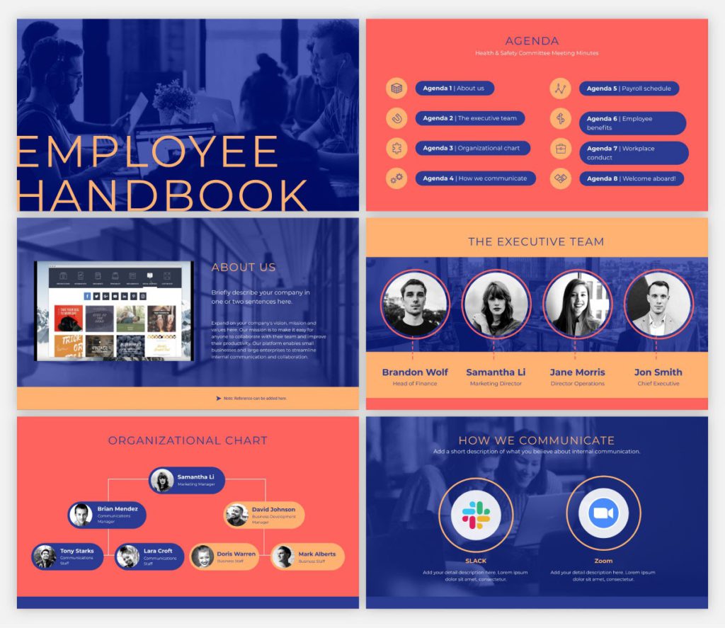
9. Workforce handbook presentation template
When hiring a new employee, your company needs to create an employee handbook to ensure they know the company’s objective and general working norms. You may connect this presentation to your intranet or website, or just distribute the digital version through a password-protected or private link.
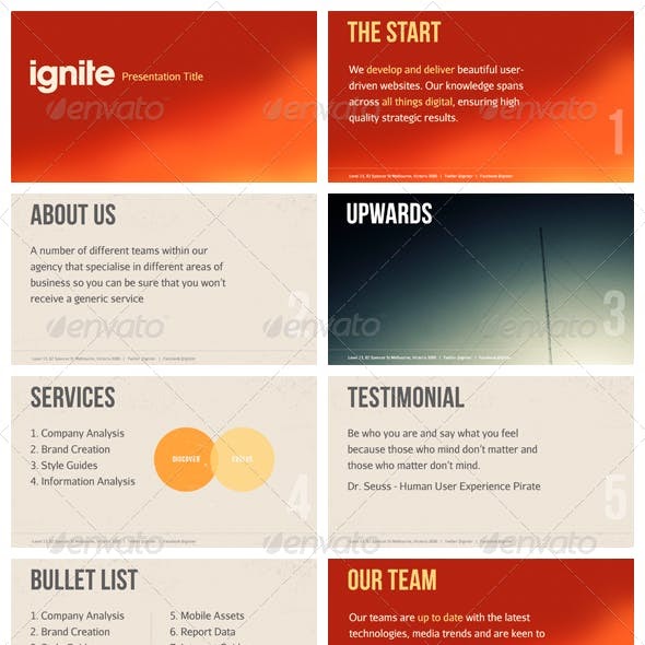
10. Ignite presentation template
Using this template as a starting point for an Ignite presentation would be ideal. An Ignite presentation is a five-minute presentation consisting of 20 slides, compelling the speaker to speak fast and concisely. As a result, an Ignite presentation template prevents you from using too much text on any slide.
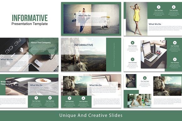
11. Informative presentation template
The need to create an educational presentation may arise due to several reasons, such as onboarding new hires, explaining a concept to students, and more. An informative presentation template is a suitable solution in all cases.
Regardless of who they are meant for, presentations are the optimal format for sharing information with any audience. Create an educational presentation that you can embed in a blog post or publish on several platforms online. Make presentations to provide knowledge at conferences and other meetings.
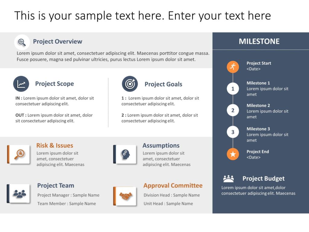
12. SWOT analysis presentation template
A strength, weakness, opportunities, and threats (SWOT) analysis is a valuable tool for gauging where your business stands, and how your strategic planning measures are paying off. This presentation template is an excellent tool for SWOT analysis or refining your marketing strategy.
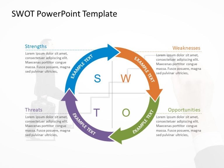
It comes in several formats; circular design and hexagonal shapes being two of them. You may modify the colors as desired.
13. Competitor analysis presentation template
Knowing your competition and what they offer is essential for a successful business. Competitor analysis means researching your competitors’ key strengths and weaknesses, which can, eventually, help you define your goals and USPs more clearly.
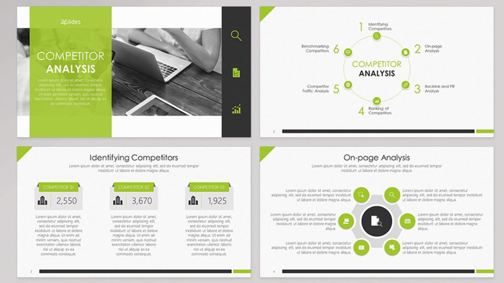
There are built-in interactive elements in this competitor analysis presentation template, which can help hook your audience.
14. Bold presentation template
Ideal for non-corporate sales presentations, a bold and daring presentation template includes slides with a vibrant, attention-grabbing theme that is neither overbearing nor distracting. The color combination is striking without being oppressive.
15. Company overview template
Creative presentation templates are all the rage today. Using a lot of negative space will allow your audience to take a breath and direct their attention to the most crucial parts of your presentation. It is suitable for corporate presentations, since it doesn’t stick out more than is necessary.
Key Takeaways
- Audiences tend to forget a large percentage of what was addressed before the presentation is through. This is why it is important to create a presentation design that is memorable.
- A presentation is much more than just a layout of slides with text and graphics on them. You need to make sure it’s visually appealing too.
- Use a wide range of best presentation design tools, components, and styles until you discover the one that resonates with your target audience.
- Consider the most recent trends and best practices, and dedicate time to thoroughly crafting every presentation.
- Fine-tuning your message, avoiding the use of bullet points, incorporating visual hierarchy, and incorporating data visualization are a few design tips to create a winning presentation.
Both your presentation style and design are crucial. You can deliver more dynamic, memorable presentations by creating visually pleasing decks. It’s advisable to create a resourceful presentation design if you want to elevate your personal as well as professional credibility.
Take cues from some popular presentation templates, and enhance one little aspect at a time. Now is the time to practice everything you’ve learned in this presentation design guide. As with any other visual communication, creating the best presentation design requires time, effort, and patience. Never be afraid to try something new; you’ll quickly see the benefits a strong presentation can have on your project.
A presentation design puts ideas, tales, words, and pictures into a series of slides that convey a narrative and engage your audience.
A presentation design template is used to achieve a uniform look for your slides. Templates are pre-made presentations into which you may insert your data.
People remember images and words better than just words. The design of your slides should be simple and consistent. This way, your audience will focus on the most important points.
Use high-quality images to back your message, but don’t use too many special effects. Make sure you don’t read from your slides.
A well-presented, memorable introduction and conclusion are two essential parts of a presentation. Don’t forget them when you write your outline.
Presentation design is essential, because it helps you weave your ideas, narrative, images, facts, and statistics into a unified story that leads your audience to the choice you want them to make.
Latest Blogs
In this blog, explore the golden rules of using AI marketing tools so you can leverage the benefits to their maximum potential.
In this blog, you’ll learn how to avoid the pitfalls of SEO over-optimization while enhancing your site’s performance.
In this article, we’ll take a look at what AMP is, its advantages and disadvantages, and how it affects SEO.
Get your hands on the latest news!
Similar posts.

7 mins read
15 Best Firms Offering Design Services in India

5 mins read
All You Need to Know About Data-Driven Design

6 mins read
Decoding Design Communities and Their Advantages

100+ Real Consulting Presentations from McKinsey, BCG, Bain, and More

By Paul Moss
We’ve gathered presentations from top consulting firms that you can use to inspire your own slide making.
For this post we’ve gathered 100+ real presentations from top consulting firms around the internet for you to review, analyze, and learn from. Each has its strengths and weaknesses, and each provides a different look into how top quality consulting presentations get created and delivered to clients.
After finishing this article, make sure you check out our advanced courses to see how you can learn to build your own high-quality, consulting-style slides from scratch.
The Internet's Best Slides
Search through our curated library of REAL slides to find inspiration for your next presentation
- Reshaping NYCHA support functions (BCG)
- Loose dogs in Dallas: Strategic Recommendations to Improve Public Safety and Animal Welfare (BCG)
- Melbourne as a Global Cultural Destination (BCG)
- The Open Education Resources ecosystem (BCG)
- The True-Luxury Global Consumer Insight (7th Edition) (BCG)
- Evaluating NYC media sector development and setting the stage for future growth (BCG)
- The Electric Car Tipping Point (BCG)
- Projecting US Mail volumes to 2020 (BCG)
- Next Generation Manufacturing (2016) (BCG)
- Corporate Ventures in Sweden (2016) (BCG)
- Port of Los Angeles Clean Truck Program – March 2008 (BCG)
- USPS Future Business Model (McKinsey)
- Investment and Industrial Policy: A Perspective on the Future (McKinsey)
- Outperformers: High-growth emerging economies and the companies that propel them (McKinsey)
- Technology’s role in mineral criticality (World Materials Forum) (McKinsey)
- Challenges in Mining: Scarcity or Opportunity? (McKinsey)
- Modelling the potential of digitally-enabled processes, transparency and participation in the NHS (McKinsey)
- Addressing the Global Affordable Housing Challenge (2016) (McKinsey)
- Capturing the Full Electrical Efficiency Potential of the UK (2012) (McKinsey)
- Digital Luxury Experience (2017) (McKinsey)
- Digitally-Enabled Processes in the NHS (2014) (McKinsey)
- How Companies can Capture the Veteran Opportunity (2012) (McKinsey)
- Insurance Trends and Growth Opportunities for Poland (2015) (McKinsey)
- Laying the Foundations for a Financially Sound Industry (2013) (McKinsey)
- From Poverty to Empowerment (2014) (McKinsey)
- Consumer privacy in retail (Deloitte)
- TMT Outlook 2017: A new wave of advances offer opportunities and challenges (Deloitte)
- Deloitte SEA CFO Forum Southeast Asia Business Outlook (Deloitte)
- Deloitte Kenya Budget 2022/23 Webinar (Deloitte)
- The Shopping Centre Handbook 4.0 (Deloitte)
Bain & Co.
- 2011 China Luxury Market Study (Bain)
- Bain & UC Berkley Operational Excellence (2010) (Bain)
- Fintech New York: Partnerships, Platforms and Open Innovation (Accenture)
- Shaping the Sustainable Organization (Accenture)
- The Decade to Deliver: A Call to Business Action (Accenture)
- Fueling the Energy Future (Accenture)
- Cracking the Code on Consumer Fraud (Accenture)
- Right Cloud Mindset: Survey Results Hospitality (Accenture)
- Unleashing Competitiveness on the Cloud Continuum (Accenture)
- Whole Brain Leadership: New Rules of Engagement for the C-Suite (Accenture)
- Federal Technology Vision 2021: Full U.S. Federal Survey Findings (Accenture)
- Accenture Consumer Behavior Research: The value shake-up (Accenture)
- Tech Adoption and Strategy for Innovation & Growth (Accenture)
- Intelligent Operations for Future-Ready Businesses (Accenture)
- When, Where & How AI Will Boost Federal Workforce Productivity (Accenture)
- How fit is your allocation strategy? (EY)
- European Banking Barometer (2015) (EY)
- EY Price Point: global oil and gas market outlook, Q2 | April 2022 (EY)
- IBOR transition: Opportunities and challenges for the asset management industry (EY)
- Global Capital Confidence Barometer 21st edition (EY)
- Power transactions and trends Q2 2019 (EY)
- MAPS2018 Keynote address on EY report: Life Sciences 4.0 – Securing value through data-driven platforms (EY)
- EY Germany FinTech Landscape (EY)
PwC / Strategy&
- Project Management: Improving performance, reducing risk (PwC)
- World Economic Forum: The power of analytics for better and faster decisions by Dan DiFilippo (PwC)
- Apache Hadoop Summit 2016: The Future of Apache Hadoop an Enterprise Architecture View (PwC)
- Turning big data into big revenue (PwC)
- Medical Cost Trend: Behind the Numbers 2017 (PwC)
- PwC’s new Golden Age Index – how well are countries harnessing the power of older workers? (PwC)
- PwC’s Global Technology IPO Review — Q1 2015 (PwC)
- PwC Trends in the workforce (PwC)
- 18th Annual Global CEO Survey – Technology industry key findings (PwC)
- The FDA and industry: A recipe for collaborating in the New Health Economy (PwC)
- Making zero-emission trucking a reality (Strategy&)
- Sustainability strategies for Oil and Gas (Strategy&)
- Driving the sustainability agenda on C-level (Strategy&)
- The Diversity Imperative: 14th Annual Australian Chief Executive Study (Strategy&)
- Creating a Winning Recipe for a Meal Kits Program (LEK)
- The 4th Annual New Mobility Study 2019 (LEK)
- 2019 APAC Hospital Priority Study Overview (LEK)
- Rail industry cost and revenue sharing (2011) (LEK)
- 2019 Media and Entertainment Study (LEK)
- Navigating a digital-first home furnishings market (LEK)
- 5 Opportunities in the Nutritional Supplements Industry (LEK)
- Infrastructure Victoria – AZ/ZEV International Scan (LEK)
- The Rapidly Evolving Landscape of Meal Kits and E-commerce in Food & Beverage (LEK)
- Top 8 Insights From the 2018 Beauty, Health & Wellness Survey (LEK)
- 2018 Brand Owner Packaging Survey (LEK)
- 2016 Strategic Hospital Priorities Study (LEK)
- The Merchandising Evolution (and why NDC Matters) (LEK)
- Infrastructure beyond COVID-19 (LEK)
- China Exit or Co-Investment Opportunities for German PE Investors (LEK)
- Strategy Study 2014 ( AT Kearney)
- Australia: Taking Bigger Steps ( AT Kearney)
- Lifting the Barriers to Retail Innovation in ASEAN ( AT Kearney)
- The Future of Commercial Vehicle Powertrains (2012) ( AT Kearney)
- A.T. Kearney 2017 State of Logistics Report: Accelerating into Uncertainty ( AT Kearney)
- Pursuing Customer Inspired Growth ( AT Kearney)
- The Accelerating Growth of Frictionless Commerce ( AT Kearney)
- Consolidation of the US Banking Industry ( AT Kearney)
- Covid-19 and Effects on Turkey ( AT Kearney)
Booz Allen Hamilton, Alvarez & Marsal and others
- European Distressed Credit Watch List (Alvarez & Marsal)
- Corporate Headquarters Study 2018 (Roland Berger)
- The Lithium-Ion (EV) battery market and supply chain (Roland Berger)
- IP Theft (Booz Allen Hamilton)
- Booz Allen Hamilton and Market Connections: C4ISR Survey Report (Booz Allen Hamilton)
- Joining Forces: Interagency Collaboration and “Smart Power” (Booz Allen Hamilton)
- Booz Allen at a glance (Booz Allen Hamilton)
- Investor Presentation Deck (Booz Allen Hamilton)
- Responding to Covid-19 (2021) (Oliver Wyman)
- C ovid-19 Special Primer (2020) (Oliver Wyman)
- Building Up Immunity of the Financial Sector (Oliver Wyman)
- Customer Experience: The 14BN Risk Noted for Discussion (Oliver Wyman)

FREE Slide Design Course
Enroll in our free 5-day email course and learn how to design slides like a McKinsey consultant.
Complete hands-on exercises , review a realistic consulting case study , and get personalized feedback from your instructor!
Plus get a free copy of our Top 50 PowerPoint Shortcuts for Consultants cheat sheet.
Learn More ➔
Success! Please check your email.
We respect your privacy. Unsubscribe anytime.

Reshaping NYCHA support functions
Good: Realistic client presentation, clear slide structure, complete storyline
Not Good: Outdated, long and dense
Download this Presentation

Loose dogs in Dallas: Strategic Recommendations to Improve Public Safety and Animal Welfare
Good: Realistic client presentation, clear slide structure, insightful and clear charts
Not Good: Outdated, long and dense

Melbourne as a Global Cultural Destination
Good: Realistic client presentation, good structure, slides “guide” audience to insights
Not Good: Outdated design

The Open Education Resources ecosystem
Good: Clearly structured slides, good visuals, good illustrative charts
Not Good: Relatively short, slightly older, incomplete storyline

The True-Luxury Global Consumer Insight (7th Edition)
Good: Recent presentation, nice looking visuals, clear charts
Not Good: Not a client presentation, too much focus on design

Evaluating NYC media sector development and setting the stage for future growth
Good: Complete presentation (intro, exec. summary, etc.), good examples of subtitles
Not Good: Lacks clear recommendations

The Electric Car Tipping Point
Good: Clear and insightful charts, clutter-free slides, good titles
Not Good: Relatively short, not a client presentation

Projecting US Mail volumes to 2020
Good: Easy to understand, good insights and analysis, contrasts with McKinsey presentation on the same topic
Not Good: Old presentation

Next Generation Manufacturing (2016)
Good: Nice clean design, excellent visuals
Not Good: Not a client deliverable

Corporate Ventures in Sweden (2016)
Good: Strong overall flow, good visualization s
Not Good: Relatively short

Port of Los Angeles Clean Truck Program – March 2008
Good: Realistic slides and presentation, good structure
Not Good: Short

USPS Future Business Model
Good: Clear structure and analysis, insightful charts
Not Good: Outdated, lackluster design

Investment and Industrial Policy: A Perspective on the Future
Good: Variety of charts, good titles
Not Good: Over designed, not a client presentation

Outperformers: High-growth emerging economies and the companies that propel them
Good: Variety of charts, qualitative visuals, clear titles
Not Good: Poor use of color, minimal footnotes

Technology’s role in mineral criticality (World Materials Forum)
Good: Clear storyline, well-structured slides, good titles and subtitles
Not Good: Overuse of visuals, relatively short

Challenges in Mining: Scarcity or Opportunity?
Good: Complex explanations made simple, variety of visual types
Not Good: Inconsistent titles, some unprofessional visuals (clipart, etc.)

Modelling the potential of digitally-enabled processes, transparency and participation in the NHS
Good: Realistic client slides, data heavy
Not Good: Cluttered, incomplete storyline

Addressing the Global Affordable Housing Challenge (2016)
Good: Realistic slide structure, good charts, great slide titles
Not Good: Strange slide formatting, mediocre design

Capturing the Full Electrical Efficiency Potential of the UK (2012)
Good: Realistic client deliverable (full deck, dense slides, proper deck structure)

Digital Luxury Experience (2017)
Good: Variety of charts, good use of icons
Not Good: Short presentation, light on content, not a client deliverable

How Companies can Capture the Veteran Opportunity
Good: Examples of text-heavy slides, good action titles
Not Good: Minimal charts, unrealistic structure, repetitive slides

Insurance Trends and Growth Opportunities for Poland
Good: Well organized presentation, clear takeaways
Not Good: Old formatting, short presentation

Laying the Foundations for a Financially Sound Industry
Good: Multiple chart examples (waterfall, line, dot, column)
Not Good: Short presentation, “conference-style” presentation

From Poverty to Empowerment (2014)
Good: Good variety of data visualizations
Not Good: Unattractive formatting and style

Consumer privacy in retail
Good: Clear titles, good use of icons and color to show insights
Not Good: Short, not a client presentation

TMT Outlook 2017: A new wave of advances offer opportunities and challenges
Good: Survey insights highlighted well, good use of color, clear charts and visuals
Not Good: Not a client presentation, heavy focus on survey data

Deloitte SEA CFO Forum Southeast Asia Business Outlook
Good: Line chart examples
Not Good: Poor titles, strange use of black

Deloitte Kenya Budget 2022/23 Webinar
Good: Consistent design, good colors
Not Good: Simple titles, meant for live presentation

The Shopping Centre Handbook 4.0
Good: Some insights
Not Good: Too many graphics, strange design

2011 China Luxury Market Study
Good: Clear titles, good use of color to highlight insights
Not Good: Short presentation, marketing presentation

Bain & UC Berkley Operational Excellence (2010)
Good: Realistic presentation, lots of slides
Not Good: Outdated content, ugly design

Fintech New York: Partnerships, Platforms and Open Innovation
Good: Simple and clear slide design, good structure, insightful charts
Not Good: Short presentation, only a few “consulting style” slides

Shaping the Sustainable Organization
Good: Well structured slides, clear takeaways
Not Good: Rounded chart bars

The Decade to Deliver: A Call to Business Action
Good: Variety of charts, good design
Not Good: Not a client presentation

Fueling the Energy Future
Good: Illustrative charts and matrices
Not Good: Curved line charts

Cracking the Code on Consumer Fraud
Good: Mix of charts and numbers

Right Cloud Mindset: Survey Results Hospitality
Good: Nice slide titles and charts
Not Good: Text heavy sections

Unleashing Competitiveness on the Cloud Continuum
Good: Focus on takeaways, clear charts
Not Good: Ugly backgrounds, overuse of pictures

Whole Brain Leadership: New Rules of Engagement for the C-Suite
Good: Formatting, use of numbers
Not Good: Unnecessary graphics

Federal Technology Vision 2021: Full U.S. Federal Survey Findings
Good: Clear survey results, nice bar charts

Accenture Consumer Behavior Research: The value shake-up
Good: Color design, focus on insights
Not Good: Marketing focused

Tech Adoption and Strategy for Innovation & Growth
Good: Color contrast, text structure
Not Good: 3D charts

Intelligent Operations for Future-Ready Businesses
Good: Sankey chart, tables, presentation structure

When, Where & How AI Will Boost Federal Workforce Productivity

How fit is your allocation strategy?
Good: Some good charts, good use of color
Not Good: Light on content, short presentation, inconsistent slide structure

European Banking Barometer (2015)
Good: Nice titles and takeaways, good variety of charts
Not Good: Survey-focused presentation (i.e. not client deliverable)

EY Price Point: global oil and gas market outlook, Q2 | April 2022
Good: Insightful charts and tables
Not Good: Report style, text heavy

IBOR transition: Opportunities and challenges for the asset management industry
Good: Formatting
Not Good: Meant for live presentation

Global Capital Confidence Barometer 21st edition
Good: Formatting and structure, interesting charts

Power transactions and trends Q2 2019
Good: Insightful charts
Not Good: Meant as appendix or “leave behind”

MAPS2018 Keynote address on EY report: Life Sciences 4.0 – Securing value through data-driven platforms
Good: Realistic slides, clear titles, good formatting

EY Germany FinTech Landscape
Good: Formatting and structure, insightful charts
Not Good: Data heavy, appendix style slides

Project Management: Improving performance, reducing risk
Good: Variety of qualitative visuals, good use of icons, nice design
Not Good: B ad titles, light on content

World Economic Forum: The power of analytics for better and faster decisions by Dan DiFilippo
Good: Scatter plot examples

Apache Hadoop Summit 2016: The Future of Apache Hadoop an Enterprise Architecture View
Good: Qualtative visuals
Not Good: Short and marketing focused

Turning big data into big revenue
Good: Text heavy slide examples

Medical Cost Trend: Behind the Numbers 2017

PwC’s new Golden Age Index – how well are countries harnessing the power of older workers?
Good: Mix of charts and tables, clean formatting
Not Good: Inconsistent titles

PwC’s Global Technology IPO Review — Q1 2015
Good: Combination and column charts
Not Good: Report style presentation

18th Annual Global CEO Survey – Technology industry key findings
Good: Visualized data
Not Good: Incomplete titles

The FDA and industry: A recipe for collaborating in the New Health Economy
Good: Simple and clear titles
Not Good: Inconsistent structure

Making zero-emission trucking a reality
Good: Very realistic slides, overall great presentation
Not Good: Text heavy transition slides

Driving the sustainability agenda on C-level
Not Good: Short, some cluttered slides

The Diversity Imperative: 14th Annual Australian Chief Executive Study
Good: Chart heavy, realistic slides
Not Good: Short presentation

Creating a Winning Recipe for a Meal Kits Program
Good: Clear titles, good charts
Not Good: Dense, too many pictures/logos

The 4th Annual New Mobility Study 2019
Good: Variety of charts, good amount of content
Not Good: Lots of filler slides, inconsistent titles

2019 APAC Hospital Priority Study Overview
Good: Very good (and realistic) design, clear slide takeaways
Not Good: Very short presentation

Rail industry cost and revenue sharing (2011)
Good: Good introduction and executive summary, realistic client presentation
Not Good: Outdated, boring design

2019 Media and Entertainment Study
Good: Clear charts, good titles
Not Good: Very short, too much text

Navigating a digital-first home furnishings market
Good: Infographic style slides

5 Opportunities in the Nutritional Supplements Industry
Good: Great charts, good deck structure
Not Good: Not a client presentation, text heavy

Infrastructure Victoria – AZ/ZEV International Scan
Good: Realistic client presentation, wide variety of slides
Not Good: Very long

The Rapidly Evolving Landscape of Meal Kits and E-commerce in Food & Beverage
Good: Variety of basic charts, realistic design

Top 8 Insights From the 2018 Beauty, Health & Wellness Survey
Good: Good column chart examples
Not Good: Report style

2018 Brand Owner Packaging Survey
Good: Good visuals, multiple charts

2016 Strategic Hospital Priorities Study
Good: Multiple charts, good qualitative visuals

The Merchandising Evolution (and why NDC Matters)
Good: Good storyline, clear charts
Not Good: Weak titles, outdated style

Infrastructure beyond COVID-19
Good: Wide variety of slide types, realistic presentation

China Exit or Co-Investment Opportunities for German PE Investors
Good: Multiple data heavy slides, good charts
Not Good: Slightly old

Strategy Study 2014
Good: Variety of charts
Not Good: Reads like an infographic, poor choice of color

Australia: Taking Bigger Steps
Good: Illustrative chart, use of icons
Not Good: D istracting backgrounds and colors

Lifting the Barriers to Retail Innovation in ASEAN
Good: Simple to follow
Not Good: Minimal analysis, questionable stacked column chart

The Future of Commercial Vehicle Powertrains (2012)
Good: Realistic slides, excellent takeaways, good overall structure
Not Good: Older presentation, simplistic design

Pursuing Customer Inspired Growth
Good: Realistic client slides, multiple frameworks
Not Good: Short, outdated design

The Accelerating Growth of Frictionless Commerce
Good: Mix of charts, clear insights
Not Good: Distracting backgrounds, short presentation

Consolidation of the US Banking Industry
Good: A couple good titles
Not Good: Large text, minimal charts, distracting colors

Covid-19 and Effects on Turkey
Good: Consistent color, focus on insights
Not Good: Strange layout, marketing focused
Booz Allen Hamilton, Alvarez & Marsal and others

European Distressed Credit Watch List
Good: Simple charts
Not Good: Boring template, appendix heavy

Corporate Headquarters Study 2018
Good: Clear and simple slides, good variety of charts and visuals, not overly produced
Not Good: Not a typical client presentation, average slide titles

The Lithium-Ion (EV) battery market and supply chain
Good: Realistic titles and content-heavy slides
Not Good: Distracting background and colors

Good: Story flow, titles
Not Good: T itle page, overall design rs

Booz Allen Hamilton and Market Connections: C4ISR Survey Report
Good: Simple bar charts
Not Good: Titles, design

Joining Forces: Interagency Collaboration and “Smart Power”
Good: Slide consistency
Not Good: Chart design, outdated

Booz Allen at a glance
Good: Easy-to-read charts
Not Good: Meant for live presentation, minimal content

Responding to Covid-19 (2021)
Good: Excellent use of color, good overall design and visualizations
Not Good: “White Paper” style presentation (i.e. not client deliverable)

Covid-19 Special Primer (2020)
Good: Variety of data visualizations, nice color usage, clear takeaways

Building Up Immunity of the Financial Sector
Good: Clean design, interesting charts
Not Good: Some text heavy slides

Customer Experience: The 14BN Risk Noted for Discussion
Good: Simple design, good overall structure
Not Good: Inconsistent colors
- Print Friendly
Home PowerPoint Templates Template Backgrounds Analysis PowerPoint Template
Analysis PowerPoint Template

Analysis PowerPoint Template is a creative PowerPoint presentation design that you can use to make slides for research & development presentations or to give a presentation with results of a business analysis. Analysis PowerPoint template contains creative slide layouts that you can reuse in your own PowerPoint presentations, just by copying and paste the slides and editing the text placeholder.
Inside this presentation template you can find circular data charts, slide layout with a simple process flow diagram created with circles and PowerPoint shapes , a very basic chevron arrow with V-shaped pattern, an agenda slide design, pie charts to present your data, and a creative cone chart design with text reflect effect in PowerPoint.
You must be logged in to download this file.
Favorite Add to Collection
Details (8 slides)

Supported Versions:
Subscribe today and get immediate access to download our PowerPoint templates.
Related PowerPoint Templates

4-Step Ramp Chart PowerPoint Template

Audience Analysis PowerPoint Template

Value Chain Analysis PowerPoint Template

Research Paper Presentation Template
20 Great Examples of PowerPoint Presentation Design [+ Templates]
Published: January 17, 2024
When it comes to PowerPoint presentation design, there's no shortage of avenues you can take.

While all that choice — colors, formats, visuals, fonts — can feel liberating, it‘s important that you’re careful in your selection as not all design combinations add up to success.
![→ Free Download: 10 PowerPoint Presentation Templates [Access Now]](https://no-cache.hubspot.com/cta/default/53/2d0b5298-2daa-4812-b2d4-fa65cd354a8e.png "analysis presentation design")
In this blog post, I’m sharing some of my favorite PowerPoint tips and templates to help you nail your next presentation.
Table of Contents
What makes a good PowerPoint presentation?
Powerpoint design ideas, best powerpoint presentation slides, good examples of powerpoint presentation design.
In my opinion, a great PowerPoint presentation gets the point across succinctly while using a design that doesn't detract from it.
Here are some of the elements I like to keep in mind when I’m building my own.
1. Minimal Animations and Transitions
Believe it or not, animations and transitions can take away from your PowerPoint presentation. Why? Well, they distract from the content you worked so hard on.
A good PowerPoint presentation keeps the focus on your argument by keeping animations and transitions to a minimum. I suggest using them tastefully and sparingly to emphasize a point or bring attention to a certain part of an image.
2. Cohesive Color Palette
I like to refresh my memory on color theory when creating a new PowerPoint presentation.
A cohesive color palette uses complementary and analogous colors to draw the audience’s attention and help emphasize certain aspects at the right time.

10 Free PowerPoint Templates
Download ten free PowerPoint templates for a better presentation.
- Creative templates.
- Data-driven templates.
- Professional templates.
You're all set!
Click this link to access this resource at any time.
Tell us a little about yourself below to gain access today:
It‘s impossible for me to tell you the specific design ideas you should go after in your next PowerPoint, because, well, I don’t know what the goal of your presentation is.
Luckily, new versions of PowerPoint actually suggest ideas for you based on the content you're presenting. This can help you keep up with the latest trends in presentation design .
PowerPoint is filled with interesting boilerplate designs you can start with. To find these suggestions, open PowerPoint and click the “Design” tab in your top navigation bar. Then, on the far right side, you'll see the following choices:

This simplistic presentation example employs several different colors and font weights, but instead of coming off as disconnected, the varied colors work with one another to create contrast and call out specific concepts.
What I like: The big, bold numbers help set the reader's expectations, as they clearly signify how far along the viewer is in the list of tips.
10. “Pixar's 22 Rules to Phenomenal Storytelling,” Gavin McMahon
This presentation by Gavin McMahon features color in all the right places. While each of the background images boasts a bright, spotlight-like design, all the characters are intentionally blacked out.
What I like: This helps keep the focus on the tips, while still incorporating visuals. Not to mention, it's still easy for me to identify each character without the details. (I found you on slide eight, Nemo.)
11. “Facebook Engagement and Activity Report,” We Are Social
Here's another great example of data visualization in the wild.
What I like: Rather than displaying numbers and statistics straight up, this presentation calls upon interesting, colorful graphs, and charts to present the information in a way that just makes sense.
12. “The GaryVee Content Model,” Gary Vaynerchuk
This wouldn‘t be a true Gary Vaynerchuk presentation if it wasn’t a little loud, am I right?
What I like: Aside from the fact that I love the eye-catching, bright yellow background, Vaynerchuk does a great job of incorporating screenshots on each slide to create a visual tutorial that coincides with the tips. He also does a great job including a visual table of contents that shows your progress as you go .
13. “20 Tweetable Quotes to Inspire Marketing & Design Creative Genius,” IMPACT Branding & Design
We‘ve all seen our fair share of quote-chronicling presentations but that isn’t to say they were all done well. Often the background images are poor quality, the text is too small, or there isn't enough contrast.
Well, this professional presentation from IMPACT Branding & Design suffers from none of said challenges.
What I like: The colorful filters over each background image create just enough contrast for the quotes to stand out.
14. “The Great State of Design,” Stacy Kvernmo
This presentation offers up a lot of information in a way that doesn't feel overwhelming.
What I like: The contrasting colors create visual interest and “pop,” and the comic images (slides 6 through 12) are used to make the information seem less buttoned-up and overwhelming.
15. “Clickbait: A Guide To Writing Un-Ignorable Headlines,” Ethos3
Not going to lie, it was the title that convinced me to click through to this presentation but the awesome design kept me there once I arrived.
What I like: This simple design adheres to a consistent color pattern and leverages bullet points and varied fonts to break up the text nicely.
16. “Digital Transformation in 50 Soundbites,” Julie Dodd
This design highlights a great alternative to the “text-over-image” display we've grown used to seeing.
What I like: By leveraging a split-screen approach to each presentation slide, Julie Dodd was able to serve up a clean, legible quote without sacrificing the power of a strong visual.
17. “Fix Your Really Bad PowerPoint,” Slide Comet
When you‘re creating a PowerPoint about how everyone’s PowerPoints stink, yours had better be terrific. The one above, based on the ebook by Seth Godin, keeps it simple without boring its audience.
What I like: Its clever combinations of fonts, together with consistent color across each slide, ensure you're neither overwhelmed nor unengaged.
18. “How Google Works,” Eric Schmidt
Simple, clever doodles tell the story of Google in a fun and creative way. This presentation reads almost like a storybook, making it easy to move from one slide to the next.
What I like: This uncluttered approach provides viewers with an easy-to-understand explanation of a complicated topic.
19. “What Really Differentiates the Best Content Marketers From The Rest,” Ross Simmonds
Let‘s be honest: These graphics are hard not to love. I especially appreciate the author’s cartoonified self-portrait that closes out the presentation. Well played, Ross Simmonds.
What I like: Rather than employing the same old stock photos, this unique design serves as a refreshing way to present information that's both valuable and fun.
20. “Be A Great Product Leader,” Adam Nash
This presentation by Adam Nash immediately draws attention by putting the company's logo first — a great move if your company is well known.
What I like: He uses popular images, such as ones of Megatron and Pinocchio, to drive his points home. In the same way, you can take advantage of popular images and media to keep your audience engaged.
PowerPoint Presentation Examples for the Best Slide Presentation
Mastering a PowerPoint presentation begins with the design itself.
Get inspired by my ideas above to create a presentation that engages your audience, builds upon your point, and helps you generate leads for your brand.
Editor's note: This post was originally published in March 2013 and has been updated for comprehensiveness. This article was written by a human, but our team uses AI in our editorial process. Check out our full disclosure to learn more about how we use AI.
![Blog - Beautiful PowerPoint Presentation Template [List-Based]](https://no-cache.hubspot.com/cta/default/53/013286c0-2cc2-45f8-a6db-c71dad0835b8.png "analysis presentation design")
Don't forget to share this post!
Related articles.
![How to Write an Ecommerce Business Plan [Examples & Template]](https://blog.hubspot.com/hubfs/ecommerce%20business%20plan.png "analysis presentation design")
How to Write an Ecommerce Business Plan [Examples & Template]
![How to Create an Infographic in Under an Hour — the 2024 Guide [+ Free Templates]](https://blog.hubspot.com/hubfs/Make-infographic-hero%20%28598%20%C3%97%20398%20px%29.jpg "analysis presentation design")
How to Create an Infographic in Under an Hour — the 2024 Guide [+ Free Templates]

Get Buyers to Do What You Want: The Power of Temptation Bundling in Sales

How to Create an Engaging 5-Minute Presentation
![How to Start a Presentation [+ Examples]](https://blog.hubspot.com/hubfs/how-to-start-presenting.webp "analysis presentation design")
How to Start a Presentation [+ Examples]
![17 PowerPoint Presentation Tips to Make More Creative Slideshows [+ Templates]](https://blog.hubspot.com/hubfs/powerpoint-design-tricks_7.webp "analysis presentation design")
17 PowerPoint Presentation Tips to Make More Creative Slideshows [+ Templates]

120 Presentation Topic Ideas Help You Hook Your Audience
![How to Create the Best PowerPoint Presentations [Examples & Templates]](https://blog.hubspot.com/hubfs/Powerpoint%20presentation.jpg "analysis presentation design")
How to Create the Best PowerPoint Presentations [Examples & Templates]

The Presenter's Guide to Nailing Your Next PowerPoint
![How to Create a Stunning Presentation Cover Page [+ Examples]](https://blog.hubspot.com/hubfs/presentation-cover-page_3.webp "analysis presentation design")
How to Create a Stunning Presentation Cover Page [+ Examples]
Marketing software that helps you drive revenue, save time and resources, and measure and optimize your investments — all on one easy-to-use platform
Got any suggestions?
We want to hear from you! Send us a message and help improve Slidesgo
Top searches
Trending searches

solar eclipse
25 templates

education technology
180 templates

32 templates

28 templates

thanksgiving
38 templates

Data Presentation templates
Data are representations by means of a symbol that are used as a method of information processing. thus, data indicate events, empirical facts, and entities. and now you can help yourself with this selection of google slides themes and powerpoint templates with data as the central theme for your scientific and computer science presentations..

Premium template
Unlock this template and gain unlimited access
Simple Data Visualization MK Plan
Have your marketing plan ready, because we've released a new template where you can add that information so that everyone can visualize it easily. Its design is organic, focusing on wavy shapes, illustrations by Storyset and some doodles on the backgrounds. Start adding the details and focus on things like...

Software Development Through AI Pitch Deck
Download the Software Development Through AI Pitch Deck presentation for PowerPoint or Google Slides. Whether you're an entrepreneur looking for funding or a sales professional trying to close a deal, a great pitch deck can be the difference-maker that sets you apart from the competition. Let your talent shine out...

Graphing and Data Analysis - Pre-K
Download the Graphing and Data Analysis - Pre-K presentation for PowerPoint or Google Slides and create big learning experiences for the littlest students! Dynamic and adorable, this template provides the visual stimuli that Pre-K students thrive on and makes your lessons more playful and exciting — after all, Pre-K education...

Data Charts
Do you need different sorts of charts to present your data? If you are a researcher, entrepreneur, marketeer, student, teacher or physician, these data infographics will help you a lot!

Data Analysis Meeting
Choose your best outfit, bring a notebook with your notes, and don't forget a bottle of water to clear your voice. That's right, the data analysis meeting begins! Apart from everything we've mentioned, there's one thing missing to make the meeting a success. And what could it be? Well, a...

Big Data Infographics
Explore and analyse large amounts of information thanks to these Big Data infographics. Create new commercial services, use them for marketing purposes or for research, no matter the topic. We have added charts, reports, gears, pie charts, text blocks, circle and cycle diagrams, pyramids and banners in different styles, such...

Data Analysis and Statistics - 5th Grade
Download the Data Analysis and Statistics - 5th Grade presentation for PowerPoint or Google Slides and easily edit it to fit your own lesson plan! Designed specifically for elementary school education, this eye-catching design features engaging graphics and age-appropriate fonts; elements that capture the students' attention and make the learning...

Maths for Elementary 2nd Grade - Measurement and Data
Make your elementary students have fun learning math operations, measurements and hours thanks to this interactive template. It has cute animal illustrations and a white background with a pastel purple frame. Did you notice the typography of the titles? It has a jovial touch that mimics the handwriting of a...

Digital Adaptation Meeting
Download the Digital Adaptation Meeting presentation for PowerPoint or Google Slides. Gone are the days of dreary, unproductive meetings. Check out this sophisticated solution that offers you an innovative approach to planning and implementing meetings! Detailed yet simplified, this template ensures everyone is on the same page, contributing to a...

Climatology Data Analysis Tool Pitch Deck
Download the Climatology Data Analysis Tool Pitch Deck presentation for PowerPoint or Google Slides. Whether you're an entrepreneur looking for funding or a sales professional trying to close a deal, a great pitch deck can be the difference-maker that sets you apart from the competition. Let your talent shine out...

Data Analysis for Business
What helps employees of a company know how the business is performing and recognize current problems that are to be solved? Data analysis laid out in a presentation, for example. Since we all want to do our best in our jobs, this template can come in handy for you. Its...

Math Subject for High School - 9th Grade: Data Analysis
Analyzing data is very helpful for middle schoolers! They will get it at the very first lesson if you use this template in your maths class. Visual representations of data, like graphs, are very helpful to understand statistics, deviation, trends… and, since math has many variables, so does our design:...

Product Data Sheet Design
Download the Product Data Sheet Design presentation for PowerPoint or Google Slides and take your marketing projects to the next level. This template is the perfect ally for your advertising strategies, launch campaigns or report presentations. Customize your content with ease, highlight your ideas and captivate your audience with a...

Big Data and Predictive Analytics in Healthcare Breakthrough
Have you heard about big data? This analysis system uses huge amount of data in order to discover new tendencies, perspectives and solutions to problems. It has a lot of uses in the medical field, such as prescriptive analysis, clinical risk intervention, variability reduction, standardized medical terms… Use this template...

Bayesian Data Analysis - Master of Science in Biostatistics
Download the Bayesian Data Analysis - Master of Science in Biostatistics presentation for PowerPoint or Google Slides. As university curricula increasingly incorporate digital tools and platforms, this template has been designed to integrate with presentation software, online learning management systems, or referencing software, enhancing the overall efficiency and effectiveness of...

Data Analytics Strategy Toolkit
Business, a fast-paced world where yesterday is simply a lot of time ago. Harnessing the power of data has become a game-changer. From analyzing customer behavior to making informed decisions, data analytics has emerged as a crucial strategy for organizations across industries. But fear not, because we have a toolkit...

Statistics and Probability: Data Analysis and Interpretation - Math - 10th Grade
Download the Statistics and Probability: Data Analysis and Interpretation - Math - 10th Grade presentation for PowerPoint or Google Slides. High school students are approaching adulthood, and therefore, this template’s design reflects the mature nature of their education. Customize the well-defined sections, integrate multimedia and interactive elements and allow space...

Data Collection and Analysis - Master of Science in Community Health and Prevention Research
Download the Data Collection and Analysis - Master of Science in Community Health and Prevention Research presentation for PowerPoint or Google Slides. As university curricula increasingly incorporate digital tools and platforms, this template has been designed to integrate with presentation software, online learning management systems, or referencing software, enhancing the...
- Page 1 of 6
New! Make quick presentations with AI
Slidesgo AI presentation maker puts the power of design and creativity in your hands, so you can effortlessly craft stunning slideshows in minutes.

Register for free and start editing online
Home Collections Analysis
Analysis Presentation Templates
Do you believe it slide egg offers 374+ best free analysis powerpoint templates and google slides themes to analyze your business performance, vrio analysis, thematic analysis, market analysis, project analysis, and more. our slides are editable, and free slides are also offered..

306+ Templates

27+ Templates

23+ Templates

Opportunity
24+ Templates

182+ Templates

169+ Templates

1102+ Templates

212+ Templates

Gap analysis
93+ Templates

Competitor Analysis
90+ Templates

Porters Five
79+ Templates

Demographics
48+ Templates

Six Thinking Hats
36+ Templates

Now-Future slide
55+ Templates

Annual Report
98+ Templates

Break-even Analysis
30+ Templates

Cause and effect
115+ Templates

STAR method
14+ Templates
Reveal Insights with Amazing Free Analysis PowerPoint Templates And Google Slides Themes!
Become an expert with slideegg.

How To Create Business Analysis Template
We're here to help you, what are analysis powerpoint templates.
Analysis PowerPoint Templates are a template designed for presenting data or analysis results. They are often used in business presentations to help explain key concepts and trends. They can include charts and diagrams to illustrate the data or analysis results.
Where can we use these Analysis Slides?
You can use these analysis slides for business presentations, educational lectures, product launches, and marketing campaigns. Also, you can use them to present data, draw conclusions, and illustrate trends.
How can I make Analysis PPT Slides in a presentation?
Start by creating a basic outline of the presentation. Include charts, graphs, and diagrams highlighting the data or trends you are discussing. Suppose you want to create slides. Visit Tips and tricks for detailed instructions.
Who can use Analysis PPT Templates?
Business professionals can use Analysis PPT templates. Also, researchers, students, teachers, and other professionals use these slides to make data visually appealing and organized.
Why do we need Analysis PowerPoint Slides?
Anyone can use Analysis PowerPoint Slides to help communicate complex data and information visually and understandably. You can also use them to help explain the results of data analysis and provide an overview of the key findings.
Where can I find Analysis PPT Templates for free?
Several websites offer free Analysis PPT templates. You can find a variety of templates on sites such as Slide egg. Our websites have a selection of uniquely designed templates to customize and organize your idea or facts.
Purdue Online Writing Lab Purdue OWL® College of Liberal Arts
Analytical Research Project Presentation

Welcome to the Purdue OWL
This page is brought to you by the OWL at Purdue University. When printing this page, you must include the entire legal notice.
Copyright ©1995-2018 by The Writing Lab & The OWL at Purdue and Purdue University. All rights reserved. This material may not be published, reproduced, broadcast, rewritten, or redistributed without permission. Use of this site constitutes acceptance of our terms and conditions of fair use.
Select the "Analytical Research Project" PowerPoint presentation in the Media box above to download and view the slides.
IMAGES
VIDEO
COMMENTS
SWOT PowerPoint Template. This free PowerPoint template offers you a really complete and detailed option to present your SWOT analysis. You'll find here 3 original designs to organize your presentation. You can use the "X" diagram to make the slide look more dynamic.
These market analysis themed PowerPoint templates can enhance your presentations by providing a professional and visually appealing design that is specifically tailored to showcase data and insights related to market analysis. This will help you effectively communicate your findings and engage your audience.
There are also several ways to design SWOT analysis slides: Use simple flat diagrams (show each SWOT item on a separate slide if you have a lot of text). Compare internal (strengths and weakness) and external (opportunities and threats SWOT factors separately. Present all four SWOT items on one slide if you have a few short keywords (SWOT ...
Template 5: Data Management Analysis PPT Framework . For achieving business excellence, the quest for efficient and time-saving solutions is a universal endeavor. ... Visualization, and Presentation to address complex business challenges. This PPT Design walks you through these stages, from issue identification and data preparation to ...
These 20 free PowerPoint and Google Slides templates for data presentations will help you cut down your preparation time significantly. You'll be able to focus on what matters most - ensuring the integrity of your data and its analysis. We'll take care of the design end for you!
1. Business plan presentation template. This is a crucial business presentation template with a significant emphasis on visualizations and graphics. To create a business strategy, you need this presentation template. It consists of several crucial elements, such as a mind map, infographics, and bar graphics.
The design of your presentation has a major influence on how your audience perceives and remembers your data analysis. To ensure a consistent and professional style, use clear and simple language ...
2. 3. Next ». Data Analysis PowerPoint presentation templates are pre-designed slides that can be used for presenting results, insights, and conclusions derived from the analysis of various kinds of data. They often contain a variety of slide layouts, diagrams, charts, and other graphic elements that can effectively communicate complex data in ...
A good presentation doesn't just rely on presentation design. There's your public speaking, the ability to connect with your audience and how well you understand your topic. However that doesn't mean that presentation design isn't important. Everything goes hand-in-hand when creating a presentation that will keep your audience engaged and talking about your topic for
This data analysis PowerPoint template features a range of 100% editable slides for presenting various facts and details. Data analysts can grab this template and prepare professional presentations without design skills. This Data Analysis PowerPoint Template has a simple format and a modern hexagonal background layout. A decent color scheme is ...
For this post we've gathered 100+ real presentations from top consulting firms around the internet for you to review, analyze, and learn from. Each has its strengths and weaknesses, and each provides a different look into how top quality consulting presentations get created and delivered to clients. After finishing this article, make sure you ...
Analysis PowerPoint Template is a creative PowerPoint presentation design that you can use to make slides for research & development presentations or to give a presentation with results of a business analysis. Analysis PowerPoint template contains creative slide layouts that you can reuse in your own PowerPoint presentations, just by copying and paste the slides and editing the text placeholder.
This presentation often includes confidential data such as revenue, profit, and cash flow. Download These Templates for Free. The Abstract PowerPoint Template has slide designs for data comparison, quotes, and analysis. Its clean and simple design will make your financial report presentations look cool and professional. Industry Trends Template
These analysis-themed PowerPoint templates can enhance your presentations by providing a visually appealing and professional design that complements your content. With their clean layouts and data-driven graphics, they help you present complex information in a clear and engaging manner, making your analysis more impactful.
Download the Statistics and Probability: Data Analysis and Interpretation - Math - 10th Grade presentation for PowerPoint or Google Slides. High school students are approaching adulthood, and therefore, this template's design reflects the mature nature of their education. Customize the well-defined sections, integrate multimedia and ...
Slide Egg offers 374+ best Free Analysis PowerPoint Templates and Google Slides Themes to analyze your business performance, VRIO analysis, thematic analysis, market analysis, project analysis, and more. Our slides are editable, and free slides are also offered. SCQA Framework PowerPoint and Google Slides Templates. 16 slides.
An Architecture Site Analysis Presentation is a detailed visual showcase that communicates the findings from a site analysis to stakeholders, highlighting how a site's physical, environmental, and socio-cultural characteristics influence architectural design decisions. It integrates diagrams, maps, photographs, and data analyses to provide a ...
Learn how to conduct an audience analysis in four steps: define, research, profile, and adapt. Improve your presentation design and delivery skills.
1. Knowing your audience helps you speak their language and gain their trust. Audience analysis makes it easier to form a connection with the audience since you already know what they are looking for. Effective communication is about both speaker and audience being in sync in terms of their motives and actions.
Create your next awesome presentation with our stunning presentation templates. Create and design stunning presentations in a matter of minutes, not hours. Use Visme's searchable library of customizable presentation layouts to mix and match the exact presentation slides for your content needs. These professional presentation templates can be ...
Introduction to Architecture Site Analysis Presentation. Architecture site analysis is the initial phase of any architectural project. Site analysis serves as the foundation for the design process. The analysis of a site involves an in-depth investigation of the site's physical characteristics, climate conditions and historical and physical ...
Analytical Research Project Presentation. Select the "Analytical Research Project" PowerPoint presentation in the Media box above to download and view the slides.
The first step is to develop the library CAD parts needed for the design. This will include schematic symbols, simulation models, footprints for PCB layout, and step models for 3D printed circuit board display. Once the libraries are ready, the next step is to create the logical representation of the circuitry on a schematic.
Jul 18, 2023 - In the field of architecturesite analysis is an essential component of the design processUnderstanding the topographyenvironmentand existing conditions of a site is critical in creating a successful design that fits the needs of the client and meets the constraints of the location.To aid in this processa digital product that utilizes annotationsignsand symbols can be a valuable ...