
- school Campus Bookshelves
- menu_book Bookshelves
- perm_media Learning Objects
- login Login
- how_to_reg Request Instructor Account
- hub Instructor Commons
- Download Page (PDF)
- Download Full Book (PDF)
- Periodic Table
- Physics Constants
- Scientific Calculator
- Reference & Cite
- Tools expand_more
- Readability
selected template will load here
This action is not available.


2.2: Graphing Quantitative Variables
- Last updated
- Save as PDF
- Page ID 7089

- Foster et al.
- University of Missouri-St. Louis, Rice University, & University of Houston, Downtown Campus via University of Missouri’s Affordable and Open Access Educational Resources Initiative
As discussed in the section on variables in Chapter 1, quantitative variables are variables measured on a numeric scale. Height, weight, response time, subjective rating of pain, temperature, and score on an exam are all examples of quantitative variables. Quantitative variables are distinguished from categorical (sometimes called qualitative) variables such as favorite color, religion, city of birth, favorite sport in which there is no ordering or measuring involved. There are many types of graphs that can be used to portray distributions of quantitative variables. The upcoming sections cover the following types of graphs:
- stem and leaf displays
- frequency polygons
- line graphs
- scatter plots (discussed in a different chapter)
Some graph types such as stem and leaf displays are best-suited for small to moderate amounts of data, whereas others such as histograms are best suited for large amounts of data. Graph types such as box plots are good at depicting differences between distributions. Scatter plots are used to show the relationship between two variables.
Stem and Leaf Displays
A stem and leaf display is a graphical method of displaying data. It is particularly useful when your data are not too numerous. In this section, we will explain how to construct and interpret this kind of graph.
As usual, we will start with an example. Consider Figure \(\PageIndex{1}\) that shows the number of touchdown passes (TD passes) thrown by each of the 31 teams in the National Football League in the 2000 season.
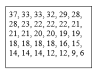
A stem and leaf display of the data is shown in Figure \(\PageIndex{2}\). The left portion of Figure \(\PageIndex{2}\) contains the stems. They are the numbers 3, 2, 1, and 0, arranged as a column to the left of the bars. Think of these numbers as 10’s digits. A stem of 3, for example, can be used to represent the 10’s digit in any of the numbers from 30 to 39. The numbers to the right of the bar are leaves, and they represent the 1’s digits. Every leaf in the graph therefore stands for the result of adding the leaf to 10 times its stem.
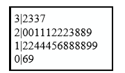
To make this clear, let us examine Figure \(\PageIndex{2}\) more closely. In the top row, the four leaves to the right of stem 3 are 2, 3, 3, and 7. Combined with the stem, these leaves represent the numbers 32, 33, 33, and 37, which are the numbers of TD passes for the first four teams in Figure \(\PageIndex{1}\). The next row has a stem of 2 and 12 leaves. Together, they represent 12 data points, namely, two occurrences of 20 TD passes, three occurrences of 21 TD passes, three occurrences of 22 TD passes, one occurrence of 23 TD passes, two occurrences of 28 TD passes, and one occurrence of 29 TD passes. We leave it to you to figure out what the third row represents. The fourth row has a stem of 0 and two leaves. It stands for the last two entries in Figure \(\PageIndex{1}\), namely 9 TD passes and 6 TD passes. (The latter two numbers may be thought of as 09 and 06.)
One purpose of a stem and leaf display is to clarify the shape of the distribution. You can see many facts about TD passes more easily in Figure \(\PageIndex{7}\) than in Figure \(\PageIndex{1}\). For example, by looking at the stems and the shape of the plot, you can tell that most of the teams had between 10 and 29 passing TD's, with a few having more and a few having less. The precise numbers of TD passes can be determined by examining the leaves.
We can make our figure even more revealing by splitting each stem into two parts. Figure \(\PageIndex{3}\) shows how to do this. The top row is reserved for numbers from 35 to 39 and holds only the 37 TD passes made by the first team in Figure \(\PageIndex{1}\). The second row is reserved for the numbers from 30 to 34 and holds the 32, 33, and 33 TD passes made by the next three teams in the table. You can see for yourself what the other rows represent.
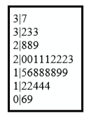
F igure \(\PageIndex{3}\) is more revealing than Figure \(\PageIndex{2}\) because the latter figure lumps too many values into a single row. Whether you should split stems in a display depends on the exact form of your data. If rows get too long with single stems, you might try splitting them into two or more parts.
There is a variation of stem and leaf displays that is useful for comparing distributions. The two distributions are placed back to back along a common column of stems. The result is a “back-to-back stem and leaf display.” Figure \(\PageIndex{4}\) shows such a graph. It compares the numbers of TD passes in the 1998 and 2000 seasons. The stems are in the middle, the leaves to the left are for the 1998 data, and the leaves to the right are for the 2000 data. For example, the second-to-last row shows that in 1998 there were teams with 11, 12, and 13 TD passes, and in 2000 there were two teams with 12 and three teams with 14 TD passes.
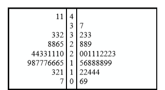
Figure \(\PageIndex{4}\) helps us see that the two seasons were similar, but that only in 1998 did any teams throw more than 40 TD passes.
There are two things about the football data that make them easy to graph with stems and leaves. First, the data are limited to whole numbers that can be represented with a one-digit stem and a one-digit leaf. Second, all the numbers are positive. If the data include numbers with three or more digits, or contain decimals, they can be rounded to two-digit accuracy. Negative values are also easily handled. Let us look at another example.
Figure \(\PageIndex{5}\) shows data from the case study Weapons and Aggression. Each value is the mean difference over a series of trials between the times it took an experimental subject to name aggressive words (like “punch”) under two conditions. In one condition, the words were preceded by a non-weapon word such as “bug.” In the second condition, the same words were preceded by a weapon word such as “gun” or “knife.” The issue addressed by the experiment was whether a preceding weapon word would speed up (or prime) pronunciation of the aggressive word compared to a non-weapon priming word. A positive difference implies greater priming of the aggressive word by the weapon word. Negative differences imply that the priming by the weapon word was less than for a neutral word.

You see that the numbers range from 43.2 to -27.4. The first value indicates that one subject was 43.2 milliseconds faster pronouncing aggressive words when they were preceded by weapon words than when preceded by neutral words. The value 27.4 indicates that another subject was 27.4 milliseconds slower pronouncing aggressive words when they were preceded by weapon words.
The data are displayed with stems and leaves in Figure \(\PageIndex{6}\). Since stem and leaf displays can only portray two whole digits (one for the stem and one for the leaf) the numbers are first rounded. Thus, the value 43.2 is rounded to 43 and represented with a stem of 4 and a leaf of 3. Similarly, 42.9 is rounded to 43. To represent negative numbers, we simply use negative stems. For example, the bottom row of the figure represents the number –27. The second-to-last row represents the numbers -10, -10, -15, etc. Once again, we have rounded the original values from Figure \(\PageIndex{5}\).
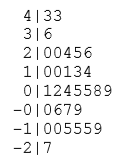
Observe that the figure contains a row headed by “0” and another headed by “-0.” The stem of 0 is for numbers between 0 and 9, whereas the stem of -0 is for numbers between 0 and -9. For example, the fifth row of the table holds the numbers 1, 2, 4, 5, 5, 8, 9 and the sixth row holds 0, -6, -7, and -9. Values that are exactly 0 before rounding should be split as evenly as possible between the “0” and “-0” rows. In Figure \(\PageIndex{5}\), none of the values are 0 before rounding. The “0” that appears in the “-0” row comes from the original value of -0.2 in the table.
Although stem and leaf displays are unwieldy for large data sets, they are often useful for data sets with up to 200 observations. Figure \(\PageIndex{7}\) portrays the distribution of populations of 185 US cities in 1998. To be included, a city had to have between 100,000 and 500,000 residents.
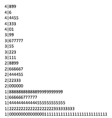
Since a stem and leaf plot shows only two-place accuracy, we had to round the numbers to the nearest 10,000. For example the largest number (493,559) was rounded to 490,000 and then plotted with a stem of 4 and a leaf of 9. The fourth highest number (463,201) was rounded to 460,000 and plotted with a stem of 4 and a leaf of 6. Thus, the stems represent units of 100,000 and the leaves represent units of 10,000. Notice that each stem value is split into five parts: 0-1, 2-3, 4-5, 67, and 8-9.
Whether your data can be suitably represented by a stem and leaf display depends on whether they can be rounded without loss of important information. Also, their extreme values must fit into two successive digits, as the data in Figure 11 fit into the 10,000 and 100,000 places (for leaves and stems, respectively). Deciding what kind of graph is best suited to displaying your data thus requires good judgment. Statistics is not just recipes!
A histogram is a graphical method for displaying the shape of a distribution. It is particularly useful when there are a large number of observations. We begin with an example consisting of the scores of 642 students on a psychology test. The test consists of 197 items each graded as “correct” or “incorrect.” The students' scores ranged from 46 to 167.
The first step is to create a frequency table. Unfortunately, a simple frequency table would be too big, containing over 100 rows. To simplify the table, we group scores together as shown in Table \(\PageIndex{1}\).
To create this table, the range of scores was broken into intervals, called class intervals. The first interval is from 39.5 to 49.5, the second from 49.5 to 59.5, etc. Next, the number of scores falling into each interval was counted to obtain the class frequencies. There are three scores in the first interval, 10 in the second, etc.
Class intervals of width 10 provide enough detail about the distribution to be revealing without making the graph too “choppy.” More information on choosing the widths of class intervals is presented later in this section. Placing the limits of the class intervals midway between two numbers (e.g., 49.5) ensures that every score will fall in an interval rather than on the boundary between intervals.
In a histogram, the class frequencies are represented by bars. The height of each bar corresponds to its class frequency. A histogram of these data is shown in Figure \(\PageIndex{8}\).
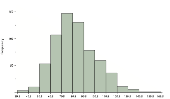
The histogram makes it plain that most of the scores are in the middle of the distribution, with fewer scores in the extremes. You can also see that the distribution is not symmetric: the scores extend to the right farther than they do to the left. The distribution is therefore said to be skewed. (We'll have more to say about shapes of distributions in Chapter 3.)
In our example, the observations are whole numbers. Histograms can also be used when the scores are measured on a more continuous scale such as the length of time (in milliseconds) required to perform a task. In this case, there is no need to worry about fence sitters since they are improbable. (It would be quite a coincidence for a task to require exactly 7 seconds, measured to the nearest thousandth of a second.) We are therefore free to choose whole numbers as boundaries for our class intervals, for example, 4000, 5000, etc. The class frequency is then the number of observations that are greater than or equal to the lower bound, and strictly less than the upper bound. For example, one interval might hold times from 4000 to 4999 milliseconds. Using whole numbers as boundaries avoids a cluttered appearance, and is the practice of many computer programs that create histograms. Note also that some computer programs label the middle of each interval rather than the end points.
Histograms can be based on relative frequencies instead of actual frequencies. Histograms based on relative frequencies show the proportion of scores in each interval rather than the number of scores. In this case, the Y-axis runs from 0 to 1 (or somewhere in between if there are no extreme proportions). You can change a histogram based on frequencies to one based on relative frequencies by (a) dividing each class frequency by the total number of observations, and then (b) plotting the quotients on the Y-axis (labeled as proportion).
There is more to be said about the widths of the class intervals, sometimes called bin widths. Your choice of bin width determines the number of class intervals. This decision, along with the choice of starting point for the first interval, affects the shape of the histogram. The best advice is to experiment with different choices of width, and to choose a histogram according to how well it communicates the shape of the distribution.
Frequency Polygons
Frequency polygons are a graphical device for understanding the shapes of distributions. They serve the same purpose as histograms, but are especially helpful for comparing sets of data. Frequency polygons are also a good choice for displaying cumulative frequency distributions.
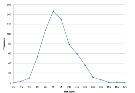
To create a frequency polygon, start just as for histograms, by choosing a class interval. Then draw an X-axis representing the values of the scores in your data. Mark the middle of each class interval with a tick mark, and label it with the middle value represented by the class. Draw the Y-axis to indicate the frequency of each class. Place a point in the middle of each class interval at the height corresponding to its frequency. Finally, connect the points. You should include one class interval below the lowest value in your data and one above the highest value. The graph will then touch the X-axis on both sides.
A frequency polygon for 642 psychology test scores shown in Figure \(\PageIndex{8}\) was constructed from the frequency table shown in Table \(\PageIndex{2}\).
The first label on the X-axis is 35. This represents an interval extending from 29.5 to 39.5. Since the lowest test score is 46, this interval has a frequency of 0. The point labeled 45 represents the interval from 39.5 to 49.5. There are three scores in this interval. There are 147 scores in the interval that surrounds 85.
You can easily discern the shape of the distribution from Figure \(\PageIndex{9}\). Most of the scores are between 65 and 115. It is clear that the distribution is not symmetric inasmuch as good scores (to the right) trail off more gradually than poor scores (to the left). In the terminology of Chapter 3 (where we will study shapes of distributions more systematically), the distribution is skewed.
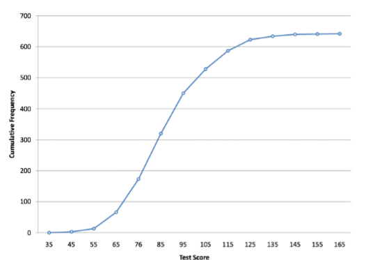
A cumulative frequency polygon for the same test scores is shown in Figure \(\PageIndex{10}\). The graph is the same as before except that the Y value for each point is the number of students in the corresponding class interval plus all numbers in lower intervals. For example, there are no scores in the interval labeled “35,” three in the interval “45,” and 10 in the interval “55.” Therefore, the Y value corresponding to “55” is 13. Since 642 students took the test, the cumulative frequency for the last interval is 642.
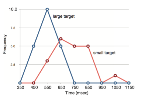
Frequency polygons are useful for comparing distributions. This is achieved by overlaying the frequency polygons drawn for different data sets. Figure 2.1.3 provides an example. The data come from a task in which the goal is to move a computer cursor to a target on the screen as fast as possible. On 20 of the trials, the target was a small rectangle; on the other 20, the target was a large rectangle. Time to reach the target was recorded on each trial. The two distributions (one for each target) are plotted together in Figure \(\PageIndex{11}\). The figure shows that, although there is some overlap in times, it generally took longer to move the cursor to the small target than to the large one.
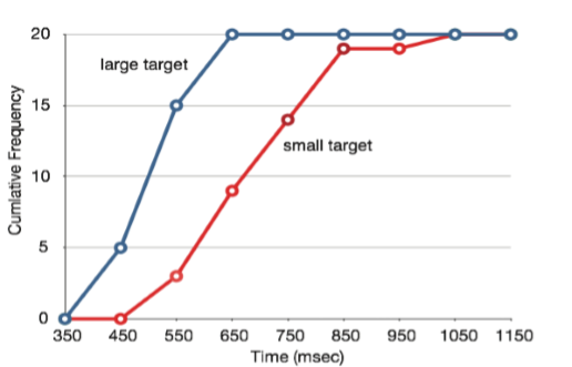
It is also possible to plot two cumulative frequency distributions in the same graph. This is illustrated in Figure \(\PageIndex{12}\) using the same data from the cursor task. The difference in distributions for the two targets is again evident.
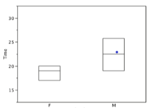
Box Plots We have already discussed techniques for visually representing data (see histograms and frequency polygons). In this section we present another important graph, called a box plot. Box plots are useful for identifying outliers and for comparing distributions. We will explain box plots with the help of data from an in-class experiment. Students in Introductory Statistics were presented with a page containing 30 colored rectangles. Their task was to name the colors as quickly as possible. Their times (in seconds) were recorded. We'll compare the scores for the 16 men and 31 women who participated in the experiment by making separate box plots for each gender. Such a display is said to involve parallel box plots.
There are several steps in constructing a box plot. The first relies on the 25th, 50th, and 75th percentiles in the distribution of scores. Figure \(\PageIndex{14}\) shows how these three statistics are used. For each gender we draw a box extending from the 25th percentile to the 75th percentile. The 50th percentile is drawn inside the box. Therefore, the bottom of each box is the 25th percentile, the top is the 75th percentile, and the line in the middle is the 50th percentile. The data for the women in our sample are shown in Figure \(\PageIndex{13}\).

For these data, the 25th percentile is 17, the 50th percentile is 19, and the 75th percentile is 20. For the men (whose data are not shown), the 25th percentile is 19, the 50th percentile is 22.5, and the 75th percentile is 25.5.
Before proceeding, the terminology in Table \(\PageIndex{3}\) is helpful.
Continuing with the box plots, we put “whiskers” above and below each box to give additional information about the spread of data. Whiskers are vertical lines that end in a horizontal stroke. Whiskers are drawn from the upper and lower hinges to the upper and lower adjacent values (24 and 14 for the women's data), as shown in Figure \(\PageIndex{15}\).
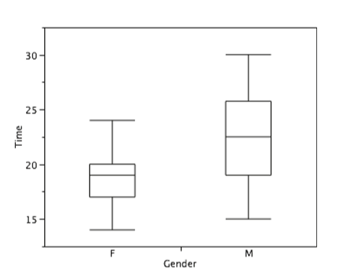
Although we don't draw whiskers all the way to outside or far out values, we still wish to represent them in our box plots. This is achieved by adding additional marks beyond the whiskers. Specifically, outside values are indicated by small “o's” and far out values are indicated by asterisks (*). In our data, there are no farout values and just one outside value. This outside value of 29 is for the women and is shown in Figure \(\PageIndex{16}\).
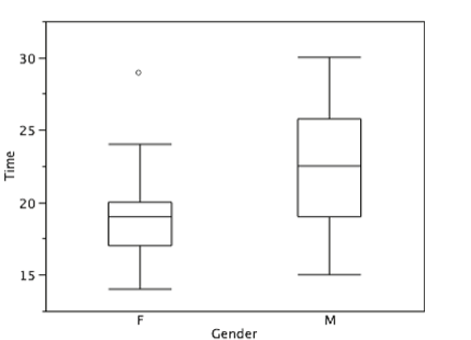
There is one more mark to include in box plots (although sometimes it is omitted). We indicate the mean score for a group by inserting a plus sign. Figure \(\PageIndex{17}\) shows the result of adding means to our box plots.
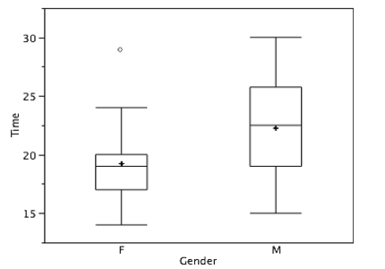
Figure \(\PageIndex{17}\) provides a revealing summary of the data. Since half the scores in a distribution are between the hinges (recall that the hinges are the 25th and 75th percentiles), we see that half the women's times are between 17 and 20 seconds whereas half the men's times are between 19 and 25.5 seconds. We also see that women generally named the colors faster than the men did, although one woman was slower than almost all of the men. Figure \(\PageIndex{18}\) shows the box plot for the women's data with detailed labels.
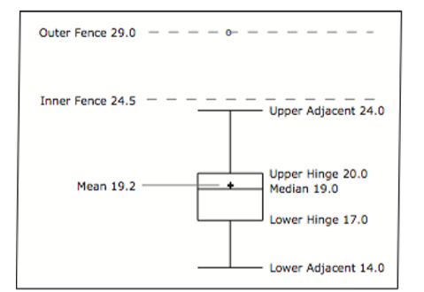
Box plots provide basic information about a distribution. For example, a distribution with a positive skew would have a longer whisker in the positive direction than in the negative direction. A larger mean than median would also indicate a positive skew. Box plots are good at portraying extreme values and are especially good at showing differences between distributions. However, many of the details of a distribution are not revealed in a box plot and to examine these details one should use create a histogram and/or a stem and leaf display.
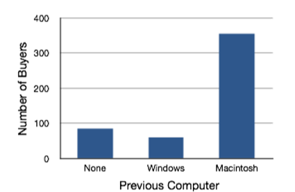
In the section on qualitative variables, we saw how bar charts could be used to illustrate the frequencies of different categories. For example, the bar chart shown in Figure \(\PageIndex{19}\) shows how many purchasers of iMac computers were previous Macintosh users, previous Windows users, and new computer purchasers.
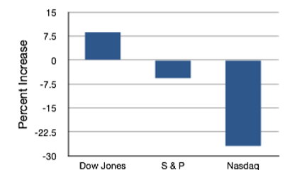
In this section we show how bar charts can be used to present other kinds of quantitative information, not just frequency counts. The bar chart in Figure \(\PageIndex{20}\) shows the percent increases in the Dow Jones, Standard and Poor 500 (S & P), and Nasdaq stock indexes from May 24th 2000 to May 24th 2001. Notice that both the S & P and the Nasdaq had “negative increases” which means that they decreased in value. In this bar chart, the Y-axis is not frequency but rather the signed quantity percentage increase.
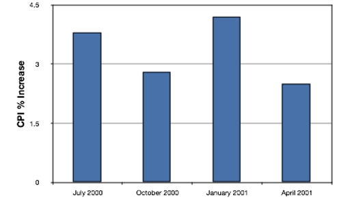
Bar charts are particularly effective for showing change over time. Figure \(\PageIndex{21}\), for example, shows the percent increase in the Consumer Price Index (CPI) over four three-month periods. The fluctuation in inflation is apparent in the graph.
Bar charts are often used to compare the means of different experimental conditions. Figure 2.1.4 shows the mean time it took one of us (DL) to move the cursor to either a small target or a large target. On average, more time was required for small targets than for large ones.
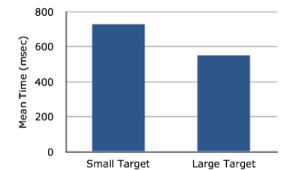
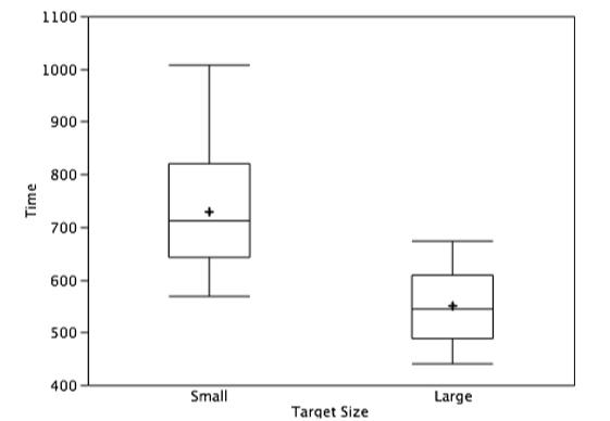
Although bar charts can display means, we do not recommend them for this purpose. Box plots should be used instead since they provide more information than bar charts without taking up more space. For example, a box plot of the cursor-movement data is shown in Figure \(\PageIndex{23}\). You can see that Figure \(\PageIndex{23}\) reveals more about the distribution of movement times than does Figure \(\PageIndex{22}\).
The section on qualitative variables presented earlier in this chapter discussed the use of bar charts for comparing distributions. Some common graphical mistakes were also noted. The earlier discussion applies equally well to the use of bar charts to display quantitative variables.
Line Graphs
A line graph is a bar graph with the tops of the bars represented by points joined by lines (the rest of the bar is suppressed). For example, Figure \(\PageIndex{24}\) was presented in the section on bar charts and shows changes in the Consumer Price Index (CPI) over time.
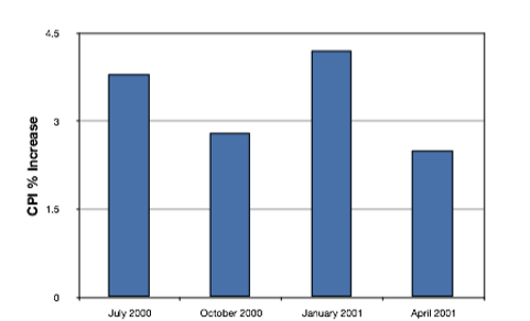
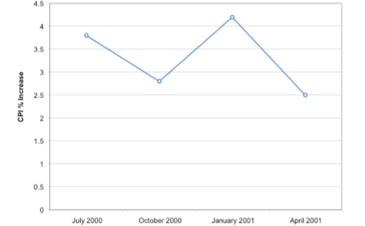
A line graph of these same data is shown in Figure \(\PageIndex{25}\). Although the figures are similar, the line graph emphasizes the change from period to period.
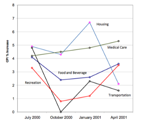
Line graphs are appropriate only when both the X- and Y-axes display ordered (rather than qualitative) variables. Although bar charts can also be used in this situation, line graphs are generally better at comparing changes over time. Figure \(\PageIndex{26}\), for example, shows percent increases and decreases in five components of the CPI. The figure makes it easy to see that medical costs had a steadier progression than the other components. Although you could create an analogous bar chart, its interpretation would not be as easy.
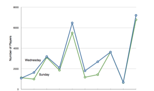
Let us stress that it is misleading to use a line graph when the X-axis contains merely qualitative variables. Figure \(\PageIndex{27}\) inappropriately shows a line graph of the card game data from Yahoo, discussed in the section on qualitative variables. The defect in Figure \(\PageIndex{27}\) is that it gives the false impression that the games are naturally ordered in a numerical way.
The Shape of Distribution
Finally, it is useful to present discussion on how we describe the shapes of distributions, which we will revisit in the next chapter to learn how different shapes affect our numerical descriptors of data and distributions.
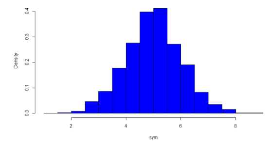
The primary characteristic we are concerned about when assessing the shape of a distribution is whether the distribution is symmetrical or skewed. A symmetrical distribution, as the name suggests, can be cut down the center to form 2 mirror images. Although in practice we will never get a perfectly symmetrical distribution, we would like our data to be as close to symmetrical as possible for reasons we delve into in Chapter 3. Many types of distributions are symmetrical, but by far the most common and pertinent distribution at this point is the normal distribution, shown in Figure \(\PageIndex{28}\). Notice that although the symmetry is not perfect (for instance, the bar just to the right of the center is taller than the one just to the left), the two sides are roughly the same shape. The normal distribution has a single peak, known as the center, and two tails that extend out equally, forming what is known as a bell shape or bell curve.
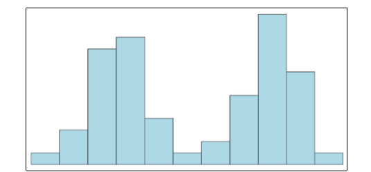
Symmetrical distributions can also have multiple peaks. Figure \(\PageIndex{29}\) shows a bimodal distribution, named for the two peaks that lie roughly symmetrically on either side of the center point. As we will see in the next chapter, this is not a particularly desirable characteristic of our data, and, worse, this is a relatively difficult characteristic to detect numerically. Thus, it is important to visualize your data before moving ahead with any formal analyses.
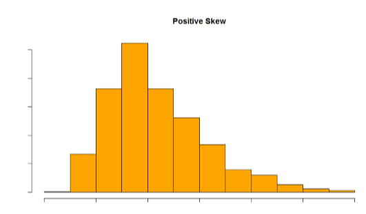
Distributions that are not symmetrical also come in many forms, more than can be described here. The most common asymmetry to be encountered is referred to as skew, in which one of the two tails of the distribution is disproportionately longer than the other. This property can affect the value of the averages we use in our analyses and make them an inaccurate representation of our data, which causes many problems.
Skew can either be positive or negative (also known as right or left, respectively), based on which tail is longer. It is very easy to get the two confused at first; many students want to describe the skew by where the bulk of the data (larger portion of the histogram, known as the body) is placed, but the correct determination is based on which tail is longer. You can think of the tail as an arrow: whichever direction the arrow is pointing is the direction of the skew. Figures \(\PageIndex{30}\) and \(\PageIndex{31}\) show positive (right) and negative (left) skew, respectively.
- Affiliate Program

- UNITED STATES
- 台灣 (TAIWAN)
- TÜRKIYE (TURKEY)
- Academic Editing Services
- - Research Paper
- - Journal Manuscript
- - Dissertation
- - College & University Assignments
- Admissions Editing Services
- - Application Essay
- - Personal Statement
- - Recommendation Letter
- - Cover Letter
- - CV/Resume
- Business Editing Services
- - Business Documents
- - Report & Brochure
- - Website & Blog
- Writer Editing Services
- - Script & Screenplay
- Our Editors
- Client Reviews
- Editing & Proofreading Prices
- Wordvice Points
- Partner Discount
- Plagiarism Checker
- APA Citation Generator
- MLA Citation Generator
- Chicago Citation Generator
- Vancouver Citation Generator
- - APA Style
- - MLA Style
- - Chicago Style
- - Vancouver Style
- Writing & Editing Guide
- Academic Resources
- Admissions Resources
How to Use Tables & Graphs in a Research Paper
It might not seem very relevant to the story and outcome of your study, but how you visually present your experimental or statistical results can play an important role during the review and publication process of your article. A presentation that is in line with the overall logical flow of your story helps you guide the reader effectively from your introduction to your conclusion.
If your results (and the way you organize and present them) don’t follow the story you outlined in the beginning, then you might confuse the reader and they might end up doubting the validity of your research, which can increase the chance of your manuscript being rejected at an early stage. This article illustrates the options you have when organizing and writing your results and will help you make the best choice for presenting your study data in a research paper.
Why does data visualization matter?
Your data and the results of your analysis are the core of your study. Of course, you need to put your findings and what you think your findings mean into words in the text of your article. But you also need to present the same information visually, in the results section of your manuscript, so that the reader can follow and verify that they agree with your observations and conclusions.
The way you visualize your data can either help the reader to comprehend quickly and identify the patterns you describe and the predictions you make, or it can leave them wondering what you are trying to say or whether your claims are supported by evidence. Different types of data therefore need to be presented in different ways, and whatever way you choose needs to be in line with your story.
Another thing to keep in mind is that many journals have specific rules or limitations (e.g., how many tables and graphs you are allowed to include, what kind of data needs to go on what kind of graph) and specific instructions on how to generate and format data tables and graphs (e.g., maximum number of subpanels, length and detail level of tables). In the following, we will go into the main points that you need to consider when organizing your data and writing your result section .
Table of Contents:
Types of data , when to use data tables .
- When to Use Data Graphs
Common Types of Graphs in Research Papers
Journal guidelines: what to consider before submission.
Depending on the aim of your research and the methods and procedures you use, your data can be quantitative or qualitative. Quantitative data, whether objective (e.g., size measurements) or subjective (e.g., rating one’s own happiness on a scale), is what is usually collected in experimental research. Quantitative data are expressed in numbers and analyzed with the most common statistical methods. Qualitative data, on the other hand, can consist of case studies or historical documents, or it can be collected through surveys and interviews. Qualitative data are expressed in words and needs to be categorized and interpreted to yield meaningful outcomes.
Quantitative data example: Height differences between two groups of participants Qualitative data example: Subjective feedback on the food quality in the work cafeteria
Depending on what kind of data you have collected and what story you want to tell with it, you have to find the best way of organizing and visualizing your results.
When you want to show the reader in detail how your independent and dependent variables interact, then a table (with data arranged in columns and rows) is your best choice. In a table, readers can look up exact values, compare those values between pairs or groups of related measurements (e.g., growth rates or outcomes of a medical procedure over several years), look at ranges and intervals, and select specific factors to search for patterns.
Tables are not restrained to a specific type of data or measurement. Since tables really need to be read, they activate the verbal system. This requires focus and some time (depending on how much data you are presenting), but it gives the reader the freedom to explore the data according to their own interest. Depending on your audience, this might be exactly what your readers want. If you explain and discuss all the variables that your table lists in detail in your manuscript text, then you definitely need to give the reader the chance to look at the details for themselves and follow your arguments. If your analysis only consists of simple t-tests to assess differences between two groups, you can report these results in the text (in this case: mean, standard deviation, t-statistic, and p-value), and do not necessarily need to include a table that simply states the same numbers again. If you did extensive analyses but focus on only part of that data (and clearly explain why, so that the reader does not think you forgot to talk about the rest), then a graph that illustrates and emphasizes the specific result or relationship that you consider the main point of your story might be a better choice.
When to Use Data Graphs
Graphs are a visual display of information and show the overall shape of your results rather than the details. If used correctly, a visual representation helps your (or your reader’s) brain to quickly understand large amounts of data and spot patterns, trends, and exceptions or outliers. Graphs also make it easier to illustrate relationships between entire data sets. This is why, when you analyze your results, you usually don’t just look at the numbers and the statistical values of your tests, but also at histograms, box plots, and distribution plots, to quickly get an overview of what is going on in your data.
Line graphs
When you want to illustrate a change over a continuous range or time, a line graph is your best choice. Changes in different groups or samples over the same range or time can be shown by lines of different colors or with different symbols.
Example: Let’s collapse across the different food types and look at the growth of our four fish species over time.
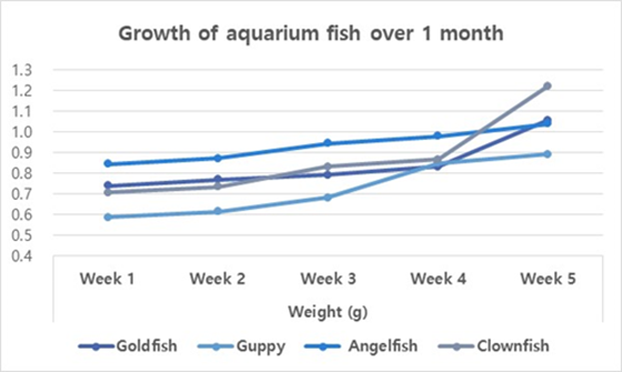
You should use a bar graph when your data is not continuous but divided into categories that are not necessarily connected, such as different samples, methods, or setups. In our example, the different fish types or the different types of food are such non-continuous categories.
Example: Let’s collapse across the food types again and also across time, and only compare the overall weight increase of our four fish types at the end of the feeding period.
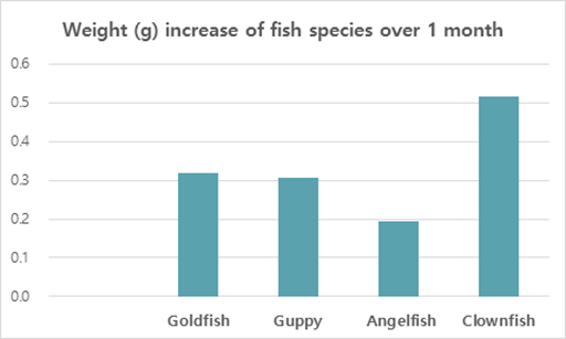
Scatter plots
Scatter plots can be used to illustrate the relationship between two variables — but note that both have to be continuous. The following example displays “fish length” as an additional variable–none of the variables in our table above (fish type, fish food, time) are continuous, and they can therefore not be used for this kind of graph.
As you see, these example graphs all contain less data than the table above, but they lead the reader to exactly the key point of your results or the finding you want to emphasize. If you let your readers search for these observations in a big table full of details that are not necessarily relevant to the claims you want to make, you can create unnecessary confusion. Most journals allow you to provide bigger datasets as supplementary information, and some even require you to upload all your raw data at submission. When you write up your manuscript, however, matching the data presentation to the storyline is more important than throwing everything you have at the reader.
Don’t forget that every graph needs to have clear x and y axis labels , a title that summarizes what is shown above the figure, and a descriptive legend/caption below. Since your caption needs to stand alone and the reader needs to be able to understand it without looking at the text, you need to explain what you measured/tested and spell out all labels and abbreviations you use in any of your graphs once more in the caption (even if you think the reader “should” remember everything by now, make it easy for them and guide them through your results once more). Have a look at this article if you need help on how to write strong and effective figure legends .
Even if you have thought about the data you have, the story you want to tell, and how to guide the reader most effectively through your results, you need to check whether the journal you plan to submit to has specific guidelines and limitations when it comes to tables and graphs. Some journals allow you to submit any tables and graphs initially (as long as tables are editable (for example in Word format, not an image) and graphs of high enough resolution.
Some others, however, have very specific instructions even at the submission stage, and almost all journals will ask you to follow their formatting guidelines once your manuscript is accepted. The closer your figures are already to those guidelines, the faster your article can be published. This PLOS One Figure Preparation Checklist is a good example of how extensive these instructions can be – don’t wait until the last minute to realize that you have to completely reorganize your results because your target journal does not accept tables above a certain length or graphs with more than 4 panels per figure.
Some things you should always pay attention to (and look at already published articles in the same journal if you are unsure or if the author instructions seem confusing) are the following:
- How many tables and graphs are you allowed to include?
- What file formats are you allowed to submit?
- Are there specific rules on resolution/dimension/file size?
- Should your figure files be uploaded separately or placed into the text?
- If figures are uploaded separately, do the files have to be named in a specific way?
- Are there rules on what fonts to use or to avoid and how to label subpanels?
- Are you allowed to use color? If not, make sure your data sets are distinguishable.
If you are dealing with digital image data, then it might also be a good idea to familiarize yourself with the difference between “adjusting” for clarity and visibility and image manipulation, which constitutes scientific misconduct . And to fully prepare your research paper for publication before submitting it, be sure to receive proofreading services , including journal manuscript editing and research paper editing , from Wordvice’s professional academic editors .
Have a language expert improve your writing
Run a free plagiarism check in 10 minutes, generate accurate citations for free.
- Knowledge Base
Methodology
- What Is Quantitative Research? | Definition, Uses & Methods
What Is Quantitative Research? | Definition, Uses & Methods
Published on June 12, 2020 by Pritha Bhandari . Revised on June 22, 2023.
Quantitative research is the process of collecting and analyzing numerical data. It can be used to find patterns and averages, make predictions, test causal relationships, and generalize results to wider populations.
Quantitative research is the opposite of qualitative research , which involves collecting and analyzing non-numerical data (e.g., text, video, or audio).
Quantitative research is widely used in the natural and social sciences: biology, chemistry, psychology, economics, sociology, marketing, etc.
- What is the demographic makeup of Singapore in 2020?
- How has the average temperature changed globally over the last century?
- Does environmental pollution affect the prevalence of honey bees?
- Does working from home increase productivity for people with long commutes?
Table of contents
Quantitative research methods, quantitative data analysis, advantages of quantitative research, disadvantages of quantitative research, other interesting articles, frequently asked questions about quantitative research.
You can use quantitative research methods for descriptive, correlational or experimental research.
- In descriptive research , you simply seek an overall summary of your study variables.
- In correlational research , you investigate relationships between your study variables.
- In experimental research , you systematically examine whether there is a cause-and-effect relationship between variables.
Correlational and experimental research can both be used to formally test hypotheses , or predictions, using statistics. The results may be generalized to broader populations based on the sampling method used.
To collect quantitative data, you will often need to use operational definitions that translate abstract concepts (e.g., mood) into observable and quantifiable measures (e.g., self-ratings of feelings and energy levels).
Note that quantitative research is at risk for certain research biases , including information bias , omitted variable bias , sampling bias , or selection bias . Be sure that you’re aware of potential biases as you collect and analyze your data to prevent them from impacting your work too much.
Receive feedback on language, structure, and formatting
Professional editors proofread and edit your paper by focusing on:
- Academic style
- Vague sentences
- Style consistency
See an example

Once data is collected, you may need to process it before it can be analyzed. For example, survey and test data may need to be transformed from words to numbers. Then, you can use statistical analysis to answer your research questions .
Descriptive statistics will give you a summary of your data and include measures of averages and variability. You can also use graphs, scatter plots and frequency tables to visualize your data and check for any trends or outliers.
Using inferential statistics , you can make predictions or generalizations based on your data. You can test your hypothesis or use your sample data to estimate the population parameter .
First, you use descriptive statistics to get a summary of the data. You find the mean (average) and the mode (most frequent rating) of procrastination of the two groups, and plot the data to see if there are any outliers.
You can also assess the reliability and validity of your data collection methods to indicate how consistently and accurately your methods actually measured what you wanted them to.
Quantitative research is often used to standardize data collection and generalize findings . Strengths of this approach include:
- Replication
Repeating the study is possible because of standardized data collection protocols and tangible definitions of abstract concepts.
- Direct comparisons of results
The study can be reproduced in other cultural settings, times or with different groups of participants. Results can be compared statistically.
- Large samples
Data from large samples can be processed and analyzed using reliable and consistent procedures through quantitative data analysis.
- Hypothesis testing
Using formalized and established hypothesis testing procedures means that you have to carefully consider and report your research variables, predictions, data collection and testing methods before coming to a conclusion.
Despite the benefits of quantitative research, it is sometimes inadequate in explaining complex research topics. Its limitations include:
- Superficiality
Using precise and restrictive operational definitions may inadequately represent complex concepts. For example, the concept of mood may be represented with just a number in quantitative research, but explained with elaboration in qualitative research.
- Narrow focus
Predetermined variables and measurement procedures can mean that you ignore other relevant observations.
- Structural bias
Despite standardized procedures, structural biases can still affect quantitative research. Missing data , imprecise measurements or inappropriate sampling methods are biases that can lead to the wrong conclusions.
- Lack of context
Quantitative research often uses unnatural settings like laboratories or fails to consider historical and cultural contexts that may affect data collection and results.
If you want to know more about statistics , methodology , or research bias , make sure to check out some of our other articles with explanations and examples.
- Chi square goodness of fit test
- Degrees of freedom
- Null hypothesis
- Discourse analysis
- Control groups
- Mixed methods research
- Non-probability sampling
- Inclusion and exclusion criteria
Research bias
- Rosenthal effect
- Implicit bias
- Cognitive bias
- Selection bias
- Negativity bias
- Status quo bias
Quantitative research deals with numbers and statistics, while qualitative research deals with words and meanings.
Quantitative methods allow you to systematically measure variables and test hypotheses . Qualitative methods allow you to explore concepts and experiences in more detail.
In mixed methods research , you use both qualitative and quantitative data collection and analysis methods to answer your research question .
Data collection is the systematic process by which observations or measurements are gathered in research. It is used in many different contexts by academics, governments, businesses, and other organizations.
Operationalization means turning abstract conceptual ideas into measurable observations.
For example, the concept of social anxiety isn’t directly observable, but it can be operationally defined in terms of self-rating scores, behavioral avoidance of crowded places, or physical anxiety symptoms in social situations.
Before collecting data , it’s important to consider how you will operationalize the variables that you want to measure.
Reliability and validity are both about how well a method measures something:
- Reliability refers to the consistency of a measure (whether the results can be reproduced under the same conditions).
- Validity refers to the accuracy of a measure (whether the results really do represent what they are supposed to measure).
If you are doing experimental research, you also have to consider the internal and external validity of your experiment.
Hypothesis testing is a formal procedure for investigating our ideas about the world using statistics. It is used by scientists to test specific predictions, called hypotheses , by calculating how likely it is that a pattern or relationship between variables could have arisen by chance.
Cite this Scribbr article
If you want to cite this source, you can copy and paste the citation or click the “Cite this Scribbr article” button to automatically add the citation to our free Citation Generator.
Bhandari, P. (2023, June 22). What Is Quantitative Research? | Definition, Uses & Methods. Scribbr. Retrieved April 6, 2024, from https://www.scribbr.com/methodology/quantitative-research/
Is this article helpful?

Pritha Bhandari
Other students also liked, descriptive statistics | definitions, types, examples, inferential statistics | an easy introduction & examples, what is your plagiarism score.
Have a language expert improve your writing
Run a free plagiarism check in 10 minutes, automatically generate references for free.
- Knowledge Base
- Methodology
- What Is Quantitative Research? | Definition & Methods
What Is Quantitative Research? | Definition & Methods
Published on 4 April 2022 by Pritha Bhandari . Revised on 10 October 2022.
Quantitative research is the process of collecting and analysing numerical data. It can be used to find patterns and averages, make predictions, test causal relationships, and generalise results to wider populations.
Quantitative research is the opposite of qualitative research , which involves collecting and analysing non-numerical data (e.g. text, video, or audio).
Quantitative research is widely used in the natural and social sciences: biology, chemistry, psychology, economics, sociology, marketing, etc.
- What is the demographic makeup of Singapore in 2020?
- How has the average temperature changed globally over the last century?
- Does environmental pollution affect the prevalence of honey bees?
- Does working from home increase productivity for people with long commutes?
Table of contents
Quantitative research methods, quantitative data analysis, advantages of quantitative research, disadvantages of quantitative research, frequently asked questions about quantitative research.
You can use quantitative research methods for descriptive, correlational or experimental research.
- In descriptive research , you simply seek an overall summary of your study variables.
- In correlational research , you investigate relationships between your study variables.
- In experimental research , you systematically examine whether there is a cause-and-effect relationship between variables.
Correlational and experimental research can both be used to formally test hypotheses , or predictions, using statistics. The results may be generalised to broader populations based on the sampling method used.
To collect quantitative data, you will often need to use operational definitions that translate abstract concepts (e.g., mood) into observable and quantifiable measures (e.g., self-ratings of feelings and energy levels).
Prevent plagiarism, run a free check.
Once data is collected, you may need to process it before it can be analysed. For example, survey and test data may need to be transformed from words to numbers. Then, you can use statistical analysis to answer your research questions .
Descriptive statistics will give you a summary of your data and include measures of averages and variability. You can also use graphs, scatter plots and frequency tables to visualise your data and check for any trends or outliers.
Using inferential statistics , you can make predictions or generalisations based on your data. You can test your hypothesis or use your sample data to estimate the population parameter .
You can also assess the reliability and validity of your data collection methods to indicate how consistently and accurately your methods actually measured what you wanted them to.
Quantitative research is often used to standardise data collection and generalise findings . Strengths of this approach include:
- Replication
Repeating the study is possible because of standardised data collection protocols and tangible definitions of abstract concepts.
- Direct comparisons of results
The study can be reproduced in other cultural settings, times or with different groups of participants. Results can be compared statistically.
- Large samples
Data from large samples can be processed and analysed using reliable and consistent procedures through quantitative data analysis.
- Hypothesis testing
Using formalised and established hypothesis testing procedures means that you have to carefully consider and report your research variables, predictions, data collection and testing methods before coming to a conclusion.
Despite the benefits of quantitative research, it is sometimes inadequate in explaining complex research topics. Its limitations include:
- Superficiality
Using precise and restrictive operational definitions may inadequately represent complex concepts. For example, the concept of mood may be represented with just a number in quantitative research, but explained with elaboration in qualitative research.
- Narrow focus
Predetermined variables and measurement procedures can mean that you ignore other relevant observations.
- Structural bias
Despite standardised procedures, structural biases can still affect quantitative research. Missing data , imprecise measurements or inappropriate sampling methods are biases that can lead to the wrong conclusions.
- Lack of context
Quantitative research often uses unnatural settings like laboratories or fails to consider historical and cultural contexts that may affect data collection and results.
Quantitative research deals with numbers and statistics, while qualitative research deals with words and meanings.
Quantitative methods allow you to test a hypothesis by systematically collecting and analysing data, while qualitative methods allow you to explore ideas and experiences in depth.
In mixed methods research , you use both qualitative and quantitative data collection and analysis methods to answer your research question .
Data collection is the systematic process by which observations or measurements are gathered in research. It is used in many different contexts by academics, governments, businesses, and other organisations.
Operationalisation means turning abstract conceptual ideas into measurable observations.
For example, the concept of social anxiety isn’t directly observable, but it can be operationally defined in terms of self-rating scores, behavioural avoidance of crowded places, or physical anxiety symptoms in social situations.
Before collecting data , it’s important to consider how you will operationalise the variables that you want to measure.
Reliability and validity are both about how well a method measures something:
- Reliability refers to the consistency of a measure (whether the results can be reproduced under the same conditions).
- Validity refers to the accuracy of a measure (whether the results really do represent what they are supposed to measure).
If you are doing experimental research , you also have to consider the internal and external validity of your experiment.
Hypothesis testing is a formal procedure for investigating our ideas about the world using statistics. It is used by scientists to test specific predictions, called hypotheses , by calculating how likely it is that a pattern or relationship between variables could have arisen by chance.
Cite this Scribbr article
If you want to cite this source, you can copy and paste the citation or click the ‘Cite this Scribbr article’ button to automatically add the citation to our free Reference Generator.
Bhandari, P. (2022, October 10). What Is Quantitative Research? | Definition & Methods. Scribbr. Retrieved 2 April 2024, from https://www.scribbr.co.uk/research-methods/introduction-to-quantitative-research/
Is this article helpful?

Pritha Bhandari
Module 11: Statistics: Describing Data
Presenting quantitative data graphically, learning outcomes.
- Create a frequency table, bar graph, pareto chart, pictogram, or a pie chart to represent a data set
- Identify features of ineffective representations of data
- Create a histogram, pie chart, or frequency polygon that represents numerical data
- Create a graph that compares two quantities
Visualizing Numbers

Quantitative, or numerical, data can also be summarized into frequency tables.
A teacher records scores on a 20-point quiz for the 30 students in his class. The scores are:
19 20 18 18 17 18 19 17 20 18 20 16 20 15 17 12 18 19 18 19 17 20 18 16 15 18 20 5 0 0
These scores could be summarized into a frequency table by grouping like values:
Using the table from the first example, it would be possible to create a standard bar chart from this summary, like we did for categorical data:
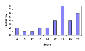
A histogram is like a bar graph, but where the horizontal axis is a number line.
For the values above, a histogram would look like:
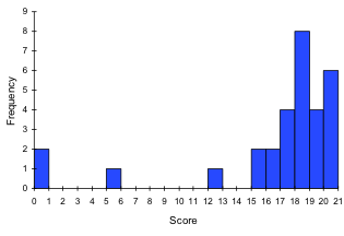
Notice that in the histogram, a bar represents values on the horizontal axis from that on the left hand-side of the bar up to, but not including, the value on the right hand side of the bar. Some people choose to have bars start at ½ values to avoid this ambiguity.
This video demonstrates the creation of the histogram from this data.
Unfortunately, not a lot of common software packages can correctly graph a histogram. About the best you can do in Excel or Word is a bar graph with no gap between the bars and spacing added to simulate a numerical horizontal axis.
If we have a large number of widely varying data values, creating a frequency table that lists every possible value as a category would lead to an exceptionally long frequency table, and probably would not reveal any patterns. For this reason, it is common with quantitative data to group data into class intervals .
Class Intervals
Class intervals are groupings of the data. In general, we define class intervals so that
- each interval is equal in size. For example, if the first class contains values from 120-129, the second class should include values from 130-139.
- we have somewhere between 5 and 20 classes, typically, depending upon the number of data we’re working with.
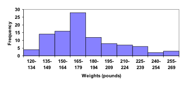
Suppose that we have collected weights from 100 male subjects as part of a nutrition study. For our weight data, we have values ranging from a low of 121 pounds to a high of 263 pounds, giving a total span of 263-121 = 142. We could create 7 intervals with a width of around 20, 14 intervals with a width of around 10, or somewhere in between. Often time we have to experiment with a few possibilities to find something that represents the data well. Let us try using an interval width of 15. We could start at 121, or at 120 since it is a nice round number.
A histogram of this data would look like:
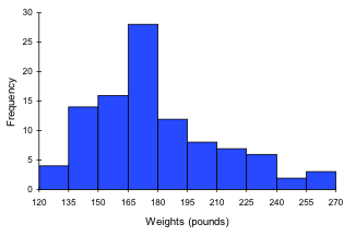
In many software packages, you can create a graph similar to a histogram by putting the class intervals as the labels on a bar chart.
The following video walks through this example in more detail.
Other graph types such as pie charts are possible for quantitative data. The usefulness of different graph types will vary depending upon the number of intervals and the type of data being represented. For example, a pie chart of our weight data is difficult to read because of the quantity of intervals we used.
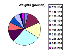
To see more about why a pie chart isn’t useful in this case, watch the following.
The total cost of textbooks for the term was collected from 36 students. Create a histogram for this data.
$140 $160 $160 $165 $180 $220 $235 $240 $250 $260 $280 $285
$285 $285 $290 $300 $300 $305 $310 $310 $315 $315 $320 $320
$330 $340 $345 $350 $355 $360 $360 $380 $395 $420 $460 $460
When collecting data to compare two groups, it is desirable to create a graph that compares quantities.
The data below came from a task in which the goal is to move a computer mouse to a target on the screen as fast as possible. On 20 of the trials, the target was a small rectangle; on the other 20, the target was a large rectangle. Time to reach the target was recorded on each trial.
One option to represent this data would be a comparative histogram or bar chart, in which bars for the small target group and large target group are placed next to each other.
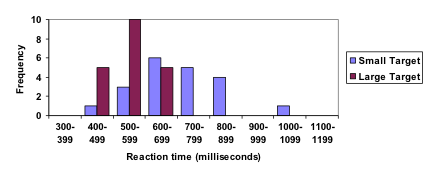
Frequency polygon
An alternative representation is a frequency polygon . A frequency polygon starts out like a histogram, but instead of drawing a bar, a point is placed in the midpoint of each interval at height equal to the frequency. Typically the points are connected with straight lines to emphasize the distribution of the data.
This graph makes it easier to see that reaction times were generally shorter for the larger target, and that the reaction times for the smaller target were more spread out.
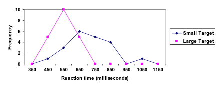
The following video explains frequency polygon creation for this example.
- Revision and Adaptation. Provided by : Lumen Learning. License : CC BY: Attribution
- Presenting Quantitative Data Graphically. Authored by : David Lippman. Located at : http://www.opentextbookstore.com/mathinsociety/ . Project : Math in Society. License : CC BY-SA: Attribution-ShareAlike
- numbers-education-kindergarten. Authored by : karanja. Located at : https://pixabay.com/en/numbers-education-kindergarten-738068/ . License : CC0: No Rights Reserved
- Creating a histogram. Authored by : OCLPhase2's channel. Located at : https://youtu.be/180FgZ_cTrE . License : CC BY: Attribution
- Defining class intervals for a frequency table or histogram. Authored by : OCLPhase2's channel. Located at : https://youtu.be/JhshitTtdP0 . License : CC BY: Attribution
- When not use a pie chart. Authored by : OCLPhase2's channel. Located at : https://youtu.be/FQ8zmZ56-XA . License : CC BY: Attribution
- Frequency polygons. Authored by : OCLPhase2's channel. Located at : https://youtu.be/rxByzA9MFFY . License : CC BY: Attribution


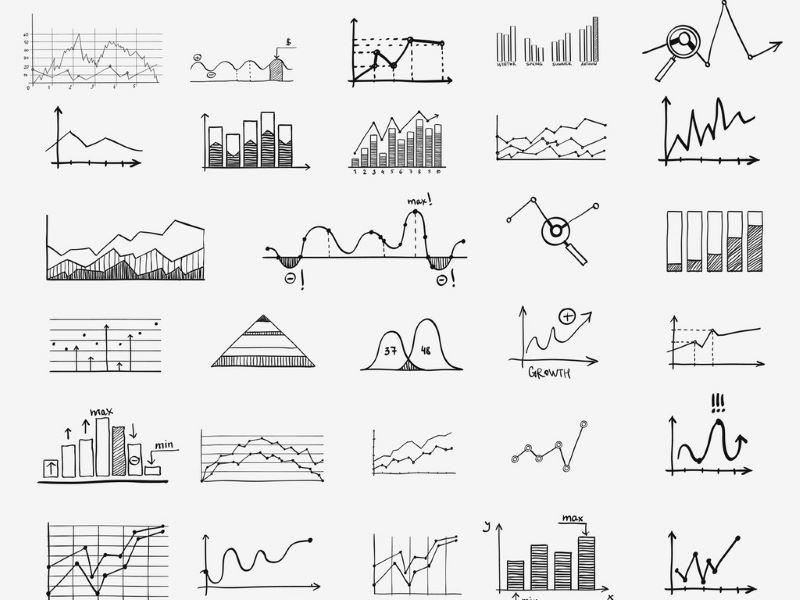
How to develop a graphical framework to chart your research
Graphic representations or frameworks can be powerful tools to explain research processes and outcomes. David Waller explains how researchers can develop effective visual models to chart their work
David Waller
You may also like

Popular resources
.css-1txxx8u{overflow:hidden;max-height:81px;text-indent:0px;} Emotions and learning: what role do emotions play in how and why students learn?
A diy guide to starting your own journal, universities, ai and the common good, artificial intelligence and academic integrity: striking a balance, create an onboarding programme for neurodivergent students.
While undertaking a study, researchers can uncover insights, connections and findings that are extremely valuable to anyone likely to read their eventual paper. Thus, it is important for the researcher to clearly present and explain the ideas and potential relationships. One important way of presenting findings and relationships is by developing a graphical conceptual framework.
A graphical conceptual framework is a visual model that assists readers by illustrating how concepts, constructs, themes or processes work. It is an image designed to help the viewer understand how various factors interrelate and affect outcomes, such as a chart, graph or map.
These are commonly used in research to show outcomes but also to create, develop, test, support and criticise various ideas and models. The use of a conceptual framework can vary depending on whether it is being used for qualitative or quantitative research.
- Using literature reviews to strengthen research: tips for PhDs and supervisors
- Get your research out there: 7 strategies for high-impact science communication
- Understanding peer review: what it is, how it works and why it is important
There are many forms that a graphical conceptual framework can take, which can depend on the topic, the type of research or findings, and what can best present the story.
Below are examples of frameworks based on qualitative and quantitative research.
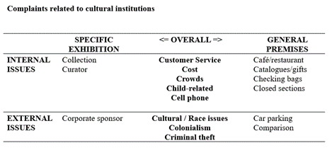
As shown by the table below, in qualitative research the conceptual framework is developed at the end of the study to illustrate the factors or issues presented in the qualitative data. It is designed to assist in theory building and the visual understanding of the exploratory findings. It can also be used to develop a framework in preparation for testing the proposition using quantitative research.
In quantitative research a conceptual framework can be used to synthesise the literature and theoretical concepts at the beginning of the study to present a model that will be tested in the statistical analysis of the research.
It is important to understand that the role of a conceptual framework differs depending on the type of research that is being undertaken.
So how should you go about creating a conceptual framework? After undertaking some studies where I have developed conceptual frameworks, here is a simple model based on “Six Rs”: Review, Reflect, Relationships, Reflect, Review, and Repeat.
Process for developing conceptual frameworks:
Review: literature/themes/theory.
Reflect: what are the main concepts/issues?
Relationships: what are their relationships?
Reflect: does the diagram represent it sufficiently?
Review: check it with theory, colleagues, stakeholders, etc.
Repeat: review and revise it to see if something better occurs.
This is not an easy process. It is important to begin by reviewing what has been presented in previous studies in the literature or in practice. This provides a solid background to the proposed model as it can show how it relates to accepted theoretical concepts or practical examples, and helps make sure that it is grounded in logical sense.
It can start with pen and paper, but after reviewing you should reflect to consider if the proposed framework takes into account the main concepts and issues, and the potential relationships that have been presented on the topic in previous works.
It may take a few versions before you are happy with the final framework, so it is worth continuing to reflect on the model and review its worth by reassessing it to determine if the model is consistent with the literature and theories. It can also be useful to discuss the idea with colleagues or to present preliminary ideas at a conference or workshop – be open to changes.
Even after you come up with a potential model it is good to repeat the process to review the framework and be prepared to revise it as this can help in refining the model. Over time you may develop a number of models with each one superseding the previous one.
A concern is that some students hold on to the framework they first thought of and worry that developing or changing it will be seen as a weakness in their research. However, a revised and refined model can be an important factor in justifying the value of the research.
Plenty of possibilities and theoretical topics could be considered to enhance the model. Whether it ultimately supports the theoretical constructs of the research will be dependent on what occurs when it is tested. As social psychologist, Kurt Lewin, famously said “ There's nothing so practical as good theory ”.
The final result after doing your reviewing and reflecting should be a clear graphical presentation that will help the reader understand what the research is about as well as where it is heading.
It doesn’t need to be complex. A simple diagram or table can clarify the nature of a process and help in its analysis, which can be important for the researcher when communicating to their audience. As the saying goes: “ A picture is worth 1000 words ”. The same goes for a good conceptual framework, when explaining a research process or findings.
David Waller is an associate professor at the University of Technology Sydney .
If you found this interesting and want advice and insight from academics and university staff delivered direct to your inbox each week, sign up for the THE Campus newsletter .
Emotions and learning: what role do emotions play in how and why students learn?
Global perspectives: navigating challenges in higher education across borders, how to help young women see themselves as coders, contextual learning: linking learning to the real world, authentic assessment in higher education and the role of digital creative technologies, how hard can it be testing ai detection tools.
Register for free
and unlock a host of features on the THE site
- Skip to main content
- Skip to primary sidebar
- Skip to footer
- QuestionPro

- Solutions Industries Gaming Automotive Sports and events Education Government Travel & Hospitality Financial Services Healthcare Cannabis Technology Use Case NPS+ Communities Audience Contactless surveys Mobile LivePolls Member Experience GDPR Positive People Science 360 Feedback Surveys
- Resources Blog eBooks Survey Templates Case Studies Training Help center
Home Market Research
Quantitative Research: What It Is, Practices & Methods
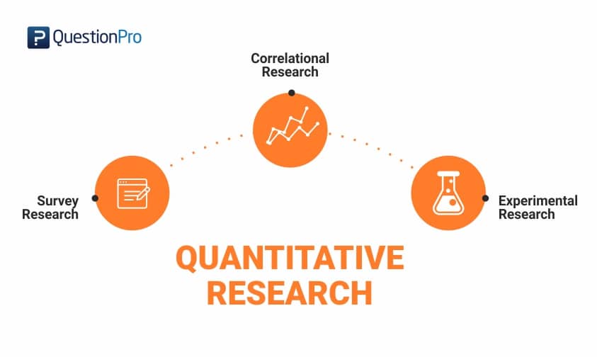
Quantitative research involves analyzing and gathering numerical data to uncover trends, calculate averages, evaluate relationships, and derive overarching insights. It’s used in various fields, including the natural and social sciences. Quantitative data analysis employs statistical techniques for processing and interpreting numeric data.
Research designs in the quantitative realm outline how data will be collected and analyzed with methods like experiments and surveys. Qualitative methods complement quantitative research by focusing on non-numerical data, adding depth to understanding. Data collection methods can be qualitative or quantitative, depending on research goals. Researchers often use a combination of both approaches to gain a comprehensive understanding of phenomena.
What is Quantitative Research?
Quantitative research is a systematic investigation of phenomena by gathering quantifiable data and performing statistical, mathematical, or computational techniques. Quantitative research collects statistically significant information from existing and potential customers using sampling methods and sending out online surveys , online polls , and questionnaires , for example.
One of the main characteristics of this type of research is that the results can be depicted in numerical form. After carefully collecting structured observations and understanding these numbers, it’s possible to predict the future of a product or service, establish causal relationships or Causal Research , and make changes accordingly. Quantitative research primarily centers on the analysis of numerical data and utilizes inferential statistics to derive conclusions that can be extrapolated to the broader population.
An example of a quantitative research study is the survey conducted to understand how long a doctor takes to tend to a patient when the patient walks into the hospital. A patient satisfaction survey can be administered to ask questions like how long a doctor takes to see a patient, how often a patient walks into a hospital, and other such questions, which are dependent variables in the research. This kind of research method is often employed in the social sciences, and it involves using mathematical frameworks and theories to effectively present data, ensuring that the results are logical, statistically sound, and unbiased.
Data collection in quantitative research uses a structured method and is typically conducted on larger samples representing the entire population. Researchers use quantitative methods to collect numerical data, which is then subjected to statistical analysis to determine statistically significant findings. This approach is valuable in both experimental research and social research, as it helps in making informed decisions and drawing reliable conclusions based on quantitative data.
Quantitative Research Characteristics
Quantitative research has several unique characteristics that make it well-suited for specific projects. Let’s explore the most crucial of these characteristics so that you can consider them when planning your next research project:
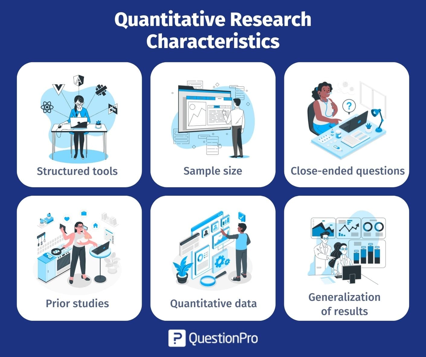
- Structured tools: Quantitative research relies on structured tools such as surveys, polls, or questionnaires to gather quantitative data . Using such structured methods helps collect in-depth and actionable numerical data from the survey respondents, making it easier to perform data analysis.
- Sample size: Quantitative research is conducted on a significant sample size representing the target market . Appropriate Survey Sampling methods, a fundamental aspect of quantitative research methods, must be employed when deriving the sample to fortify the research objective and ensure the reliability of the results.
- Close-ended questions: Closed-ended questions , specifically designed to align with the research objectives, are a cornerstone of quantitative research. These questions facilitate the collection of quantitative data and are extensively used in data collection processes.
- Prior studies: Before collecting feedback from respondents, researchers often delve into previous studies related to the research topic. This preliminary research helps frame the study effectively and ensures the data collection process is well-informed.
- Quantitative data: Typically, quantitative data is represented using tables, charts, graphs, or other numerical forms. This visual representation aids in understanding the collected data and is essential for rigorous data analysis, a key component of quantitative research methods.
- Generalization of results: One of the strengths of quantitative research is its ability to generalize results to the entire population. It means that the findings derived from a sample can be extrapolated to make informed decisions and take appropriate actions for improvement based on numerical data analysis.
Quantitative Research Methods
Quantitative research methods are systematic approaches used to gather and analyze numerical data to understand and draw conclusions about a phenomenon or population. Here are the quantitative research methods:
- Primary quantitative research methods
- Secondary quantitative research methods
Primary Quantitative Research Methods
Primary quantitative research is the most widely used method of conducting market research. The distinct feature of primary research is that the researcher focuses on collecting data directly rather than depending on data collected from previously done research. Primary quantitative research design can be broken down into three further distinctive tracks and the process flow. They are:
A. Techniques and Types of Studies
There are multiple types of primary quantitative research. They can be distinguished into the four following distinctive methods, which are:
01. Survey Research
Survey Research is fundamental for all quantitative outcome research methodologies and studies. Surveys are used to ask questions to a sample of respondents, using various types such as online polls, online surveys, paper questionnaires, web-intercept surveys , etc. Every small and big organization intends to understand what their customers think about their products and services, how well new features are faring in the market, and other such details.
By conducting survey research, an organization can ask multiple survey questions , collect data from a pool of customers, and analyze this collected data to produce numerical results. It is the first step towards collecting data for any research. You can use single ease questions . A single-ease question is a straightforward query that elicits a concise and uncomplicated response.
This type of research can be conducted with a specific target audience group and also can be conducted across multiple groups along with comparative analysis . A prerequisite for this type of research is that the sample of respondents must have randomly selected members. This way, a researcher can easily maintain the accuracy of the obtained results as a huge variety of respondents will be addressed using random selection.
Traditionally, survey research was conducted face-to-face or via phone calls. Still, with the progress made by online mediums such as email or social media, survey research has also spread to online mediums.There are two types of surveys , either of which can be chosen based on the time in hand and the kind of data required:
Cross-sectional surveys: Cross-sectional surveys are observational surveys conducted in situations where the researcher intends to collect data from a sample of the target population at a given point in time. Researchers can evaluate various variables at a particular time. Data gathered using this type of survey is from people who depict similarity in all variables except the variables which are considered for research . Throughout the survey, this one variable will stay constant.
- Cross-sectional surveys are popular with retail, SMEs, and healthcare industries. Information is garnered without modifying any parameters in the variable ecosystem.
- Multiple samples can be analyzed and compared using a cross-sectional survey research method.
- Multiple variables can be evaluated using this type of survey research.
- The only disadvantage of cross-sectional surveys is that the cause-effect relationship of variables cannot be established as it usually evaluates variables at a particular time and not across a continuous time frame.
Longitudinal surveys: Longitudinal surveys are also observational surveys , but unlike cross-sectional surveys, longitudinal surveys are conducted across various time durations to observe a change in respondent behavior and thought processes. This time can be days, months, years, or even decades. For instance, a researcher planning to analyze the change in buying habits of teenagers over 5 years will conduct longitudinal surveys.
- In cross-sectional surveys, the same variables were evaluated at a given time, and in longitudinal surveys, different variables can be analyzed at different intervals.
- Longitudinal surveys are extensively used in the field of medicine and applied sciences. Apart from these two fields, they are also used to observe a change in the market trend analysis , analyze customer satisfaction, or gain feedback on products/services.
- In situations where the sequence of events is highly essential, longitudinal surveys are used.
- Researchers say that when research subjects need to be thoroughly inspected before concluding, they rely on longitudinal surveys.
02. Correlational Research
A comparison between two entities is invariable. Correlation research is conducted to establish a relationship between two closely-knit entities and how one impacts the other, and what changes are eventually observed. This research method is carried out to give value to naturally occurring relationships, and a minimum of two different groups are required to conduct this quantitative research method successfully. Without assuming various aspects, a relationship between two groups or entities must be established.
Researchers use this quantitative research design to correlate two or more variables using mathematical analysis methods. Patterns, relationships, and trends between variables are concluded as they exist in their original setup. The impact of one of these variables on the other is observed, along with how it changes the relationship between the two variables. Researchers tend to manipulate one of the variables to attain the desired results.
Ideally, it is advised not to make conclusions merely based on correlational research. This is because it is not mandatory that if two variables are in sync that they are interrelated.
Example of Correlational Research Questions :
- The relationship between stress and depression.
- The equation between fame and money.
- The relation between activities in a third-grade class and its students.
03. Causal-comparative Research
This research method mainly depends on the factor of comparison. Also called quasi-experimental research , this quantitative research method is used by researchers to conclude the cause-effect equation between two or more variables, where one variable is dependent on the other independent variable. The independent variable is established but not manipulated, and its impact on the dependent variable is observed. These variables or groups must be formed as they exist in the natural setup. As the dependent and independent variables will always exist in a group, it is advised that the conclusions are carefully established by keeping all the factors in mind.
Causal-comparative research is not restricted to the statistical analysis of two variables but extends to analyzing how various variables or groups change under the influence of the same changes. This research is conducted irrespective of the type of relationship that exists between two or more variables. Statistical analysis plan is used to present the outcome using this quantitative research method.
Example of Causal-Comparative Research Questions:
- The impact of drugs on a teenager. The effect of good education on a freshman. The effect of substantial food provision in the villages of Africa.
04. Experimental Research
Also known as true experimentation, this research method relies on a theory. As the name suggests, experimental research is usually based on one or more theories. This theory has yet to be proven before and is merely a supposition. In experimental research, an analysis is done around proving or disproving the statement. This research method is used in natural sciences. Traditional research methods are more effective than modern techniques.
There can be multiple theories in experimental research. A theory is a statement that can be verified or refuted.
After establishing the statement, efforts are made to understand whether it is valid or invalid. This quantitative research method is mainly used in natural or social sciences as various statements must be proved right or wrong.
- Traditional research methods are more effective than modern techniques.
- Systematic teaching schedules help children who struggle to cope with the course.
- It is a boon to have responsible nursing staff for ailing parents.
B. Data Collection Methodologies
The second major step in primary quantitative research is data collection. Data collection can be divided into sampling methods and data collection using surveys and polls.
01. Data Collection Methodologies: Sampling Methods
There are two main sampling methods for quantitative research: Probability and Non-probability sampling .
Probability sampling: A theory of probability is used to filter individuals from a population and create samples in probability sampling . Participants of a sample are chosen by random selection processes. Each target audience member has an equal opportunity to be selected in the sample.
There are four main types of probability sampling:
- Simple random sampling: As the name indicates, simple random sampling is nothing but a random selection of elements for a sample. This sampling technique is implemented where the target population is considerably large.
- Stratified random sampling: In the stratified random sampling method , a large population is divided into groups (strata), and members of a sample are chosen randomly from these strata. The various segregated strata should ideally not overlap one another.
- Cluster sampling: Cluster sampling is a probability sampling method using which the main segment is divided into clusters, usually using geographic segmentation and demographic segmentation parameters.
- Systematic sampling: Systematic sampling is a technique where the starting point of the sample is chosen randomly, and all the other elements are chosen using a fixed interval. This interval is calculated by dividing the population size by the target sample size.
Non-probability sampling: Non-probability sampling is where the researcher’s knowledge and experience are used to create samples. Because of the researcher’s involvement, not all the target population members have an equal probability of being selected to be a part of a sample.
There are five non-probability sampling models:
- Convenience sampling: In convenience sampling , elements of a sample are chosen only due to one prime reason: their proximity to the researcher. These samples are quick and easy to implement as there is no other parameter of selection involved.
- Consecutive sampling: Consecutive sampling is quite similar to convenience sampling, except for the fact that researchers can choose a single element or a group of samples and conduct research consecutively over a significant period and then perform the same process with other samples.
- Quota sampling: Using quota sampling , researchers can select elements using their knowledge of target traits and personalities to form strata. Members of various strata can then be chosen to be a part of the sample as per the researcher’s understanding.
- Snowball sampling: Snowball sampling is conducted with target audiences who are difficult to contact and get information. It is popular in cases where the target audience for analysis research is rare to put together.
- Judgmental sampling: Judgmental sampling is a non-probability sampling method where samples are created only based on the researcher’s experience and research skill .
02. Data collection methodologies: Using surveys & polls
Once the sample is determined, then either surveys or polls can be distributed to collect the data for quantitative research.
Using surveys for primary quantitative research
A survey is defined as a research method used for collecting data from a pre-defined group of respondents to gain information and insights on various topics of interest. The ease of survey distribution and the wide number of people it can reach depending on the research time and objective makes it one of the most important aspects of conducting quantitative research.
Fundamental levels of measurement – nominal, ordinal, interval, and ratio scales
Four measurement scales are fundamental to creating a multiple-choice question in a survey. They are nominal, ordinal, interval, and ratio measurement scales without the fundamentals of which no multiple-choice questions can be created. Hence, it is crucial to understand these measurement levels to develop a robust survey.
Use of different question types
To conduct quantitative research, close-ended questions must be used in a survey. They can be a mix of multiple question types, including multiple-choice questions like semantic differential scale questions , rating scale questions , etc.
Survey Distribution and Survey Data Collection
In the above, we have seen the process of building a survey along with the research design to conduct primary quantitative research. Survey distribution to collect data is the other important aspect of the survey process. There are different ways of survey distribution. Some of the most commonly used methods are:
- Email: Sending a survey via email is the most widely used and effective survey distribution method. This method’s response rate is high because the respondents know your brand. You can use the QuestionPro email management feature to send out and collect survey responses.
- Buy respondents: Another effective way to distribute a survey and conduct primary quantitative research is to use a sample. Since the respondents are knowledgeable and are on the panel by their own will, responses are much higher.
- Embed survey on a website: Embedding a survey on a website increases a high number of responses as the respondent is already in close proximity to the brand when the survey pops up.
- Social distribution: Using social media to distribute the survey aids in collecting a higher number of responses from the people that are aware of the brand.
- QR code: QuestionPro QR codes store the URL for the survey. You can print/publish this code in magazines, signs, business cards, or on just about any object/medium.
- SMS survey: The SMS survey is a quick and time-effective way to collect a high number of responses.
- Offline Survey App: The QuestionPro App allows users to circulate surveys quickly, and the responses can be collected both online and offline.
Survey example
An example of a survey is a short customer satisfaction (CSAT) survey that can quickly be built and deployed to collect feedback about what the customer thinks about a brand and how satisfied and referenceable the brand is.
Using polls for primary quantitative research
Polls are a method to collect feedback using close-ended questions from a sample. The most commonly used types of polls are election polls and exit polls . Both of these are used to collect data from a large sample size but using basic question types like multiple-choice questions.
C. Data Analysis Techniques
The third aspect of primary quantitative research design is data analysis . After collecting raw data, there must be an analysis of this data to derive statistical inferences from this research. It is important to relate the results to the research objective and establish the statistical relevance of the results.
Remember to consider aspects of research that were not considered for the data collection process and report the difference between what was planned vs. what was actually executed.
It is then required to select precise Statistical Analysis Methods , such as SWOT, Conjoint, Cross-tabulation, etc., to analyze the quantitative data.
- SWOT analysis: SWOT Analysis stands for the acronym of Strengths, Weaknesses, Opportunities, and Threat analysis. Organizations use this statistical analysis technique to evaluate their performance internally and externally to develop effective strategies for improvement.
- Conjoint Analysis: Conjoint Analysis is a market analysis method to learn how individuals make complicated purchasing decisions. Trade-offs are involved in an individual’s daily activities, and these reflect their ability to decide from a complex list of product/service options.
- Cross-tabulation: Cross-tabulation is one of the preliminary statistical market analysis methods which establishes relationships, patterns, and trends within the various parameters of the research study.
- TURF Analysis: TURF Analysis , an acronym for Totally Unduplicated Reach and Frequency Analysis, is executed in situations where the reach of a favorable communication source is to be analyzed along with the frequency of this communication. It is used for understanding the potential of a target market.
Inferential statistics methods such as confidence interval, the margin of error, etc., can then be used to provide results.
Secondary Quantitative Research Methods
Secondary quantitative research or desk research is a research method that involves using already existing data or secondary data. Existing data is summarized and collated to increase the overall effectiveness of the research.
This research method involves collecting quantitative data from existing data sources like the internet, government resources, libraries, research reports, etc. Secondary quantitative research helps to validate the data collected from primary quantitative research and aid in strengthening or proving, or disproving previously collected data.
The following are five popularly used secondary quantitative research methods:
- Data available on the internet: With the high penetration of the internet and mobile devices, it has become increasingly easy to conduct quantitative research using the internet. Information about most research topics is available online, and this aids in boosting the validity of primary quantitative data.
- Government and non-government sources: Secondary quantitative research can also be conducted with the help of government and non-government sources that deal with market research reports. This data is highly reliable and in-depth and hence, can be used to increase the validity of quantitative research design.
- Public libraries: Now a sparingly used method of conducting quantitative research, it is still a reliable source of information, though. Public libraries have copies of important research that was conducted earlier. They are a storehouse of valuable information and documents from which information can be extracted.
- Educational institutions: Educational institutions conduct in-depth research on multiple topics, and hence, the reports that they publish are an important source of validation in quantitative research.
- Commercial information sources: Local newspapers, journals, magazines, radio, and TV stations are great sources to obtain data for secondary quantitative research. These commercial information sources have in-depth, first-hand information on market research, demographic segmentation, and similar subjects.
Quantitative Research Examples
Some examples of quantitative research are:
- A customer satisfaction template can be used if any organization would like to conduct a customer satisfaction (CSAT) survey . Through this kind of survey, an organization can collect quantitative data and metrics on the goodwill of the brand or organization in the customer’s mind based on multiple parameters such as product quality, pricing, customer experience, etc. This data can be collected by asking a net promoter score (NPS) question , matrix table questions, etc. that provide data in the form of numbers that can be analyzed and worked upon.
- Another example of quantitative research is an organization that conducts an event, collecting feedback from attendees about the value they see from the event. By using an event survey , the organization can collect actionable feedback about the satisfaction levels of customers during various phases of the event such as the sales, pre and post-event, the likelihood of recommending the organization to their friends and colleagues, hotel preferences for the future events and other such questions.
What are the Advantages of Quantitative Research?
There are many advantages to quantitative research. Some of the major advantages of why researchers use this method in market research are:
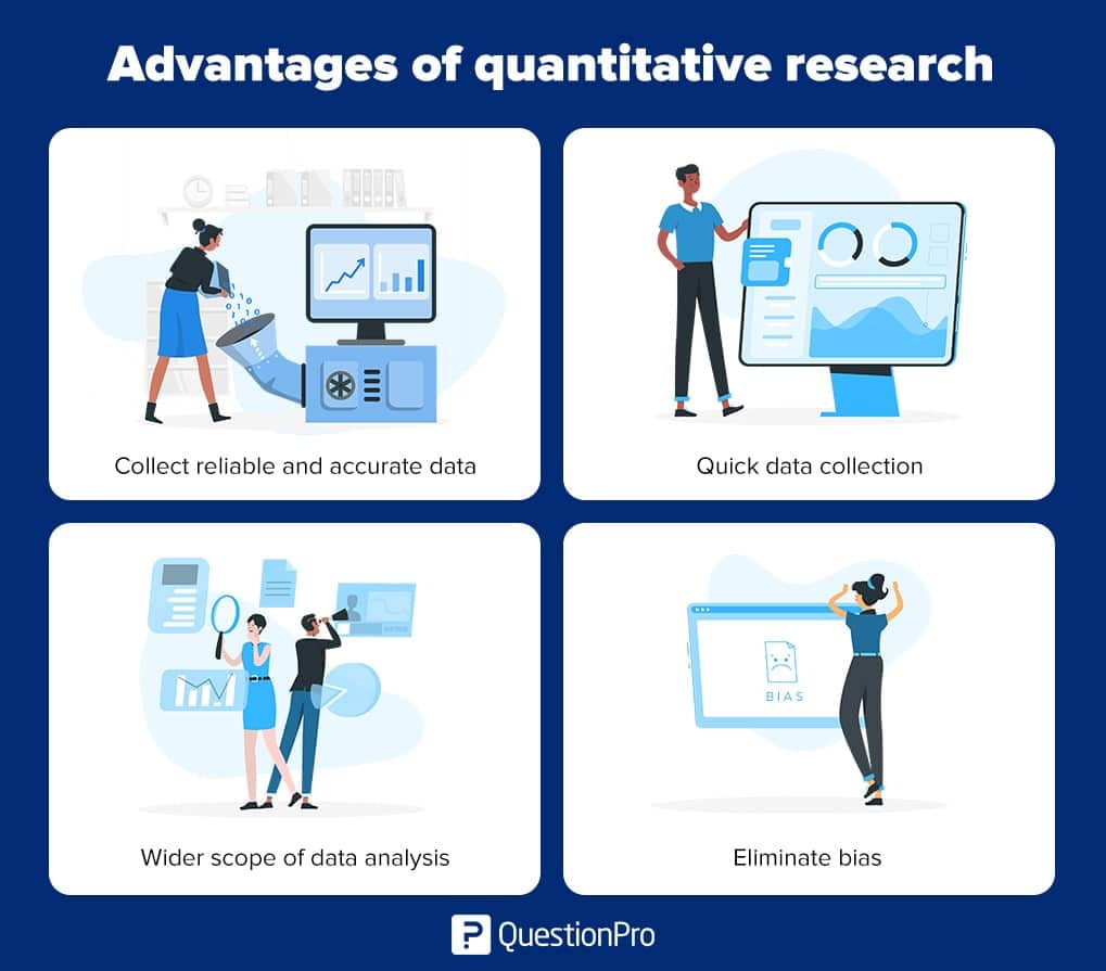
Collect Reliable and Accurate Data:
Quantitative research is a powerful method for collecting reliable and accurate quantitative data. Since data is collected, analyzed, and presented in numbers, the results obtained are incredibly reliable and objective. Numbers do not lie and offer an honest and precise picture of the conducted research without discrepancies. In situations where a researcher aims to eliminate bias and predict potential conflicts, quantitative research is the method of choice.
Quick Data Collection:
Quantitative research involves studying a group of people representing a larger population. Researchers use a survey or another quantitative research method to efficiently gather information from these participants, making the process of analyzing the data and identifying patterns faster and more manageable through the use of statistical analysis. This advantage makes quantitative research an attractive option for projects with time constraints.
Wider Scope of Data Analysis:
Quantitative research, thanks to its utilization of statistical methods, offers an extensive range of data collection and analysis. Researchers can delve into a broader spectrum of variables and relationships within the data, enabling a more thorough comprehension of the subject under investigation. This expanded scope is precious when dealing with complex research questions that require in-depth numerical analysis.
Eliminate Bias:
One of the significant advantages of quantitative research is its ability to eliminate bias. This research method leaves no room for personal comments or the biasing of results, as the findings are presented in numerical form. This objectivity makes the results fair and reliable in most cases, reducing the potential for researcher bias or subjectivity.
In summary, quantitative research involves collecting, analyzing, and presenting quantitative data using statistical analysis. It offers numerous advantages, including the collection of reliable and accurate data, quick data collection, a broader scope of data analysis, and the elimination of bias, making it a valuable approach in the field of research. When considering the benefits of quantitative research, it’s essential to recognize its strengths in contrast to qualitative methods and its role in collecting and analyzing numerical data for a more comprehensive understanding of research topics.
Best Practices to Conduct Quantitative Research
Here are some best practices for conducting quantitative research:
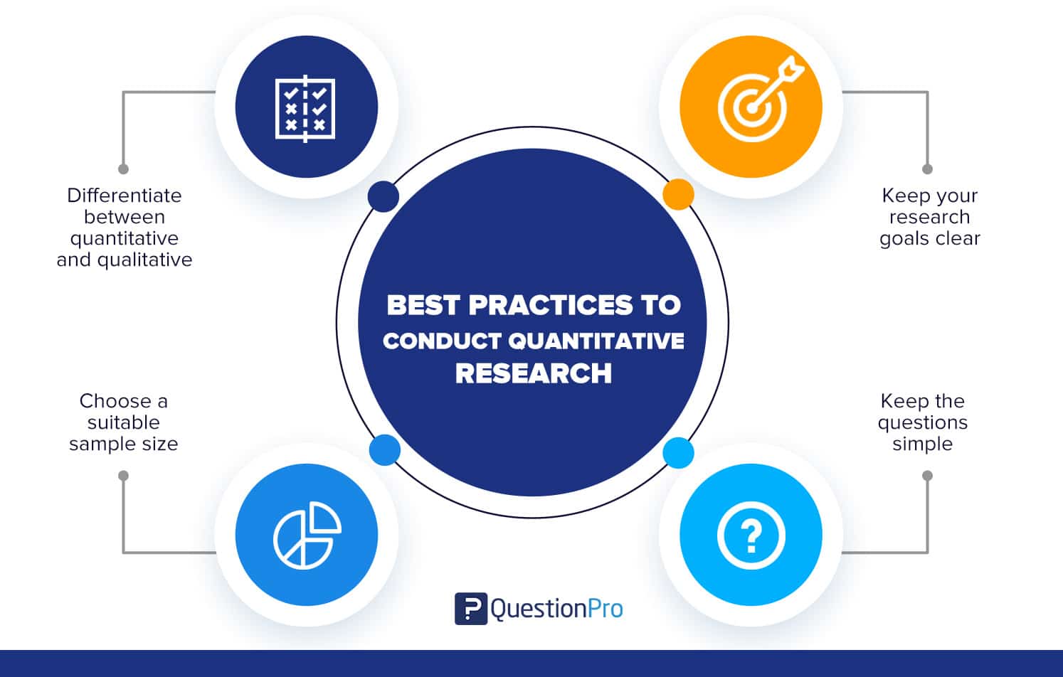
- Differentiate between quantitative and qualitative: Understand the difference between the two methodologies and apply the one that suits your needs best.
- Choose a suitable sample size: Ensure that you have a sample representative of your population and large enough to be statistically weighty.
- Keep your research goals clear and concise: Know your research goals before you begin data collection to ensure you collect the right amount and the right quantity of data.
- Keep the questions simple: Remember that you will be reaching out to a demographically wide audience. Pose simple questions for your respondents to understand easily.
Quantitative Research vs Qualitative Research
Quantitative research and qualitative research are two distinct approaches to conducting research, each with its own set of methods and objectives. Here’s a comparison of the two:
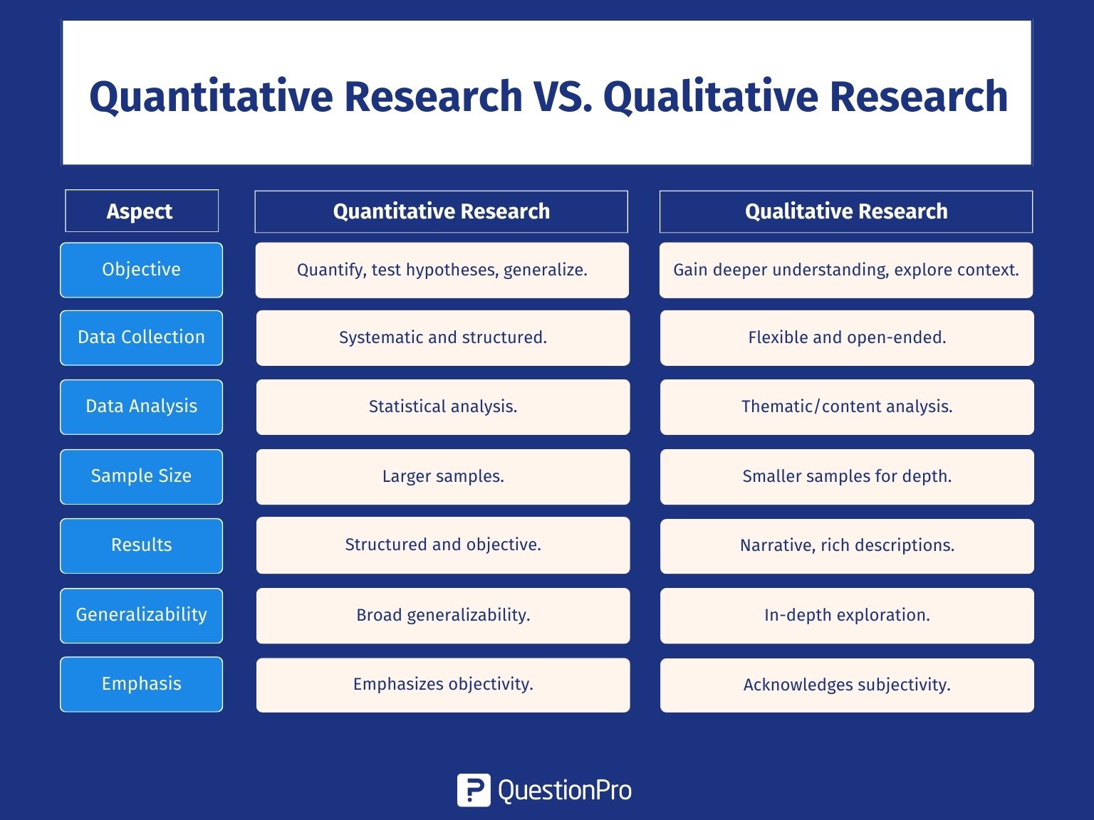
Quantitative Research
- Objective: The primary goal of quantitative research is to quantify and measure phenomena by collecting numerical data. It aims to test hypotheses, establish patterns, and generalize findings to a larger population.
- Data Collection: Quantitative research employs systematic and standardized approaches for data collection, including techniques like surveys, experiments, and observations that involve predefined variables. It is often collected from a large and representative sample.
- Data Analysis: Data is analyzed using statistical techniques, such as descriptive statistics, inferential statistics, and mathematical modeling. Researchers use statistical tests to draw conclusions and make generalizations based on numerical data.
- Sample Size: Quantitative research often involves larger sample sizes to ensure statistical significance and generalizability.
- Results: The results are typically presented in tables, charts, and statistical summaries, making them highly structured and objective.
- Generalizability: Researchers intentionally structure quantitative research to generate outcomes that can be helpful to a larger population, and they frequently seek to establish causative connections.
- Emphasis on Objectivity: Researchers aim to minimize bias and subjectivity, focusing on replicable and objective findings.
Qualitative Research
- Objective: Qualitative research seeks to gain a deeper understanding of the underlying motivations, behaviors, and experiences of individuals or groups. It explores the context and meaning of phenomena.
- Data Collection: Qualitative research employs adaptable and open-ended techniques for data collection, including methods like interviews, focus groups, observations, and content analysis. It allows participants to express their perspectives in their own words.
- Data Analysis: Data is analyzed through thematic analysis, content analysis, or grounded theory. Researchers focus on identifying patterns, themes, and insights in the data.
- Sample Size: Qualitative research typically involves smaller sample sizes due to the in-depth nature of data collection and analysis.
- Results: Findings are presented in narrative form, often in the participants’ own words. Results are subjective, context-dependent, and provide rich, detailed descriptions.
- Generalizability: Qualitative research does not aim for broad generalizability but focuses on in-depth exploration within a specific context. It provides a detailed understanding of a particular group or situation.
- Emphasis on Subjectivity: Researchers acknowledge the role of subjectivity and the researcher’s influence on the Research Process . Participant perspectives and experiences are central to the findings.
Researchers choose between quantitative and qualitative research methods based on their research objectives and the nature of the research question. Each approach has its advantages and drawbacks, and the decision between them hinges on the particular research objectives and the data needed to address research inquiries effectively.
Quantitative research is a structured way of collecting and analyzing data from various sources. Its purpose is to quantify the problem and understand its extent, seeking results that someone can project to a larger population.
Companies that use quantitative rather than qualitative research typically aim to measure magnitudes and seek objectively interpreted statistical results. So if you want to obtain quantitative data that helps you define the structured cause-and-effect relationship between the research problem and the factors, you should opt for this type of research.
At QuestionPro , we have various Best Data Collection Tools and features to conduct investigations of this type. You can create questionnaires and distribute them through our various methods. We also have sample services or various questions to guarantee the success of your study and the quality of the collected data.
FREE TRIAL LEARN MORE
Quantitative research is a systematic and structured approach to studying phenomena that involves the collection of measurable data and the application of statistical, mathematical, or computational techniques for analysis.
Quantitative research is characterized by structured tools like surveys, substantial sample sizes, closed-ended questions, reliance on prior studies, data presented numerically, and the ability to generalize findings to the broader population.
The two main methods of quantitative research are Primary quantitative research methods, involving data collection directly from sources, and Secondary quantitative research methods, which utilize existing data for analysis.
1.Surveying to measure employee engagement with numerical rating scales. 2.Analyzing sales data to identify trends in product demand and market share. 4.Examining test scores to assess the impact of a new teaching method on student performance. 4.Using website analytics to track user behavior and conversion rates for an online store.
1.Differentiate between quantitative and qualitative approaches. 2.Choose a representative sample size. 3.Define clear research goals before data collection. 4.Use simple and easily understandable survey questions.
MORE LIKE THIS

AI Question Generator: Create Easy + Accurate Tests and Surveys
Apr 6, 2024

Top 17 UX Research Software for UX Design in 2024
Apr 5, 2024

Healthcare Staff Burnout: What it Is + How To Manage It
Apr 4, 2024

Top 15 Employee Retention Software in 2024
Other categories.
- Academic Research
- Artificial Intelligence
- Assessments
- Brand Awareness
- Case Studies
- Communities
- Consumer Insights
- Customer effort score
- Customer Engagement
- Customer Experience
- Customer Loyalty
- Customer Research
- Customer Satisfaction
- Employee Benefits
- Employee Engagement
- Employee Retention
- Friday Five
- General Data Protection Regulation
- Insights Hub
- Life@QuestionPro
- Market Research
- Mobile diaries
- Mobile Surveys
- New Features
- Online Communities
- Question Types
- Questionnaire
- QuestionPro Products
- Release Notes
- Research Tools and Apps
- Revenue at Risk
- Survey Templates
- Training Tips
- Uncategorized
- Video Learning Series
- What’s Coming Up
- Workforce Intelligence
Quantitative Research
- Reference work entry
- First Online: 13 January 2019
- Cite this reference work entry

- Leigh A. Wilson 2 , 3
4075 Accesses
4 Citations
Quantitative research methods are concerned with the planning, design, and implementation of strategies to collect and analyze data. Descartes, the seventeenth-century philosopher, suggested that how the results are achieved is often more important than the results themselves, as the journey taken along the research path is a journey of discovery. High-quality quantitative research is characterized by the attention given to the methods and the reliability of the tools used to collect the data. The ability to critique research in a systematic way is an essential component of a health professional’s role in order to deliver high quality, evidence-based healthcare. This chapter is intended to provide a simple overview of the way new researchers and health practitioners can understand and employ quantitative methods. The chapter offers practical, realistic guidance in a learner-friendly way and uses a logical sequence to understand the process of hypothesis development, study design, data collection and handling, and finally data analysis and interpretation.
- Quantitative
- Epidemiology
- Data analysis
- Methodology
- Interpretation
This is a preview of subscription content, log in via an institution to check access.
Access this chapter
- Available as PDF
- Read on any device
- Instant download
- Own it forever
- Available as EPUB and PDF
- Durable hardcover edition
- Dispatched in 3 to 5 business days
- Free shipping worldwide - see info
Tax calculation will be finalised at checkout
Purchases are for personal use only
Institutional subscriptions
Babbie ER. The practice of social research. 14th ed. Belmont: Wadsworth Cengage; 2016.
Google Scholar
Descartes. Cited in Halverston, W. (1976). In: A concise introduction to philosophy, 3rd ed. New York: Random House; 1637.
Doll R, Hill AB. The mortality of doctors in relation to their smoking habits. BMJ. 1954;328(7455):1529–33. https://doi.org/10.1136/bmj.328.7455.1529 .
Article Google Scholar
Liamputtong P. Research methods in health: foundations for evidence-based practice. 3rd ed. Melbourne: Oxford University Press; 2017.
McNabb DE. Research methods in public administration and nonprofit management: quantitative and qualitative approaches. 2nd ed. New York: Armonk; 2007.
Merriam-Webster. Dictionary. http://www.merriam-webster.com . Accessed 20th December 2017.
Olesen Larsen P, von Ins M. The rate of growth in scientific publication and the decline in coverage provided by Science Citation Index. Scientometrics. 2010;84(3):575–603.
Pannucci CJ, Wilkins EG. Identifying and avoiding bias in research. Plast Reconstr Surg. 2010;126(2):619–25. https://doi.org/10.1097/PRS.0b013e3181de24bc .
Petrie A, Sabin C. Medical statistics at a glance. 2nd ed. London: Blackwell Publishing; 2005.
Portney LG, Watkins MP. Foundations of clinical research: applications to practice. 3rd ed. New Jersey: Pearson Publishing; 2009.
Sheehan J. Aspects of research methodology. Nurse Educ Today. 1986;6:193–203.
Wilson LA, Black DA. Health, science research and research methods. Sydney: McGraw Hill; 2013.
Download references
Author information
Authors and affiliations.
School of Science and Health, Western Sydney University, Penrith, NSW, Australia
Leigh A. Wilson
Faculty of Health Science, Discipline of Behavioural and Social Sciences in Health, University of Sydney, Lidcombe, NSW, Australia
You can also search for this author in PubMed Google Scholar
Corresponding author
Correspondence to Leigh A. Wilson .
Editor information
Editors and affiliations.
Pranee Liamputtong
Rights and permissions
Reprints and permissions
Copyright information
© 2019 Springer Nature Singapore Pte Ltd.

About this entry
Cite this entry.
Wilson, L.A. (2019). Quantitative Research. In: Liamputtong, P. (eds) Handbook of Research Methods in Health Social Sciences. Springer, Singapore. https://doi.org/10.1007/978-981-10-5251-4_54
Download citation
DOI : https://doi.org/10.1007/978-981-10-5251-4_54
Published : 13 January 2019
Publisher Name : Springer, Singapore
Print ISBN : 978-981-10-5250-7
Online ISBN : 978-981-10-5251-4
eBook Packages : Social Sciences Reference Module Humanities and Social Sciences Reference Module Business, Economics and Social Sciences
Share this entry
Anyone you share the following link with will be able to read this content:
Sorry, a shareable link is not currently available for this article.
Provided by the Springer Nature SharedIt content-sharing initiative
- Publish with us
Policies and ethics
- Find a journal
- Track your research
- USC Libraries
- Research Guides
Organizing Your Social Sciences Research Paper
- Quantitative Methods
- Purpose of Guide
- Design Flaws to Avoid
- Independent and Dependent Variables
- Glossary of Research Terms
- Reading Research Effectively
- Narrowing a Topic Idea
- Broadening a Topic Idea
- Extending the Timeliness of a Topic Idea
- Academic Writing Style
- Choosing a Title
- Making an Outline
- Paragraph Development
- Research Process Video Series
- Executive Summary
- The C.A.R.S. Model
- Background Information
- The Research Problem/Question
- Theoretical Framework
- Citation Tracking
- Content Alert Services
- Evaluating Sources
- Primary Sources
- Secondary Sources
- Tiertiary Sources
- Scholarly vs. Popular Publications
- Qualitative Methods
- Insiderness
- Using Non-Textual Elements
- Limitations of the Study
- Common Grammar Mistakes
- Writing Concisely
- Avoiding Plagiarism
- Footnotes or Endnotes?
- Further Readings
- Generative AI and Writing
- USC Libraries Tutorials and Other Guides
- Bibliography
Quantitative methods emphasize objective measurements and the statistical, mathematical, or numerical analysis of data collected through polls, questionnaires, and surveys, or by manipulating pre-existing statistical data using computational techniques . Quantitative research focuses on gathering numerical data and generalizing it across groups of people or to explain a particular phenomenon.
Babbie, Earl R. The Practice of Social Research . 12th ed. Belmont, CA: Wadsworth Cengage, 2010; Muijs, Daniel. Doing Quantitative Research in Education with SPSS . 2nd edition. London: SAGE Publications, 2010.
Need Help Locating Statistics?
Resources for locating data and statistics can be found here:
Statistics & Data Research Guide
Characteristics of Quantitative Research
Your goal in conducting quantitative research study is to determine the relationship between one thing [an independent variable] and another [a dependent or outcome variable] within a population. Quantitative research designs are either descriptive [subjects usually measured once] or experimental [subjects measured before and after a treatment]. A descriptive study establishes only associations between variables; an experimental study establishes causality.
Quantitative research deals in numbers, logic, and an objective stance. Quantitative research focuses on numeric and unchanging data and detailed, convergent reasoning rather than divergent reasoning [i.e., the generation of a variety of ideas about a research problem in a spontaneous, free-flowing manner].
Its main characteristics are :
- The data is usually gathered using structured research instruments.
- The results are based on larger sample sizes that are representative of the population.
- The research study can usually be replicated or repeated, given its high reliability.
- Researcher has a clearly defined research question to which objective answers are sought.
- All aspects of the study are carefully designed before data is collected.
- Data are in the form of numbers and statistics, often arranged in tables, charts, figures, or other non-textual forms.
- Project can be used to generalize concepts more widely, predict future results, or investigate causal relationships.
- Researcher uses tools, such as questionnaires or computer software, to collect numerical data.
The overarching aim of a quantitative research study is to classify features, count them, and construct statistical models in an attempt to explain what is observed.
Things to keep in mind when reporting the results of a study using quantitative methods :
- Explain the data collected and their statistical treatment as well as all relevant results in relation to the research problem you are investigating. Interpretation of results is not appropriate in this section.
- Report unanticipated events that occurred during your data collection. Explain how the actual analysis differs from the planned analysis. Explain your handling of missing data and why any missing data does not undermine the validity of your analysis.
- Explain the techniques you used to "clean" your data set.
- Choose a minimally sufficient statistical procedure ; provide a rationale for its use and a reference for it. Specify any computer programs used.
- Describe the assumptions for each procedure and the steps you took to ensure that they were not violated.
- When using inferential statistics , provide the descriptive statistics, confidence intervals, and sample sizes for each variable as well as the value of the test statistic, its direction, the degrees of freedom, and the significance level [report the actual p value].
- Avoid inferring causality , particularly in nonrandomized designs or without further experimentation.
- Use tables to provide exact values ; use figures to convey global effects. Keep figures small in size; include graphic representations of confidence intervals whenever possible.
- Always tell the reader what to look for in tables and figures .
NOTE: When using pre-existing statistical data gathered and made available by anyone other than yourself [e.g., government agency], you still must report on the methods that were used to gather the data and describe any missing data that exists and, if there is any, provide a clear explanation why the missing data does not undermine the validity of your final analysis.
Babbie, Earl R. The Practice of Social Research . 12th ed. Belmont, CA: Wadsworth Cengage, 2010; Brians, Craig Leonard et al. Empirical Political Analysis: Quantitative and Qualitative Research Methods . 8th ed. Boston, MA: Longman, 2011; McNabb, David E. Research Methods in Public Administration and Nonprofit Management: Quantitative and Qualitative Approaches . 2nd ed. Armonk, NY: M.E. Sharpe, 2008; Quantitative Research Methods. Writing@CSU. Colorado State University; Singh, Kultar. Quantitative Social Research Methods . Los Angeles, CA: Sage, 2007.
Basic Research Design for Quantitative Studies
Before designing a quantitative research study, you must decide whether it will be descriptive or experimental because this will dictate how you gather, analyze, and interpret the results. A descriptive study is governed by the following rules: subjects are generally measured once; the intention is to only establish associations between variables; and, the study may include a sample population of hundreds or thousands of subjects to ensure that a valid estimate of a generalized relationship between variables has been obtained. An experimental design includes subjects measured before and after a particular treatment, the sample population may be very small and purposefully chosen, and it is intended to establish causality between variables. Introduction The introduction to a quantitative study is usually written in the present tense and from the third person point of view. It covers the following information:
- Identifies the research problem -- as with any academic study, you must state clearly and concisely the research problem being investigated.
- Reviews the literature -- review scholarship on the topic, synthesizing key themes and, if necessary, noting studies that have used similar methods of inquiry and analysis. Note where key gaps exist and how your study helps to fill these gaps or clarifies existing knowledge.
- Describes the theoretical framework -- provide an outline of the theory or hypothesis underpinning your study. If necessary, define unfamiliar or complex terms, concepts, or ideas and provide the appropriate background information to place the research problem in proper context [e.g., historical, cultural, economic, etc.].
Methodology The methods section of a quantitative study should describe how each objective of your study will be achieved. Be sure to provide enough detail to enable the reader can make an informed assessment of the methods being used to obtain results associated with the research problem. The methods section should be presented in the past tense.
- Study population and sampling -- where did the data come from; how robust is it; note where gaps exist or what was excluded. Note the procedures used for their selection;
- Data collection – describe the tools and methods used to collect information and identify the variables being measured; describe the methods used to obtain the data; and, note if the data was pre-existing [i.e., government data] or you gathered it yourself. If you gathered it yourself, describe what type of instrument you used and why. Note that no data set is perfect--describe any limitations in methods of gathering data.
- Data analysis -- describe the procedures for processing and analyzing the data. If appropriate, describe the specific instruments of analysis used to study each research objective, including mathematical techniques and the type of computer software used to manipulate the data.
Results The finding of your study should be written objectively and in a succinct and precise format. In quantitative studies, it is common to use graphs, tables, charts, and other non-textual elements to help the reader understand the data. Make sure that non-textual elements do not stand in isolation from the text but are being used to supplement the overall description of the results and to help clarify key points being made. Further information about how to effectively present data using charts and graphs can be found here .
- Statistical analysis -- how did you analyze the data? What were the key findings from the data? The findings should be present in a logical, sequential order. Describe but do not interpret these trends or negative results; save that for the discussion section. The results should be presented in the past tense.
Discussion Discussions should be analytic, logical, and comprehensive. The discussion should meld together your findings in relation to those identified in the literature review, and placed within the context of the theoretical framework underpinning the study. The discussion should be presented in the present tense.
- Interpretation of results -- reiterate the research problem being investigated and compare and contrast the findings with the research questions underlying the study. Did they affirm predicted outcomes or did the data refute it?
- Description of trends, comparison of groups, or relationships among variables -- describe any trends that emerged from your analysis and explain all unanticipated and statistical insignificant findings.
- Discussion of implications – what is the meaning of your results? Highlight key findings based on the overall results and note findings that you believe are important. How have the results helped fill gaps in understanding the research problem?
- Limitations -- describe any limitations or unavoidable bias in your study and, if necessary, note why these limitations did not inhibit effective interpretation of the results.
Conclusion End your study by to summarizing the topic and provide a final comment and assessment of the study.
- Summary of findings – synthesize the answers to your research questions. Do not report any statistical data here; just provide a narrative summary of the key findings and describe what was learned that you did not know before conducting the study.
- Recommendations – if appropriate to the aim of the assignment, tie key findings with policy recommendations or actions to be taken in practice.
- Future research – note the need for future research linked to your study’s limitations or to any remaining gaps in the literature that were not addressed in your study.
Black, Thomas R. Doing Quantitative Research in the Social Sciences: An Integrated Approach to Research Design, Measurement and Statistics . London: Sage, 1999; Gay,L. R. and Peter Airasain. Educational Research: Competencies for Analysis and Applications . 7th edition. Upper Saddle River, NJ: Merril Prentice Hall, 2003; Hector, Anestine. An Overview of Quantitative Research in Composition and TESOL . Department of English, Indiana University of Pennsylvania; Hopkins, Will G. “Quantitative Research Design.” Sportscience 4, 1 (2000); "A Strategy for Writing Up Research Results. The Structure, Format, Content, and Style of a Journal-Style Scientific Paper." Department of Biology. Bates College; Nenty, H. Johnson. "Writing a Quantitative Research Thesis." International Journal of Educational Science 1 (2009): 19-32; Ouyang, Ronghua (John). Basic Inquiry of Quantitative Research . Kennesaw State University.
Strengths of Using Quantitative Methods
Quantitative researchers try to recognize and isolate specific variables contained within the study framework, seek correlation, relationships and causality, and attempt to control the environment in which the data is collected to avoid the risk of variables, other than the one being studied, accounting for the relationships identified.
Among the specific strengths of using quantitative methods to study social science research problems:
- Allows for a broader study, involving a greater number of subjects, and enhancing the generalization of the results;
- Allows for greater objectivity and accuracy of results. Generally, quantitative methods are designed to provide summaries of data that support generalizations about the phenomenon under study. In order to accomplish this, quantitative research usually involves few variables and many cases, and employs prescribed procedures to ensure validity and reliability;
- Applying well established standards means that the research can be replicated, and then analyzed and compared with similar studies;
- You can summarize vast sources of information and make comparisons across categories and over time; and,
- Personal bias can be avoided by keeping a 'distance' from participating subjects and using accepted computational techniques .
Babbie, Earl R. The Practice of Social Research . 12th ed. Belmont, CA: Wadsworth Cengage, 2010; Brians, Craig Leonard et al. Empirical Political Analysis: Quantitative and Qualitative Research Methods . 8th ed. Boston, MA: Longman, 2011; McNabb, David E. Research Methods in Public Administration and Nonprofit Management: Quantitative and Qualitative Approaches . 2nd ed. Armonk, NY: M.E. Sharpe, 2008; Singh, Kultar. Quantitative Social Research Methods . Los Angeles, CA: Sage, 2007.
Limitations of Using Quantitative Methods
Quantitative methods presume to have an objective approach to studying research problems, where data is controlled and measured, to address the accumulation of facts, and to determine the causes of behavior. As a consequence, the results of quantitative research may be statistically significant but are often humanly insignificant.
Some specific limitations associated with using quantitative methods to study research problems in the social sciences include:
- Quantitative data is more efficient and able to test hypotheses, but may miss contextual detail;
- Uses a static and rigid approach and so employs an inflexible process of discovery;
- The development of standard questions by researchers can lead to "structural bias" and false representation, where the data actually reflects the view of the researcher instead of the participating subject;
- Results provide less detail on behavior, attitudes, and motivation;
- Researcher may collect a much narrower and sometimes superficial dataset;
- Results are limited as they provide numerical descriptions rather than detailed narrative and generally provide less elaborate accounts of human perception;
- The research is often carried out in an unnatural, artificial environment so that a level of control can be applied to the exercise. This level of control might not normally be in place in the real world thus yielding "laboratory results" as opposed to "real world results"; and,
- Preset answers will not necessarily reflect how people really feel about a subject and, in some cases, might just be the closest match to the preconceived hypothesis.
Research Tip
Finding Examples of How to Apply Different Types of Research Methods
SAGE publications is a major publisher of studies about how to design and conduct research in the social and behavioral sciences. Their SAGE Research Methods Online and Cases database includes contents from books, articles, encyclopedias, handbooks, and videos covering social science research design and methods including the complete Little Green Book Series of Quantitative Applications in the Social Sciences and the Little Blue Book Series of Qualitative Research techniques. The database also includes case studies outlining the research methods used in real research projects. This is an excellent source for finding definitions of key terms and descriptions of research design and practice, techniques of data gathering, analysis, and reporting, and information about theories of research [e.g., grounded theory]. The database covers both qualitative and quantitative research methods as well as mixed methods approaches to conducting research.
SAGE Research Methods Online and Cases
- << Previous: Qualitative Methods
- Next: Insiderness >>
- Last Updated: Apr 5, 2024 1:38 PM
- URL: https://libguides.usc.edu/writingguide
An official website of the United States government
The .gov means it’s official. Federal government websites often end in .gov or .mil. Before sharing sensitive information, make sure you’re on a federal government site.
The site is secure. The https:// ensures that you are connecting to the official website and that any information you provide is encrypted and transmitted securely.
- Publications
- Account settings
Preview improvements coming to the PMC website in October 2024. Learn More or Try it out now .
- Advanced Search
- Journal List
- Indian J Anaesth
- v.60(9); 2016 Sep
Interpretation and display of research results
Dilip kumar kulkarni.
Department of Anaesthesiology and Intensive Care, Nizam's Institute of Medical Sciences, Hyderabad, Telangana, India
It important to properly collect, code, clean and edit the data before interpreting and displaying the research results. Computers play a major role in different phases of research starting from conceptual, design and planning, data collection, data analysis and research publication phases. The main objective of data display is to summarize the characteristics of a data and to make the data more comprehensible and meaningful. Usually data is presented depending upon the type of data in different tables and graphs. This will enable not only to understand the data behaviour, but also useful in choosing the different statistical tests to be applied.
INTRODUCTION
Collection of data and display of results is very important in any study. The data of an experimental study, observational study or a survey are required to be collected in properly designed format for documentation, taking into consideration the design of study and different end points of the study. Usually data are collected in the proforma of the study. The data recorded and documented should be stored carefully in documents and in electronic form for example, excel sheets or data bases.
The data are usually classified into qualitative and quantitative [ Table 1 ]. Qualitative data is further divided into two categories, unordered qualitative data, such as blood groups (A, B, O, AB); and ordered qualitative data, such as severity of pain (mild, moderate, severe). Quantitative data are numerical and fall into two categories: discrete quantitative data, such as the internal diameter of endotracheal tube; and continuous quantitative data, such as blood pressure.[ 1 ]
Examples of types of data and display of data

Data Coding is needed to allow the data recorded in categories to be used easily in statistical analysis with a computer. Coding assigns a unique number to each possible response. A few statistical packages analyse categorical data directly. If a number is assigned to categorical data, it becomes easier to analyse. This means that when the data are analysed and reported, the appropriate label needs to be assigned back to the numerical value to make it meaningful. The codes such as 1/0 for yes/no has the added advantage that the variable's 1/0 values can be easily analysed. The record of the codes modified is to be stored for later reference. Such coding can also be done for categorical ordinal data to convert in to numerical ordinal data, for example the severity of pain mild, moderate and severe into 1, 2 and 3 respectively.
PROCESS OF DATA CHECKING, CLEANING AND EDITING
In clinical research, errors occur despite designing the study properly, entering data carefully and preventing errors. Data cleaning and editing are carried out to identify and correct these errors, so that the study results will be accurate.[ 2 ]
Data entry errors in case of sex, dates, double entries and unexpected results are to be corrected unquestionably. Data editing can be done in three phases namely screening, diagnosing and editing [ Figure 1 ].

Process of data checking, cleaning and editing in three phases
Screening phase
During screening of data, it is possible to distinguish the odd data, excess of data, double entries, outliers, and unexpected results. Screening methods are checking of questionnaires, data validation, browsing the excel sheets, data tables and graphical methods to observe data distribution.
Diagnostic phase
The nature of the data can be assessed in this phase. The data entries can be true normal, true errors, outliers, unexpected results.
Treatment phase
Once the data nature is identified the editing can be done by correcting, deleting or leaving the data sets unchanged.
The abnormal data points usually have to be corrected or to be deleted.[ 2 ] However some authors advocate these data points to be included in analysis.[ 3 ] If these extreme data points are deleted, they should be reported as “excluded from analysis”.[ 4 ]
ROLE OF COMPUTERS IN RESEARCH
The role of computers in scientific research is very high; the computers have the ability to perform the analytic tasks with high speed, accuracy and consistency. The Computers role in research process can be explained in different phases.[ 5 ]
Role of computer in conceptual phase
The conceptual phase consists of formulation of research problem, literature survey, theoretical frame work and developing the hypothesis. Computers are useful in searching the literatures. The references can be stored in the electronic database.
Role of computers in design and planning phase
This phase consists of research design preparation and determining sample design, population size, research variables, sampling plan, reviewing research plan and pilot study. The role of computers in these process is almost indispensable.
Role of computers in data collection phase
The data obtained from the subjects stored in computers are word files or excel spread sheets or statistical software data files or from data centers of hospital information management systems (data warehouse). If the data are stored in electronic format checking the data becomes easier. Thus, computers help in data entry, data editing, and data management including follow up actions. Examples of editors are Word Pad, SPSS data editor, word processors.
Role of computers in data analysis
This phase mainly consist of statistical analysis of the data and interpretation of results. Software like Minitab (Minitab Inc. USA.), SPSS (IBM Crop. New York), NCSS (LLC. Kaysville, Utah, USA) and spreadsheets are widely used.
Role of computer in research publication
Research article, research paper, research thesis or research dissertation is typed in word processing software in computers and stored. Which can be easily published in different electronic formats.[ 5 ]
DATA DISPLAY AND DESCRIPTION OF RESEARCH DATA
Data display and description is an important part of any research project which helps in knowing the distribution of data, detecting errors, missing values and outliers. Ultimately the data should be more comprehensible and meaningful.
Tables are commonly used for describing both qualitative and quantitative data. The graphs are useful for visualising the data and understanding the variations and trends of the data. Qualitative data are usually described by using bar or pie charts. Histograms, polygons or box plots are used to represent quantitative data.[ 1 ]
Qualitative data
Tabulation of qualitative data.
The qualitative observations are categorised in to different categories. The category frequency is nothing but the number of observations with in that category. The category relative frequency can be calculated by dividing the number of observations in the category by total number of observations. The Percentage for a category is more commonly used to describe qualitative data. It can be computed by multiplying relative frequency with hundred.[ 6 , 7 ]
The classification of 30 Patients of a group by severity of postoperative pain presented in Table 2 . The frequency table for this data computed by using the software NCSS[ 8 ] is shown in Table 3 .
The classification of post-operative pain in patients

The frequency table for the variable pain

Graphical display of qualitative data
The qualitative data are commonly displayed by bar graphs and pie charts.[ 9 ]
Bar graphs displays information of the frequency, relative frequency or percentage of each category on vertical axis or horizontal axis of the graph. [ Figure 2 ] Pie charts depicts the same information in divided slices in a complete circle. The area for the circle is equal to the frequency, relative frequency or percentage of that category [ Figure 3 ].

The bar graph generated by computer using NCSS software for the variable pain

The Pie graph generated by computer using NCSS software for the variable pain
Quantitative data
Tabulation of quantitative data.
The quantitative data are usually presented as frequency distribution or relative frequency rather than percentage. The data are divided into different classes. The upper and lower limits or the width of classes will depend up on the size of the data and can easily be adjusted.
The frequency distribution and relative frequency distribution table can be constructed in the following manner:
- The quantitative data are divided into number of classes. The lower limit and upper limit of the classes have to be defined.
- The range or width of the class intervals can be calculated by dividing the difference in the upper limit and lower limit by total number of classes.
- The class frequency is the number of observations that fall in that class.
- The relative class frequency can be calculated by dividing class frequency by total number of observations.
Example of frequency table for the data of Systolic blood pressure of 60 patients undergoing craniotomy is shown in Table 4 . The number of classes were 20, the lower limit and the upper limit were 86 mm of Hg and 186 mm of Hg respectively.
Frequency tabulation of systolic blood pressure in sixty patients (unit is mm Hg)

Graphical description of quantitative data
The frequency distribution is usually depicted in histograms. The count or frequency is plotted along the vertical axis and the horizontal axis represents data values. The normality of distribution can be assessed visually by histograms. A frequency histogram is constructed for the dataset of systolic blood pressure, from the frequency Table 4 [ Figure 4 ].

The frequency histogram for the data set of systolic blood pressure (BP), for which the frequency table is constructed in Table 4
Box plot gives the information of spread of observations in a single group around a centre value. The distribution pattern and extreme values can be easily viewed by box plot. A boxplot is constructed for the dataset of systolic blood pressure, from the frequency Table 4 [ Figure 5 ].

Box plot is constructed from data of Table 4
Polygon construction is similar to histogram. However it is a line graph connecting the data points at mid points of class intervals. The polygon is simpler and outline the data pattern clearly[ 8 ] [ Figure 6 ].

A frequency polygon constructed from data of Table 4 in NCSS software
It is often necessary to further summarise quantitative data, for example, for hypothesis testing. The most important elements of a data are its location, which is measured by mean, median and mode. The other parameters are variability (range, interquartile range, standard deviation and variance) and shape of the distribution (normal, skewness, and kurtosis). The details of which will be discussed in the next chapter.
The proper designing of research methodology is an important step from the conceptual phase to the conclusion phase and the computers play an invaluable role from the beginning to the end of a study. The data collection, data storage and data management are vital for any study. The data display and interpretation will help in understating the behaviour of the data and also to know the assumptions for statistical analysis.
What’s the Difference: Qualitative vs Quantitative Research?
Discover the differences between qualitative vs quantitative research. Learn how to choose the right methodology for your research project.
There are several methodologies for conducting research, with qualitative and quantitative research being two of the most prominent. Qualitative research focuses on understanding an individual’s experiences and points of view through observation and interviews, whereas quantitative research analyses and draws conclusions based on numerical data. Both strategies have benefits as well as drawbacks, and selecting the appropriate methodology can have a considerable influence on the outcome of a study.
In this article, we will look at the differences between qualitative vs quantitative research, their benefits and drawbacks, and how to analyze based on each method. By the end of this article, you will have a better grasp of these two research methods and will be better prepared to select the best one for your research.
What is Qualitative Research?
Qualitative research is a research method that focuses on understanding individuals’ experiences, perspectives, and behaviors in their natural environment. This method is frequently used to investigate complex phenomena that are difficult to quantify, such as beliefs, attitudes, and feelings. Data for qualitative research is often gathered through methods such as observation, interviews, and focus groups. The information gathered is frequently non-numerical and might comprise text, audio, and visual records.
One of the distinctive features of qualitative research is the emphasis on context and the subjective interpretation of data. Rather than attempting to generalize the findings to a broader population, qualitative researchers strive to grasp the meaning and relevance of the data acquired by evaluating it in its context.
This strategy helps researchers to obtain a better understanding of the experiences and points of view of the individuals being examined, as well as find patterns and themes that may not have been obvious using other research methods.
What is Quantitative Research?
Quantitative research is a research method that focuses on the systematic collecting and analysis of numerical data. This strategy is frequently used to investigate correlations between variables and to make predictions or generalizations about a wider population based on a sample. Quantitative research often entails gathering data using methods such as surveys, experiments, and structured observations, and then evaluating the data using statistical techniques.
One of the distinctive features of quantitative research is its emphasis on impartiality and the use of standardized measurements. Quantitative researchers use rigorous methods for gathering and analyzing information to reduce the effect of personal bias and subjectivity.
This method enables researchers to test hypotheses, identify cause-and-effect correlations, and draw statistical inferences about a wider population.
Advantages and Disadvantages of Qualitative Research
When deciding on the methodology to use, researchers should examine the advantages and disadvantages of qualitative research, as follows:
- Data richness and depth: Qualitative research enables researchers to collect rich, detailed data about participants’ experiences, attitudes, and points of view, which can offer a more complete picture of the phenomena under investigation.
- Flexibility: Qualitative research is adaptive and flexible, allowing researchers to change their method in response to new or unexpected discoveries.
- Understanding participants: Since qualitative research frequently involves direct involvement with individuals, researchers can get a better grasp of their personal experiences and points of view.
- Contextualization: Qualitative research stresses the relevance of context and subjective data interpretation, which can give insights into how individuals make meaning of their experiences in their specific settings.
- Hypothesis generation: By recognizing patterns and themes in the data, qualitative research may be utilized to develop hypotheses for additional research.
Disadvantages
- Limited generalizability: Since qualitative research occasionally relies on small sample size, it may not be representative of the wider population, its generalizability is limited.
- Subjectivity: Qualitative research entails subjective data interpretation, which may be impacted by the researcher’s bias or personal perspective.
- Time-consuming: As qualitative research includes in-depth data collecting and processing, it may be time-consuming.
- Difficulties in analysis: Qualitative data can be complicated and difficult to analyze, especially when non-textual material such as photos or audio recordings are included.
- Data saturation: Qualitative research might reach a point where new information does not yield significant insights, limiting the relevance of further data collection.
Advantages and Disadvantages of Quantitative Research
Quantitative research, like qualitative research, has advantages and disadvantages that researchers should consider when selecting this method for their study.
- Generalizability: Since quantitative research is frequently based on a larger sample size, it can yield statistically valid findings that can be generalized to a broader population.
- Objectivity: Quantitative research places an emphasis on objectivity and standardized measurements, which reduces the impact of personal bias and subjectivity.
- Replicability: Quantitative research provides an established method and standardized measurements, allowing other researchers to replicate the research.
- Statistical analysis: Statistical analysis is possible in quantitative research, which may assist researchers evaluate hypotheses and discover cause-and-effect connections.
- Effective data analysis: Quantitative research frequently involves numerical data, which may be quickly examined using statistical tools.
Disadvantages
- Lack of depth: As quantitative research frequently depends on standardized measurements, it may overlook the intricacies of participants’ experiences and points of view.
- Limited comprehension: Quantitative research frequently focuses on specific aspects of the phenomenon being examined, it may not give an in-depth understanding of the entire phenomenon being studied.
- Inflexibility: Since quantitative research relies on a set methodology and established measurements, it is frequently inflexible.
- Limited context: Quantitative research may fail to recognize the significance of context and may neglect the impact of subjective data interpretation.
- Measurement error: Quantitative research is based on numerical data, which might be prone to measurement errors or inaccuracies.
Data Collection Methods: Qualitative vs Quantitative Research
The collection of data methods differs in different ways between qualitative vs quantitative research.
Qualitative research often employs data-collecting methods such as interviews, focus groups, observation, and document analysis. Using these methods, researchers may acquire extensive, detailed data about participants’ experiences, perspectives, and points of view.
Interviews and focus groups, for example, allow researchers to interact directly with participants and delve deeper into their personal experiences and points of view. Researchers can use observation to study participants’ behavior in their natural environment and capture their experiences in real-time.
They might investigate written or visual materials such as diaries, letters, or photos to get insights into participants’ experiences and points of view through document analysis.
Quantitative research often uses methods for collecting data such as surveys, experiments, and structured observations. These methods enable researchers to acquire numerical data that can then be examined statistically.
Surveys entail asking individuals to answer a series of standardized questions, usually in writing or online. Experiments entail tinkering with one or more variables in order to test hypotheses and quantify the effect on a dependent variable. Structured observations entail gathering data in a methodical manner, frequently utilizing pre-determined categories or checklists.
Overall, data-collecting methods are employed in both qualitative and quantitative research, although the methods utilized change based on the research’s methodology and the type of data being gathered. Quantitative research focuses on numerical data that can be evaluated using statistical tools, whereas qualitative research emphasizes rich, detailed data that can give insights into participants’ experiences and points of view.
How to Analyze Qualitative vs Quantitative Data
Due to the nature of the data, analyzing qualitative and quantitative data requires different methodologies.
The identification of patterns, themes, and categories in collected data is the primary objective of qualitative data analysis . This method frequently includes the following steps:
- Transcribing or turning recorded data into text is usually the first stage in assessing qualitative data.
- Data coding entails the researcher reading and rereading the data in order to uncover patterns, themes, and categories. To aid in this process, the researcher may employ software programs.
- The researcher then generates themes and sub-themes that arise from the data once the data has been coded.
- Finally, depending on the data collected, the researcher evaluates the themes and sub-themes, drawing conclusions and providing suggestions.
When it comes to quantitative data analysis , statistical approaches are used to examine the numerical data obtained. The process frequently includes the following steps:
- Cleaning the data is the first step in interpreting quantitative data since it removes errors, inconsistencies, and outliers.
- The researcher then arranges the data into an analyzable format, such as a spreadsheet or database.
- To summarize the data, the researcher may use descriptive statistics such as mean, median, or mode.
- Finally, the researcher may employ inferential statistics such as t-tests or ANOVA to test hypotheses and evaluate if the results are statistically significant.
Your Creations, Ready within Minutes!
Mind the Graph is a valuable resource for scientists and researchers who need to create professional-looking scientific illustrations and graphics in a matter of minutes! With its range of tools and resources, the platform makes it easy to create high-quality visuals that effectively communicate research findings to a wide audience.
Subscribe to our newsletter
Exclusive high quality content about effective visual communication in science.
About Jessica Abbadia
Jessica Abbadia is a lawyer that has been working in Digital Marketing since 2020, improving organic performance for apps and websites in various regions through ASO and SEO. Currently developing scientific and intellectual knowledge for the community's benefit. Jessica is an animal rights activist who enjoys reading and drinking strong coffee.
Content tags
- Privacy Policy
Buy Me a Coffee

Home » Quantitative Research – Methods, Types and Analysis
Quantitative Research – Methods, Types and Analysis
Table of Contents

Quantitative Research
Quantitative research is a type of research that collects and analyzes numerical data to test hypotheses and answer research questions . This research typically involves a large sample size and uses statistical analysis to make inferences about a population based on the data collected. It often involves the use of surveys, experiments, or other structured data collection methods to gather quantitative data.
Quantitative Research Methods

Quantitative Research Methods are as follows:
Descriptive Research Design
Descriptive research design is used to describe the characteristics of a population or phenomenon being studied. This research method is used to answer the questions of what, where, when, and how. Descriptive research designs use a variety of methods such as observation, case studies, and surveys to collect data. The data is then analyzed using statistical tools to identify patterns and relationships.
Correlational Research Design
Correlational research design is used to investigate the relationship between two or more variables. Researchers use correlational research to determine whether a relationship exists between variables and to what extent they are related. This research method involves collecting data from a sample and analyzing it using statistical tools such as correlation coefficients.
Quasi-experimental Research Design
Quasi-experimental research design is used to investigate cause-and-effect relationships between variables. This research method is similar to experimental research design, but it lacks full control over the independent variable. Researchers use quasi-experimental research designs when it is not feasible or ethical to manipulate the independent variable.
Experimental Research Design
Experimental research design is used to investigate cause-and-effect relationships between variables. This research method involves manipulating the independent variable and observing the effects on the dependent variable. Researchers use experimental research designs to test hypotheses and establish cause-and-effect relationships.
Survey Research
Survey research involves collecting data from a sample of individuals using a standardized questionnaire. This research method is used to gather information on attitudes, beliefs, and behaviors of individuals. Researchers use survey research to collect data quickly and efficiently from a large sample size. Survey research can be conducted through various methods such as online, phone, mail, or in-person interviews.
Quantitative Research Analysis Methods
Here are some commonly used quantitative research analysis methods:
Statistical Analysis
Statistical analysis is the most common quantitative research analysis method. It involves using statistical tools and techniques to analyze the numerical data collected during the research process. Statistical analysis can be used to identify patterns, trends, and relationships between variables, and to test hypotheses and theories.
Regression Analysis
Regression analysis is a statistical technique used to analyze the relationship between one dependent variable and one or more independent variables. Researchers use regression analysis to identify and quantify the impact of independent variables on the dependent variable.
Factor Analysis
Factor analysis is a statistical technique used to identify underlying factors that explain the correlations among a set of variables. Researchers use factor analysis to reduce a large number of variables to a smaller set of factors that capture the most important information.
Structural Equation Modeling
Structural equation modeling is a statistical technique used to test complex relationships between variables. It involves specifying a model that includes both observed and unobserved variables, and then using statistical methods to test the fit of the model to the data.
Time Series Analysis
Time series analysis is a statistical technique used to analyze data that is collected over time. It involves identifying patterns and trends in the data, as well as any seasonal or cyclical variations.
Multilevel Modeling
Multilevel modeling is a statistical technique used to analyze data that is nested within multiple levels. For example, researchers might use multilevel modeling to analyze data that is collected from individuals who are nested within groups, such as students nested within schools.
Applications of Quantitative Research
Quantitative research has many applications across a wide range of fields. Here are some common examples:
- Market Research : Quantitative research is used extensively in market research to understand consumer behavior, preferences, and trends. Researchers use surveys, experiments, and other quantitative methods to collect data that can inform marketing strategies, product development, and pricing decisions.
- Health Research: Quantitative research is used in health research to study the effectiveness of medical treatments, identify risk factors for diseases, and track health outcomes over time. Researchers use statistical methods to analyze data from clinical trials, surveys, and other sources to inform medical practice and policy.
- Social Science Research: Quantitative research is used in social science research to study human behavior, attitudes, and social structures. Researchers use surveys, experiments, and other quantitative methods to collect data that can inform social policies, educational programs, and community interventions.
- Education Research: Quantitative research is used in education research to study the effectiveness of teaching methods, assess student learning outcomes, and identify factors that influence student success. Researchers use experimental and quasi-experimental designs, as well as surveys and other quantitative methods, to collect and analyze data.
- Environmental Research: Quantitative research is used in environmental research to study the impact of human activities on the environment, assess the effectiveness of conservation strategies, and identify ways to reduce environmental risks. Researchers use statistical methods to analyze data from field studies, experiments, and other sources.
Characteristics of Quantitative Research
Here are some key characteristics of quantitative research:
- Numerical data : Quantitative research involves collecting numerical data through standardized methods such as surveys, experiments, and observational studies. This data is analyzed using statistical methods to identify patterns and relationships.
- Large sample size: Quantitative research often involves collecting data from a large sample of individuals or groups in order to increase the reliability and generalizability of the findings.
- Objective approach: Quantitative research aims to be objective and impartial in its approach, focusing on the collection and analysis of data rather than personal beliefs, opinions, or experiences.
- Control over variables: Quantitative research often involves manipulating variables to test hypotheses and establish cause-and-effect relationships. Researchers aim to control for extraneous variables that may impact the results.
- Replicable : Quantitative research aims to be replicable, meaning that other researchers should be able to conduct similar studies and obtain similar results using the same methods.
- Statistical analysis: Quantitative research involves using statistical tools and techniques to analyze the numerical data collected during the research process. Statistical analysis allows researchers to identify patterns, trends, and relationships between variables, and to test hypotheses and theories.
- Generalizability: Quantitative research aims to produce findings that can be generalized to larger populations beyond the specific sample studied. This is achieved through the use of random sampling methods and statistical inference.
Examples of Quantitative Research
Here are some examples of quantitative research in different fields:
- Market Research: A company conducts a survey of 1000 consumers to determine their brand awareness and preferences. The data is analyzed using statistical methods to identify trends and patterns that can inform marketing strategies.
- Health Research : A researcher conducts a randomized controlled trial to test the effectiveness of a new drug for treating a particular medical condition. The study involves collecting data from a large sample of patients and analyzing the results using statistical methods.
- Social Science Research : A sociologist conducts a survey of 500 people to study attitudes toward immigration in a particular country. The data is analyzed using statistical methods to identify factors that influence these attitudes.
- Education Research: A researcher conducts an experiment to compare the effectiveness of two different teaching methods for improving student learning outcomes. The study involves randomly assigning students to different groups and collecting data on their performance on standardized tests.
- Environmental Research : A team of researchers conduct a study to investigate the impact of climate change on the distribution and abundance of a particular species of plant or animal. The study involves collecting data on environmental factors and population sizes over time and analyzing the results using statistical methods.
- Psychology : A researcher conducts a survey of 500 college students to investigate the relationship between social media use and mental health. The data is analyzed using statistical methods to identify correlations and potential causal relationships.
- Political Science: A team of researchers conducts a study to investigate voter behavior during an election. They use survey methods to collect data on voting patterns, demographics, and political attitudes, and analyze the results using statistical methods.
How to Conduct Quantitative Research
Here is a general overview of how to conduct quantitative research:
- Develop a research question: The first step in conducting quantitative research is to develop a clear and specific research question. This question should be based on a gap in existing knowledge, and should be answerable using quantitative methods.
- Develop a research design: Once you have a research question, you will need to develop a research design. This involves deciding on the appropriate methods to collect data, such as surveys, experiments, or observational studies. You will also need to determine the appropriate sample size, data collection instruments, and data analysis techniques.
- Collect data: The next step is to collect data. This may involve administering surveys or questionnaires, conducting experiments, or gathering data from existing sources. It is important to use standardized methods to ensure that the data is reliable and valid.
- Analyze data : Once the data has been collected, it is time to analyze it. This involves using statistical methods to identify patterns, trends, and relationships between variables. Common statistical techniques include correlation analysis, regression analysis, and hypothesis testing.
- Interpret results: After analyzing the data, you will need to interpret the results. This involves identifying the key findings, determining their significance, and drawing conclusions based on the data.
- Communicate findings: Finally, you will need to communicate your findings. This may involve writing a research report, presenting at a conference, or publishing in a peer-reviewed journal. It is important to clearly communicate the research question, methods, results, and conclusions to ensure that others can understand and replicate your research.
When to use Quantitative Research
Here are some situations when quantitative research can be appropriate:
- To test a hypothesis: Quantitative research is often used to test a hypothesis or a theory. It involves collecting numerical data and using statistical analysis to determine if the data supports or refutes the hypothesis.
- To generalize findings: If you want to generalize the findings of your study to a larger population, quantitative research can be useful. This is because it allows you to collect numerical data from a representative sample of the population and use statistical analysis to make inferences about the population as a whole.
- To measure relationships between variables: If you want to measure the relationship between two or more variables, such as the relationship between age and income, or between education level and job satisfaction, quantitative research can be useful. It allows you to collect numerical data on both variables and use statistical analysis to determine the strength and direction of the relationship.
- To identify patterns or trends: Quantitative research can be useful for identifying patterns or trends in data. For example, you can use quantitative research to identify trends in consumer behavior or to identify patterns in stock market data.
- To quantify attitudes or opinions : If you want to measure attitudes or opinions on a particular topic, quantitative research can be useful. It allows you to collect numerical data using surveys or questionnaires and analyze the data using statistical methods to determine the prevalence of certain attitudes or opinions.
Purpose of Quantitative Research
The purpose of quantitative research is to systematically investigate and measure the relationships between variables or phenomena using numerical data and statistical analysis. The main objectives of quantitative research include:
- Description : To provide a detailed and accurate description of a particular phenomenon or population.
- Explanation : To explain the reasons for the occurrence of a particular phenomenon, such as identifying the factors that influence a behavior or attitude.
- Prediction : To predict future trends or behaviors based on past patterns and relationships between variables.
- Control : To identify the best strategies for controlling or influencing a particular outcome or behavior.
Quantitative research is used in many different fields, including social sciences, business, engineering, and health sciences. It can be used to investigate a wide range of phenomena, from human behavior and attitudes to physical and biological processes. The purpose of quantitative research is to provide reliable and valid data that can be used to inform decision-making and improve understanding of the world around us.
Advantages of Quantitative Research
There are several advantages of quantitative research, including:
- Objectivity : Quantitative research is based on objective data and statistical analysis, which reduces the potential for bias or subjectivity in the research process.
- Reproducibility : Because quantitative research involves standardized methods and measurements, it is more likely to be reproducible and reliable.
- Generalizability : Quantitative research allows for generalizations to be made about a population based on a representative sample, which can inform decision-making and policy development.
- Precision : Quantitative research allows for precise measurement and analysis of data, which can provide a more accurate understanding of phenomena and relationships between variables.
- Efficiency : Quantitative research can be conducted relatively quickly and efficiently, especially when compared to qualitative research, which may involve lengthy data collection and analysis.
- Large sample sizes : Quantitative research can accommodate large sample sizes, which can increase the representativeness and generalizability of the results.
Limitations of Quantitative Research
There are several limitations of quantitative research, including:
- Limited understanding of context: Quantitative research typically focuses on numerical data and statistical analysis, which may not provide a comprehensive understanding of the context or underlying factors that influence a phenomenon.
- Simplification of complex phenomena: Quantitative research often involves simplifying complex phenomena into measurable variables, which may not capture the full complexity of the phenomenon being studied.
- Potential for researcher bias: Although quantitative research aims to be objective, there is still the potential for researcher bias in areas such as sampling, data collection, and data analysis.
- Limited ability to explore new ideas: Quantitative research is often based on pre-determined research questions and hypotheses, which may limit the ability to explore new ideas or unexpected findings.
- Limited ability to capture subjective experiences : Quantitative research is typically focused on objective data and may not capture the subjective experiences of individuals or groups being studied.
- Ethical concerns : Quantitative research may raise ethical concerns, such as invasion of privacy or the potential for harm to participants.
About the author
Muhammad Hassan
Researcher, Academic Writer, Web developer
You may also like

Questionnaire – Definition, Types, and Examples

Case Study – Methods, Examples and Guide

Observational Research – Methods and Guide

Qualitative Research Methods

Explanatory Research – Types, Methods, Guide

Survey Research – Types, Methods, Examples

IMAGES
VIDEO
COMMENTS
2.2: Graphing Quantitative Variables. As discussed in the section on variables in Chapter 1, quantitative variables are variables measured on a numeric scale. Height, weight, response time, subjective rating of pain, temperature, and score on an exam are all examples of quantitative variables.
In a table, readers can look up exact values, compare those values between pairs or groups of related measurements (e.g., growth rates or outcomes of a medical procedure over several years), look at ranges and intervals, and select specific factors to search for patterns. Tables are not restrained to a specific type of data or measurement.
A scatter plot (also called scatter diagram) is a graph in which the values of two quantitative variables are plotted along two axes, the pattern of the resulting points revealing any correlation present between variables for a set of data. ... Illustrate well to get noticed: Graphs and figures in research papers. Kerala J Psychiatry. 2017; 30: ...
The use of graphs in research presentation and the communication of results makes it possible to synthesise large amounts of data and enables users to comprehend the information more easily than if it were presented in mere words or numbers (Cukier 2010).Tufte refers to well-designed graphics as instruments for reasoning about quantitative information and considers them the most powerful way ...
Quantitative research Quantitative research is expressed in numbers and graphs. It is used to test or confirm theories and assumptions. This type of research can be used to establish generalizable facts. about a topic. Common quantitative methods include experiments, observations recorded as numbers, and surveys with closed-ended questions.
In quantitative Research, one way to represent the data once it has been treated with statistics is through the use of graphic organizers such as pie charts,...
Revised on June 22, 2023. Quantitative research is the process of collecting and analyzing numerical data. It can be used to find patterns and averages, make predictions, test causal relationships, and generalize results to wider populations. Quantitative research is the opposite of qualitative research, which involves collecting and analyzing ...
Abstract. The present paper aims to provide basic guidelines to present epidemiological data using tables and graphs in Dermatology. Although simple, the preparation of tables and graphs should follow basic recommendations, which make it much easier to understand the data under analysis and to promote accurate communication in science.
Graph, plot, and chart often refer to the display of data, data summaries, and models, while image suggests a picture. ... and quantitative information into effective visualizations. However, as figures move in the direction of infographics, it remains important to keep chart junk and other non-essential visual elements out of the design. ...
Revised on 10 October 2022. Quantitative research is the process of collecting and analysing numerical data. It can be used to find patterns and averages, make predictions, test causal relationships, and generalise results to wider populations. Quantitative research is the opposite of qualitative research, which involves collecting and ...
2. 255 - 269. 3. A histogram of this data would look like: In many software packages, you can create a graph similar to a histogram by putting the class intervals as the labels on a bar chart. The following video walks through this example in more detail. Defining class intervals for a frequency table or histogram.
These are commonly used in research to show outcomes but also to create, develop, test, support and criticise various ideas and models. The use of a conceptual framework can vary depending on whether it is being used for qualitative or quantitative research. Using literature reviews to strengthen research: tips for PhDs and supervisors
Quantitative research involves analyzing and gathering numerical data to uncover trends, calculate averages, evaluate relationships, and derive overarching insights. It's used in various fields, including the natural and social sciences. Quantitative data analysis employs statistical techniques for processing and interpreting numeric data.
A quantitative research study collects numerical data that must be analyzed to help draw the study's conclusions. Teaching quantitative data analysis is not teaching number crunching, but teaching a way of critical thinking for how to analyze the data. The goal of data analysis is to reveal the underlying patterns, trends, and relationships ...
Quantitative research methods are concerned with the planning, design, and implementation of strategies to collect and analyze data. Descartes, the seventeenth-century philosopher, suggested that how the results are achieved is often more important than the results themselves, as the journey taken along the research path is a journey of discovery. . High-quality quantitative research is ...
These programs allow for more advanced statistical analyses and data modeling, as well as the creation of charts and graphs. Quantitative Data Gathering Guide. Here is a basic guide for gathering quantitative data: Define the research question: The first step in gathering quantitative data is to clearly define the research question. This will ...
In quantitative studies, it is common to use graphs, tables, charts, and other non-textual elements to help the reader understand the data. ... Black, Thomas R. Doing Quantitative Research in the Social Sciences: An Integrated Approach to Research Design, Measurement and Statistics. London: Sage, 1999; Gay,L. R. and Peter Airasain.
Quantitative research is a research strategy that focuses on quantifying the collection and analysis of data. It is formed from a deductive approach where emphasis is placed on the testing of theory, shaped by empiricist and positivist philosophies.. Associated with the natural, applied, formal, and social sciences this research strategy promotes the objective empirical investigation of ...
INTRODUCTION. Scientific research is usually initiated by posing evidenced-based research questions which are then explicitly restated as hypotheses.1,2 The hypotheses provide directions to guide the study, solutions, explanations, and expected results.3,4 Both research questions and hypotheses are essentially formulated based on conventional theories and real-world processes, which allow the ...
In clinical research, errors occur despite designing the study properly, entering data carefully and preventing errors. ... Tables are commonly used for describing both qualitative and quantitative data. The graphs are useful for visualising the data and understanding the variations and trends of the data. Qualitative data are usually described ...
Quantitative research is a research method that focuses on the systematic collecting and analysis of numerical data. This strategy is frequently used to investigate correlations between variables and to make predictions or generalizations about a wider population based on a sample.
Quantitative research is the process of collecting and analyzing numerical data to describe, predict, or control variables of interest. This type of research helps in testing the causal relationships between variables, making predictions, and generalizing results to wider populations. The purpose of quantitative research is to test a predefined ...
Quantitative Research. Quantitative research is a type of research that collects and analyzes numerical data to test hypotheses and answer research questions.This research typically involves a large sample size and uses statistical analysis to make inferences about a population based on the data collected.
A subfield of mathematics called graph theory studies networks of points interconnected by lines. Researchers may model and examine the structure of a network using graph theory. Mostly topological in nature, graph theory supports both qualitative and quantitative methods. Important scientific findings have been made possible by graph theory, including a better understanding of how electrical ...