
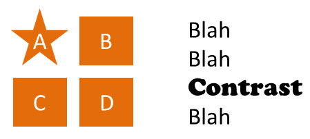
Using Contrasts in PowerPoint: 3 Different Types of Contrasts with Tips and Tricks!
The goal of your PowerPoint presentation is always to skillfully convey your content to the audience. Surely, you are aware that the design of your slides plays an essential role in this. Visual aspects should always be well thought out.
Consider using contrasts in PowerPoint effectively. With the right implementation, you can skillfully emphasize important elements and make a strong impact. We will show you the different types of contrasts and how to use them effectively.
What are Contrasts?
In visual design, contrasts refer to distinct differences between various elements . In PowerPoint presentations, different types of contrasts can occur, such as differences in colors, sizes, fonts, shapes, or movements.
Why are contrasts in PowerPoint that important?
When you strategically incorporate contrasts into your presentations, they significantly contribute to improving the visual impact and comprehensibility of your content . Contrasts create distinct differences between elements such as colors, sizes, shapes, and fonts , directing the audience’s eyes to important information.
With contrasts, you can also establish clear hierarchies and structure your content effectively. Additionally, they enhance the readability of texts and give your presentation an aesthetic and professional touch .
Examples: A well-chosen contrast between text and background enhances readability, while a size contrast helps highlight important elements and establish visual hierarchies. Color contrasts can evoke emotional responses and support the message of the presentation.
Three types of contrasts in PowerPoint
Fundamentally, three main types of contrasts can be distinguished:
- Color Contrast: Refers to differences between colors and can direct attention to important information or distinguish various content areas from each other.
- Size Contrast: Involves differences in the size of elements and allows you to highlight important elements or establish visual hierarchies.
- Font Contrast: Involves combining different fonts and font sizes to achieve better readability and a clear visual structure.
- Other Types of Contrast: These include shape contrast, texture contrast, and motion contrast, each producing different visual effects.
How can you skillfully implement these contrasts in PowerPoint? We’ll show you now.
The Color Contrast
When it comes to color contrast, there are several aspects to consider. For a good color contrast, ensure that you choose colors that harmonize well together and provide clear differentiation between various elements.
Tip: Use colors from the color wheel to create contrasts, such as combining complementary colors.
When editing your backgrounds, ensure an appropriate contrast between background and text colors . Light text on a dark background or vice versa allows for clear separation and improved readability. It is advisable to choose contrasting colors without becoming too bright or straining to the eyes.

Consider these color combinations for selection:
- Warm-Cold Contrast – Combination of warm and cold colors
- Monochromatic-Polychromatic Contrast – Combination of polychromatic and monochromatic images
- Light-Dark Contrast – Combination of intense and lightened color tones
- Quantity Contrast – Combination of large and small color elements
Caution: Consider color blindness as well when making choices to ensure a more accessible presentation.
Avoid using too many different colors as it can quickly distract from the essential content. Decide in advance which colors you will use and consistently apply them in a targeted manner.
The Size Contrast
By using different sizes, you can highlight important information, headings, or key images in your presentation, creating a clear visual hierarchy that makes the main message of the presentation more accessible. Through the use of various sizes, you can skillfully develop hierarchies and emphasize important aspects.
Example: Headings, main points, etc., can be highlighted as significant using larger elements. Smaller elements can support these main points and complement details.

Caution: It is essential not to use too many elements of different sizes to avoid cluttered visuals and instead focus on highlighting the essentials.
Tip: Use size contrasts to create a connection between text and images . For instance, if a statement or heading needs visual emphasis, it can be presented in combination with an image or graphic that is larger than the rest of the content. This establishes a strong visual connection, anchoring the message more effectively in the audience’s memory.
The Font Contrast
With font contrast, you influence the readability and visual impact of your PowerPoint presentation. Choose only appropriate font styles that match the message and theme of your presentation (tips on this are available in the article “Fonts in PowerPoint”).
When using different font styles (e.g., for headings, body text, and bullet points), you create clear hierarchies . Ensure that your font sizes provide adequate readability .
It is also crucial to have an effective font-color contrast to ensure that the text stands out clearly from the background. If the background is dark, the text should be displayed in a light color, and vice versa. This improves the readability of text content, allowing the audience to grasp the information more easily (see Color Contrast).
To create a clear visual distinction between headings and body text, you can employ font contrast. Headings should be larger and more prominent than the body text to establish a clear visual difference. This way, the main themes of the presentation can be recognized more quickly.

Contrasts in Slide Elements
Images and contrast.
Images speak louder than words, and the same applies to presentations. Therefore, never forego enhancing your statements with images. When using images, pay attention to contrasts as well. Additionally, you can create contrasts through the placement of images . By linking them sensibly with the content of the slide, you ensure an engaging and contrast-rich presentation that impresses the audience and effectively conveys the message.
The selected images should be clear and easily recognizable to enable clear communication and enhance the contrast with other presentation elements. In some cases, you may need to edit the images to adjust the visual contrast. For example, you can adjust brightness, contrast, and sharpness.
Caution: When editing, make sure the images still look realistic and appealing without appearing overly exaggerated.
Using Contrasts in PowerPoint for Data Visualization
Diagrams and charts are essential when seeking an effective way to present complex data vividly. When using diagrams and charts in a presentation, it is often necessary to highlight specific data points or results . This can be achieved through different colors, markers, or labels . Create contrasts in this regard:
Use colors deliberately to clearly convey the information. Choose contrasting colors to make the distinction between data categories visually apparent.
Contrasts in PowerPoint Animations
Using animations or other interactive elements keeps the audience engaged. Even in animations, you can consciously pay attention to contrasts. Skillfully using contrasts in animations increases visual dynamics and livens up the presentation.
You can find many ideas for animations and interactive elements in our blogs “ Animations in PowerPoint ” and “ Interactive Presentations “.
For instance, utilize effective object fade-ins and fade-outs . These create a clear visual contrast between the state before and after the animation. A gentle fade-in can draw the audience’s attention to the element, while an abrupt fade-out signals a significant change. There are numerous animation options available for contrasts in PowerPoint:

Another approach is using animated size contrasts. Here, you skillfully direct the focus to specific elements in the presentation. Animated size contrasts create visual focal points and thus support the communication of your message.
For example, a crucial text section or a key image can be enlarged during the fade-in to emphasize its importance.
Also, use colors as contrasts in animations. By using contrasting colors, you create a vibrant and dynamic representation (e.g., color changes, gradients, striking colors), adding an appealing visual aesthetic to the PowerPoint presentation.
What to Consider When Using Contrasts
- Consistency in the Use of Contrasts
When using contrasts, ensure that they are applied consistently throughout the entire presentation. This includes using similar color palettes, font sizes, and styles, as well as size contrasts for similar elements.
Maintaining consistent contrast usage creates a harmonious and professional overall look and avoids visual clutter or confusion for the audience.
- Moderation in Using Contrasts
Although contrasts have a strong visual impact, it’s essential to use them with moderation and thoughtfulness . Too many contrasts can overwhelm the presentation and distract from the actual content.
Focus on using contrasts for relevant elements that need to be highlighted. Less is often more , and a targeted use of contrasts leads to a clearer and more impactful presentation of information.
Extra Tip: Black and White Contrasts in PowerPoint
One of the most well-known contrasts is the black and white contrast . When creating a presentation, the question often arises whether to use a white background with black text or a black background with white text.
The convention is to read dark text on a light background . A black background is often associated with a heavy mood , but that doesn’t have to be the case.
A black background is equally suitable as a background as a white one. After all, black clearly highlights other colors and makes contrasts highly visible . With a dark background, you can, for example, emphasize your company logos. Additionally, black adds a touch of elegance and variety to your presentations, which often feature the standard white background.
If you choose a dark background, keep in mind that white or light text may be more challenging to read . Also, using bold formatting with white or light text can sometimes be risky, as the letters may blend together and become difficult to read.
An advantage of using a white or light background is that you have the opportunity to use a wider range of colors . Particularly saturated, bright colors appear more contrasting on a white slide background and may get lost on dark backgrounds.
In contrast, unsaturated and pastel colors are better visible on a black background . Therefore, consider the color palette you want to use for your presentation and adjust it accordingly based on your background.
The same applies to the integration of graphics, icons , etc. A white or light background often works better in such cases. Often, these elements have a white frame on a dark background, which can be challenging to remove without proficient editing skills.
Black or white? Our recommendation: Both options work, but the choice depends on your presentation design and your industry. White tends to represent clarity, structure, and purity, making slides with a white background a good choice for academic and scientific presentations. Black, on the other hand, exudes elegance and modernity, making it a more fitting trend for business, marketing, and corporate presentations.
Conclusion: Skillfully Using Contrasts in PowerPoint
Contrasts are versatile and can be used effectively in presentations. Use the contrasts that suit your content and skillfully emphasize your messages. Give it a try today.
If you have any questions about contrasts in PowerPoint, feel free to contact us at [email protected] . We’re here to help!
Are you looking for visually supportive and professionally designed slide templates ? Take a look at our shop. We have numerous slides available for download on various (business) topics. Check it out today! ► Shop
You may also be interested in these articles:
- PowerPoint Layout: Proper Layout Design for Your Slides
- Preparing PowerPoint Presentations – 11 Tips
- Fonts in PowerPoint
Share this post
- share
- save

Design Thinking: Problem Solving with a Difference

Why Corporate Mission Statements Are So Important

7 Tips & Learnings from the Apple Keynote
PowerPoint Ninja
The PowerPoint Ninja Blog covers practical PowerPoint topics, tips, and tricks.
- Bullet Point Therapy
- Design Tips
- PowerPoint 2007
- PowerPoint 2010
- Presentation Books
- Presentation Delivery
- Presentation Planning
- January 2013
- October 2012
- February 2012
- December 2011
- November 2011
- February 2011
Oct 08 2012
- PowerPoint Design Principle #3: Contrast

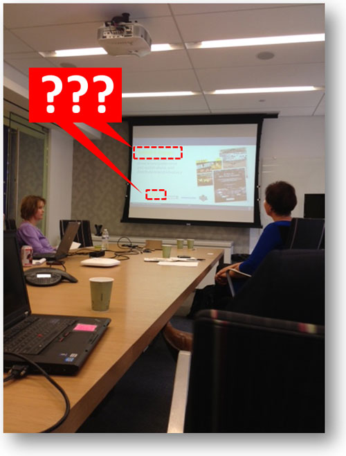
Have you ever sat through a PowerPoint presentation and the presenter had to apologize to the audience for not being able to read text on the slide? That’s what I experienced on my business trip. Often it is due to the font size being too small, but just as frequently it can be caused by sloppy color contrast . While the most common application of contrast in PowerPoint is color, contrast can be created by having different object shapes, object sizes, font types, font sizes, alignment, etc. The principle of contrast is dependent upon the surrounding elements being noticeably different from the focal point . Contrast fails when the difference is too subtle or weak.
There are lots of different ways of showing contrast besides color.
The Projector Curve Ball

I’d like to share three common scenarios where poor color contrast can ruin PowerPoint slides. I’ll start by sharing the two contrast-related mistakes I witnessed on my recent business trip along with a third one I’ve seen on several occasions.
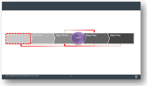
Gradient steps or blends
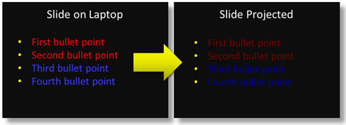
When you have a process or flow diagram, it’s common to color the objects with different gradients – going from light to dark. Problems occur on the side with the lighter gradients if you’re using a light text color consistently across all of the objects . The light font will have good contrast against the darker gradients, but against the light gradient it can become ineligible, especially when you throw the projector brightness wildcard into the mix.
As you can see below, the light gradient with light text was too difficult to read even with the text shading. Unfortunately, the presenter had to pause and explain to the audience what the label was on the first object when he realized it couldn’t be read. If you’re using gradients, you either want to ensure you start darker on the light side or have darker text on the lighter objects (switching to lighter text on the darker objects).
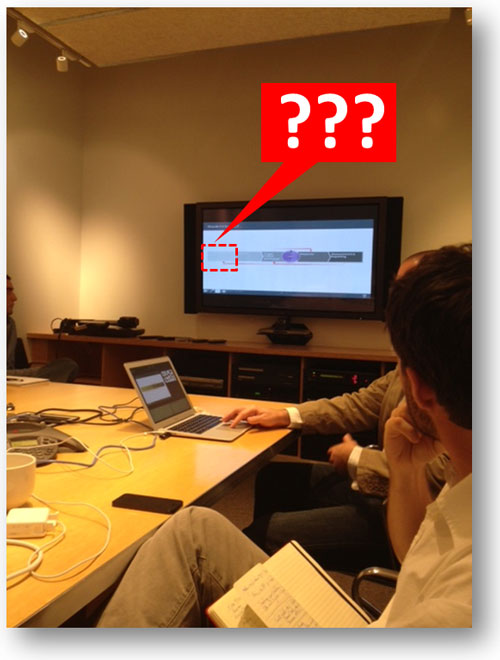
This is the picture I took with my iPhone when I spotted this contrast issue. On the far left, the text was impossible to read because the white text didn’t contrast with the light gray object.
On a laptop screen, the text on the left is still legible, but once it is projected then the white text doesn’t stand out enough to be read against the light gray object. Either the background color on the object needs to be darker or the text needs to be darker — more contrast is required!
When using a PowerPoint template with a white background, you should avoid using certain colors for text. I’ve found that green or light green are not handled very well by a lot of projectors . There’s probably some technical reason for this, but I’ve learned over the years that this particular color is problematic. In the presentation below, the title of the slides and key metrics were in a lime green color. While it looked okay on a laptop screen, it became almost invisible when projected onto a screen. As a result, the presenter had to explain the purpose of each slide to the audience and verbally highlight key metrics that couldn’t be seen.
Be careful about the text colors you choose, especially for key text such as slide titles or data points. I would recommend never using green text due to how unreliable it can be with some projectors. If you’re using a template with a white background, use only dark colors for text.
Here’s another snapshot I took with my iPhone. This meeting was actually before the previous one, and the disruption to the presentation was more dramatic.
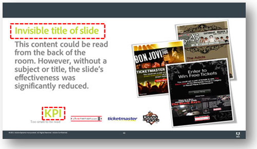
The lime green was visible on a laptop screen, but disappeared when projected. Not good if it’s used for the slide title or a key metric.
Colors on a dark background
My last real-world example comes from the Sunday school teacher at my church who uses PowerPoint presentations for her gospel lessons. She has a tendency to use red or blue text on a black background, which causes the text to be washed out and almost indistinguishable from the dark background . If you’re using a template with a dark background, don’t use standard colors such as blue, green, or red because most projectors struggle to project those colors with the same vibrancy as what you see in your laptop screen. If you’re using a dark background, always try to use light colors that will stand out when projected. Don’t be tricked by your laptop or desktop screen that the colors will display the same way when they’re projected.
Okay, no iPhone snapshot for this one so I’ve tried to reproduce what happened. While the colored text looks vibrant on your laptop (left), it can appear washed out when projected (right).
Don’t make your presentations hard to read; use appropriate levels of contrast for your text. There’s nothing wrong with black text on a light background or white text on a dark background. I know it might be a little boring but better boring than baffling (it seemed to work for Steve Jobs ). If you’d like to get creative with your text try a different font or more expressive language—but don’t use font colors that won’t provide enough contrast.
You can also run into color contrast problems with other parts of your presentation besides text. For example, I was saddled with a corporate template (white background) which used a light faded orange color for its bullets. What might have looked stylish on the designer’s laptop, failed in execution. Simply because a brand designer failed to consider how the light-colored bullets would look on most projectors, hundreds of employees were communicating less effectively with their bullets (except for a rogue PowerPoint ninja who edited his version of the corporate template to include bold orange bullets). Be kind to your audiences and remember the PowerPoint design principle of contrast!
- PowerPoint Design Principle #1: Consistency
- PowerPoint Design Principle #2: Control
- Background Basics for Effective Corporate Templates
- Book Review: The Non-Designer’s Design Book
- 10 Ways to Spot a Lame Corporate PowerPoint Template
Tags: brightness , color contrast , contrast , design principle , projectors
Comments (0)
Leave a Reply
Name (required)
Mail (will not be published) (required)
Comment text
The PowerPoint Ninja Blog covers practical PowerPoint topics, tips, and tricks. If you’re looking to move from PowerPoint apprentice to ninja, subscribe to this RSS today!
- Choose Your PowerPoint Fonts Wisely
- Tips for Removing the Background from Images in PowerPoint 2010
- How Recover an Unsaved PowerPoint 2010 File
- Why Color Contrast Matters in Your PowerPoint Presentations
by Stephanie Ivec | PowerPoint Graphics , PowerPoint Tips | 0 comments

Have you ever been sitting in the back of a conference room and unable to read a presentation because the text color was too light or the text was blending into the background? Frustrating, right?
An important part of creating a good presentation is ensuring that your content has enough contrast.
What is contrast?
As a principle of art, contrast refers to the arrangement of opposite elements and effects. For example, light and dark colors, smooth and rough textures, large and small shapes. Contrast can be used to create variety, visual interest, and drama in an artwork.
Aside from adding visual interest, contrast is also essential for content visibility and legibility. If there isn’t enough contrast between your text and the background or enough color contrast between lines on a graph, your audience is going to have trouble reading and understanding your content.
Did you know there are actual rules about color contrast?
There’s a set of guidelines called the Web Content Accessibility Guidelines (WCAG) that web developers follow to ensure their content can be accessed and read by as many people as possible, including those with visual, auditory, or physical impairments. We’ll be focusing on color contrast today, but WCAG covers many more topics.
If you work for the government or government contractors, you might be more familiar with Section 508 rules.
According to Section 508 rules, designers and developers must ensure all text elements have sufficient color contrast between the text in the foreground and background color behind it.
How do you know if you have sufficient color contrast?
There’s a fairly technical explanation involving “luminance” or perceived brightness of colors, but all you really need to know is the contrast ratio that has been set down in the standards.
Three success criteria in WCAG 2 address color contrast ratios:
- The visual presentation of text and images of text has a contrast ratio of at least 4.5:1. This is the bare minimum and some viewers may still experience difficulties distinguishing color differences.
- Requires 7:1 contrast for normal text and 4.5:1 for large text.
- The visual presentation of user interface components and graphical objects must have a contrast ratio of at least 3:1 against adjacent color(s). This consideration was added in 2018.
One additional success criterion, Use of Color, dictates that color is not used as the only visual means of conveying information, indicating an action, prompting a response, or distinguishing a visual element.
Section 508 outlines the same contrast ratio guidelines.
Here’s a good example of some excellent color contrast, both in the text versus background color and in the row shading of the table graphic. This template is part of the Montserrat design series in our PowerPoint graphics library.
But I’m creating PowerPoint presentations, not websites. Why do I care about color contrast?
You never know who in your audience might have a visual impairment. In addition, your audience doesn’t have the luxury of holding the screen two inches from their face. Your content needs to stand out to everyone, whether they’re sitting at the front of the room or way in the back.
There’s one last consideration that we haven’t talked about yet.
Projectors.
If you are giving a presentation using a projector, it’s a good general rule to assume the colors are going to be projected 20-30% lighter than what you’re looking at on your computer screen.
Not sure if your color scheme has enough color contrast?
Lucky for you, there are tons of color contrast checkers available online. Put in your colors and the magic of computers spits out your contrast ratio.
Here’s a color contrast checker from WebAIM that I like.
When in doubt, you really can’t go wrong with black and white. I know that may sound boring, but if you look at some of our PowerPoint templates , you’ll see that you can create many exciting designs using a lot of black and white.
Plus, we’ve already done all the color contrast head-scratching for you in our PowerPoint templates!
Download tons of templates and graphics from our PowerPoint Graphics Library to make your next presentation a slam dunk.
Not a member yet?
Sign up for a free 7-day trial to explore all the PowerPoint templates and graphics in our library.
Submit a Comment Cancel reply
Your email address will not be published. Required fields are marked *
Recent Posts
- Bad PowerPoints Happen to Good People (But Not You)
- Fresh New PowerPoint Template Styles for Spring
- How to Create Awesome Zoom Virtual Backgrounds
- Creating Branching Scenarios in PowerPoint
Recent Comments
- Karen Webb on 5 PowerPoint Design Tips from a Graphic Designer
- Miriam Castellon on PowerPoint Tips: Over 25 Ways to Save a Presentation
- Elevano Consulting on Get Rolling with these 40 New Hub and Spoke Graphics
- Miguel Monteiro on 5 Things You Didn’t Know PowerPoint Could Do
- Philippa Leguen de Lacroix on 5 Things You Didn’t Know PowerPoint Could Do
- February 2020
- January 2020
- December 2019
- January 2017
- December 2016
- November 2016
- October 2016
- September 2016
- August 2016
- February 2016
- January 2016
- December 2015
- November 2015
- October 2015
- September 2015
- August 2015
- February 2015
- January 2015
- December 2014
- November 2014
- October 2014
- September 2014
- February 2014
- January 2014
- December 2013
- Cutout People Images
- Cutout People Images Questions
- Knowledge Base
- Membership/Account
- PowerPoint Graphics
- PowerPoint Graphics Questions
- PowerPoint Tips
- Stock Images
- Uncategorized
- Entries RSS
- Comments RSS
- WordPress.org
- Media and Press
- PowerPoint Training
- Public Courses
- Public PowerPoint Training
- Presentation Planning & Strategy
- Presentation Coaching
- Our Clients

Colour Contrast and how it Applies to PowerPoint
- Fiona Walsh
- July 9, 2021
- No Comments
When you create slides in PowerPoint, do you consider colour contrast? A recent poll conducted on LinkedIn showed that only 5% of people use a contrast tool to check how easy it is to read their content.
I don’t know about you, but recently I have seen some very hard to read PowerPoint slides. Imagine losing out on business because a potential customer couldn’t read your slides, or social media posts, for that matter ! This is why colour contrast is so important. What do we mean by colour contrast? How easy it is to see text, depending on the colour of the text and background. The image below shows some examples.

I’ve always had an interest in colour. Many years ago, I worked in the automotive industry. My job was to colour match the fabric for the interior of cars. When a new roll of material arrived on site, I had to assess it to ensure the colour was within tolerance. The company made interior parts for companies including Rover, Land Rover, Toyota, Ford and Jaguar. These companies did not want the fabric on one door to look different from another door.
Colour Tests
On my first day on the job, I was introduced to the Farnsworth Munsell 100 hue colour test. The test consists of 4 trays containing 85 removable colour reference caps of incremental hue variations spanning the visible spectrum. The colour caps were removed and put in random order. The test involves putting the caps back into hue order between two fixed hues. This is repeated for each of the four trays.
I passed with zero errors. I had an eye for colour! My boss, a man, told me that he rarely saw this result. Why is it important to say to you my boss was a man? Because men are more likely to experience colour blindness than women. According to X-rite, a manufacturer of spectrophotometers (scientific equipment to measure colour), 1 in 12 males has a form of colour blindness compared with 1 in 225 women; a big difference! I worked in a male-dominated environment. Perhaps that was why my boss had never seen anyone get a perfect score before.
If like me, you’re curious, you can take an online test on the X-rite website . Here’s an example of the test before and after completion. On the left is the test before you start and on the right is the completed test.

And, here’s the result below. Although I now wear glasses, my colour assessment is still as sharp as twenty-something years ago!

What does all this have to do with PowerPoint slide design?
We perceive colour differently, and what’s more, some people with colour blindness only see in black and white or greyscale. The most crucial aspect to consider when creating a presentation is our audience, so how can we cater for colour disabilities when we design PowerPoint slides?
One way is to consider the contrast between the colour of your text and the background colour. There are several online tools you can use. The assessment is based on the Web Content Accessibility Guidelines (WCAG) 2.0 .
These tools allow you to enter the colour of your text and background using various colour measurements units. If this is all new to you, start with Contrast Checker because this tool allows you to use RGB colour units (Red, Green, Blue) used in PowerPoint. Below is the output from Contrast Checker. As you can see, this combination ticks all the boxes.

The pass or fail criteria are based on different font sizes, the brightness and colour difference and how readable your text is in greyscale (for people who cannot see in colour).
Others tools available are WebAim and Coolors .
I’d love to hear your feedback on these tools and if you’d like to know more about how I can help you with your PowerPoint slide, check out my Services page!
Subscribe to our Newsletter
Share this post with your friends, contact us now.
Please feel free to contact us within working hours using the information below.
- Cork, Ireland
- +353 86 334 4065
- [email protected]

Empower Presentations is on the ISME panel of trainers.

Empower Presentations is on the Carmichael panel of trainers.
Privacy Policy
Website terms of use, terms of engagement, © 2024 all rights reserved. website by fahey media ., this website uses cookies to ensure you get the best experience on our website..
- Presentation Design
Measuring Contrast Ratios in Your Presentation Design
- By: Amy Boone
Contrast. It grabs and directs attention. It highlights what’s important. And it is, without a doubt, one of the most important things in your presentation design. So how do you make sure you have the right contrast ratio in your presentation design? You measure it.
Today we’ll share why contrast is important, and then we’ll show you how to use Adobe’s free contrast checker to make sure your slide deck passes the test when it comes to contrast.
Why is Contrast So Important in Slide Design?
Accessibility.
The main reason we need contrast is so that people can easily view and understand the elements in our design. Without the appropriate amount of contrast, our eyes lose the distinction between colors and elements start to blur together. You can check out your own contrast sensitivity using the Pelli-Robson test here .
The Web Accessibility Initiative has published some standards when it comes to contrast ratios that can be seen by most people. While there are different levels (A, AA, AAA) for contrast, we’d suggest adopting the AA level minimum standards whenever you are designing. For successful contrast at this level, you’d need a contrast ratio of at least 4.5:1. There are a few exceptions: large-scale text and images of large-scale text can have less contrast (3:1) due to their size, and text that doesn’t offer any meaningful information is purely decorative or that is part of a logo doesn’t legally have to meet the 4.5:1 ratio either. But great designers aren’t clinging to minimums. They are figuring out how to use high levels of contrast to insure all their users can easily navigate their designs.
Aesthetic Attention
The other main reason for using high levels of contrast is that it grabs and directs audience attention. Designers make use of something called preattentive attributes all the time. Expert in data visualization Cole Nussbaumer Knaflic explains these well. She says that preattentive attributes are “elements like color, size, and position on page. [They] focus your audience’s attention on the most important parts of your data. These are visual cues that ease the processing of the information. When done well, there should be no question on the part of your audience when it comes to what is important or where they should focus their attention—it is obvious.” While contrast is not specifically named as a preattentive attribute, it is the foundational principle that underlies many of them as you can see below in this example from Callum Ballard of Towards Data Science .
Measure Contrast with the Adobe Contrast Checker
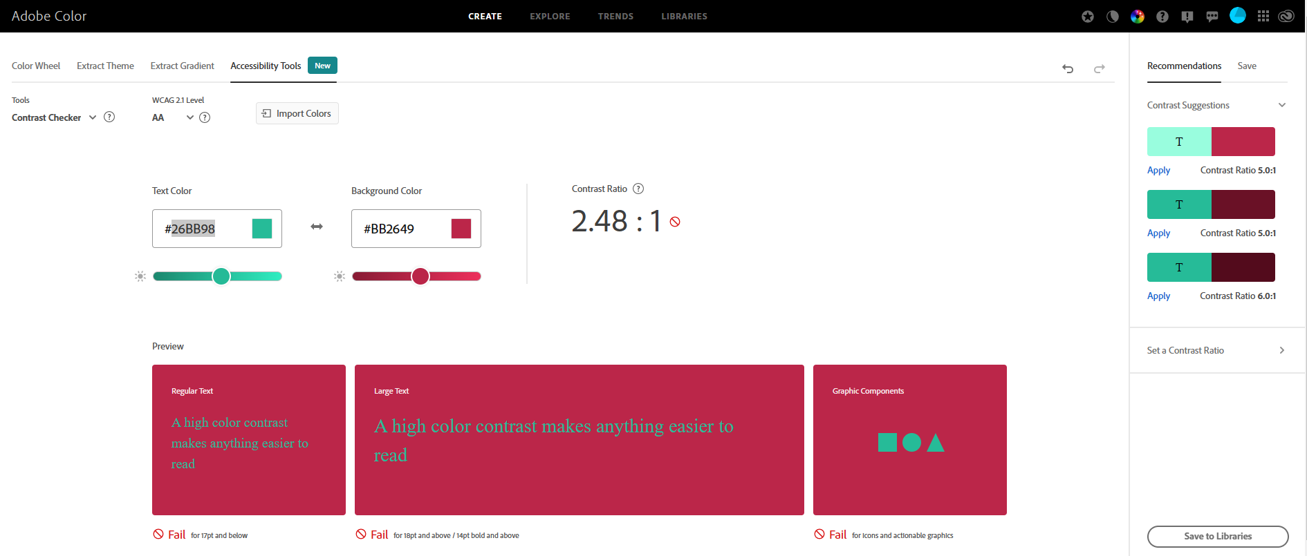
So how do you know if you’ve met the minimum contrast ratio of 4.5:1? Let’s look at an example. We recently wrote about Pantone’s 2023 Color of the Year, Viva Magenta (hex code #BB2649). If you missed that blog, you can check it out here . Proactive Creative says, “The complementary color for Viva Magenta is Mountain Meadow. This fresh green shade is also known as the opposite color as it’s directly across on the color wheel. So, these two colors have a strong contrast and are eye-catching when used together. The hex code for Mountain Meadow is #26BB98.” And sure enough, these colors look great together. But do they really offer enough contrast? Let’s use the Adobe Contrast Checker to make sure.
You can access Adobe’s Contrast Checker Tool here. Once on that screen, you can enter the hex code for your text color (Mountain Meadow) and your background color (Viva Magenta), as shown below.
For more ways to elevate your presentation, check out our blog or subscribe to our podcast . Or get in touch with us to find out how to collaborate with Ethos3 on your next big presentation.

Join our newsletter today!
© 2006-2024 Ethos3 – An Award Winning Presentation Design and Training Company ALL RIGHTS RESERVED
- Terms & Conditions
- Privacy Policy
- Diversity and Inclusion
Picture Correction in PowerPoint [Brighten, Sharpen, Contrast!]
By: Author Shrot Katewa
![Picture Correction in PowerPoint [Brighten, Sharpen, Contrast!]](https://artofpresentations.com/wp-content/uploads/2022/10/Featured-Image-1.jpg "contrast meaning in powerpoint presentation")
A picture enhances the engagement of your content, so PowerPoint makes sure that the pictures in your presentation are well-integrated with your slides. Once you have added pictures, Powerpoint allows you to brighten, sharpen and adjust the contrast of your pictures, offering both preprogrammed and manual options.
To correct pictures in PowerPoint, right-click on the image and click on “Picture Format”. Then, from the “Format Picture” panel, click on the “Picture Correction” option, and adjust the brightness, sharpness, and contrast values of the image by moving the slider or typing the desired value.
Powerpoint also lets you make your picture fade by adjusting its transparency and increasing saturation to adjust the amount of color in your picture.
Do you want to learn step-by-step about picture correction in Powerpoint? This article will show you how to use Powerpoint picture editor for the purpose of picture brightness, sharpness, and contrast.
Let’s give it a try!
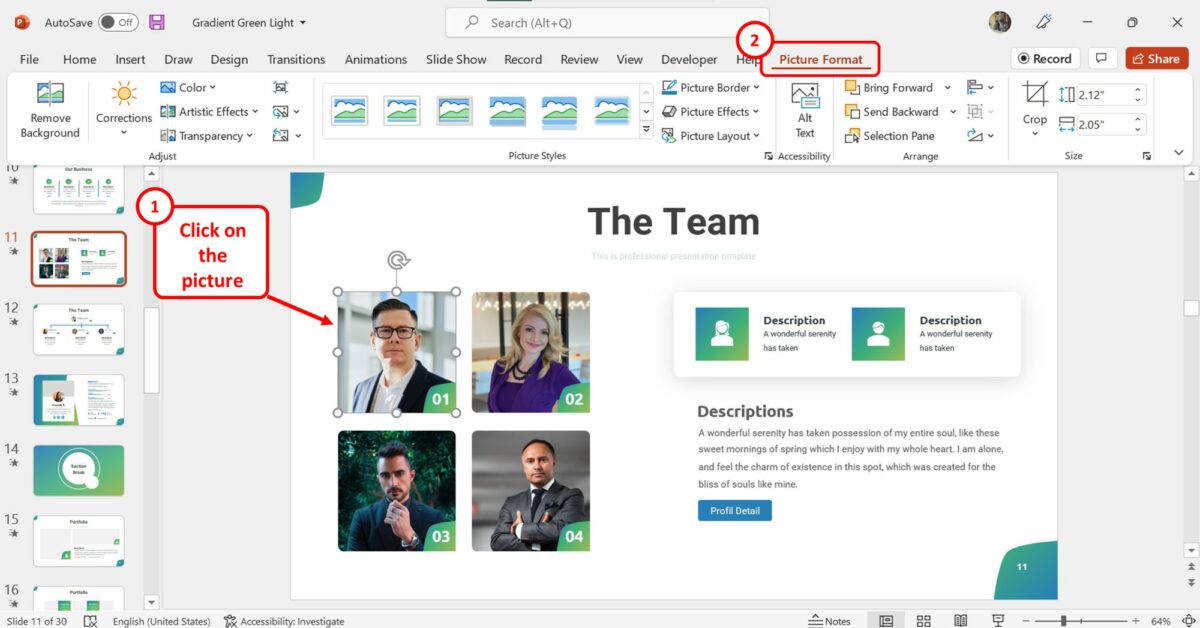
1. How to Sharpen Images in PowerPoint?
The sharpening effect in Microsoft PowerPoint can be applied to any picture inserted into a slide. To sharpen an image using the preset options in PowerPoint, follow the 2 simple steps.
Step-1: Click on the “Picture Format” tab
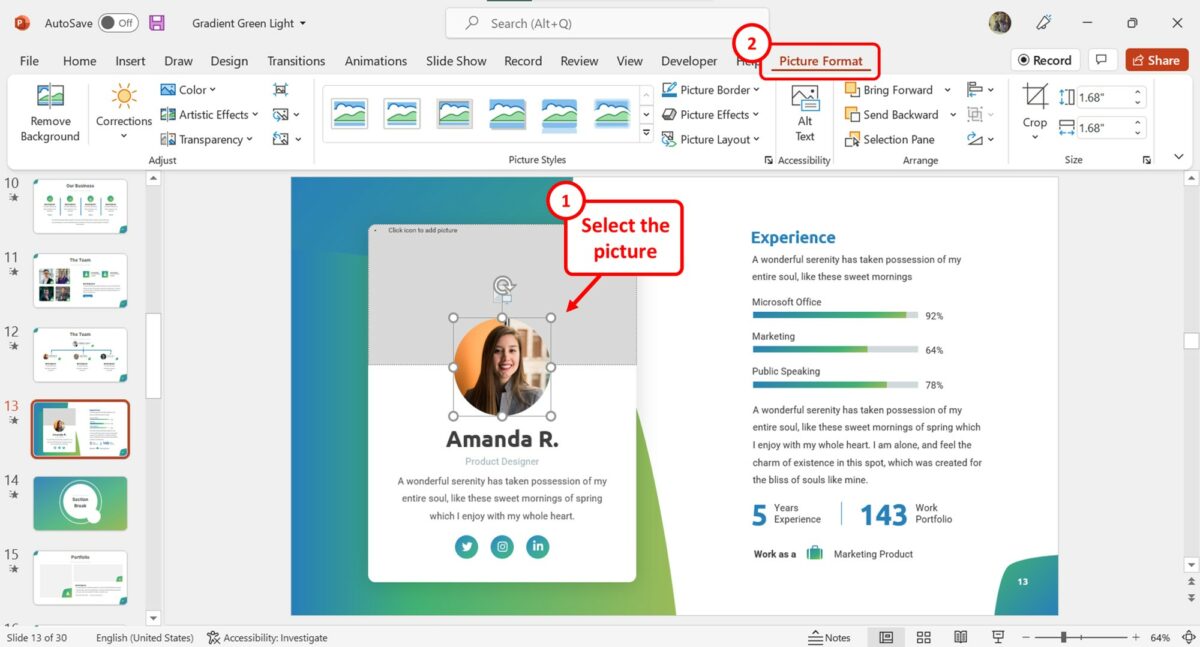
In the PowerPoint slide, you have to first click on the picture that you want to sharpen. Then click on the “Picture Format” tab in the menu ribbon located at the top of the screen.
Step-2: Click on the “Corrections” option
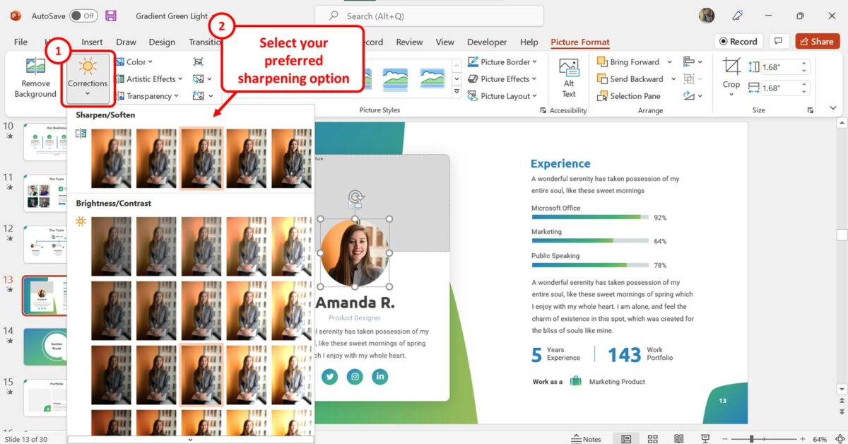
In the “Adjust” group of the “Picture Format” tab, click on the “Corrections” button. Now all you have to do is click on your preferred sharpening option from the “Sharpen/Soften” section of the dropdown menu under the “Corrections” option.
2. How to Increase Brightness or Contrast in PowerPoint
Using the “Picture Format” tab in Microsoft PowerPoint, you can quickly change the brightness or the contrast of a picture inserted into the slide. To increase the brightness or the contrast of a picture using the preset options, follow the 3 quick steps.
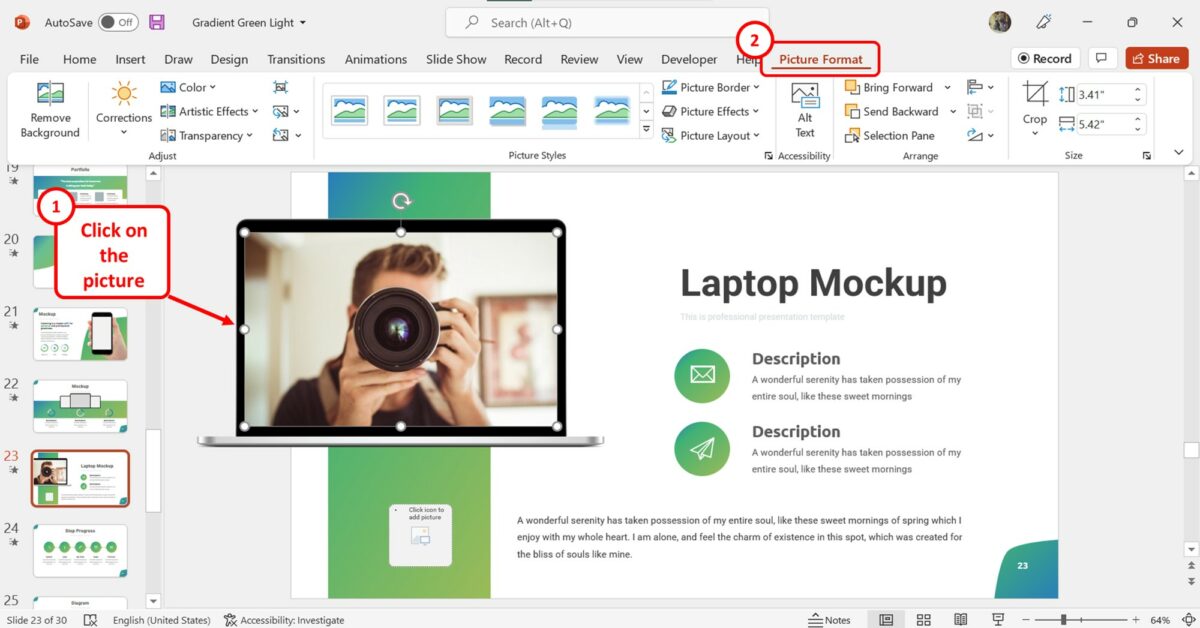
The first step is to click on the picture on the slide. Then click on the “Picture Format” tab in the menu ribbon.
Step-2: Click on the “Corrections” button
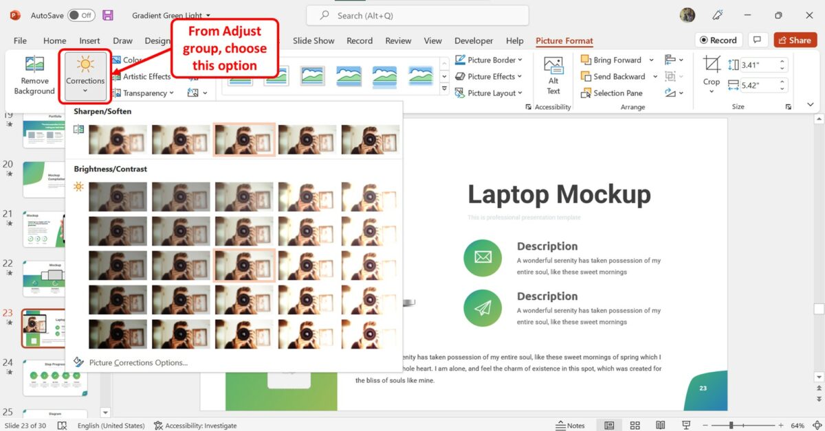
The next step is to click on the “Corrections” option in the “Adjust” group of the “Picture Format” tab. This will open a dropdown menu containing the preset brightness and contrast adjustment options.
Step-3: Click on your preferred brightness or contrast preset
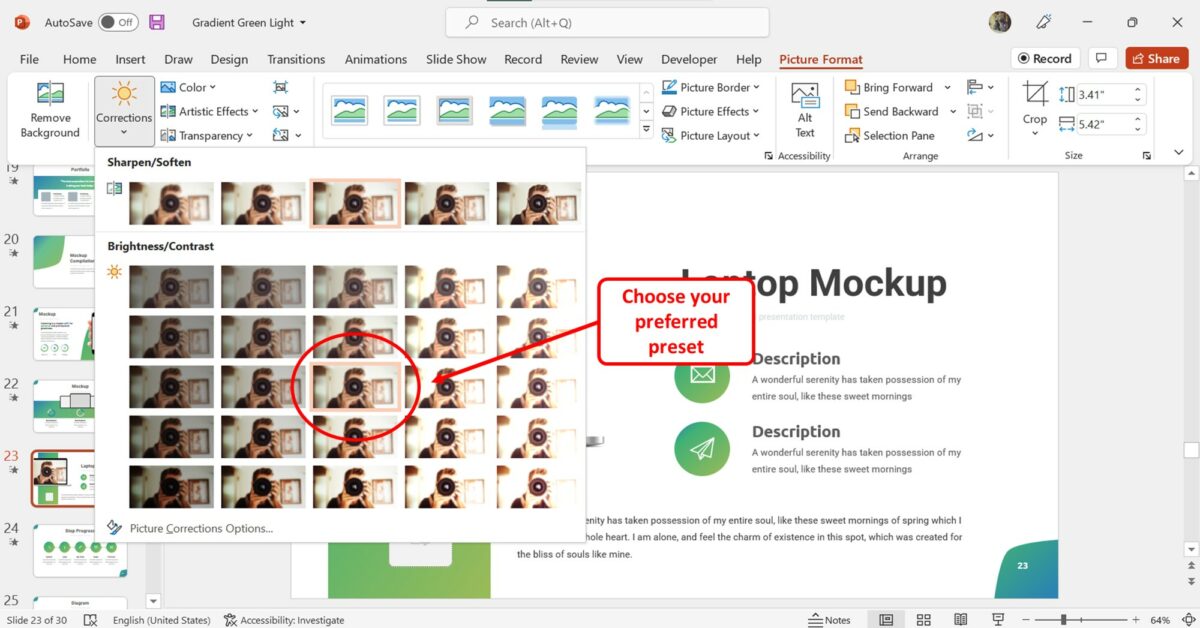
In the “Brightness/Contrast” section of the dropdown menu under the “Corrections” option, you can hover your pointer over the presets to see the brightness and contrast settings for each. Then click on your preferred preset.
3. How to Manually adjust the Sharpness of Picture in PowerPoint?
In Microsoft PowerPoint, you can manually adjust the sharpness of a picture rather than using a preset option. To manually adjust the sharpness of an image in PowerPoint, follow the 3 easy steps.
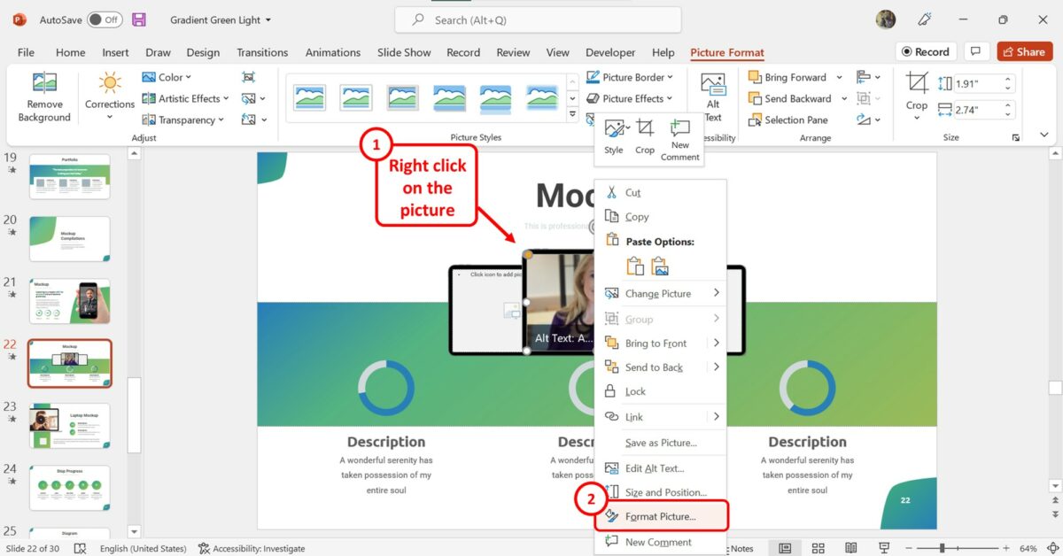
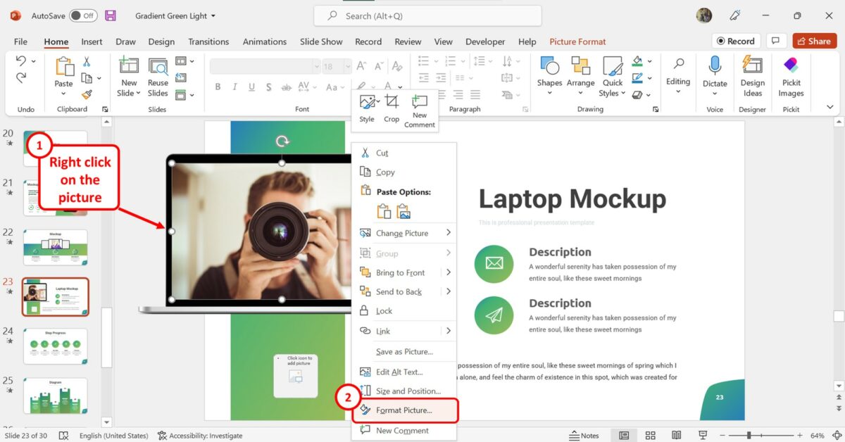
Step-1: Click on the “Format Picture” option
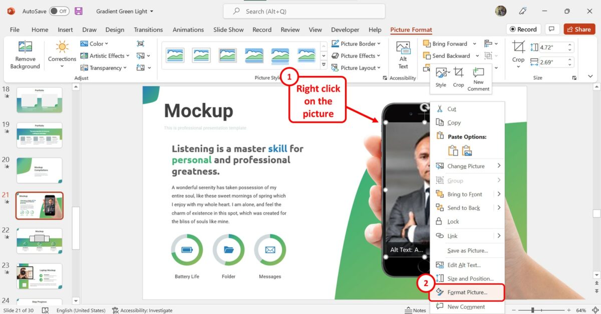
In the open slide, “Right Click” on the picture. Then click on the “Format Picture” option from the right-click menu. This will open the “Format Picture” sidebar.
Step-2: Click on the “Picture” icon
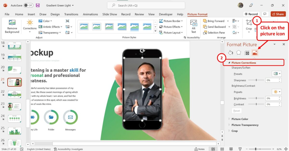
In the “Format Picture” sidebar on the right side of the screen, click on the “Picture” icon at the top. Then click on the “Picture Corrections” option.
Step-3: Click on the “Sharpness” box
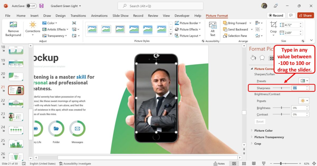
In the “Picture Corrections” section, click on the “Sharpness” box. Now you can enter any number between “-100” to “100” . You can also drag the “Sharpness” slider left and right to decrease or increase the picture sharpness.
4. How to Manually Control Brightness or Contrast of an Image in PowerPoint?
In Microsoft PowerPoint, you can adjust the brightness or contrast of an image using the presets available. However, there are a limited number of presets, and for more options, you have to do it manually. To control image brightness and contrast manually, follow the 4 quick steps.
The first step is to “Right Click” on the image inserted into the slide. Then click on the “Format Picture” option.
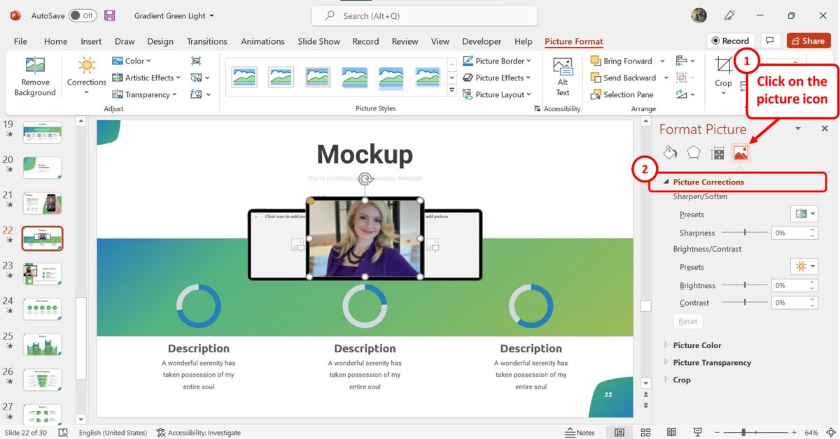
In the “Format Picture” sidebar at the right side of the screen, click on the “Picture” option which is the last icon at the top. Then click on the “Picture Corrections” option to expand the picture correction options.
Step-3: Click on the “Brightness” box
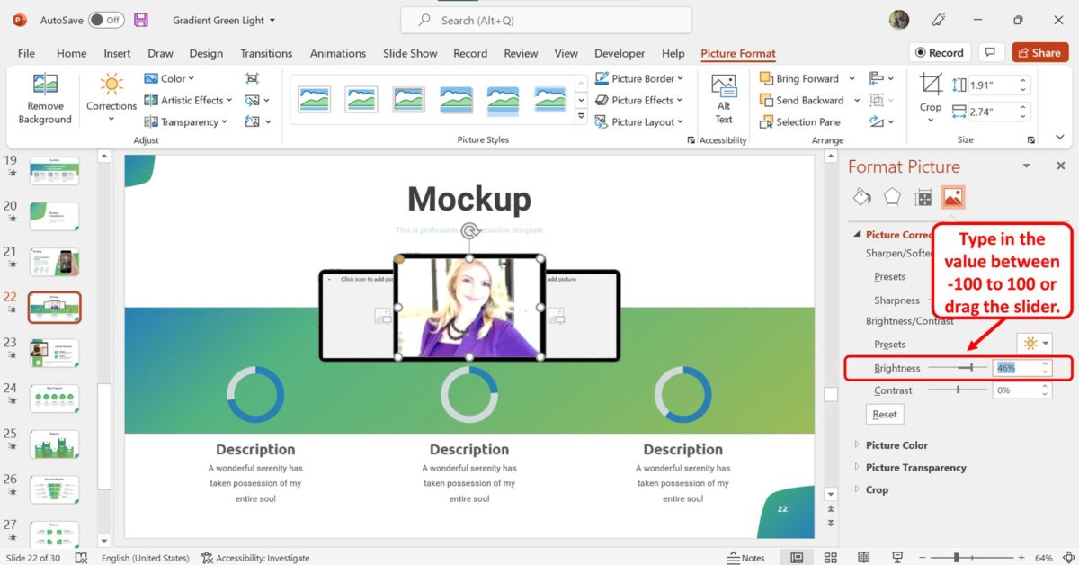
In the “Picture Corrections” section of the “Format Picture” sidebar, click on the “Brightness” box. Now you can type in any value between “-100” to “100” to set the brightness. You can also drag the “Brightness” slider to adjust the brightness of the picture.
Step-4: Click on the “Contrast” box
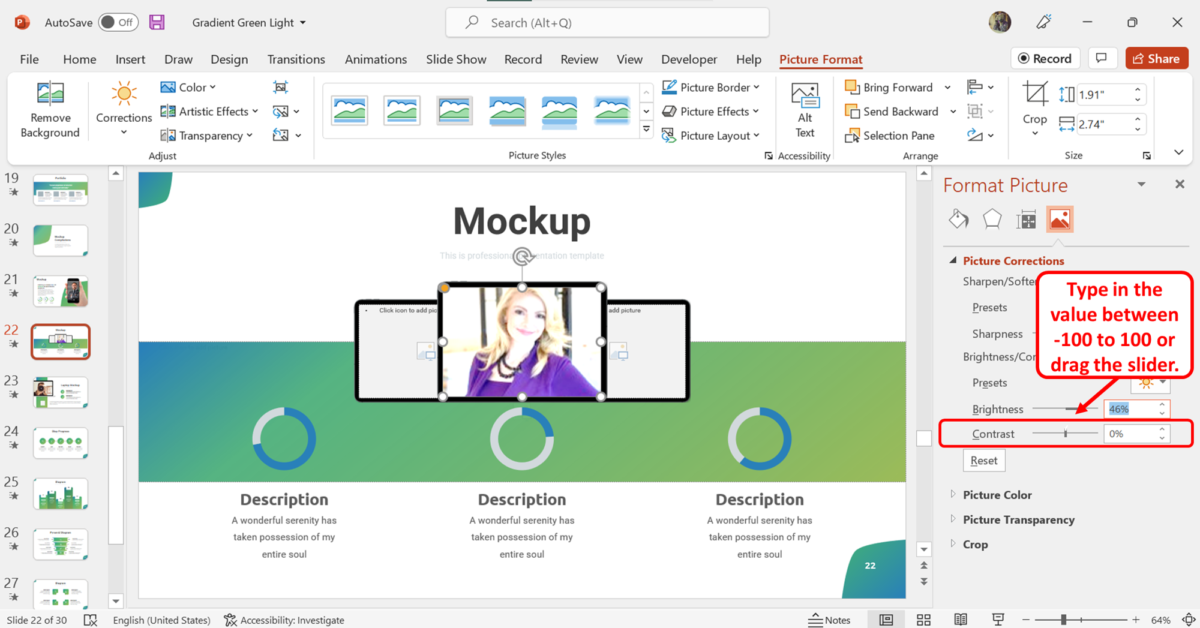
The next step is to adjust the contrast of the picture on the slide. Click on the “Contrast” box in the “Format Picture” sidebar and type in a contrast value between “-100” to “100” . You can also drag the slider to adjust the contrast.
5. How to Fade an Image in PowerPoint?
In Microsoft PowerPoint, you can adjust the transparency of a picture to fade it. To fade a picture in a slide, follow the 3 simple steps.
The first step is to click on the picture inserted into the slide that you want to fade. Then click on the “Picture Format” tab in the menu ribbon located at the top of the screen.
Step-2: Click on the “Transparency” option
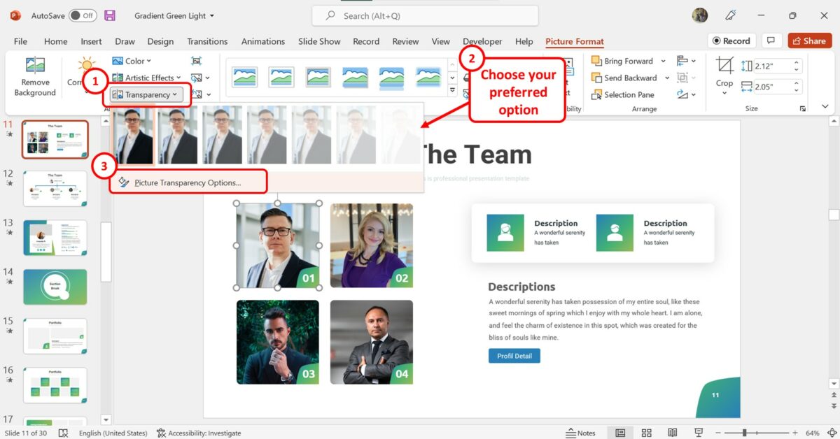
In the “Adjust” group of the “Picture Format” tab, click on the “Transparency” option which is the last option in the group. In the dropdown menu under the “Transparency” option, click on your preferred transparency preset to fade the image. You can also click on the “Picture Transparency Options” option to manually set the transparency.
Step-3: Click on the “Transparency” box
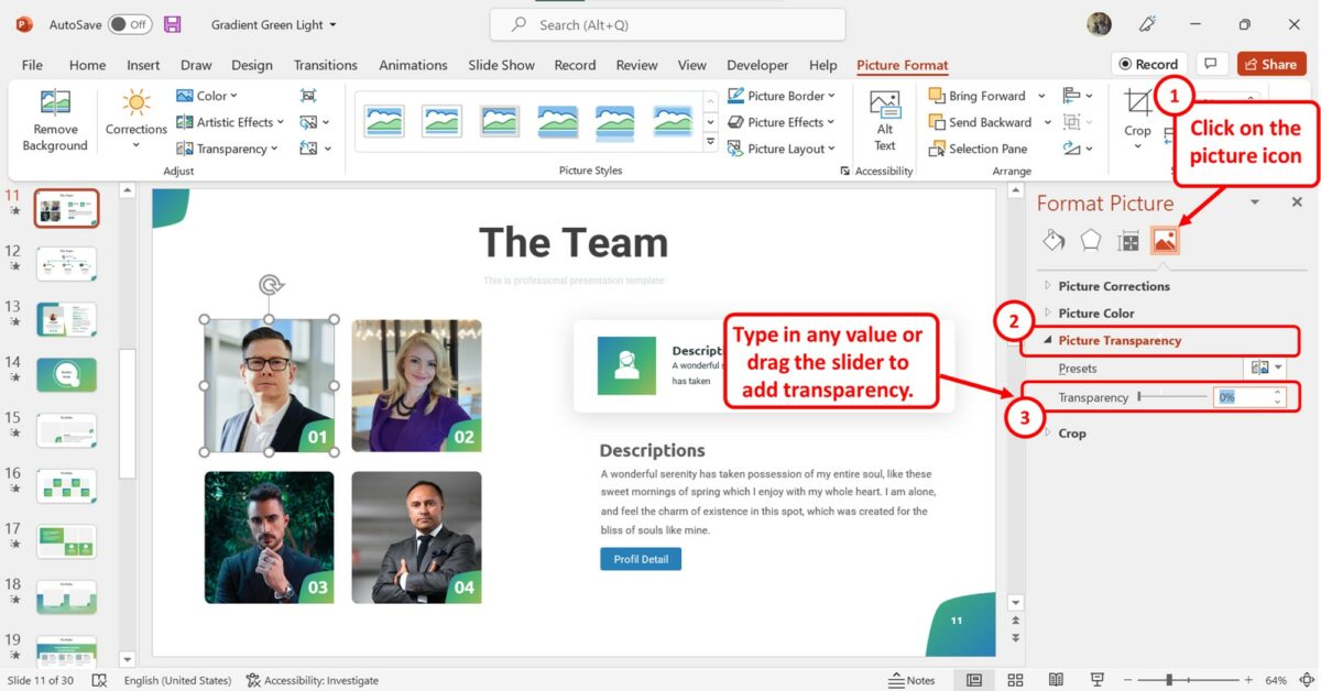
In the “Format Picture” sidebar on the right side of the screen, click on the “Transparency” box and enter your preferred transparency value. You can also drag the “Transparency” slider to the right to increase the transparency to fade the selected image.
6. How to Increase Picture Saturation in PowerPoint?
Picture saturation is what controls the amount of color in a picture. When you insert an image in PowerPoint, you can adjust the saturation to match the presentation theme.
I’ve covered the topic of how to change picture color in PowerPoint in great detail in another article. Make sure you check that out as well!
To increase picture saturation, follow the 3 easy steps.
In the open slide, you have to first “Right Click” on the picture that you want to change the saturation for. Then click on the “Format Picture” option in the right-click menu. This will open the “Format Picture” sidebar.
Step-2: Click on the “Picture Color” option
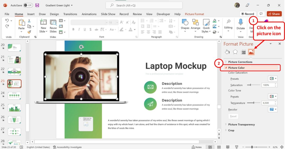
At the top of the “Format Picture” sidebar, click on the “Picture” option which is the last icon. Then click on the “Picture Color” option in the sidebar.
Step-3: Click on the “Saturation” box
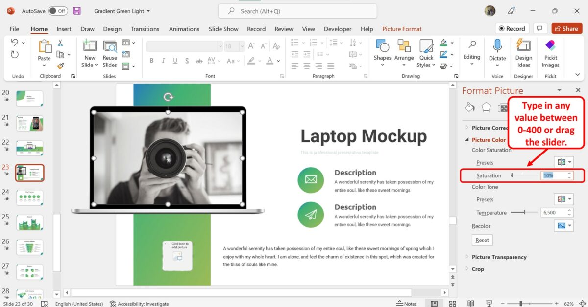
Under the “Picture Color” section in the “Format Picture” sidebar, click on the “Saturation” box. Then type in a value between “0” and “400” in the box. You can also drag the slider to the right to increase the saturation of the selected picture in PowerPoint.
- Faculty/Staff
- Defining online accessibility
- Accessible Word Documents
- Accessible PowerPoint Presentations
- Accessible PDFs
- Accessible Audio and Video
- Canvas accessibility resources
- Accessibility Newsletter archive
April 26, 2021: PowerPoint accessibility - Checking color contrast
Accessibility goal of the week.
Continuing our multi-part series on PowerPoint accessibility, this week we will address the importance of color contrast in PowerPoint slides and how to check if your contrast is sufficient.
What is color contrast?
Perceiving color contrast refers to the ability to distinguish between two colors which appear next to each other. Colors which appear directly opposite each other on the color wheel have the highest degree of contrast. For example, purple has a high contrast with yellow, and blue has a high contrast with orange. Conversely, colors which appear next to or near each other on the color wheel have a lower degree of contrast.
Why is it necessary to check color contrast?
Some students with visual impairments or color deficiencies may have a harder time distinguishing between colors that have a lower degree of contrast. Federal regulations mandate that sufficient color contrast be employed in online content, with a contrast ratio of at least 4.5:1 for normal text and 3:1 for large text (large text being defined as 14 point and bold or larger, or 18 point or larger).
How do I check color contrast?
There are free tools online that easily allow you to check for sufficient color contrast. Some require downloading software, which may pose a problem if you do not have administrator rights on your computer. For this tutorial, we will show a workflow to check contrast without the need to download any extra programs.
Find the RGB (Red, Green, Blue) numbers for your foreground and background colors.
Office 2016 and 2019 (Office 365 instructions further down):
- Navigate to a PowerPoint slide which has colors you wish to check.
- Click on an element in the slide (i.e. words or an image). You should see the "Format" tab appear in the ribbon.
- Click on the "Shape Fill" drop-down arrow, and then "Eyedropper".
- Your cursor will now resemble an eyedropper. Hover the eyedropper over the foreground color (i.e. the color of the text). You will see a box with the color appear as well as the RGB numbers for that specific color. Make a note of these three numbers. You will need them in a moment.

If you use PowerPoint via Office 365 , to find your RGB numbers for text: Select your text > right click > Font Color drop-down > More Colors. For background colors: Design > Background > arrow next to Solid Fill > More Colors.
Use the WebAIM Color Contrast Checker
- Go to webaim.org/resources/contrastchecker/ . WebAIM is a non-profit organization based at the Center for Persons with Disabilities at Utah State University. It is an excellent resource for online content authors. The contrast checker tool is a free resource offered through WebAIM.

- The "Contrast Ratio" number we are aiming for is at least 4.5:1 for normal text, or 3:1 for large text (large text being defined as 14 point and bold or larger, or 18 point or larger). In the sample contrast ratio below, we can see that our two colors have passed.
- The pass report will also show you how your contrast fared for normal text and large text. In this area we are aiming for a pass in WCAG AA for both normal and large. Do not worry if your contrast fails WCAG AAA. The minimum standard required under law is conformance with the AA rating. WCAG stands for Web Content Accessibility Guidelines, which is an international standard recognized by the federal government.

Back to the Accessibility Goal of the Week archive
404 Not found
Home Blog Design Color Theory for Presentations: A Detailed Guide for Non-Designers
Color Theory for Presentations: A Detailed Guide for Non-Designers
Color theory is a common conversation topic for graphic designers as its rules guide every aspect of a quality-crafted project. We can ask ourselves then: does color theory apply to presentation design? The short answer is: definitely yes.
To elevate the impact that your presentations can have, we designed this guide, intended to help people who are not necessarily knowledgeable in graphic design. We will cover in detail what color theory is, how different color schemes make a psychological effect on your target audience, recommended color schemes and pairings, and accessibility rules. Also, you can find two step-by-step examples in the final section on how to craft high-quality presentations by following these rules.

Table of Contents
Color properties and models
- On primary, Secondary, and Tertiary colors
Color temperature
Why do we use color theory, monochromatic, complementary, rectangle or tetradic, split complement, accessibility rules for color theory, black: luxurious, sexy & powerful, white: fresh and clean, silver: innovation and modernity, red: power, action & confidence, blue: trustworthiness, stability & safety, yellow: happiness, energy & attention, green: money, health, nature & luck, purple: wisdom, creativity & ambition, brown: strength, security & isolation, orange: uplifting, attention & energy, pink: girly and romance, case study 1: creating a presentation with contrasting values, case study 2: create a presentation for eco-friendly purposes, case study 3: create a vibrant presentation to engage your audience, final tips for proper usage of color theory in presentation design, what is color theory.
We can resume color theory as guidance on color mixing and combinations for achieving harmonious results, but to truly understand color theory, we must understand the concept of color itself.
The initial findings and research on color date back to ancient Greece , where Aristotle understood colors as “a mixture of light and darkness,” but discordances were seen in the way the human eye was able to perceive the phenomenon of color. Demokritos understood colors as the energy emitted from self-radiating objects but could not be extracted for artistic purposes. For philosophers like Plato, color was perceived after the rays emitted by the self-radiating objects collided with “pure rays” placed in the human eyes by the gods. Therefore the perception of “color” mainly depended on the properties of those rays (size, strength, and speed).
Even if we can criticize such simplistic approaches to color perception these days, the truth is those definitions aren’t that far from contemporary concepts. The color theory formalization process started with the findings of Leone Battista Alberti, referring to the mixture of colors as an infinite process in which other hues are created, but recognized only four true colors: red, blue, green, and grey. For Alberti, white and black were alterations in different colors.
The works of Leonardo da Vinci were geared toward the interaction of light and shade, where white represented the light and black the absence of color. This formulation was adequately analyzed by Sir Isaac Newton in 1666 when he observed that white light was composed of the entire spectrum of colors present in the rainbow. His experiment, made using two prisms, proved that light lacked any proper color on its own, but “color” was a human perception of the range of energies emitted when light fulfilled these three premises:
- It had a medium for propagation: air, water, etc.
- It involved interacting with at least two elements: an object and light.
- It had a spectator whose rational interpretation was able to “decode” the energy into a “color.”
The direct consequence of Newton’s findings is the method by which we can analyze a color’s properties.
- Hue : How is the color perceived (if it is blue, red, yellow, etc.).
- Saturation : Also known as Intensity, it refers to how vivid color is. The more saturation it has, the stronger the color it will be. The lower the saturation value is, the more grayish the color would look.
- Value : Speaks of the amount of light present in color. Colors with considerable amounts of light are referred to as Tints , whereas colors lacking light are known as Shades .

Thanks to these properties, colors can be classified according to their interaction with each other in two big models:
- Additive color model : This is where RGB comes from. Red, Green, and Blue make the primary colors as they are the colors available in the photoreceptors of the human eyes. Since white is conceived as the combination of red, green, and blue in equal parts, any ratio alteration creates the different colors we can perceive. Hence, black is defined as the removal of the three primary colors. This theory was conceived by James Clerk Maxwell and is fundamental for any kind of visual media.
- Subtractive color model: This model refers to CYMK, the acronym being Cyan, Yellow, Magenta, and Black. It is called subtractive as the concept behind it is purely physics-based. If we take the light spectrum and mix it with pigments, certain pigments absorb part of the light spectrum before letting the light bounce. Therefore, light waves are “subtracted” from the original light source when the color reaches the viewer’s eye. For instance, white objects lack pigments; that’s why the full spectrum reaches the object and can be perceived as white. As you add more pigments, you subtract more light waves from the light source, getting to the point where an object is perceived as black (hence why the letter K is in the acronym).
Now, these two different color perception models are applied in various mediums. As mentioned above, the RGB color range from the additive color model is used in visual media, such as computers and television. Up to 16.7 million colors can be created from this model, and the methodology for this is by mixing each channel (red, green, and blue) in a range from 0 (least saturated) to 255 (most saturated).
The CYMK color range from the subtractive color model is used for print media in a broad range of options: paper, textile, dyes, ink, etc. Unlike the RGB mode, CMYK is heavily restricted to an estimated 16k possible colors. Since CMYK is based on pigments, the conformation of each color is expressed in percentages for each tint.
On Primary, Secondary, and Tertiary Colors
We have approached a great deal of information, but what about what the teacher told us about “primary” and “secondary” colors in school? Well, let’s blame artists for this.
During the 18th century, discussions about color vision came to the convention that all elements were made out of three primary colors: red, yellow, and blue. This was due to the belief that these three tints could mix all the other colors perceived by the human eye. The RYB model distinct red, yellow and blue as the primary colors , where the mixture of these hues produces the secondary colors : orange, green, and violet.
Tertiary colors result from mixing a primary and a secondary color but include a higher ratio of the primary color. By doing that, you end up with these colors:
- Blue-green (Teal) = Blue + Green
- Yellow-green (Chartreuse) = Yellow + Green
- Red-orange (Vermilion) = Red + Orange
- Red-purple (Magenta) = Red + Purple
- Blue-purple (Violet) = Blue + Purple
- Yellow-orange (Amber) = Yellow + Orange
Although lighting professionals typically coin this concept, the truth is we can classify colors by their “temperature.” For artists and any kind of visual/printed medium, color temperature is a relative concept that relates to how cold or warm a color is perceived and the psychological effects linked to it.
Why is the color temperature a relative concept? Simple, it’s strictly related to the color in proximity to it. For example, if we take a wine color sample (red-violet) and put it close to a blue-colored object, the wine color will be perceived as warmer . On the other hand, if we take that same sample and place it next to a red thing, the wine color is observed as cooler due to the presence of blue pigment.
As a convention, colors can be classified according to their temperature as:
- Warm colors : Red, yellow, and orange hues
- Cool colors : Blue, blue-green, and violet hues
Some colors are “in-between” as they can both be warm or cold. Examples of these are pink, green, and gray.
In a later section, we will analyze the impact color temperature has on psychology and its usage for transmitting emotions in a message.
As in any discipline, we need a framework to provide quality results. Color theory is the consequence of centuries of research made by thinkers, scientists, and artists about the behavior of color and the human psyche.
This framework ensures we work under visually harmonic results for the desired outcome. Correct usage of color theory can elevate a design to its maximum potential. Although, we should consider that design is not the ultimate reason why the research on color and its theorization happened in the first place. In 1879 Odgen Rod published Modern Chromatics , the first scientifical publication made by a physicist about color theory taking notions from Jack Clerk Maxwell’s postulates. His work inspired the creation of a color standardization system, resumed in the 1912 book Color Standards and Color Nomenclature by Robert Ridgway.
In a different line of research, color representation was an idea often revisited during the 18th and 19th centuries. 3D shapes displayed the different hues, shades, and tints: spheres, pyramids, and cones. Eventually, the method was inefficient for any respectable academic or professional work. It was by the hand of professor Albert Munsell (creator of the Munsell Color System, still used to date) that a proper relationship between hue, saturation, and value was established. His discoveries involved a rigorous methodology in which the three color properties were expressed in percentages as a “rational way to describe color” – contrasting with the traditional (and misleading) color naming system.
Munsell’s first findings were published in his 1905 Color Atlas , improved later in the 1929 Munsell Book of Color . The impact of Munsell’s research was that his system was almost instantly adopted by the United States Department of Agriculture (USDA) for soil research and later on by the American National Standards Institute (ANSI) for the standardization of skin and hair colors in forensic pathology. Other known usages of Munsell’s system include dental restoration practices (for defining dental pieces’ tint) or comparing digital media to human color vision.
A final application of color theory and the one that mainly involves us in crafting presentations came from the findings of art theorist and artist Wassily Kandinsky . He established the nexus between colors and the effect on human behavior – a study that later evolved into the discipline of Color Psychology . His perception of the spirituality found in art is heavily used to date in marketing as specific colors were able to alter the mood of the audience. We will elaborate on this topic in a later section of this guide.
Types of Color Schemes
In this section, we will explain in detail each of the color schemes. Consider this article on color mixing for presentations as complementary information about tips for how to balance the color ratio and how to select a scheme.

A monochromatic color scheme applies a single color with variations in shades and tints. This kind of scheme is often found in house paint palettes, and the overall effect is consistency.
Whereas it lacks contrast to make it look “vibrant,” the monochromatic scheme is one of the preferred choices of many designers as simply you cannot go wrong with it. It takes the decision of color matching out of the scene, and you can play with different shades and tints of the same hue to make transitions, highlight an element, etc.

The analogous color scheme works with a pairing of the main color and the two directly next to it in the color wheel. One example we can take is an analogous scheme of blue with blue-green and green.
Overall, it is a color scheme that can be applied in most scenarios without harsh dynamic range impact. Its expected usage is for logos or branding, looking for a harmonic result in which the different colors blend together to convey a message.

If you want to create an impactful contrast, this is your color scheme. The complementary color scheme uses two colors directly across the color wheel. Any other tints or shades relevant to those two colors can also be used.
And here’s why color theory is critical when approaching a presentation design. How would you actually use the colors in this complementary color scheme? 50/50? If that’s your initial guess, you are awfully wrong.
To preserve harmony in the composition, the advisable route is to consider one color as the predominant and the second contrasting color as the accent . The different tints and shades can be used in similar proportions, always as subordinates of those two.
The complementary color scheme is ideal for graphs, charts, and infographics. Its striking contrast makes elements outstand; thus, it’s advisable not to overload the balance between predominant and accent. One part can be colored in the accent color, then tints and shades of that color make the different points of the graph. The predominant color becomes the background for that presentation.

The tetradic color scheme defines a rectangle area where the four corners are the selected colors for the palette. It is one of the schemes that oughts to be used with extreme caution.
As a result of this selection process, we end up with two bold tones, and two muted ones, which are secondary colors related to the first ones. To apply the rectangle color scheme, start by making one color dominant . Balance the rest of the colors as subtle accents for different sections. To avoid its overwhelming effect, you can use either black or white (depending on your selection of colors) to tone down the color explosion.
Mobile development is a fine example of applying a tetradic color scheme, where we can see menus with cards in different colors. Keep a close eye on it; you will subtly find the other three tones in each card. Companies like Google or Microsoft use tetradic schemes for their logos, as it boosts the idea of diversity and openness.

The triadic color scheme is trendy in flyers design and is also known to produce the best colors for presentations. Since all colors are equally distant in the color wheel, you get a high contrast composition; however, the best part of this color scheme is to play with the softer tints each color has as it gets closer to white.
Say you pick blue-violet as the dominant color. Yellow-green will be the color to contrast that blue-violet for a balanced look (red-orange if your take was to make it highly vibrant), so you can use either 100% yellow-green or a softer tint of it for different parts of your design. Then, the red-orange becomes a hue to add dynamism to the composition in attention-grabbing details.

The square color scheme is a bolder version of the rectangle color scheme. Coining the idea of even spaces between colors, you end up with dramatic changes in hues while preserving one primary color, which is one of the reasons why web designers often pick this color scheme.
For correctly applying this scheme, we suggest you pick the darkest hue as the dominant color , then gradually introduce the others using the 60-30-10 rule for a balanced composition. Using white or black as the predominant color is an alternative, whereas the others picked by the square color scheme make the composition pop.

Finally, we have the Split Complement or Split Complementary color scheme, which resembles a tree structure. This scheme picks a primary color. Instead of selecting its direct complementary, it opts for a split in which the two colors are chosen on each side of the complementary color.
This kind of scheme is ideal for infographics and presentations since you balance the high contrast of the Complementary scheme with two subtler but intense colors. The second reason why so many users are fans of this scheme is that it keeps a proper balance between warm and cool colors.
Let’s assume red-violet is going to act as the base color . Then blue-violet can be used to enforce some shadow areas and yellow to bring life to the composition in a striking way. Since the contrast can be overwhelming, be mindful about the dosage of color you apply, and mostly: choose the base color with care . As an extra note, you can use a tint of the selected base color if you consider the chosen one is far too bold (e.g., if you picked yellow as the base color).
Color isn’t the answer to every project. Even if you consider the first step of picking the proper color scheme for your design is done, there are some extra rules you ought to check to ensure design accessibility . We cannot be more clear about this topic: if your design doesn’t follow the basic accessibility rules, all that hard work was done for nothing. Why? Let’s consider the following scenario.
You designed a presentation. The slides are done and ready to be projected for your audience. After the conference started, people in the back rows complained they could not understand what was written in your slides. Or worse: they get confused when trying to visualize graphs. And this doesn’t just affect people with visual impairments (which you should always consider when designing your slides) – different lighting conditions can hinder your own presentation performance from your workspace if the color contrast isn’t appropriate.
Therefore, we will resume the principal guidelines for accessibility that concern color theory:
- Contrast foreground and background : To ensure your presentation is readable, apply a color contrast of 4.5:1 for placeholder text and 3:1 for titles. This also applies if the text was rasterized as part of an image. You can see the difference below between what’s considered a faulty contrast and a well-made pairing.
- A word of caution : Please look at the font color’s overall lightness. There’s a specific reason for not using 100% lightness because it causes visual discomfort to the user.

- Don’t assume people understand color the same way: As we’ve seen above, the perception of color is subjective and can be influenced by factors that can be both psychological, physiological, or even educational. Let’s take a classic as an example. A form section that says, “Required fields are in red.” Whereas this can be simple to understand, a person with daltonism or achromatopsia (total color blindness) won’t even know where to look. Instead, use a visual cue to help the user understand where to look, such as “Required fields are marked with an *.”
- Test designs in different sizes: Something that can be seen as balanced on a printed paper or computer screen may be overwhelming when reduced to mobile format. It’s a good practice to test the color schemes in different screen sizes to be confident users can read and understand our content, regardless of the medium they use.
Psychological effects associated with effective color theory application
Even though the naming is relatively recent, color psychology is the discipline that understands the relationship between color and human interaction. So significant is the importance for this study area that food packaging doesn’t happen accidentally, as improper color usage can alter how you perceive that food. Marketing, interior design, gaming industry, graphic designers , and so many other industries apply the guidelines of color psychology in their daily production to grant consumer satisfaction.
This section will explore the intrinsic messages that color can transmit and how our presentations can benefit from that.

As an easy term, black can be understood as the absence of color. People can also interpret black as the lack of light or the technical fact that black can absorb the entire light spectrum.
Since we can analyze the color meanings by its positive and negative associations, we start with the positive feelings oozed by the color black. It is a direct message of sophistication and luxury. People instantly associate black with the color of tuxedos, black limos, and many spy-themed movies.
The black color also speaks of power, and it’s not without a cause, as court dresses historically have been black. Banking institutions reserve the black color for their premium members’ cards.
Negative connotations of the color black are feelings that evoke depression. This can be easily fixed by a sound, contrasting presentation color palette.
Opt for a black-themed presentation if you wish to transmit exclusivity, a VIP product or service for your audience. Gold accents work perfectly for this kind of topic, although somewhat cliché. Instead, you can work with ochre and coffee tones with subtle white accents to make the design tridimensional. Use texture images, such as carbon fiber, to reinforce the message of something luxurious that can elevate the customer’s standards.
Word of advice: not all black colors are precisely “black” – You can find warmer blacks, which work best with ochre tones, and cooler blacks that get along best with silver/gray hues.

White speaks of purity, of something clean and innocent, hence why it is the main color picked for wedding dresses, baptisms, or hotel bedding. White also transmits minimalism, which is why nordic styling often pairs warm wood with matte white finishes for table lamps or furniture. It has a conveyed message of austerity.
As a color, technically speaking, is the full spectrum of light without being bounced. Therefore, white can be understood as a blank state, a new beginning of sorts. Its simplicity makes easier the effort to craft a presentation, so that’s the reason behind many users opting for classical white-predominant themes.
Negatively speaking, white can evoke bad feelings for those who have photophobia (intolerance to harsh lights) due to its striking contrast. Remember the recommendation above for not using pure 100% lightness in the white text? The same applies here for backgrounds unless you have a keen desire to hurt the spectators’ eyesight. Lower the value of white to 80-90% if your presentation is going to be purely white-based, and use 100% lightness for accent details if you prefer.
Pure white can also be perceived as dull, so pairing it with another hue is necessary for specific industries for quality presentation design.

Silver or gray (depending on whether it resembles a metallic look) is a color of grace and modernity. It transmits a message of a change of direction, as light can bounce off it. Hence, professionals use it not just for technological aspects but also mental health as you feel all mental blocks are getting lifted.
It is a color often associated with wealth – its direct relationship with the silver metal – and thanks to being shiny, clean, and alluring, it is associated with everything modern and hi-tech.
Whereas it can be seen as a perfectly balanced color, it can easily be misused and fall under the bland side of the color spectrum. Melancholy and loneliness are negative feelings sometimes associated due to the lack of a prominent hue on them. Don’t be fooled by such a statement as there aren’t two equal grays in the world: put two gray color samples side by side, and you’ll notice the subtle differences in hue.
It is a color that dignifies, speaks of maturity, and a well-organized scenario. The corporate world uses this color in almost every scenario without even relating that embedded message, and at the same time, it reinforces the meaning.

In color psychology, the primary colors are the ones that transmit the most powerful messages. Red conveys the fiery energy that fuels power and confidence. It is a color with a duality no other hue can express, and we will analyze why.
On a positive note, red is associated with love and passion. The image of a woman wearing a red dress or holding a red bottle of perfume not just seeks to evoke passion but to present the woman as a confident person, capable of making her own choices to shape her future. She is the coveted element of desire, not by her sex but by the ideal of power she can transmit.
Traditionally, red is the color of power in cultural scenarios. The Academy Awards attendants and nominees walk over the “red carpet.” Political parties use the color red for their logos. Anyone who sees the color red can instantly associate with the brand Ferrari and their Cavallino Rampante logo.
Physiologically, red is powerful enough to produce these physical effects:
- Elevate blood pressure
- Enhance metabolic rate
- Increase heart rate
- Induce hyperventilation
- Increase appetite
That’s why using red is not something to take for granted. Abusing the usage of red in a presentation can cause discomfort, whereas proper usage of red makes it engaging and dynamic. Remember that red is also the color used for signage in the case of “danger,” “stop,” “fire,” and several other negative connotations.
Be cautious when using pure red as your dominant color. Sometimes it’s best to play it safer and opt for a shade or a tint not so predominant in the message.

Blue is a color that instantly uplifts productivity. Commonly found in nature as in the daytime sky or water, it inspires serenity in the spectator, building confidence to become more productive.
One of the reasons blue is so commonly used in designs is because it’s felt as something conservative. Like you cannot go wrong when using blue or pairing blue with another color. That’s another sign of how much of an intense presence blue has in our daily life that we feel natural to pair blue with another hue.
As one of the primary colors, blue creates a strong feeling of stability and safety. Businesses, banking institutions, and health centers use blue to transmit their values of professionalism and trustworthiness. Psychologically, blue has the opposite effect to red regarding pulse rate, so it’s not unusual to find blue hues in offices requiring much concentration time.
Negatively, blue is associated with sadness, as in the common saying “feeling blue.” Pure blue schemes can seem detached to some audiences; therefore, opt for a Split Complement , Analogous , or Rectangle color scheme to make it look attention-grabbing. Some schemes pairing blue shades with ochre, brown, or orange can transmit the message of luxury when done with subtlety.

As the final primary color, it’s bright and intense, becoming one of its main usages as an attention-grabber. In general guidelines, we must not overuse yellow as a color in designs since it quickly builds visual fatigue. Physiologically, that has been related to the amount of lighting it emits in comparison with other colors (hence, its similar performance to white in cases of photophobia). However, we must not forget yellow can also increase the metabolic rate.
Yellow can get perception dualities as we’ve seen with red: some people find it cheerful, inspiring happiness and energy (e.g., SpongeBob SquarePants character), and others perceive it as absolutely annoying. That’s due to the attention-grabbing factor, so we must apply it carefully in presentation design.
Due to it being a stimulating color, we would recommend using tints of yellow as background color if yellow is a must. Avoid pure yellow at all costs. Some people interpret the yellow color as aggressive, and your presentation conveys the wrong message. Psychologically, it has been studied that conceited people prefer yellow color , whereas introverts react negatively to it. Instead, use a color scheme that pairs yellow with a less dramatic color, and apply yellow as the accent color of your scheme.

Is there any other instant connotation for green besides nature, outdoors, and ecology? Green is distinguished as a refreshing color and associated with health and eco-friendly practices.
As a combination of the steady blue and the happiness-booster yellow, green mellows the soul, taking us to a relaxing atmosphere. This is why designers create “green spaces” inside office buildings – becoming critical in dense capital cities with limited outdoor places to unplug from work.
Historically, humanity has associated green with different values:
- Money : Currency bills, such as the US dollar.
- Health : There are cultural associations of the color green with fertility, eating healthy, the agricultural industry, and living stress-free.
- Nature : The outdoors, green energy, eco-friendly organizations.
- Luck : A four-leaf clover, casinos, winning.
On the other hand, there’s the common saying that one can be “green with envy”, or relate to motion-sickness. Thankfully, that’s not the message green transmits when used in the design.
Before applying green to your slides, remember it’s not the same message you send when using an olive green (that speaks of elegance and earthiness) as when using an aqua green (freshness, sports). Be mindful when picking the green hue and research its own meaning before using the color because you just like it.

Although this color is associated with feminist movements these days, purple historically speaks of wisdom and creativity. It has an embedded message of ambition due to its cultural references to royalty and the clergy. You may ask yourself why if black is associated with the luxurious, we say that purple is the color of royalty. Well, the answer to that question we have to speak about a dye named Tyrian purple , with an insanely costly procedure that only allowed the extremely wealthy population to wear clothes in that color.
Changing perspectives, we can speak of the purple color from a creative aspect as a color that boosts inspiration. Its link to spirituality is well-documented, and one of its most controversial usages is the work of artist Francis Bacon in Study after Velázquez’s Portrait of Pope Innocent X . Also, purple is a color associated with courage. The Purple Heart medal is a military decoration of the United States awarded in the name of the US President to those wounded or killed during service.
The shades of purple can evoke exotic perceptions, from wine to delicate flowers such as orchids to precious gemstones such as Amethyst.
Since it’s not a color felt as natural by humans, we can create vibrant presentations on different topics that take the user away from conventionalism.

Brown is a color commonly used for outdoor adventures or to introduce all-terrain experiences in isolated places. Being the color usually associated with earth, it’s not a surprise to find the values of strength and reliability linked to the color brown, even if it’s not a color easy to manage as it leans towards both orange and yellow.
Warmth, comfort, and security are feelings transmitted by the color brown for its close relationship with nature. That could explain why security firms opt to include brown in their branding strategies and pair it with black to enforce the importance of “securing the valuables.”
To apply it in presentation design, it is a color that must be balanced in a complementary or split complementary scheme, preferably with a blue tint. Orange can bring far too much energy to the scene, so use the combination of brown + orange with caution (the same rules apply with brown + yellow).

Depending on where its hue leans, we can say orange can be an uplifting color on an extremely attention-seeking one. The strong-red oranges are used for attention, such as in signage, whereas yellow-orange speaks of happiness, of being carefree. The “ideal” orange – such as the one in the photo above – is a color that transmits the feeling of energy, leading parcel delivery companies to use it for their marketing strategies.
As a highly energetic color, it’s often found in uniforms for sports, mascots, energy drinks, etc. People associate orange with summer and autumn: spectacular sunsets, orange juice, flowers, and so on. For the Asiatic culture, orange is a spiritual color that speaks of meditation, leaving materialism behind and Buddha. For Americans, orange is linked to Thanksgiving and Halloween.
Thankfully, orange is a color easy to pair in most scenarios as it blends with a multitude of colors. Still, we recommend it to mute the pure orange, opting for a sophisticated shade of it and leaving the intense orange hues as accent colors.

Last but not least, we will speak about the pink color. It is a color associated with the feeling of kindness, love, and femininity. A broad range of shades transmits different messages: whereas pastel pinks can evoke tenderness, a vibrant shade of pink such as magenta can be observed as aggressive by some audiences.
Joyful, pink is a girly tone that makes you feel integrated. As if you achieved your most desired dreams and you celebrate the outcome surrounded by your loved ones. For artists, it is a vibrant color that contrasts with often “dull” colors such as gray and black for interesting composition values.
If you can look aside the simplistic “girl” color concept, it’s a refreshing color that instantly takes people to a feeling of inspiration and renewal.
Case studies for color theory
In this final section of the article, we will use four different case studies to explain why some color selections are made in regard to sending the viewer a message with the presentation. Please keep in mind that most presentation templates are fully editable; therefore, if you love a design, but you don’t feel comfortable with its color range, you can change the color palette for ppt presentation by making a custom theme in PowerPoint .
This first case study involves a medium-sized company that seeks to automatize its candidate selection process for the HR department through AI technology. As not every single member in the managerial area is convinced about this idea, the HR department prepared what’s known as a force field analysis presentation .
Thanks to the force field analysis model, the HR department presents the initiative, its driving forces (being the Pros of the initiative), and the restraining forces (the cons of this initiative) are easy to identify and represent with the help of a force field analysis slide template .

In a Complementary color scheme, the elements that weigh on the decision are represented in two colors: sapphire blue for the driving forces and orange-red to expose the restraining forces. Since we talk about something corporative, the same sapphire blue was used for the initiative area, not influencing the palette with another color.
Conducting the analysis from a color psychology perspective, the orange-red is attention-grabbing enough for people not to ignore the cons that this project can experience over time, whilst also reflecting an energetic resistance to change. Sapphire blue, on the other hand, speaks of professionalism. Of trusting the process in the decision to make since it’s time to move on and pursue bigger horizons – and the current selection process for new personnel is both time-demanding and often not tailored for certain departments.
In our second case study, a waste management company is visiting potential customers to offer their services whilst also educating company owners on the importance of treating production waste with the care it requires.
This next slide introduces the ecology of waste management, in which, depending on the original materials, there are multiple methods to repurpose waste rather than piling it up in open outdoor spaces.

The waste management presentation template used features a Monochrome color scheme in shades and tones of green. The greens used are not also randomly selected:
- Dark green used in the title and accent effects speaks of the fact that waste can be repurposed into money, and that fact can easily become a driving force for customers to change their waste management policies.
- Bright green in the accent sections and number of slides refers to rebirth. Of giving new life to what’s considered decay.
- Pale green in the cogwheels and placeholder text percentages is a symbol of peace. Remembers the audience that being mindful about the final destination of our production processes is part of having a corporate social responsibility.
- Mint green is a signal for refreshment. Of lifting taxing decisions and outsourcing from people knowledgeable in the subject.
With this case study, you can appreciate how slide color schemes can reinforce the message to transmit without filler words.
The next case study to analyze comes from a group of young software developers presenting their skills to a customer for a web design project. Despite not having a large trajectory in the industry, their team is well-balanced between experienced developers and creative designers to meet the demands of their clients.
This programming presentation template is the chosen asset to introduce their services visually compellingly while also listing their project portfolio.

A fine example of a Split Complementary color scheme, no doubt. The color selected was yellow-red, using blue and violet as the other two colors that made up this scheme. Since yellow is far too intense, it’s left as the accent color for some sections, and the background is a darker blue leaning towards blue-violet. The vector images follow suit by combining the colors selected in the palette, using gradients and lighter tints.
The question becomes now: what about the aqua tone? Sometimes, designers can combine color schemes inside a design to balance the overall composition. Since yellow would be too much attention-grabbing, and the presence of blues and violets is covered, there is a secondary usage of the Analogous color scheme, opting for a tint of the blue-green next to the blue color. The discrete way in which it was used brings life to the image and centers the vision in the placeholder text area.
To conclude this guide, it is essential to answer a common question: how do I pick the colors for my slide design project?
For some people, inspiration about a word, a concept, or a product to present directly leads to the color selection of the main color – or at least an indicator of which hue would work best. Then, the selected color scheme helps to build up the entire color palette for the presentation. In some other cases, an image can become the leading source of inspiration. That’s the reason why you should check tools such as Design Seeds’ Instagram Profile or even Pinterest.
Online tools can help us easily come up with good colors for presentations. Some recommendations for this are Coolors or COLOURlovers . Although… what if you already got inspiration from a presentation you attended but don’t know which colors were used? This incredible tool may cheer you up: Site Palette , a Google Chrome extension that gives you the entire list of colors used, with their HEX values to reproduce them in your designs.
Check out our complete tutorial on how to make a PowerPoint Presentation .

Like this article? Please share
Presentation Approaches, Presentation Ideas, Presentation Skills Filed under Design
Related Articles

Filed under Design • March 27th, 2024
How to Make a Presentation Graph
Detailed step-by-step instructions to master the art of how to make a presentation graph in PowerPoint and Google Slides. Check it out!

Filed under Presentation Ideas • February 29th, 2024
How to Make a Fundraising Presentation (with Thermometer Templates & Slides)
Meet a new framework to design fundraising presentations by harnessing the power of fundraising thermometer templates. Detailed guide with examples.

Filed under Presentation Ideas • February 15th, 2024
How to Create a 5 Minutes Presentation
Master the art of short-format speeches like the 5 minutes presentation with this article. Insights on content structure, audience engagement and more.
Leave a Reply

How to Change Picture Brightness or Contrast in PowerPoint

Change the Brightness or Contrast of Images in PowerPoint (2 Ways)
by Avantix Learning Team | Updated September 10, 2023
Applies to: Microsoft ® PowerPoint ® 2013, 2016, 2019, 2021 and 365 (Windows)
In PowerPoint, you can change the brightness or contrast of a picture using picture correction tools in the Ribbon or in the Format Picture task pane.
Note: Buttons and Ribbon tabs may display in a different way (with or without text) depending on your version of PowerPoint, the size of your screen and your Control Panel settings. For PowerPoint 365 users, Ribbon tabs may appear with different names. For example, the Picture Tools Format tab may appear as Picture Format and the Drawing Tools Format tab may appear as Drawing Format or Shape Format.
Recommended article: How to Make a Picture Transparent in PowerPoint (3 Ways)
Do you want to learn more about PowerPoint? Check out our virtual classroom or in-person classroom PowerPoint courses >
Adjust picture brightness or contrast using the Ribbon
To adjust picture brightness or contrast using the Ribbon:
- Select the picture you want to adjust.
- Click the Picture Tools Format or Picture Format tab in the Ribbon.
- In the Adjust group, click Corrections. A drop-down menu appears.
- Under Brightness/Contrast, hover over the thumbnails to preview the effect and when you find the setting you want, click the thumbnail.
- Thumbnails on the left show less brightness and thumbnails on the right show more brightness. Thumbnails on the top show less contrast and thumbnails on the bottom show more contrast.
The Picture Corrections drop-down menu appears as follows in the Ribbon:

Adjust picture brightness or contrast using the Format Picture task pane
You can use the Format Picture task pane for more control over brightness and contrast settings.
To adjust picture brightness or contrast using the Format Picture task pane:
- Click More Picture Corrections Options. The Format Picture task pane appears. At the top of the task pane, the Picture icon should be selected.
- Click the arrow beside Picture Corrections to expand the area (if necessary).
- Drag the slider beside Brightness and / or Contrast to change the settings. You can also enter a number in the box next to the slider.
The Format Picture task pane appears as follows:

In PowerPoint, you can also remove the changes by clicking Reset in the task pane.
Subscribe to get more articles like this one
Did you find this article helpful? If you would like to receive new articles, join our email list.
More resources
How to Rotate Objects in PowerPoint (4 Ways)
PowerPoint Shortcuts for Copy, Paste and Paste Special
How to Remove the Background of a Picture in PowerPoint (2 Ways)
Change the Background of PowerPoint Slides to a Color, Gradient or Picture
How to Add Animation in PowerPoint (Animate Text, Images and Other Objects)
Related courses
Microsoft PowerPoint: Intermediate / Advanced
Microsoft PowerPoint: Design for Non-Designers
Microsoft PowerPoint: Animations Bootcamp
Microsoft Excel: Intermediate / Advanced
VIEW MORE COURSES >
Our instructor-led courses are delivered in virtual classroom format or at our downtown Toronto location at 18 King Street East, Suite 1400, Toronto, Ontario, Canada (some in-person classroom courses may also be delivered at an alternate downtown Toronto location). Contact us at [email protected] if you'd like to arrange custom instructor-led virtual classroom or onsite training on a date that's convenient for you.
Copyright 2024 Avantix ® Learning
You may also like

How to Insert or Type E with an Accent Mark in PowerPoint (È, É, Ê, Ë, è, é, ê, or ë)
You can insert or type e with an accent mark in PowerPoint using built-in tools or keyboard shortcuts (including Alt code shortcuts). The letter e can be inserted with an accent in both upper or lower case in text boxes or placeholders on slides, the slide master or layouts. The following are common accents in upper or lower case – È, É, Ê, Ë, è, é, ê, or ë.

How to Fade a Picture or Part of a Picture in PowerPoint (Using a Gradient)
You can fade a picture in PowerPoint by drawing a rectangle shape on top of the picture and then filling the rectangle with a gradient from opaque to transparent. This technique is often used to fade an image into the background of a slide. Since the rectangle is placed on top of the image and then text may be placed on top of the rectangle, you may need to reorder the objects.

How to Lock an Image, Shape or Other Object in PowerPoint
You can now lock an image, shape or other object in PowerPoint. Objects can be locked in Normal View or Slide Master View. Only PowerPoint 365 users can lock objects to prevent moving and resizing. This is helpful if you want to select and move other objects on the slide or prevent others from moving or resizing an object. You can lock items using the context menu or the Selection Pane.
Microsoft, the Microsoft logo, Microsoft Office and related Microsoft applications and logos are registered trademarks of Microsoft Corporation in Canada, US and other countries. All other trademarks are the property of the registered owners.
Avantix Learning |18 King Street East, Suite 1400, Toronto, Ontario, Canada M5C 1C4 | Contact us at [email protected]
Our Courses
Avantix Learning courses are offered online in virtual classroom format or as in-person classroom training. Our hands-on, instructor-led courses are available both as public scheduled courses or on demand as a custom training solution.
All Avantix Learning courses include a comprehensive course manual including tips, tricks and shortcuts as well as sample and exercise files.
VIEW COURSES >
Contact us at [email protected] for more information about any of our courses or to arrange custom training.
Privacy Overview
Pin it on pinterest.
- Print Friendly

Make your PowerPoint presentations accessible to people with disabilities
This topic gives you step-by-step instructions and best practices for making your PowerPoint presentations accessible and unlock your content to everyone, including people with disabilities.
PowerPoint has many features built-in that help people with different abilities to read and author presentations. In this topic, you learn, for example, how to work with the Accessibility Checker to tackle accessibility issues while you're creating your presentation. You'll also learn how to add alt texts to images so that people using screen readers are able to listen to what the image is all about. You can also read about how to use slide design, fonts, colors, and styles to maximize the inclusiveness of your slides before you share or present them to your audience.
In this topic
Best practices for making powerpoint presentations accessible.
Check accessibility while you work
Create accessible slides
Avoid using tables
Add alt text to visuals
Create accessible hyperlink text and add screentips, use accessible font format and color, use captions, subtitles, and alternative audio tracks in videos, save your presentation in a different format, test accessibility with a screen reader.
The following table includes key best practices for creating PowerPoint presentations that are accessible to people with disabilities.
Top of Page
The Accessibility Checker is a tool that reviews your content and flags accessibility issues it comes across. It explains why each issue might be a potential problem for someone with a disability. The Accessibility Checker also suggests how you can resolve the issues that appear.
In PowerPoint, the Accessibility Checker runs automatically in the background when you're creating a presentation. If the Accessibility Checker detects accessibility issues, you will get a reminder in the status bar.
To manually launch the Accessibility Checker, select Review > Check Accessibility . The Accessibility pane opens, and you can now review and fix accessibility issues. For more info, go to Improve accessibility with the Accessibility Checker .
Top of Page
The following procedures describe how to make the slides in your PowerPoint presentations accessible. For more info, go to Video: Create slides with an accessible reading order and Video: Design slides for people with dyslexia .
Use an accessible presentation template
Use one of the accessible PowerPoint templates to make sure that your slide design, colors, contrast, and fonts are accessible for all audiences. They are also designed so that screen readers can more easily read the slide content.
To find an accessible template, select File > New .
In the Search for Online templates and themes text field, type accessible templates and press Enter.
In the search results, select a suitable template.
In the template preview, select Create .
Give every slide a title
One simple step towards inclusivity is having a unique, descriptive title on each slide, even if it isn't visible. A person with a visual disability that uses a screen reader relies on the slide titles to know which slide is which.
Use the Accessibility ribbon to make sure every slide has a title. For instructions, go to Title a slide and expand the "Use the Accessibility ribbon to title a slide" section.
Hide a slide title
You can position a title off the slide. That way, the slide has a title for accessibility, but you save space on the slide for other content. For instructions, go to Title a slide and expand the "Put a title on a slide, but make the title invisible" section.
If you want all or many of your slide titles to be hidden, you can modify the slide master. For instructions, go to Title a slide and expand the "Systematically hide slide titles" section.
Restore a slide design
If you've moved or edited a placeholder on a slide, you can reset the slide to its original design. All formatting (for example, fonts, colors, effects) go back to what has been assigned in the template. Restoring the design might also help you find title placeholders which need a unique title.
To restore all placeholders for the selected slide, on the Home tab, in the Slides group, select Reset .
Set the reading order of slide contents
Some people with visual disabilities use a screen reader to read the information on the slide. When you create slides, putting the objects in a logical reading order is crucial for screen reader users to understand the slide.
Use the Accessibility Checker and the Reading Order pane to set the order in which the screen readers read the slide contents. When the screen reader reads the slide, it reads the objects in the order they are listed in the Reading Order pane.
For the step-by-step instructions how to set the reading order, go to Make slides easier to read by using the Reading Order pane .
Use built-in slide designs for inclusive reading order, colors, and more
PowerPoint has built-in, predesigned slide designs that contain placeholders for text, videos, pictures, and more. They also contain all the formatting, such as theme colors, fonts, and effects. To make sure that your slides are accessible, the built-in layouts are designed so that the reading order is the same for people who use assistive technologies such as screen readers and people who see. For more info, go to Video: Use accessible colors and styles in slides .
On the View tab, select Normal .
On the Design tab, do one or both of the following:
Expand the Themes gallery and select the slide layout that you want. PowerPoint automatically applies this layout to the presentation.
Select Design Ideas and select one of the predesigned designs.
In general, avoid tables if possible and present the data another way, like paragraphs with headings. Tables with fixed width might prove difficult to read for people who use Magnifier, because such tables force the content to a specific size. This makes the font very small, which forces Magnifier users to scroll horizontally, especially on mobile devices.
If you have to use tables, use the following guidelines to make sure your table is as accessible as possible:
Avoid fixed width tables.
Make sure the tables render properly on all devices, including phones and tablets.
If you have hyperlinks in your table, edit the link texts, so they make sense and don't break mid-sentence.
Make sure the slide content is easily read with Magnifier. View it on a mobile device to make sure people won’t need to horizontally scroll the slide on a phone, for example.
Use table headers.
Test accessibility with Immersive Reader.
Use table headers
Screen readers keep track of their location in a table by counting table cells. If a table is nested within another table or if a cell is merged or split, the screen reader loses count and can’t provide helpful information about the table after that point. Blank cells in a table could also mislead someone using a screen reader into thinking that there is nothing more in the table. Use a simple table structure for data only and specify column header information. Screen readers also use header information to identify rows and columns.
To ensure that tables don't contain split cells, merged cells, or nested tables, use the Accessibility Checker .
Place the cursor anywhere in a table.
On the Table Design tab, in the Table Styles Options group, select the Header Row checkbox.
Type your column headings.
Alt text helps people who use screen readers to understand what’s important in the visuals in your slides. Visual content includes pictures, SmartArt graphics, shapes, groups, charts, embedded objects, ink, and videos.
In alt text, briefly describe the image, its intent, and what is important about the image. Screen readers read the description to users who can’t see the content.
Tip: To write a good alt text, make sure to convey the content and the purpose of the image in a concise and unambiguous manner. The alt text shouldn’t be longer than a short sentence or two—most of the time a few thoughtfully selected words will do. Do not repeat the surrounding textual content as alt text or use phrases referring to images, such as, "a graphic of" or "an image of." For more info on how to write alt text, go to Everything you need to know to write effective alt text .
Avoid using text in images as the sole method of conveying important information. If you use images with text in them, repeat the text in the slide. In alt text of such images, mention the existence of the text and its intent.
PowerPoint for PC in Microsoft 365 automatically generates alt texts for photos, stock images, and the PowerPoint icons by using intelligent services in the cloud. Always check the autogenerated alt texts to make sure they convey the right message. If necessary, edit the text. For charts, SmartArt, screenshots, or shapes, you need to add the alt texts manually.
For the step-by-step instructions on how to add or edit alt text, go to Add alternative text to a shape, picture, chart, SmartArt graphic, or other object and Video: Improve image accessibility in PowerPoint .
In the Alt Text pane, spelling errors are marked with a red squiggly line under the word. To correct the spelling, right-click the word and select from the suggested alternatives.
In the Alt Text pane, you can also select Generate a description for me to have Microsoft cloud-powered intelligent services create a description for you. You see the result in the alt text field. Remember to delete any comments PowerPoint added there, for example, "Description automatically generated."
To find missing alternative text, use the Accessibility Checker.
Note: For audio and video content, in addition to alt text, include closed captioning for people who are deaf or have limited hearing.
People who use screen readers sometimes scan a list of links. Links should convey clear and accurate information about the destination. For example, avoid using link texts such as "Click here," "See this page," "Go here," or "Learn more." Instead include the full title of the destination page. You can also add ScreenTips that appear when your cursor hovers over text or images that include a hyperlink.
Tip: If the title on the hyperlink's destination page gives an accurate summary of what’s on the page, use it for the hyperlink text. For example, this hyperlink text matches the title on the destination page: Create more with Microsoft templates .
For the step-by-step instructions on how to create hyperlinks and ScreenTips, go to Add a hyperlink to a slide .
An accessible font doesn't exclude or slow down the reading speed of anyone reading a slide, including people with low vision or reading disability or people who are blind. The right font improves the legibility and readability of the text in the presentation.
For the step-by-step instructions on how to change fonts in PowerPoint go to Change the fonts in a presentation or Change the default font in PowerPoint .
Use accessible font format
To reduce the reading load, select familiar sans serif fonts such as Arial or Calibri. Avoid using all capital letters and excessive italics or underlines.
A person with a vision disability might miss out on the meaning conveyed by particular colors. For example, add an underline to color-coded hyperlink text so that people who are colorblind know that the text is linked even if they can’t see the color. For headings, consider adding bold or using a larger font.
Use accessible font color
Here are some ideas to consider:
The text in your presentation should be readable in a high contrast mode. For example, use bright colors or high-contrast color schemes on opposite ends of the color spectrum. White and black schemes make it easier for people who are colorblind to distinguish text and shapes.
Use the predesigned Office Themes to make sure that your slide design is accessible. For instructions, go to Use an accessible presentation template or Use built-in slide designs for inclusive reading order, colors, and more .
Use the Accessibility Checker to analyze the presentation and find insufficient color contrast. It finds insufficient color contrast in text with or without highlights or hyperlinks in shapes, tables, or SmartArt with solid opaque colors. It does not find insufficient color contrast in other cases such as text in a transparent text box or placeholder on top of the slide background, or color contrast issues in non-textual content.
PowerPoint supports the playback of video with multiple audio tracks. It also supports closed captions and subtitles that are embedded in video files.
Currently, only PowerPoint for Windows supports insertion and playback of closed captions or subtitles that are stored in files separate from the video. For all other editions of PowerPoint (such as PowerPoint for macOS or the mobile editions), closed captions or subtitles must be encoded into the video before they are inserted into PowerPoint.
Supported video formats for captions and subtitles vary depending on the operating system that you're using. Each operating system has settings to adjust how the closed captions or subtitles are displayed. For more information, go to Closed Caption file types supported by PowerPoint .
Closed captions, subtitles, and alternative audio tracks are not preserved when you use the Compress Media or Optimize Media Compatibility features. Also, when turning your presentation into a video , closed captions, subtitles, or alternative audio tracks in the embedded videos are not included in the video that is saved.
When you use the Save Media as command on a selected video, closed captions, subtitles, and multiple audio tracks embedded in the video are preserved in the video file that is saved.
To make your PowerPoint presentations with videos accessible, ensure the following:
Videos include an audio track with video descriptions, if needed, for users who are blind or have low vision.
Videos that include dialogue also include closed captions, in-band closed captions, open captions, or subtitles in a supported format for users that are deaf or hard-of-hearing.
For more information, refer to Add closed captions or subtitles to media in PowerPoint .
You can save your presentation in a format that can be easily read by a screen reader or be ported to a Braille reader. For instructions, go to Video: Save a presentation in a different format or Create accessible PDFs . Before converting a presentation into another format, make sure you run the Accessibility Checker and fix all reported issues.
When your presentation is ready and you've run the Accessibility Checker to make sure it is inclusive, you can try navigating the slides using a screen reader, for example, Narrator. Narrator comes with Windows, so there's no need to install anything. This is one additional way to spot issues in the navigation order, for example.
Start the screen reader. For example, to start Narrator, press Ctrl+Windows logo key+Enter.
Press F6 until the focus, the blue rectangle, is on the slide content area.
Press the Tab key to navigate the elements within the slide and fix the navigation order if needed. To move the focus away from the slide content, press Esc or F6.
Exit the screen reader. For example, to exit Narrator, press Ctrl+Windows logo key+Enter.
Rules for the Accessibility Checker
Everything you need to know to write effective alt text
Use a screen reader to attend a PowerPoint Live session in Microsoft Teams
Make your Word documents accessible to people with disabilities
Make your Excel documents accessible to people with disabilities
Make your Outlook email accessible to people with disabilities
Closed Caption file types supported by PowerPoint
Use built-in slide designs for inclusive reading order, colors, and more
Use accessible hyperlink texts and screentips.
Use accessible text alignment and spacing
Create accessible lists
Test the accessibility of your slides with a screen reader.
The Accessibility Checker is a tool that reviews your content and flags accessibility issues it comes across. It explains why each issue might be a potential problem for someone with a disability. The Accessibility Checker also suggests how you can resolve the issues that appear.
PowerPoint has built-in slide designs that contain placeholders for text, videos, pictures, and more. They also contain all the formatting, such as theme colors, fonts, and effects. To make sure that your slides are accessible, the built-in layouts are designed so that the reading order is the same for people who see and people who use technology such as screen readers.
Tip: For more info on what to consider when you're creating slides for people with dyslexia, go to Design slides for people with dyslexia .

To find an accessible template, select File > New from Template .
In the Search text field, type accessible templates , and then press Return.
Off-white backgrounds are better for people with perceptual disabilities, like dyslexia.
Select templates and themes with sans serif fonts that are 18 points or larger.
Look for solid backgrounds with contrasting text color.
Use the Accessibility ribbon to make sure every slide has a title. For the step-by-step instructions, go to Title a slide and expand the "Use the Accessibility ribbon to title a slide" section.
Tip: If you've moved or edited a placeholder on a slide, you can reset the slide to its original design. All formatting (for example, fonts, colors, effects) go back to what has been assigned in the template. Restoring the original design might also help you find title placeholders which need a unique title. To restore all placeholders for the selected slide, on the Home tab, select Reset .
You can position a title off the slide. That way, the slide has a title for accessibility, but you save space on the slide for other content. For the step-by-step instructions, go to Title a slide and expand the "Put a title on a slide, but make the title invisible" section.
If you want all or many of your slide titles to be hidden, you can modify the slide master. For the step-by-step instructions, go to Title a slide and expand the "Systematically hide slide titles" section.
When someone who can see reads a slide, they usually read things, such as text or a picture, in the order the elements appear on the slide. In contrast, a screen reader reads the elements on a slide in the order they were added to the slide, which might be very different from the order in which things appear.
Use the Selection Pane to set the order in which screen readers read the slide contents. Screen readers read the objects in the reverse of the order they are listed in the Selection Pane .
To find slides with a problematic reading order, use the Accessibility Checker .
On the Home tab, select Arrange .
In the Arrange menu, select Selection Pane .
In the Selection Pane , to change the reading order, drag and drop items to the new location.
Avoid using tables
In general, avoid tables if possible and present the data another way, like paragraphs with headings. Tables with fixed width might prove difficult to read for people who use magnifying features or apps, because such tables force the content to a specific size. This makes the font very small, which forces magnifier users to scroll horizontally, especially on mobile devices.
Make sure the slide content is easily read with magnifying features, such as Zoom . View it on a mobile device to make sure people won’t need to horizontally scroll the slide on a phone, for example.
Use table headers .
Test the accessibility of your slides with a screen reader .
If you do need to use tables, add headers to your table to help screen readers keep track of the columns and rows. If a table is nested within another table or if a cell is merged or split, the screen reader loses count and can’t provide helpful information about the table after that point. Blank cells in a table could also mislead someone using a screen reader into thinking that there is nothing more in the table. Screen readers also use header information to identify rows and columns.

Type the column headers.
Avoid using text in images as the sole method of conveying important information. If you use images with text in them, repeat the text in the slide. In alt text of such images, mention the existence of the text and its intent.
For the step-by-step instructions on how to add or edit alt text, go to Add alternative text to a shape, picture, chart, SmartArt graphic, or other object .
For audio and video content, in addition to alt text, include closed captioning for people who are deaf or have limited hearing.
In the Alt Text pane, spelling errors are marked with a red squiggly line under the word. To correct the spelling, select and right-click the word, and then select an option from the suggested alternatives.
In the Alt Text pane, you can also select Generate a description for me to have Microsoft cloud-powered intelligent services create a description for you. You'll see the result in the alt text field. Remember to delete any comments PowerPoint added there, for example, "Description automatically generated."
To find missing alternative text, use the Accessibility Checker .
People who use screen readers sometimes scan a list of links. Links should convey clear and accurate information about the destination. For example, avoid using link texts such as "Click here," "See this page," "Go here," or "Learn more." Instead include the full title of the destination page. You can also add ScreenTips that appear when your cursor hovers over text or images that include a hyperlink.
Tip: If the title on the hyperlink's destination page gives an accurate summary of what’s on the page, use it for the hyperlink text. For example, this hyperlink text matches the title on the destination page: Create more with Microsoft templates .
For the step-by-step instructions on how to create hyperlinks, go to Add a hyperlink to a slide .
Use accessible font format and color
For the step-by-step instructions on how to change fonts in PowerPoint, go to Change the fonts in a presentation .
Use the predesigned themes to make sure that your slide design is accessible. For instructions, go to Use an accessible presentation template or Use built-in slide designs for inclusive reading order, colors, and more .
Use the Accessibility Checker to analyze the presentation and find insufficient color contrast. It finds insufficient color contrast in text with or without highlights or hyperlinks in shapes, tables, or SmartArt with solid opaque colors. It does not find insufficient color contrast in other cases such as text in a transparent text box or placeholder on top of the slide background, or color contrast issues in non-textual content.
Use accessible text alignment and spacing
People with dyslexia perceive text in a way that can make it difficult to distinguish letters and words. For example, they might perceive a line of text compressing into the line below, or adjacent letters seeming to merge. Also, having multiple blank lines or consecutive spaces can make keyboard navigation slow and screen reader usage more cumbersome.
Align your paragraph to the left to avoid uneven gaps between words, and increase or decrease the white space between lines to improve readability. Include sufficient white space between lines and paragraphs but avoid more than two spaces between words and two blank lines between paragraphs.
Select the piece of text you want to modify.

To make it easier for screen readers to read your slides, organize the information into small chunks such as bulleted or numbered lists.
Design lists so that you do not need to add a plain paragraph without a bullet or number to the middle of a list. If your list is broken up by a plain paragraph, some screen readers might announce the number of list items wrong. Also, the user might hear in the middle of the list that they are leaving the list.
Place the cursor where you want to create a list.

Type the text you want for each bullet or numbered item in the list.
Closed captions or subtitles must be encoded into the video before it is inserted into PowerPoint. PowerPoint does not support closed captions or subtitles that are stored in a separate file from the video file.
Supported video formats for captions and subtitles vary depending on the operating system that you're using. Each operating system has settings to adjust how the closed captions or subtitles are displayed. For more information, go to Closed Caption file types supported by PowerPoint.
Closed captions, subtitles, and alternative audio tracks are not preserved when you use the Compress Media or Optimize Media Compatibility features. To learn more about optimizing media for compatibility, go to the section "Optimize media in your presentation for compatibility" in Are you having video or audio playback issues? Also, when turning your presentation into a video , closed captions, subtitles, or alternative audio tracks in the embedded videos are not included in the video that is saved.
When you use the Save Media as command on a selected video, closed captions, subtitles, and multiple audio tracks embedded in the video are preserved in the video file that is saved. For more info, go to Save embedded media from a presentation (audio or video) .
Videos include an audio track with video descriptions, if needed, for users that are blind or have low vision.
Videos that include dialogue also include closed captions, in-band closed captions, open captions, or subtitles in a supported format for users that are deaf or hard-of-hearing.
When your presentation is ready and you've run the Accessibility Checker to make sure it is inclusive, you can try navigating the slides using a screen reader, for example, VoiceOver. VoiceOver comes with macOS, so there's no need to install anything. This is one additional way to spot issues in the navigation order, for example.
Start the screen reader. For example, to start VoiceOver, press Command+F5.
Press F6 until the focus, the black rectangle, is on the slide content area.
Exit the screen reader. For example, to exit VoiceOver, press Command+F5.
Best practices for making PowerPoint presentations accessible
Use accessible hyperlink texts
Use accessible text format and color
Test the accessibility of your slides
PowerPoint has built-in, predesigned slide designs that contain placeholders for text, videos, pictures, and more. They also contain all the formatting, such as theme colors, fonts, and effects. To make sure that your slides are accessible, the built-in layouts are designed so that the reading order is the same for people who use assistive technologies such as screen readers and people who see.

Select Home > Design .
Select Themes , and then select the theme you want.

One simple step towards inclusivity is having a unique, descriptive title on each slide, even if it isn't visible. A person with a visual disability that uses a screen reader relies on the slide titles to know which slide is which. With descriptive titles on each slide, everyone can quickly scan through a list of slide titles and go right to the slide they want.
On a slide, select the title placeholder, and then type the title.
Go through each slide in your presentation to make sure they all have titles.
Hide a slide title
You can position a title off the slide. That way, the slide has a title for accessibility, but you save space on the slide for other content.
On a slide, tap and hold the title element.
Drag the title element outside the slide boundary and then lift your finger off the screen to drop the element off the slide.

Test the accessibility of your slides .
Screen readers keep track of their location in a table by counting table cells. If a table is nested within another table or if a cell is merged or split, the screen reader loses count and can’t provide helpful information about the table after that point. Blank cells in a table could also mislead someone using a screen reader into thinking that there is nothing more in the table. Use a simple table structure for data only and specify column header information. Screen readers also use header information to identify rows and columns.
Select Style Options and then select Header Row .
In your table, type the column headings.

Select the visual, for example, an image.
Select Alt Text , and then type a description for the visual.

Mark visuals as decorative
If your visuals are purely decorative and add visual interest but aren't informative, you can mark them as such without needing to write any alt text. Examples of objects that should be marked as decorative are stylistic borders. People using screen readers will hear that these objects are decorative, so they know they aren’t missing any important information.
Select the visual, for example, a picture or chart.
Select Alt Text .
Turn on the Mark as decorative switch, and then select Done .

Use accessible hyperlink texts
People who use screen readers sometimes scan a list of links. Links should convey clear and accurate information about the destination. For example, avoid using link texts such as "Click here," "See this page," "Go here," or "Learn more." Instead include the full title of the destination page.
Tip: If the title on the hyperlink's destination page gives an accurate summary of what’s on the page, use it for the hyperlink text. For example, this hyperlink text matches the title on the destination page: Create more with Microsoft templates .
Select the piece of text you want to turn into a hyperlink. The context menu opens.
In the context menu, select Link . The Insert Hyperlink dialog box opens.
Type or paste the hyperlink URL to the ADDRESS text field.
If you want to change the hyperlink text, modify the text in the DISPLAY text field.
Use accessible text format and color
An accessible font doesn't exclude or slow down the reading speed of anyone reading a slide, including people with low vision or reading disability or people who are blind. The right font improves the legibility and readability of the text in the presentation.
Use accessible text format
Select the piece of text you want to format.
On the Home tab, select the current font type to open the font menu, and then select the font type you want or adjust the font size to your liking.
Use accessible text color
Use the predesigned Themes to make sure that your slide design is accessible. For instructions, go to Use built-in slide designs for inclusive reading order, colors, and more .
On the Home tab, select Font Color , and then pick the font color you want.
Select the text you want to modify.

Create accessible lists
Design lists so that you do not need to add a plain paragraph without a bullet or number to the middle of a list. If your list is broken up by a plain paragraph, some screen readers might announce the number of list items wrong. Also, the user might hear in the middle of the list that they are leaving the list.
On a slide, place the cursor where you want to create a list.
On the Home tab, select Bullets or Numbering , and then select the bullet or numbering style you want.
Type the first bulleted or numbered item in the list, and then select return on the on-screen keyboard. A new list item is added. Repeat this step for each list item you want to add.
When your slides are ready, you can try a few things to make sure they are accessible:
Switch to the full desktop or web version of PowerPoint, and then run the Accessibility Checker. The Accessibility Checker is a tool that reviews your content and flags accessibility issues it comes across. It explains why each issue might be a potential problem for someone with a disability. The Accessibility Checker also suggests how you can resolve the issues that appear. For instructions, go to Improve accessibility with the Accessibility Checker .
In the PowerPoint for iOS app, you can try navigating the slides using the built-in screen reader, VoiceOver. VoiceOver comes with iOS, so there's no need to install anything. This is one additional way to spot issues in the navigation order, for example.
To turn on VoiceOver, do one of the following:
In your device settings, select Accessibility > VoiceOver , and then turn on the VoiceOver switch.
Press the power button of your device three times.
To navigate the content in the slide, swipe left or right. Modify the reading order of the elements on the slides if necessary.
Tip: To select an item in focus when VoiceOver is on, double-tap the screen.
To turn off VoiceOver, do one of the following:
In your device settings, select Accessibility > VoiceOver , and then turn off the VoiceOver switch.
Make your OneNote notebooks accessible to people with disabilities
PowerPoint has built-in, predesigned slide designs that contain placeholders for text, videos, pictures, and more. They also contain all the formatting, such as theme colors, fonts, and effects. To make sure that your slides are accessible, the built-in layouts are designed so that the reading order is the same for people who use assistive technologies such as screen readers and people who see.

Give every slide a title
One simple step towards inclusivity is having a unique, descriptive title on each slide, even if it isn't visible. A person with a visual disability that uses a screen reader relies on the slide titles to know which slide is which. With descriptive titles on each slide, everyone can quickly scan through a list of slide titles and go right to the slide they want.

Select Style Options , and then select Header Row .
In the table, type the column headings.

On a slide, select a visual.

Select the visual.
Select Alt Text .
Select the Mark as decorative checkbox.

Select the piece of text you want to turn into a hyperlink.
Select Home > Insert > Link .
Do one of the following:
To insert a hyperlink to a web page, select Insert Link . Type or paste the hyperlink URL to the Address text field. If you want to change the hyperlink text, modify the text in the Text to display text field.
To insert a link to a recent document, browse the Recent Items list until you find the one you want, and then select it.
On the Home tab, you can do, for example, the following:
To change the font type, select the current font type to open the Font menu, and then select the font type you want.
To adjust the font size, select the current font size, and then select the new font size.

Use the predesigned Themes to make sure that your slide design is accessible. For the step-by-step instructions, go to Use built-in slide designs for inclusive reading order, colors, and more .
On the Home tab, expand the Font Color menu, and then pick the color you want.

On the Home tab, select Bullets or Numbering , and then select the bullet or numbering style you want.

Test the accessibility of your slides
In the PowerPoint for Android app, you can try navigating the slides using the built-in screen reader, TalkBack. TalkBack comes with Android, so there's no need to install anything. This is one additional way to spot issues in the navigation order, for example.
To turn on TalkBack, do one of the following:
In your device settings, select Accessibility > TalkBack , and then turn on the Use service switch.
Press and hold the volume keys of your device until the device vibrates.
Tip: To select an item in focus when TalkBack is on, double-tap the screen.
To turn off TalkBack, do one of the following:
In your device settings, select Accessibility > TalkBack , and then turn off the Use service switch.
Best practices for making PowerPoint for the web presentations accessible
Add alt text to visuals and tables.
The following table includes key best practices for creating PowerPoint for the web presentations that are accessible to people with disabilities.
Check accessibility while you work
To manually launch the Accessibility Checker, select Review > Check Accessibility . The Accessibility pane opens, and you can now review and fix accessibility issues. For more info, go to Improve accessibility with the Accessibility Checker .
PowerPoint for the web has built-in slide designs that contain placeholders for text, videos, pictures, and more. They also contain all the formatting, such as theme colors, fonts, and effects. To make sure that your slides are accessible, the built-in layouts are designed so that the reading order is the same for people who see and people who use technology such as screen readers.
Tip: For more info on what to consider when you're creating slides for people with dyslexia, go to Design slides for people with dyslexia .

In your browser, go to Accessible PowerPoint template sampler .
On the Accessible PowerPoint template sampler page, select Download . The template sampler is downloaded to your device.
Open the sampler in the full desktop version of PowerPoint, select a suitable slide design, and save it.
Open PowerPoint for the web in your browser, open the selected design, and create your presentation.
Use the Accessibility ribbon to make sure every slide has a title. For the step-by-step instructions, go to the section "Use the Accessibility ribbon to title a slide" in Title a slide .
You can position a title off the slide. That way, the slide has a title for accessibility, but you save space on the slide for other content. For the step-by-step instructions, go to the section "Put a title on a slide, but make the title invisible" in Title a slide .
Use an accessible reading order for the slide contents
Use the Selection Pane to set the order in which screen readers read the slide contents. Screen readers read the objects in the reverse of the order they are listed in the Selection Pane .
To find slides with a problematic reading order, use the Accessibility Checker .
On the Home tab, select Arrange > Selection Pane .

If you do need to use tables, add headers to your table to help screen readers keep track of the columns and rows. If a table is nested within another table or if a cell is merged or split, the screen reader loses count and can’t provide helpful information about the table after that point. Blank cells in a table could also mislead someone using a screen reader into thinking that there is nothing more in the table. Screen readers also use header information to identify rows and columns.
Select Table Design .

In the alt text description field, spelling errors are marked with a red squiggly line under the word.
In the visual's Alt Text pane, you can also select Generate a description for me to have Microsoft cloud-powered intelligent services create a description for you. You'll see the result in the alt text field. Remember to delete any comments PowerPoint added there, for example, "Description automatically generated."
To add alt text to visuals and tables, do one of the following:
To add alt text to an image, do one of the following:
Right-click an image. Select Alt Text... .
Select an image. Select Picture > Alt Text .
To add alt text to a SmartArt graphic, select a SmartArt graphic, and then select SmartArt > Alt Text .
To add alt text to a shape or embedded video, select a shape or video, and then select Shape > Alt Text .
To add alt text to a table, place the cursor in any cell, and then select Table Layout > Alt Text .
For images, type a description. For SmartArt graphics, shapes, videos, and tables, type a title and description.

For the step-by-step instructions on how to create hyperlinks, go to Add a hyperlink to a slide .
To change the font format or color, select the piece of text you want to modify
Select the Home tab.
In the Font group, select your formatting options, for example, a different font type or color.

Type the text you want for each bulleted or numbered item in the list.
PowerPoint supports the playback of video with multiple audio tracks. It also supports closed captions and subtitles that are embedded in video files.
Closed captions or subtitles must be encoded into the video before it is inserted into PowerPoint. PowerPoint does not support closed captions or subtitles that are stored in a separate file from the video file.
Closed captions, subtitles, and alternative audio tracks are not preserved when you use the Compress Media or Optimize Media Compatibility features. To learn more about optimizing media for compatibility, go to the section "Optimize media in your presentation for compatibility" in Are you having video or audio playback issues? Also, when turning your presentation into a video, closed captions, subtitles, or alternative audio tracks in the embedded videos are not included in the video that is saved.
When you use the Save Media as command on a selected video, closed captions, subtitles, and multiple audio tracks embedded in the video are preserved in the video file that is saved. For more info, go to Save embedded media from a presentation (audio or video) .
To make your PowerPoint presentations with videos accessible, ensure the following:
Improve accessibility with the Accessibility Checker
Make your Outlook email accessible to people with disabilities
Technical support for customers with disabilities
Microsoft wants to provide the best possible experience for all our customers. If you have a disability or questions related to accessibility, please contact the Microsoft Disability Answer Desk for technical assistance. The Disability Answer Desk support team is trained in using many popular assistive technologies and can offer assistance in English, Spanish, French, and American Sign Language. Please go to the Microsoft Disability Answer Desk site to find out the contact details for your region.
If you are a government, commercial, or enterprise user, please contact the enterprise Disability Answer Desk .

Need more help?
Want more options.
Explore subscription benefits, browse training courses, learn how to secure your device, and more.

Microsoft 365 subscription benefits

Microsoft 365 training

Microsoft security

Accessibility center
Communities help you ask and answer questions, give feedback, and hear from experts with rich knowledge.

Ask the Microsoft Community

Microsoft Tech Community

Windows Insiders
Microsoft 365 Insiders
Find solutions to common problems or get help from a support agent.

Online support
Was this information helpful?
Thank you for your feedback.
Skip to Content
Understanding PowerPoint Accessibility
Introduction to powerpoint and accessibility.
Accessibility is fundamentally about making sure people can access the content you create. As a presenter, ensuring your PowerPoint is accessible means that your entire audience is going to be able to fully engage with and learn from the content you are creating.
Any recipient of your presentation should be able to perceive and understand the information within it. Your audience and users may include individuals with visual, auditory, motor, and/or cognitive disabilities.
Visual information is a significant component of most slideshows, but people will not always be able to see the content on your slides. This includes people who are blind or low vision, as well as individuals with processing disorders that make it difficult to understand and integrate visual information. Ensure that meaningful visual content is also provided in a way that someone could access without vision, either textually or audibly. Visual information doesn’t just mean images or text; if you are using colors, font size, or animations to convey meaning, that information should also be provided in a non-visual format like a written description.
Some people will have difficulty accessing the auditory component of your slides and presentation. This could be due to deafness, being hard of hearing, having a disability that interferes with auditory information processing, or even being in a noisy environment or not having an amplification system at the presentation venue. You’ll need to provide captions and transcripts for videos and audio files respectively, and make sure you know how to request an ASL interpreter, live captionist, or hearing assistive devices for your presentation if an audience member requests any of those services.
This doesn’t mean you can’t have purely visual or auditory elements in a presentation. As long as you provide the same information in a different format in the same part of your presentation, your slideshow can be accessible as a whole even if specific elements are not. Additionally, not all content needs an accessible alternative; if an animation, image, or audio is purely decorative and conveys no meaning (like a decorative image border on your slide), it doesn’t require description in an alternate format.
PowerPoint Accessibility in Context
To make an accessible PowerPoint, you should consider not just the types of information in the file, but also the ways in which users will access the content. Sometimes people will access your PowerPoint as a file on their computer; other times it will be shown in a live presentation or in a presentation over a conferencing app like Zoom.
If the PowerPoint will be displayed visually in a live or pre-recorded presentation…
- Verbally describe all meaningful visual content.
- Ensure there is adequate color contrast on all slides, and that color alone is not used to convey meaning.
- If the presentation is accessed as a pre-recorded video, provide closed captions.
- For live presentations, be prepared to arrange for live captions, an ASL interpreter, or hearing assistive devices if an accommodation request is received.
- If an amplification system is available for an in-person event, always use it and repeat questions from the audience into the microphone.
- If the presentation is at an in-person event, review our Guidelines for Accessible Events .
- Review our Guidelines for Accessible Presentations .
- It is a best practice to provide the audience with digital access to your file so they can follow along with your presentation in the way that works best for them. This can benefit individuals with vision impairments, attention disorders, and more.
- You may be required to share your content digitally if someone has requested an accommodation for a disability.
- A good way to share the file is to provide a short link to the presentation on the title slide that you read out loud at the beginning of your presentation.
If the audience will have digital access to the file….
- Follow all guidelines listed in the Components of an Accessible PowerPoint section below.
Components of an Accessible PowerPoint File
Template selection.
Before starting to create your PowerPoint, set yourself up for success by choosing an accessible template. Ensure the template has readable fonts and adequate color contrast between text and the slide background.
Basic Content
The content of your slideshow should be well-structured and logical. For specific instructions on how to accomplish each item in this list on your particular operating system, consult the Microsoft PowerPoint accessibility documentation .
- If multiple slides in a row have the same title, add a number at the end to distinguish them.
- Use the Selection Pane to adjust the slide reading order . In older versions of PowerPoint, you may not have this option. Update to a newer version of PowerPoint or utilize the Reorder Objects function to accomplish the same outcome.
- The item at the bottom of the Selection Pane list will be the first one read by assistive technology; this should typically be the slide title. The item at the top of the list is the last item read.
- This is particularly important in live presentations where not all audience members may be seated close to the projector.
- Use a simple, standard, and readable font (sans serif fonts are best) in at least 18 point font. Minimize the use of italics and underlining.
- Provide enough white space to improve your audience’s experience.
- Measure color contrast with the WebAIM checker or Colour Contrast Analyzer .
- Do not use color, font style, font face, visual arrangement, animation, or any other visual attribute as the only method of conveying meaning.
- For example, do not say “the item in red is the most important” or “define all the underlined words below”.
- Don’t just use “*” or “-” to manually make a 'fake list'.
- Check that you're in a 'real list': hitting Enter should cause a new bullet point or number to appear on the new line.
- Avoid pasting the full URL for a website in your slides unless it is intended to be memorized.
- Use hyperlink text that provides a meaningful description of the destination.
- “Click Here” is not a meaningful label out of context. A label like “Giraffe Social Behavior” tells someone exactly what they will find if they click on it.
- If a link takes the user to a file type besides an HTML web page, indicate the file type at the end of the link, like “CU Boulder Org Chart [pdf]”.
- Alt text should be shorter than a sentence and describe the meaningful content of the image.
- Some versions of PowerPoint have a “Title” and “Description” field. If so, ignore the “Title” field and add alt text to the “Description” field.
- If a graphic is entirely decorative, such as an image used as a slide border or content divider, it should be marked as decorative . This tells screen readers to ignore the image.
- Some versions of PowerPoint don’t allow you to mark an image as decorative. If so, type “decorative” in the alt text field.
- If a complex graphic requires more than a sentence to describe, add a short description in the alt text field and insert a longer description in a content placeholder on the slide.
- You can position the long description off-screen so it won’t appear during a presentation but will be available to screen reader users.

Specialized Content
- “Header Row” should be selected if the header cells describe the columns below them. “First Column” should be selected if the header cells describe the rows to the right of themselves.
- If animations convey meaning, that information needs to also appear in written form.
- This can happen either on or off-screen; see " Insert long descriptions for complex graphics " above for an example of off-screen content.
- If an animation does not convey meaning, consider not using it, since it may be distracting or induce nausea or disorientation in individuals with vestibular disorders .
- If possible, provide the graph data in a table.
- Describe the shape and layout of the graph in text (either on- or off-screen).
- Provide caption files for videos . Some versions of PowerPoint allow you to add caption files within PowerPoint; others may require you to burn in or encode the caption files into the video file in advance. For assistance with captioning, please contact the CU Boulder captioning service .
- Ensure the video has sufficient description of any visual content in the video. If the video does not adequately describe its visual content, consider adding any missing visual descriptions into an offscreen text box for screen reader users.
- Avoid using the Notes field to convey important information.
- If you want to use Notes, consider duplicating that text in an offscreen content placeholder so screen reader users are more likely to encounter it.
- The narrator should describe all visual content audibly as they would in a normal presentation.
- Provide an annotated transcript for the narration that contains all spoken content and note when each slide appears or when an animation activates.
Accessibility Checker
The accessibility checker in Office products like PowerPoint will identify some of the accessibility problems listed above. The accessibility checker may also offer options for a way to fix the problem.
However, there are many accessibility problems an automated checker will fail to identify, which is why it is important to learn to identify them or to ask an expert to look over the slides. For example, the accessibility checker will not identify if the reading order is inaccurate, if text color is exclusively used to convey a piece of information, or if there are inaccuracies in captions. In short, always run the accessibility checker to see if it identifies anything, but do not assume it will catch all or even most accessibility problems.
WebAIM PowerPoint Accessibility article Microsoft Office PowerPoint Accessibility documentation
Want Additional Support?
If you would like to consult with someone from the Digital Accessibility Office on PowerPoint accessibility, please contact [email protected]
- Speech Writing
- Delivery Techniques
- PowerPoint & Visuals
- Speaker Habits
- Speaker Resources
Speech Critiques
- Book Reviews
- Browse Articles
- ALL Articles
- Learn About Us
- About Six Minutes
- Meet Our Authors
- Write for Us
- Advertise With Us
8 Ways to Use Contrast in Your Speeches
What quality both sharpens the attention of your audience and makes them understand you better?
In this article, we’ll define contrast, explore its benefits, and examine many strategies for using contrast in your next presentation.
What is Contrast?
Contrast is a very broad term referring to any difference–usually a large difference–between two or more elements. The elements being contrasted might be anything: words, phrases, concepts, anecdotes, story characters, sounds, actions, shapes, visuals, or emotions.
There are several degrees of contrast available to you, and each can be effectively used in speeches and presentations:
- Opposite pairs of elements may be contrasted against one another, each helping to define the other through their differences.
- Two or more elements which are not commonly associated with each other may be juxtaposed in surprising ways.
- Two or more elements that belong in the same category are examined to highlight their differences.
Contrast is Ubiquitous
Contrast is everywhere, so our brains are hard-wired to recognize it and seek it out. Don’t believe me? Let’s consider just two examples, one contemporary and one from over 150 years ago.
For a lyrical example of contrast, consider the chorus for John Legend’s 2013 hit “All of Me”:
‘Cause all of me Loves all of you Love your curves and all your edges All your perfect imperfections Give your all to me I’ll give my all to you You’re my end and my beginning Even when I lose I’m winning
In eight short lines, five contrasting pairs of words (me-you, curves-edges, perfect-imperfections, end-beginning, lose-winning) create wonderful balance and evocative imagery.
Arguably the most famous use of literary contrast is found in the opening lines of A Tale of Two Cities (1859) by Charles Dickens:
It was the best of times, it was the worst of times, it was the age of wisdom, it was the age of foolishness, it was the epoch of belief, it was the epoch of incredulity, it was the season of Light, it was the season of Darkness, it was the spring of hope, it was the winter of despair, we had everything before us, we had nothing before us, we were all going direct to Heaven, we were all going direct the other way —
Benefits of Contrast in Your Speeches
The first benefit of using contrast is that it sharpens the attention of your audience. Contrast surprises your audience and draws them into your presentation because contrast is appealing. The more you are able to capture and sustain your audience’s attention, the more likely they will remember your message.
In her excellent book Resonate ( Six Minutes review ), Nancy Duarte expresses this idea powerfully:
Presentations with a pulse have an ebb and flow to them. Those bursts of movement result from contrast—contrast in content, emotion, and delivery. […] Contrast […] is at the heart of communication, because people are attracted to things that stand out.
The second benefit of using contrast is that it adds precision to your words and ideas by placing them next to contrasting words and ideas. This, in turn, helps your audience understand your message.
In Writing Tools ( Six Minutes review ), Roy Peter Clark conveys this benefit succinctly:
Put odd and interesting things next to each other. Help the reader learn from contrast.
How to use Contrast in Your Presentation
If contrast is so vital, how can you incorporate it into your speeches and presentations? There are numerous ways to inject contrast into both your content and delivery. Let’s examine just a few.
1. Contrasting Concepts
Organizing your overall presentation around contrasting themes is one of the most reliable techniques you can choose. For example, consider the following common speech organization patterns:
- Advantages versus Disadvantages
- Status Quo versus Proposed
- Risks versus Opportunities
- Past/Present versus Future
- Problems versus Solutions
When you organize your speech around contrasting concepts, you create a natural cadence as you shift between the two poles of the argument.
2. Contrasting Viewpoints
Within a presentation, you can study a topic from two or more contrasting viewpoints. For example, consider three diverse speech topics–mass transit, corporate restructuring, and after-school programs–which can be presented using a contrasting viewpoint strategy:
- Consider the impact of mass transit design on local residents, commuters, and tourists.
- Analyze the impact of corporate restructuring on engineering, accounting, and service teams.
- Study the impact of after-school programs on students, staff, and parents.
By contrasting several different perspectives (e.g. local residents, commuters, and tourists), the salient qualities of each perspective are clarified and amplified.
In addition, when you devote time to contrasting perspectives, you are generally seen as being fair, balanced, and comprehensive.
3. Contrasting Phrases and Words
An easy technique to make your words more memorable is to employ contrasting phrases and words in close proximity to one another. In his TED talk, Dan Pink ( watch and read review ) uses contrast wonderfully, including this memorable line which he repeats four separate times:
There’s a mismatch between what science knows and what business does .
In Speak like Churchill, Stand Like Lincoln ( Six Minutes review ), James C. Humes writes:
If you want to coin your own Power Line, try pairing […] antonyms. Take one word for the first part of the sentence and then its opposite for the second part.
Two of the antonym pairs mentioned by Humes (end-beginning; win-lose) are employed in the John Legend lyrics quoted earlier in this article.
4. Contrasting Visuals
Yesterday, I saw a television commercial which depicts a healthy, prosperous family having a delightful lunch in a park. All seems normal until the parents hand their children bottles of (very) dirty water. The commercial achieves its purpose—to highlight the lack of clean drinking water for 1.1 billion people—by using a contrasting visual scene to surprise the viewer.
You can trigger emotional and cognitive responses in your audience by employing contrasting slide visuals in a variety of ways, including:
- Juxtapose objects which don’t “belong together” into a single image, like the dirty water bottles in the park scene described above.
- Use a pair of contrasting images on the same slide.
- Use a series of slide images to set a pattern, and then follow them with a highly contrasting image to create visual tension.
5. Contrasting Voice
Monotone speaking is sure to put your audience to sleep, so effective speakers incorporate a healthy dose of vocal variety into their delivery. In particular, contrasting vocal qualities can be used strategically as you present:
- Speak louder or quieter — Variations in volume should be used sparingly as you don’t want to seem like you are yelling or whispering for the bulk of your presentation. However, when used to emphasize special words or sentences, the contrast in your voice will immediately heighten the attention of your audience.
- Speaking faster or slower — As with volume, your regular speaking rate should allow your audience to understand you comfortably. In small doses, however, altering your rate is powerful. Slowing down signals that you are delivering a key message that you want your audience to remember. Speeding up, on the other hand, conveys heightened emotion and energy.
6. Contrasting Gestures
One of my personal speaking challenges is to avoid the repetitive “arm thrust” throughout my talk. It’s not that the action is necessarily negative when used in isolation, but any gesture that is used too much weakens its effectiveness and leads to audience boredom. Instead, using varied gestures is more effective.
There are many types of contrasting gestures that complement your message effectively. For example:
- Left versus Right – You can indicate the passage of time by gesturing to the audience’s left (past) or right (future).
- Down versus Up – You can emphasize the contrast between something short (by gesturing down) and something tall (by gesturing up).
- Small versus Large – If you use smaller, constrained gestures (i.e. gestures close to the body) for most of your presentation, you can generate huge impact by using a larger gesture (i.e. gesture with arms extended).
7. Contrasting Movement
Just like contrasting gestures, contrasting full-body movement can be very effective in accentuating your message and maintaining audience attention. There are infinite possibilities for full-body movements; if you choose movements which are unique, you will achieve the desired contrast.
Note that the contrasting movement does not need to be relative to yourself. If you offer movements which contrast other speakers at the event, the effect can be just as positive. For example, if all other speakers at the event speak from a stationary position behind a lectern, you have a great opportunity for contrast simply by venturing away from the lectern.
Beware of a pitfall when it comes to body movement. Avoid pacing methodically left and right, or rocking forward and backward. Even though these are technically “contrasting movements”, the effect you will produce is one of a swinging pendulum which will slowly soothe your audience to sleep!
8. Contrasting Emotions
I once attended a conference with a fabulously inspiring keynote speaker. Later at the conference, I asked the speaker what she thought was the most important quality for a keynote address. She said that her goal is always to make the audience laugh several times, cry several times, and end with a smile. This reinforces the importance not only of connecting emotionally with an audience, but also offering the audience contrasting emotions.
An entire presentation which evokes the same emotion throughout — whether it be sorrow, joy, empathy, humor, love, or anything else — can be very flat and one-dimensional, just like a monotone voice. On the other hand, a presentation which offers an array of contrasting emotional cues creates an exciting cadence or rhythm that draws in audience members.
- Speech Quotations
- Rhetorical Questions
- Triads (the Rule of Three)
- Parallelism
Contrasting emotions can be achieved in a variety of ways mentioned earlier, including your speech themes, words, vocal variety, gestures, and visuals.
Questions for You
What examples of contrast have you observed in your favorite presentations?
How can you use contrast in your next speech?
Please share in the article comments .
Please share this...
This is one of many public speaking articles featured on Six Minutes . Subscribe to Six Minutes for free to receive future articles.
Add a Comment Cancel reply
E-Mail (hidden)
Subscribe - It's Free!
Similar articles you may like....
- Book Review: Resonate (Nancy Duarte)
- Speech Preparation #6: Add Impact with Rhetorical Devices
- Be More Memorable by Repeating Your Speech Words (Anaphora)
- How to Use Rhetorical Questions in Your Speech
- Speech Critique: Dan Pink (TED 2009)
- 8 Speechwriting Lessons You Can Learn from Songwriters
Find More Articles Tagged:
Awesome post after such a long time. Thank you, Andrew.
Thanks, Geetesh. I’m glad you find it useful.
Very nice idea! Good article!
I would like to receive the public speaking articles.
Featured Articles
- Majora Carter (TED, 2006) Energy, Passion, Speaking Rate
- Hans Rosling (TED, 2006) 6 Techniques to Present Data
- J.A. Gamache (Toastmasters, 2007) Gestures, Prop, Writing
- Steve Jobs (Stanford, 2005) Figures of speech, rule of three
- Al Gore (TED, 2006) Humor, audience interaction
- Dick Hardt (OSCON, 2005) Lessig Method of Presentation
Books We Recommend
Six Minutes Copyright © 2007-2019 All Rights Reserved.
Read our permissions policy , privacy policy , or disclosure policy .
Comments? Questions? Contact us .
IMAGES
VIDEO
COMMENTS
Three types of contrasts in PowerPoint. Fundamentally, three main types of contrasts can be distinguished: Color Contrast: Refers to differences between colors and can direct attention to important information or distinguish various content areas from each other. Size Contrast: Involves differences in the size of elements and allows you to ...
The strongest contrast is black on white or white on black. Because most PowerPoint presentations aren't just black-and-white, you need to be mindful of the contrast principle in your design. With color contrast you also need to be careful about the hues you're using on your PowerPoint slides. If you look at a color wheel, colors on ...
Three success criteria in WCAG 2 address color contrast ratios: The visual presentation of text and images of text has a contrast ratio of at least 4.5:1. This is the bare minimum and some viewers may still experience difficulties distinguishing color differences. Requires 7:1 contrast for normal text and 4.5:1 for large text.
152 Presentation Zen Chapter 6 Presentation Design: Principles and Techniques 153 On this page you can see five samples of simple slides in which elements were arranged with the help of the "rule of thirds" grid (you can easily create your own using the guides in Keynote or PowerPoint). The rule of thirds is not a rule at all, it is only a ...
Powered by AI and the LinkedIn community. 1. Choose contrasting colors. Be the first to add your personal experience. 2. Vary the shapes and sizes. Be the first to add your personal experience. 3 ...
In this episode, we'll talk about how to check color contrasts in PPT using a couple of helpful tools.BrightSlide by BrightCarbon:https://www.brightcarbon.co...
Contrast is key when it comes to creating a compelling middle of a presentation. Infuse contrast into the middle so it grips and holds people's attention. You can: Juxtapose "what is" vs. "what could be": Describe your hero's current state with the one they could reach if they support your idea or do what you're urging.
If this is all new to you, start with Contrast Checker because this tool allows you to use RGB colour units (Red, Green, Blue) used in PowerPoint. Below is the output from Contrast Checker. As you can see, this combination ticks all the boxes. An Example of the Results from Contrast Checker
First, use contrast sparingly and consistently. Don't overdo it or change it randomly, as this will make your slides look messy and chaotic. Second, use contrast to create hierarchy and focus ...
For successful contrast at this level, you'd need a contrast ratio of at least 4.5:1. There are a few exceptions: large-scale text and images of large-scale text can have less contrast (3:1) due to their size, and text that doesn't offer any meaningful information is purely decorative or that is part of a logo doesn't legally have to meet ...
To increase the brightness or the contrast of a picture using the preset options, follow the 3 quick steps. Step-1: Click on the "Picture Format" tab. The first step is to click on the picture on the slide. Then click on the "Picture Format" tab in the menu ribbon. Step-2: Click on the "Corrections" button.
Yellow. As with several of the colors above, we borrow our perception of yellow from nature. The sun, sunflowers, summer and golden plains — yellow occupies the place in our brain reserved for joy, optimism and fun.. If you want your presentation to have a warm, happy and upbeat feel, try making yellow your focus color, just make sure you choose an appropriate background color to make it pop ...
You should see the "Format" tab appear in the ribbon. Click on the "Shape Fill" drop-down arrow, and then "Eyedropper". Your cursor will now resemble an eyedropper.Hoverthe eyedropper over the foreground color (i.e. the color of the text). You will see a box with the color appear as well as the RGB numbers for that specific color.
Still ensure doesn't mean you need till know design. All you need is the PowerPoint equivalence slide feature. ... Equipment 18 compare plus contrast presentation. Here's how to add it: Level 1: Go to which "Insert" card and click on "Table". ... You can also photo data from Excel plus paste it into PowerPoint. Initially ...
Tertiary colors result from mixing a primary and a secondary color but include a higher ratio of the primary color. By doing that, you end up with these colors: Blue-green (Teal) = Blue + Green. Yellow-green (Chartreuse) = Yellow + Green. Red-orange (Vermilion) = Red + Orange. Red-purple (Magenta) = Red + Purple.
To adjust picture brightness or contrast using the Format Picture task pane: Select the picture you want to adjust. Click the Picture Tools Format or Picture Format tab in the Ribbon. In the Adjust group, click Corrections. A drop-down menu appears. Click More Picture Corrections Options. The Format Picture task pane appears.
Turn on the Color filter switch, and then select Grayscale . Visually scan each slide in your presentation for instances of color-coding. People who are blind, have low vision, or are colorblind might miss out on the meaning conveyed by particular colors. Use an accessible presentation template.
If the PowerPoint will be displayed visually in a live or pre-recorded presentation… Verbally describe all meaningful visual content. Ensure there is adequate color contrast on all slides, and that color alone is not used to convey meaning. Consider how someone with a hearing disability will access the audio content.
Definition. Writing a comparison/contrast paper involves comparing and contrasting two subjects. A comparison shows how two things are alike. A contrast shows how two things are different. Choosing a Topic. When you choose a topic, be sure not to choose two totally unrelated subjects. You must start with subjects that have some basic similarities.
All your perfect imperfections. Give your all to me. I'll give my all to you. You're my end and my beginning. Even when I lose I'm winning. In eight short lines, five contrasting pairs of words (me-you, curves-edges, perfect-imperfections, end-beginning, lose-winning) create wonderful balance and evocative imagery.
Present your students with information about comparing and contrasting texts with our Compare and Contrast PowerPoint & Google Slides Presentation. It serves as a wonderful introduction to compare and contrast language for students. They'll interact with the concept of comparing and contrasting texts throughout this presentation.This resource addresses the following standards: CCSS RI.3.5 ...
To print or download this file, click the link below: L3 Comparison & Contrast Essays.pptx — application/vnd.openxmlformats-officedocument.presentationml ...
Compare and contrast_ppt. Feb 18, 2013 •. 8 likes • 11,651 views. A. aelowans. 1 of 10. Download Now. Download to read offline. Compare and contrast_ppt - Download as a PDF or view online for free.