Graphical Representation of Data
Graphical representation of data is an attractive method of showcasing numerical data that help in analyzing and representing quantitative data visually. A graph is a kind of a chart where data are plotted as variables across the coordinate. It became easy to analyze the extent of change of one variable based on the change of other variables. Graphical representation of data is done through different mediums such as lines, plots, diagrams, etc. Let us learn more about this interesting concept of graphical representation of data, the different types, and solve a few examples.

Definition of Graphical Representation of Data
A graphical representation is a visual representation of data statistics-based results using graphs, plots, and charts. This kind of representation is more effective in understanding and comparing data than seen in a tabular form. Graphical representation helps to qualify, sort, and present data in a method that is simple to understand for a larger audience. Graphs enable in studying the cause and effect relationship between two variables through both time series and frequency distribution. The data that is obtained from different surveying is infused into a graphical representation by the use of some symbols, such as lines on a line graph, bars on a bar chart, or slices of a pie chart. This visual representation helps in clarity, comparison, and understanding of numerical data.
Representation of Data
The word data is from the Latin word Datum, which means something given. The numerical figures collected through a survey are called data and can be represented in two forms - tabular form and visual form through graphs. Once the data is collected through constant observations, it is arranged, summarized, and classified to finally represented in the form of a graph. There are two kinds of data - quantitative and qualitative. Quantitative data is more structured, continuous, and discrete with statistical data whereas qualitative is unstructured where the data cannot be analyzed.
Principles of Graphical Representation of Data
The principles of graphical representation are algebraic. In a graph, there are two lines known as Axis or Coordinate axis. These are the X-axis and Y-axis. The horizontal axis is the X-axis and the vertical axis is the Y-axis. They are perpendicular to each other and intersect at O or point of Origin. On the right side of the Origin, the Xaxis has a positive value and on the left side, it has a negative value. In the same way, the upper side of the Origin Y-axis has a positive value where the down one is with a negative value. When -axis and y-axis intersect each other at the origin it divides the plane into four parts which are called Quadrant I, Quadrant II, Quadrant III, Quadrant IV. This form of representation is seen in a frequency distribution that is represented in four methods, namely Histogram, Smoothed frequency graph, Pie diagram or Pie chart, Cumulative or ogive frequency graph, and Frequency Polygon.

Advantages and Disadvantages of Graphical Representation of Data
Listed below are some advantages and disadvantages of using a graphical representation of data:
- It improves the way of analyzing and learning as the graphical representation makes the data easy to understand.
- It can be used in almost all fields from mathematics to physics to psychology and so on.
- It is easy to understand for its visual impacts.
- It shows the whole and huge data in an instance.
- It is mainly used in statistics to determine the mean, median, and mode for different data
The main disadvantage of graphical representation of data is that it takes a lot of effort as well as resources to find the most appropriate data and then represent it graphically.
Rules of Graphical Representation of Data
While presenting data graphically, there are certain rules that need to be followed. They are listed below:
- Suitable Title: The title of the graph should be appropriate that indicate the subject of the presentation.
- Measurement Unit: The measurement unit in the graph should be mentioned.
- Proper Scale: A proper scale needs to be chosen to represent the data accurately.
- Index: For better understanding, index the appropriate colors, shades, lines, designs in the graphs.
- Data Sources: Data should be included wherever it is necessary at the bottom of the graph.
- Simple: The construction of a graph should be easily understood.
- Neat: The graph should be visually neat in terms of size and font to read the data accurately.
Uses of Graphical Representation of Data
The main use of a graphical representation of data is understanding and identifying the trends and patterns of the data. It helps in analyzing large quantities, comparing two or more data, making predictions, and building a firm decision. The visual display of data also helps in avoiding confusion and overlapping of any information. Graphs like line graphs and bar graphs, display two or more data clearly for easy comparison. This is important in communicating our findings to others and our understanding and analysis of the data.
Types of Graphical Representation of Data
Data is represented in different types of graphs such as plots, pies, diagrams, etc. They are as follows,
Related Topics
Listed below are a few interesting topics that are related to the graphical representation of data, take a look.
- x and y graph
- Frequency Polygon
- Cumulative Frequency
Examples on Graphical Representation of Data
Example 1 : A pie chart is divided into 3 parts with the angles measuring as 2x, 8x, and 10x respectively. Find the value of x in degrees.
We know, the sum of all angles in a pie chart would give 360º as result. ⇒ 2x + 8x + 10x = 360º ⇒ 20 x = 360º ⇒ x = 360º/20 ⇒ x = 18º Therefore, the value of x is 18º.
Example 2: Ben is trying to read the plot given below. His teacher has given him stem and leaf plot worksheets. Can you help him answer the questions? i) What is the mode of the plot? ii) What is the mean of the plot? iii) Find the range.
Solution: i) Mode is the number that appears often in the data. Leaf 4 occurs twice on the plot against stem 5.
Hence, mode = 54
ii) The sum of all data values is 12 + 14 + 21 + 25 + 28 + 32 + 34 + 36 + 50 + 53 + 54 + 54 + 62 + 65 + 67 + 83 + 88 + 89 + 91 = 958
To find the mean, we have to divide the sum by the total number of values.
Mean = Sum of all data values ÷ 19 = 958 ÷ 19 = 50.42
iii) Range = the highest value - the lowest value = 91 - 12 = 79
go to slide go to slide

Book a Free Trial Class
Practice Questions on Graphical Representation of Data
Faqs on graphical representation of data, what is graphical representation.
Graphical representation is a form of visually displaying data through various methods like graphs, diagrams, charts, and plots. It helps in sorting, visualizing, and presenting data in a clear manner through different types of graphs. Statistics mainly use graphical representation to show data.
What are the Different Types of Graphical Representation?
The different types of graphical representation of data are:
- Stem and leaf plot
- Scatter diagrams
- Frequency Distribution
Is the Graphical Representation of Numerical Data?
Yes, these graphical representations are numerical data that has been accumulated through various surveys and observations. The method of presenting these numerical data is called a chart. There are different kinds of charts such as a pie chart, bar graph, line graph, etc, that help in clearly showcasing the data.
What is the Use of Graphical Representation of Data?
Graphical representation of data is useful in clarifying, interpreting, and analyzing data plotting points and drawing line segments , surfaces, and other geometric forms or symbols.
What are the Ways to Represent Data?
Tables, charts, and graphs are all ways of representing data, and they can be used for two broad purposes. The first is to support the collection, organization, and analysis of data as part of the process of a scientific study.
What is the Objective of Graphical Representation of Data?
The main objective of representing data graphically is to display information visually that helps in understanding the information efficiently, clearly, and accurately. This is important to communicate the findings as well as analyze the data.
- Math Article
Graphical Representation
Graphical Representation is a way of analysing numerical data. It exhibits the relation between data, ideas, information and concepts in a diagram. It is easy to understand and it is one of the most important learning strategies. It always depends on the type of information in a particular domain. There are different types of graphical representation. Some of them are as follows:
- Line Graphs – Line graph or the linear graph is used to display the continuous data and it is useful for predicting future events over time.
- Bar Graphs – Bar Graph is used to display the category of data and it compares the data using solid bars to represent the quantities.
- Histograms – The graph that uses bars to represent the frequency of numerical data that are organised into intervals. Since all the intervals are equal and continuous, all the bars have the same width.
- Line Plot – It shows the frequency of data on a given number line. ‘ x ‘ is placed above a number line each time when that data occurs again.
- Frequency Table – The table shows the number of pieces of data that falls within the given interval.
- Circle Graph – Also known as the pie chart that shows the relationships of the parts of the whole. The circle is considered with 100% and the categories occupied is represented with that specific percentage like 15%, 56%, etc.
- Stem and Leaf Plot – In the stem and leaf plot, the data are organised from least value to the greatest value. The digits of the least place values from the leaves and the next place value digit forms the stems.
- Box and Whisker Plot – The plot diagram summarises the data by dividing into four parts. Box and whisker show the range (spread) and the middle ( median) of the data.

General Rules for Graphical Representation of Data
There are certain rules to effectively present the information in the graphical representation. They are:
- Suitable Title: Make sure that the appropriate title is given to the graph which indicates the subject of the presentation.
- Measurement Unit: Mention the measurement unit in the graph.
- Proper Scale: To represent the data in an accurate manner, choose a proper scale.
- Index: Index the appropriate colours, shades, lines, design in the graphs for better understanding.
- Data Sources: Include the source of information wherever it is necessary at the bottom of the graph.
- Keep it Simple: Construct a graph in an easy way that everyone can understand.
- Neat: Choose the correct size, fonts, colours etc in such a way that the graph should be a visual aid for the presentation of information.
Graphical Representation in Maths
In Mathematics, a graph is defined as a chart with statistical data, which are represented in the form of curves or lines drawn across the coordinate point plotted on its surface. It helps to study the relationship between two variables where it helps to measure the change in the variable amount with respect to another variable within a given interval of time. It helps to study the series distribution and frequency distribution for a given problem. There are two types of graphs to visually depict the information. They are:
- Time Series Graphs – Example: Line Graph
- Frequency Distribution Graphs – Example: Frequency Polygon Graph
Principles of Graphical Representation
Algebraic principles are applied to all types of graphical representation of data. In graphs, it is represented using two lines called coordinate axes. The horizontal axis is denoted as the x-axis and the vertical axis is denoted as the y-axis. The point at which two lines intersect is called an origin ‘O’. Consider x-axis, the distance from the origin to the right side will take a positive value and the distance from the origin to the left side will take a negative value. Similarly, for the y-axis, the points above the origin will take a positive value, and the points below the origin will a negative value.

Generally, the frequency distribution is represented in four methods, namely
- Smoothed frequency graph
- Pie diagram
- Cumulative or ogive frequency graph
- Frequency Polygon
Merits of Using Graphs
Some of the merits of using graphs are as follows:
- The graph is easily understood by everyone without any prior knowledge.
- It saves time
- It allows us to relate and compare the data for different time periods
- It is used in statistics to determine the mean, median and mode for different data, as well as in the interpolation and the extrapolation of data.
Example for Frequency polygonGraph
Here are the steps to follow to find the frequency distribution of a frequency polygon and it is represented in a graphical way.
- Obtain the frequency distribution and find the midpoints of each class interval.
- Represent the midpoints along x-axis and frequencies along the y-axis.
- Plot the points corresponding to the frequency at each midpoint.
- Join these points, using lines in order.
- To complete the polygon, join the point at each end immediately to the lower or higher class marks on the x-axis.
Draw the frequency polygon for the following data
Mark the class interval along x-axis and frequencies along the y-axis.
Let assume that class interval 0-10 with frequency zero and 90-100 with frequency zero.
Now calculate the midpoint of the class interval.
Using the midpoint and the frequency value from the above table, plot the points A (5, 0), B (15, 4), C (25, 6), D (35, 8), E (45, 10), F (55, 12), G (65, 14), H (75, 7), I (85, 5) and J (95, 0).
To obtain the frequency polygon ABCDEFGHIJ, draw the line segments AB, BC, CD, DE, EF, FG, GH, HI, IJ, and connect all the points.

Frequently Asked Questions
What are the different types of graphical representation.
Some of the various types of graphical representation include:
- Line Graphs
- Frequency Table
- Circle Graph, etc.
Read More: Types of Graphs
What are the Advantages of Graphical Method?
Some of the advantages of graphical representation are:
- It makes data more easily understandable.
- It saves time.
- It makes the comparison of data more efficient.
Leave a Comment Cancel reply
Your Mobile number and Email id will not be published. Required fields are marked *
Request OTP on Voice Call
Post My Comment
Very useful for understand the basic concepts in simple and easy way. Its very useful to all students whether they are school students or college sudents
Thanks very much for the information
- Share Share
Register with BYJU'S & Download Free PDFs
Register with byju's & watch live videos.

Want to create or adapt books like this? Learn more about how Pressbooks supports open publishing practices.
Chapter 5: Statistics: Describing Data
Learning Outcomes
- Create a frequency table, bar graph, pareto chart, pictogram, or a pie chart to represent a data set
- Identify features of ineffective representations of data
- Create a histogram, pie chart, or frequency polygon that represents numerical data
- Create a graph that compares two quantities
In this lesson we will present some of the most common ways data is represented graphically. W e will also discuss some of the ways you can increase the accuracy and effectiveness of graphs of data that you create.
Presenting Categorical Data Graphically
Visualizing data.
Categorical, or qualitative, data are pieces of information that allow us to classify the objects under investigation into various categories. We usually begin working with categorical data by summarizing the data into a frequency table.
Frequency Table
A frequency table is a table with two columns. One column lists the categories, and another for the frequencies with which the items in the categories occur (how many items fit into each category).
An insurance company determines vehicle insurance premiums based on known risk factors. If a person is considered a higher risk, their premiums will be higher. One potential factor is the color of your car. The insurance company believes that people with some color cars are more likely to get in accidents. To research this, they examine police reports for recent total-loss collisions. The data is summarized in the frequency table below.
Click here to try this problem.
Sometimes we need an even more intuitive way of displaying data. This is where charts and graphs come in. There are many, many ways of displaying data graphically, but we will concentrate on one very useful type of graph called a bar graph. In this section we will work with bar graphs that display categorical data; the next section will be devoted to bar graphs that display quantitative data.
A bar graph is a graph that displays a bar for each category with the length of each bar indicating the frequency of that category.
To construct a bar graph, we need to draw a vertical axis and a horizontal axis. The vertical direction will have a scale and measure the frequency of each category; the horizontal axis has no scale in this instance. The construction of a bar chart is most easily described by use of an example.
Using our car data from above, note the highest frequency is 52, so our vertical axis needs to go from 0 to 52, but we might as well use 0 to 55, so that we can put a hash mark every 5 units:

Notice that the height of each bar is determined by the frequency of the corresponding color. The horizontal gridlines are a nice touch, but not necessary. In practice, you will find it useful to draw bar graphs using graph paper, so the gridlines will already be in place, or using technology. Instead of gridlines, we might also list the frequencies at the top of each bar, like this:

The following video explains the process and value of moving data from a table to a bar graph.
In this case, our chart might benefit from being reordered from largest to smallest frequency values. This arrangement can make it easier to compare similar values in the chart, even without gridlines. When we arrange the categories in decreasing frequency order like this, it is called a Pareto chart .
Pareto chart
A Pareto chart is a bar graph ordered from highest to lowest frequency
Transforming our bar graph from earlier into a Pareto chart, we get:

The following video addressed Pareto charts.
In a survey [1] , adults were asked whether they personally worried about a variety of environmental concerns. The numbers (out of 1012 surveyed) who indicated that they worried “a great deal” about some selected concerns are summarized below.
This data could be shown graphically in a bar graph:

To show relative sizes, it is common to use a pie chart.
A pie chart is a circle with wedges cut of varying sizes marked out like slices of pie or pizza. The relative sizes of the wedges correspond to the relative frequencies of the categories.
For our vehicle color data, a pie chart might look like this:

Pie charts can often benefit from including frequencies or relative frequencies (percents) in the chart next to the pie slices. Often having the category names next to the pie slices also makes the chart clearer.

This video demonstrates how to create pie charts like the ones above.
The pie chart below shows the percentage of voters supporting each candidate running for a local senate seat.
If there are 20,000 voters in the district, the pie chart shows that about 11% of those, about 2,200 voters, support Reeves.

The following video addresses how to read a pie chart like the one above.
Pie charts look nice, but are harder to draw by hand than bar charts since to draw them accurately we would need to compute the angle each wedge cuts out of the circle, then measure the angle with a protractor. Computers are much better suited to drawing pie charts. Common software programs like Microsoft Word or Excel, OpenOffice.org Write or Calc, or Google Drive are able to create bar graphs, pie charts, and other graph types. It is suggested you refer back to the chapter on Excel and create your pie graphs using that software. If you are ever need to create a pie chart and do not have access to Excel, there are also numerous online tools besides Excel that can create graphs. [2] .

Here is another way that fanciness can lead to trouble. Instead of plain bars, it is tempting to substitute meaningful images. This type of graph is called a pictogram .
A pictogram is a statistical graphic in which the size of the picture is intended to represent the frequencies or size of the values being represented.

Looking at the picture, it would be reasonable to guess that the manager salaries is 4 times as large as the worker salaries – the area of the bag looks about 4 times as large. However, the manager salaries are in fact only twice as large as worker salaries, which were reflected in the picture by making the manager bag twice as tall.
This video reviews the two examples of ineffective data representation in more detail.
Another distortion in bar charts results from setting the baseline to a value other than zero. The baseline is the bottom of the vertical axis, representing the least number of cases that could have occurred in a category. Normally, this number should be zero.
Compare the two graphs below showing support for same-sex marriage rights from a poll taken in December 2008 [3] . The difference in the vertical scale on the first graph suggests a different story than the true differences in percentages; the second graph makes it look like twice as many people oppose marriage rights as support it.

Presenting Quantitative Data Graphically
Visualizing numbers.

Quantitative, or numerical, data can also be summarized into frequency tables.
A teacher records scores on a 20-point quiz for the 30 students in his class. The scores are:
19 20 18 18 17 18 19 17 20 18 20 16 20 15 17 12 18 19 18 19 17 20 18 16 15 18 20 5 0 0
These scores could be summarized into a frequency table by grouping like values:
Using the table from the first example, it would be possible to create a standard bar chart from this summary, like we did for categorical data:

A histogram is like a bar graph, but where the horizontal axis is a number line.
For the values above, a histogram would look like:

Notice that in the histogram, a bar represents values on the horizontal axis from that on the left hand-side of the bar up to, but not including, the value on the right hand side of the bar. Some people choose to have bars start at ½ values to avoid this ambiguity.
This video demonstrates the creation of the histogram by hand from this data.
Fortunately, you can create a histogram using Excel. Refer back to the section on histograms in Chapter 2.
If we have a large number of widely varying data values, creating a frequency table that lists every possible value as a category would lead to an exceptionally long frequency table, and probably would not reveal any patterns. For this reason, it is common with quantitative data to group data into class intervals .
Class Intervals
Class intervals are groupings of the data. In general, we define class intervals so that
- each interval is equal in size. For example, if the first class contains values from 120-129, the second class should include values from 130-139.
- we have somewhere between 5 and 20 classes, typically, depending upon the number of data we’re working with.
Suppose that we have collected weights from 100 male subjects as part of a nutrition study. For our weight data, we have values ranging from a low of 121 pounds to a high of 263 pounds, giving a total span of 263-121 = 142. We could create 7 intervals with a width of around 20, 14 intervals with a width of around 10, or somewhere in between. Often time we have to experiment with a few possibilities to find something that represents the data well. Let us try using an interval width of 15. We could start at 121, or at 120 since it is a nice round number.
A histogram of this data would look like:

In many software packages, you can create a graph similar to a histogram by putting the class intervals as the labels on a bar chart.

The following video walks through this example in more detail.
Other graph types such as pie charts are possible for quantitative data, but are not recommended. The usefulness of different graph types will vary depending upon the number of intervals and the type of data being represented. For example, a pie chart of our weight data is difficult to read because of the quantity of intervals we used.

To see more about why a pie chart isn’t useful in this case, watch the following.
The total cost of textbooks for the term was collected from 36 students. Create a histogram for this data.
$140 $160 $160 $165 $180 $220 $235 $240 $250 $260 $280 $285
$285 $285 $290 $300 $300 $305 $310 $310 $315 $315 $320 $320
$330 $340 $345 $350 $355 $360 $360 $380 $395 $420 $460 $460
When collecting data to compare two groups, it is desirable to create a graph that compares quantities.
The data below came from a task in which the goal is to move a computer mouse to a target on the screen as fast as possible. On 20 of the trials, the target was a small rectangle; on the other 20, the target was a large rectangle. Time to reach the target was recorded on each trial.
One option to represent this data would be a comparative histogram or bar chart, in which bars for the small target group and large target group are placed next to each other.

Frequency polygon
An alternative representation is a frequency polygon . A frequency polygon starts out like a histogram, but instead of drawing a bar, a point is placed in the midpoint of each interval at height equal to the frequency. Typically the points are connected with straight lines to emphasize the distribution of the data.
This graph makes it easier to see that reaction times were generally shorter for the larger target, and that the reaction times for the smaller target were more spread out.

The following video explains frequency polygon creation for this example.
Attributions
This chapter contains material taken from Math in Society (on OpenTextBookStore) by David Lippman, and is used under a CC Attribution-Share Alike 3.0 United States (CC BY-SA 3.0 US) license.
This chapter contains material taken from of Math for the Liberal Arts (on Lumen Learning) by Lumen Learning, and is used under a CC BY: Attribution license.
- Gallup Poll. March 5-8, 2009. http://www.pollingreport.com/enviro.htm ↵
- For example: http://nces.ed.gov/nceskids/createAgraph/ or http://docs.google.com ↵
- CNN/Opinion Research Corporation Poll. Dec 19-21, 2008, from http://www.pollingreport.com/civil.htm ↵
Representing Data Graphically Copyright © by Gail Poitrast is licensed under a Creative Commons Attribution 4.0 International License , except where otherwise noted.
Share This Book

- school Campus Bookshelves
- menu_book Bookshelves
- perm_media Learning Objects
- login Login
- how_to_reg Request Instructor Account
- hub Instructor Commons
- Download Page (PDF)
- Download Full Book (PDF)
- Periodic Table
- Physics Constants
- Scientific Calculator
- Reference & Cite
- Tools expand_more
- Readability
selected template will load here
This action is not available.
2.1: Types of Data Representation
- Last updated
- Save as PDF
- Page ID 5696
Two common types of graphic displays are bar charts and histograms. Both bar charts and histograms use vertical or horizontal bars to represent the number of data points in each category or interval. The main difference graphically is that in a bar chart there are spaces between the bars and in a histogram there are not spaces between the bars. Why does this subtle difference exist and what does it imply about graphic displays in general?
Displaying Data
It is often easier for people to interpret relative sizes of data when that data is displayed graphically. Note that a categorical variable is a variable that can take on one of a limited number of values and a quantitative variable is a variable that takes on numerical values that represent a measurable quantity. Examples of categorical variables are tv stations, the state someone lives in, and eye color while examples of quantitative variables are the height of students or the population of a city. There are a few common ways of displaying data graphically that you should be familiar with.
A pie chart shows the relative proportions of data in different categories. Pie charts are excellent ways of displaying categorical data with easily separable groups. The following pie chart shows six categories labeled A−F. The size of each pie slice is determined by the central angle. Since there are 360 o in a circle, the size of the central angle θ A of category A can be found by:

CK-12 Foundation - https://www.flickr.com/photos/slgc/16173880801 - CCSA
A bar chart displays frequencies of categories of data. The bar chart below has 5 categories, and shows the TV channel preferences for 53 adults. The horizontal axis could have also been labeled News, Sports, Local News, Comedy, Action Movies. The reason why the bars are separated by spaces is to emphasize the fact that they are categories and not continuous numbers. For example, just because you split your time between channel 8 and channel 44 does not mean on average you watch channel 26. Categories can be numbers so you need to be very careful.

CK-12 Foundation - https://www.flickr.com/photos/slgc/16173880801 - CCSA
A histogram displays frequencies of quantitative data that has been sorted into intervals. The following is a histogram that shows the heights of a class of 53 students. Notice the largest category is 56-60 inches with 18 people.

A boxplot (also known as a box and whiskers plot ) is another way to display quantitative data. It displays the five 5 number summary (minimum, Q1, median , Q3, maximum). The box can either be vertically or horizontally displayed depending on the labeling of the axis. The box does not need to be perfectly symmetrical because it represents data that might not be perfectly symmetrical.

Earlier, you were asked about the difference between histograms and bar charts. The reason for the space in bar charts but no space in histograms is bar charts graph categorical variables while histograms graph quantitative variables. It would be extremely improper to forget the space with bar charts because you would run the risk of implying a spectrum from one side of the chart to the other. Note that in the bar chart where TV stations where shown, the station numbers were not listed horizontally in order by size. This was to emphasize the fact that the stations were categories.
Create a boxplot of the following numbers in your calculator.
8.5, 10.9, 9.1, 7.5, 7.2, 6, 2.3, 5.5
Enter the data into L1 by going into the Stat menu.

CK-12 Foundation - CCSA
Then turn the statplot on and choose boxplot.

Use Zoomstat to automatically center the window on the boxplot.

Create a pie chart to represent the preferences of 43 hungry students.
- Other – 5
- Burritos – 7
- Burgers – 9
- Pizza – 22

Create a bar chart representing the preference for sports of a group of 23 people.
- Football – 12
- Baseball – 10
- Basketball – 8
- Hockey – 3

Create a histogram for the income distribution of 200 million people.
- Below $50,000 is 100 million people
- Between $50,000 and $100,000 is 50 million people
- Between $100,000 and $150,000 is 40 million people
- Above $150,000 is 10 million people

1. What types of graphs show categorical data?
2. What types of graphs show quantitative data?
A math class of 30 students had the following grades:
3. Create a bar chart for this data.
4. Create a pie chart for this data.
5. Which graph do you think makes a better visual representation of the data?
A set of 20 exam scores is 67, 94, 88, 76, 85, 93, 55, 87, 80, 81, 80, 61, 90, 84, 75, 93, 75, 68, 100, 98
6. Create a histogram for this data. Use your best judgment to decide what the intervals should be.
7. Find the five number summary for this data.
8. Use the five number summary to create a boxplot for this data.
9. Describe the data shown in the boxplot below.

10. Describe the data shown in the histogram below.

A math class of 30 students has the following eye colors:
11. Create a bar chart for this data.
12. Create a pie chart for this data.
13. Which graph do you think makes a better visual representation of the data?
14. Suppose you have data that shows the breakdown of registered republicans by state. What types of graphs could you use to display this data?
15. From which types of graphs could you obtain information about the spread of the data? Note that spread is a measure of how spread out all of the data is.
Review (Answers)
To see the Review answers, open this PDF file and look for section 15.4.
Additional Resources
PLIX: Play, Learn, Interact, eXplore - Baby Due Date Histogram
Practice: Types of Data Representation
Real World: Prepare for Impact
tableau.com is not available in your region.

- school Campus Bookshelves
- menu_book Bookshelves
- perm_media Learning Objects
- login Login
- how_to_reg Request Instructor Account
- hub Instructor Commons
- Download Page (PDF)
- Download Full Book (PDF)
- Periodic Table
- Physics Constants
- Scientific Calculator
- Reference & Cite
- Tools expand_more
- Readability
selected template will load here
This action is not available.
9.2: Presenting Quantitative Data Graphically
- Last updated
- Save as PDF
- Page ID 59977

- Darlene Diaz
- Santiago Canyon College via ASCCC Open Educational Resources Initiative
Quantitative, or numerical, data can also be summarized into frequency tables.
Example \(\PageIndex{1}\)
A teacher records scores on a 20-point quiz for the 30 students in his class. The scores are
19 20 18 18 17 18 19 17 20 18 20 16 20 15 17 12 18 19 18 19 17 20 18 16 15 18 20 5 0 0
These scores could be summarized into a frequency table by grouping like values:
Using this table, it would be possible to create a standard bar chart from this summary, like we did for categorical data:

However, since the scores are numerical values, this chart doesn’t really make sense; the first and second bars are five values apart, while the later bars are only one value apart. It would be more correct to treat the horizontal axis as a number line. This type of graph is called a histogram .
Definition: Histogram
A histogram is a graphical representation of quantitative data. The horizontal axis is a number line.
Example \(\PageIndex{2}\)
For the values above, a histogram would look like:

Unfortunately, not a lot of common software packages can correctly graph a histogram. About the best you can do in Excel or Word is a bar graph with no gap between the bars and spacing added to simulate a numerical horizontal axis.
If we have a large number of widely varying data values, creating a frequency table that lists every possible value as a category would lead to an exceptionally long frequency table, and probably would not reveal any patterns. For this reason, it is common with quantitative data to group data into class intervals .
Definition: Class Intervals
Class intervals are groupings of the data. In general, we define class intervals so that
- Each interval is equal in size. For example, if the first class contains values from 120-129, the second class should include values from 130-139.
- Each interval has a lower limit and an upper limit , e.g., for interval 120-129, 120 is the lower limit and 129 is the upper limit.
- The class width is the difference between two consecutive lower limits.
- The class width is the same for every interval in the frequency table.
- We have somewhere between 5 and 20 classes, typically, depending upon the number of data we’re working with.
Example \(\PageIndex{3}\)
Suppose that we have collected weights from 100 male subjects as part of a nutrition study. For our weight data, we have values ranging from a low of 121 pounds to a high of 263 pounds, giving a total span of \(263-121 = 142\). We could create 7 intervals with a width of around 20, 14 intervals with a width of around 10, or somewhere in between. Oftentimes, we have to experiment with a few possibilities to find something that represents the data well. Let us try using an interval width of 15. We could start at 121, or at 120 since it is a nice round number.
Notice, the class width is 15 since \(150-135 = 15\), \(165-150 = 15\), and so on.
A histogram of this data would look like:

In many software packages, you can create a graph similar to a histogram by putting the class intervals as the labels on a bar chart.

Other graph types such as pie charts are possible for quantitative data. The usefulness of different graph types will vary depending upon the number of intervals and the type of data being represented. For example, a pie chart of our weight data is difficult to read because of the quantity of intervals we used.

Try It Now 3
The total cost of textbooks for the term was collected from 36 students. Create a histogram for this data.
$140 $160 $160 $165 $180 $220 $235 $240 $250 $260 $280 $285
$285 $285 $290 $300 $300 $305 $310 $310 $315 $315 $320 $320
$330 $340 $345 $350 $355 $360 $360 $380 $395 $420 $460 $460
When collecting data to compare two groups, it is desirable to create a graph that compares quantities.
Example \(\PageIndex{4}\)
The data below came from a task in which the goal is to move a computer mouse to a target on the screen as fast as possible. On 20 of the trials, the target was a small rectangle; on the other 20, the target was a large rectangle. Time to reach the target was recorded on each trial.
One option to represent this data would be a comparative histogram or bar chart, in which bars for the small target group and large target group are placed next to each other.

Definition: Frequency Polygon
An alternative representation is a frequency polygon. A frequency polygon starts out like a histogram, but instead of drawing a bar, a point is placed in the midpoint of each interval at height equal to the frequency. The midpoint of an interval is
\[\dfrac{\text{lower limit}_2 - \text{lower limit}_1}{2} \nonumber \]
Typically, the points are connected with straight lines to emphasize the distribution of the data.
Example \(\PageIndex{5}\)
This graph makes it easier to see that reaction times were generally shorter for the larger target, and that the reaction times for the smaller target were more spread out.

Numerical Summaries of Data
It is often desirable to use a few numbers to summarize a distribution. One important aspect of a distribution is where its center is located. Measures of central tendency are discussed first. A second aspect of a distribution is how spread out it is. In other words, how much the data in the distribution vary from one another. The second section describes measures of variability

- school Campus Bookshelves
- menu_book Bookshelves
- perm_media Learning Objects
- login Login
- how_to_reg Request Instructor Account
- hub Instructor Commons
- Download Page (PDF)
- Download Full Book (PDF)
- Periodic Table
- Physics Constants
- Scientific Calculator
- Reference & Cite
- Tools expand_more
- Readability
selected template will load here
This action is not available.
2.1: Three Popular Data Displays
- Last updated
- Save as PDF
- Page ID 555
Learning Objectives
- To learn to interpret the meaning of three graphical representations of sets of data: stem and leaf diagrams, frequency histograms, and relative frequency histograms.
A well-known adage is that “a picture is worth a thousand words.” This saying proves true when it comes to presenting statistical information in a data set. There are many effective ways to present data graphically. The three graphical tools that are introduced in this section are among the most commonly used and are relevant to the subsequent presentation of the material in this book.
Stem and Leaf Diagrams
Suppose \(30\) students in a statistics class took a test and made the following scores:
\[\begin{array}{r}86 & 80 & 25 & 77 & 73 & 76 & 100 & 90 & 69 & 93 \\ 90 & 83 & 70 & 73 & 73 & 70 & 90 & 83 & 71 & 95 \\ 40 & 58 & 68 & 69 & 100 & 78 & 87 & 97 & 92 & 74\end{array} \nonumber \]
How did the class do on the test? A quick glance at the set of \(30\) numbers does not immediately give a clear answer. However the data set may be reorganized and rewritten to make relevant information more visible. One way to do so is to construct a stem and leaf diagram as shown in Figure \(\PageIndex{1}\) The numbers in the tens place, from \(2\) through \(9\), and additionally the number \(10\), are the “stems,” and are arranged in numerical order from top to bottom to the left of a vertical line. The number in the units place in each measurement is a “leaf,” and is placed in a row to the right of the corresponding stem, the number in the tens place of that measurement. Thus the three leaves \(9, 8, \text{and} \; 9\) in the row headed with the stem \(6\) correspond to the three exam scores in the \(60s, 69\) (in the first row of data), \(68\) (in the third row), and \(69\) (also in the third row).

The display is made even more useful for some purposes by rearranging the leaves in numerical order, as shown in Figure \(\PageIndex{2}\). Either way, with the data reorganized certain information of interest becomes apparent immediately. There are two perfect scores; three students made scores under \(60\); most students scored in the \(70s, 80s\; \text{and} \; 90s\); and the overall average is probably in the high \(70s\; \text{or low}\; 80s\).

In this example the scores have a natural stem (the tens place) and leaf (the ones place). One could spread the diagram out by splitting each tens place number into lower and upper categories. For example, all the scores in the \(80s\) may be represented on two separate stems, lower \(80s\) and upper \(80s\):
\[\begin{array}{r|lcc}8 & 0 & 3 & 3 \\ 8 & 6 & 7 &\end{array} \nonumber \]
The definitions of stems and leaves are flexible in practice. The general purpose of a stem and leaf diagram is to provide a quick display of how the data are distributed across the range of their values; some improvisation could be necessary to obtain a diagram that best meets that goal.
Note that all of the original data can be recovered from the stem and leaf diagram. This will not be true in the next two types of graphical displays.
Frequency Histograms
The stem and leaf diagram is not practical for large data sets, so we need a different, purely graphical way to represent data. A frequency histogram is such a device. We will illustrate it using the same data set from the previous subsection. For the \(30\) scores on the exam, it is natural to group the scores on the standard ten-point scale, and count the number of scores in each group. Thus there are two \(100s\), seven scores in the \(90s\), six in the \(80s\), and so on. We then construct the diagram shown in Figure \(\PageIndex{3}\) by drawing for each group, or class, a vertical bar whose length is the number of observations in that group. In our example, the bar labeled \(100\) is \(2\) units long, the bar labeled \(90\) is \(7\) units long, and so on. While the individual data values are lost, we know the number in each class. This number is called the frequency of the class, hence the name frequency histogram.

The same procedure can be applied to any collection of numerical data. Observations are grouped into several classes and the frequency (the number of observations) of each class is noted. These classes are arranged and indicated in order on the horizontal axis (called the x-axis), and for each group a vertical bar, whose length is the number of observations in that group, is drawn. The resulting display is a frequency histogram for the data. The similarity in Figure \(\PageIndex{1}\) and Figure \(\PageIndex{3}\) is apparent, particularly if you imagine turning the stem and leaf diagram on its side by rotating it a quarter turn counterclockwise.
In general, the definition of the classes in the frequency histogram is flexible. The general purpose of a frequency histogram is very much the same as that of a stem and leaf diagram, to provide a graphical display that gives a sense of data distribution across the range of values that appear.
We will not discuss the process of constructing a histogram from data since in actual practice it is done automatically with statistical software or even handheld calculators.
Relative Frequency Histograms
In our example of the exam scores in a statistics class, five students scored in the \(80s\). The number \(5\) is the frequency of the group labeled “\(80s\).” Since there are \(30\) students in the entire statistics class, the proportion who scored in the \(80s\) is \(5/30\). The number \(5/30\), which could also be expressed as \(0.1 \bar{6} \approx . 1667\), or as \(16.67\% \), is the relative frequency of the group labeled “\(80s\).” Every group (the \(70s\), the \(80s\), and so on) has a relative frequency. We can thus construct a diagram by drawing for each group, or class, a vertical bar whose length is the relative frequency of that group. For example, the bar for the \(80s\) will have length \(5/30\) unit, not \(5\) units. The diagram is a relative frequency histogram for the data, and is shown in Figure \(\PageIndex{4}\). It is exactly the same as the frequency histogram except that the vertical axis in the relative frequency histogram is not frequency but relative frequency.

The same procedure can be applied to any collection of numerical data. Classes are selected, the relative frequency of each class is noted, the classes are arranged and indicated in order on the horizontal axis, and for each class a vertical bar, whose length is the relative frequency of the class, is drawn. The resulting display is a relative frequency histogram for the data. A key point is that now if each vertical bar has width \(1\) unit, then the total area of all the bars is \(1\) or \(100\% \).
Although the histograms in Figure \(\PageIndex{3}\) and Figure \(\PageIndex{4}\) have the same appearance, the relative frequency histogram is more important for us, and it will be relative frequency histograms that will be used repeatedly to represent data in this text. To see why this is so, reflect on what it is that you are actually seeing in the diagrams that quickly and effectively communicates information to you about the data. It is the relative sizes of the bars. The bar labeled “\(70s\)” in either figure takes up \(1/3\) of the total area of all the bars, and although we may not think of this consciously, we perceive the proportion \(1/3\) in the figures, indicating that a third of the grades were in the \(70s\). The relative frequency histogram is important because the labeling on the vertical axis reflects what is important visually: the relative sizes of the bars.

When the size n of a sample is small only a few classes can be used in constructing a relative frequency histogram. Such a histogram might look something like the one in panel (a) of Figure \(\PageIndex{5}\). If the sample size \(n\) were increased, then more classes could be used in constructing a relative frequency histogram and the vertical bars of the resulting histogram would be finer, as indicated in panel (b) of Figure \(\PageIndex{5}\). For a very large sample the relative frequency histogram would look very fine, like the one in (c) of Figure \(\PageIndex{5}\). If the sample size were to increase indefinitely then the corresponding relative frequency histogram would be so fine that it would look like a smooth curve, such as the one in panel (d) of Figure \(\PageIndex{5}\).

It is common in statistics to represent a population or a very large data set by a smooth curve. It is good to keep in mind that such a curve is actually just a very fine relative frequency histogram in which the exceedingly narrow vertical bars have disappeared. Because the area of each such vertical bar is the proportion of the data that lies in the interval of numbers over which that bar stands, this means that for any two numbers \(a\) and \(b\), the proportion of the data that lies between the two numbers \(a\) and \(b\) is the area under the curve that is above the interval (\(a,b\)) in the horizontal axis. This is the area shown in Figure \(\PageIndex{6}\). In particular the total area under the curve is \(1\), or \(100\% \).
Key Takeaway
- Graphical representations of large data sets provide a quick overview of the nature of the data.
- A population or a very large data set may be represented by a smooth curve. This curve is a very fine relative frequency histogram in which the exceedingly narrow vertical bars have been omitted.
- When a curve derived from a relative frequency histogram is used to describe a data set, the proportion of data with values between two numbers \(a\) and \(b\) is the area under the curve between \(a\) and \(b\), as illustrated in Figure \(\PageIndex{6}\).
16 Best Types of Charts and Graphs for Data Visualization [+ Guide]
Published: June 08, 2023
There are more type of charts and graphs than ever before because there's more data. In fact, the volume of data in 2025 will be almost double the data we create, capture, copy, and consume today.

This makes data visualization essential for businesses. Different types of graphs and charts can help you:
- Motivate your team to take action.
- Impress stakeholders with goal progress.
- Show your audience what you value as a business.
Data visualization builds trust and can organize diverse teams around new initiatives. Let's talk about the types of graphs and charts that you can use to grow your business.
.png)
Free Excel Graph Templates
Tired of struggling with spreadsheets? These free Microsoft Excel Graph Generator Templates can help.
- Simple, customizable graph designs.
- Data visualization tips & instructions.
- Templates for two, three, four, and five-variable graph templates.
You're all set!
Click this link to access this resource at any time.
Different Types of Graphs for Data Visualization
1. bar graph.
A bar graph should be used to avoid clutter when one data label is long or if you have more than 10 items to compare.

Best Use Cases for These Types of Graphs
Bar graphs can help you compare data between different groups or to track changes over time. Bar graphs are most useful when there are big changes or to show how one group compares against other groups.
The example above compares the number of customers by business role. It makes it easy to see that there is more than twice the number of customers per role for individual contributors than any other group.
A bar graph also makes it easy to see which group of data is highest or most common.
For example, at the start of the pandemic, online businesses saw a big jump in traffic. So, if you want to look at monthly traffic for an online business, a bar graph would make it easy to see that jump.
Other use cases for bar graphs include:
- Product comparisons.
- Product usage.
- Category comparisons.
- Marketing traffic by month or year.
- Marketing conversions.
Design Best Practices for Bar Graphs
- Use consistent colors throughout the chart, selecting accent colors to highlight meaningful data points or changes over time.
- Use horizontal labels to improve readability.
- Start the y-axis at 0 to appropriately reflect the values in your graph.
2. Line Graph
A line graph reveals trends or progress over time, and you can use it to show many different categories of data. You should use it when you chart a continuous data set.

Line graphs help users track changes over short and long periods. Because of this, these types of graphs are good for seeing small changes.
Line graphs can help you compare changes for more than one group over the same period. They're also helpful for measuring how different groups relate to each other.
A business might use this graph to compare sales rates for different products or services over time.
These charts are also helpful for measuring service channel performance. For example, a line graph that tracks how many chats or emails your team responds to per month.
Design Best Practices for Line Graphs
- Use solid lines only.
- Don't plot more than four lines to avoid visual distractions.
- Use the right height so the lines take up roughly 2/3 of the y-axis' height.
3. Bullet Graph
A bullet graph reveals progress towards a goal, compares this to another measure, and provides context in the form of a rating or performance.

In the example above, the bullet graph shows the number of new customers against a set customer goal. Bullet graphs are great for comparing performance against goals like this.
These types of graphs can also help teams assess possible roadblocks because you can analyze data in a tight visual display.
For example, you could create a series of bullet graphs measuring performance against benchmarks or use a single bullet graph to visualize these KPIs against their goals:
- Customer satisfaction.
- Average order size.
- New customers.
Seeing this data at a glance and alongside each other can help teams make quick decisions.
Bullet graphs are one of the best ways to display year-over-year data analysis. You can also use bullet graphs to visualize:
- Customer satisfaction scores.
- Customer shopping habits.
- Social media usage by platform.
Design Best Practices for Bullet Graphs
- Use contrasting colors to highlight how the data is progressing.
- Use one color in different shades to gauge progress.
Different Types of Charts for Data Visualization
To better understand these chart types and how you can use them, here's an overview of each:
1. Column Chart
Use a column chart to show a comparison among different items or to show a comparison of items over time. You could use this format to see the revenue per landing page or customers by close date.

Best Use Cases for This Type of Chart
You can use both column charts and bar graphs to display changes in data, but column charts are best for negative data. The main difference, of course, is that column charts show information vertically while bar graphs show data horizontally.
For example, warehouses often track the number of accidents on the shop floor. When the number of incidents falls below the monthly average, a column chart can make that change easier to see in a presentation.
In the example above, this column chart measures the number of customers by close date. Column charts make it easy to see data changes over a period of time. This means that they have many use cases, including:
- Customer survey data, like showing how many customers prefer a specific product or how much a customer uses a product each day.
- Sales volume, like showing which services are the top sellers each month or the number of sales per week.
- Profit and loss, showing where business investments are growing or falling.
Design Best Practices for Column Charts
2. dual-axis chart.
A dual-axis chart allows you to plot data using two y-axes and a shared x-axis. It has three data sets. One is a continuous data set, and the other is better suited to grouping by category. Use this chart to visualize a correlation or the lack thereof between these three data sets.

A dual-axis chart makes it easy to see relationships between different data sets. They can also help with comparing trends.
For example, the chart above shows how many new customers this company brings in each month. It also shows how much revenue those customers are bringing the company.
This makes it simple to see the connection between the number of customers and increased revenue.
You can use dual-axis charts to compare:
- Price and volume of your products.
- Revenue and units sold.
- Sales and profit margin.
- Individual sales performance.
Design Best Practices for Dual-Axis Charts
- Use the y-axis on the left side for the primary variable because brains naturally look left first.
- Use different graphing styles to illustrate the two data sets, as illustrated above.
- Choose contrasting colors for the two data sets.
3. Area Chart
An area chart is basically a line chart, but the space between the x-axis and the line is filled with a color or pattern. It is useful for showing part-to-whole relations, like showing individual sales reps’ contributions to total sales for a year. It helps you analyze both overall and individual trend information.

Best Use Cases for These Types of Charts
Area charts help show changes over time. They work best for big differences between data sets and help visualize big trends.
For example, the chart above shows users by creation date and life cycle stage.
A line chart could show more subscribers than marketing qualified leads. But this area chart emphasizes how much bigger the number of subscribers is than any other group.
These charts make the size of a group and how groups relate to each other more visually important than data changes over time.
Area graphs can help your business to:
- Visualize which product categories or products within a category are most popular.
- Show key performance indicator (KPI) goals vs. outcomes.
- Spot and analyze industry trends.
Design Best Practices for Area Charts
- Use transparent colors so information isn't obscured in the background.
- Don't display more than four categories to avoid clutter.
- Organize highly variable data at the top of the chart to make it easy to read.
4. Stacked Bar Chart
Use this chart to compare many different items and show the composition of each item you’re comparing.

These graphs are helpful when a group starts in one column and moves to another over time.
For example, the difference between a marketing qualified lead (MQL) and a sales qualified lead (SQL) is sometimes hard to see. The chart above helps stakeholders see these two lead types from a single point of view — when a lead changes from MQL to SQL.
Stacked bar charts are excellent for marketing. They make it simple to add a lot of data on a single chart or to make a point with limited space.
These graphs can show multiple takeaways, so they're also super for quarterly meetings when you have a lot to say but not a lot of time to say it.
Stacked bar charts are also a smart option for planning or strategy meetings. This is because these charts can show a lot of information at once, but they also make it easy to focus on one stack at a time or move data as needed.
You can also use these charts to:
- Show the frequency of survey responses.
- Identify outliers in historical data.
- Compare a part of a strategy to its performance as a whole.
Design Best Practices for Stacked Bar Graphs
- Best used to illustrate part-to-whole relationships.
- Use contrasting colors for greater clarity.
- Make the chart scale large enough to view group sizes in relation to one another.
5. Mekko Chart
Also known as a Marimekko chart, this type of graph can compare values, measure each one's composition, and show data distribution across each one.
It's similar to a stacked bar, except the Mekko's x-axis can capture another dimension of your values — instead of time progression, like column charts often do. In the graphic below, the x-axis compares the cities to one another.

Image Source
You can use a Mekko chart to show growth, market share, or competitor analysis.
For example, the Mekko chart above shows the market share of asset managers grouped by location and the value of their assets. This chart clarifies which firms manage the most assets in different areas.
It's also easy to see which asset managers are the largest and how they relate to each other.
Mekko charts can seem more complex than other types of charts and graphs, so it's best to use these in situations where you want to emphasize scale or differences between groups of data.
Other use cases for Mekko charts include:
- Detailed profit and loss statements.
- Revenue by brand and region.
- Product profitability.
- Share of voice by industry or niche.
Design Best Practices for Mekko Charts
- Vary your bar heights if the portion size is an important point of comparison.
- Don't include too many composite values within each bar. Consider reevaluating your presentation if you have a lot of data.
- Order your bars from left to right in such a way that exposes a relevant trend or message.
6. Pie Chart
A pie chart shows a static number and how categories represent part of a whole — the composition of something. A pie chart represents numbers in percentages, and the total sum of all segments needs to equal 100%.

The image above shows another example of customers by role in the company.
The bar graph example shows you that there are more individual contributors than any other role. But this pie chart makes it clear that they make up over 50% of customer roles.
Pie charts make it easy to see a section in relation to the whole, so they are good for showing:
- Customer personas in relation to all customers.
- Revenue from your most popular products or product types in relation to all product sales.
- Percent of total profit from different store locations.
Design Best Practices for Pie Charts
- Don't illustrate too many categories to ensure differentiation between slices.
- Ensure that the slice values add up to 100%.
- Order slices according to their size.
7. Scatter Plot Chart
A scatter plot or scattergram chart will show the relationship between two different variables or reveal distribution trends.
Use this chart when there are many different data points, and you want to highlight similarities in the data set. This is useful when looking for outliers or understanding your data's distribution.

Scatter plots are helpful in situations where you have too much data to see a pattern quickly. They are best when you use them to show relationships between two large data sets.
In the example above, this chart shows how customer happiness relates to the time it takes for them to get a response.
This type of graph makes it easy to compare two data sets. Use cases might include:
- Employment and manufacturing output.
- Retail sales and inflation.
- Visitor numbers and outdoor temperature.
- Sales growth and tax laws.
Try to choose two data sets that already have a positive or negative relationship. That said, this type of graph can also make it easier to see data that falls outside of normal patterns.
Design Best Practices for Scatter Plots
- Include more variables, like different sizes, to incorporate more data.
- Start the y-axis at 0 to represent data accurately.
- If you use trend lines, only use a maximum of two to make your plot easy to understand.
8. Bubble Chart
A bubble chart is similar to a scatter plot in that it can show distribution or relationship. There is a third data set shown by the size of the bubble or circle.

In the example above, the number of hours spent online isn't just compared to the user's age, as it would be on a scatter plot chart.
Instead, you can also see how the gender of the user impacts time spent online.
This makes bubble charts useful for seeing the rise or fall of trends over time. It also lets you add another option when you're trying to understand relationships between different segments or categories.
For example, if you want to launch a new product, this chart could help you quickly see your new product's cost, risk, and value. This can help you focus your energies on a low-risk new product with a high potential return.
You can also use bubble charts for:
- Top sales by month and location.
- Customer satisfaction surveys.
- Store performance tracking.
- Marketing campaign reviews.
Design Best Practices for Bubble Charts
- Scale bubbles according to area, not diameter.
- Make sure labels are clear and visible.
- Use circular shapes only.
9. Waterfall Chart
Use a waterfall chart to show how an initial value changes with intermediate values — either positive or negative — and results in a final value.
Use this chart to reveal the composition of a number. An example of this would be to showcase how different departments influence overall company revenue and lead to a specific profit number.

The most common use case for a funnel chart is the marketing or sales funnel. But there are many other ways to use this versatile chart.
If you have at least four stages of sequential data, this chart can help you easily see what inputs or outputs impact the final results.
For example, a funnel chart can help you see how to improve your buyer journey or shopping cart workflow. This is because it can help pinpoint major drop-off points.
Other stellar options for these types of charts include:
- Deal pipelines.
- Conversion and retention analysis.
- Bottlenecks in manufacturing and other multi-step processes.
- Marketing campaign performance.
- Website conversion tracking.
Design Best Practices for Funnel Charts
- Scale the size of each section to accurately reflect the size of the data set.
- Use contrasting colors or one color in graduated hues, from darkest to lightest, as the size of the funnel decreases.
11. Heat Map
A heat map shows the relationship between two items and provides rating information, such as high to low or poor to excellent. This chart displays the rating information using varying colors or saturation.

Best Use Cases for Heat Maps
In the example above, the darker the shade of green shows where the majority of people agree.
With enough data, heat maps can make a viewpoint that might seem subjective more concrete. This makes it easier for a business to act on customer sentiment.
There are many uses for these types of charts. In fact, many tech companies use heat map tools to gauge user experience for apps, online tools, and website design .
Another common use for heat map graphs is location assessment. If you're trying to find the right location for your new store, these maps can give you an idea of what the area is like in ways that a visit can't communicate.
Heat maps can also help with spotting patterns, so they're good for analyzing trends that change quickly, like ad conversions. They can also help with:
- Competitor research.
- Customer sentiment.
- Sales outreach.
- Campaign impact.
- Customer demographics.
Design Best Practices for Heat Map
- Use a basic and clear map outline to avoid distracting from the data.
- Use a single color in varying shades to show changes in data.
- Avoid using multiple patterns.
12. Gantt Chart
The Gantt chart is a horizontal chart that dates back to 1917. This chart maps the different tasks completed over a period of time.
Gantt charting is one of the most essential tools for project managers. It brings all the completed and uncompleted tasks into one place and tracks the progress of each.
While the left side of the chart displays all the tasks, the right side shows the progress and schedule for each of these tasks.
This chart type allows you to:
- Break projects into tasks.
- Track the start and end of the tasks.
- Set important events, meetings, and announcements.
- Assign tasks to the team and individuals.

Download the Excel templates mentioned in the video here.
5 Questions to Ask When Deciding Which Type of Chart to Use
1. do you want to compare values.
Charts and graphs are perfect for comparing one or many value sets, and they can easily show the low and high values in the data sets. To create a comparison chart, use these types of graphs:
- Scatter plot
2. Do you want to show the composition of something?
Use this type of chart to show how individual parts make up the whole of something, like the device type used for mobile visitors to your website or total sales broken down by sales rep.
To show composition, use these charts:
- Stacked bar
3. Do you want to understand the distribution of your data?
Distribution charts help you to understand outliers, the normal tendency, and the range of information in your values.
Use these charts to show distribution:
4. Are you interested in analyzing trends in your data set?
If you want more information about how a data set performed during a specific time, there are specific chart types that do extremely well.
You should choose one of the following:
- Dual-axis line
5. Do you want to better understand the relationship between value sets?
Relationship charts can show how one variable relates to one or many different variables. You could use this to show how something positively affects, has no effect, or negatively affects another variable.
When trying to establish the relationship between things, use these charts:
Featured Resource: The Marketer's Guide to Data Visualization

Don't forget to share this post!
Related articles.

9 Great Ways to Use Data in Content Creation

Data Visualization: Tips and Examples to Inspire You

17 Data Visualization Resources You Should Bookmark
![An Introduction to Data Visualization: How to Create Compelling Charts & Graphs [Ebook]](https://blog.hubspot.com/hubfs/data-visualization-guide.jpg "the graphical representation of numerical data in chart")
An Introduction to Data Visualization: How to Create Compelling Charts & Graphs [Ebook]

Why Data Is The Real MVP: 7 Examples of Data-Driven Storytelling by Leading Brands
![How to Create an Infographic Using Poll & Survey Data [Infographic]](https://blog.hubspot.com/hubfs/00-Blog_Thinkstock_Images/Survey_Data_Infographic.jpg "the graphical representation of numerical data in chart")
How to Create an Infographic Using Poll & Survey Data [Infographic]

Data Storytelling 101: Helpful Tools for Gathering Ideas, Designing Content & More

What Great Data Visualization Looks Like: 12 Complex Concepts Made Easy

Stats Shouldn't Stand Alone: Why You Need Data Visualization to Teach and Convince

How to Harness the Power of Data to Elevate Your Content
Tired of struggling with spreadsheets? These free Microsoft Excel Graph Generator Templates can help
Marketing software that helps you drive revenue, save time and resources, and measure and optimize your investments — all on one easy-to-use platform
- Introduction
- Presentation of data
- Steps to draw bar graph
- Double bar graph
- Steps to draw pie graph
Data Handling, Presentation and Interpretation
Types of Graphs and Charts And Their Uses
If you are wondering what are the different types of graphs and charts , their uses and names, this page summarizes them with examples and pictures.
Although it is hard to tell what are all the types of graphs, this page consists all of the common types of statistical graphs and charts (and their meanings) widely used in any science.
1. Line Graphs
A line chart graphically displays data that changes continuously over time. Each line graph consists of points that connect data to show a trend (continuous change). Line graphs have an x-axis and a y-axis. In the most cases, time is distributed on the horizontal axis.
Uses of line graphs:
- When you want to show trends . For example, how house prices have increased over time.
- When you want to make predictions based on a data history over time.
- When comparing two or more different variables, situations, and information over a given period of time.
The following line graph shows annual sales of a particular business company for the period of six consecutive years:
Note: the above example is with 1 line. However, one line chart can compare multiple trends by several distributing lines.
2. Bar Charts
Bar charts represent categorical data with rectangular bars (to understand what is categorical data see categorical data examples ). Bar graphs are among the most popular types of graphs and charts in economics, statistics, marketing, and visualization in digital customer experience . They are commonly used to compare several categories of data.
Each rectangular bar has length and height proportional to the values that they represent.
One axis of the bar chart presents the categories being compared. The other axis shows a measured value.
Bar Charts Uses:
- When you want to display data that are grouped into nominal or ordinal categories (see nominal vs ordinal data ).
- To compare data among different categories.
- Bar charts can also show large data changes over time.
- Bar charts are ideal for visualizing the distribution of data when we have more than three categories.
The bar chart below represents the total sum of sales for Product A and Product B over three years.
The bars are 2 types: vertical or horizontal. It doesn’t matter which kind you will use. The above one is a vertical type.
3. Pie Charts
When it comes to statistical types of graphs and charts, the pie chart (or the circle chart) has a crucial place and meaning. It displays data and statistics in an easy-to-understand ‘pie-slice’ format and illustrates numerical proportion.
Each pie slice is relative to the size of a particular category in a given group as a whole. To say it in another way, the pie chart brakes down a group into smaller pieces. It shows part-whole relationships.
To make a pie chart, you need a list of categorical variables and numerical variables.
Pie Chart Uses:
- When you want to create and represent the composition of something.
- It is very useful for displaying nominal or ordinal categories of data.
- To show percentage or proportional data.
- When comparing areas of growth within a business such as profit.
- Pie charts work best for displaying data for 3 to 7 categories.
The pie chart below represents the proportion of types of transportation used by 1000 students to go to their school.
Pie charts are widely used by data-driven marketers for displaying marketing data.
4. Histogram
A histogram shows continuous data in ordered rectangular columns (to understand what is continuous data see our post discrete vs continuous data ). Usually, there are no gaps between the columns.
The histogram displays a frequency distribution (shape) of a data set. At first glance, histograms look alike to bar graphs. However, there is a key difference between them. Bar Chart represents categorical data and histogram represent continuous data.
Histogram Uses:
- When the data is continuous .
- When you want to represent the shape of the data’s distribution .
- When you want to see whether the outputs of two or more processes are different.
- To summarize large data sets graphically.
- To communicate the data distribution quickly to others.
The histogram below represents per capita income for five age groups.
Histograms are very widely used in statistics, business, and economics.
5. Scatter plot
The scatter plot is an X-Y diagram that shows a relationship between two variables. It is used to plot data points on a vertical and a horizontal axis. The purpose is to show how much one variable affects another.
Usually, when there is a relationship between 2 variables, the first one is called independent. The second variable is called dependent because its values depend on the first variable.
Scatter plots also help you predict the behavior of one variable (dependent) based on the measure of the other variable (independent).
Scatter plot uses:
- When trying to find out whether there is a relationship between 2 variables .
- To predict the behavior of dependent variable based on the measure of the independent variable.
- When having paired numerical data.
- When working with root cause analysis tools to identify the potential for problems.
- When you just want to visualize the correlation between 2 large datasets without regard to time .
The below Scatter plot presents data for 7 online stores, their monthly e-commerce sales, and online advertising costs for the last year.
The orange line you see in the plot is called “line of best fit” or a “trend line”. This line is used to help us make predictions that are based on past data.
The Scatter plots are used widely in data science and statistics. They are a great tool for visualizing linear regression models .
More examples and explanation for scatter plots you can see in our post what does a scatter plot show and simple linear regression examples .
6. Venn Chart
Venn Diagram (also called primary diagram, set diagram or logic diagrams) uses overlapping circles to visualize the logical relationships between two or more group of items.
Venn Diagram is one of the types of graphs and charts used in scientific and engineering presentations, in computer applications, in maths, and in statistics.
The basic structure of the Venn diagram is usually overlapping circles. The items in the overlapping section have specific common characteristics. Items in the outer portions of the circles do not have common traits.
Venn Chart Uses:
- When you want to compare and contrast groups of things.
- To categorize or group items.
- To illustrate logical relationships from various datasets.
- To identify all the possible relationships between collections of datasets.
The following science example of Venn diagram compares the features of birds and bats.
7. Area Charts
Area Chart Uses:
- When you want to show trends , rather than express specific values.
- To show a simple comparison of the trend of data sets over the period of time.
- To display the magnitude of a change.
- To compare a small number of categories.
The area chart has 2 variants: a variant with data plots overlapping each other and a variant with data plots stacked on top of each other (known as stacked area chart – as the shown in the following example).
The area chart below shows quarterly sales for product categories A and B for the last year.
This area chart shows you a quick comparison of the trend in the quarterly sales of Product A and Product B over the period of the last year.
8. Spline Chart
The Spline Chart is one of the most widespread types of graphs and charts used in statistics. It is a form of the line chart that represent smooth curves through the different data points.
Spline charts possess all the characteristics of a line chart except that spline charts have a fitted curved line to join the data points. In comparison, line charts connect data points with straight lines.
Spline Chart Uses:
- When you want to plot data that requires the usage of curve-fitting such as a product lifecycle chart or an impulse-response chart.
- Spline charts are often used in designing Pareto charts .
- Spline chart also is often used for data modeling by when you have limited number of data points and estimating the intervening values.
The following spline chart example shows sales of a company through several months of a year:
9. Box and Whisker Chart
A box and whisker chart is a statistical graph for displaying sets of numerical data through their quartiles. It displays a frequency distribution of the data.
The box and whisker chart helps you to display the spread and skewness for a given set of data using the five number summary principle: minimum, maximum, median, lower and upper quartiles. The ‘five-number summary’ principle allows providing a statistical summary for a particular set of numbers. It shows you the range (minimum and maximum numbers), the spread (upper and lower quartiles), and the center (median) for the set of data numbers.
A very simple figure of a box and whisker plot you can see below:
Box and Whisker Chart Uses:
- When you want to observe the upper, lower quartiles, mean, median, deviations, etc. for a large set of data.
- When you want to see a quick view of the dataset distribution .
- When you have multiple data sets that come from independent sources and relate to each other in some way.
- When you need to compare data from different categories.
The table and box-and-whisker plots below shows test scores for Maths and Literature for the same class.
Box and Whisker charts have applications in many scientific areas and types of analysis such as statistical analysis, test results analysis, marketing analysis, data analysis, and etc.
10. Bubble Chart
Bubble charts are super useful types of graphs for making a comparison of the relationships between data in 3 numeric-data dimensions: the Y-axis data, the X-axis data, and data depicting the bubble size.
Bubble charts are very similar to XY Scatter plots but the bubble chart adds more functionality – a third dimension of data that can be extremely valuable.
Both axes (X and Y) of a bubble chart are numeric.
Bubble Chart Uses:
- When you have to display three or four dimensions of data.
- When you want to compare and display the relationships between categorized circles, by the use of proportions.
The bubble chart below shows the relationship between Cost (X-Axis), Profit (Y-Axis), and Probability of Success (%) (Bubble Size).
11. Pictographs
The pictograph or a pictogram is one of the more visually appealing types of graphs and charts that display numerical information with the use of icons or picture symbols to represent data sets.
They are very easy to read statistical way of data visualization. A pictogram shows the frequency of data as images or symbols. Each image/symbol may represent one or more units of a given dataset.
Pictograph Uses:
- When your audience prefers and understands better displays that include icons and illustrations. Fun can promote learning.
- It’s habitual for infographics to use of a pictogram.
- When you want to compare two points in an emotionally powerful way.
The following pictographic represents the number of computers sold by a business company for the period from January to March.
The pictographic example above shows that in January are sold 20 computers (4×5 = 20), in February are sold 30 computers (6×5 = 30) and in March are sold 15 computers.
12. Dot Plot
Dot plot or dot graph is just one of the many types of graphs and charts to organize statistical data. It uses dots to represent data. A Dot Plot is used for relatively small sets of data and the values fall into a number of discrete categories.
If a value appears more than one time, the dots are ordered one above the other. That way the column height of dots shows the frequency for that value.
Dot Plot Uses:
- To plot frequency counts when you have a small number of categories .
- Dot plots are very useful when the variable is quantitative or categorical .
- Dot graphs are also used for univariate data (data with only one variable that you can measure).
Suppose you have a class of 26 students. They are asked to tell their favorite color. The dot plot below represents their choices:
It is obvious that blue is the most preferred color by the students in this class.
13. Radar Chart
A radar chart is one of the most modern types of graphs and charts – ideal for multiple comparisons. Radar charts use a circular display with several different quantitative axes looking like spokes on a wheel. Each axis shows a quantity for a different categorical value.
Radar charts are also known as spider charts, web charts, star plots, irregular polygons, polar charts, cobweb charts or Kiviat diagram.
Radar Chart has many applications nowadays in statistics, maths, business, sports analysis, data intelligence, and etc.
Radar Chart Uses:
- When you want to observe which variables have similar values or whether there are any outliers amongst each variable.
- To represent multiple comparisons .
- When you want to see which variables are scoring low or high within a dataset. This makes radar chart ideal for displaying performance .
For example, we can compare employee’s performance with the scale of 1-8 on subjects such as Punctuality, Problem-solving, Meeting Deadlines, Marketing Knowledge, Communications. A point that is closer to the center on an axis shows a lower value and a worse performance.
It is obvious that Jane has a better performance than Samanta.
14. Pyramid Graph
When it comes to easy to understand and good looking types of graphs and charts, pyramid graph has a top place.
A pyramid graph is a chart in a pyramid shape or triangle shape. These types of charts are best for data that is organized in some kind of hierarchy. The levels show a progressive order.
Pyramid Graph Uses:
- When you want to indicate a hierarchy level among the topics or other types of data.
- Pyramid graph is often used to represent progressive orders such as: “older to newer”, “more important to least important”, “specific to least specific”‘ and etc.
- When you have a proportional or interconnected relationship between data sets.
A classic pyramid graph example is the healthy food pyramid that shows fats, oils, and sugar (at the top) should be eaten less than many other foods such as vegetables and fruits (at the bottom of the pyramid).
Conclusion:
You might know that choosing the right type of chart is some kind of tricky business.
Anyway, you have a wide choice of types of graphs and charts. Used in the right way, they are a powerful weapon to help you make your reports and presentations both professional and clear.
What are your favorite types of graphs and charts? Share your thoughts on the field below.
About The Author
Silvia Valcheva
Silvia Valcheva is a digital marketer with over a decade of experience creating content for the tech industry. She has a strong passion for writing about emerging software and technologies such as big data, AI (Artificial Intelligence), IoT (Internet of Things), process automation, etc.

I have learned a lot from your presentation. Very informative

Nicely described different graphs, I learned a lot.

very useful. exiting

I love this. I learned a lot.

Very good representation of date. I would suggest an addition of “stem and leaf” diagrams.

I have only one thing to say and that is this is the best representation of every graphs and charts I have ever seen 😀

Very well described. Great learning article for beginners on Charts.

Really helpful thanks
Leave a Reply Cancel Reply
This site uses Akismet to reduce spam. Learn how your comment data is processed .
Graphical Display

A chart is a graphical representation for data visualization, in which "the data is represented by symbols, such as bars in a bar chart, lines in a line chart, or slices in a pie chart". A chart can represent tabular numeric data, functions or some kinds of quality structure and provides different info.
The term "chart" as a graphical representation of data has multiple meanings:
- A data chart is a type of diagram or graph, that organizes and represents a set of numerical or qualitative data.
- Maps that are adorned with extra information (map surround) for a specific purpose are often known as charts, such as a nautical chart or aeronautical chart, typically spread over several map sheets.
- Other domain-specific constructs are sometimes called charts, such as the chord chart in music notation or a record chart for album popularity.
Charts are often used to ease understanding of large quantities of data and the relationships between parts of the data. Charts can usually be read more quickly than the raw data. They are used in a wide variety of fields, and can be created by hand (often on graph paper) or by computer using a charting application. Certain types of charts are more useful for presenting a given data set than others. For example, data that presents percentages in different groups (such as "satisfied, not satisfied, unsure") are often displayed in a pie chart, but maybe more easily understood when presented in a horizontal bar chart. On the other hand, data that represents numbers that change over a period of time (such as "annual revenue from 1990 to 2000") might be best shown as a line chart.
- 2.1 Common charts
- 4 Dot plots
- 5 Histogram
- 7 Licensing
A chart can take a large variety of forms. However, there are common features that provide the chart with its ability to extract meaning from data.
Typically the data in a chart is represented graphically since humans can infer meaning from pictures more quickly than from text. Thus, the text is generally used only to annotate the data.
One of the most important uses of text in a graph is the title . A graph's title usually appears above the main graphic and provides a succinct description of what the data in the graph refers to.
Dimensions in the data are often displayed on axes . If a horizontal and a vertical axis are used, they are usually referred to as the x-axis and y-axis. Each axis will have a scale , denoted by periodic graduations and usually accompanied by numerical or categorical indications. Each axis will typically also have a label displayed outside or beside it, briefly describing the dimension represented. If the scale is numerical, the label will often be suffixed with the unit of that scale in parentheses. For example, "Distance traveled (m)" is a typical x-axis label and would mean that the distance traveled, in units of meters, is related to the horizontal position of the data within the chart.
Within the graph, a grid of lines may appear to aid in the visual alignment of data. The grid can be enhanced by visually emphasizing the lines at regular or significant graduations. The emphasized lines are then called major gridlines, and the remainder is minor grid lines.
A chart's data can appear in all manner of formats and may include individual textual labels describing the datum associated with the indicated position in the chart. The data may appear as dots or shapes, connected or unconnected, and in any combination of colors and patterns. In addition, inferences or points of interest can be overlaid directly on the graph to further aid information extraction.
When the data appearing in a chart contains multiple variables, the chart may include a legend (also known as a key ). A legend contains a list of the variables appearing in the chart and an example of their appearance. This information allows the data from each variable to be identified in the chart.
Common charts
Four of the most common charts are:

This gallery shows:
- A histogram consists of tabular frequencies, shown as adjacent rectangles, erected over discrete intervals (bins), with an area equal to the frequency of the observations in the interval; first introduced by Karl Pearson.
- A bar chart is a chart with rectangular bars with lengths proportional to the values that they represent. The bars can be plotted vertically or horizontally. The first known bar charts are usually attributed to Nicole Oresme, Joseph Priestley, and William Playfair.
- A pie chart shows percentage values as a slice of a pie; first introduced by William Playfair.
- A line chart is a two-dimensional scatterplot of ordered observations where the observations are connected following their order. The first known line charts are usually credited to Francis Hauksbee, Nicolaus Samuel Cruquius, Johann Heinrich Lambert and William Playfair.
Other common charts are:

Timeline chart
Organizational chart

Pedigree chart
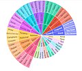
Sunburst Chart

Here is a more complicated data set: {10,14,86,2,68,99,1}. The mean would be calculated like this:

The dot plot as a representation of a distribution consists of group of data points plotted on a simple scale. Dot plots are used for continuous, quantitative, univariate data. Data points may be labelled if there are few of them.
Dot plots are one of the simplest statistical plots, and are suitable for small to moderate sized data sets. They are useful for highlighting clusters and gaps, as well as outliers. Their other advantage is the conservation of numerical information. When dealing with larger data sets (around 20–30 or more data points) the related stem plot, box plot or histogram may be more efficient, as dot plots may become too cluttered after this point. Dot plots may be distinguished from histograms in that dots are not spaced uniformly along the horizontal axis.
Although the plot appears to be simple, its computation and the statistical theory underlying it are not simple. The algorithm for computing a dot plot is closely related to kernel density estimation. The size chosen for the dots affects the appearance of the plot. Choice of dot size is equivalent to choosing the bandwidth for a kernel density estimate.
In the R programming language this type of plot is also referred to as a stripchart
A histogram is an approximate representation of the distribution of numerical data. It was first introduced by Karl Pearson. To construct a histogram, the first step is to "bin" (or "bucket") the range of values—that is, divide the entire range of values into a series of intervals—and then count how many values fall into each interval. The bins are usually specified as consecutive, non-overlapping intervals of a variable. The bins (intervals) must be adjacent and are often (but not required to be) of equal size.
If the bins are of equal size, a rectangle is erected over the bin with height proportional to the frequency—the number of cases in each bin. A histogram may also be normalized to display "relative" frequencies. It then shows the proportion of cases that fall into each of several categories, with the sum of the heights equaling 1.
However, bins need not be of equal width; in that case, the erected rectangle is defined to have its area proportional to the frequency of cases in the bin. The vertical axis is then not the frequency but frequency density —the number of cases per unit of the variable on the horizontal axis. Examples of variable bin width are displayed on Census bureau data below.
As the adjacent bins leave no gaps, the rectangles of a histogram touch each other to indicate that the original variable is continuous.
Histograms give a rough sense of the density of the underlying distribution of the data, and often for density estimation: estimating the probability density function of the underlying variable. The total area of a histogram used for probability density is always normalized to 1. If the length of the intervals on the x-axis are all 1, then a histogram is identical to a relative frequency plot.
A histogram can be thought of as a simplistic kernel density estimation, which uses a kernel to smooth frequencies over the bins. This yields a smoother probability density function, which will in general more accurately reflect distribution of the underlying variable. The density estimate could be plotted as an alternative to the histogram, and is usually drawn as a curve rather than a set of boxes. Histograms are nevertheless preferred in applications, when their statistical properties need to be modeled. The correlated variation of a kernel density estimate is very difficult to describe mathematically, while it is simple for a histogram where each bin varies independently.
An alternative to kernel density estimation is the average shifted histogram, which is fast to compute and gives a smooth curve estimate of the density without using kernels.
The histogram is one of the seven basic tools of quality control.
Histograms are sometimes confused with bar charts. A histogram is used for continuous data, where the bins represent ranges of data, while a bar chart is a plot of categorical variables. Some authors recommend that bar charts have gaps between the rectangles to clarify the distinction.
This is the data for the histogram to the right, using 500 items:

The words used to describe the patterns in a histogram are: "symmetric", "skewed left" or "right", "unimodal", "bimodal" or "multimodal".

Symmetric, unimodal

Skewed right
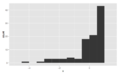
Skewed left

It is a good idea to plot the data using several different bin widths to learn more about it. Here is an example on tips given in a restaurant.

Tips using a $1 bin width, skewed right, unimodal

Tips using a 10c bin width, still skewed right, multimodal with modes at $ and 50c amounts, indicates rounding, also some outliers
The U.S. Census Bureau found that there were 124 million people who work outside of their homes. Using their data on the time occupied by travel to work, the table below shows the absolute number of people who responded with travel times "at least 30 but less than 35 minutes" is higher than the numbers for the categories above and below it. This is likely due to people rounding their reported journey time. The problem of reporting values as somewhat arbitrarily rounded numbers is a common phenomenon when collecting data from people.

This histogram shows the number of cases per unit interval as the height of each block, so that the area of each block is equal to the number of people in the survey who fall into its category. The area under the curve represents the total number of cases (124 million). This type of histogram shows absolute numbers, with Q in thousands.
Content obtained and/or adapted from:
- Chart, Wikipedia under a CC BY-SA license
Navigation menu
Personal tools.
- View source
- View history
- Recent changes
- Random page
- Help about MediaWiki
- What links here
- Related changes
- Special pages
- Printable version
- Permanent link
- Page information
- Cite this page
- This page was last edited on 30 October 2021, at 10:35.
- Content is available under Creative Commons Attribution unless otherwise noted.
- Privacy policy
- About Department of Mathematics at UTSA
- Disclaimers
Module 11: Statistics: Describing Data
Representing data graphically, learning outcomes.
- Create a frequency table, bar graph, pareto chart, pictogram, or a pie chart to represent a data set
- Identify features of ineffective representations of data
- Create a histogram, pie chart, or frequency polygon that represents numerical data
- Create a graph that compares two quantities
In this lesson we will present some of the most common ways data is represented graphically. W e will also discuss some of the ways you can increase the accuracy and effectiveness of graphs of data that you create.
Presenting Categorical Data Graphically
Visualizing data.
Categorical, or qualitative, data are pieces of information that allow us to classify the objects under investigation into various categories. We usually begin working with categorical data by summarizing the data into a frequency table.
Frequency Table
A frequency table is a table with two columns. One column lists the categories, and another for the frequencies with which the items in the categories occur (how many items fit into each category).
An insurance company determines vehicle insurance premiums based on known risk factors. If a person is considered a higher risk, their premiums will be higher. One potential factor is the color of your car. The insurance company believes that people with some color cars are more likely to get in accidents. To research this, they examine police reports for recent total-loss collisions. The data is summarized in the frequency table below.
Sometimes we need an even more intuitive way of displaying data. This is where charts and graphs come in. There are many, many ways of displaying data graphically, but we will concentrate on one very useful type of graph called a bar graph. In this section we will work with bar graphs that display categorical data; the next section will be devoted to bar graphs that display quantitative data.
A bar graph is a graph that displays a bar for each category with the length of each bar indicating the frequency of that category.
To construct a bar graph, we need to draw a vertical axis and a horizontal axis. The vertical direction will have a scale and measure the frequency of each category; the horizontal axis has no scale in this instance. The construction of a bar chart is most easily described by use of an example.
Using our car data from above, note the highest frequency is 52, so our vertical axis needs to go from 0 to 52, but we might as well use 0 to 55, so that we can put a hash mark every 5 units:
Notice that the height of each bar is determined by the frequency of the corresponding color. The horizontal gridlines are a nice touch, but not necessary. In practice, you will find it useful to draw bar graphs using graph paper, so the gridlines will already be in place, or using technology. Instead of gridlines, we might also list the frequencies at the top of each bar, like this:
The following video explains the process and value of moving data from a table to a bar graph.
In this case, our chart might benefit from being reordered from largest to smallest frequency values. This arrangement can make it easier to compare similar values in the chart, even without gridlines. When we arrange the categories in decreasing frequency order like this, it is called a Pareto chart .
Pareto chart
A Pareto chart is a bar graph ordered from highest to lowest frequency
Transforming our bar graph from earlier into a Pareto chart, we get:
The following video addressed Pareto charts.
In a survey [1] , adults were asked whether they personally worried about a variety of environmental concerns. The numbers (out of 1012 surveyed) who indicated that they worried “a great deal” about some selected concerns are summarized below.
This data could be shown graphically in a bar graph:
To show relative sizes, it is common to use a pie chart.
A pie chart is a circle with wedges cut of varying sizes marked out like slices of pie or pizza. The relative sizes of the wedges correspond to the relative frequencies of the categories.
For our vehicle color data, a pie chart might look like this:
Pie charts can often benefit from including frequencies or relative frequencies (percents) in the chart next to the pie slices. Often having the category names next to the pie slices also makes the chart clearer.
This video demonstrates how to create pie charts like the ones above.
The pie chart below shows the percentage of voters supporting each candidate running for a local senate seat.
If there are 20,000 voters in the district, the pie chart shows that about 11% of those, about 2,200 voters, support Reeves.
The following video addresses how to read a pie chart like the one above.
Pie charts look nice, but are harder to draw by hand than bar charts since to draw them accurately we would need to compute the angle each wedge cuts out of the circle, then measure the angle with a protractor. Computers are much better suited to drawing pie charts. Common software programs like Microsoft Word or Excel, OpenOffice.org Write or Calc, or Google Drive are able to create bar graphs, pie charts, and other graph types. There are also numerous online tools that can create graphs. [2]
Create a bar graph and a pie chart to illustrate the grades on a history exam below.
A: 12 students, B: 19 students, C: 14 students, D: 4 students, F: 5 students
Here is another way that fanciness can lead to trouble. Instead of plain bars, it is tempting to substitute meaningful images. This type of graph is called a pictogram .
A pictogram is a statistical graphic in which the size of the picture is intended to represent the frequencies or size of the values being represented.
Looking at the picture, it would be reasonable to guess that the manager salaries is 4 times as large as the worker salaries – the area of the bag looks about 4 times as large. However, the manager salaries are in fact only twice as large as worker salaries, which were reflected in the picture by making the manager bag twice as tall.
This video reviews the two examples of ineffective data representation in more detail.
Another distortion in bar charts results from setting the baseline to a value other than zero. The baseline is the bottom of the vertical axis, representing the least number of cases that could have occurred in a category. Normally, this number should be zero.
Compare the two graphs below showing support for same-sex marriage rights from a poll taken in December 2008 [3] . The difference in the vertical scale on the first graph suggests a different story than the true differences in percentages; the second graph makes it look like twice as many people oppose marriage rights as support it.
Presenting Quantitative Data Graphically
Visualizing numbers.
Quantitative, or numerical, data can also be summarized into frequency tables.
A teacher records scores on a 20-point quiz for the 30 students in his class. The scores are:
19 20 18 18 17 18 19 17 20 18 20 16 20 15 17 12 18 19 18 19 17 20 18 16 15 18 20 5 0 0
These scores could be summarized into a frequency table by grouping like values:
Using the table from the first example, it would be possible to create a standard bar chart from this summary, like we did for categorical data:
A histogram is like a bar graph, but where the horizontal axis is a number line.
For the values above, a histogram would look like:
Notice that in the histogram, a bar represents values on the horizontal axis from that on the left hand-side of the bar up to, but not including, the value on the right hand side of the bar. Some people choose to have bars start at ½ values to avoid this ambiguity.
This video demonstrates the creation of the histogram from this data.
Unfortunately, not a lot of common software packages can correctly graph a histogram. About the best you can do in Excel or Word is a bar graph with no gap between the bars and spacing added to simulate a numerical horizontal axis.
If we have a large number of widely varying data values, creating a frequency table that lists every possible value as a category would lead to an exceptionally long frequency table, and probably would not reveal any patterns. For this reason, it is common with quantitative data to group data into class intervals .
Class Intervals
Class intervals are groupings of the data. In general, we define class intervals so that
- each interval is equal in size. For example, if the first class contains values from 120-129, the second class should include values from 130-139.
- we have somewhere between 5 and 20 classes, typically, depending upon the number of data we’re working with.
Suppose that we have collected weights from 100 male subjects as part of a nutrition study. For our weight data, we have values ranging from a low of 121 pounds to a high of 263 pounds, giving a total span of 263-121 = 142. We could create 7 intervals with a width of around 20, 14 intervals with a width of around 10, or somewhere in between. Often time we have to experiment with a few possibilities to find something that represents the data well. Let us try using an interval width of 15. We could start at 121, or at 120 since it is a nice round number.
A histogram of this data would look like:
In many software packages, you can create a graph similar to a histogram by putting the class intervals as the labels on a bar chart.
The following video walks through this example in more detail.
Other graph types such as pie charts are possible for quantitative data. The usefulness of different graph types will vary depending upon the number of intervals and the type of data being represented. For example, a pie chart of our weight data is difficult to read because of the quantity of intervals we used.
To see more about why a pie chart isn’t useful in this case, watch the following.
The total cost of textbooks for the term was collected from 36 students. Create a histogram for this data.
$140 $160 $160 $165 $180 $220 $235 $240 $250 $260 $280 $285
$285 $285 $290 $300 $300 $305 $310 $310 $315 $315 $320 $320
$330 $340 $345 $350 $355 $360 $360 $380 $395 $420 $460 $460
When collecting data to compare two groups, it is desirable to create a graph that compares quantities.
The data below came from a task in which the goal is to move a computer mouse to a target on the screen as fast as possible. On 20 of the trials, the target was a small rectangle; on the other 20, the target was a large rectangle. Time to reach the target was recorded on each trial.
One option to represent this data would be a comparative histogram or bar chart, in which bars for the small target group and large target group are placed next to each other.
Frequency polygon
An alternative representation is a frequency polygon . A frequency polygon starts out like a histogram, but instead of drawing a bar, a point is placed in the midpoint of each interval at height equal to the frequency. Typically the points are connected with straight lines to emphasize the distribution of the data.
This graph makes it easier to see that reaction times were generally shorter for the larger target, and that the reaction times for the smaller target were more spread out.
The following video explains frequency polygon creation for this example.
- Gallup Poll. March 5-8, 2009. http://www.pollingreport.com/enviro.htm ↵
- For example: http://nces.ed.gov/nceskids/createAgraph/ or http://docs.google.com ↵
- CNN/Opinion Research Corporation Poll. Dec 19-21, 2008, from http://www.pollingreport.com/civil.htm ↵
- Learning Objectives and Introduction. Provided by : Lumen Learning. License : CC BY: Attribution
- Revision and Adaptation. Provided by : Lumen Learning. License : CC BY: Attribution
- Math in Society. Authored by : David Lippman. Located at : http://www.opentextbookstore.com/mathinsociety/ . License : CC BY-SA: Attribution-ShareAlike
- Bar graphs for categorical data. Authored by : OCLPhase2's channel. Located at : https://youtu.be/vwxKf_O3ui0 . License : CC BY: Attribution
- Pareto Chart. Authored by : OCLPhase2's channel. Located at : https://youtu.be/Tsvru8DPxBE . License : CC BY: Attribution
- Creating a pie chart. Authored by : OCLPhase2's channel. Located at : https://youtu.be/__1f8dKh6yo . License : CC BY: Attribution
- Reading a pie chart. Authored by : OCLPhase2's channel. Located at : https://youtu.be/mwa8vQnGr3I . License : CC BY: Attribution
- Bad graphical representations of data. Authored by : OCLPhase2's channel. Located at : https://youtu.be/bFwTZNGNLKs . License : CC BY: Attribution
- numbers-education-kindergarten. Authored by : karanja. Located at : https://pixabay.com/en/numbers-education-kindergarten-738068/ . License : CC0: No Rights Reserved
- Creating a histogram. Authored by : OCLPhase2's channel. Located at : https://youtu.be/180FgZ_cTrE . License : CC BY: Attribution
- Defining class intervals for a frequency table or histogram. Authored by : OCLPhase2's channel. Located at : https://youtu.be/JhshitTtdP0 . License : CC BY: Attribution
- When not use a pie chart. Authored by : OCLPhase2's channel. Located at : https://youtu.be/FQ8zmZ56-XA . License : CC BY: Attribution
- Frequency polygons. Authored by : OCLPhase2's channel. Located at : https://youtu.be/rxByzA9MFFY . License : CC BY: Attribution
- Business Essentials
- Leadership & Management
- Credential of Leadership, Impact, and Management in Business (CLIMB)
- Entrepreneurship & Innovation
- *New* Digital Transformation
- Finance & Accounting
- Business in Society
- For Organizations
- Support Portal
- Media Coverage
- Founding Donors
- Leadership Team

- Harvard Business School →
- HBS Online →
- Business Insights →
Business Insights
Harvard Business School Online's Business Insights Blog provides the career insights you need to achieve your goals and gain confidence in your business skills.
- Career Development
- Communication
- Decision-Making
- Earning Your MBA
- Negotiation
- News & Events
- Productivity
- Staff Spotlight
- Student Profiles
- Work-Life Balance
- Alternative Investments
- Business Analytics
- Business Strategy
- Business and Climate Change
- Design Thinking and Innovation
- Digital Marketing Strategy
- Disruptive Strategy
- Economics for Managers
- Entrepreneurship Essentials
- Financial Accounting
- Global Business
- Launching Tech Ventures
- Leadership Principles
- Leadership, Ethics, and Corporate Accountability
- Leading with Finance
- Management Essentials
- Negotiation Mastery
- Organizational Leadership
- Power and Influence for Positive Impact
- Strategy Execution
- Sustainable Business Strategy
- Sustainable Investing
- Winning with Digital Platforms
17 Data Visualization Techniques All Professionals Should Know

- 17 Sep 2019
There’s a growing demand for business analytics and data expertise in the workforce. But you don’t need to be a professional analyst to benefit from data-related skills.
Becoming skilled at common data visualization techniques can help you reap the rewards of data-driven decision-making , including increased confidence and potential cost savings. Learning how to effectively visualize data could be the first step toward using data analytics and data science to your advantage to add value to your organization.
Several data visualization techniques can help you become more effective in your role. Here are 17 essential data visualization techniques all professionals should know, as well as tips to help you effectively present your data.
Access your free e-book today.
What Is Data Visualization?
Data visualization is the process of creating graphical representations of information. This process helps the presenter communicate data in a way that’s easy for the viewer to interpret and draw conclusions.
There are many different techniques and tools you can leverage to visualize data, so you want to know which ones to use and when. Here are some of the most important data visualization techniques all professionals should know.
Data Visualization Techniques
The type of data visualization technique you leverage will vary based on the type of data you’re working with, in addition to the story you’re telling with your data .
Here are some important data visualization techniques to know:
- Gantt Chart
- Box and Whisker Plot
- Waterfall Chart
- Scatter Plot
- Pictogram Chart
- Highlight Table
- Bullet Graph
- Choropleth Map
- Network Diagram
- Correlation Matrices
1. Pie Chart

Pie charts are one of the most common and basic data visualization techniques, used across a wide range of applications. Pie charts are ideal for illustrating proportions, or part-to-whole comparisons.
Because pie charts are relatively simple and easy to read, they’re best suited for audiences who might be unfamiliar with the information or are only interested in the key takeaways. For viewers who require a more thorough explanation of the data, pie charts fall short in their ability to display complex information.
2. Bar Chart

The classic bar chart , or bar graph, is another common and easy-to-use method of data visualization. In this type of visualization, one axis of the chart shows the categories being compared, and the other, a measured value. The length of the bar indicates how each group measures according to the value.
One drawback is that labeling and clarity can become problematic when there are too many categories included. Like pie charts, they can also be too simple for more complex data sets.
3. Histogram

Unlike bar charts, histograms illustrate the distribution of data over a continuous interval or defined period. These visualizations are helpful in identifying where values are concentrated, as well as where there are gaps or unusual values.
Histograms are especially useful for showing the frequency of a particular occurrence. For instance, if you’d like to show how many clicks your website received each day over the last week, you can use a histogram. From this visualization, you can quickly determine which days your website saw the greatest and fewest number of clicks.
4. Gantt Chart

Gantt charts are particularly common in project management, as they’re useful in illustrating a project timeline or progression of tasks. In this type of chart, tasks to be performed are listed on the vertical axis and time intervals on the horizontal axis. Horizontal bars in the body of the chart represent the duration of each activity.
Utilizing Gantt charts to display timelines can be incredibly helpful, and enable team members to keep track of every aspect of a project. Even if you’re not a project management professional, familiarizing yourself with Gantt charts can help you stay organized.
5. Heat Map

A heat map is a type of visualization used to show differences in data through variations in color. These charts use color to communicate values in a way that makes it easy for the viewer to quickly identify trends. Having a clear legend is necessary in order for a user to successfully read and interpret a heatmap.
There are many possible applications of heat maps. For example, if you want to analyze which time of day a retail store makes the most sales, you can use a heat map that shows the day of the week on the vertical axis and time of day on the horizontal axis. Then, by shading in the matrix with colors that correspond to the number of sales at each time of day, you can identify trends in the data that allow you to determine the exact times your store experiences the most sales.
6. A Box and Whisker Plot

A box and whisker plot , or box plot, provides a visual summary of data through its quartiles. First, a box is drawn from the first quartile to the third of the data set. A line within the box represents the median. “Whiskers,” or lines, are then drawn extending from the box to the minimum (lower extreme) and maximum (upper extreme). Outliers are represented by individual points that are in-line with the whiskers.
This type of chart is helpful in quickly identifying whether or not the data is symmetrical or skewed, as well as providing a visual summary of the data set that can be easily interpreted.
7. Waterfall Chart

A waterfall chart is a visual representation that illustrates how a value changes as it’s influenced by different factors, such as time. The main goal of this chart is to show the viewer how a value has grown or declined over a defined period. For example, waterfall charts are popular for showing spending or earnings over time.
8. Area Chart

An area chart , or area graph, is a variation on a basic line graph in which the area underneath the line is shaded to represent the total value of each data point. When several data series must be compared on the same graph, stacked area charts are used.
This method of data visualization is useful for showing changes in one or more quantities over time, as well as showing how each quantity combines to make up the whole. Stacked area charts are effective in showing part-to-whole comparisons.
9. Scatter Plot

Another technique commonly used to display data is a scatter plot . A scatter plot displays data for two variables as represented by points plotted against the horizontal and vertical axis. This type of data visualization is useful in illustrating the relationships that exist between variables and can be used to identify trends or correlations in data.
Scatter plots are most effective for fairly large data sets, since it’s often easier to identify trends when there are more data points present. Additionally, the closer the data points are grouped together, the stronger the correlation or trend tends to be.
10. Pictogram Chart

Pictogram charts , or pictograph charts, are particularly useful for presenting simple data in a more visual and engaging way. These charts use icons to visualize data, with each icon representing a different value or category. For example, data about time might be represented by icons of clocks or watches. Each icon can correspond to either a single unit or a set number of units (for example, each icon represents 100 units).
In addition to making the data more engaging, pictogram charts are helpful in situations where language or cultural differences might be a barrier to the audience’s understanding of the data.
11. Timeline

Timelines are the most effective way to visualize a sequence of events in chronological order. They’re typically linear, with key events outlined along the axis. Timelines are used to communicate time-related information and display historical data.
Timelines allow you to highlight the most important events that occurred, or need to occur in the future, and make it easy for the viewer to identify any patterns appearing within the selected time period. While timelines are often relatively simple linear visualizations, they can be made more visually appealing by adding images, colors, fonts, and decorative shapes.
12. Highlight Table

A highlight table is a more engaging alternative to traditional tables. By highlighting cells in the table with color, you can make it easier for viewers to quickly spot trends and patterns in the data. These visualizations are useful for comparing categorical data.
Depending on the data visualization tool you’re using, you may be able to add conditional formatting rules to the table that automatically color cells that meet specified conditions. For instance, when using a highlight table to visualize a company’s sales data, you may color cells red if the sales data is below the goal, or green if sales were above the goal. Unlike a heat map, the colors in a highlight table are discrete and represent a single meaning or value.
13. Bullet Graph

A bullet graph is a variation of a bar graph that can act as an alternative to dashboard gauges to represent performance data. The main use for a bullet graph is to inform the viewer of how a business is performing in comparison to benchmarks that are in place for key business metrics.
In a bullet graph, the darker horizontal bar in the middle of the chart represents the actual value, while the vertical line represents a comparative value, or target. If the horizontal bar passes the vertical line, the target for that metric has been surpassed. Additionally, the segmented colored sections behind the horizontal bar represent range scores, such as “poor,” “fair,” or “good.”
14. Choropleth Maps

A choropleth map uses color, shading, and other patterns to visualize numerical values across geographic regions. These visualizations use a progression of color (or shading) on a spectrum to distinguish high values from low.
Choropleth maps allow viewers to see how a variable changes from one region to the next. A potential downside to this type of visualization is that the exact numerical values aren’t easily accessible because the colors represent a range of values. Some data visualization tools, however, allow you to add interactivity to your map so the exact values are accessible.
15. Word Cloud

A word cloud , or tag cloud, is a visual representation of text data in which the size of the word is proportional to its frequency. The more often a specific word appears in a dataset, the larger it appears in the visualization. In addition to size, words often appear bolder or follow a specific color scheme depending on their frequency.
Word clouds are often used on websites and blogs to identify significant keywords and compare differences in textual data between two sources. They are also useful when analyzing qualitative datasets, such as the specific words consumers used to describe a product.
16. Network Diagram

Network diagrams are a type of data visualization that represent relationships between qualitative data points. These visualizations are composed of nodes and links, also called edges. Nodes are singular data points that are connected to other nodes through edges, which show the relationship between multiple nodes.
There are many use cases for network diagrams, including depicting social networks, highlighting the relationships between employees at an organization, or visualizing product sales across geographic regions.
17. Correlation Matrix

A correlation matrix is a table that shows correlation coefficients between variables. Each cell represents the relationship between two variables, and a color scale is used to communicate whether the variables are correlated and to what extent.
Correlation matrices are useful to summarize and find patterns in large data sets. In business, a correlation matrix might be used to analyze how different data points about a specific product might be related, such as price, advertising spend, launch date, etc.
Other Data Visualization Options
While the examples listed above are some of the most commonly used techniques, there are many other ways you can visualize data to become a more effective communicator. Some other data visualization options include:
- Bubble clouds
- Circle views
- Dendrograms
- Dot distribution maps
- Open-high-low-close charts
- Polar areas
- Radial trees
- Ring Charts
- Sankey diagram
- Span charts
- Streamgraphs
- Wedge stack graphs
- Violin plots

Tips For Creating Effective Visualizations
Creating effective data visualizations requires more than just knowing how to choose the best technique for your needs. There are several considerations you should take into account to maximize your effectiveness when it comes to presenting data.
Related : What to Keep in Mind When Creating Data Visualizations in Excel
One of the most important steps is to evaluate your audience. For example, if you’re presenting financial data to a team that works in an unrelated department, you’ll want to choose a fairly simple illustration. On the other hand, if you’re presenting financial data to a team of finance experts, it’s likely you can safely include more complex information.
Another helpful tip is to avoid unnecessary distractions. Although visual elements like animation can be a great way to add interest, they can also distract from the key points the illustration is trying to convey and hinder the viewer’s ability to quickly understand the information.
Finally, be mindful of the colors you utilize, as well as your overall design. While it’s important that your graphs or charts are visually appealing, there are more practical reasons you might choose one color palette over another. For instance, using low contrast colors can make it difficult for your audience to discern differences between data points. Using colors that are too bold, however, can make the illustration overwhelming or distracting for the viewer.
Related : Bad Data Visualization: 5 Examples of Misleading Data
Visuals to Interpret and Share Information
No matter your role or title within an organization, data visualization is a skill that’s important for all professionals. Being able to effectively present complex data through easy-to-understand visual representations is invaluable when it comes to communicating information with members both inside and outside your business.
There’s no shortage in how data visualization can be applied in the real world. Data is playing an increasingly important role in the marketplace today, and data literacy is the first step in understanding how analytics can be used in business.
Are you interested in improving your analytical skills? Learn more about Business Analytics , our eight-week online course that can help you use data to generate insights and tackle business decisions.
This post was updated on January 20, 2022. It was originally published on September 17, 2019.

About the Author
- Privacy Policy
Buy Me a Coffee
Home » Histogram – Types, Examples and Making Guide
Histogram – Types, Examples and Making Guide
Table of Contents

Definition:
Histogram is a graphical representation of the distribution of numerical data. It consists of a series of bars, where the height of each bar represents the frequency or relative frequency of the data within a particular interval or “bin.” The intervals, or bins, are typically specified on the x-axis, while the frequency or relative frequency is displayed on the y-axis. Histograms are commonly used in data analysis to visualize the distribution of a dataset, including information about its central tendency, spread, and skewness. They are particularly useful for identifying patterns and outliers in large datasets.
Parts of Histogram
The parts of a histogram include:
The x-axis, or horizontal axis, represents the range of values for the variable being measured. It is divided into intervals or bins, each of which represents a range of values.
The y-axis, or vertical axis, represents the frequency or relative frequency of the data within each interval or bin. The height of each bar represents the frequency or relative frequency of the data within that interval.
The bars in a histogram are vertical rectangles that represent the frequency or relative frequency of the data within each interval or bin. The width of the bars corresponds to the width of the interval or bin.
Intervals or bins
The intervals or bins represent the ranges of values that are grouped together in a histogram. They are typically of equal width and are specified on the x-axis.
The title of the histogram should provide a clear and concise description of the variable being measured and the purpose of the histogram.
If the histogram represents multiple groups or categories, a legend may be included to explain the meaning of each color or pattern used to represent the data.
The shape of the histogram can indicate whether the data is skewed to the left, right, or has a symmetrical distribution. This can be helpful in understanding the distribution of the data and making inferences about the population being measured.
Types of Histogram
Some common types of Histogram are as follows:
Probability Histogram
A probability histogram is a type of histogram that shows the probability density function of a continuous variable. The area under each bar in a probability histogram represents the probability of the data falling within that range.
Bimodal Histogram
A bimodal histogram is a type of histogram that shows two distinct peaks, indicating that the data has two modes or two different populations. Bimodal histograms can indicate that the data is a mixture of two different distributions or that there are two underlying processes contributing to the data.
Uniform Histogram
A uniform histogram is a type of histogram that shows that the data is evenly distributed over a given range. In a uniform histogram, all bars are approximately the same height, indicating that there is an equal probability of the data falling within any given range.
Symmetric Histogram
A symmetric histogram is a type of histogram that shows that the data is evenly distributed around a central value, resulting in a shape that is roughly symmetrical. In a symmetric histogram, the mean, median, and mode are all approximately equal. This means that the distribution of the data is balanced, with roughly the same number of values on either side of the central value. An example of a symmetric histogram is the normal distribution.
How to Make Histogram
Here are the general steps to make a histogram:
- Collect and organize the data: Collect the data you want to represent in the histogram. Group the data into intervals or bins, depending on the range and distribution of the data.
- Determine the range and interval width: Determine the minimum and maximum values of the data, and decide on an appropriate interval width or bin size. The bin size should be small enough to capture the variability in the data, but large enough to group similar values together.
- Draw the horizontal and vertical axes: Draw the horizontal axis and label it with the variable being measured. Draw the vertical axis and label it with the frequency or relative frequency of the data.
- Draw the bars : Draw rectangles above each interval or bin, with the height of the rectangle corresponding to the frequency or relative frequency of the data in that bin. The width of the rectangle should be equal to the bin size.
- Add titles and labels : Add a title to the histogram that describes the variable being measured and the range of the data. Label the x-axis and y-axis with appropriate units and titles.
- Fine-tune the histogram: Adjust the histogram as needed to improve its readability and visual appeal. This may include changing the bin size, adjusting the scale of the axes, or changing the colors and styles of the bars.
- Interpret the histogram: Analyze the shape, center, and spread of the data using the histogram. Look for patterns and trends, and draw conclusions based on the data.
Histogram Creating Guide
Here are the steps to create a histogram using a spreadsheet program like Microsoft Excel:
- Open a new spreadsheet and enter the data you want to use for the histogram.
- Create a column for the bins or intervals you want to use for the histogram. These bins should be evenly spaced and cover the entire range of your data.
- Select the data and the bin column, and then click on the “Insert” tab and select “Histogram” from the “Charts” section.
- Choose the desired histogram style and format for your chart. You can customize the colors, titles, axis labels, and other chart elements to suit your needs.
- Review the histogram and make any necessary adjustments. You may need to adjust the bin size, scale of the axis, or formatting of the bars to make the histogram more informative and visually appealing.
- Analyze the histogram and draw conclusions based on the data. Look for patterns, trends, and outliers in the data, and use the histogram to support your analysis and decision-making.
Examples of Histogram

Here are some examples of histograms:
- Height of Students in a Class: A histogram of the height of students in a class might show a normal distribution with a peak around the average height of the class.
- Daily Temperatures in a City: A histogram of daily temperatures in a city might show a bimodal distribution, with one peak around the average high temperature and another peak around the average low temperature.
- Ages of Employees in a Company: A histogram of the ages of employees in a company might show a slightly skewed distribution, with more employees in their 30s and 40s than in their 20s or 50s.
- Grades on a Test: A histogram of grades on a test might show a uniform distribution if all the students performed equally well, or a skewed distribution if there are a few high or low scores that are significantly different from the others.
- Housing Prices in a Neighborhood: A histogram of housing prices in a neighborhood might show a skewed distribution with a long tail on the high end, indicating that there are a few very expensive houses in the area.
Applications of Histogram
Histograms have many applications in various fields, including:
- Quality Control: Histograms are used in quality control to monitor the distribution of product characteristics, such as weight, dimensions, or color. By analyzing histograms, manufacturers can identify and correct problems with production processes and ensure that products meet quality standards.
- Market Research: Histograms are used in market research to analyze data on consumer preferences, behavior, and demographics. By analyzing histograms, marketers can identify trends and patterns in consumer data and use this information to develop targeted marketing strategies.
- Finance and Economics: Histograms are used in finance and economics to analyze data on stock prices, interest rates, and other financial variables. By analyzing histograms, analysts can identify trends and patterns in financial data and use this information to make investment decisions and develop economic models.
- Medical Research: Histograms are used in medical research to analyze data on patient characteristics, such as age, weight, and medical history. By analyzing histograms, researchers can identify risk factors for disease, track the progress of treatment, and identify patterns in health outcomes.
- Image Processing: Histograms are used in image processing to analyze and manipulate digital images. By analyzing histograms of image pixels, software can adjust image contrast, brightness, and color balance to enhance image quality and improve visual clarity.
When to use Histogram
They are particularly useful for:
- Identifying the shape of a distribution: Histograms can help you identify the shape of a distribution, including whether it is symmetric, skewed, or bimodal.
- Identifying central tendency: Histograms can help you identify the center of a distribution, including the mean, median, and mode.
- Identifying variability: Histograms can help you identify the range and spread of a distribution, including the minimum and maximum values, as well as the interquartile range and standard deviation.
- Identifying outliers: Histograms can help you identify outliers, or extreme values that are significantly different from the rest of the data.
- Comparing distributions: Histograms can help you compare the distributions of two or more variables to identify similarities and differences.
Purpose of Histogram
The purpose of a histogram is to visualize the distribution of a dataset. It provides a graphical representation of the frequency or proportion of data points that fall within each interval or bin of a continuous variable. Histograms can reveal patterns and trends in the data that may not be apparent from other methods of analysis, and can help you identify the shape, center, spread, and outliers of a distribution.
Histograms are particularly useful for identifying the following:
- The shape of a distribution: Histograms can help you identify whether a distribution is symmetric, skewed, bimodal, or uniform.
- The center of a distribution : Histograms can help you identify the mean, median, or mode of a distribution.
- The spread of a distribution : Histograms can help you identify the range, interquartile range, or standard deviation of a distribution.
- Outliers : Histograms can help you identify values that fall far outside the bulk of the distribution, which may be unusual or extreme.
Advantages of Histogram
Here are some advantages of using a histogram to analyze data:
- Easy to interpret: Histograms provide a visual representation of the data that is easy to understand and interpret. The bars in a histogram show the frequency or proportion of data points that fall within each interval or bin, making it easy to see the distribution of the data.
- Reveals patterns and trends: Histograms can reveal patterns and trends in the data that may not be apparent from other methods of analysis. By looking at the shape of the distribution, you can identify whether it is symmetric, skewed, bimodal, or uniform, which can provide insights into the underlying data.
- Identifies outliers: Histograms can help you identify outliers, or data points that fall far outside the bulk of the distribution. This can be useful for identifying unusual or extreme values that may require further investigation.
- Quantitative analysis: Histograms provide a quantitative analysis of the data that can be used to calculate measures such as the mean, median, mode, range, interquartile range, and standard deviation. This can help you gain a more precise understanding of the distribution of the data.
- Comparisons: Histograms can be used to compare the distribution of two or more variables, which can reveal similarities and differences in the data.
Limitation of Histogram
- Bin size: The shape of the histogram can be affected by the bin size or width, and choosing the appropriate bin size can be subjective. A small bin size can lead to a jagged or noisy histogram, while a large bin size can oversimplify the distribution and obscure important features.
- Outliers : Histograms can be affected by outliers, which are data points that fall far outside the bulk of the distribution. Outliers can skew the distribution and make it difficult to interpret the data.
- Noisy data: Histograms can be sensitive to noisy or incomplete data, which can affect the shape and interpretation of the distribution.
- Subjectivity : The interpretation of histograms can be subjective, and different analysts may choose different bin sizes or interpret the distribution differently.
- Limited to one variable: Histograms are limited to analyzing one variable at a time, which can make it difficult to identify relationships between variables.
About the author

Muhammad Hassan
Researcher, Academic Writer, Web developer
You may also like

Cluster Analysis – Types, Methods and Examples

Discriminant Analysis – Methods, Types and...

MANOVA (Multivariate Analysis of Variance) –...

Documentary Analysis – Methods, Applications and...

ANOVA (Analysis of variance) – Formulas, Types...

Graphical Methods – Types, Examples and Guide
- School Guide
- Mathematics
- Number System and Arithmetic
- Trigonometry
- Probability
- Mensuration
- Maths Formulas
- Class 8 Maths Notes
- Class 9 Maths Notes
- Class 10 Maths Notes
- Class 11 Maths Notes
- Class 12 Maths Notes
- Difference Between Variance and Standard Deviation
- Skewness Formula
- What is Arithmetic?
- How are sine, cosine, and tangent calculated?
- What is the value of (-8/27) -2/3 ?
- In a triangle XYZ right angled at Y, find the side length of YZ, if XY = 5 cm and ∠C = 30°
- What is the probability that the sum of the numbers is divisible by 4 when two dice are thrown simultaneously?
- What is the probability of getting a sum of 9 when two dice are thrown simultaneously?
- What is the probability of getting a prime number between 1 to 100?
- Difference between an Arithmetic Sequence and a Geometric Sequence
- Simplify and express the result in positive power notation: (−4) 5 ÷ (−4) 8
- How to express a number as a power?
- How to find the mean of a dataset?
- How to Find Square Root of a Number?
- Evaluating Definite Integrals
- Quotient Rule | Formula, Proof and Examples
- Derivative of Functions in Parametric Forms
- Derivatives of Composite Functions
Histogram – Definition, Types, Graph, and Examples
Histogram-Definition, Types, Graph, and Examples: A histogram is a graphical representation used in statistics to show the distribution of numerical data. It looks somewhat like a bar chart, but with key differences that make it suitable for showing how data is distributed across continuous intervals or specific categories that are considered “bins”.
A histogram is similar to a bar graph. The basic difference between the two is that bar charts correlate a value with a single category or discrete variable, whereas histograms visualize frequencies for continuous variables.
In this article, we have provided every detail about Histograms, their definition, types, examples, how the histogram looks, etc.

Table of Content
What is Histogram?
Parts of a histogram, types of histogram, histogram examples, histogram graph, how to draw histogram, how to interpret a histogram, when to use histogram, advantages of histogram, disadvantages of histogram, applications of histogram, difference between bar graph and histogram, histogram solved examples, practice problems of histogram.
Histogram is a graphical representation that condenses data series into easy-to-understand numerical data by grouping them into logical ranges of varying heights, often known as bins. Essentially, it summarises discrete or continuous data. Histogram is a tool for visualising the distribution of data across a continuous interval or period.
In a histogram data is grouped into continuous number ranges and each range corresponds to a vertical bar.
- Horizontal axis displays the number range.
- Vertical axis (frequency) represents the amount of data present in each range.
It allows us to assess where the values are concentrated, what the extremes are, and whether there are any gaps or anomalous values. A Histogram is similar to a vertical bar graph, however, the distinction is that the Histogram has no space between the bars, but a bar graph has.
Histogram Meaning
A histogram is a graph that shows the distribution of data. It resembles a sequence of interconnected bars. Each bar represents a range of values, and its height indicates how many data points are inside that range.
A histogram is a graph that represents the distribution of data. Here are the essential components, presented in simple terms:
Title: This is similar to the name of the histogram. It explains what the histogram is about and what data it displays.
X-axis: Visualize the X-axis as a horizontal line at the bottom of the histogram. It displays the many categories or groups that the data is sorted into. For example, if you’re measuring people’s heights, the X-axis may indicate several height ranges such as “5-6 feet” or “6-7 feet.”
Y-axis: The Y-axis appears as a vertical line on the side of the histogram. It displays the number of times something occurs in each category or group shown on the X-axis. So, if you’re measuring heights, the Y-axis may display how many individuals are in each height range.
Bars: Bars are like the histogram’s building blocks. They are the vertical rectangles you see on the chart. Each bar on the X-axis represents a category or group, and its height indicates how many times something occurs inside that category. So, higher bars indicate more occurrences, whereas shorter bars indicate fewer occurrences. The bar’s width remains constant, but it indicates the range covered by each category on the X-axis. If all of the bars have the same width, it indicates that the categories are all the same size.
The following are some typical forms of histograms and their characteristics:
Uniform Histogram
A uniform distribution means that the data is uniformly distributed among the classes, with each having a same number of elements. It may display many peaks, suggesting varying degrees of incidence.

Bimodal Histogram
A histogram is called bimodal if it has two distinct peaks. This implies that the data consists of observations from two distinct groups or categories, with notable variations between them.

Symmetric Histogram
Symmetric Histogram is also known as a bell-shaped histogram, it has perfect symmetry when divided vertically down the centre, with both sides matching each other in size and shape. The balance reflects a steady distribution pattern.

Right-Skewed Histogram
A right-skewed histogram shows bars leaning towards the right side. This signifies that the majority of the data points are on the left side, with a few outliers reaching to the right. Consider a histogram showing the distribution of family earnings. A right-skewed histogram occurs when the majority of families are in lower income groups, but a small number of highly rich households skew the average income.

Left-Skewed Histogram
A left-skewed histogram shows bars that lean towards the left side. This means that the majority of the data points are on the right side, with a few exceptionally low values extending to the left. Consider a histogram reflecting the distribution of test scores in a classroom. A left-skewed histogram occurs when the majority of students receive excellent grades but a few do badly, resulting in an average that is dragged to the left.

Frequency Histogram
A frequency histogram visually displays how often specific values appear in data. Each bar represents a range of values, with its height indicating the frequency of occurrences. For instance, if we’re tracking study hours, the histogram shows how many students fall into each study time range, offering insights into study habits across the student population.
Relative Frequency Histogram
Relative Frequency Histogram displays proportions instead of exact counts for each interval. For example, in a class of 20 students, it might show that 25% scored between 70 and 80%. Relative frequency histograms offer insights into the occurrence of distinct values and distribution patterns within a dataset.
Cumulative Frequency Histogram
A cumulative frequency histogram is a graph that depicts the total number of values up to a specific point. Instead of displaying the frequency of each individual number, it shows the cumulative frequency, which increases as you walk down the graph.
For example, if you’re graphing test scores, the height of each bar shows the total number of points received to that moment. So, if the first bar displays a frequency of 10 for scores 0-10 and the second bar shows a frequency of 20 for scores 0-20, it indicates that 20 students scored 20 or below.
Cumulative Relative Frequency Histogram
A Cumulative Relative Frequency Histogram is a histogram that depicts the percentage of data points in a dataset that fall below a specific number. Each bar indicates the sum of relative frequencies up to a certain point.
For example, if we have test results ranging from 0 to 100, the histogram will show the percentage of students that scored below each level. If 30% of students scored less than 70, the bar for 70 would be 30% higher.
1. Normal Distribution Histogram
- The histogram will likely be bell-shaped, indicating a normal distribution.
- The highest bar (or bars) will be around the middle score range, with the height of bars decreasing symmetrically as you move away from the middle.
2. Skewed Distribution Histogram
- The histogram will have a long tail to the right, indicating a right-skewed distribution.
- Most of the bars will be taller on the left side of the histogram (representing younger employees), with the height of bars decreasing as you move to the right (older age groups).
A histogram is like a bar graph that shows data in columns along the x-axis. Each column represents a range of outcomes, and the height of the column on the y-axis shows how many times that outcome occurred in the data. It’s a simple and effective way to see how data is spread out or distributed. A histogram chart is added below,

Histogram is the basic toll of representing data and we can easily draw histogram by following the steps added below:
Step 1: Collect the data you wish to display in the histogram. This might range from test results to population distribution. For example: Assume you get the following test scores: 14, 20, 12, 26, 8, 7, 2, 28, 30, 16, 18, 23. First arrange it in ascending order. Exam results: 2, 7, 8, 12, 14, 16, 18, 19, 23, 26, 28 and 30.
Step 2: Determine the number of intervals, or “bins,” you wish to split your data into. This is determined by the scope and distribution of your data, as well as the amount of information you choose to display. Assume we wish to divide the scores into 5 bins.
Step 3: Determine the limits of each bin. These bounds should encompass the complete range of your data and be regularly spaced. 0-5 – 10 – 15 – 20 – 25 – 30.
Step 4: Count the number of data points that belong in each bin.
Step 5: On a graph, show the bin borders on the x-axis and the frequency of data points in each bin on the y-axis. Create bars for each bin, with the height of each bar representing the frequency of data points in that bin.

In this histogram, the x-axis depicts the bins, while the y-axis indicates the frequency of data points falling within each bin. The bars represent the sample data’s distribution across the given bins.
A histogram is a type of bar graph that displays the distribution of data. Assume you have a collection of numbers, such as test results or people’s heights. A histogram divides these numbers into ranges known as “bins,” and then illustrates how many data points fall into each bin by creating bars. The higher the bar, the more data points are contained inside that range.
So, when you look at a histogram, you can immediately observe where the majority of the data is, whether it is grouped in one location or spread out, and whether there are any strange patterns, such as gaps or outliers.
Histogram graphs are utilised under various scenarios and some of them are,
- When you have numbers as data.
- To understand how your data is distributed, especially whether it follows a typical pattern.
- To determine if a process satisfies consumer needs.
- Analyse the results of a supplier’s procedure.
- Compare changes in a process over time.
- To compare the results of several processes.
- When you want to quickly and clearly show people how your data is distributed.
Histograms provide various advantages for data analysis and visualization:
- Histograms provide an easy-to-understand visual representation, allowing for fast estimate of key statistical measures such as the mean and median based solely on the shape and central tendency of the graph.
- Histograms can give insights into probable future data events by highlighting patterns and trends in the current dataset, which can help with forecasting and decision-making.
- Histograms are a simple way to exhibit data of variable frequencies and kinds, allowing for clear communication and analysis across several domains and disciplines.
- Statisticians respect histograms for their consistency since they organise data into intervals with uniform distribution, guaranteeing precision and dependability when showing data distributions.
Histograms has advantages as well as disadvantages for data analysis and visualization:
- While histograms provide a simple visual representation, they might oversimplify complicated data patterns, potentially leading to misconceptions or missing subtleties in the information.
- Histogram interpretation can be subjective since people perceive patterns differently, resulting in various judgements regarding the data.
- The bin sizes and intervals used in a histogram can influence the visual look and perception of the data. Poorly designed bins might hide key details or generate fake patterns.
- In rare situations, histograms can be visually deceiving, particularly if the scale or axes are modified to emphasise some traits or downplay others, resulting in inaccurate data interpretation.
- While histograms are useful for visualising a single dataset, they may not allow for straightforward comparison of many datasets, particularly those with differing sizes or distributions.
- In the Classroom : Imagine a teacher curious about how well her students understood the latest math test. She plots their scores on a histogram, and it’s like seeing the class’s academic portrait. She can quickly spot if most kids nailed it (scores clustered in the high end), if it was a mixed bag, or if she needs to revisit some topics (scores spread out or leaning towards the lower end).
- Health Checks : Think of a doctor looking over the ages of patients getting flu shots. A histogram helps the doc see at a glance which age groups are rolling up their sleeves the most and which might need a nudge. It’s like getting a health pulse on the community with just a peek.
- Nature’s Patterns : A biologist tracking the growth of plants in different environments uses a histogram to visualize growth patterns. It’s as if the plants are telling their stories, showing which conditions make them thrive or barely hang on, all through the height and spread of those bars.
- Market Trends : Imagine a business owner gauging when their store is busiest by plotting customer visits across the day. The histogram becomes a daily schedule, highlighting rush hours when the store should be fully staffed and quiet times perfect for restocking.
A histogram is one of the most frequent graphs used to represent frequency distribution. The histogram appears more like a bar graph, but there is a distinction between the two. The differences between the bar graph and the histogram are as follows:
People Also View:
Interpretations of Histogram Histogram-Definition, Types, Steps to Draw Definition, Types, Examples | How To Make Bar Graphs? Bar graphs and Histograms
Example 1: Present the following information as a histogram:
We take the Marks on the graph’s horizontal axis and, based on the first column of the data, set the scale to 1 unit = 10. We pick number of students on the vertical axis of the graph and use the second column of the table to determine the scale: 1 unit = 10. Now we’ll create the relevant histogram.

Example 2: Present the following information as a histogram:
We take the Marks on the graph’s horizontal axis and, based on the first column of the data, set the scale to 1 unit = 10. We pick number of students on the vertical axis of the graph and use the second column of the table to determine the scale: 1 unit = 5. Now we’ll create the relevant histogram.

1) Present the following information as a histogram:
2) Present the following information as a histogram:
FAQs of Histogram – Definition, Types, Graph, and Examples
What is histogram and how is it different from a bar graph.
A histogram is a graphical depiction of frequency distributions in continuous data, whereas a bar chart is used in categorical data. A histogram, unlike a bar chart, depicts frequencies for continuous variables with no gaps between the bars.
What are key elements of a histogram?
A histogram is made up of a title, an X-axis (which represents categories or groups), a Y-axis (which shows frequency), and bars (which show frequency distribution).
What are many forms of histograms and what do they represent?
Histograms can be uniform, bimodal, symmetric (bell-shaped), right-skewed, or left-skewed. Each class represents distinct patterns in data distribution.
When should you use a histogram?
Histograms are important for analysing numerical data distributions, evaluating process changes over time, determining if data meets customer demands, and visualising data distribution patterns quickly and effectively.
What are advantage of utilising histograms?
Histograms simplify complicated data representation, make statistical measurements easier to read, provide insights into future data patterns, improve data communication, and assure consistent and trustworthy data visualization.
What is a right-skewed histogram, and when does it appear?
A right-skewed histogram means that the majority of data points are on the left side, with outliers stretching to the right. It happens when a dataset has a small number of high-value outliers.
What is a left-skewed histogram, and when does it appear?
A left-skewed histogram depicts the majority of data points on the right side, with outliers to the left. It happens when there are just a few low-value outliers in a dataset.
What is difference between a bar graph and a histogram?
Bar graphs show categorical data, whereas histograms display numerical data. Furthermore, bar graphs depict independent variables on the x-axis, whereas histograms show a continuous scale on the x-axis that represents ranges of data values.
Please Login to comment...
- Math-Statistics
- School Learning
- How to Delete Whatsapp Business Account?
- Discord vs Zoom: Select The Efficienct One for Virtual Meetings?
- Otter AI vs Dragon Speech Recognition: Which is the best AI Transcription Tool?
- Google Messages To Let You Send Multiple Photos
- 30 OOPs Interview Questions and Answers (2024)
Improve your Coding Skills with Practice
What kind of Experience do you want to share?
IMAGES
VIDEO
COMMENTS
The data that is obtained from different surveying is infused into a graphical representation by the use of some symbols, such as lines on a line graph, bars on a bar chart, or slices of a pie chart. This visual representation helps in clarity, comparison, and understanding of numerical data.
This page titled 2: Graphical Representations of Data is shared under a CC BY 4.0 license and was authored, remixed, and/or curated by OpenStax via source content that was edited to the style and standards of the LibreTexts platform; a detailed edit history is available upon request. In this chapter, you will study numerical and graphical ways ...
Graphical Representation is the study of the relationship between two variables and it is a way to easily analyse the numerical data. For more info, visit BYJU'S. Login. ... Circle Graph - Also known as the pie chart that shows the relationships of the parts of the whole. The circle is considered with 100% and the categories occupied is ...
Create a frequency table, bar graph, pareto chart, pictogram, or a pie chart to represent a data set. Identify features of ineffective representations of data. Create a histogram, pie chart, or frequency polygon that represents numerical data. Create a graph that compares two quantities. In this lesson we will present some of the most common ...
5. Box Plot. Box plot is a graphical representation of numerical data that can be used to understand the variability of the data and the existence of outliers. Box plot is designed by identifying the following descriptive statistics. 1. Lower quartile, median and upper quartile.
2.1: Types of Data Representation. Page ID. Two common types of graphic displays are bar charts and histograms. Both bar charts and histograms use vertical or horizontal bars to represent the number of data points in each category or interval. The main difference graphically is that in a bar chart there are spaces between the bars and in a ...
However, since the scores are numerical values, this chart doesn't really make sense; the first and second bars are five values apart, while the later bars are only one value apart. ... This type of graph is called a histogram. Histogram. A histogram is a graphical representation of quantitative data, similar to a bar graph. The horizontal ...
Data visualization is the graphical representation of information and data. By using v isual elements like charts, graphs, and maps, data visualization tools provide an accessible way to see and understand trends, outliers, and patterns in data. Additionally, it provides an excellent way for employees or business owners to present data to non ...
Qualitative Data: Categorical, Binary, and Ordinal. When you record information that categorizes your observations, you are collecting qualitative data. There are three types of qualitative variables—categorical, binary, and ordinal. With these data types, you're often interested in the proportions of each category.
To make this graph less misleading, a y-axis with salary information should be included. Even when both axes are present and labeled correctly, graphical representations of data can be misleading. This is shown in the set of attendance graphs that follow. In the graph on the left, the scale begins at 0 and goes to 20,000.
A circle graph (or pie chart) is a circle that is divided into as many sections as there are categories of the qualitative variable. The area of each section represents, for each category, the value of the quantitative data as a fraction of the sum of values. The fractions sum to 1 . Sometimes the section labels include both the category ...
Example 9.2.4 9.2. 4. The data below came from a task in which the goal is to move a computer mouse to a target on the screen as fast as possible. On 20 of the trials, the target was a small rectangle; on the other 20, the target was a large rectangle. Time to reach the target was recorded on each trial.
Learning Objectives. To learn to interpret the meaning of three graphical representations of sets of data: stem and leaf diagrams, frequency histograms, and relative frequency histograms. A well-known adage is that "a picture is worth a thousand words.". This saying proves true when it comes to presenting statistical information in a data set.
It is more effective than presenting the data in tabular form. Graphical representation is another way of analysing numerical data. A graph is a chart through which data are represented in the form of lines or curves drawn across the coordinated points plotted on the surface. Graphs enable us in studying the relationship between two variables ...
Graphs usually represent numerical data, while charts are visual representations of data that may or may not use numbers. So, while all graphs are a type of chart, not all charts are graphs. If you don't already have the kind of data you need, you might need to spend some time putting your data together before building your chart. 3. Gather ...
Pie graph is also a pictorial representation of numerical data, represented by sectors of circle. ... Line chart ot line graph is known as curve chart. Line graph displays the data that changes continuously over periods of time. In this chart, data diaplays as series of data points which is called as markers. There data points are connected by ...
A box and whisker chart is a statistical graph for displaying sets of numerical data through their quartiles. It displays a frequency distribution of the data. The box and whisker chart helps you to display the spread and skewness for a given set of data using the five number summary principle: minimum, maximum, median, lower and upper quartiles.
A chart is a graphical representation for data visualization, in which "the data is represented by symbols, such as bars in a bar chart, lines in a line chart, or slices in a pie chart". A chart can represent tabular numeric data, functions or some kinds of quality structure and provides different info. The term "chart" as a graphical ...
Create a frequency table, bar graph, pareto chart, pictogram, or a pie chart to represent a data set. Identify features of ineffective representations of data. Create a histogram, pie chart, or frequency polygon that represents numerical data. Create a graph that compares two quantities. In this lesson we will present some of the most common ...
Bullet Graph. Choropleth Map. Word Cloud. Network Diagram. Correlation Matrices. 1. Pie Chart. Pie charts are one of the most common and basic data visualization techniques, used across a wide range of applications. Pie charts are ideal for illustrating proportions, or part-to-whole comparisons.
Histogram. Definition: Histogram is a graphical representation of the distribution of numerical data. It consists of a series of bars, where the height of each bar represents the frequency or relative frequency of the data within a particular interval or "bin."
A histogram is a graphical representation used in statistics to show the distribution of numerical data. It looks somewhat like a bar chart, but with key differences that make it suitable for showing how data is distributed across continuous intervals or specific categories that are considered "bins".
A digital photograph, piece of line art, or other graphic that is created in another program and is inserted into Powerpoint. Cropping. To hide part of an object, such as using the _____ tool or to delete a part of a picture. Chart. A graphical representation of numerical data from a worksheet ... that identifies data in a chart. About us ...